
20 Kitchen Ideas to Transform Your Cooking Space
The kitchen is the room most people use most often and renovate least thoughtfully. It accumulates problems gradually — storage that doesn’t work, lighting that’s too dim, a layout that makes cooking harder than it needs to be — until the friction becomes impossible to ignore. These 20 ideas address the most common kitchen problems with specific, practical solutions. Whether you’re planning a full renovation or just want to improve what you already have, each idea includes exactly what to do, what to watch for, and what mistake most people make.
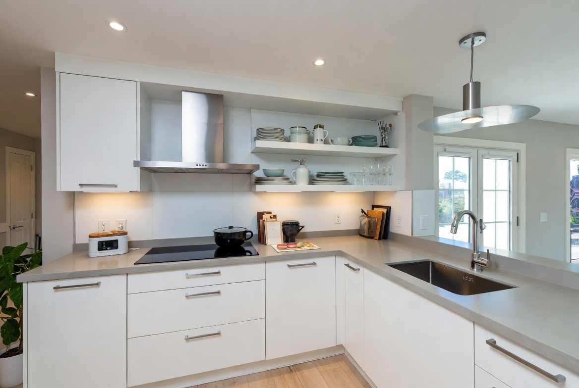
1. Open Shelving Instead of Cabinets
Best for: Kitchens with beautiful dishware, small kitchens that feel closed in, anyone who wants a more personal and lived-in look
Replacing upper cabinets with open shelves immediately makes a kitchen feel larger and more personal. The visual weight of solid cabinet doors disappears, and the room gains depth. But open shelving only works when what’s on the shelves is worth displaying — mismatched mugs and random clutter look worse open than they did behind a door.
The most successful open shelf kitchens use matching or coordinating dishware, a limited color palette on the shelves, and practical items that are also visually appealing — cast iron pans, ceramic bowls, glass jars of dry goods.
Smart tip: Keep the bottom shelf of open shelving at least 18 inches above the counter. Lower than this and items on the shelf interfere with counter work. Higher is actually more practical than you’d expect.
Mistake to avoid: Going fully open everywhere. Replace only the upper cabinets on one wall — usually the one most visible from the living area — and keep solid cabinets elsewhere for items you don’t want permanently on display. Half-and-half almost always looks better than fully open.
2. Statement Kitchen Island
Best for: Kitchens with enough floor space — minimum 42 inches of clearance on all sides
A kitchen island does more work than any other single element in the kitchen. It provides additional prep space, extra storage, seating for informal meals, a gathering point during parties, and a visual anchor for the entire room.
The 2025 approach to islands has shifted away from the matching-cabinet look toward islands that contrast with the surrounding kitchen — a darker color, a different material, or a different door style. A navy or forest green island in a white kitchen looks designed. The same island in white looks like an extension of the countertops.
A waterfall countertop — where the counter material continues down the side of the island to the floor — adds a sculptural quality that photographs well and looks expensive even in budget materials like laminate that mimics stone.
Smart tip: If you’re adding seating to the island, the overhang needs to be at least 12 inches for comfortable knee clearance. 15 inches is better. Less than 12 inches and people sit awkwardly without room for their legs.
Mistake to avoid: Installing an island that’s too large for the kitchen. The 42-inch clearance rule on all sides isn’t just comfortable — it’s the minimum for two people to work in the kitchen simultaneously without constantly getting in each other’s way. Measure before ordering.
3. Bold Backsplash Design
Best for: Any kitchen that feels bland, rooms where you want visual interest without a full renovation
The backsplash is the lowest-risk place to be bold in a kitchen. It’s behind the stove and counter, framed by cabinets — a contained area where even a dramatic pattern or color is visually bounded. Changing it is also relatively affordable and less disruptive than most kitchen renovations.
Subway tile has dominated kitchen backsplashes for a decade and is now giving way to more interesting options: zellige tile (Moroccan handmade ceramic with slight irregularity in color and surface that catches light beautifully), handmade-looking tiles with organic texture, and large-format slab backsplashes in the same material as the countertop.
Dark backsplashes — deep green, navy, charcoal — work especially well in kitchens with white or light cabinets. The dark backsplash creates a visual anchor that prevents the kitchen from looking washed out.
Smart tip: Extend the backsplash material up to the ceiling between the upper cabinets rather than stopping at the bottom of the cabinet line. Full-height backsplash makes the kitchen feel taller and the walls look intentional rather than like an afterthought.
Mistake to avoid: Choosing grout that’s too similar in color to the tile. Grout defines the tile pattern — if grout and tile are nearly the same color, the pattern disappears and you lose the visual texture you paid for. A slightly contrasting grout makes the tile pattern readable and more interesting.
4. Two-Tone Cabinet Colors
Best for: Any kitchen with upper and lower cabinets, kitchens that feel flat or monotonous
Two-tone cabinets — upper cabinets in one color, lower cabinets in another — is one of the highest-impact visual changes you can make to a kitchen without touching the layout. It breaks up the visual mass of a wall of identical cabinets and makes the kitchen look more considered and layered.
The most reliable combinations: white uppers with navy, forest green, or charcoal lowers. Cream uppers with warm wood-toned lowers. Light grey uppers with darker grey or black lowers. The principle is: lighter on top, darker on bottom. Reversing this — dark uppers, light lowers — can work in large kitchens with high ceilings, but often makes smaller kitchens feel top-heavy.
Smart tip: If repainting existing cabinets rather than replacing them, use a cabinet-specific paint rather than standard wall paint. Cabinet paint is formulated for the wear that kitchen surfaces receive — heat, moisture, daily contact — and adheres properly to the smooth surfaces that standard paint struggles with.
Mistake to avoid: Choosing two colors that are too close in value. Two slightly different shades of beige in a two-tone kitchen look like a color-matching mistake rather than a design decision. The contrast between the two tones needs to be clear and intentional.
5. Under-Cabinet Task Lighting
Best for: Every kitchen — this is the single most universally useful kitchen improvement available
Most kitchen lighting is designed to illuminate the room from above — a ceiling fixture or recessed lights. But cooking happens on the counter, and overhead lights cast the cook’s own shadow onto the work surface. Under-cabinet lighting solves this directly by putting the light source directly above the counter where work happens.
LED strip lights mounted to the underside of upper cabinets cost between $50 and $200 depending on length and quality, and they transform how the kitchen feels at night — from dim and shadowy to bright and functional.
Plug-in versions require no electrical work and can be installed in an afternoon. Hardwired versions look cleaner (no visible cords) and are appropriate for a full renovation.
Smart tip: Position the LED strip toward the front edge of the cabinet underside rather than the back. Strips mounted at the back cast light primarily onto the backsplash rather than the counter surface. Front-mounted strips illuminate the counter directly where you’re working.
Mistake to avoid: Using cool white LED strips (above 4000K) in a warm kitchen. Cool light against warm wood cabinets, warm tile, and warm dishware looks clinical and jarring. Use warm white (2700K to 3000K) for under-cabinet lighting in any kitchen with natural timber, warm paint colors, or earthy materials.
6. Warm Wood Accents and Shelves
Best for: White or grey kitchens that feel cold, any kitchen that needs warmth without a full repaint
The “soft kitchen” trend that dominated 2025 — making kitchens feel more like living rooms — is primarily driven by the addition of natural wood elements to kitchens that previously used only painted or laminate surfaces.
Wood open shelves in a white kitchen add immediate warmth without any structural changes. A wood-topped island in a painted kitchen does the same. Even small wood elements — a wooden knife block, wooden cutting boards displayed on the counter, wooden bar stools — shift the atmosphere noticeably.
Medium oak is the most versatile wood tone for kitchens — warm enough to add life, neutral enough to work with most paint colors. Very dark walnut suits high-contrast contemporary designs. Very light ash suits Scandinavian and minimalist aesthetics.
Smart tip: Seal open wood shelves in a kitchen with a water-resistant oil or varnish before loading them with dishes. Kitchen environments expose wood to steam and moisture regularly, and unsealed wood discolors and warps over time in these conditions.
Mistake to avoid: Mixing multiple wood tones in the same kitchen. Oak shelves plus pine flooring plus walnut stools creates visual noise because the tones conflict. Either commit to one wood tone throughout or keep wood elements far enough apart that they don’t visually interact.
7. Pull-Out Pantry Organization
Best for: Deep cabinets where items at the back are unreachable, any kitchen where finding things takes longer than it should
The most common kitchen storage problem is depth — items pushed to the back of a deep cabinet or pantry become functionally invisible. Pull-out shelving within cabinets and pantries solves this completely: the back of the storage comes to the front with a single motion.
Full-extension pull-out drawers within a lower cabinet convert an inaccessible deep storage space into fully accessible storage across its entire depth. Pull-out pantry units — tall, narrow towers on slides that pull out to reveal tiered shelving — are particularly effective in narrow gaps beside appliances or at the end of a cabinet run.
Smart tip: Organize pull-out shelves by frequency of use, not by category. Items used daily go at the most accessible position — front shelf, eye level or slightly below. Items used weekly go to the middle positions. Items used monthly or seasonally go to the back or highest shelves.
Mistake to avoid: Buying pull-out organizers without measuring the interior cabinet dimensions first. Cabinet interiors vary significantly in width, depth, and height, and the wrong-sized organizer either won’t fit or won’t extend properly. Measure interior width, interior depth, and clearance height before ordering anything.
8. Quartz or Marble Countertops
Best for: Any kitchen currently using laminate or tile countertops, anyone planning a renovation
Countertops have more visual impact than almost any other kitchen element — they’re one of the largest uninterrupted surfaces in the room. Upgrading from laminate or old tile to stone or engineered stone changes the feel of the entire kitchen.
Quartz (engineered stone) vs. natural marble — the practical comparison: marble is more beautiful, especially in close inspection, and develops patina over time. But it’s porous, stains from acids (lemon, wine, vinegar), and requires sealing. Quartz is virtually indestructible, non-porous, never needs sealing, and available in finishes that credibly mimic marble. For a kitchen that actually gets used heavily, quartz performs significantly better.
White quartz with subtle grey veining is the most widely used option because it suits virtually every cabinet color and reads as clean and contemporary. Calacatta-style quartz (bold dramatic veining) suits statement-focused kitchens with strong design intent.
Smart tip: Request a large sample (at least 12 x 12 inches) of any countertop material before ordering. The patterns in stone and engineered stone vary dramatically across slabs — what looks like a subtle vein in a 2-inch sample can be an overwhelming dramatic pattern across 8 feet of counter.
Mistake to avoid: Choosing a countertop edge profile that doesn’t suit the kitchen’s overall style. A waterfall edge looks sharp and modern. A bullnose edge looks traditional. An eased edge suits both. The edge profile is a design decision, not just a finishing detail — it should be chosen with the same deliberateness as the countertop material.
9. Herb Garden on the Windowsill
Best for: Kitchens with a south or east-facing window, anyone who cooks with fresh herbs regularly
A kitchen herb garden is one of the few additions that improves both the function and the appearance of the kitchen simultaneously. Fresh basil, parsley, thyme, and chives within arm’s reach of the stove changes how you cook — the step from reaching for dried herbs to reaching for fresh is a small one when the plants are on the windowsill.
Visually, a row of plants in the kitchen adds the organic warmth that no other decorative element achieves. The green against the kitchen’s hard surfaces — tile, stone, metal — creates the layered, lived-in quality that the best kitchens have.
Keep each herb in its own pot — mint especially must be contained separately, as it colonizes any shared container within weeks. Use consistent pot materials (all terracotta, all white ceramic) for visual cohesion.
Smart tip: Position the herb pots so you can reach them while standing at the stove without leaning across the counter. The herb garden fails as a functional element if accessing it requires moving things or awkward reaching. Proximity to the cooking zone is more important than the best window position.
Mistake to avoid: Buying mature herb plants in flower at the supermarket. Supermarket herb plants are grown quickly in greenhouse conditions and are often already stressed by the time they reach the shelf. A plant in flower has stopped putting energy into leaf production — which is what you want for cooking. Buy younger plants from a garden center and cut them back immediately to encourage bushy leaf growth.
10. Statement Range Hood
Best for: Kitchens where the cooking area needs a focal point, any renovation where the hood is being replaced anyway
The range hood used to be a purely functional element — a box that removed cooking fumes. In the past few years it has become one of the strongest design opportunities in the kitchen. A custom plaster hood, a sculptural stainless steel form, or a bold painted wooden hood above the stove creates a focal point that anchors the cooking wall and gives the kitchen a designed quality that flat-fronted cabinets alone can’t achieve.
Plaster hoods painted in a contrasting color to the cabinets are particularly popular because they add architectural weight and a handcrafted quality that prefabricated hoods can’t replicate.
Smart tip: Size the hood relative to the cooking range below it. The hood should be at least as wide as the range — ideally 3 to 6 inches wider on each side. An undersized hood over a large range looks like it belongs in a different kitchen.
Mistake to avoid: Prioritizing aesthetics over extraction capacity. A beautiful range hood that doesn’t adequately extract cooking fumes fills the kitchen with smoke and grease. Check the CFM (cubic feet per minute) rating and match it to the output of your specific cooking range before choosing a hood design.
11. Deep Drawer Storage System
Best for: Lower kitchen cabinets, any kitchen replacing existing lower cabinets
Deep drawers — three or four large drawers filling the space where a single lower cabinet with shelving would typically go — are significantly more practical than cabinets for almost all lower kitchen storage. Pots, pans, mixing bowls, and bakeware accessed from a drawer are visible at a glance and retrievable in one motion. The same items in a lower cabinet require crouching, reaching to the back, and removing multiple items to reach the one you want.
Kitchen designers consistently cite the shift from lower cabinet shelves to deep drawer systems as one of the highest-value practical improvements available in a kitchen renovation.
Smart tip: Use drawer peg systems (a grid of adjustable rubber or wooden pegs) inside deep drawers to organize pots and pans by stacking them vertically — lids and bases in adjacent positions — rather than nesting them. This allows you to remove one pan without disturbing the others.
Mistake to avoid: Installing very deep drawers without soft-close undermount slides rated for the expected load. Deep drawers filled with cast iron pans and heavy cookware are extremely heavy. Standard slides rated for light loads will fail quickly. Specify slides rated for at least 100 pounds for any deep cooking equipment drawer.
12. Eat-In Kitchen Breakfast Nook
Best for: Kitchens with an unused corner, families who want a casual eating area separate from the formal dining room
A built-in breakfast nook — a corner banquette with a table — creates a defined eating area that feels more intimate than a kitchen table and uses corner space that’s typically wasted. The built-in bench provides storage beneath the seat and the fixed position creates a settled, architectural quality that a moveable table and chairs can’t replicate.
Bench seat height of 17 to 18 inches is standard. Table height of 28 to 30 inches. The seat depth should be at least 18 inches for comfortable seating. The table should have at least 24 inches of clear space between the table edge and any wall or obstacle for comfortable entry and exit.
Smart tip: Upholster the bench in a durable, cleanable fabric — outdoor-grade indoor fabrics are excellent for kitchen banquettes because they resist staining and clean easily with a damp cloth. Avoid light-colored fabric without stain protection in a kitchen used by children.
Mistake to avoid: Building the nook too tight for comfortable occupancy. In a floor plan, a breakfast nook that looks like it seats four comfortably often seats three uncomfortably in practice. Add at least 4 to 6 inches to the dimensions that seem “right” on paper.
13. Glass-Front Cabinet Doors
Best for: Upper cabinets containing dishware you want to display, any kitchen that feels closed and dark
Glass-front cabinet doors break up the visual mass of a wall of solid cabinet fronts while allowing contents to be displayed rather than hidden. They suit kitchens where the dishware is worth showing — coordinated sets, interesting ceramics, collected glassware.
Clear glass shows everything and encourages (or demands) organized, photogenic contents. Fluted or reeded glass (the trending 2025 choice) provides partial visibility — you can see color and shape but not specific items — which is far more forgiving of imperfect organization.
Installing glass fronts in just two or three upper cabinets — not all of them — is usually more effective than converting the entire kitchen. Two glass-front doors with flanking solid doors creates asymmetric visual interest.
Smart tip: Add interior cabinet lighting — LED strip lights inside the cabinet — to glass-front cabinets. Lit interiors turn the cabinet into a display case and make the kitchen feel more atmospheric and considered in the evenings.
Mistake to avoid: Choosing glass-front doors without addressing the interior organization first. Glass doors reveal everything inside the cabinet permanently. Disorganized, mismatched, or visually chaotic interiors look worse through glass than they do behind solid doors.
14. Smart Kitchen Appliances
Best for: Tech-comfortable households, anyone replacing aging appliances in a renovation
Smart kitchen appliances have crossed from novelty to genuine usefulness. The most practically valuable: a refrigerator with inventory tracking that reduces food waste (some models send expiry notifications via phone), a dishwasher that can be started remotely and tracks its own maintenance needs, an oven with precise temperature programming that can be preheated from the car on the way home, and a smart faucet with touchless activation that reduces cross-contamination during food preparation.
The benefit threshold: smart appliances are worth the premium when the smart functions address a problem you actually have. Smart features for their own sake rarely get used after the novelty wears off.
Smart tip: Check compatibility with your existing smart home system (Apple HomeKit, Google Home, Amazon Alexa) before purchasing any smart appliance. A smart appliance that works with a different ecosystem than the rest of your home requires a separate app and can’t be integrated into routines and automation.
Mistake to avoid: Buying smart appliances primarily for energy monitoring features. Most households don’t change their usage patterns based on appliance energy data — the monitoring feature goes unused after the first week. Focus on features that reduce friction in daily kitchen use (touchless, remote start, inventory management) rather than data-heavy features that require behavioral change.
15. Corner Cabinet Solutions
Best for: Any kitchen with corner cabinets — this is one of the most universally problematic kitchen storage areas
The corner cabinet is the most consistently wasted storage space in any kitchen. Standard corner shelving is technically accessible but practically inaccessible — items pushed to the back corner require crouching, reaching at an angle, and removing multiple items to access what’s stored behind them.
Three solutions that actually work: the lazy Susan (a rotating circular shelf that brings the back of the corner to the front — effective and affordable); the pull-out corner drawer system (a large drawer that slides forward and rotates to access the full corner depth — expensive but very functional); and the diagonal corner cabinet with a single wide door (simplest structurally, more accessible than a standard L-shaped corner but less accessible than the two rotating options).
Smart tip: If replacing corner shelves with a lazy Susan, choose a full-circle rather than a kidney-shaped (D-shaped) version. The kidney-shaped versions have a gap at the front that causes items to fall through the opening and into the dark space behind the cabinet face.
Mistake to avoid: Assuming a corner cabinet problem must be solved by whatever was already there. If the existing corner storage genuinely doesn’t work for your kitchen, a modest investment in replacing the interior hardware — a pull-out system costs $150 to $400 depending on size — creates storage you’ll actually use.
16. Patterned Kitchen Floor Tiles
Best for: Kitchens with plain or minimal design elements, anyone wanting character without changing the cabinets
A patterned kitchen floor — encaustic cement tiles, geometric ceramic, or Moroccan-style patterns — adds visual richness that no other single element provides in a kitchen. It creates the impression of a designed room regardless of what the walls and cabinets are doing.
The practical consideration: patterned floors read most effectively in simpler kitchens. In a kitchen with patterned countertops, patterned backsplash, and patterned curtains, a patterned floor creates chaos. In a kitchen with plain white cabinets and a simple backsplash, a patterned floor is the element that prevents the room from feeling like a showroom.
Smart tip: Use a large-scale pattern in a large kitchen and a small-scale pattern in a small kitchen. A large encaustic tile pattern in a small kitchen makes the floor feel restless and the room smaller. Small-scale pattern in a large kitchen looks insignificant. Match pattern scale to room scale.
Mistake to avoid: Choosing handmade-look cement or encaustic tiles without understanding their maintenance requirements. Cement tiles are porous and require sealing before use, re-sealing annually, and careful cleaning with pH-neutral products. Standard household cleaning products can permanently damage unsealed cement tile. Research the maintenance commitment before purchasing.
17. Hidden Appliance Garage
Best for: Kitchens with small appliances that are used daily but clutter the counter
A countertop appliance garage — a tall upper cabinet positioned at the back of the counter with a roll-up or tambour door — hides the toaster, coffee machine, kettle, and blender when not in use while keeping them on the counter and accessible without storing them away completely.
The tambour door rolls up into the cabinet above, taking up no additional space and no swing clearance. When you want the appliances, open the door and they’re already in position on the counter. When you’re finished, close the door and the counter looks clear.
Smart tip: Install an electrical outlet inside the appliance garage if building new — this allows appliances to stay plugged in permanently without visible cords trailing across the counter. This single detail dramatically reduces the friction of using appliances and keeping the counter tidy simultaneously.
Mistake to avoid: Building the appliance garage too low. The clear height inside the garage needs to accommodate your tallest appliance with the door fully open. Measure the tallest appliance you plan to store there and add at least 2 inches of clearance before finalizing the cabinet height.
18. Matte Black Fixtures and Faucets
Best for: Contemporary kitchens, white or grey cabinets, kitchens that need visual anchoring
Matte black faucets, cabinet handles, pendant light fittings, and hardware create consistent graphic punctuation across the kitchen that ties disparate elements together. Where stainless steel hardware blends into the background, matte black stands out deliberately and makes the hardware itself part of the design.
The practical advantage of matte black over stainless: it hides fingerprints and water marks far more effectively. Stainless steel kitchen faucets show every drop and smear; matte black surfaces require wiping down once every few days rather than after every use.
Smart tip: Commit to matte black throughout one application layer rather than mixing with other finishes in the same category. All cabinet hardware in matte black plus all plumbing fixtures in matte black plus all lighting fixtures in matte black creates cohesion. Mixing matte black with brushed brass and polished chrome in the same kitchen creates visual confusion.
Mistake to avoid: Using matte black fixtures in a kitchen with very warm, earthy tones. Matte black works best in cooler, more contemporary palettes — white, grey, navy. Against very warm terracotta, honey oak, and cream tones, matte black can look jarring and out of place. In warm kitchens, brushed brass or oil-rubbed bronze is usually a better choice.
19. Ceiling-Height Cabinetry
Best for: Kitchens where storage is limited, any room with standard 8 to 9-foot ceilings where the space above the upper cabinets is currently empty
The gap between the top of standard upper cabinets and the ceiling is one of the most consistently wasted storage opportunities in residential kitchens. Extending cabinets to ceiling height eliminates this gap and adds a meaningful amount of storage — in a typical kitchen, enough for seasonal bakeware, serving platters, and occasional-use items.
Ceiling-height cabinetry also makes the kitchen feel taller. The vertical line of the cabinets draws the eye upward and the ceiling appears higher than it actually is.
In kitchens with lower ceilings (below 8 feet), ceiling-height cabinetry is particularly effective because the extension is modest and the storage gain is proportionally large.
Smart tip: Reserve the top sections of ceiling-height cabinets for items used only occasionally — Christmas baking equipment, large serving platters, extra stock. Daily-use items should live at accessible heights (between knee and shoulder level). A simple step stool stored in the kitchen is sufficient for the occasional access to top cabinets.
Mistake to avoid: Extending cabinets to ceiling height without considering the molding detail at the junction. Standard upper cabinets that simply extend to the ceiling without a finishing detail at the top look unresolved. Either add a crown molding at the top or paint the cabinet front and ceiling the same color so the junction disappears visually.
20. Kitchen Color Palette That Works
Best for: Any kitchen planning a repaint or renovation — this is the foundational decision
Color is the element that most determines whether a kitchen feels cohesive or assembled by accident. A kitchen color palette that works has three components: a dominant color (cabinets and walls, usually 60-70% of the visual field), a secondary color (countertops and backsplash, usually 20-30%), and an accent color (hardware, small appliances, and plants, usually 10%).
Current colors performing strongly: warm white (more welcoming than stark bright white), sage green (connects the kitchen to nature without committing to a bold choice), navy blue (confident and classic for islands or lower cabinets), and warm greige (the safe choice that almost always works with natural materials).
The mistake most kitchens make: choosing each element independently without considering the whole. A countertop chosen because it’s beautiful in the showroom can clash with cabinets chosen separately. Decide the full palette before purchasing any individual element.
Smart tip: Create a physical reference board — actual material samples, not screen images — and evaluate them together in the kitchen’s natural light before finalizing any choices. Colors that look coordinated on a screen or in a showroom often behave completely differently in the specific light of your kitchen.
Mistake to avoid: Choosing a kitchen color based entirely on trend. Kitchen renovations are expensive and long-lasting. A color that’s fashionable in 2025 may feel dated by 2030. Choose colors with a long track record of success — warm whites, warm greys, navy, sage green — rather than the color appearing most frequently in current design media.
Before You Start
- Fix the layout before fixing the aesthetics. If the kitchen layout creates friction — wrong placement of appliances, insufficient counter space, poor workflow between sink and stove — no amount of cosmetic improvement will resolve it. Address layout first.
- Budget 20% contingency. Kitchen renovations consistently encounter unexpected costs — concealed plumbing issues, structural surprises, appliances that don’t fit the planned space. Budget for the unexpected before you start.
- Live with good lighting first. Under-cabinet lighting and improved general lighting can transform how a kitchen feels for a few hundred dollars. Do this before committing to more expensive changes — you may find it resolves more than you expected.
- Measure appliances before cabinets. Appliance dimensions drive cabinet dimensions. Always measure actual appliances (or select them) before finalizing cabinet specifications.
- Think about the triangle. The cooking triangle — the relationship between stove, sink, and refrigerator — determines kitchen efficiency. Each leg of the triangle should ideally be between 4 and 9 feet. Outside this range, the kitchen becomes inefficient regardless of how good it looks.
Conclusion
The best kitchens aren’t the most expensive ones — they’re the ones that work well for the specific household using them, look considered rather than assembled, and feel like they belong to the people who live in them. Start with the single change that will have the most impact on your daily kitchen experience: usually lighting, storage, or counter space. Get that right, live with it, then decide what the next priority is. The kitchen improvements that actually improve daily life are worth far more than the ones that photograph well but change nothing about how the room functions.