
The exterior color of a house is one of the most consequential design decisions a homeowner makes — it affects the property’s curb appeal, its perceived value, its relationship to the neighborhood, and how it reads against the specific light conditions of its location. Yet most exterior repainting decisions are made with small paint chips, unreliable mental visualization, and an unclear understanding of how the chosen color will behave at full scale in morning light, afternoon light, and under overcast skies. A color that looks warm and inviting on a chip can look cool and institutional at full scale. A color that appears bold and exciting in a showroom photograph can look overwhelming on a specific house with a specific roof and specific landscaping. These 20 ideas address the full spectrum of exterior color approaches — from the safest and most universally appealing choices to the most dramatic and distinctive — with specific guidance on what makes each combination work.
1. Classic White and Black Trim
Best for: Any architectural style — white body with black trim is the most universally appealing exterior color combination available
White with black trim is the exterior combination that works on virtually every house style: colonial, craftsman, farmhouse, contemporary, ranch, Victorian. The high contrast between the crisp white body and the bold black trim emphasizes architectural details — window surrounds, corner boards, fascias, doors — making them read as deliberate design elements rather than structural necessities.
The specific white matters significantly. Bright pure white (Benjamin Moore Chantilly Lace, Sherwin-Williams Extra White) creates a crisp, contemporary effect. Warm off-white (Benjamin Moore White Dove, Sherwin-Williams Alabaster) creates a softer, more classic quality. The choice between the two depends on the architectural style and the warmth of adjacent materials — warm stone, warm brick, and warm wood suit off-white better than pure white.
Smart tip: Paint the front door a third color — deep navy, forest green, or charcoal — to add a focal point without disrupting the clean black-and-white composition. A colored front door in a white-and-black scheme creates visual interest without visual complexity.
Mistake to avoid: Using the same flat white on both the body and the trim. The visual distinction between body and trim depends not just on color difference but on sheen difference — using a higher sheen on the trim (semi-gloss or gloss) while keeping the body in a flat or eggshell finish creates a subtle depth that makes the composition more sophisticated and makes the trim more cleanly washable.
2. Warm Creamy White
Best for: Traditional, colonial, Victorian, and farmhouse styles — any home where warmth and approachability are the desired impression
Warm creamy white — with yellow, beige, or pink undertones — creates an exterior that feels welcoming and domestically comfortable in a way that pure bright white doesn’t. The warmth of a cream exterior works particularly well in natural light, softening in morning and evening light and appearing rich and considered in midday sun.
Trending creamy white shades: Benjamin Moore White Dove (the most specified warm white for exterior use — a gentle cream with no dominant undertone); Sherwin-Williams Alabaster (slightly warmer than White Dove, suits craftsman and farmhouse styles particularly well); Benjamin Moore Pale Oak (a deeper cream that reads almost as a very pale beige from a distance).
Smart tip: Pair a warm creamy white body with warm-toned trim rather than stark white. A creamy white house with bright white trim creates a color temperature conflict — the warm body and cool trim look inconsistent rather than composed. Choose trim in a warm white that matches or is slightly brighter than the body color.
Mistake to avoid: Choosing a warm white based on interior samples. Interior and exterior paints have different formulations, and interior samples painted on drywall look very different from the same shade applied on exterior siding in variable natural light. Always test exterior paint on the actual surface in multiple light conditions before committing.
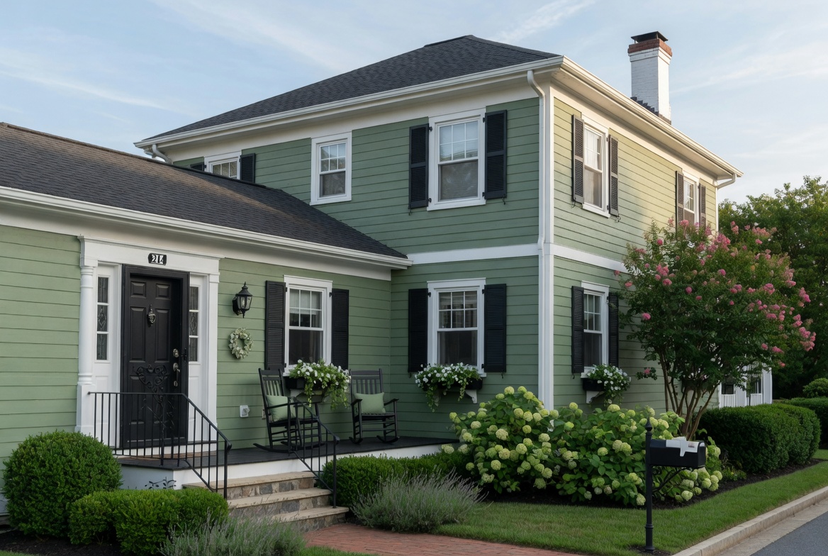
3. Sage Green with White Trim
Best for: Craftsman, cottage, Victorian, farmhouse, and traditional homes — the most popular exterior green combination of the current decade
Sage green — the soft, slightly grey-toned green associated with Mediterranean herbs and natural landscapes — has become one of the most requested exterior colors because it satisfies multiple design priorities simultaneously: it connects the house visually to its surrounding landscape, reads as calm and considered rather than bold, and suits the current appetite for nature-inspired interiors extended to the exterior.
Sage green against white trim creates a combination that reads as timeless rather than trendy — it has the character of homes that have looked this way for generations rather than homes following a current moment. This quality makes it a safe choice for homeowners who want significant improvement without a look that will feel dated in five years.
Smart tip: Extend the sage green to the front porch floor (painted concrete or timber porch flooring in a darker version of the body color) and choose dark bronze or antique brass hardware for the door and fixtures. The dark hardware against the sage creates a richness that black hardware can’t provide — the warm metal tone suits the organic quality of green.
Mistake to avoid: Choosing a sage green that reads as too yellow or too blue in the specific light conditions of the house location. Sage green exists on a spectrum — warmer sages lean toward olive; cooler sages lean toward blue-grey. Test samples in morning and afternoon light, as the undertone shifts significantly with light direction. The ideal sage reads as a balanced grey-green in all conditions.
4. Bold Navy Blue Exterior
Best for: Colonial, Cape Cod, coastal, and traditional homes — any house where a strong, dignified color suits the architecture
Navy blue exterior — with white or cream trim and a contrasting colored door — creates a house that reads as confident and distinguished. The dark blue recedes slightly visually, making it suit a house that might otherwise feel imposing, while the white trim creates enough contrast to define the architectural elements clearly.
Benjamin Moore Hale Navy is the most cited exterior navy — a deep, slightly blue-black with enough warmth to avoid reading as cold. Sherwin-Williams Naval is slightly deeper; Benjamin Moore Van Deusen Blue is slightly lighter and more classically blue. All three work well on traditional exteriors; the specific choice depends on the roof color and surrounding materials.
Smart tip: Pair navy blue siding with a brass or copper door hardware finish. The warmth of brass or copper against deep navy creates a yacht-like quality that suits the maritime associations of navy blue and prevents the exterior from feeling cold despite the dark color.
Mistake to avoid: Applying navy blue on a house with a dark roof without testing the combination carefully. Two dark elements — dark siding and a dark roof — can make the house read as heavy and oppressive, particularly on a smaller house or one in a shaded location. Navy blue works best with medium-toned or light-colored roofing.
5. Charcoal and Dark Grey
Best for: Contemporary, modern, transitional, and industrial-inspired homes — any house where a sophisticated, design-forward exterior is the goal
Charcoal grey exterior — with black or very dark trim and often a bold accent door — creates a contemporary statement with the quiet authority of a confident design decision. The dark exterior makes the house appear more compact and intentional than a light exterior of the same dimensions, and it creates a dramatic contrast with any white-painted interior spaces visible through windows after dark.
Charcoal grey shades by temperature: warm charcoal (with brown undertones — Sherwin-Williams Iron Ore, Benjamin Moore Kendall Charcoal) suits houses with warm stone, warm brick, or warm wood elements; cool charcoal (with blue undertones — Benjamin Moore Wrought Iron, Sherwin-Williams Gauntlet Gray) suits houses with cooler materials and contemporary architecture.
Smart tip: Use charcoal grey on the body and black on the window and door frames specifically. The color step from dark grey body to black window frames creates a subtle depth that makes the windows read as intentional openings in a composed facade rather than holes in a grey box. The contrast is subtle at a distance but adds sophistication at close range.
Mistake to avoid: Applying charcoal grey on a north-facing house in a cold climate. Dark colors absorb heat — which is an advantage in cold climates in terms of energy performance but can make a north-facing facade appear even darker because it receives little direct sunlight. Test the color in the specific light conditions of the house’s orientation before committing.
6. Warm Greige and Taupe
Best for: Any architectural style — greige is the most flexible and broadly appealing exterior neutral available
Greige (grey-beige) — a warm neutral that blends the warmth of beige with the sophistication of grey — is the exterior color with the broadest appeal and the fewest conditions under which it looks wrong. It flatters most roof colors, most stone and brick materials, and most landscaping conditions. It reads as considered without being distinctive, and it appeals to the widest range of potential buyers — making it the safest choice for homes being prepared for sale.
Popular greige shades for exteriors: Sherwin-Williams Accessible Beige (warm, approachable — the most widely specified greige); Benjamin Moore Revere Pewter (slightly cooler, suits more traditional applications); Sherwin-Williams Agreeable Gray (balanced grey-beige, suits transitional architecture).
Smart tip: Contrast a greige body with trim in a slightly warmer or slightly lighter tone rather than pure white. Pure white trim against greige can create a contrast that emphasizes any imperfections in the facade — gaps between boards, minor unevenness in the siding. A warm off-white or cream trim creates sufficient contrast to define architectural elements while being more forgiving.
Mistake to avoid: Choosing greige without checking its specific undertone against the roof material. Greige with pink undertones looks jarring against a brown or orange-toned roof. Greige with yellow undertones clashes with a blue-grey roof. Identify the dominant undertone of the chosen greige sample and verify it’s compatible with the existing roof color before committing.
7. Forest Green and Wood Tones
Best for: Craftsman, Tudor, cabin, and naturalistic homes — any house that benefits from a deep connection to its natural setting
Deep forest green — darker and richer than sage, more like the green of dense foliage or old-growth forest — creates an exterior that feels grounded in its landscape. Where sage green is soft and contemporary, forest green is bold and committed. It suits houses surrounded by mature trees and naturalistic landscaping far better than it suits urban or suburban settings with little adjacent greenery.
Forest green paired with natural wood accents — timber porch columns, cedar shingle details, or wood-grain siding sections — creates a material richness that all-painted exteriors lack. The warm wood tone against the deep green replicates the color combination found in forested environments and creates an exterior that feels genuinely connected to nature.
Smart tip: Keep the trim on a forest green house in a warm cream or off-white rather than stark white or black. White trim against deep forest green creates a Christmas-like association that can limit the color’s appeal. Cream trim warms the combination and gives it a more sophisticated, craft-quality character.
Mistake to avoid: Using forest green on a house with inadequate landscaping. A deep green house surrounded by sparse, immature, or poorly maintained landscaping looks like the setting is wrong — the color promises a naturalistic context that isn’t there. Invest in landscaping before or simultaneously with a forest green exterior repaint.
8. Terracotta and Earth Tones
Best for: Mediterranean, Spanish, Pueblo, and ranch-style homes — any house in a warm, dry climate where terracotta’s cultural associations are appropriate
Terracotta — the warm orange-red of fired clay — creates an exterior with immediate Mediterranean or Southwestern character. It’s a color associated with specific architectural traditions and specific climates: it suits stucco construction, tile roofs, and the dry, sun-bleached landscapes of the American Southwest and Mediterranean coast. In different contexts — a colonial in New England, a craftsman in the Pacific Northwest — terracotta can look misplaced rather than distinctive.
Terracotta shades exist on a spectrum from a soft, dusty amber to a deep, saturated clay red. The softer, dustier shades suit contemporary applications where a hint of warmth is the goal; the deeper, more saturated shades suit traditional Mediterranean and Pueblo architecture where terracotta has genuine cultural authenticity.
Smart tip: Pair terracotta with natural materials rather than painted trim — stone, rough plaster, or natural timber — for the most authentic result. Terracotta against white painted trim reads as a color choice; terracotta against natural stone reads as part of a material palette that references an architectural tradition. The material combination is what makes terracotta feel authentic rather than decorative.
Mistake to avoid: Using terracotta in a color palette that includes cool colors — cool grey roofing, blue-green trim, cool-toned stone. Terracotta is a warm color that requires warm companions — warm stone, warm timber, red tile roofing, warm cream accents. A terracotta house with cool-toned adjacent materials creates a color temperature conflict that makes the exterior feel unresolved.
9. All-Black Exterior
Best for: Modern, contemporary, and industrial-chic homes — any house where a dramatic, architectural statement is appropriate
An all-black or near-black exterior — black siding, black trim, black windows and doors — is the most dramatic exterior color choice available and one that’s becoming increasingly common in contemporary residential architecture. The monochromatic approach eliminates the visual complexity of different body and trim colors, creating a house that reads as a single sculptural form.
Black exteriors suit houses with strong architectural geometry — clear rectangular forms, large windows, flat or shed rooflines — better than houses with complex traditional detailing. The color choice amplifies architectural clarity; it also amplifies any architectural weaknesses.
Smart tip: Introduce warmth into an all-black exterior through material rather than color — natural timber decking, wood window frames, warm stone or brick accents at the foundation. These warm material touches prevent the all-black exterior from reading as harsh or severe and create the rich, considered quality that distinguishes a successful monochromatic scheme.
Mistake to avoid: Applying an all-black exterior on a small house in a shaded location. Black absorbs light — a small black house in heavy shade can appear to disappear visually rather than making a statement. All-black exteriors perform best on larger houses in open, well-lit positions where the scale and the architecture can support the dramatic color choice.
10. Soft Blue and Grey-Blue
Best for: Coastal, Cape Cod, shingle-style, and cottage homes — any house where a relaxed, water-adjacent quality is the impression
Soft blue and grey-blue exteriors create an immediate association with coastal environments — the weathered shingles of Cape Cod houses, the bleached timber of coastal cottages, the sky and water colors of seaside locations. This association makes soft blue one of the most regionally specific exterior colors: it suits coastal and near-coastal locations authentically, and feels somewhat misplaced in inland suburban settings without the visual context of water and sky.
Soft blue shades for exteriors: Benjamin Moore Wedgewood Gray (a classic grey-blue with enormous appeal — the most specified shade in this family); Sherwin-Williams Silvermist (lighter, airier quality); Benjamin Moore Hale Navy lightened (for a softer version of the navy association).
Smart tip: Pair soft blue with natural cedar shingle or weathered timber accents rather than painted wood siding where possible. The combination of blue painted sections with natural timber allows the house to reference both the painted and weathered coastal traditions simultaneously — a richer material palette than all-painted.
Mistake to avoid: Using soft blue in a color palette with strong warm tones — warm terracotta stone, warm orange-toned roofing. Cool blue and warm orange-red are complementary colors — they vibrate against each other rather than harmonizing. Soft blue requires cool-toned stone, grey or weathered wood, and cool-toned roofing for a cohesive exterior palette.
11. Warm Brown and Cedar
Best for: Craftsman, bungalow, prairie, and naturalistic homes — any house where an organic, earthy quality suits the architectural style and setting
Warm brown — ranging from a medium tan through rich walnut brown to a deep chocolate — creates an exterior with the quiet confidence of natural materials. Brown houses read as grounded and settled in their landscapes in a way that painted colors rarely achieve, because brown is the color of the earth itself.
Cedar siding — either painted a warm brown or stained to reveal the natural grain — combines with brown-painted sections to create an exterior of genuine material richness. The variation in surface texture between painted areas and cedar grain areas, combined with the warm tone, creates a house that reads as crafted rather than simply constructed.
Smart tip: Use a stain rather than paint on cedar siding sections where wood grain is to be preserved. A solid-color exterior stain in a warm brown penetrates the timber rather than forming a surface film — it allows the natural grain to remain visible, dries to a consistent color, and is significantly easier to maintain than paint (no peeling or flaking).
Mistake to avoid: Using a too-dark brown on a house with limited natural light exposure. Very dark brown in a shaded setting absorbs what little light is available and can make the house appear oppressively heavy. In shaded locations, opt for a medium warm brown that retains some light-reflective quality while maintaining the warm, grounded character of the color family.
12. Two-Tone Exterior Color Scheme
Best for: Victorian, Queen Anne, Painted Lady, and highly detailed traditional homes where the architectural complexity warrants multiple colors
A two-tone exterior — where the upper and lower portions of the house, or the main body and various trim and architectural details, are in clearly different (but related) colors — is the traditional approach to painting houses with significant architectural detail. Victorian-era houses were often painted in three or more colors to make their elaborate trim, brackets, spindles, and decorative elements readable and celebrated rather than buried in a single color.
Modern two-tone approaches are typically more restrained: a darker color on the lower portion or foundation treatment with a lighter upper body; or a body color with a complementary trim color that’s different enough to create visual interest without creating conflict.
Smart tip: The two colors in a two-tone scheme should share an undertone — both warm or both cool, both muted or both saturated. Mixing a warm-toned lower color with a cool-toned upper color creates visual tension that reads as a mistake rather than a composition. The relationship between the two colors determines whether the scheme feels designed or accidental.
Mistake to avoid: Using too many colors in an attempt to make a Victorian house look like a San Francisco Painted Lady. Authentic Painted Lady schemes use carefully studied color relationships developed by professional architectural colorists. An amateur three-, four-, or five-color scheme developed without this expertise typically looks garish rather than celebratory. A well-executed two-color scheme is a better starting point.
13. Red Front Door Statement
Best for: Any neutral body color — a red front door is the fastest curb appeal improvement available for any house
A red front door against a neutral body color — white, grey, greige, navy — creates an immediate focal point that draws the eye to the entrance, signals welcome, and adds personality to an otherwise neutral exterior. The tradition of red doors as hospitality signals dates back centuries in different architectural traditions.
The shade of red matters enormously. A tomato red (orange-toned) suits warm-toned body colors; a true red (neither warm nor cool) suits most neutral body colors; a burgundy or wine red (blue-toned) suits cool-toned body colors and creates a more sophisticated, restrained statement than a bright red.
Smart tip: Repaint the front door in a new color before repainting the entire exterior — the single-door repaint costs almost nothing and provides immediate visual feedback about whether the color direction is right for the house. A red door test lets you live with the color combination and decide whether it reads as you imagined before committing to a full exterior repaint.
Mistake to avoid: Painting only the front door and leaving door hardware that clashes with the new color. A red door with silver/chrome hardware looks incomplete. A red door with oil-rubbed bronze or antique brass hardware looks finished. Changing door hardware simultaneously with the door color is a small investment that completes the focal point.
14. Stone and Painted Combination
Best for: Any house with stone or brick elements — the painted sections should complement rather than compete with the natural material
Houses with stone or brick elements have a natural material that the paint color must work with rather than against. The painted sections — siding, trim, gable ends, shutters — should read as a composed palette with the existing stone or brick, not as a separate, unrelated color choice.
The approach: identify the dominant undertone of the stone or brick (warm orange-red, warm grey, cool blue-grey, warm tan) and choose the painted body color within the same temperature family. A warm-toned stone with warm greige siding reads as a cohesive material palette; the same stone with cool blue-grey siding creates a color temperature conflict.
Smart tip: Sample paint colors directly adjacent to the existing stone or brick surface rather than testing on a separate board. The relationship between the sample color and the existing material is what matters — colors that look perfect in isolation can look wrong next to the specific tones of a particular stone or brick. Hold the sample directly against the existing material in natural light for the most accurate assessment.
Mistake to avoid: Painting the stone or brick sections of a house to simplify the color combination. Natural stone and brick should never be painted — the paint traps moisture in porous masonry, causing structural damage over time, and the paint is essentially impossible to remove completely without damaging the masonry surface. Accept the existing stone or brick as a fixed element and choose paint colors to complement it.
15. Modern White and Wood
Best for: Contemporary, mid-century modern, and Scandinavian-inspired homes — any house where clean lines and natural materials are the design language
White painted sections combined with natural or stained wood elements — cedar cladding sections, timber window frames, wood-detailed fascias and soffits — creates an exterior with the quality of contemporary Scandinavian architecture: the white provides a clean, minimal base; the wood provides warmth, texture, and material honesty.
This combination suits houses with large windows, flat or monopitch rooflines, and clear geometric forms. It doesn’t suit houses with complex Victorian or traditional detailing, where the material contrast between painted and natural timber sections becomes confusing rather than considered.
Smart tip: Use a semi-transparent timber stain on wood sections rather than leaving timber completely natural or painting it. A semi-transparent stain in a warm grey or warm brown tone provides some color consistency between paint and timber applications while allowing the wood grain to remain visible — the most aesthetically satisfying outcome for the natural timber sections.
Mistake to avoid: Using fresh, very orange-toned cedar sections in a white and wood combination. New cedar is intensely orange before it weathers or is treated — this orange tone conflicts with white in an unresolved way. Either pre-treat cedar with a grey or brown semi-transparent stain before installation, or use naturally grey-toned timber species (grey elm, weathered oak) for a more immediately successful combination.
16. Dusty Blue Cottage Exterior
Best for: Cottage, bungalow, English country, and romantic traditional homes — any house where a soft, nostalgic quality is the desired impression
Dusty blue — a muted, slightly grey blue that has been desaturated to a point between blue and grey — creates a cottage exterior with an old-world charm that fully saturated blue cannot achieve. The dustiness of the color gives it the quality of something seen in soft light, slightly faded by weather, genuinely aged rather than freshly painted.
Dusty blue works particularly well with white painted trim, climbing roses or wisteria on the facade, a painted timber porch, and a natural slate or weathered tile roof. The combination creates a visual narrative that tells the story of a house that has been loved and tended over time.
Smart tip: Use window boxes filled with seasonal flowers — white geraniums in summer, cream violas in autumn — to add living color that complements without conflicting with the dusty blue. The white flowers against the blue-grey exterior and the natural green of the foliage creates the most complete cottage exterior composition.
Mistake to avoid: Using dusty blue on a contemporary house with clean modern lines. The slightly faded, nostalgic quality of dusty blue creates a period character that suits traditionally detailed architecture. On a flat-roofed, large-windowed contemporary house, the same color looks lost and incongruous — a period color choice on a non-period house.
17. Olive Green Modern Exterior
Best for: Contemporary, transitional, and mid-century modern homes — any house where a sophisticated earthy statement suits the architecture
Olive green — with its yellow-green-brown complexity — occupies a distinct place among exterior greens. It’s neither the soft approachability of sage nor the forested depth of forest green, but something more sophisticated and less immediately legible. Olive reads differently in different lights — sometimes yellow, sometimes brown, sometimes grey — a quality that makes it visually interesting across changing conditions.
Olive green suits contemporary homes with clean lines and suits the current appetite for sophisticated, unconventional exterior color. It’s distinguished without being loud and reads as a considered choice rather than a default.
Smart tip: Pair olive green with matte black window frames and warm timber accents for the most contemporary result. The combination of olive, black, and natural timber is one of the most consistently successful contemporary exterior palettes — the three elements complement each other’s warmth and sophistication.
Mistake to avoid: Using olive green on a house with a warm orange or red-toned roof. Olive and orange-red are near-complementary colors — the combination is visually active in a way that reads as unresolved rather than bold. Olive suits cool-toned, grey, or weathered roofing materials.
18. Pale Yellow Farmhouse
Best for: Farmhouse, colonial, country, and traditional homes — any house where a warm, sunny, welcoming quality is the priority
Pale yellow — a warm, soft, barely-there yellow that reads as cream with a yellow undertone in shade and as a gentle warm gold in direct sunlight — creates the most welcoming and domestically comfortable exterior color available. It’s the color of houses that look like home from a distance — approachable, warm, human-scaled.
The specific shade matters enormously. Very pale yellow (almost cream with a hint of yellow) suits nearly any traditional house style. A stronger yellow becomes a specific statement that requires careful material and color coordination. The safest pale yellow for exteriors sits in the range between cream and a very pale butter tone.
Smart tip: Pale yellow exterior looks best against a black or very dark green front door — the contrast between the warm pale body and the deeply saturated dark door creates a focal point that anchors the welcoming quality of the overall color. A pale yellow door against a pale yellow body disappears visually.
Mistake to avoid: Using a pale yellow that has pink undertones on a house with warm orange-toned brick or stone. Pink-toned yellow near warm orange creates a combination that reads as a color coordination problem rather than a palette. Test pale yellows against all existing exterior materials — especially any brick, stone, or masonry elements — before committing.
19. Dark Moody Jewel Tones
Best for: Victorian, Edwardian, and character homes where a bold, personality-driven exterior color makes an architectural statement
Deep jewel tones — midnight blue, deep plum, rich burgundy, dark teal — are among the most dramatic and personality-driven exterior colors available. They suit houses with enough architectural detail and presence to carry a saturated, dark color without being overwhelmed by it. A small, undetailed house in a deep jewel tone can look like a painted box; a Victorian with elaborate trim in the same color can look extraordinary.
The key to jewel tone exteriors: the trim color must provide sufficient contrast to make the architectural details readable. Deep jewel tone body with cream or white trim creates the necessary contrast; dark jewel tone body with similarly dark trim creates a monochromatic effect where details disappear.
Smart tip: Jewel tone exteriors benefit from professional color consultation before commitment — the specific shade, the trim color, and the door color need to work together as a composed palette that celebrates the house’s character without overwhelming it. A color consultation from an architectural color specialist or experienced exterior painter is worthwhile for a jewel tone application.
Mistake to avoid: Applying a jewel tone exterior without testing in the specific lighting conditions of the house. Jewel tones shift dramatically between morning light, afternoon light, and overcast conditions — a deep teal that reads as sophisticated in afternoon sun can read as almost black on an overcast winter day. Test large sample swatches in all likely light conditions before committing.
20. How to Choose the Right Exterior Color
Best for: Anyone in the planning stage — color selection methodology determines whether the final result matches the intention
Choosing an exterior color that works requires a systematic approach that accounts for the specific house, the specific location, and the specific light conditions — not just an attractive color seen in a photograph of a different house in different conditions.
The selection process: start with fixed elements (the roof color, any existing stone or brick, the paving material of the driveway and paths) — these constrain the palette significantly and cannot be changed. Identify the dominant temperature and undertone of these fixed elements — warm or cool, yellow or red or grey. Work within the same temperature family for the painted elements. Test at least three large samples (at least 12×12 inches) on the actual house surface in the most visible location. Observe the samples across morning, midday, afternoon, and overcast conditions over at least three days. Make the final decision based on the worst-performing light condition — a color that looks good only in ideal light is less versatile than one that performs acceptably in all conditions.
Smart tip: The roof color is the most frequently ignored factor in exterior color selection and the most impactful one after the body color. The roof covers 30 to 40% of what’s visible from the street — a body color that conflicts with the roof undermines the entire exterior palette regardless of how well the body and trim work together.
Mistake to avoid: Making an exterior color decision based on digital photographs or computer visualizations without testing physical samples. Digital photographs of houses are shot in specific lighting conditions, processed to enhance color, and displayed on screens with varying color calibration — none of which replicates the actual appearance of paint on your specific house in your specific light. Physical samples on the actual surface are the only reliable test.
Before You Start
- Test samples on the actual house. No photograph, chip, or digital visualization accurately represents how a color will look on your specific house. Large physical samples (at least 12×12 inches) applied to the actual surface in the most visible location are the minimum reliable test.
- Consider the roof color first. It covers 30 to 40% of the visible exterior surface. Work with it, not against it.
- Account for your climate and light. Sunny climates bleach colors toward lighter, warmer appearances. Overcast climates make colors read darker and cooler. Northern exposures are perpetually shaded. All of these factors affect how the chosen color performs in practice.
- Don’t change only the front. A dramatically different front color from the sides and back creates a house that looks like a facade rather than a home. The color decision applies to the entire exterior.
- Use a quality exterior paint. Premium exterior paints contain higher quality pigments, more resin binders, and better UV inhibitors than economy paints. The color looks better, lasts longer, and resists fading more effectively — justifying the higher cost over the full paint life.
Conclusion
The right exterior color for any house is the one that suits the architecture, works with the existing fixed elements, performs across the full range of light conditions the house experiences, and reflects the character the homeowner wants the property to project. No single color is universally correct — the combination of house style, roof color, stone and masonry elements, landscaping, and neighborhood context makes every exterior color decision specific. The best decisions are made with large physical samples, adequate observation time, and honest assessment of how the color performs in the worst light conditions as well as the best.