The best interiors don’t happen by accident. They’re the result of deliberate choices made at every scale — the color on the walls, the texture of the upholstery, the quality of the light, and the way objects are arranged in relation to each other. Most rooms don’t need more things. They need better decisions about the things already in them — and a clear understanding of what makes a space feel considered rather than assembled.
These 20 ideas cover the full range of interior decoration — from foundational decisions about color and furniture to the finishing details of styling and scent — with specific guidance on what makes each approach work and what most people get wrong.
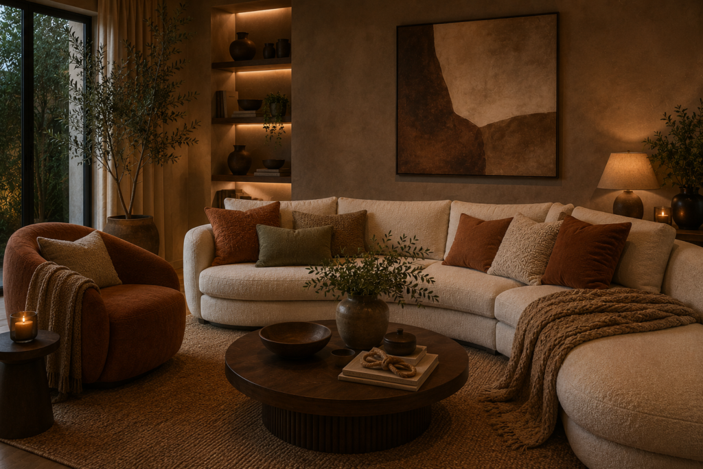
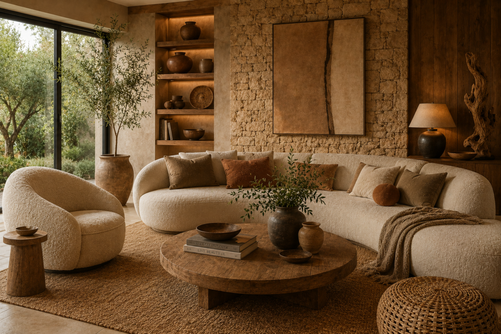
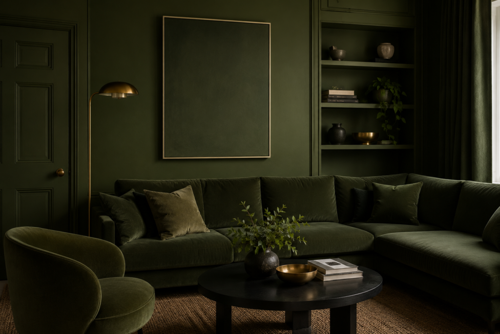
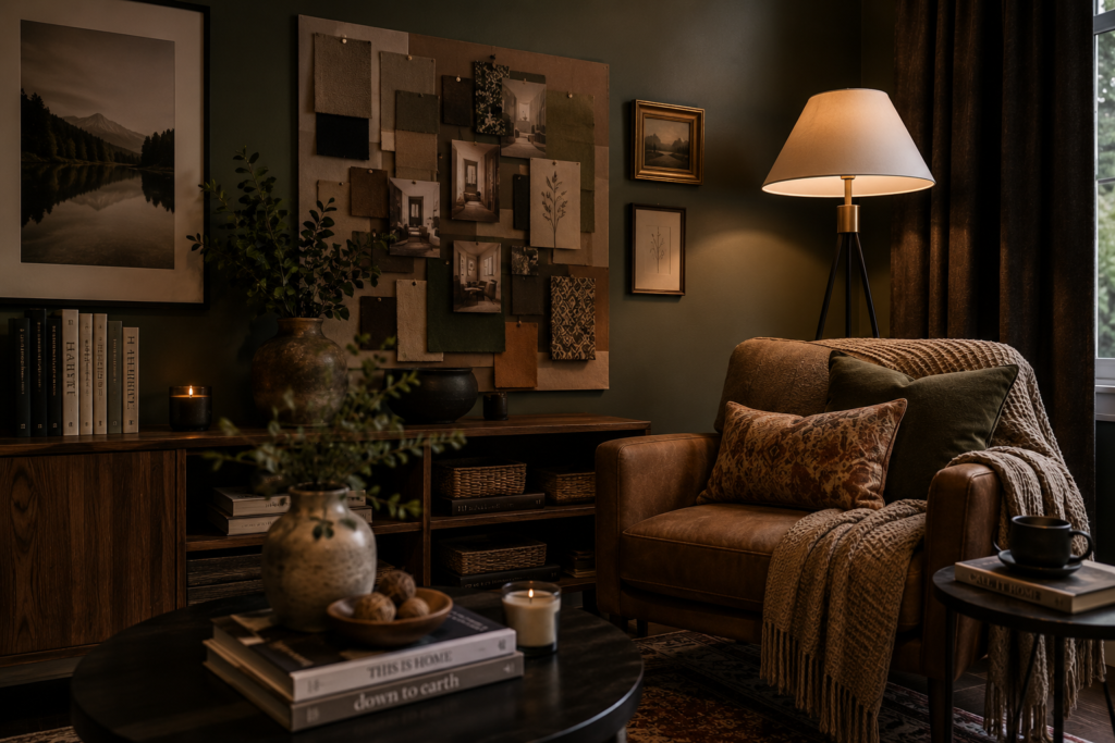
1. Embrace Earthy Warm Tones
Best for: Any room — warm earth tones are the most universally flattering and most enduringly appealing color palette available
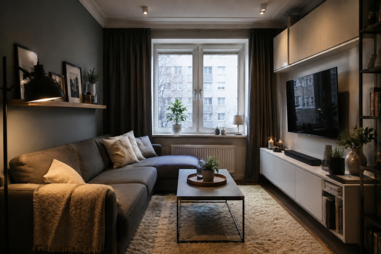
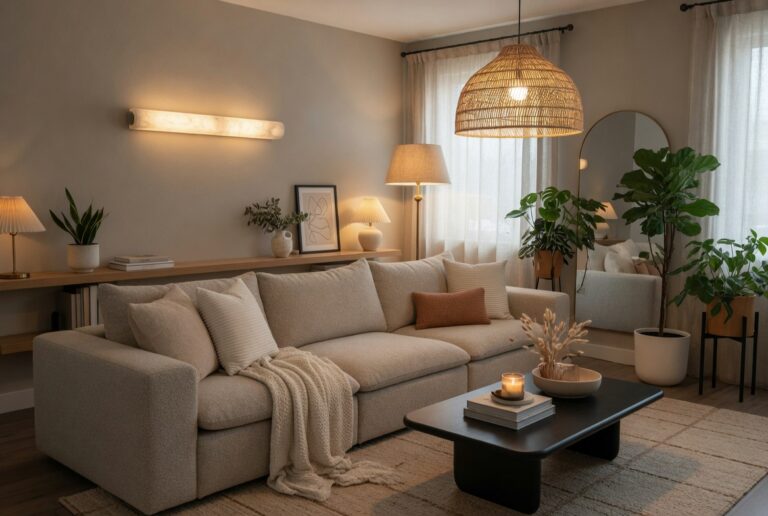
The dominance of grey and white in residential interiors over the past decade is giving way to something warmer and more grounded. Mocha brown, terracotta, olive green, deep burgundy, and warm ochre — colors drawn from soil, clay, dried botanicals, and weathered stone — create interiors that feel settled and human in a way that cool neutrals rarely achieve.
These colors suit every room and every architectural style. They work on walls, on upholstery, on painted furniture, and as accent colors in textiles and accessories. Their warmth improves with artificial light — where cool grey walls look flat and institutional under a standard warm bulb, earthy tones become richer and more inviting.
Smart tip: Start with the largest surface in the room — the walls — when introducing earthy tones. A single wall in a warm terracotta or deep olive makes more impact than the same color distributed across multiple smaller elements. Commit to one strong color statement and build the room’s palette around it.
Mistake to avoid: Mixing too many earthy tones without a cohesive thread. Terracotta, ochre, burgundy, and olive green are all earthy — but together without restraint they create a market stall rather than a considered interior. Choose one or two dominant tones and use the others as accents at reduced saturation.
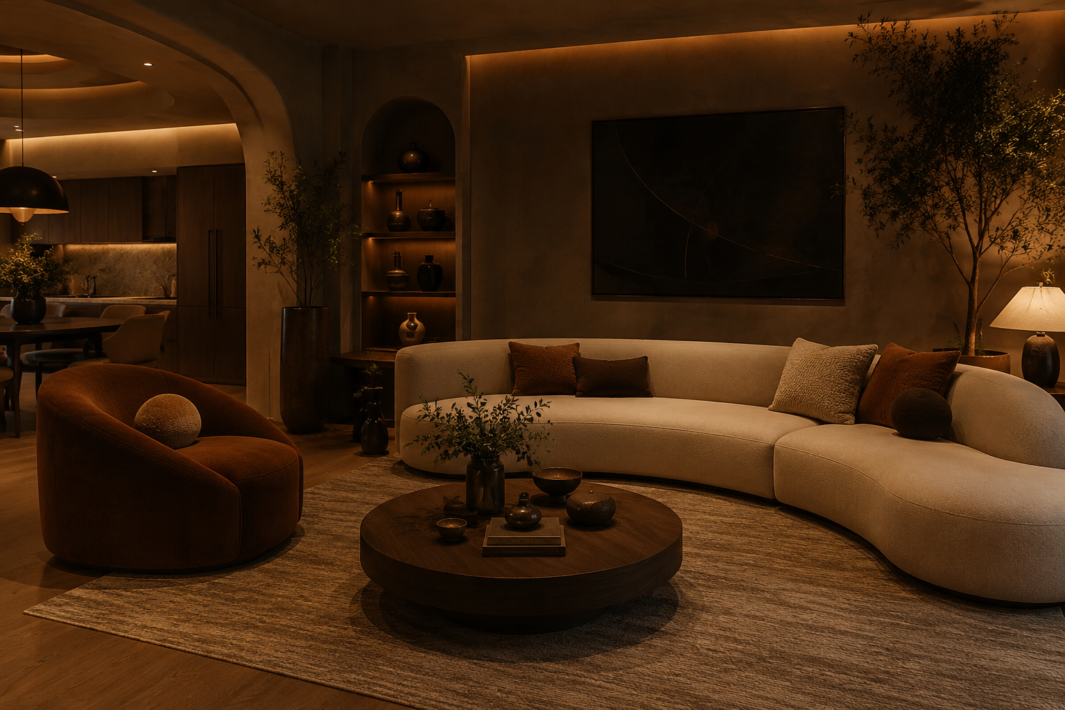
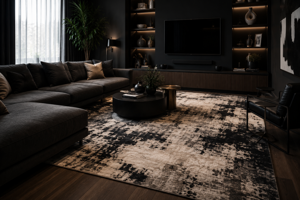
2. Add Curved Furniture
Best for: Any room dominated by straight lines and right angles — curves introduce visual warmth that geometry cannot provide
Curved furniture — sofas with rounded backs, circular coffee tables, arched doorways, oval dining tables — softens the rectilinear quality of most rooms in a way that no other single change achieves. Curves are inherently welcoming: they draw people in, they reference the organic forms of the natural world, and they create visual flow rather than visual stops.
A single curved sofa in a rectangular living room changes the room’s atmosphere more profoundly than any amount of repainting or rearranging of straight-edged furniture. The curve introduces movement and approachability that right angles inherently lack.
Smart tip: Use a circular rug to introduce curves into a room without replacing furniture. A large circular rug beneath a rectangular sofa arrangement introduces the same organic visual quality as curved furniture at a fraction of the investment. It works because the eye reads the curve from the room’s main viewing positions and the circular form anchors the seating arrangement naturally.
Mistake to avoid: Mixing multiple curved pieces without any straight-edged anchors. A room full of curved furniture loses the tension between organic and geometric forms that makes curves interesting. One or two curved statement pieces against a background of straight-edged architecture creates the most effective contrast.
3. Create a Statement Accent Wall
Best for: Any room needing a focal point — an accent wall is the fastest single-wall transformation available
An accent wall — one wall treated differently from the others through color, texture, pattern, or material — creates a focal point in any room without the commitment of decorating all four walls. It provides the visual anchor that furniture arrangements need, creates depth that a uniformly painted room lacks, and allows bold decorating choices to be explored at limited scale.
The most effective accent wall positions: the wall directly behind the sofa in a living room, the wall behind the bed’s headboard in a bedroom, or the wall facing the room’s entrance.
Smart tip: Make the accent wall color significantly darker or more saturated than the adjacent walls rather than choosing a merely slightly different tone. The impact of an accent wall depends on contrast — a wall that’s two shades darker than its neighbors barely registers visually. A wall that’s dramatically different — a deep navy in an otherwise pale room, a rich terracotta against cream — creates genuine visual impact.
Mistake to avoid: Using the accent wall as a dumping ground for all the room’s decorative elements. A wall that carries both a strong paint color and multiple layers of hanging art, shelving, and accessories loses the clarity that makes an accent wall effective. The statement is the wall color itself — decorative additions should be minimal and considered.
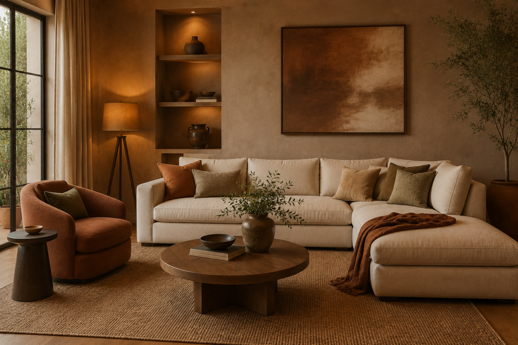
4. Layer Textiles and Textures
Best for: Any room that feels flat or cold — textiles are the fastest and most affordable way to add warmth and depth
A room decorated with hard surfaces alone — painted walls, wooden floors, ceramic, glass, and metal — feels austere regardless of how well the hard elements are chosen. Textiles — rugs, cushions, throws, curtains, upholstery — introduce the softness, color variation, and tactile quality that makes a room feel genuinely comfortable and inviting.
The principle is layering: multiple textiles of different materials, weights, and textures combined to create the rich, complex quality of a room that’s been furnished and lived in over time. A linen sofa with velvet cushions, a wool rug, a cotton throw, and curtains in a natural woven fabric creates more visual depth than any single statement textile.
Smart tip: Vary the scale of textile patterns within a room. A large-scale pattern on a rug or curtains works best when paired with medium-scale patterns on cushions and small-scale or plain textures on upholstery. Mixing scales creates visual rhythm — all large patterns compete, all small patterns create visual noise, a mix creates the layered quality of a considered interior.
Mistake to avoid: Buying cushions and throws that match too perfectly. A sofa with six cushions in the exact same fabric and color looks purchased rather than curated. Mix fabrics (linen, velvet, cotton, wool), mix scales of pattern, and vary the colors within a consistent palette. The slight variation is what creates richness.
5. Use Natural Materials Throughout
Best for: Any interior style — natural materials create a connection to the physical world that synthetic materials cannot replicate
Natural materials — timber, stone, linen, wool, cotton, leather, rattan, clay — create interiors with a sensory quality that synthetic alternatives can imitate but never achieve. The variation in wood grain, the irregular texture of natural stone, the softness of genuine wool against skin, and the warm patina that natural leather develops over time all contribute to a room that rewards close attention in a way that synthetic materials don’t.
The biophilic design movement has made natural materials central to contemporary residential interiors precisely because their connection to the natural world has measurable effects on the people living among them.
Smart tip: Prioritize natural materials on the surfaces that receive the most tactile contact — the sofa upholstery, the rug, the bed linen, the dining chair seat. These are the surfaces people touch most frequently, and the difference between natural and synthetic materials is most keenly felt at the point of contact.
Mistake to avoid: Using natural materials without understanding their maintenance requirements. Natural stone requires sealing. Solid timber floors expand and contract seasonally. Linen upholstery marks more readily than synthetic fabrics. Natural leather needs conditioning. Understanding and accepting these maintenance requirements before choosing natural materials prevents disappointment — these are the characteristics of living materials, not defects.
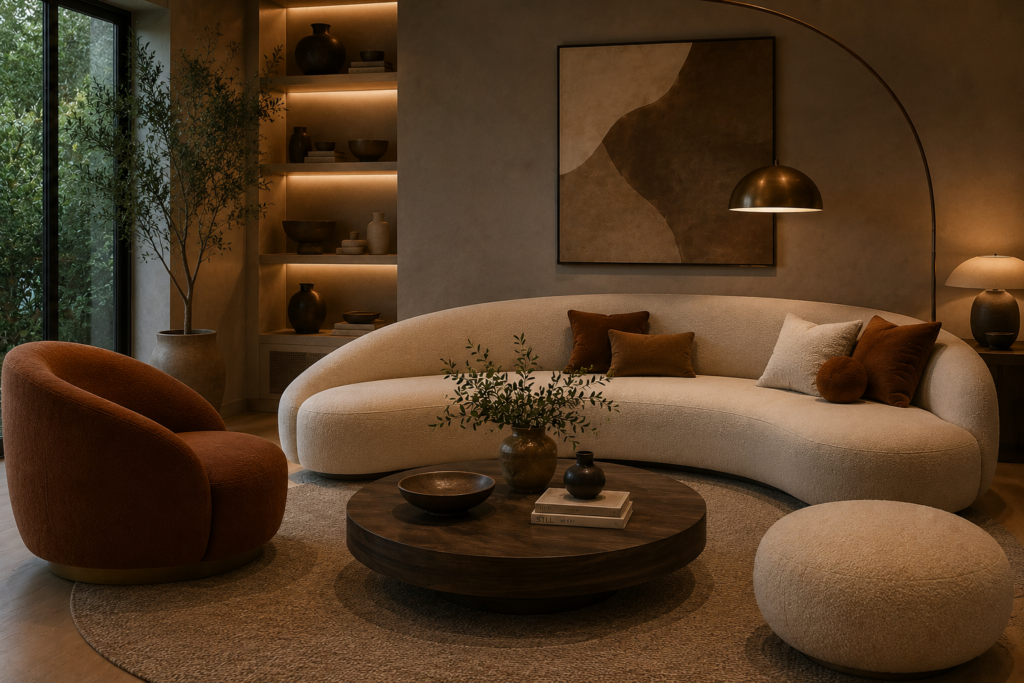
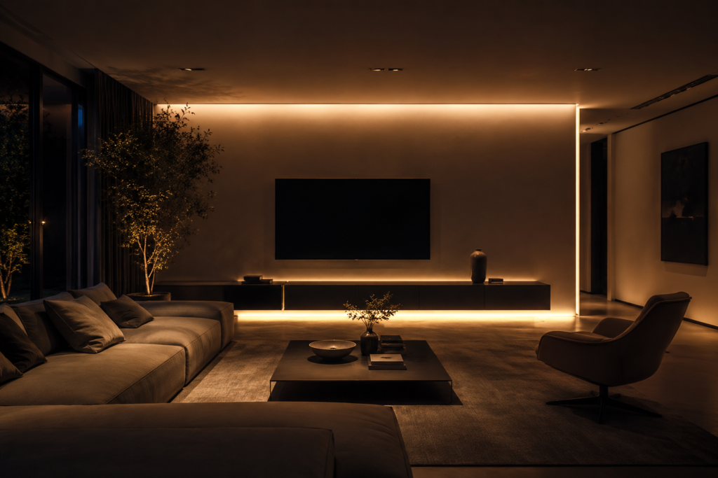
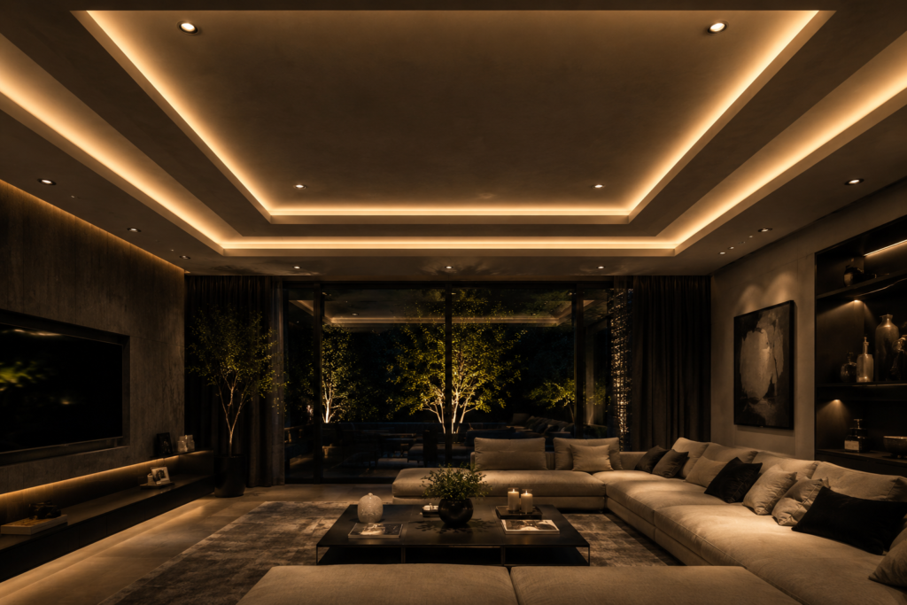
6. Make Lighting a Design Feature
Best for: Every room — lighting is the single most impactful and most underinvested element in most residential interiors
Most homes are dramatically underlit and poorly lit — a single overhead light provides flat, directionless illumination that makes every room look the same. Layered lighting — ambient (general illumination), task (focused where needed), and accent (highlighting specific elements) — creates the depth, atmosphere, and functionality that a single overhead light cannot provide.
A statement pendant over a dining table, a sculptural floor lamp beside a reading chair, LED strips under kitchen cabinets, and table lamps at sofa level together create a room that looks and feels different at different times of day and for different purposes.
Smart tip: Install dimmer switches on every light circuit that doesn’t already have one. The ability to reduce light levels in the evening — from the full bright of a working day to the low warmth of an evening at home — transforms the atmosphere of any room at minimal cost. Dimmer switches are one of the highest-return investments in residential interior improvement.
Mistake to avoid: Choosing light fittings based on their appearance in a brightly lit showroom without assessing what light they actually produce. A beautiful pendant that casts a narrow pool of light may look extraordinary but leaves the rest of the room in shadow. Test or research the actual light output and distribution of any fitting before purchasing — the light produced is more important than the fitting’s appearance.
7. Design Your Ceiling as a Fifth Wall
Best for: Rooms where the walls are already well-decorated but the ceiling is ignored — treating the ceiling as a design surface adds a dimension most rooms lack
The ceiling is the one surface in every room that’s visible from every position within it — yet in most homes it receives the least decorative attention. Painting it a dramatic color, applying wallpaper, adding decorative plasterwork, installing timber beams, or simply painting it the same color as the walls rather than default white all create a room with genuine three-dimensional character.
A ceiling painted in a deep, rich color — the same color as the walls or a complementary dark tone — lowers the perceived ceiling height and creates an enclosed, intimate quality that high white ceilings lack. In a room with good ceiling height (9 feet or more), this enclosure is cozy rather than claustrophobic.
Smart tip: Paint the ceiling the same color as the walls for the most immersive, dramatic effect — this is the color drenching technique applied to the ceiling, and it creates an enveloping quality that no other single decorating decision achieves. The room becomes a colored volume rather than a box with colored sides, which is a fundamentally different visual and spatial experience.
Mistake to avoid: Adding ceiling decoration without considering how it interacts with the lighting. A patterned ceiling with a central pendant light creates a visual competition — the fixture interrupts the pattern and neither reads cleanly. Plan ceiling decoration and ceiling lighting simultaneously, choosing fixtures that complement rather than conflict with the ceiling treatment.
8. Build a Gallery Wall
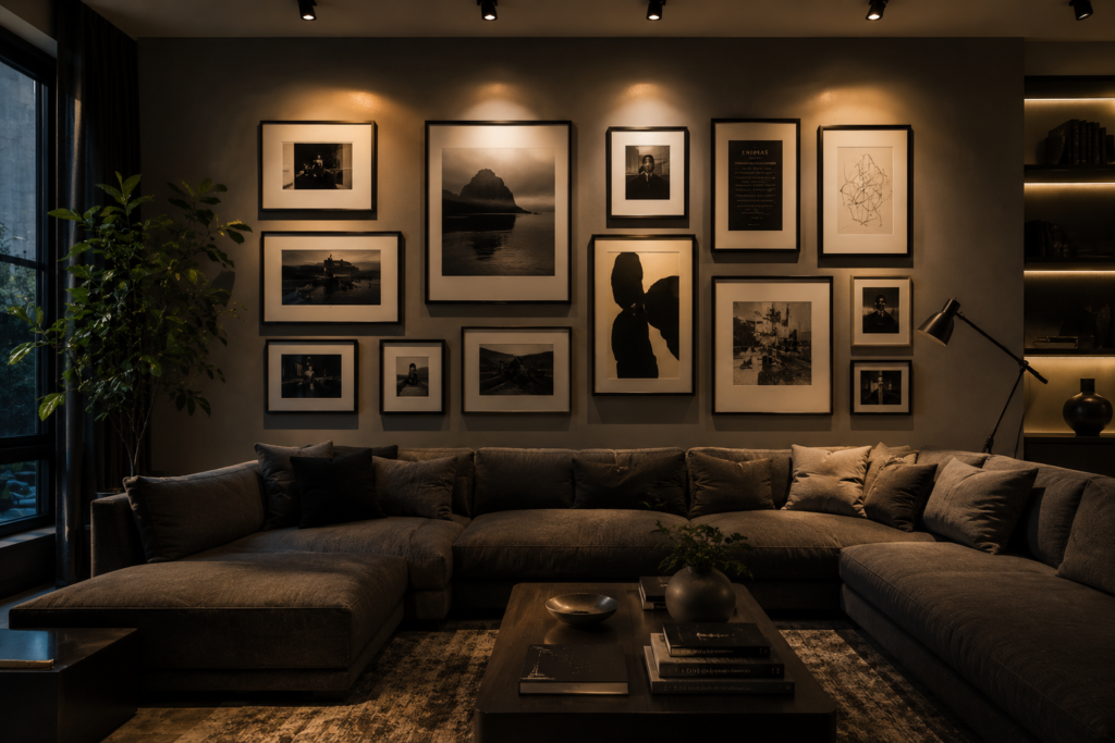
Best for: Any large blank wall — a gallery wall converts the most underused surface in a room into its most personal feature
A gallery wall — a curated arrangement of framed artwork, photographs, prints, and objects on a single wall — creates the most personal decorative statement available in any interior. Unlike any other decorating element, a gallery wall tells a specific story about the people who assembled it — their travels, their tastes, their relationships, and their aesthetic sensibility.
The composition can range from strictly symmetrical (identical frames in a grid) to deliberately casual (mixed sizes and styles in an organic arrangement) — both approaches work when executed with consistency and intention.
Smart tip: Arrange the gallery wall on the floor before hanging anything. Lay all the frames on the floor in their intended positions, photograph the arrangement, and use the photograph as a reference for hanging. This allows the composition to be refined without creating unnecessary holes in the wall — and reveals quickly which arrangements work and which don’t.
Mistake to avoid: Using too many frames that are too small for the wall’s scale. A gallery wall with eight small frames on a large wall looks sparse and unresolved — the frames get lost and the wall reads as decorated rather than designed. Either use fewer, larger frames or use many more frames of varying sizes that genuinely fill the wall surface.
9. Mix Vintage and Modern Pieces
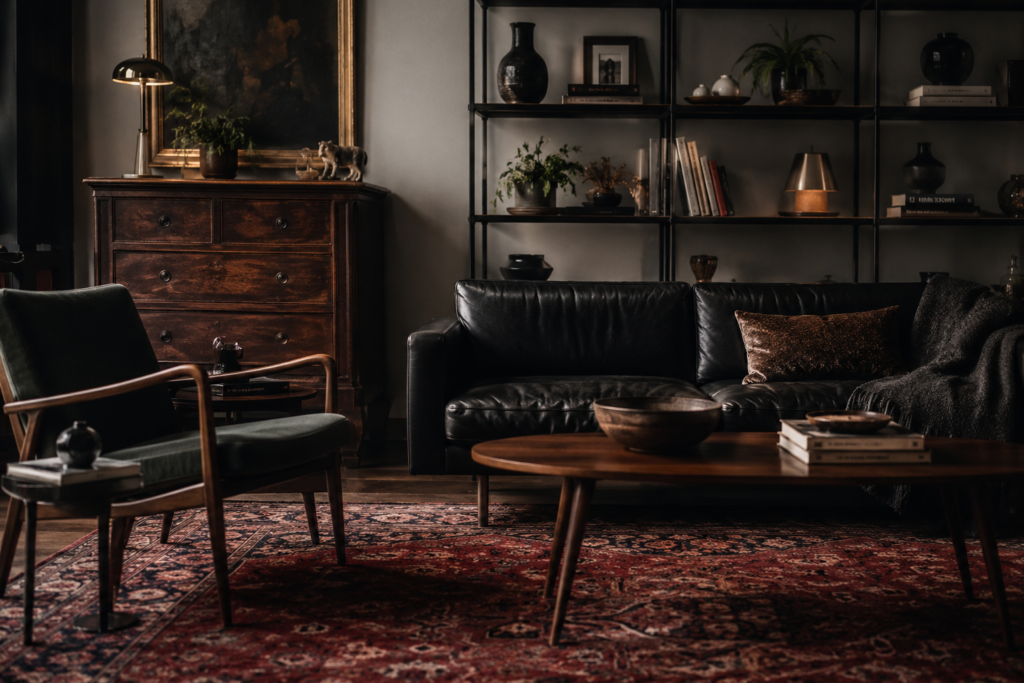
Best for: Any interior that feels too new, too matched, or too showroom-complete — mixing eras creates the curated quality that all-new furniture lacks
A room furnished exclusively with new pieces has a quality of incompleteness — every item is equally new, equally perfect, and equally devoid of the history that makes a room feel genuinely lived in. Introducing one or two vintage or antique pieces among contemporary furnishings creates the visual tension between old and new that defines the most interesting residential interiors.
The vintage piece doesn’t need to be expensive or rare — a mid-century chair reupholstered in a contemporary fabric, a vintage ceramic lamp base with a fresh shade, or a single piece of antique furniture among contemporary pieces all create the same effect.
Smart tip: Focus on vintage finds for the pieces that receive the most daily contact and attention — the coffee table, the reading chair, the sideboard. These are the pieces that people interact with closely enough to appreciate genuine character: the slight imperfection of hand-planed timber, the patina of aged leather, the quality of solid joinery.
Mistake to avoid: Mixing periods randomly without a cohesive design thread connecting them. A Victorian side table beside a 1970s sofa beside an ultramodern coffee table reads as a storage unit rather than an interior. The cohesive thread — a consistent color palette, a consistent material family, or a consistent scale — is what turns period mixing into a designed aesthetic.
10. Add Warm Metallic Accents
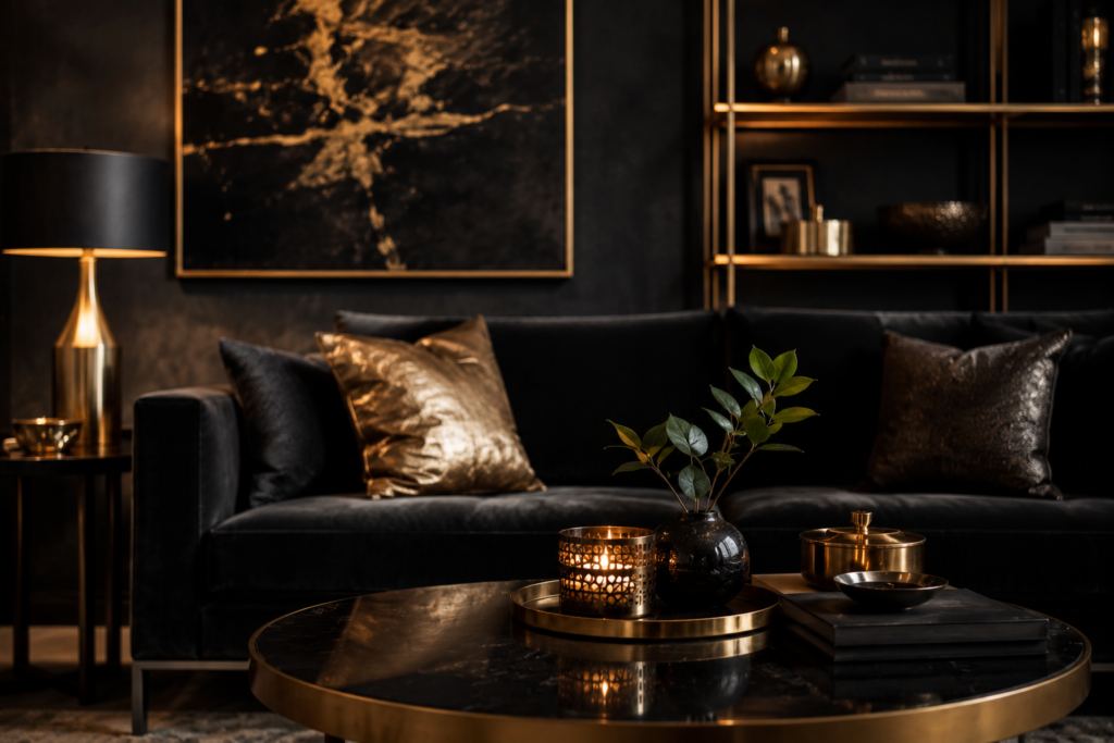
Best for: Any room needing visual warmth and refinement — metallic accents add luxury at small scale
Warm metallics — brass, bronze, copper, and aged gold — create a specific quality of visual warmth that no paint color or fabric achieves. Their reflective surface catches and multiplies light, their warm tones complement earthy and neutral palettes, and their association with quality materials gives a room a sense of considered refinement.
The key is restraint. Metallic accents in hardware (door handles, light switch plates, furniture legs), in lighting (pendant shades, lamp bases), and in decorative objects (vases, candleholders, picture frames) accumulate to create a warm, rich quality without any single element being dominant.
Smart tip: Commit to one metallic family throughout a room rather than mixing brass, chrome, and black metal in the same space. A room with all-brass hardware, all-brass lighting fixtures, and all-brass decorative accents has a cohesive material quality. A room with brass, chrome, and black metal mixed randomly looks indecisive. Choose one warm metallic and use it consistently across all metallic elements.
Mistake to avoid: Using high-polished brass in a room where a warmer, more aged finish would suit the aesthetic better. High-polished brass is formal and contemporary; aged or brushed brass is warmer and more rustic. Match the finish to the room’s overall aesthetic — the same brass in different finishes creates entirely different room characters.
11. Decorate with Large-Scale Art
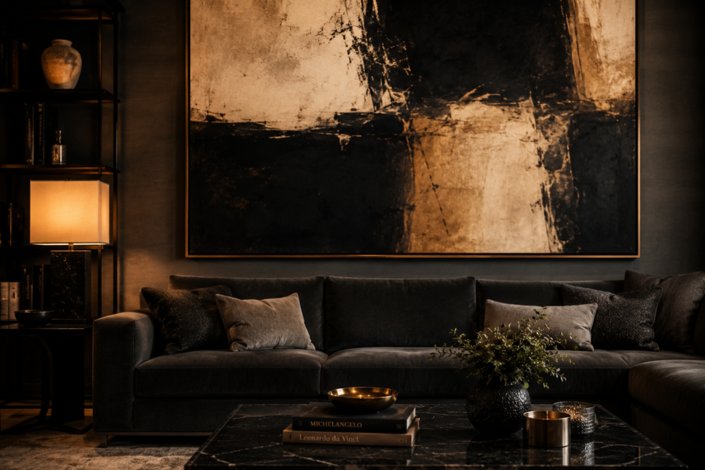
Best for: Rooms with large blank walls — oversized artwork is the single most impactful decorative element available for any wall
A single large-scale artwork — a canvas or print that occupies a significant proportion of the wall it hangs on — creates more visual impact than any number of smaller pieces in the same position. The scale commands attention, the single piece creates visual clarity, and the artwork’s specific character — its colors, its subject, its mood — sets the tone for the entire room.
Large-scale art need not be expensive. A large canvas with a simple abstract field of color, a photographic print in a substantial frame, or even a piece of fabric or textile stretched over a frame all create the same scale impact as a traditionally valuable artwork.
Smart tip: Hang large-scale art lower than instinct suggests. The conventional guideline — hanging art with its center at eye level (approximately 57 to 60 inches from the floor) — was developed for gallery spaces where viewers stand. In a living room where people sit, lowering art by 4 to 6 inches brings it into the natural sightline of a seated person and creates a more comfortable, domestic relationship between the artwork and the viewer.
Mistake to avoid: Choosing large-scale art primarily for its color match with the room’s existing palette. Art chosen to match a sofa cushion reads as decorative accessory rather than genuine artwork. The most interesting interiors contain art that’s chosen for its own qualities — its composition, its mood, its subject — even when it creates a slight tension with the surrounding decoration.
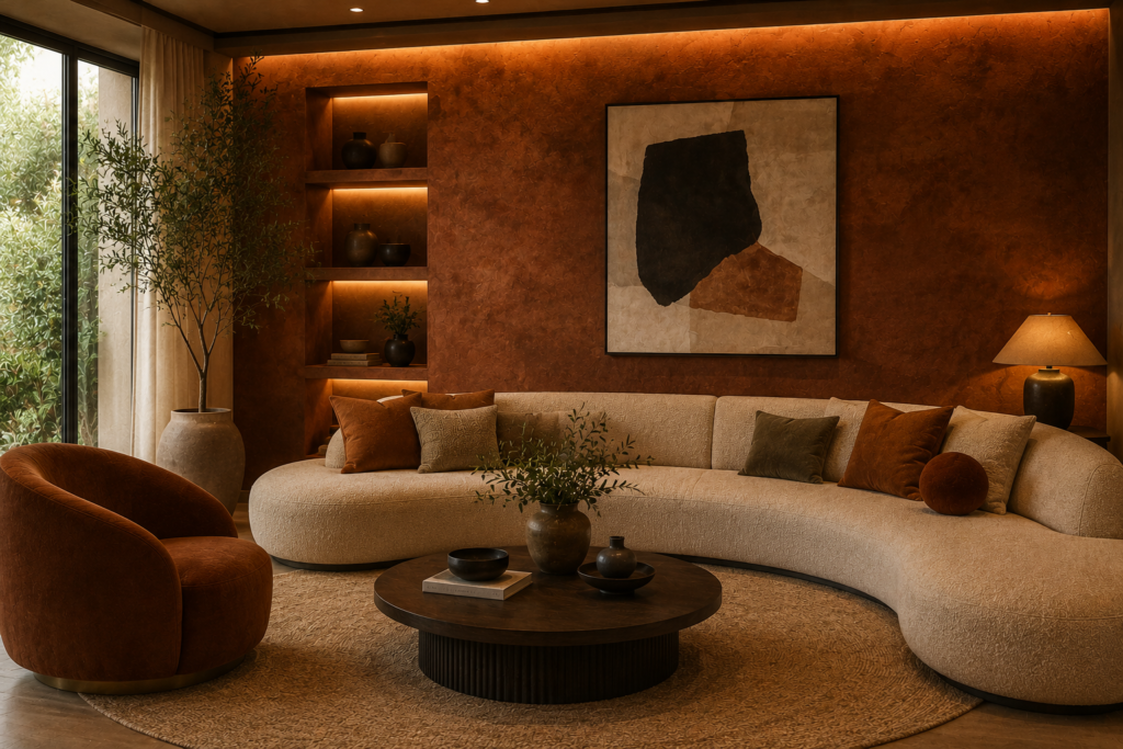
12. Try Color Drenching
Best for: Bold, confident interiors where commitment to a single color creates immersion rather than decoration
Color drenching — painting the walls, ceiling, trim, and woodwork in the same color or closely related tones — creates an immersive room experience that conventional multi-color painting cannot achieve. When every surface is the same color, the room becomes a colored volume rather than a box with painted sides — the effect is more atmospheric, more hotel-like, and more deliberately designed than any other paint treatment.
Deep, saturated colors work best for color drenching: forest green, deep navy, rich burgundy, warm terracotta — colors that create genuine atmosphere rather than merely changing the wall surface.
Smart tip: Use the same color in slightly different finishes for the different surfaces in a color-drenched room. Matte paint on the walls, eggshell on the trim, and satin on the ceiling creates subtle variation that prevents the color drenching from feeling flat or monotonous — the slight sheen differences catch light differently and create depth within the single-color palette.
Mistake to avoid: Color drenching a room without considering its natural light. A deeply saturated color in a room with excellent natural light creates a dramatic, beautiful effect. The same color in a dark, poorly lit room creates oppressive, cave-like conditions. Assess the room’s light thoroughly before committing to color drenching in a deep tone — and if in doubt, test a large sample over several days in different light conditions.
13. Bring Nature Indoors
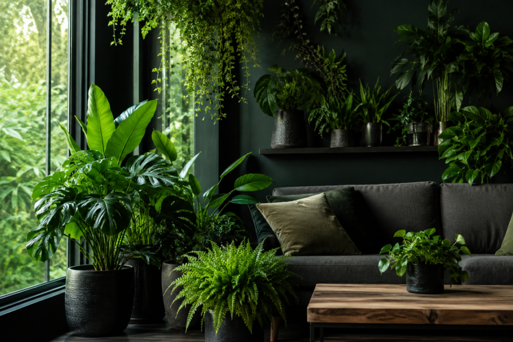
Best for: Any room — biophilic design elements improve mood, reduce stress, and create the living quality that static decor cannot provide
Biophilic design — incorporating natural elements (plants, natural materials, natural light, water, views of the outdoors) into interior spaces — creates measurable improvements in the people who inhabit those spaces. The presence of living plants, the sound of moving water, the view of trees through a window, and the feel of natural materials underfoot all reduce stress hormones and improve reported wellbeing.
At its simplest, bringing nature indoors means plants — real, living plants in rooms throughout the house. At its most developed, it means designing rooms to maximize connection with the natural world through material choice, window placement, and the incorporation of natural features.
Smart tip: Choose plants for their architectural quality as well as their ease of care. A large fiddle leaf fig or bird of paradise contributes to the room’s architecture — it creates vertical interest, defines zones, and provides the kind of presence that a small potted plant on a shelf doesn’t. Investing in a few substantial plants rather than many small ones creates more visual and biophilic impact.
Mistake to avoid: Treating plants as accessories that can be placed anywhere regardless of their needs. A plant that’s declining — yellowing, dropping leaves, growing spindly — looks worse than no plant in the same position. Place plants where they’ll genuinely thrive — matching each species to the room’s actual light and humidity conditions — and they’ll contribute positively to the space indefinitely.
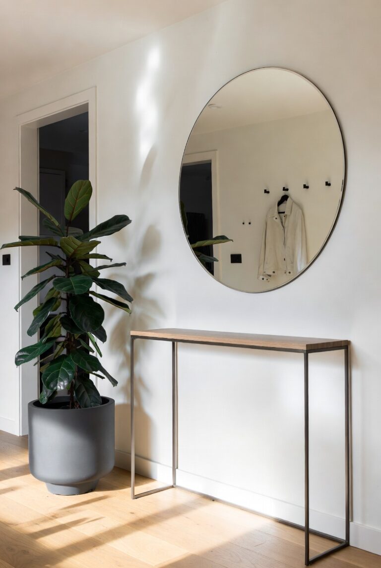
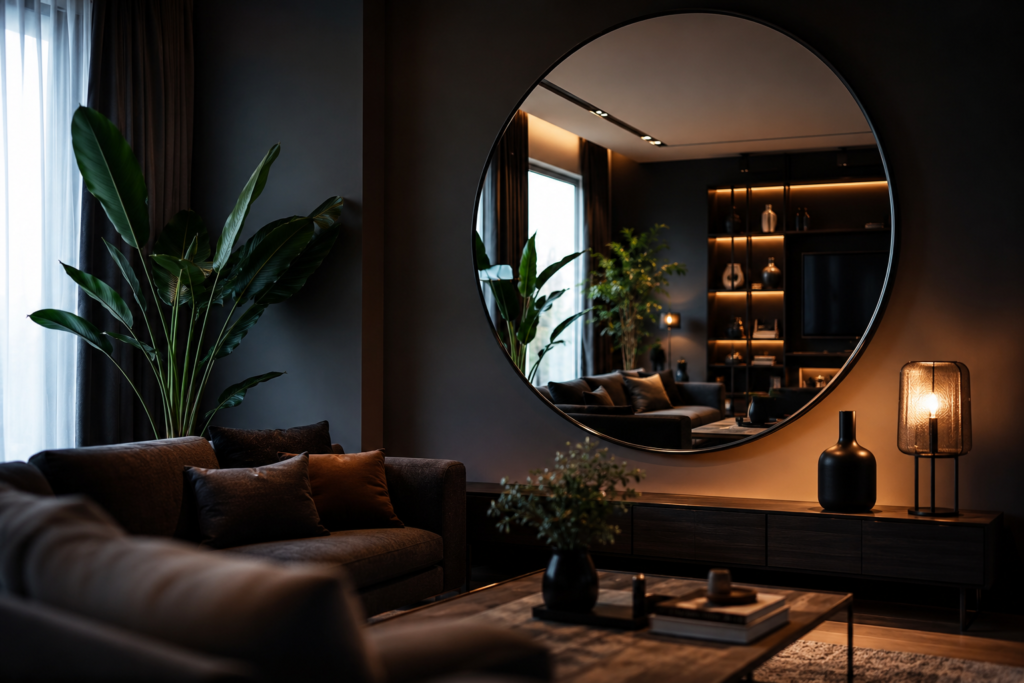
14. Use Mirrors Strategically
Best for: Small rooms, dark rooms, and any space where the illusion of greater size or light is valuable
Mirrors are the most space-effective tool in interior decoration — they create the appearance of additional space, double the apparent light in a room, and provide a reflective surface that adds visual complexity without competing with other decorative elements. A large mirror on the wall opposite a window effectively creates a second window, filling the room with reflected natural light.
The placement of mirrors is as important as their selection — a mirror that reflects a beautiful view or a well-styled corner doubles that beauty; a mirror that reflects a cluttered corner doubles the clutter.
Smart tip: Use a large, floor-length mirror leaned against a wall rather than hung — this contemporary approach creates a more casual, layered quality than a formally hung mirror and can be repositioned easily. Leaned mirrors also make rooms feel taller because their full height is visible from base to top, creating a vertical visual element that ends at the floor rather than being cut off by a frame hung at a specific height.
Mistake to avoid: Placing a mirror directly opposite the room’s entrance if the view it reflects is the room’s least attractive angle. A mirror facing the front door doubles the first impression of the room from the entrance — if that reflection shows a cluttered hallway or an unattractive wall, it amplifies the problem. Position mirrors to reflect the room’s best views, not its least attractive ones.
15. Add Wallpaper for Instant Character
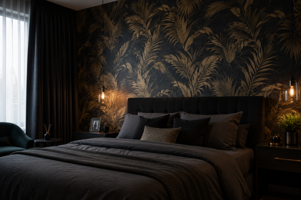
Best for: Any room needing pattern, depth, or a specific sense of place — wallpaper creates character that paint alone cannot achieve
Wallpaper transforms rooms in a way that paint cannot match — the pattern, texture, and depth of wallpaper creates an immediate sense of place and intentionality that a painted wall, however well-chosen the color, doesn’t provide. A single wallpapered wall in an otherwise painted room adds the pattern and visual complexity that prevents a space from feeling too plain or too safe.
Botanical prints, geometric patterns, abstract textures, and architectural designs all suit different room types and aesthetics — the range of contemporary wallpaper design is the broadest it has been in decades.
Smart tip: Apply wallpaper to the inside of a wardrobe or bookcase rather than a full wall for a lower-commitment introduction of pattern. Wallpaper lining the back of a bookcase creates a beautiful background for displayed objects and allows pattern exploration without the visual commitment of a full wall installation.
Mistake to avoid: Applying wallpaper without matching the pattern repeat correctly at the seams. Wallpaper with a large pattern repeat requires careful planning of where each strip begins and ends to prevent awkward partial patterns at the ceiling line, the corners, or beside doorframes. Plan the layout and calculate material requirements before ordering — inadequate material purchased without accounting for pattern matching is the most common wallpaper installation error.
16. Invest in a Statement Rug
Best for: Any room with hard flooring — a quality rug is the single most transformative furniture purchase available per dollar spent
A large, quality rug — covering the majority of the floor area in a room’s seating arrangement — defines the space, anchors the furniture, adds warmth and acoustic softness, introduces color and pattern, and makes the room feel finished in a way that bare floorboards alone don’t achieve. The difference between a well-chosen, appropriately sized rug and no rug is frequently the difference between a room that feels complete and one that feels unfurnished.
The sizing principle is consistent: the rug should be large enough that all the main furniture in the seating arrangement has at least its front legs on the rug. A rug that only the coffee table sits on is too small for the arrangement it’s meant to anchor.
Smart tip: Choose a rug that’s one size larger than initially seems right. Rugs consistently look smaller once placed in a room than they appeared in the showroom — the surrounding floor and furniture reduce the perceived scale. Going one size up prevents the undersized rug problem that makes a room look oddly proportioned.
Mistake to avoid: Placing all four legs of all furniture pieces on the rug in a large room. A rug large enough to contain an entire seating arrangement dominates the room and leaves no visible floor between the rug edge and the walls — making the room feel wall-to-wall carpeted rather than having a defined seating zone. The standard guideline — front legs on the rug — creates the right visual relationship between rug, furniture, and bare floor.
17. Style Open Shelving
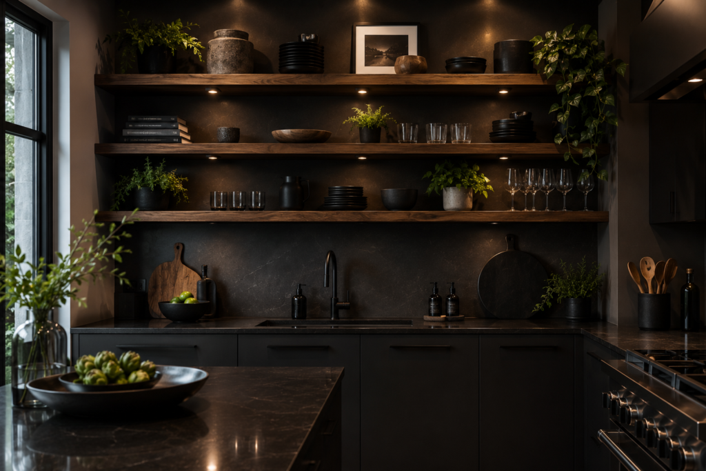
Best for: Living rooms, studies, and kitchens — well-styled open shelving creates the most personal and most decoratively rich storage display available
Open shelving — visible, accessible storage — succeeds or fails based entirely on how it’s styled. Functional items stacked randomly on open shelves look worse than no shelves at all. The same items organized thoughtfully, with decorative objects adding visual breaks and varying heights creating rhythm, create a display that reads as intentional and personal.
The principles of effective shelf styling: vary the heights of objects, create visual groupings of related items, mix functional objects (books, kitchen equipment) with purely decorative ones (ceramics, plants, candles), and leave space — negative space between groups prevents the crowded appearance that makes open shelving look cluttered.
Smart tip: Organize books by color on shelving that’s primarily decorative — the rainbow-gradient effect of color-organized books creates a striking visual impact that subject-organized books in mixed binding colors can’t achieve. This works in living rooms and studies where the books are as much part of the display as they are reference material.
Mistake to avoid: Using open shelving for items that look poor when visible. Cleaning products, utility items, mismatched containers, and accumulated clutter all look worse on open shelving than in closed storage. Be honest about what’s actually going on the shelves before committing to open storage — if the reality of the stored items undermines the aesthetic, closed storage is the right choice.
18. Create a Reading Nook
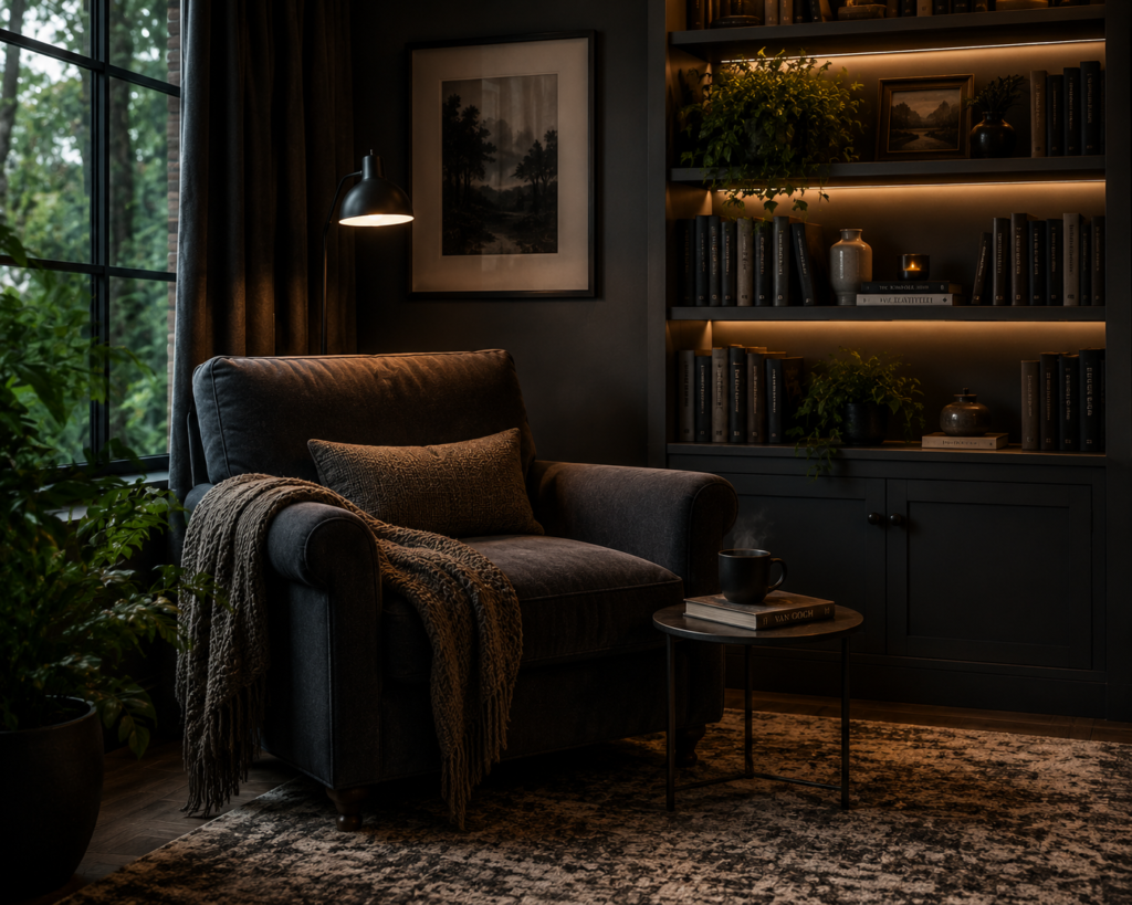
Best for: Any home — a reading nook creates the most intimate, purposeful small space available within a larger room
A reading nook — a defined, dedicated space for reading that feels separate from the room’s main activity — creates a specific quality of retreat within a home. The nook’s defining characteristics are enclosure (a sense of being contained and separated), comfort (a chair or window seat genuinely suited to extended reading), and adequate light (a dedicated reading lamp positioned correctly for the seated position).
Reading nooks can be created in an alcove beside a chimney breast, in a bay window, under the stairs, or simply in a corner of a living room where a chair and lamp are positioned deliberately.
Smart tip: Add curtains or a simple canopy to a reading nook to increase the sense of enclosure. A curtain that draws across the entrance to a reading alcove — even partially — creates a genuine sense of a room within a room that transforms the nook from a seating position into an actual retreat. The enclosure created by fabric is immediate and powerful even when it’s a single lightweight curtain.
Mistake to avoid: Creating a reading nook in a location with poor natural light and relying on artificial light alone. Reading by artificial light in a dark corner is genuinely less pleasant than reading in natural light — over time, a dark reading nook gets used less and less. Position the reading nook where it receives natural light during the times of day when reading happens most frequently in the household.
19. Use Scent as Part of Your Decor
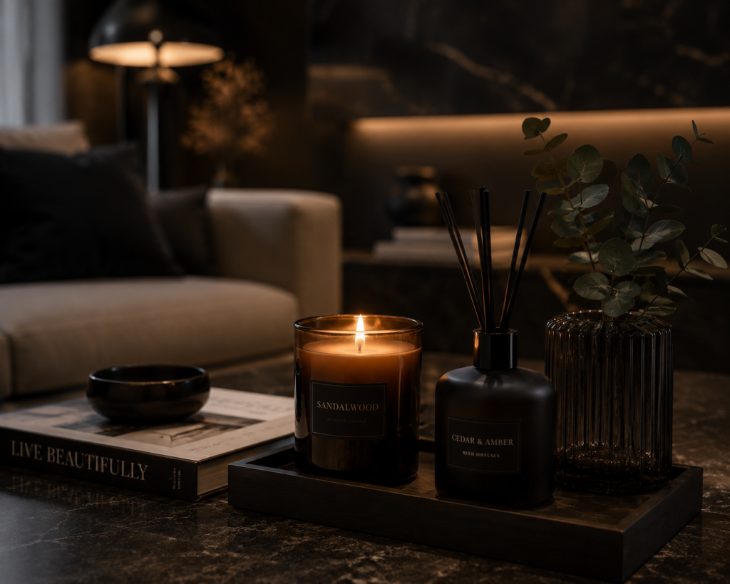
Best for: Every room — scent is the most immediate and most emotionally powerful sensory element in any interior
Scent is the sense most directly connected to memory and emotion — a specific fragrance can change how a room feels more immediately than any visual change. A room that smells of fresh linen, warm woodsmoke, or specific fragrance creates an atmosphere that guests register before they consciously notice any decorative element.
Candles, diffusers, fresh flowers, herbs in the kitchen, and quality cleaning products with considered fragrances all contribute to a home’s olfactory character. The most sophisticated interiors are as thoughtfully considered in their scent as in their visual presentation.
Smart tip: Use different scents in different rooms to create a sense of distinct character and purpose in each space. A fresh, citrus-forward scent in the kitchen, a warmer woody fragrance in the living room, and a clean, linen-forward scent in the bedroom create fragrance zones that reinforce each room’s function and atmosphere. This deliberate scent mapping is one of the least-discussed but most impactful elements of professional interior design.
Mistake to avoid: Using multiple competing scents in the same space. A room with three different candles, a diffuser, and fresh flowers all producing different fragrances simultaneously creates an olfactory confusion that registers as unpleasant even when each individual scent is appealing. Choose one scent source per room and use it consistently.
20. How to Develop Your Personal Decor Style
Best for: Anyone who feels uncertain about their decorating direction — personal style is developed, not discovered
The most common barrier to confident decorating is the belief that personal style is something you either have or don’t — a fixed aesthetic identity that you need to identify before you can start. In reality, personal decorating style is developed through exposure, experimentation, and the gradual accumulation of objects and decisions that feel right.
The most practical approach: collect images of rooms that appeal to you without analyzing why. After collecting 20 to 30 images, look for the consistent elements — the colors that recur, the types of furniture that appear repeatedly, the ratio of pattern to plain, the level of clutter or emptiness. The patterns in the images you’re drawn to reveal your aesthetic preferences more accurately than any theoretical analysis.
Start with what you know. The furniture you already own and the objects that have accumulated meaningful associations are more important than anything new you might buy. Building a room around existing pieces with genuine personal meaning creates an interior with the authentic, lived-in quality that new purchases alone cannot produce.
Smart tip: Spend as much time editing existing possessions as acquiring new ones. Most rooms improve more from removing inappropriate or unloved items than from adding new ones. A rigorous edit — removing everything that doesn’t suit the intended aesthetic or that carries no positive association — often reveals a well-decorated room already present beneath the accumulated clutter.
Mistake to avoid: Decorating a room entirely from a single source in a single shopping session. A room furnished from one store in one visit has the cohesion of a showroom display — every element is compatible but nothing is personal. The most interesting interiors accumulate over time: a piece from travel, an inherited object, a discovered vintage find, a considered new purchase. Allow the room to develop rather than completing it.
Before You Start
- Live with the room before making significant changes. The most expensive decorating mistakes come from acting before understanding how a room is actually used throughout the day and across different seasons.
- Establish a budget and prioritize. Invest most in the elements that are hardest to change later — paint colors, flooring, major upholstered pieces — and spend less on accessories that can be updated easily.
- Start with the bones. Light, proportion, and furniture arrangement determine more about how a room feels than any decorative addition. Get these right before adding decoration.
- Edit before you add. Remove anything that doesn’t contribute positively to the room before purchasing anything new. The room after editing is a more honest starting point than the room before it.
Conclusion
The best-decorated rooms have one quality in common: they feel like the people who live in them. Not like a showroom, not like a trend report, not like an Instagram feed — like the specific, irreplaceable combination of tastes, histories, and personalities of the household. The decorating decisions that move a room in this direction are rarely the most expensive or the most dramatic — they’re the most honest ones. Start with what you genuinely love, remove what you don’t, and add deliberately and slowly. The result will be a room that improves with time rather than dating with it.