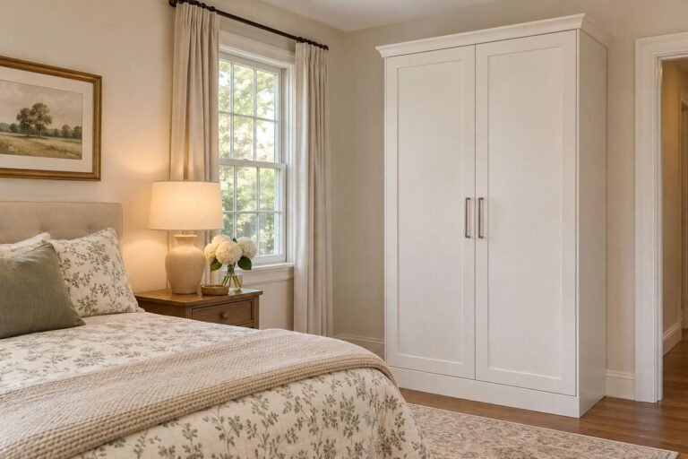
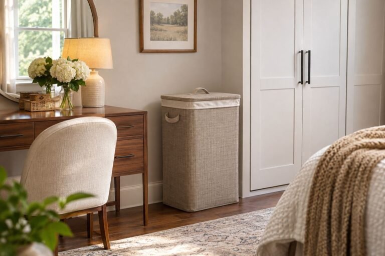
Layered bedding looks inviting when the colors relate and each textile has a reason to be there. A beautiful bed should also be easy to uncover at night, remake in the morning and care for with the equipment and storage you have.
Begin with the sleeping layers you actually prefer, then add a limited decorative combination. These ideas offer different palettes and arrangements rather than a requirement to sleep beneath every layer shown.
The images are original AI-generated decor concepts, not installation diagrams or photographs of completed client projects.
Browse These 24 Layered Bedding
Jump to an idea
- Pair chalk white with a warm quilt
- Build an oatmeal and ivory combination
- Use sage with a pale sleeping base
- Combine dusty blue and natural linen tones
- Anchor a white bed with navy at the foot
- Warm a pale room with a clay covering
- Use blush with brown rather than more pink
- Give forest green a quiet cream border
- Create contrast with ivory and charcoal
- Choose one broad stripe as the main print
- Use a fine stripe for a quieter pattern
- Balance a small floral with a plain quilt
- Let a patchwork quilt carry the color story
- Use a check in a different scale from the accent
- Choose embroidery as a narrow finishing detail
- Make texture the main contrast
- Use a reversible covering for a controlled reveal
- Fold the duvet into one clear lower band
- Keep a single blanket as the visible top
- Use one lumbar instead of a deep pillow display
- Coordinate twin beds through one shared layer
- Relate the bedding to a detailed headboard
- Keep the lower edge clear of the route
- Give optional layers a simple nightly home
Build a Layered Bedding Plan from the Mattress Outward
Write down the mattress width, length and depth, then identify which sheets, quilt, blanket or duvet you actually use. Pottery Barn’s bed-dressing guide describes several possible layers and treats decorative additions as choices. Adapt the composition to your own comfort, room conditions and textile care labels. Styling is separate from any claim about better sleep or a particular health benefit.
| Layer | Practical role | Appearance decision |
|---|---|---|
| Sheets and pillowcases | Preferred sleeping surface | Neutral or deliberate color edge |
| Quilt, coverlet or blanket | Chosen usable covering | Texture or main pattern |
| Duvet or comforter | Optional covering for the routine | Folded position and visual volume |
| Decorative pillow or throw | Optional finishing accent | Small enough to remove and store easily |
A Simple Bedding Drop Example
For a 60-inch-wide mattress, a 90-inch-wide covering leaves 30 inches of extra width, or approximately 15 inches on each side when centered. That does not establish the right size by itself: mattress depth, frame rails, intended tuck and fabric construction affect the result. Measure the existing bed and compare the maker’s finished dimensions rather than assuming that every product with the same size name drapes identically.
Copy This Four-Part Bedding Recipe
Make four entries: the main neutral, one accent color, the largest visible pattern and the texture that supplies contrast. For example, cream sheets, muted blue quilt, a wide blue-and-cream stripe at the foot and one plain lumbar form a complete recipe. Lay the pieces together before adding another print. Then write where the optional pieces go each night; if that place is missing, simplify the recipe.
1. Pair chalk white with a warm quilt
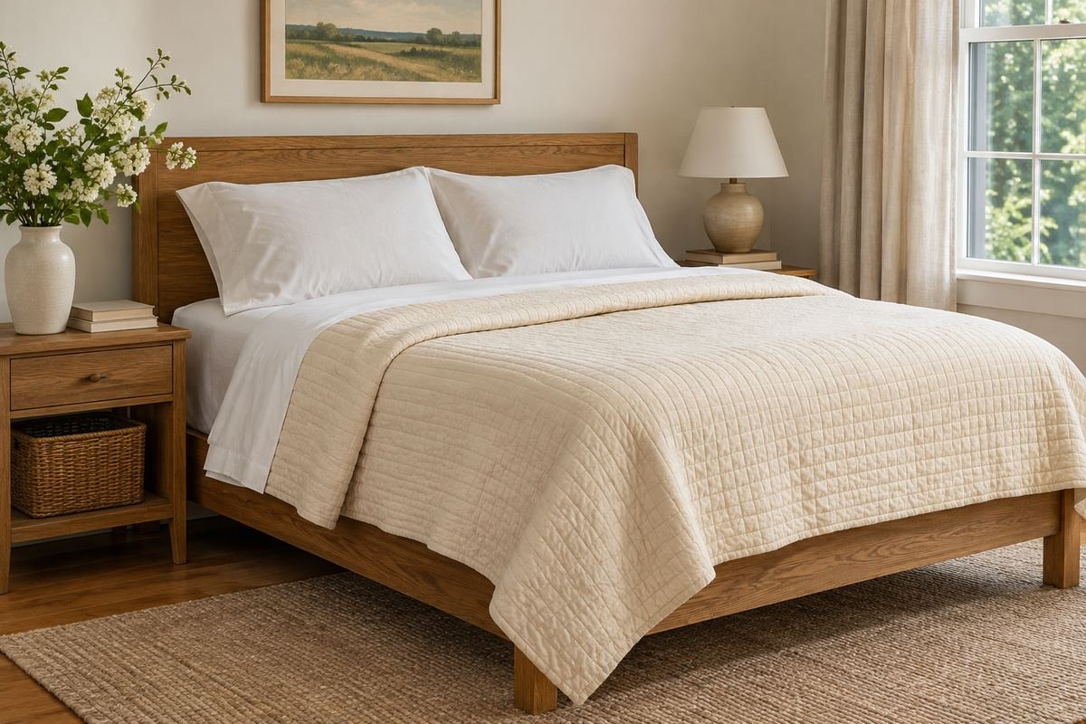
A chalk-white sleeping base and a warm cream quilt can create depth without a strong accent color. The small difference between the two tones makes the bedding look layered while keeping the room quiet.
Compare the pieces against the wall paint so the whites feel intentional together. Fold the upper edge to reveal a narrow band of the underlying fabric. Keep the remainder simple enough that the tonal difference is visible from the doorway.
Practical tip: Use texture to separate similar whites before adding another color.
2. Build an oatmeal and ivory combination

Oatmeal and ivory create a warm neutral composition suited to natural wood furniture. A slightly darker woven blanket at the foot can add definition without introducing a new color family.
Keep the largest layer relatively plain and let the weave supply the interest. Compare the complete group beside the actual headboard rather than choosing each piece separately. A narrow visible sheet edge helps the pale layers avoid merging into one broad surface.
Practical tip: Choose the darkest neutral from an existing furniture or rug tone.
3. Use sage with a pale sleeping base

Muted sage can make the bed the main color area in a neutral room. A pale sheet edge and quiet pillowcases keep the green from becoming an uninterrupted block.
Repeat sage in one modest detail elsewhere, such as a picture or ceramic piece. Keep neighboring greens different enough to look deliberate rather than almost matching. This works especially well when wood grain and a simple rug provide the other major textures.
Practical tip: Keep one broad green layer instead of adding several competing green prints.
4. Combine dusty blue and natural linen tones

Dusty blue can sit comfortably beside beige, flax and warm wood. A natural-toned folded coverlet gives the blue a warmer companion than another pale blue textile would.
View the combination in the room’s evening light as well as daylight. Keep the proportion clear: let either blue or neutral occupy most of the bed and use the other as a smaller band. Equal blocks of similar pale colors can appear less deliberate.
Practical tip: Choose which color will read first from the bedroom doorway.
5. Anchor a white bed with navy at the foot

A navy folded quilt can give a white bed a defined lower edge. It introduces a dark accent without making the entire bed visually heavy.
Repeat the dark tone in a small detail near the head, such as piping or one pillow. Leave a broad white area between those accents. Adjust the fold to reveal the amount of navy that suits the room rather than spreading a dark layer simply because it is available.
Practical tip: Photograph the bed from the doorway to judge the dark accent’s proportion.
6. Warm a pale room with a clay covering
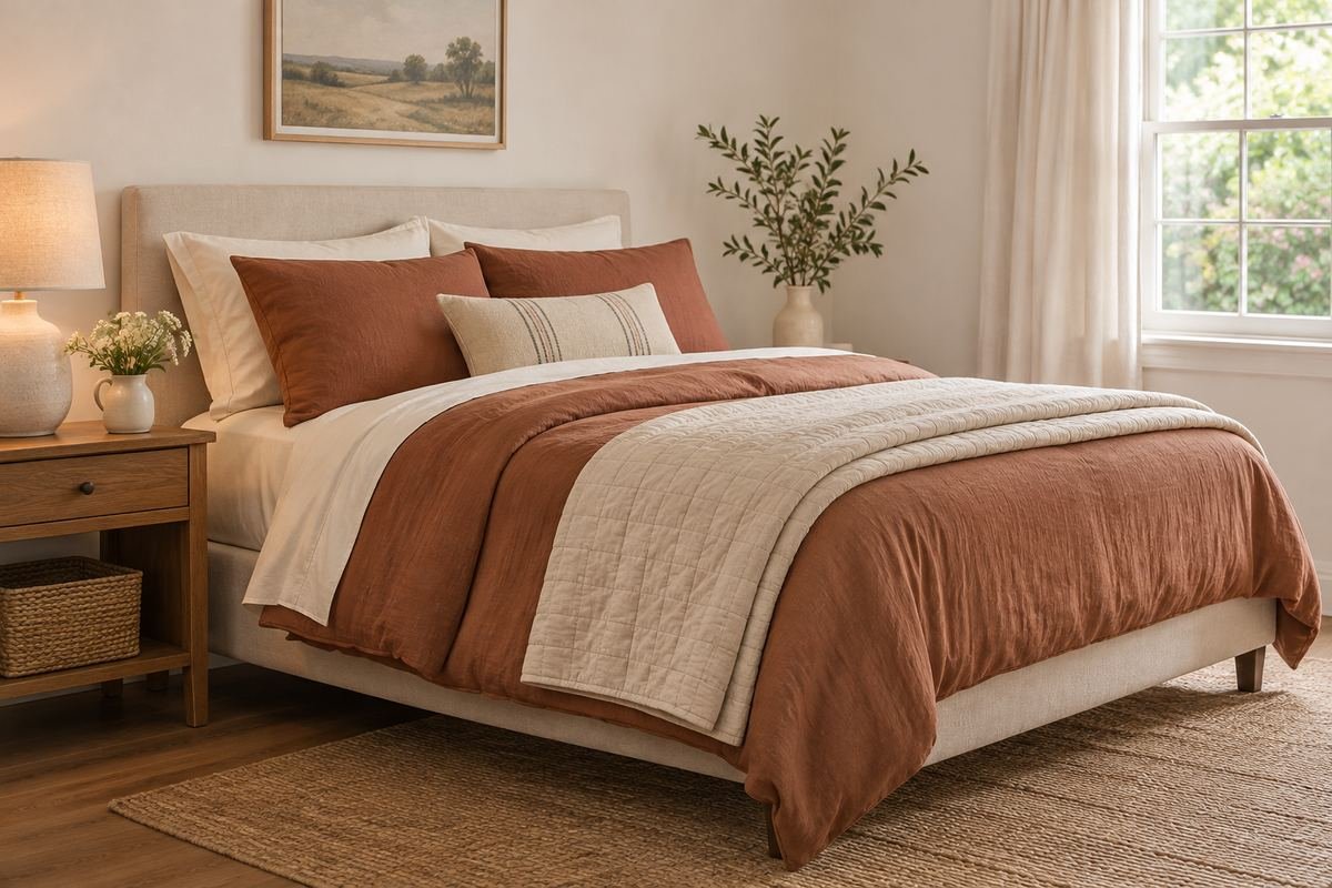
A muted clay quilt or duvet can bring warmth to pale walls and simple wood furniture. Cream pillowcases and a lighter folded layer keep the color comfortable to look at across a large surface.
Avoid adding several equally strong rust or orange accessories around the bed. Let the covering be the main color statement, then connect it to one quiet detail in the room. A real fabric sample helps distinguish a muted clay from a brighter terracotta.
Practical tip: Hold the sample beside the rug before changing other textiles.
7. Use blush with brown rather than more pink
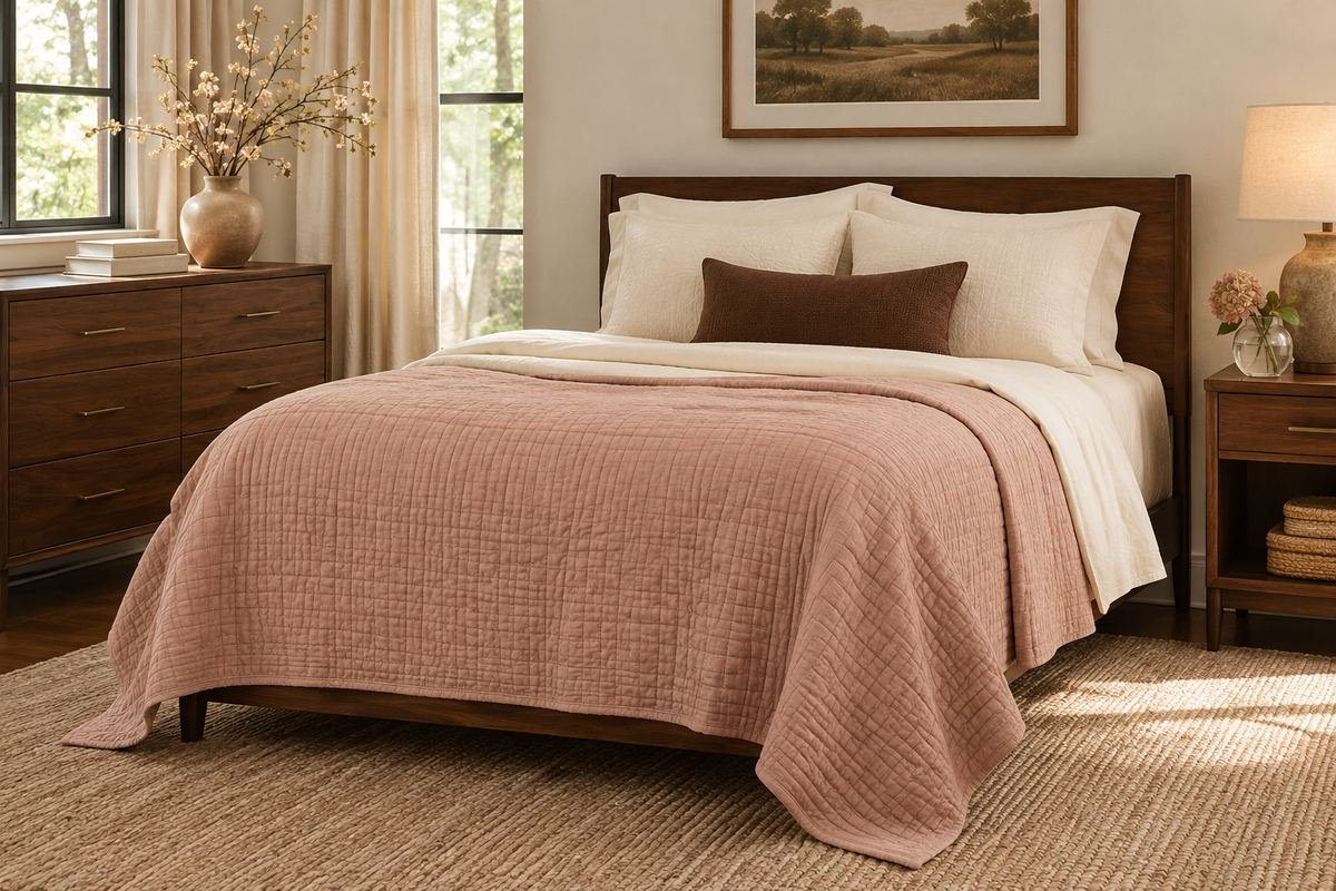
A softened blush cover can feel grounded beside walnut or cocoa tones. A small brown accent makes the palette more varied without requiring a second large patterned textile.
Keep the blush muted and establish its relationship to existing wood before adding accessories. A restrained cream layer between the colors can soften the transition. Choose pieces for their actual texture and care needs, not only the mood suggested by their color names.
Practical tip: Try one cocoa lumbar against the blush before buying a matching set.
8. Give forest green a quiet cream border

A deep green covering can bring a strong focal point to a light bedroom. A visible cream sheet turnback and lighter pillowcases create a clear border around the darker fabric.
Keep the largest surrounding pattern small or quiet so the green remains easy to read. If the bed begins to dominate the room, reduce the visible green by folding the covering lower. The bedding can carry color without requiring every accessory to match.
Practical tip: Adjust the fold before adding new decorative pieces.
9. Create contrast with ivory and charcoal

Ivory and charcoal can create a clear, graphic bed without relying on a bright color. A broad ivory base and a smaller dark quilt band keep the contrast controlled.
Choose a soft texture in at least one layer so the composition does not depend only on sharp lines. Relate the charcoal to existing metal or artwork. A few repeated dark details are usually easier to coordinate than a full set of differently patterned monochrome accessories.
Practical tip: Keep the largest dark area in one deliberate position.
10. Choose one broad stripe as the main print
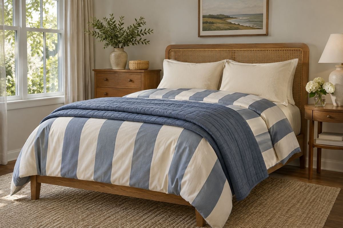
A broad stripe can organize the bed visually through a clear repeating direction. Plain pillowcases and a solid folded quilt give the pattern room to remain the main feature.
Look at how the stripe falls over both sides of the mattress and across any fold. The actual covering dimensions affect that result. Avoid crowding a strong stripe with another equally large geometric print unless the complete group has been tested together.
Practical tip: Lay the full cover on the bed before deciding on accent pillows.
11. Use a fine stripe for a quieter pattern

A fine stripe can bring subtle movement to a mostly solid bed. It can occupy a sheet edge, a quilt or the pillowcases without requiring every layer to use the same repeat.
Choose one main location for the stripe and keep neighboring textiles calmer. View it from across the room because a very fine repeat may read as texture rather than obvious pattern. This makes the actual fabric scale more useful than a close product photograph.
Practical tip: Decide whether the stripe should read clearly or blend into texture.
12. Balance a small floral with a plain quilt

A small floral covering can supply several colors while a solid quilt gives the bed a quieter companion. Pull one restrained tone from the print for the plain layer rather than adding an unrelated accent.
Leave part of the floral visible at a deliberate fold or upper section. Too many additional printed pillows can make it harder to read the original pattern. Keep the headboard and curtains in the comparison because they occupy nearby visual space.
Practical tip: Choose the plain quilt after looking at the floral in the bedroom.
13. Let a patchwork quilt carry the color story
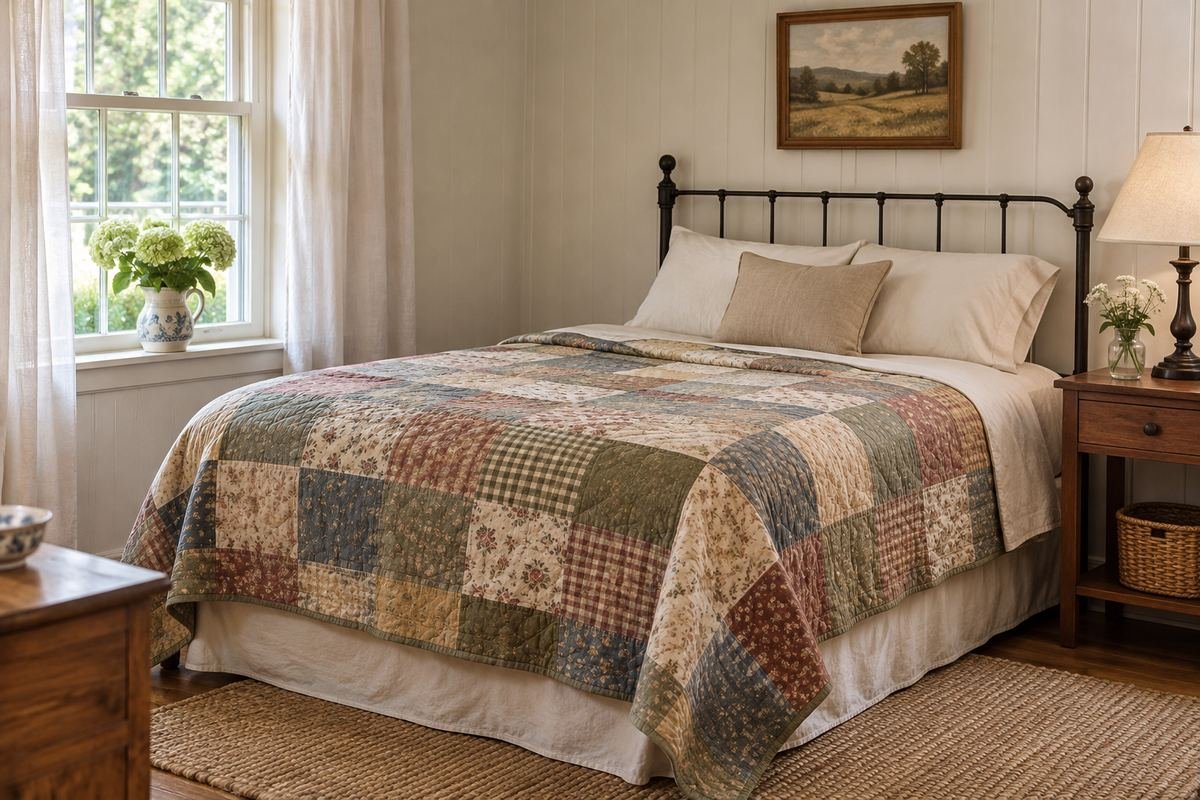
A patchwork quilt can act as the main patterned piece on a bed. Simple sheets and understated pillowcases allow its individual fabric blocks to remain legible.
Choose surrounding accents from the quilt’s quieter tones rather than trying to repeat every color. Keep the quilt’s actual dimensions in mind so the intended patchwork area is visible after draping. A second large busy print may obscure the value of the piece you wanted to feature.
Practical tip: Start the palette with the quilt and add only what it needs.
14. Use a check in a different scale from the accent

A checked covering can coordinate with a smaller plain or subtly textured accent. Clear differences in scale give the individual layers a role instead of making every surface equally busy.
Choose the check size from the whole bed rather than a small sample. A large check can become a strong geometric shape when folded, while a small repeat may read as texture. Keep the accent simple until the main covering has been laid out.
Practical tip: Compare the complete checked covering with the largest nearby room pattern.
15. Choose embroidery as a narrow finishing detail

A narrow embroidered edge can give a plain bed a considered finish without adding another large pattern. It can connect a pillowcase or sheet turnback to a small room accent.
Keep the detail visible in the finished arrangement so it contributes something useful. Avoid piling several decorative layers over the edge you chose to feature. Follow the textile’s actual care label, especially when different pieces use different fabrics or trims.
Practical tip: Plan the fold so the embroidered edge is seen without constant readjustment.
16. Make texture the main contrast
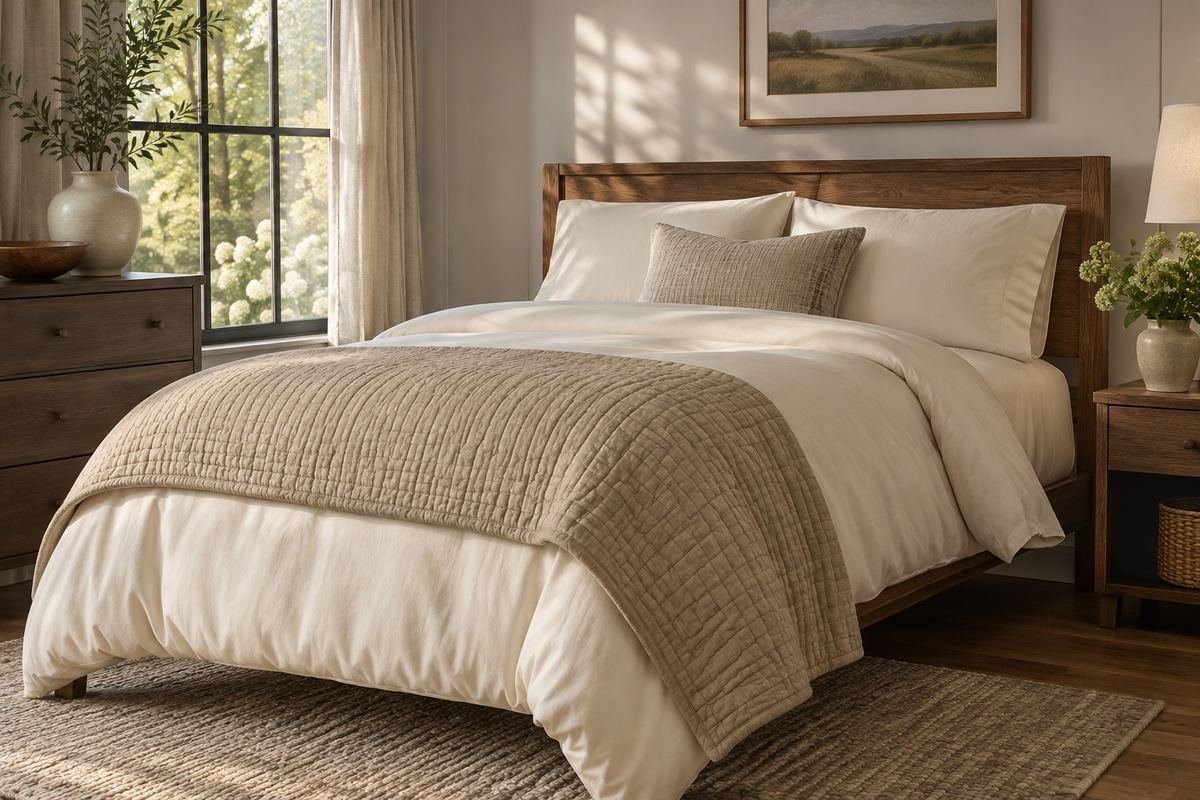
A smooth duvet beside a visibly stitched quilt can create a layered appearance with very little color variation. The surface differences become clearer in side light.
Choose textures you enjoy handling and can care for as directed. More texture does not automatically make the bed more comfortable, and heavy decorative layers can be unnecessary. Keep the number of pieces small enough that the contrast remains easy to understand.
Practical tip: Use two distinct textures before considering a third.
17. Use a reversible covering for a controlled reveal

A reversible covering can provide two coordinated surfaces within one piece. A fold that reveals the second face creates a defined band without requiring another full covering.
Confirm that both faces are intended to be visible and follow the product’s care guidance. Choose the fold from the actual fabric pattern and the way the bed is used. Avoid buying extra layers merely to create a contrast that the existing reversible piece already provides.
Practical tip: Try both faces on the bed before deciding which becomes the main field.
18. Fold the duvet into one clear lower band
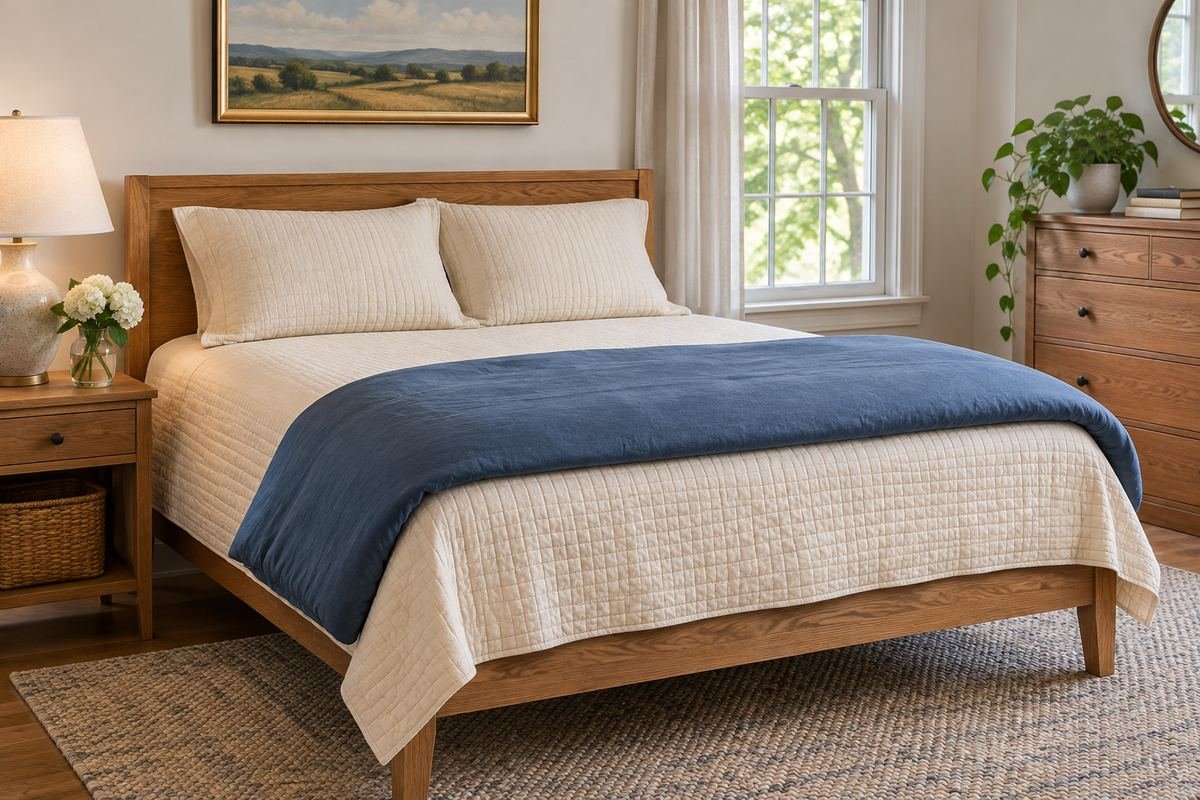
A folded duvet can provide visual volume at the foot while leaving another covering visible above. It is useful when the duvet is an optional part of the routine rather than the only layer in use.
Adjust the fold to the bed length and avoid pushing a bulky stack over the walking edge. The arrangement should be easy to unfold when wanted. If the folded duvet constantly ends up on the floor, use a simpler composition or provide a suitable clean storage position.
Practical tip: Test unfolding the duvet without moving several decorative objects.
19. Keep a single blanket as the visible top
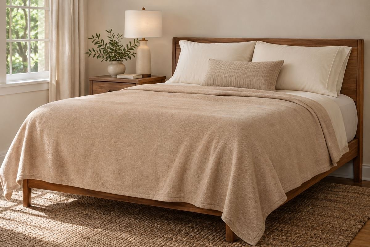
Layered bedding does not have to be thick. A chosen blanket over sheets can create a complete composition through a clear upper edge, simple pillows and a limited color relationship.
Use the covering that suits your normal preference rather than adding volume for a photograph. The blanket’s actual drape and finished dimensions matter more than the number of layers. Keep optional decorative items small enough that they do not change how the bed is used.
Practical tip: Begin with the minimum useful sleeping combination and style that well.
20. Use one lumbar instead of a deep pillow display

One lumbar can connect the bedding colors while leaving most of the bed visible. It can be easier to remove than several rows of decorative pillows.
Choose a size that relates to the mattress and headboard without hiding the sleeping pillows. Give it a clean place off the bed each night. The fabric can introduce one quiet texture or accent color, but it does not need to repeat every pattern in the room.
Practical tip: Decide where the lumbar goes at bedtime before choosing a larger one.
21. Coordinate twin beds through one shared layer

Two beds can feel related without identical stacks of every textile. A shared quilt color or pillowcase detail creates a clear connection while another layer varies between them.
Keep the visual weight balanced across both beds and leave the space between them useful. Choose each mattress’s actual covering dimensions rather than assuming two similar frames need the same drape. This approach works especially well when the room has one shared rug or bedside surface.
Practical tip: Use one repeated layer to establish the pair before adding individual accents.
22. Relate the bedding to a detailed headboard

A patterned or strongly textured headboard can already provide the bed’s main decorative feature. Quieter bedding lets that surface remain visible and avoids a competition at the head of the room.
Compare the upper pillows with the headboard from the doorway. Keep their height low enough to reveal the feature you want to retain. A small repeated tone in the lower quilt can connect the composition without reproducing the headboard’s entire pattern.
Practical tip: Style around the headboard you already have before introducing another dominant print.
23. Keep the lower edge clear of the route

A covering that pools heavily at the foot can make a narrow bedroom harder to use. A considered drape should suit the bed frame and the route around it.
Compare finished textile dimensions with the mattress and frame before choosing a longer look. If the covering is intended to tuck, test that arrangement on the actual bed. Do not let a staged oversized layer hide the furniture edge or obstruct a drawer beneath it.
Practical tip: Open any under-bed drawer with the bedding arranged normally.
24. Give optional layers a simple nightly home

A complete styling plan includes the pieces removed before sleep. A clean bench or suitable storage position can hold a modest throw and decorative pillow without placing them on the floor.
Keep the group small enough to return easily in the morning and leave actual seating useful if the bench has another role. Revisit the arrangement after several ordinary nights. Layered bedding succeeds when its colors feel intentional and the reset remains straightforward.
Practical tip: Remove any decorative layer that has no useful daytime or nighttime position.
Frequently Asked Questions
Do I need a quilt and duvet on the bed together?
No. Use the coverings that suit your normal comfort and routine. A photograph can show a folded optional layer without requiring every textile to be used at once. A sheet and one chosen covering can still create a finished composition.
How many decorative pillows should I use?
Choose a number you can comfortably remove, store and return. One lumbar or a small pair may be sufficient. Keep your actual sleeping pillows available and do not let a display consume the usable bed.
How can mixed bedding look coordinated?
Choose one shared color or a clear contrast, limit the number of competing large patterns and include a quieter area. Lay the textiles together in the bedroom light; fabric samples and actual pieces show undertones more reliably than product names.
Choose the Details That Work in Your Home
Let layered bedding follow the way the bed is used. A clear color recipe, an intentional edge and a simple home for optional pieces can create a considered room without turning bedtime into a long clearing routine.
For related ideas, explore bedroom paint colors, bedroom bench ideas, bedroom curtain ideas.
Planning References
Pottery Barn: bed dressing and optional layers; Pottery Barn: coordinating bedding color and pattern. Follow the instructions for the exact products you choose.
Optional digital guide for this topic
If you prefer a structured workbook, explore this related paid guide.