The living room is the room that does the most work in any home. It hosts family evenings, guests, movie nights, reading, and the daily transition from the outside world back to the domestic one. Yet it’s also the room most people feel least satisfied with — decorated once and left, gradually accumulating furniture that doesn’t quite go together, lighting that’s wrong, and surfaces that feel unfinished. Most living room problems aren’t expensive to solve. They’re the result of decisions made one piece at a time without a coherent plan. These 20 ideas address every dimension of a living room that actually works — color, furniture, lighting, layout, and the details that separate a room that feels designed from one that feels assembled.
1. Choose a Neutral Color Palette
Best for: Any living room — especially those that feel visually busy or unresolved
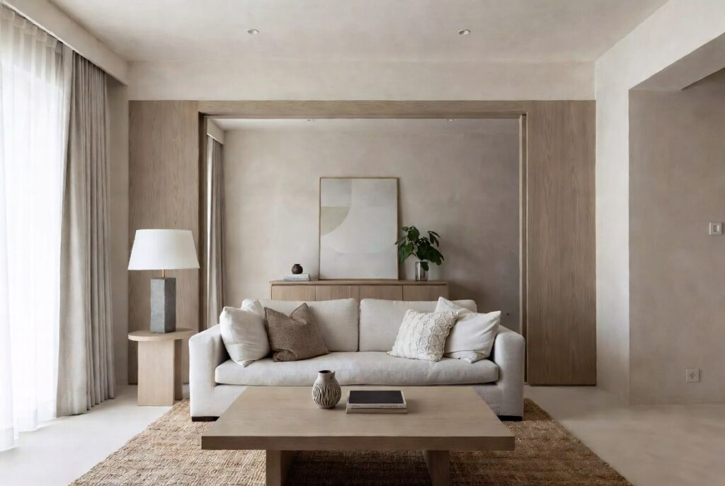
A neutral color palette — warm whites, soft greys, sand, greige, warm beige — creates the visual calm that a well-used room needs. Neutral walls don’t compete with furniture, artwork, or the people in the room. They create a background that makes everything else look more considered.
The difference between a neutral palette that works and one that looks bland is in the undertones. Warm neutrals (cream, warm white, sand, greige) create a welcoming, relaxed atmosphere. Cool neutrals (pale grey, soft blue-grey) create a more formal, contemporary atmosphere. Mixing warm and cool neutrals — warm-toned furniture against cool-toned walls — creates an uncomfortable visual tension. Stay within the same temperature range.
Smart tip: Paint the ceiling the same neutral as the walls, or one shade lighter. A white ceiling above colored or strongly toned walls creates a hard visual edge where wall meets ceiling. Continuing the wall color (slightly lightened) onto the ceiling makes the room feel taller and more enveloping.
Mistake to avoid: Choosing a neutral based on a paint chip. Living room walls are seen in morning light, afternoon light, evening lamplight, and on overcast days — and the same paint looks completely different in each condition. Test large swatches (at least 12×12 inches) on the actual wall and observe them for several days before committing.
2. Anchor the Room with a Large Rug
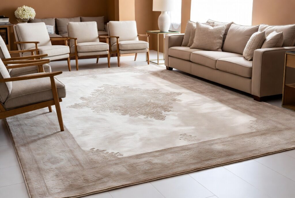
Best for: Any living room with hard flooring — the single most impactful improvement available
A rug defines the seating area, adds warmth and acoustic softness to a hard-floored room, and creates the visual structure that pulls furniture together into a composition rather than leaving pieces floating independently. A living room without a rug almost always looks unfinished, regardless of how good the furniture is.
The most common rug mistake: choosing one that’s too small. The rug should be large enough for at least the front legs of all seating pieces to sit on it. A rug that only sits under the coffee table — with all furniture legs off the edge — looks like a decorative mat rather than a room-anchoring element. In a standard living room, an 8×10 foot rug is usually the minimum; 9×12 is more effective.
Smart tip: In an open-plan space where the living area connects to a dining area or kitchen, the rug’s edge defines the living room boundary. This is more effective than furniture placement alone for creating the sense of a defined room within a larger open space.
Mistake to avoid: Choosing a rug based on how it looks rolled out in a showroom. Rugs look different on the floor of your specific room with your specific furniture and your specific light. Order samples when possible, or choose from retailers with good return policies.
3. Build a Gallery Wall
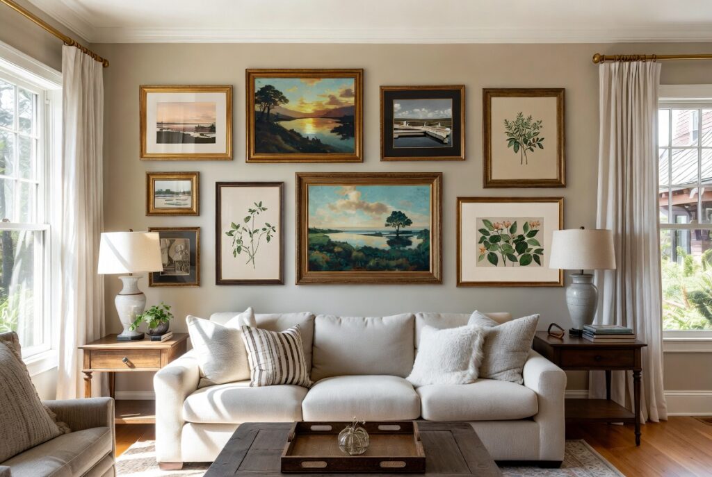
Best for: Bare walls, living rooms that need personality, anyone with artwork or photographs worth displaying
A gallery wall — a composed arrangement of artwork, photographs, and objects on a single wall — adds character and personal expression to a living room in a way that single large pieces rarely achieve. The collection creates visual interest at multiple sizes and distances, and it tells a story about the people who live in the room.
The keys to a gallery wall that looks designed rather than random: a consistent framing style (all black, all natural wood, all white — or a deliberate two-material combination); enough variation in image size to create visual movement; and a composition centered on the wall rather than drifting to one side.
Smart tip: Plan the gallery wall arrangement on the floor before touching the wall. Arrange the frames in the intended composition, photograph it, and compare the photo to the wall space. This prevents the accumulation of incorrect nail holes and allows the composition to be refined without commitment.
Mistake to avoid: Hanging the gallery wall too high. The center of the overall composition should sit at approximately eye level — around 57 to 60 inches from the floor. Gallery walls hung higher than this float above the furniture below and feel disconnected from the room.
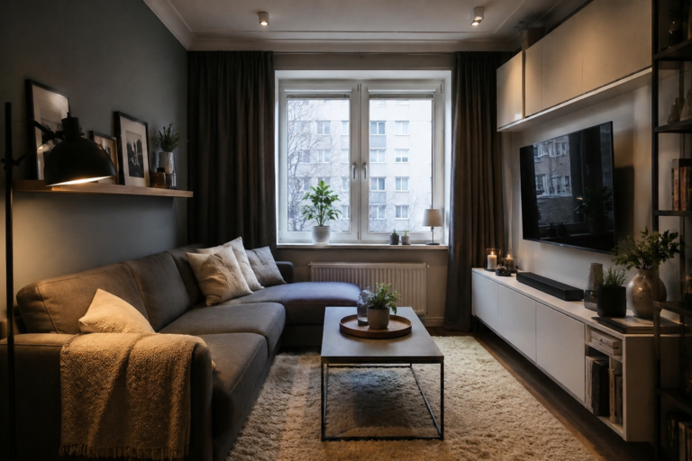
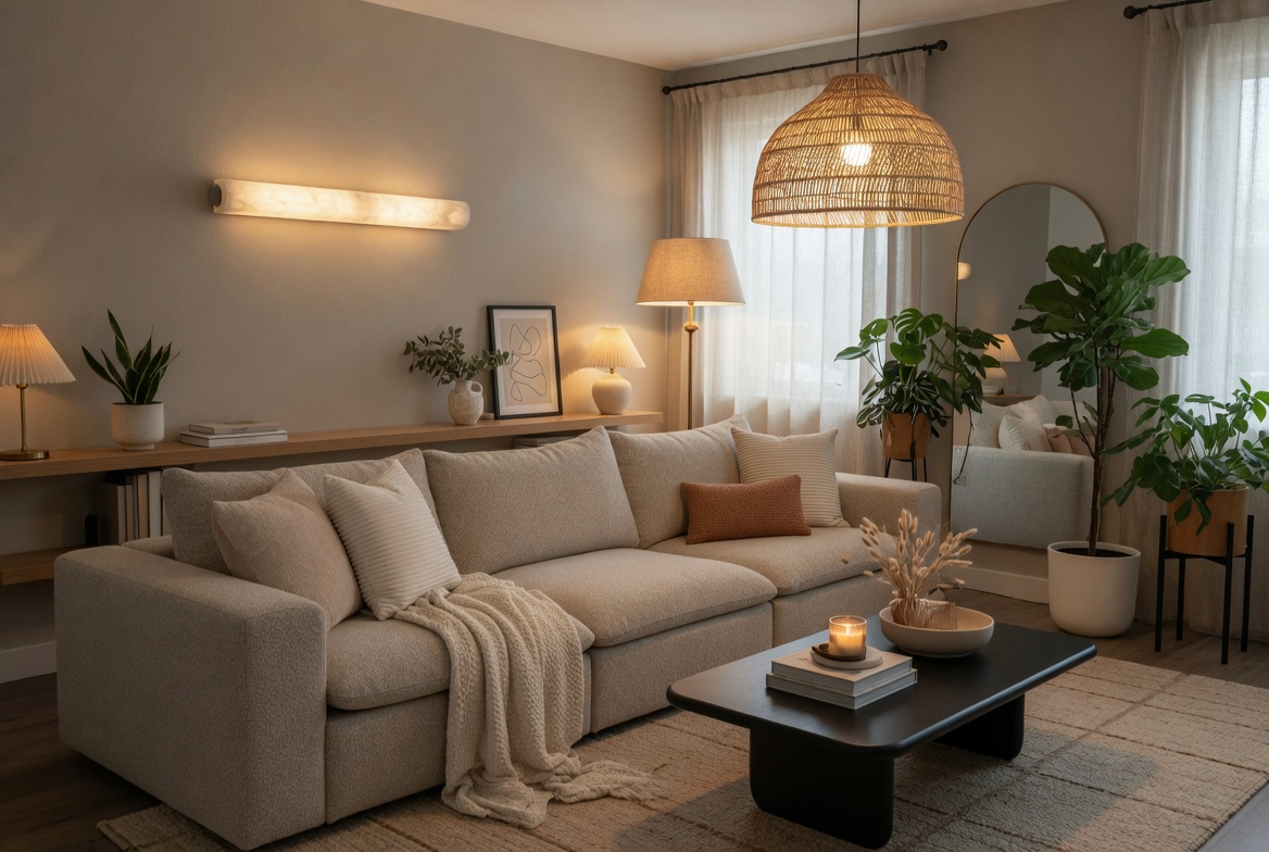
4. Layer Your Lighting
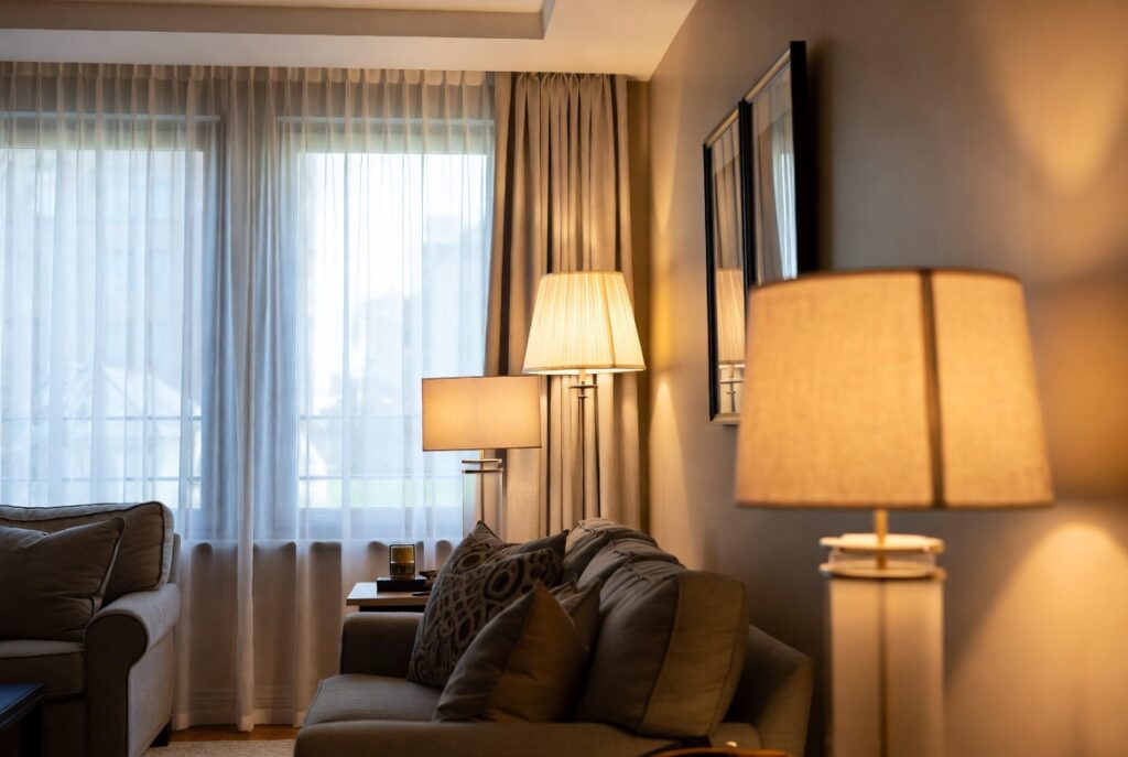
Best for: Every living room — most living rooms rely on a single overhead light that makes the room feel flat and institutional
A living room that functions across different activities — relaxed evening watching, reading, entertaining, bright daytime use — needs lighting that adjusts for each. This requires multiple light sources at different heights: ambient (general illumination from ceiling fixtures or recessed lights), task (reading lamps, desk lamps), and accent (table lamps, floor lamps, LED strips, fireplace light).
The most common living room lighting failure: relying on a single overhead ceiling light. Overhead-only lighting creates harsh downward shadows, makes people look unflattering, and produces a flat, institutional quality that no amount of good furniture can overcome. Turn the overhead light off and use floor and table lamps instead — the transformation in atmosphere is immediate.
Smart tip: Install dimmers on every living room light switch. The ability to reduce light levels from full bright (for cleaning, daytime activities) to low ambient (for evening relaxation) costs relatively little to install and changes how the room is experienced every evening.
Mistake to avoid: Using cool white LED bulbs (above 4000K) in living room lamps. Cool light is appropriate for task-focused spaces (kitchens, bathrooms) but creates an uncomfortable, clinical atmosphere in a room designed for relaxation. Use warm white (2700K to 3000K) throughout the living room.
5. Add a Statement Sofa
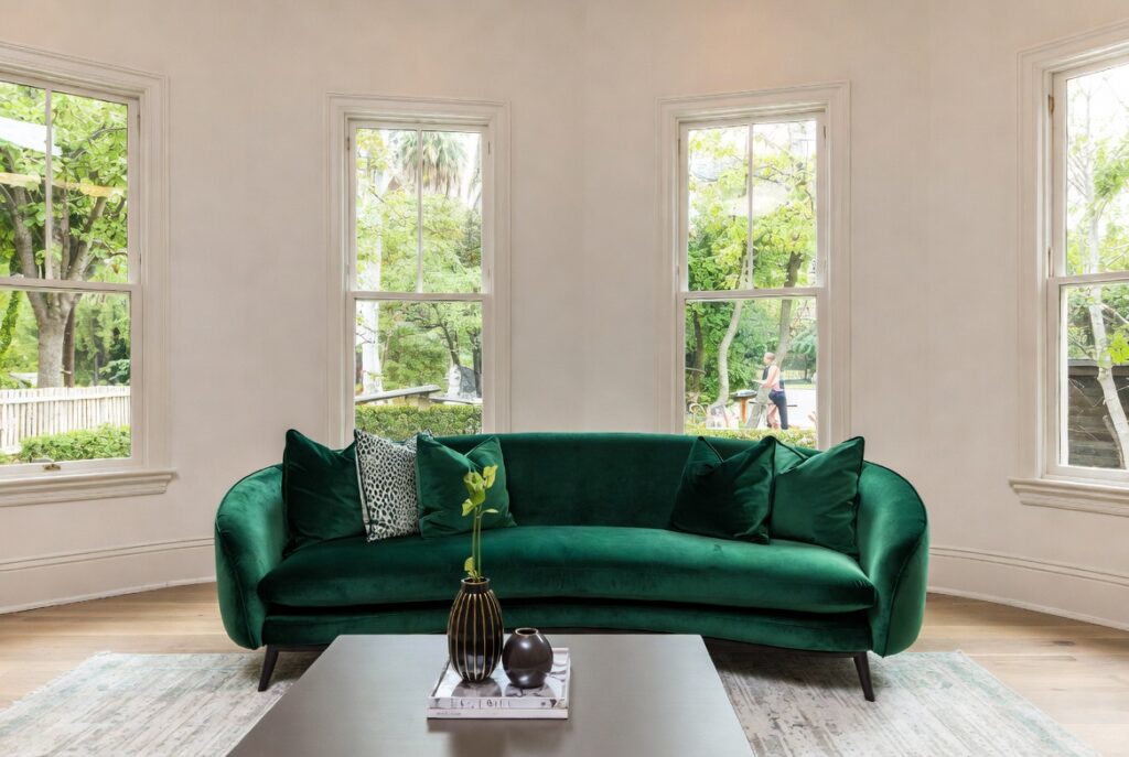
Best for: Any living room — the sofa is the most important single piece of furniture in the room
The sofa determines the living room’s character more than any other element. It occupies the most floor space, carries the most visual weight, and is where people spend the most time. A sofa chosen thoughtfully for the room’s proportions, color palette, and the household’s actual use transforms a living room. One chosen hurriedly or based primarily on price creates a foundation that everything else has to work around.
Key sofa decisions: size (the sofa should be proportional to the room — not so large it dominates, not so small it reads as insufficient); color (a neutral sofa allows more flexibility in changing cushions, throws, and other accessories; a statement color or pattern is a longer commitment); and comfort (a sofa that looks good but isn’t genuinely comfortable is a daily disappointment).
Smart tip: Measure twice before ordering. The sofa must fit through all doorways, hallways, and staircases to reach the living room — and it must fit the room with adequate clearance on all sides. A 36-inch clearance around the sofa for traffic flow is the practical minimum.
Mistake to avoid: Buying a sofa without sitting on it for at least 10 minutes. Sofa comfort varies enormously and is impossible to assess from photographs or brief contact in a showroom. The cushion density, seat depth, back height, and armrest height all determine daily comfort. Sit long enough for an honest assessment.
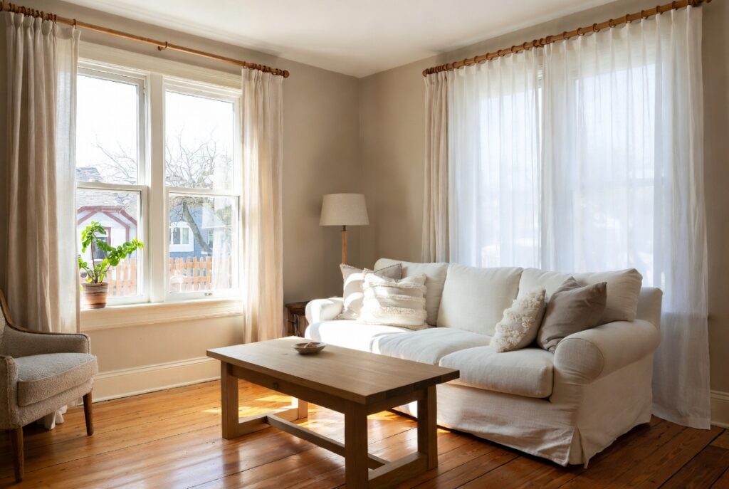
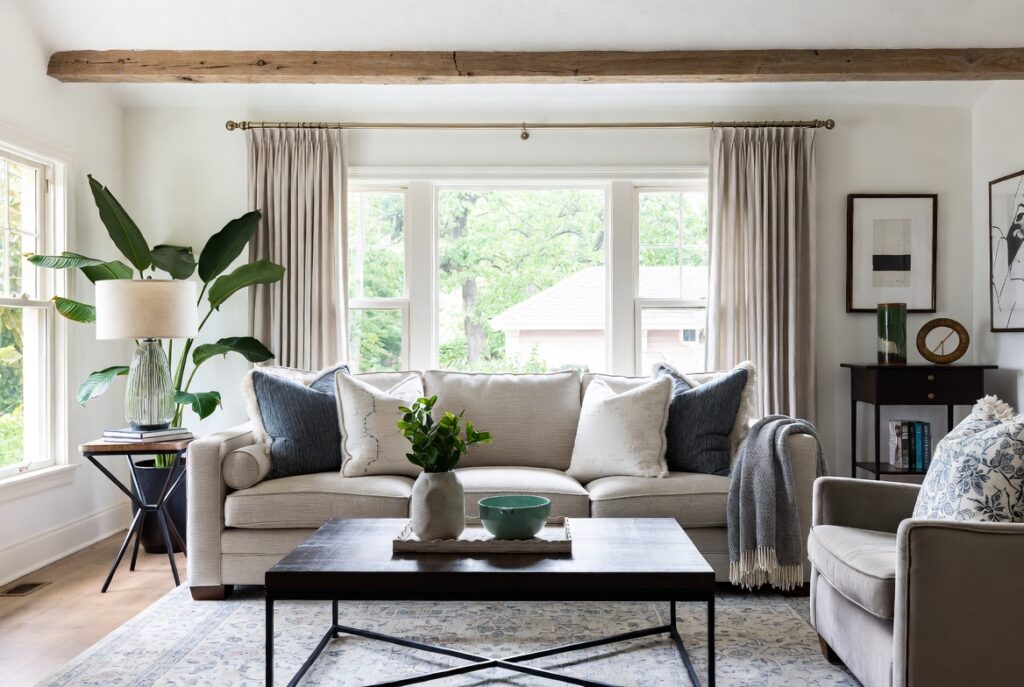
6. Use Curtains Hung High and Wide
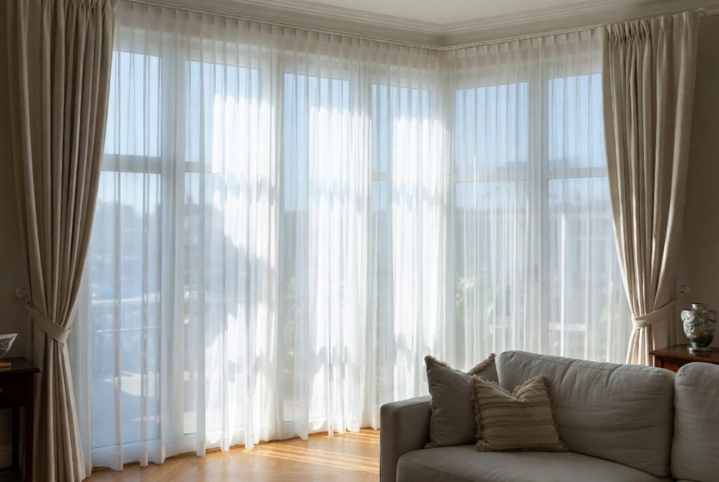
Best for: Any living room with windows — this single change improves almost every window
Curtains hung just above the window frame make windows look small and ceilings look low. Curtains hung just below the ceiling line with the rod extending 8 to 12 inches beyond each side of the window frame make the same window look dramatically larger, the ceiling feel higher, and the room more generous.
This is one of the most frequently cited and least frequently implemented living room improvements. It requires only repositioning the curtain rod — no new curtains needed in many cases, just longer ones.
Curtains should reach the floor — ideally just touching it or with a very slight puddle of 1 to 2 inches. Curtains that stop above the floor look as though they shrank in the wash.
Smart tip: In a living room where privacy isn’t a primary concern, use sheer or linen curtains that diffuse rather than block light. Curtains that soften and warm natural light create a completely different daytime atmosphere from curtains that block it. Both can be appropriate — the choice depends on the room’s orientation and the desired atmosphere.
Mistake to avoid: Choosing curtain fabric that’s too heavy for the window size. Heavy velvet on a modest window makes the window look smaller and the room more oppressive. Lighter fabrics — linen, cotton, sheer — suit all window sizes and create a more relaxed atmosphere in most living rooms.
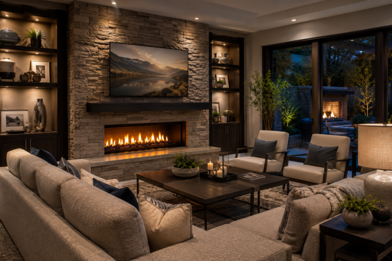
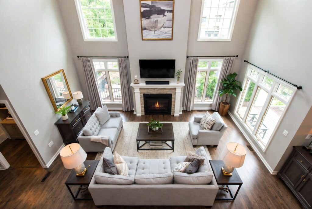
7. Create a Focal Point Fireplace
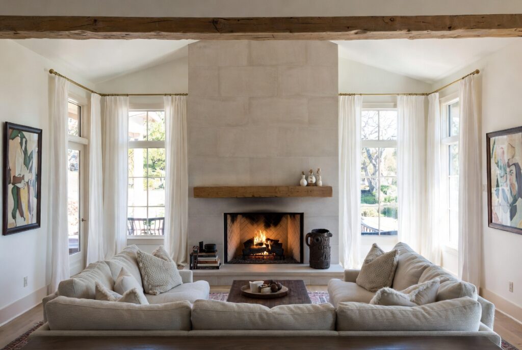
Best for: Any living room with a fireplace, and any living room that needs a clear visual anchor
A fireplace is the most natural focal point in a living room — it provides warmth, light, movement, and sound that draws people toward it instinctively. When a living room has a fireplace, the entire furniture arrangement should acknowledge it: seating facing or oriented toward the fire, a mantel styled as the room’s most considered surface, and no competing elements of equal visual weight on adjacent walls.
For living rooms without a working fireplace: an electric fireplace insert, a bio-ethanol fireplace, or even a well-styled mantel (with mirrors, artwork, or a large clock above it) creates a focal point with similar compositional logic — a defined center that the room’s arrangement references.
Smart tip: The fireplace mantel is the room’s prime styling real estate — the surface and wall immediately above the fireplace. Style it with restraint: one large piece (a mirror, a large artwork, or a statement clock) plus two or three smaller supporting pieces. A mantel crowded with many objects of similar size looks like a display shelf rather than a designed composition.
Mistake to avoid: Hanging a television above the fireplace. The combination of neck strain (the TV is always too high), heat and soot damage to electronics, and the visual competition between two dominant focal points makes this arrangement — despite being popular — consistently problematic. Mount the TV on an adjacent wall where it can be watched at eye level.
8. Add Indoor Plants for Life
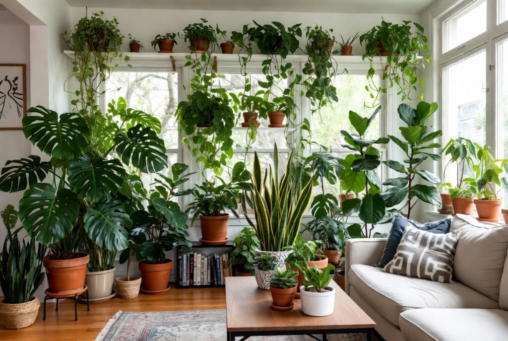
Best for: Living rooms that feel stark, impersonal, or lacking warmth
Plants in a living room do something that no other decorative element achieves — they add genuine living presence. The organic warmth, slight movement, and visual softness of plants in an otherwise hard-surfaced room changes the atmosphere from assembled to inhabited.
The most effective plants for living rooms: a large floor plant (fiddle-leaf fig, olive tree, tall snake plant, bird of paradise) as a statement piece that adds height and presence; trailing plants on high shelves or in hanging positions (pothos, string of pearls, tradescantia) that add softness; and a few smaller plants on surfaces for close-range interest.
Smart tip: One large plant makes more visual impact than many small ones. A single 5-foot fiddle-leaf fig in a good pot in the right corner changes the character of a living room significantly. Five 6-inch pots scattered across different surfaces creates a sense of collection without achieving the visual weight that a large specimen provides.
Mistake to avoid: Placing plants based on aesthetic preference without considering light requirements. A fiddle-leaf fig that looks perfect in a dark corner will decline within weeks. Assess the light conditions at the intended position honestly, then choose a plant suited to those specific conditions.
9. Style the Coffee Table Right
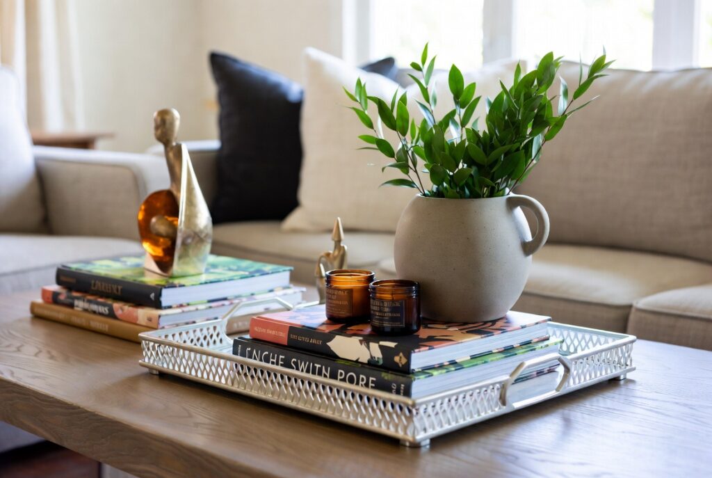
Best for: Any living room — the coffee table is the most visible styling surface in the room
The coffee table sits at the center of the seating arrangement, visible from every seat in the room and at eye level when seated. It needs to be both functional (holding drinks, books, remotes) and considered in its styling.
The classic coffee table styling approach: one larger item (a tray, a stack of books, a sculptural vase), one medium item (a candle, a small plant, a bowl), and one small accent (a coaster, a small object). The tray defines the “organized” zone of the table and prevents the surface from looking scattered.
Smart tip: A tray on a coffee table serves two purposes: it organizes and contains the styling elements, and it provides a dedicated place to set drinks that reads as intentional rather than random. Choose a tray proportional to the table — roughly half the length of the table surface.
Mistake to avoid: Over-styling the coffee table to the point where it has no functional surface for actual use. A coffee table where you can’t set a drink without moving three objects becomes frustrating daily. Leave at least one clear area of functional surface.
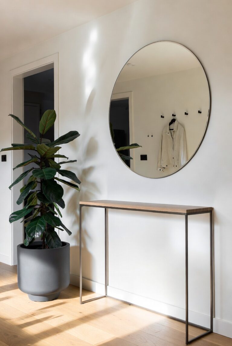
10. Use Mirrors to Expand the Space
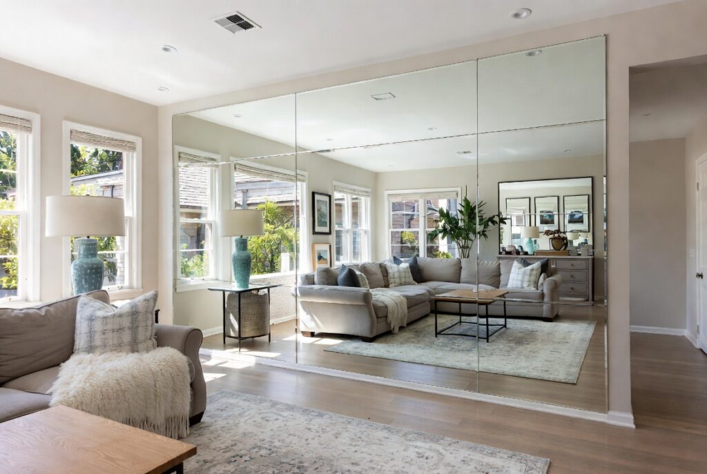
Best for: Small living rooms, dark living rooms, any room that feels smaller than it is
A large mirror in a living room does two things simultaneously: it reflects light — effectively doubling the apparent light in the room — and it creates the visual impression of additional depth, making the room feel larger than its actual dimensions.
The most effective mirror position: on a wall perpendicular to a window, where it reflects natural light back into the room rather than reflecting the viewer. A mirror reflecting a window reads as a second window — an impression that significantly changes the room’s apparent brightness and size.
Smart tip: Choose a mirror that suits the room’s proportions. A full-length vertical mirror on a low wall makes a low-ceilinged room feel taller. A wide horizontal mirror on a narrow wall makes the room feel wider. Mirror size and orientation should serve the room’s specific spatial needs.
Mistake to avoid: Placing a large mirror directly facing the main seating area. A mirror that reflects the backs of the sofa cushions and the room as seen from behind the sitting position creates an odd, disorienting view. Position mirrors to reflect attractive elements — windows, plants, artwork — not the functional backs of furniture.
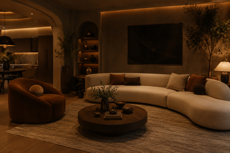
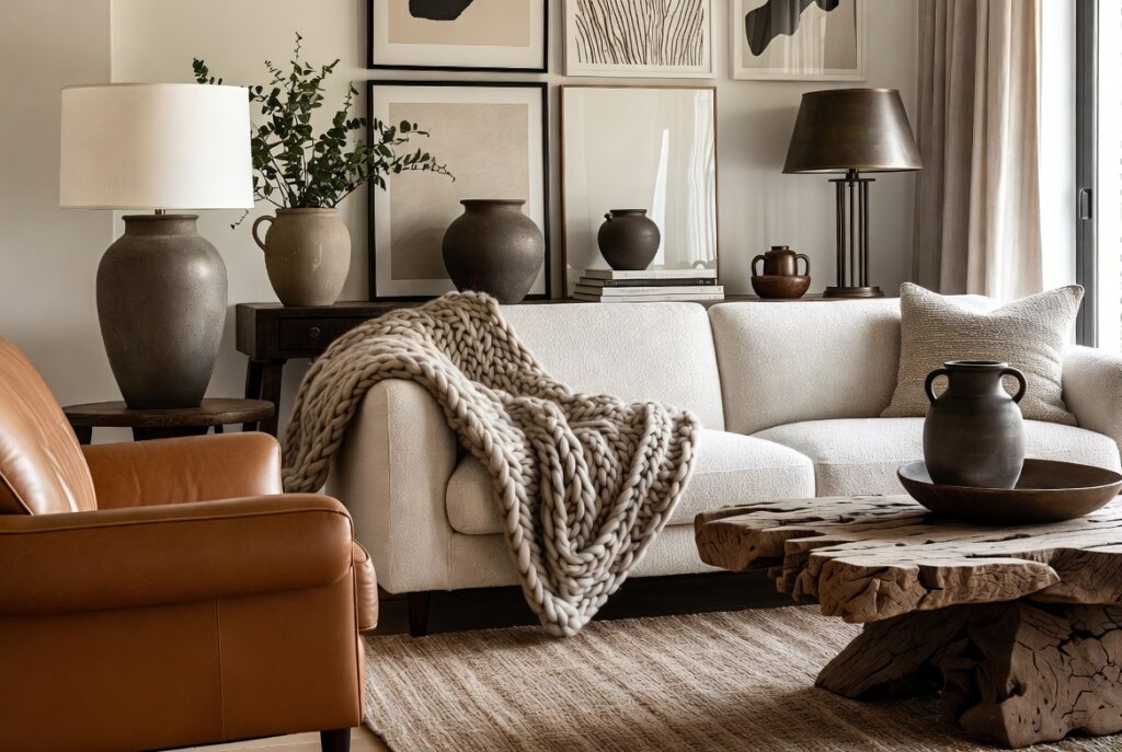
11. Layer Throw Pillows and Blankets
Best for: Any living room sofa or seating area — textile layering is the fastest way to add warmth and personality
Throw pillows and blankets do for a sofa what a rug does for a floor — they add texture, color, and softness that the hard surface of the sofa frame and basic upholstery can’t provide. A sofa with no cushions looks like a showroom piece. The same sofa with layered cushions in two or three complementary textures looks like someone lives there comfortably.
The working formula: two to four cushions in a coordinating palette (not matching exactly), mixing at least two different textures (linen and velvet, cotton and boucle), and one throw blanket folded casually over one arm.
Smart tip: Change cushion covers seasonally rather than replacing cushions entirely. Cushion cover changes take minutes, cost a fraction of new cushions, and allow the living room to feel refreshed without significant expense. Warmer textures (velvet, chunky knit) in autumn and winter; lighter materials (linen, cotton) in spring and summer.
Mistake to avoid: Using too many cushions in too many competing colors or patterns. Three colors maximum in a cushion arrangement; two colors is often more elegant. More than two distinct patterns on the same sofa creates visual chaos rather than considered layering.
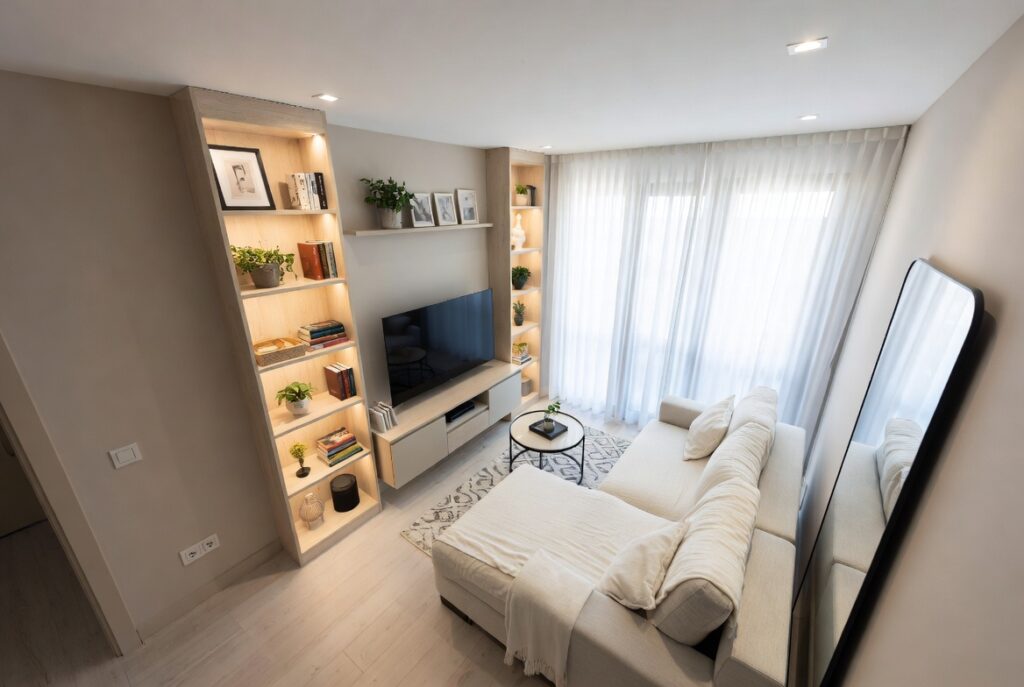
12. Add a Bookshelf as a Feature Wall
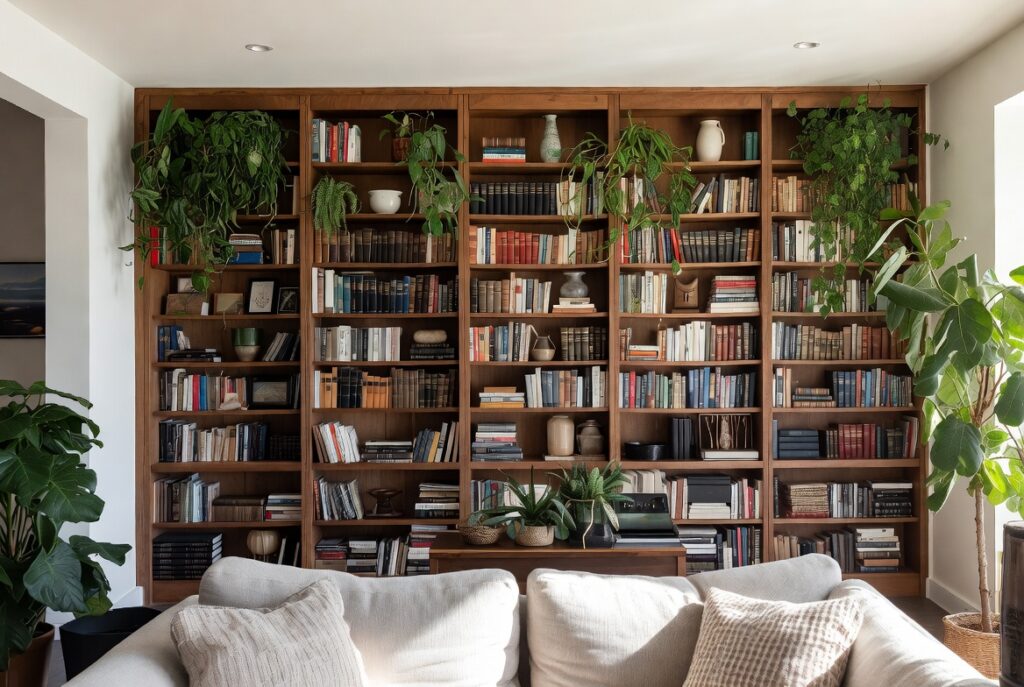
Best for: Living rooms with a blank wall, readers, anyone wanting a functional wall element with strong visual presence
A bookshelf — whether a freestanding unit, a built-in, or a floating shelf arrangement — creates a feature wall that’s genuinely personal. Books are both decoration and autobiography: the collection visible in a living room tells visitors something real about the people who live there, which no piece of purchased decor can achieve.
A well-styled bookshelf mixes books (organized by color, size, or simply by ownership) with objects — a few framed photographs, some sculptural pieces, a plant, a basket. The ratio that usually works: 60 to 70% books, 30 to 40% objects.
Smart tip: Remove dust jackets from hardbacks when shelving them. The underlying cloth binding is almost always more attractive and more consistent in tone than the varied colors and graphic designs of dust jackets. A shelf of cloth-bound books reads as curated; a shelf of dust-jacketed books reads as a collection.
Mistake to avoid: Packing shelves completely. Densely packed shelves with no visual breathing room look like storage rather than a feature. Leave occasional gaps, group books at different heights, and allow some empty shelf space that lets the eye rest between groupings.
13. Choose the Right Sofa Layout
Best for: Any living room where the furniture arrangement doesn’t feel quite right but the individual pieces are good
The furniture layout determines how the living room functions — whether conversations happen easily, whether everyone can see the TV, whether the room feels open or cramped. Most living room layout problems come from one of two tendencies: pushing all furniture against the walls (creating an empty center and conversation distances that are too large), or placing furniture without a clear conversational logic.
The most versatile living room layout: a sofa facing or at right angles to the room’s focal point (fireplace, TV, or view), with a coffee table at a distance of 14 to 18 inches from the sofa edge (close enough to reach but not so close it crowds leg space), and one or two chairs completing the conversational group on adjacent sides.
Smart tip: Float furniture away from walls in most living rooms. A sofa with 6 to 12 inches of space between its back and the wall feels placed; pushed flush against the wall it looks stored. The space behind the sofa can hold a narrow console table — adding surface and definition to the seating group.
Mistake to avoid: Arranging the living room entirely around the television. A layout optimized purely for TV viewing typically fails for conversation and social gathering. Arrange for conversation first — the TV can be watched from a good sofa arrangement; a TV-optimized arrangement can’t easily host conversation.
14. Use an Accent Wall for Drama
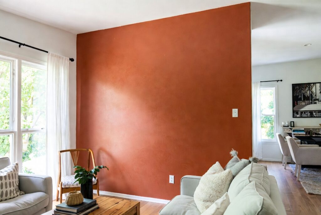
Best for: Living rooms that feel flat or lacking in visual interest, rooms where one wall is more prominent than others
An accent wall — one wall painted in a deeper, more saturated tone than the surrounding three walls — creates visual depth and drama without the commitment of painting the entire room a bold color. The accent wall focuses attention and gives the room a defined hierarchy: one wall is primary, the others are secondary.
The accent wall works best when it’s the wall that already draws the eye — the fireplace wall, the wall behind the sofa (when visible from the entrance), or the wall facing the main seating area. An accent wall on a side wall that’s not naturally prominent can look arbitrary.
Smart tip: Dark accent walls — navy, forest green, charcoal, deep burgundy — are more effective than medium tones. A medium tone accent wall often looks like an unfinished paint job or a color decision that didn’t quite commit. Dark colors create genuine contrast that reads as intentional.
Mistake to avoid: Painting an accent wall without considering what’s on it. An accent wall with a mismatched picture frame, an awkward light switch, or poorly positioned furniture looks worse than a plain wall. The accent wall should be the room’s most considered surface — what’s on it and in front of it matters as much as the color.
15. Add an Accent Chair
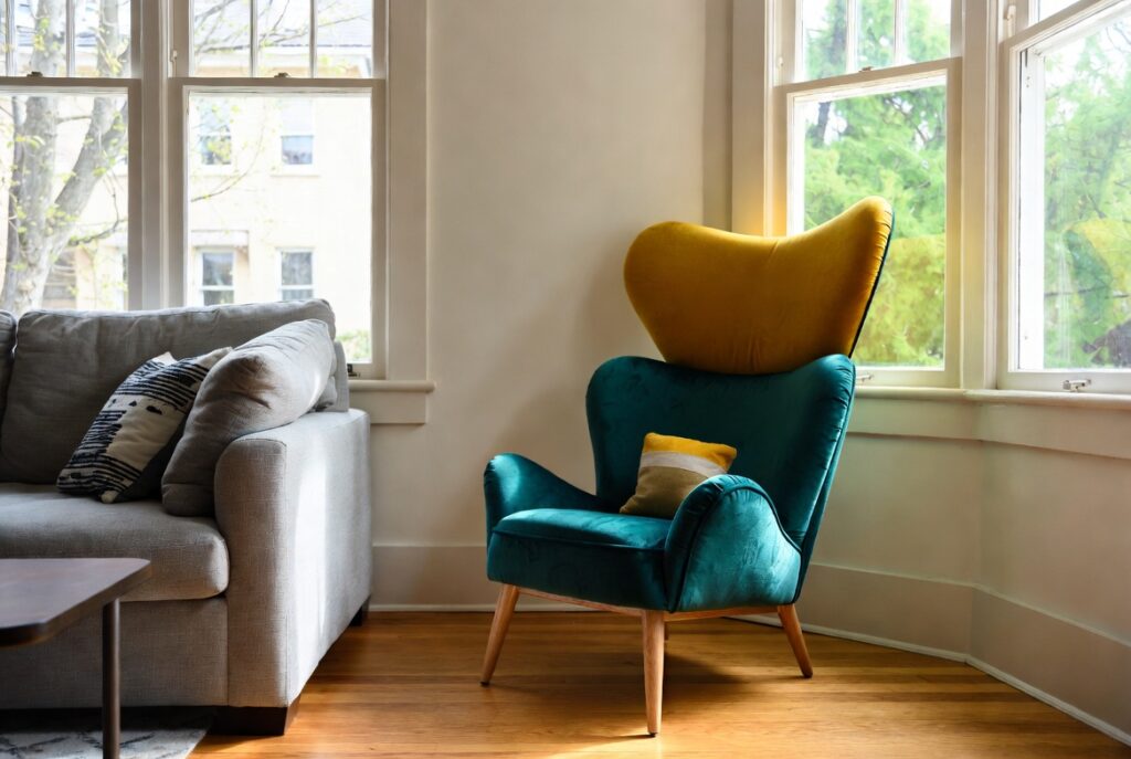
Best for: Living rooms with only a sofa, any seating arrangement that needs visual variety or additional seating
An accent chair — a single chair in a different material, color, or style from the sofa — adds visual interest, provides additional seating, and creates the composed quality of a furniture arrangement rather than just a sofa placement. The contrast between the sofa and the accent chair creates the visual tension that makes a seating group look designed.
The accent chair doesn’t need to match the sofa — it needs to complement it. A velvet accent chair in a contrasting color alongside a linen sofa. A cane or rattan chair alongside an upholstered sofa. A mid-century chair alongside a contemporary sofa. The contrast between materials is more interesting than uniformity.
Smart tip: Position the accent chair at roughly 90 degrees to the sofa rather than directly facing it. A chair facing the sofa creates a formal, interview-like conversational arrangement. A chair at right angles creates a more relaxed, three-way conversational group that feels less confrontational.
Mistake to avoid: Choosing an accent chair that’s uncomfortable. An accent chair that looks good but isn’t pleasant to sit in gets avoided rather than used. The chair needs to be genuinely comfortable enough for the time people actually spend in it — for most living rooms, that means 30 to 60 minutes of comfortable sitting.
16. Style Floating Shelves
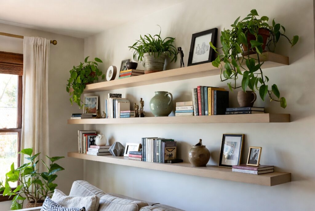
Best for: Any wall that needs interest without the commitment of large furniture, small living rooms where floor space is limited
Floating shelves add vertical interest, display space, and storage to a living room without occupying any floor space. They suit walls where furniture can’t go — flanking a fireplace, above a sofa, in a narrow alcove — and create an opportunity for personal expression through the objects displayed on them.
The most common floating shelf mistake: displaying too many items at similar heights in similar sizes, creating a cluttered horizontal band. Effective shelf styling uses varied heights (tall books standing, shorter books lying flat, objects of different heights), varied depths (some items near the edge, some pushed back), and deliberate empty space.
Smart tip: The rule of three applies to shelf styling: group objects in threes of varied heights. A tall item, a medium item, and a short item arranged in a triangle create a more natural-looking group than items of similar heights lined up in a row.
Mistake to avoid: Installing shelves that are too close together. Shelves with less than 12 inches of vertical clearance feel cramped and limit what can be displayed. 12 to 14 inches between shelves allows books, medium-sized objects, and plants to sit comfortably without everything looking crowded.
17. Declutter for a Calmer Space
Best for: Any living room that feels visually busy or stressful — decluttering is the most impactful free improvement available
The visual calm of a well-designed living room depends as much on what’s absent as on what’s present. Every unnecessary object on a surface adds to the visual load that the eye processes when entering the room. Reduce that load and the room immediately feels more composed — even if nothing else changes.
Decluttering a living room doesn’t require minimalism. It requires that every visible object has a reason to be there — it’s beautiful, it’s meaningful, or it’s functional. Objects that are none of these three things should be stored or removed.
Smart tip: Do a timed 20-minute surface clear before assessing the living room. Remove everything from all surfaces (shelves, coffee table, side tables) and put it temporarily in boxes. Then return only the items that meet the three criteria — beautiful, meaningful, functional. Items that don’t meet any of the three go to storage or disposal.
Mistake to avoid: Solving a clutter problem by buying more storage. Storage purchases often become additional surfaces for accumulation rather than solutions to the underlying issue. Address why clutter accumulates (inadequate systems, too many objects, habit) before investing in additional storage.
18. Small Living Room Layout Tips
Best for: Living rooms under roughly 200 square feet where every furniture decision affects the room’s functionality
In a small living room, layout is the design. A well-arranged small living room — furniture positioned to maximize circulation and conversation while minimizing visual crowding — functions and feels significantly better than the same furniture arranged poorly.
Key small living room principles: use a sofa scaled to the room (a 60 to 72-inch two-seater rather than a 90-inch three-seater in a small room); choose furniture with legs rather than floor-level bases (you can see the floor beneath, which reads as more space); avoid blocking natural light paths with furniture; and use a single large rug rather than multiple small ones.
Smart tip: A sofa placed against the wall in a small living room often works better than floating it. The wall provides a defined back edge that clarifies the room layout and maximizes the floor space in front of the seating area. The rule about floating furniture applies primarily to rooms with adequate space.
Mistake to avoid: Filling every corner with furniture in a small living room. Empty corners in a small room read as breathing space. Filling them creates a cluttered, busy atmosphere. Leave at least one corner clear of furniture and use it for a plant, a floor lamp, or nothing at all.
19. Add Texture Through Materials
Best for: Living rooms with a neutral palette that feels flat or lacking depth
Texture is what prevents a neutral living room from feeling bland. A room with walls, sofa, and rug all in similar neutral tones looks flat and uninteresting — but the same tones in different materials (smooth plaster walls, linen sofa, wool rug, velvet cushions, rattan side table, ceramic lamp base) create a richness that reads as designed and considered.
The principle: vary the material in every horizontal and vertical surface. Wall: plaster or paint. Sofa: linen or velvet. Rug: wool or cotton. Coffee table: wood or marble. Cushions: a mix of textures. Lamp: ceramic, rattan, or metal. Each material adds a different quality of light reflection and tactile interest.
Smart tip: Introduce natural materials deliberately — woven baskets, rattan, wood, stone, ceramic, linen — as these add the organic quality that makes a room feel warm and lived-in rather than showroom-like. Even a single rattan tray or woven basket introduces natural texture that synthetic materials can’t replicate.
Mistake to avoid: Mixing too many bold textures simultaneously. Boucle sofa plus shag rug plus heavily textured wallpaper plus chunky knit throws creates a room that’s exhausting to be in. Use one or two bold textures as accents against smoother, simpler backgrounds.
20. Make the Sofa the Focal Point
Best for: Every living room — this is the principle that ties all other ideas together
In a living room, the sofa performs the same compositional function that the bed performs in a bedroom — it’s the largest, most important, most used element, and everything else should support and frame it rather than compete with it. When the sofa is clearly the primary element and other furniture, lighting, and decor support it, the room feels resolved. When multiple elements compete with the sofa for dominance, the room feels unsettled.
This means: the rug is sized for the sofa arrangement, not independently; the lighting is positioned to serve the sofa area; the artwork and styling is concentrated on the wall the sofa faces or the wall behind it; and secondary furniture — accent chair, side tables, coffee table — is scaled and positioned in relation to the sofa.
Smart tip: If the living room feels unresolved and you can’t identify why, photograph it. The camera flattens the three-dimensional space and makes the visual hierarchy — or lack of it — more apparent than it is when you’re standing in the room. The photograph usually reveals clearly which element is competing with the sofa for attention.
Mistake to avoid: Treating the television as the room’s focal point and arranging everything around it. A room arranged primarily around the TV typically fails for conversation, social gathering, and daily living. The sofa is the focal point; the TV is a feature that the sofa arrangement accommodates — not the other way around.
Before You Start
- Measure everything before buying anything. The sofa, rug, coffee table, and curtain rod positions all depend on precise room dimensions. Measure the room, draw a simple plan to scale, and test furniture sizes on the plan before purchasing.
- Fix the lighting first. Add a floor lamp and a table lamp before making any other purchase. The change in atmosphere often reveals that less additional investment is needed than expected.
- Identify the focal point. Decide what the room is arranged around — fireplace, view, TV, or a specific wall — before choosing furniture or layout. Everything else follows from this decision.
- Start with the sofa. It’s the most important piece. Get the sofa right in size, color, and comfort before purchasing anything else.
- Live with it before adding more. After making initial changes, spend two weeks in the room before adding anything else. The perspective gained by living with a partially finished room almost always clarifies what’s actually needed rather than what initially seemed necessary.
Conclusion
A living room that works well is one where the proportions are right, the lighting suits the time of day, the furniture is comfortable enough to actually use, and the surfaces are edited rather than accumulated. Most of these qualities require decisions more than purchases — choosing what not to include is often more impactful than choosing what to add. Start with the structural elements (layout, lighting, rug), get those right, and the decorative elements that follow will have a foundation worth building on.