Most rooms that feel wrong don’t need new furniture. They need their existing furniture rearranged, some pieces removed, and a clear understanding of what the room is actually for. Layout is the most powerful and most underestimated tool in interior design — a room with mediocre furniture and an excellent layout will feel better every day than a room with expensive furniture arranged badly.
These 20 ideas cover every room and every common layout challenge — from the fundamental principles that apply everywhere to specific solutions for small spaces, awkward proportions, and open-plan arrangements.
1. Start with a Focal Point
Best for: Every room — a focal point gives the layout its organizing principle and the room its sense of direction
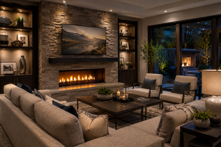
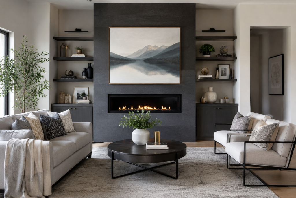
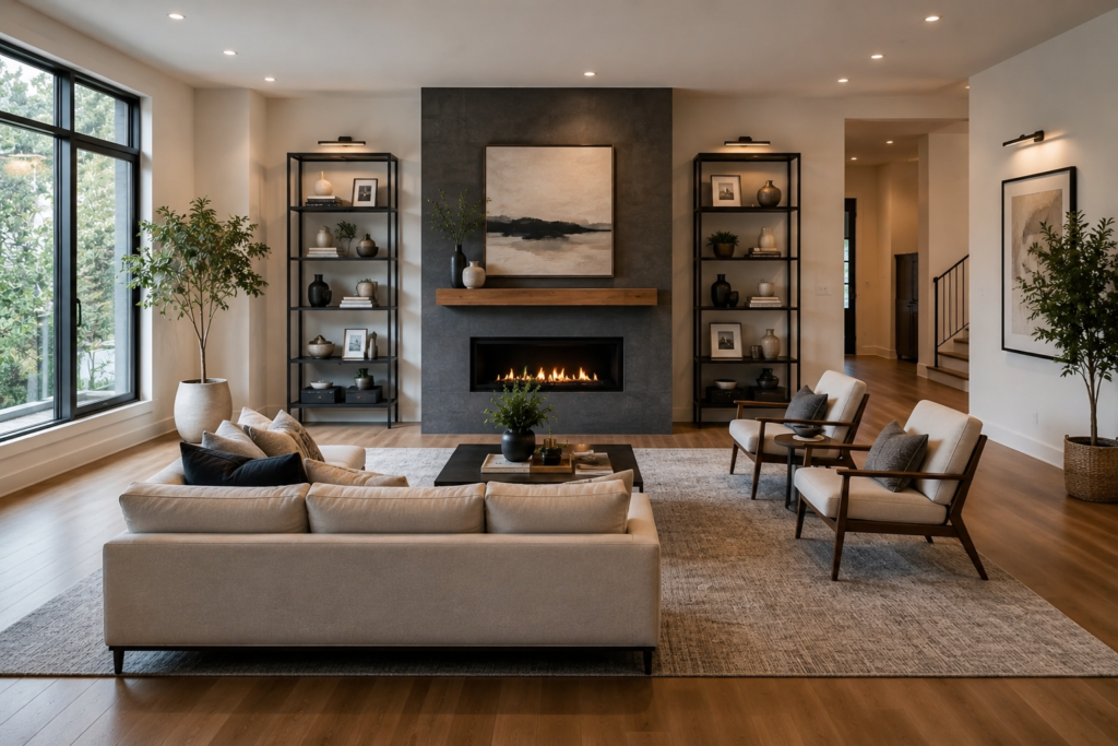
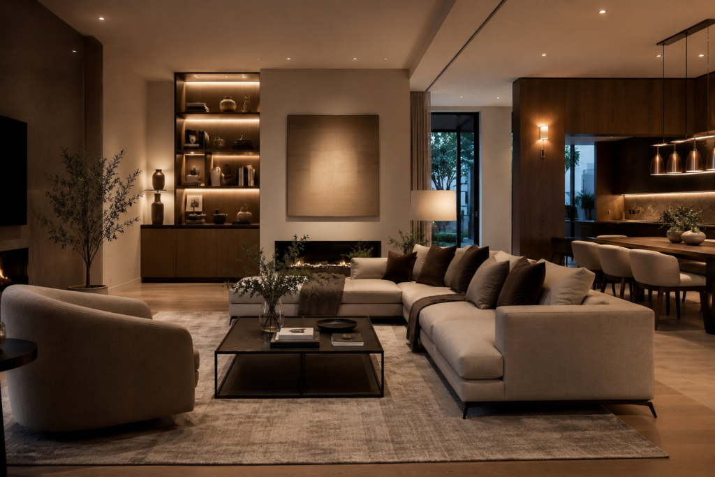
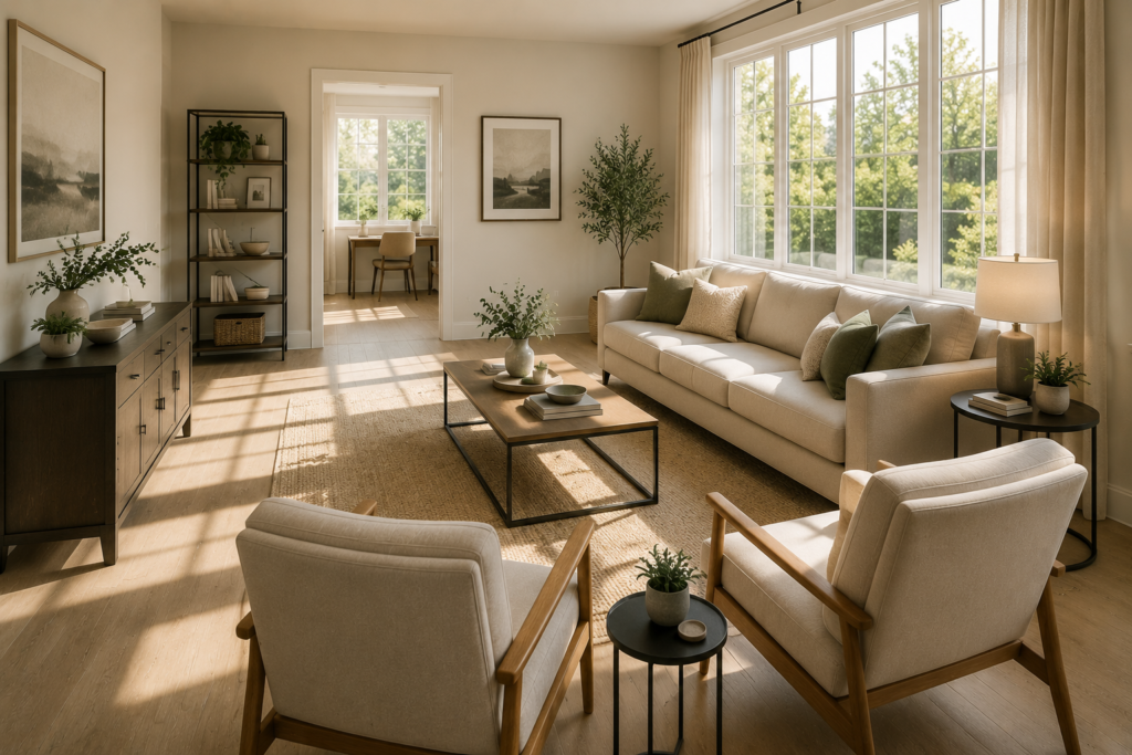
Every successful room layout begins with identifying the focal point — the element that the eye naturally moves toward first and that the furniture arrangement should acknowledge. In a living room, this is typically the fireplace, the largest window, or the television. In a bedroom, it’s the bed. In a dining room, it’s the table under the pendant light.
Furniture arranged to face and acknowledge the focal point creates a coherent layout — every piece knows its relationship to the room’s center of gravity. Furniture arranged without reference to a focal point creates a scattered, purposeless arrangement regardless of the quality of the individual pieces.
Smart tip: If a room has no obvious natural focal point — no fireplace, no significant window, no architectural feature — create one. A large piece of art, a dramatic bookcase, or a distinctive piece of furniture can serve as a manufactured focal point around which the rest of the layout organizes. The manufactured focal point works just as well as a natural one as long as it’s genuinely significant in scale.
Mistake to avoid: Trying to create two equal focal points in the same room. A living room where both the fireplace and the television are given equal visual emphasis creates a layout that can never fully commit to either — furniture can’t face two things at once. Choose one primary focal point and treat the other as secondary.
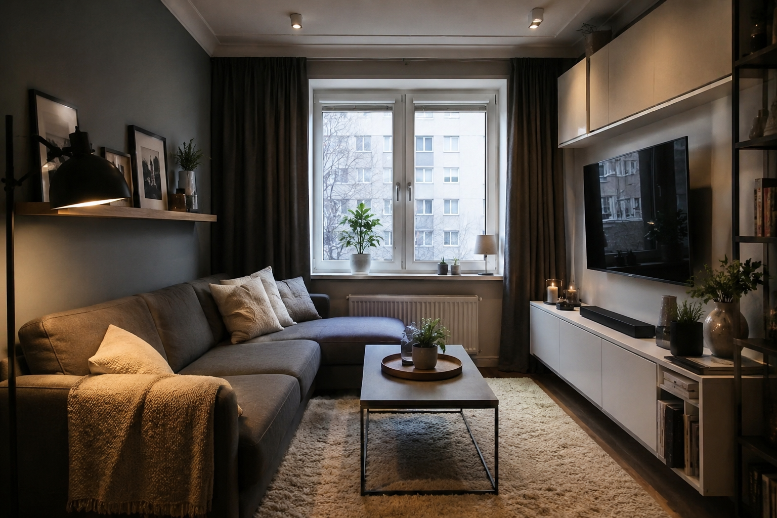
2. Float Furniture Away from Walls
Best for: Any room larger than approximately 12×12 feet — pulling furniture away from the walls creates intimacy and scale
The instinct to push all furniture against the walls — leaving the center of the room empty — produces a layout that feels like a waiting room. All the seating is at the room’s periphery, the center is dead space, and conversation requires people to shout across an empty middle ground.
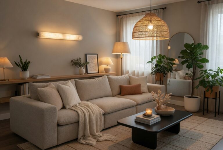
Floating the main seating group away from the walls — creating a few inches to a few feet of space between the sofa’s back and the wall — immediately improves a room’s social quality. The space between the furniture and the wall creates depth, the floating arrangement creates a defined seating zone within the larger room, and the result feels more intimate and more designed.
Smart tip: Pull the sofa 12 to 18 inches away from the wall as a starting point and assess the visual difference. Even this modest floating — less than two feet — creates a significant change in how the room feels. The gap behind the sofa can be filled with a console table that provides both a visual surface and practical storage.
Mistake to avoid: Floating furniture in a small room where there isn’t adequate clearance for circulation. In a room less than 12 feet wide, floating the sofa away from the wall can create awkward, narrow passages that make the room harder to navigate rather than easier. Float furniture only when the room dimensions genuinely support circulation around the furniture arrangement.
3. Create a Conversation Layout
Best for: Living rooms used primarily for social gathering — the conversation layout prioritizes face-to-face interaction
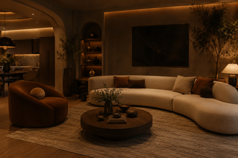
A conversation layout places seating so that people can talk comfortably without raising their voices or turning awkwardly to face each other. The maximum comfortable conversation distance is approximately 8 to 10 feet — beyond this, normal conversation volume becomes inadequate and the social connection degrades.
The classic conversation layout: two sofas facing each other across a coffee table, or a sofa and two armchairs forming a U or L shape around the coffee table. Every seat has a clear sightline to every other seat, and the coffee table provides a shared surface that anchors the arrangement.
Smart tip: Include at least one movable chair in any conversation layout — an armchair or occasional chair that can be repositioned to accommodate varying group sizes. A conversation arrangement designed only for the household’s standard use becomes awkward when guests arrive in numbers that the fixed seating can’t accommodate comfortably.
Mistake to avoid: Making the conversation area too large by choosing a coffee table that’s too wide. A coffee table more than 18 to 20 inches wide pushes the facing sofas further apart than comfortable conversation distance requires. The coffee table’s width directly determines the social distance between facing seats — choose a table that maintains intimate conversation distance rather than one that fills the visual center of the arrangement.
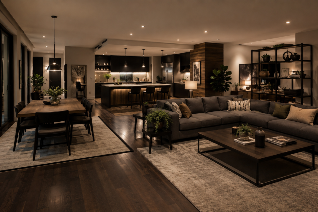
4. Define Zones in Open Plan Spaces
Best for: Open-plan living, dining, and kitchen arrangements — zone definition creates order without physical walls
An open-plan space without defined zones reads as a large, undifferentiated area where furniture floats without clear purpose. Defining distinct zones — the living area, the dining area, the kitchen — within a single open space creates the organizational clarity of separate rooms while maintaining the openness and connection that open-plan living provides.
Zone definition tools: rugs (each zone gets its own rug that defines its boundaries); furniture arrangement (the back of a sofa facing away from the kitchen defines the boundary between living and kitchen zones); lighting (pendant lights mark the dining zone; different lighting in the living zone distinguishes the spaces); and level changes (a step up or down, where architecturally available).
Smart tip: Use the back of the sofa as a room divider in open-plan spaces. A sofa with its back to the kitchen and its face toward the living space creates a clear visual boundary between zones without any physical barrier. A console table placed immediately behind the sofa — on the kitchen-facing side — provides additional zone definition and a practical surface.
Mistake to avoid: Creating zones that are too small for their intended function. A dining zone that barely fits the table and chairs with insufficient circulation space around it looks squeezed into an afterthought position. Each zone needs enough space to function comfortably — including the space for people to move around furniture, pull out chairs, and access the zone from multiple directions.
5. Maximize a Small Living Room

Best for: Any living room under approximately 180 square feet — small room layouts require specific strategies that counterintuitively work
Small living rooms are improved by strategies that seem counterintuitive: keeping the central area clear rather than filling it, choosing one larger sofa instead of multiple smaller pieces, and using vertical space rather than floor space for storage and display. The most common small room mistake — filling every available inch — creates a room that feels cluttered rather than efficiently used.
The key principle: fewer, larger pieces of furniture create more perceived space than many small pieces. A single large sofa, one coffee table, and one armchair leave more apparent floor space than the same area filled with a small sofa, two small armchairs, a side table, a console, and a small coffee table.
Smart tip: Choose furniture with visible legs rather than pieces that sit on the floor. A sofa on legs rather than a platform base allows the floor to be seen beneath the furniture — creating visual continuity that makes the floor appear larger. This single characteristic — visible legs — makes furniture appear lighter and less space-consuming than equivalent platform-based pieces.
Mistake to avoid: Using small furniture in a small room in an attempt to create the illusion of space. A small sofa doesn’t make a small room feel larger — it makes the room feel like it’s furnished with undersized pieces. Appropriately sized furniture that fits comfortably within the space without crowding it creates a better result than miniaturized pieces that reference the room’s limitations.
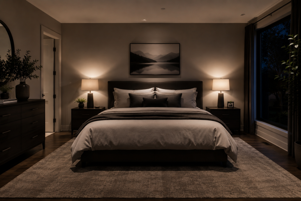
6. Position the Bed for Best Sleep
Best for: Any bedroom — bed placement is the most important single furniture decision in the room
The bed’s position in a bedroom determines everything else — how the remaining furniture arranges, how traffic moves through the room, and fundamentally how the room feels. The optimal bed position: against the wall that faces the door, so that a person in bed has a clear view of the room’s entrance without being directly in line with the door.
This position — sometimes described in feng shui as the “command position” — creates a subconscious sense of security and control. Being able to see the room from bed without being directly exposed to the doorway satisfies the instinctive preference for protected positions with wide visual fields.
Smart tip: Center the bed on its wall rather than pushing it into a corner or positioning it asymmetrically. A centered bed creates visual balance in the room, allows equal access from both sides (important for couples), and accommodates bedside tables symmetrically on both sides — creating the composed, hotel-quality bedroom aesthetic.
Mistake to avoid: Positioning the bed under a window. A bed under a window exposes the sleeper to drafts in winter, direct sun in the morning, and the psychological discomfort of an unprotected position — with the window as a potential intrusion point behind the sleeper’s head. Avoid window-placement unless no other option is available.
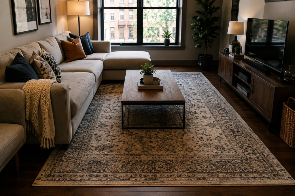
7. Use a Rug to Anchor the Layout
Best for: Any room with hard flooring — the rug is the layout’s foundation, defining the zone and anchoring the furniture
A rug placed beneath the main furniture grouping does what no other single element achieves: it defines the zone, anchors the furniture arrangement, adds warmth and acoustic softness, and makes the layout look considered rather than provisional. A room with a well-chosen, appropriately sized rug looks more finished than the same room without one, regardless of the quality of everything else.
The sizing rule for living rooms: the rug should be large enough that all the main seating pieces have at least their front legs on it. For bedrooms: the rug should extend at least 18 to 24 inches beyond each side of the bed.
Smart tip: Place the rug before arranging the furniture to establish the zone before filling it. A rug positioned first — defining the area the seating arrangement will occupy — creates a cleaner organizational logic than furniture placed first with a rug added afterward. The rug-first approach ensures the rug and furniture are genuinely in relationship rather than merely adjacent.
Mistake to avoid: Using a rug that’s too small for the furniture arrangement. A rug that only the coffee table sits on — with the sofa and chairs on bare floor — creates a disconnected, floating quality that looks like the rug was an afterthought. The rug should be large enough to establish a genuine zone, with furniture and rug clearly in relationship.
8. Choose Furniture Proportional to the Room
Best for: Every room — furniture at the wrong scale for a room undermines the layout regardless of arrangement quality
The most common furniture scale error is choosing pieces that are too small for the room — a small sofa against a large wall, small artwork on a high ceiling, a tiny rug in a large space. Small pieces in a large room look lost and make the room feel sparsely furnished rather than spaciously open.
The second scale error is choosing pieces that are too large — a massive sectional that fills a small room, an oversized coffee table that leaves no circulation space, a dining table that seats ten in a room designed for six.
Smart tip: Measure the room before purchasing any significant piece of furniture — and measure with tape rather than estimating by eye. The eye consistently misjudges room dimensions and furniture scale; tape measures consistently tell the truth. Mark the furniture’s footprint on the floor with painter’s tape before purchasing to assess the actual impact of the piece in the actual space.
Mistake to avoid: Purchasing furniture in a showroom without assessing how it will look in the actual room context. Furniture in a showroom is surrounded by other furniture at similar scale — the proportional relationships that make it look right in the showroom may not transfer to a domestic room with different dimensions, ceiling heights, and adjacent pieces.
9. Plan Traffic Flow First
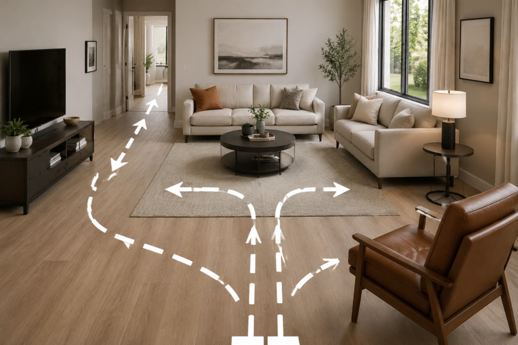
Best for: Any room — traffic flow determines whether a layout is livable or merely decorative
A layout that looks beautiful in a floor plan but creates awkward, narrow, or circuitous circulation routes fails in daily use. Traffic flow — the paths people take through and around furniture in normal use — must be assessed before finalizing any layout. The standard clearance guidelines: 36 inches minimum for primary circulation routes; 24 to 30 inches for secondary routes between furniture pieces; 18 inches minimum around dining chairs when occupied.
Traffic flow issues reveal themselves most clearly when a room is in use — paths that require squeezing past furniture or turning sideways create daily friction that reduces how much the room is enjoyed.
Smart tip: Walk through the intended layout before finalizing it. Stand in the positions you use most — the sofa position, the chair beside the lamp, the dining table seat — and mentally move through the room’s circulation routes. Pay particular attention to the paths from the room’s entrance to its main seating, and from the seating to the television, the fireplace, and the exit points.
Mistake to avoid: Prioritizing visual symmetry over practical circulation. A symmetrical furniture arrangement that creates a narrow bottleneck at the room’s primary circulation point — typically the path from the entrance to the main seating — looks good in photographs and feels frustrating every day. Practical flow always takes priority over visual perfection in the rooms people actually live in.
10. Use Multifunctional Furniture
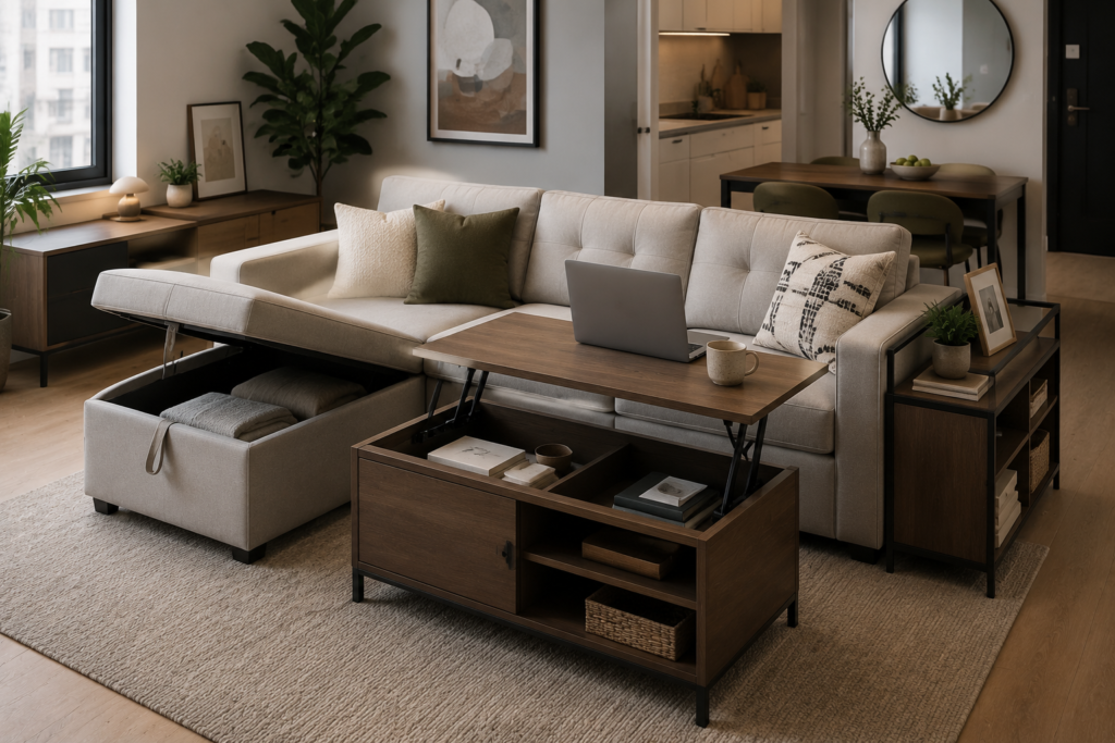
Best for: Small spaces and rooms that serve multiple purposes — multifunctional furniture provides the storage and flexibility that dedicated single-use pieces can’t
Multifunctional furniture — an ottoman with hidden storage, a sofa bed, a dining table with fold-down extensions, a bed with built-in drawers — provides multiple uses from a single piece’s footprint. In small rooms where every square foot matters, multifunctional furniture is the most effective single category of improvement available.
The most useful multifunctional pieces: storage ottomans that serve as coffee tables and seat storage simultaneously; beds with integrated drawers that eliminate the need for a separate chest of drawers; dining tables with leaves that expand for entertaining and retract for daily use.
Smart tip: Prioritize multifunctional pieces for the rooms that serve the most different purposes — a guest room that also functions as a home office, a living room that also accommodates occasional overnight guests, a bedroom with insufficient wardrobe space. The rooms with the most conflicting requirements benefit most from furniture that can shift between uses.
Mistake to avoid: Choosing multifunctional furniture that’s awkward to convert from one function to the other. A sofa bed that requires 20 minutes and significant physical effort to convert from sofa to bed will not be used as a bed. The conversion mechanism must be genuinely easy to operate — furniture that requires daily conversion needs daily ease of conversion to be practically useful.
11. Layout a Dining Room for Entertaining
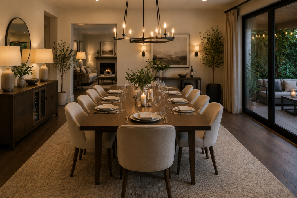
Best for: Dining rooms and dining areas — the layout determines how many people can be accommodated and how comfortably
A dining room layout begins with the table — its size, its shape, and its position in the room determine everything else. The standard clearance between the table edge and the nearest wall or furniture is 36 inches — enough space for a person to sit at the table and push the chair back without hitting the wall, and for another person to circulate behind the seated person.
Round or oval tables are more sociable than rectangular ones for equivalent group sizes — they eliminate head-of-table hierarchy and allow everyone to make eye contact with everyone else. Rectangular tables are more efficient in terms of seating capacity per square foot.
Smart tip: Choose an extendable table for a dining room that needs to accommodate different group sizes. An extendable table at its smallest size is appropriate for daily household use; at its largest, it accommodates entertaining. The daily quality of a smaller, right-sized table is better than living permanently with a large table that’s only needed occasionally.
Mistake to avoid: Placing the dining table too close to the kitchen entrance. Chairs on the kitchen-adjacent side of the table will conflict with people entering and leaving the kitchen — particularly during service when kitchen traffic is heaviest. Leave at least 42 to 48 inches between the kitchen entrance and the nearest dining chair back.
12. Design a Home Office Layout
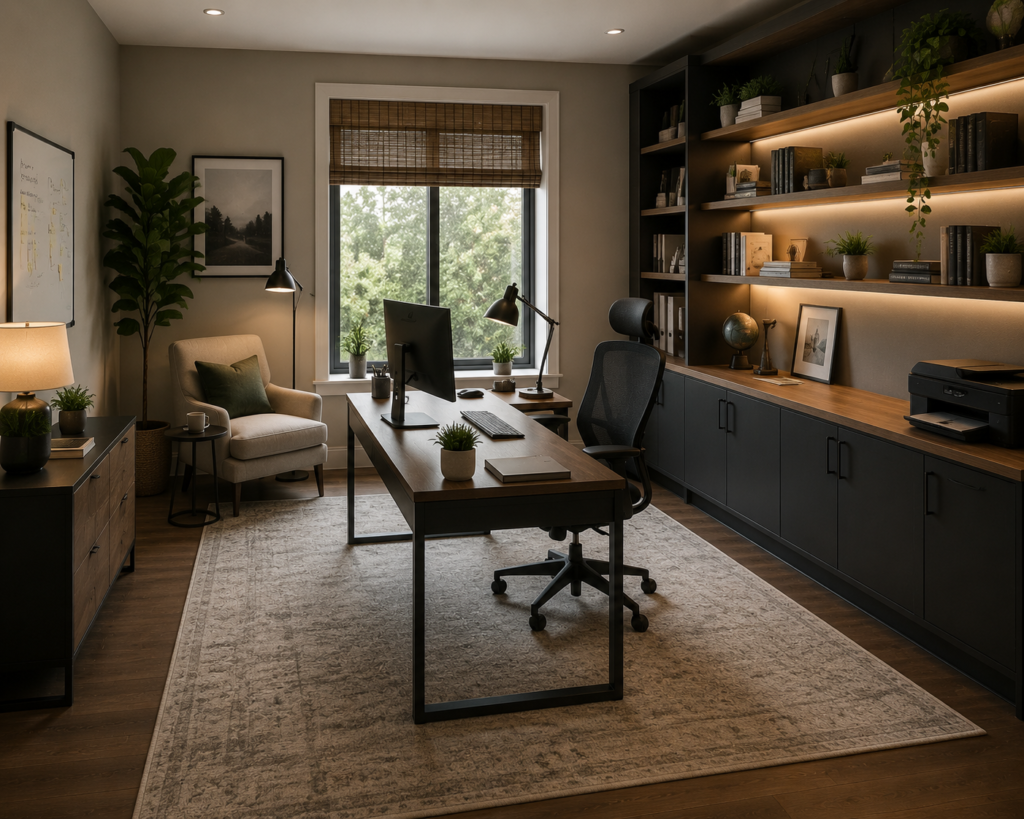
Best for: Dedicated home offices and home office corners — desk position and flow determine productivity more than any other factor
The home office layout begins with the desk position — the single most important decision in any work-from-home space. The desk should face the room rather than a wall where possible, to avoid the psychologically enclosed feeling of facing a blank surface. If the desk must face a wall, a window in that wall provides visual relief and natural light that significantly improves the working experience.
Position the desk where natural light comes from the side rather than directly behind or in front of the monitor — light from behind creates glare on the screen; light from directly in front creates silhouette conditions that make video calls difficult.
Smart tip: Position the desk chair with a solid wall behind it for video calls — a wall behind the chair creates the most professional, distraction-free video call background available. A view of the cluttered room, a window with changing light, or a bed all create video backgrounds that signal an improvised workspace rather than a dedicated professional environment.
Mistake to avoid: Creating a home office layout that doesn’t separate work from living spatially. A desk positioned in the bedroom’s sleeping zone, or in the living room’s primary relaxation zone, creates a spatial conflation between work and rest that undermines both. If a dedicated room isn’t available, use a corner, a closet conversion, or a clearly defined zone that can be visually separated from the room’s primary function.
13. Arrange Furniture for Natural Light
Best for: Any room — natural light is the most valuable quality in any interior space and furniture should enhance rather than obstruct it
Natural light is the most valuable quality any room possesses — and furniture arrangement that blocks, diffuses, or underuses available natural light wastes the room’s primary asset. The relationship between furniture and windows determines how light moves through the room and how the room feels throughout the day.
Key principles: don’t place tall furniture directly in front of windows; position seating to take advantage of natural light rather than face away from it; use light-colored walls and floors to reflect and distribute natural light deeper into the room; and keep window treatments minimal during the day to maximize light entry.
Smart tip: Arrange seating so that the primary reading and relaxation positions receive natural light from the side or slightly ahead — not from directly behind. Natural light from behind a seated person creates uncomfortable glare in the eyes of anyone facing them and makes reading or screen use difficult. Side-lit positions are the most comfortable for sustained use.
Mistake to avoid: Placing a large sofa across a window to maximize floor space elsewhere in the room. A sofa blocking a significant window sacrifices the room’s primary light source for a marginal spatial gain. The light that the sofa obstructs is more valuable than the floor space it frees — position the sofa elsewhere even if the floor plan is slightly less efficient.
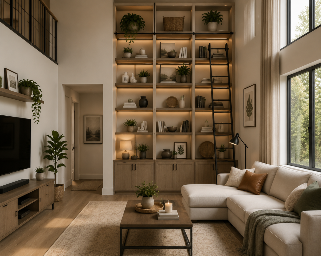
14. Use Vertical Space Effectively
Best for: Small rooms and rooms with high ceilings — vertical space is consistently underused in most homes
Floor space is finite and expensive; vertical space is typically abundant and underused. In small rooms, the shift from floor-based to wall-based storage and display — floor-to-ceiling shelving, wall-mounted cabinets, hanging storage — frees floor area that allows the room to breathe and feel more spacious.
In rooms with high ceilings, the vertical space above standard furniture height is architecturally significant but often ignored — it can be addressed through tall bookcases, stacked picture arrangements, tall plants, hanging lights at varying heights, and shelving that extends toward the ceiling.
Smart tip: Install shelving significantly higher than eye level in rooms where storage is a priority. Shelving at 7 to 8 feet stores items that don’t need frequent access — seasonal items, rarely referenced books, archived documents — without consuming the wall space at the more visually prominent and more functionally important eye-level zone.
Mistake to avoid: Adding shelving to every wall in a small room in an attempt to maximize storage. Shelving on all four walls of a small room creates a claustrophobic, library-stacks quality that makes the room feel smaller rather than better organized. Concentrate wall storage on one or two walls and keep adjacent walls clear to maintain visual breathing room.
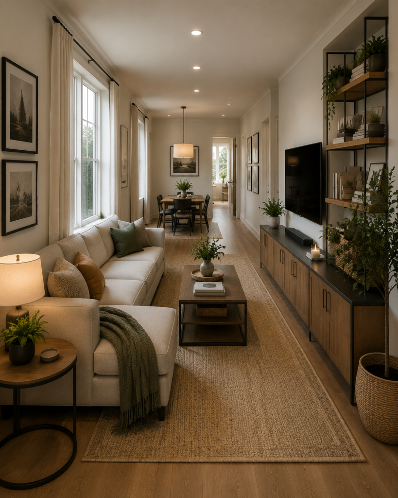
15. Arrange a Long Narrow Room
Best for: Hallway-shaped rooms that feel like corridors regardless of how they’re furnished
A long, narrow room — where the length significantly exceeds the width — presents the most challenging layout problem in residential design. The standard approach of placing furniture along the long walls reinforces the corridor quality; the correct approach counteracts it.
The solutions: create two or more furniture groupings across the room’s length rather than one long arrangement; place furniture across the room’s width rather than along its length; use a rug that emphasizes the width rather than the length; and position the primary sofa arrangement perpendicular to the long walls rather than parallel to them.
Smart tip: Use a large piece of furniture — a bookcase, a dividing shelf, or a credenza — to divide a very long room into two distinct zones. This division converts one problematic corridor-shaped room into two appropriately proportioned zones, each with its own layout and its own character. The division can be partial — open above, allowing light and visual connection between zones — while still creating the sense of two separate spaces.
Mistake to avoid: Placing a sofa along the longest wall in a narrow room. This is the instinctive response to a long narrow room and the one that most reinforces the corridor quality. A sofa along the long wall requires the viewer to sit facing the opposite long wall — amplifying the sense of a narrow, channel-like space. Orient the sofa perpendicular to the long axis instead.
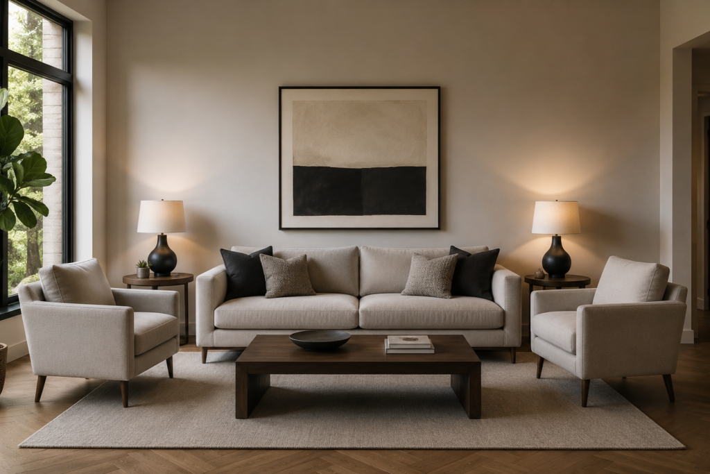
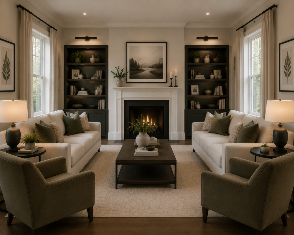
16. Create a Symmetrical Layout
Best for: Formal rooms and rooms where a calm, ordered quality is the design priority
A symmetrical furniture arrangement — matching pieces on either side of a central axis (typically the fireplace, the bed, or the main window) — creates a visual calm and formality that asymmetric arrangements can’t achieve. The brain reads symmetry as order, and order creates the settled, composed quality of a well-considered room.
The most classic symmetrical arrangements: identical bedside tables and lamps flanking the bed; matching armchairs flanking a fireplace; paired sofas facing each other across a coffee table; twin bookcases on either side of a central architectural feature.
Smart tip: Create symmetry through the arrangement of pieces that aren’t identical — two different armchairs at similar scale, positioned symmetrically, create a softer, more personal symmetry than identical pairs. The arrangement is symmetrical; the individual pieces have different character. This “collected symmetry” creates order without the showroom quality of perfectly matched pairs.
Mistake to avoid: Forcing symmetry onto a room whose architecture doesn’t support it. A room with a window on one side of the fireplace and a door on the other cannot be made symmetrical without compromise — and forced asymmetrical symmetry looks more unsettled than a deliberately asymmetric arrangement that acknowledges and works with the architectural reality.
17. Use a Corner Effectively
Best for: Any room — corners are the most underused and most potentially useful areas in any space
Room corners are where most furniture arrangements fail — they’re left empty because standard rectangular furniture doesn’t fit corners naturally, or they accumulate clutter because they’re outside the room’s main organizational logic. A well-used corner can become the room’s most interesting area.
Corner solutions: an armchair and a floor lamp create a reading corner with an intimate, enclosed quality; a corner shelving unit uses space that rectangular furniture can’t; a round coffee table or side table in a corner softens the angular collision of two walls; and a tall plant fills a corner with vertical organic presence.
Smart tip: Create a “reading corner” in any room with an available corner — an armchair angled diagonally across the corner, a floor lamp positioned for reading light, and a small side table for books and drinks. The diagonal positioning of the chair creates an enclosed, slightly separate quality that suits quiet, individual activities and adds a secondary seating position to any room.
Mistake to avoid: Placing a sofa directly into a corner so that it occupies both walls. A sofa in a corner is difficult to access from the wall-adjacent end, blocks the corner entirely, and creates an awkward visual termination for both walls simultaneously. Sofas generally work better floating or against a single wall rather than tucked into corners.
18. Mix Furniture Heights
Best for: Any room — varied furniture heights create visual rhythm that same-height arrangements lack
A room where all the furniture sits at the same height — all low seating, all medium-height tables, no tall pieces — reads as flat. The visual rhythm of varied heights — the low sofa beside a tall bookcase, the dining table between low chairs and a high pendant, the bed with a tall headboard and low bedside tables — creates a dynamic quality that keeps the eye moving through the room.
Tall pieces in particular are important — they draw the eye upward, make use of the vertical space above standard furniture height, and give the room a sense of scale that all-low arrangements lack.
Smart tip: Include at least one genuinely tall piece in every room — a floor lamp, a tall bookcase, a significant plant, or a large piece of wall art that extends near the ceiling. The tall element provides the vertical counterpoint to lower furniture that creates the visual rhythm distinguishing a designed room from a furnished one.
Mistake to avoid: Placing tall furniture in a position that blocks natural light from reaching the room’s interior. A tall bookcase or large plant placed directly in front of the room’s primary window may use vertical space effectively but at the cost of the room’s most valuable resource. Tall pieces belong on windowless walls or in corners where they don’t interrupt light.
19. Edit Before You Add
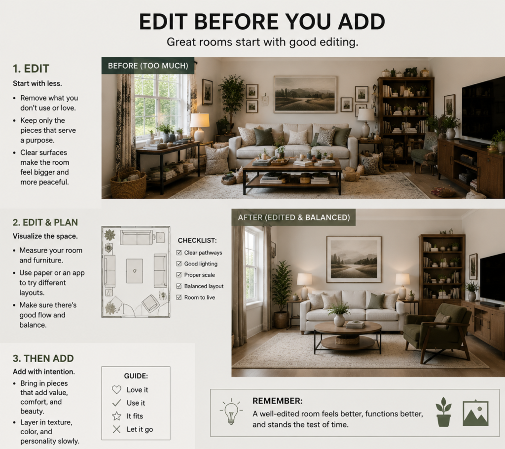
Best for: Any room that feels cluttered, heavy, or overwhelming — editing is the most transformative and most overlooked improvement available
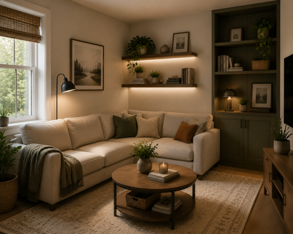
The most common room layout problem isn’t a lack of furniture or decoration — it’s an excess of it. A room with too many pieces of furniture, too many decorative objects, and too many competing visual elements feels cluttered regardless of how well each individual element is chosen.
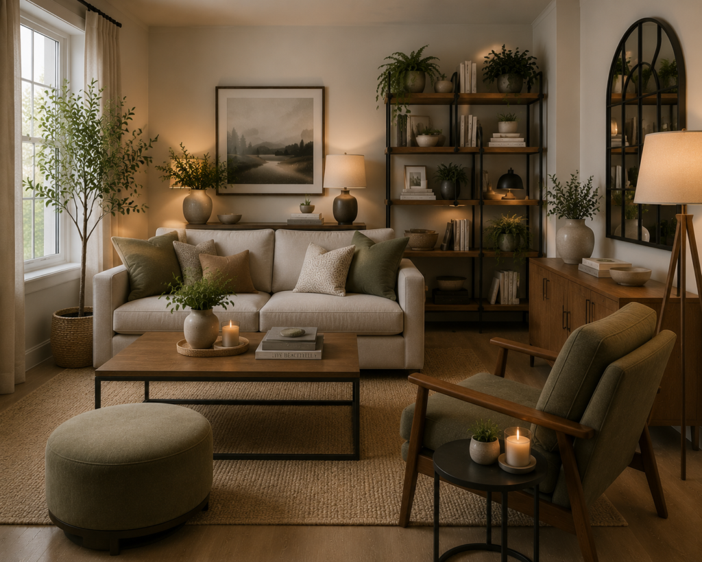
Editing — systematically removing pieces that don’t contribute positively to the room’s function or aesthetics — frequently produces better results than any amount of rearranging. When in doubt about whether a piece belongs: remove it temporarily and live without it for a week. If the room is better without it, it should go permanently.
Smart tip: Apply the “one in, one out” rule when adding to any room that’s already fully furnished. Every new piece that enters the room should prompt the removal of an existing piece that it replaces or improves upon. This discipline prevents the gradual accumulation of pieces that individually seem reasonable but collectively create visual noise.
Mistake to avoid: Keeping furniture pieces out of guilt, obligation, or the sunk-cost fallacy. A piece that doesn’t suit the room, that you don’t genuinely like, or that serves no practical purpose makes the room worse regardless of how much it cost or what history it carries. The room’s daily quality is the correct measure of whether something belongs — not its cost or provenance.
20. How to Plan a Room Layout from Scratch
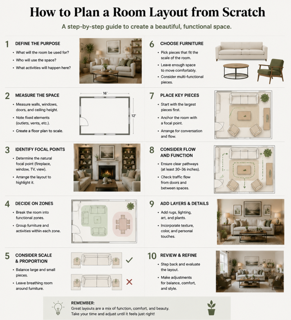
Best for: Anyone starting fresh — a systematic planning process prevents the most expensive layout mistakes
Planning a room layout from scratch requires four steps in sequence: measure the room accurately; identify the room’s purpose and prioritize its functions; establish the focal point and the furniture arrangement that acknowledges it; and plan circulation routes before finalizing any position.
Measure every dimension of the room: length, width, ceiling height, window positions and sizes, door positions and swing directions, and any fixed features (radiators, electrical outlets, light switches). Draw the room to scale on graph paper or use a free room planning app — this prevents the most expensive mistake in furniture purchasing, which is buying pieces that don’t fit the available space.
Identify the room’s primary purpose and the one or two secondary purposes it needs to serve. A living room whose primary purpose is family television watching and secondary purpose is adult conversation needs a different layout than one whose primary purpose is adult entertaining and secondary purpose is occasional television. The purpose hierarchy determines which functions the layout optimizes for.
Smart tip: Start with the largest piece of furniture in the room — the sofa in a living room, the bed in a bedroom, the dining table in a dining room — and position it first. All other pieces arrange in relation to the largest piece. Starting with smaller pieces and trying to fit the large piece in afterward creates the most common layout problems.
Mistake to avoid: Planning a room layout without accounting for door swing. A door that swings into the room’s primary circulation path, or that blocks a chair from being fully pulled back, creates a daily functional problem that no amount of subsequent rearranging can solve. Mark every door swing on the floor plan and plan furniture positions around them from the beginning.
Before You Start
- Measure accurately before purchasing. The single most effective preventive measure in furniture planning is measuring the room — and the furniture — before any purchasing decision. Tape, pencil, and graph paper are the most valuable furniture planning tools available.
- Plan for how you actually live, not how you intend to live. The room needs to serve real daily habits, not aspirational ones. A reading nook is only valuable if reading actually happens; a formal dining arrangement only works if formal dining actually occurs.
- Give every layout change time to settle. A new furniture arrangement feels unfamiliar for the first few days regardless of whether it’s better or worse than what preceded it. Give any layout change at least a week before assessing whether it works.
- Photograph the room from multiple angles. The camera reveals layout problems that the eye acclimates to — a room that looks fine from the sofa often looks obviously wrong in a photograph taken from the doorway.
Conclusion
A good room layout makes every activity that happens in the room easier, more comfortable, and more enjoyable. It ensures that natural light reaches the people in the room, that circulation routes are natural and unobstructed, that furniture is at the right scale for the space, and that the focal point is acknowledged rather than ignored. None of this requires expensive furniture or professional design expertise — it requires measurement, thought, and the willingness to move things until the room works.