Wallpaper ceiling ideas need two decisions kept together: the decorative field you want and a product genuinely suitable for the ceiling. Compare the real room, retained fixtures and pattern repeat before selecting a print. A paper sold for a wall or described as removable is not automatically an overhead product.
These 23 original concepts show visual directions rather than named products or verified installations. Use the repeat-and-fixture plan below to discuss the actual application with the supplier and an appropriate installer. The images do not show how to prepare a ceiling, work at height or alter electrical equipment.
Contents
- 1. Begin with quiet wallpaper ceiling ideas in a pale texture
- 2. Use a small leaf repeat above plain furniture
- 3. Give a broad botanical print enough quiet surroundings
- 4. Let a loose vine pattern provide movement overhead
- 5. Use broad stripes with a measured edge plan
- 6. Choose a fine stripe for a lighter graphic role
- 7. Use a small check with an uncomplicated room palette
- 8. Let a larger geometric pattern be the main decorative surface
- 9. Choose a printed star motif rather than implying a lighting system
- 10. Use a cloud-like original mural as one broad composition
- 11. Pair blue-and-ivory pattern with a warmer wood surface
- 12. Use muted green and cream above a quiet neutral room
- 13. Try clay and cream with restrained textiles
- 14. Give a dark ceiling print a deliberate lighter companion
- 15. Relate the wall paint to the paper’s background
- 16. Use only the inner plane of an existing tray
- 17. Keep retained beams separate from the printed infill
- 18. Treat existing ceiling panels as individual pattern fields
- 19. Coordinate the pattern with an existing dining fixture
- 20. Review the ceiling from the normal bedroom position
- 21. Use a short entry ceiling as one complete patterned field
- 22. Keep a home-work corner’s ceiling related to its task
- 23. Let the ceiling lead by editing one competing pattern
Confirm overhead suitability before the pattern layout
York’s current FAQ does not recommend its peel-and-stick wallpaper for ceilings, explaining that its adhesive is not rated for that use. Graham & Brown separately discusses ceiling wallpaper and defines pattern repeat and design match in its guidance. Those sources show why a general style idea cannot replace the exact product, substrate, adhesive and installation requirements. Do not transfer one brand’s approval or restriction to every different paper.
Resolve the ceiling decision through the actual room and product
- The product is marketed for walls or as removable: Confirm the exact overhead application before treating it as a candidate.
- A large motif crosses a light fitting: Compare the full layout and another starting position before moving equipment.
- The room has an existing tray or beam fields: Measure each real surface and define its finish boundary.
- The walls and textiles already have strong pattern: Choose which large surface leads and simplify a companion.
- A small sample looks attractive close up: Compare several repeats at the normal room viewing distance.
1. Begin with quiet wallpaper ceiling ideas in a pale texture

A pale texture-like print can give the ceiling a visible finish without a strong motif. Compare it from the normal seat and the doorway; the repeat may read as a quiet field at that distance. Keep the product’s real construction separate from its appearance. A woven-looking print and a natural-fiber paper are different choices with their own information to confirm.
Choose a product specifically suitable for the actual overhead application.
2. Use a small leaf repeat above plain furniture
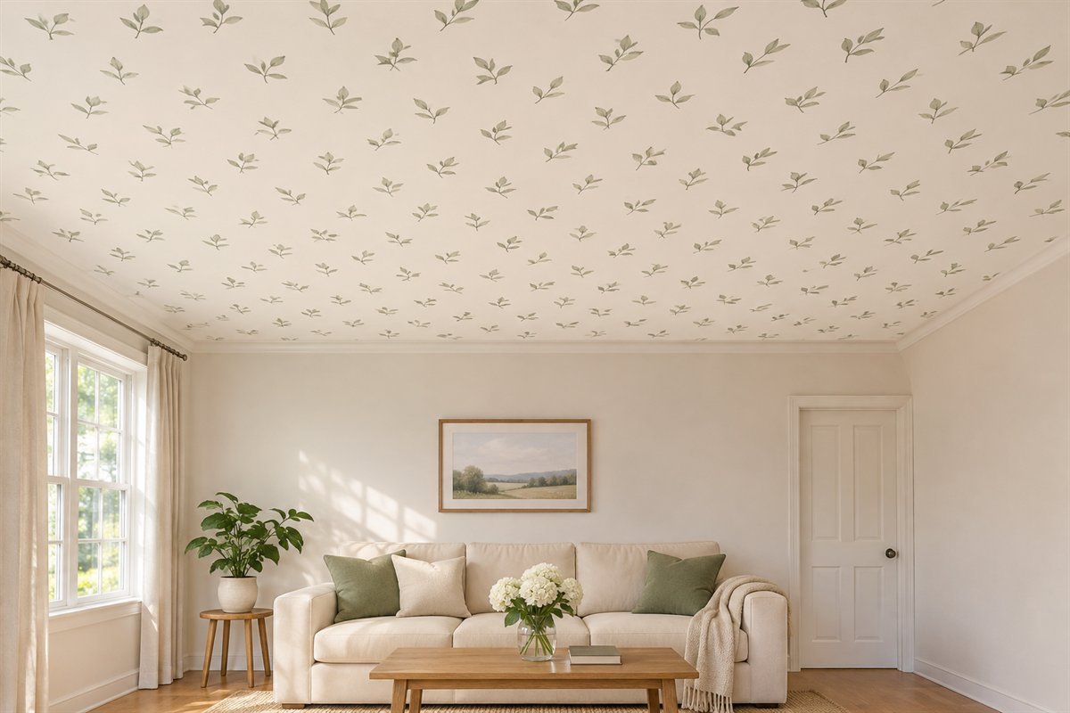
A small leaf repeat can connect a plain room with one restrained botanical detail. Compare enough of the paper to understand the spacing rather than selecting from one attractive leaf. Let the larger furniture and curtains remain simpler if the ceiling is the main patterned area. The effect should still be readable when the room is furnished.
Judge the background color as well as the motif.
3. Give a broad botanical print enough quiet surroundings

A larger botanical print can become the room’s leading pattern. Map a full repeat against the ceiling outline and retained fixture before choosing the scale. Keep surrounding textiles relatively quiet so the print does not have to compete on every side. A large motif may be appropriate in one room and awkwardly interrupted in another.
Draw where the complete leaves and partial repeats will appear.
4. Let a loose vine pattern provide movement overhead
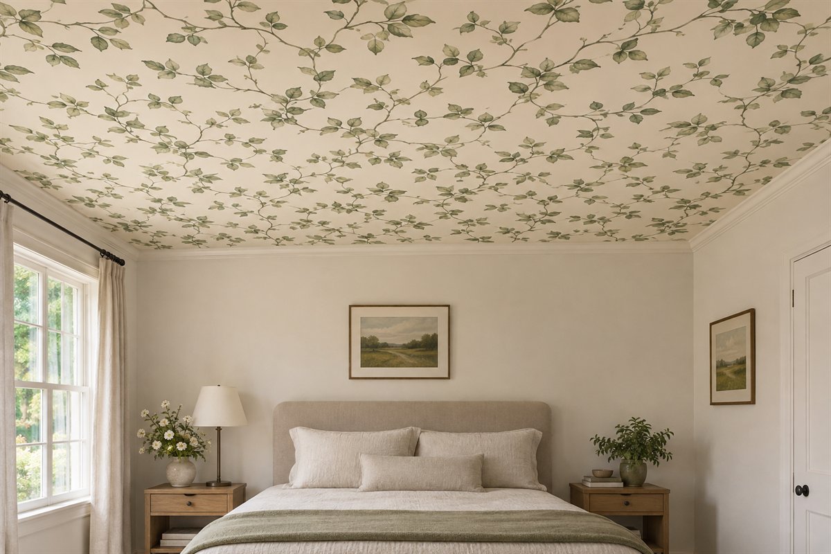
A loose trailing pattern creates a different rhythm from a strict grid. Compare its apparent direction from the bed and the doorway, including where branches meet the ceiling edge. Keep the intended orientation on the drawing so the design does not look correct from only one carefully chosen photograph. Use actual product layout information when resolving the repeat.
Review the pattern from both ordinary viewing directions.
5. Use broad stripes with a measured edge plan

Broad stripes make the ceiling direction immediately visible. Compare the full room width with the proposed repeat and the remaining bands at the edges. Do not assume the room is perfectly square or that centering one stripe will resolve every boundary. A more restrained contrast may be the better option when the retained trim is irregular.
Have the complete measured layout checked before ordering the paper.
6. Choose a fine stripe for a lighter graphic role

A finer stripe can supply a quieter graphic than broad bands, but it still needs an intentional direction. Compare how it reads under side light and from the resting position. Very fine detail may merge at a distance, which can be useful if the ceiling is meant to be a background. Decide that role before selecting the strongest contrast.
Compare a full sample under the actual room lighting.
7. Use a small check with an uncomplicated room palette
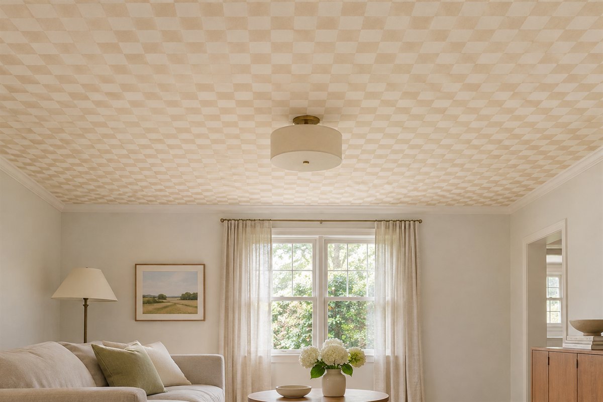
A small check gives a plain room a repeated geometric layer. Compare the pattern from across the room so you can see whether it remains a check or becomes a texture. Keep the furniture and the largest nearby textiles quieter. The repeat also needs checking at corners and around the existing fixture rather than judged in isolation.
Choose the check scale through the whole room view.
8. Let a larger geometric pattern be the main decorative surface
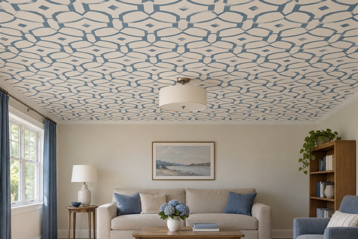
A larger geometric print can organize the ceiling into a clearly decorative field. Keep the main motif legible around the actual ceiling features. A light fitting or access panel may interrupt a shape that looked complete on the sample. Compare another scale or starting position before assuming the fixture must be moved for the pattern.
Keep required equipment positions in the first layout.
9. Choose a printed star motif rather than implying a lighting system

A printed star design provides pattern without being a collection of lights. Keep that distinction clear when choosing the actual finish and comparing its appearance at night. A sparse repeat can leave more quiet ground than a dense novelty print. Review it from the bed and decide whether the pattern remains enjoyable during ordinary use.
Choose printed decoration independently of the room’s functional lighting.
10. Use a cloud-like original mural as one broad composition

A broad cloud-like field offers a different design task from a repeating roll. Plan the complete image against the ceiling dimensions and every opening. Keep the artwork original or appropriately licensed, and confirm the exact mural’s suitability for the application. A pleasing crop on a screen does not establish a usable room-sized composition.
Review the entire mural crop before selecting the final image.
11. Pair blue-and-ivory pattern with a warmer wood surface

Blue and ivory can give the overhead pattern a clear relationship with warm wood below. Compare the ceiling’s background with the wall and trim rather than assuming all pale colors will match. A restrained table and plain chair fabrics allow the print to remain the main motif. Keep the actual wood that already matters in the sample group.
Use the retained furniture finish during the color comparison.
12. Use muted green and cream above a quiet neutral room

A muted green print can introduce color above neutral furniture without requiring green on every surface. Keep the pattern’s scale and background clear from the main seat. Compare the actual paper beside retained curtains and the room’s evening lights. A small connecting detail below may be enough; the sofa does not need a new matching cover.
Choose the useful repeated color after the ceiling sample is in the room.
13. Try clay and cream with restrained textiles

Clay and cream can provide a warmer patterned ceiling above plain bedding. Compare that warmth with any red or yellow tones already present in the floor or furniture. Keep the first fabric comparisons simple so you can judge the overhead field itself. The room may need a softer clay rather than an additional strong orange accent.
Check the color from the bed before adding patterned cushions.
14. Give a dark ceiling print a deliberate lighter companion

A dark print can be the main visual statement when the surrounding room supports that choice. Compare its darkest area under normal lamps and the actual window light. A pale wall or sofa provides one possible companion, but there is no universal rule that the same contrast suits every room. Review the complete field rather than one bright part of the sample.
Keep the actual fixture and ceiling edges in the dark-sample comparison.
15. Relate the wall paint to the paper’s background

One background color from the paper can guide a neighboring wall-paint comparison. The relationship can be close without being an exact match. Compare physical paper and coating samples at their actual meeting edge and under the same light. Keep the wallpaper and paint specifications separate; a coordinated appearance does not make their preparation interchangeable.
Start with the ceiling background rather than its smallest accent.
16. Use only the inner plane of an existing tray

An existing tray provides a defined field where a print might be considered. Mark the exact finish boundary and compare it from the room’s main views. Keep the surrounding planes quieter if the inner field is meant to lead. Confirm that the product suits the actual surface rather than treating the tray as a reason to improvise a new ceiling assembly.
Draw the existing shape before choosing the pattern area.
17. Keep retained beams separate from the printed infill

Where beams are already present, the infill can be compared as a separate surface. Keep the wood and paper distinct enough to understand their roles. Plan each real field, including any differences in width, instead of forcing a large motif into repeated fragments. Existing building elements and their condition need assessment independently of the decorative selection.
Choose the repeat through the actual infill dimensions.
18. Treat existing ceiling panels as individual pattern fields

An existing panel layout can break the ceiling into smaller visible areas. Compare the pattern inside one full field before judging the whole room. A small repeat may remain readable where a larger motif is reduced to unrelated pieces. Keep the retained grid’s depth and fixture access resolved through the real ceiling rather than inferring a construction from the image.
Use each actual field size in the pattern drawing.
19. Coordinate the pattern with an existing dining fixture

A dining room introduces both the table view and the suspended fixture. Map the fixture’s actual position on the ceiling drawing and compare the print around it. The room center, table center and repeat center may be different decisions. Resolve the decorative layout around the working room before assuming the light should move.
Keep the complete table and occupied chairs in the overall view.
20. Review the ceiling from the normal bedroom position

A bedroom ceiling is viewed for longer from a different angle than the entrance photograph. Compare the proposed repeat from the normal resting position and beside the bed. Keep the bedding and lamps that will stay in that comparison. A quieter version may suit the actual use even if a bolder print looked striking in a cropped inspiration image.
Make the everyday view the deciding comparison.
21. Use a short entry ceiling as one complete patterned field

A short entry can offer a contained overhead field when the product and surface suit it. Compare the whole visible area from the open door, including the fixture and the transition into the next room. Keep the surrounding walls simpler if the print is the arrival feature. The modest field still needs a measured repeat and edge plan.
Review where the paper stops at the next opening.
22. Keep a home-work corner’s ceiling related to its task

An overhead print in a work corner should be considered with the real task and lighting. Compare the room from the occupied chair as well as the doorway. Keep the monitor, light fittings and retained wall surfaces part of the view. The pattern can remain a quiet background rather than becoming another strong graphic competing with the workspace.
Use the actual work position for the final sample review.
23. Let the ceiling lead by editing one competing pattern
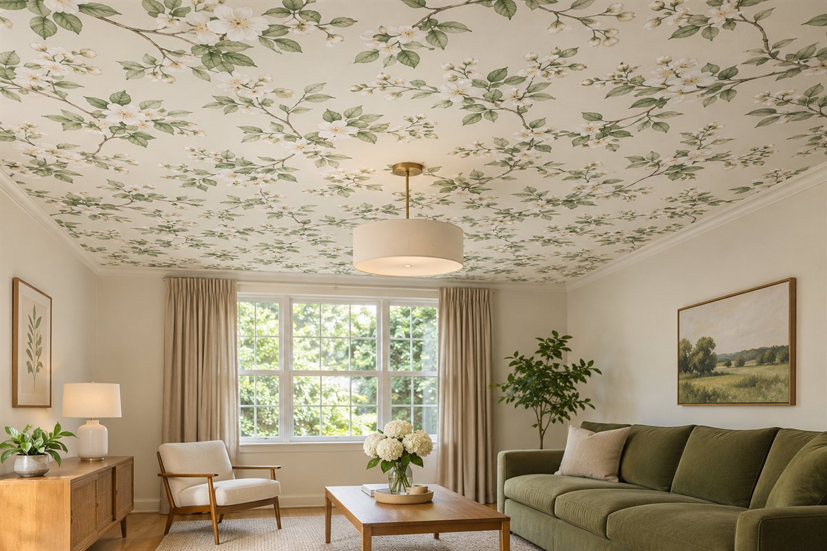
If the ceiling is the strongest pattern, the finished room may need fewer printed layers below. Compare the retained rug, curtains and upholstery together before buying more connecting accessories. Keep the pieces that already contribute to the room. A single quieter textile may resolve the relationship more clearly than repeating the ceiling motif on every cushion.
Use the layout sheet below to connect the decorative decision with the actual room.
Make an original repeat-and-fixture plan before ordering
Begin with the actual ceiling outline as seen from below. Record the room dimensions, existing slopes, trays or beams, and every retained light, fan, detector, grille and access panel. Identify the boundaries of the intended papered field. Keep required equipment operation and access independent of the decorative layout; a pattern drawing is not an electrical or building-work plan.
Make a product record next. Include the manufacturer, exact design and product type, ceiling suitability, substrate requirements, specified preparation and adhesive, roll or panel dimensions, repeat, match and any relevant room conditions. Use the complete current instructions for that product. If overhead use is not supported, choose another candidate or a different finish rather than attempting to make a wall-only paper suitable through extra adhesive.
On a separate copy of the ceiling drawing, show the proposed strip or panel direction and several complete pattern repeats. Mark where the main motif would fall in relation to the retained fixture and the largest visible edges. Keep the dimensions from the actual selected product rather than a generic roll width. A mural needs its complete image crop and panel layout instead of an assumed repeating-roll arrangement.
Compare more than one starting position on paper. One version might give the main fixture a clear space between motifs, while another might place a motif symmetrically around it. Neither approach automatically resolves the whole ceiling. Review the edges, smaller fields and the view through the doorway before deciding which compromise is most deliberate. Have the actual layout and quantities resolved with the appropriate supplier or installer.
Use a hypothetical dining room to make the comparison practical. The retained pendant hangs over the table, slightly away from the geometric center of the ceiling. A large printed motif placed at the room center appears awkwardly cut by the pendant canopy. A revised drawing changes the pattern’s starting position while keeping the useful light where it is. If the edges then become less convincing, compare a smaller motif or quieter print before planning an equipment move. This is an illustrative design decision, not a measured client result.
View physical samples with the retained room finishes and normal lights. Keep the paper’s orientation and viewing distance in mind. Where a useful sample cannot represent several full repeats, use an appropriately scaled layout to understand the composition while treating the physical paper as the color and texture reference. A screen image or rendering does not establish exact shade, finish or product performance.
Record the final decision in four short lines: approved candidate, pattern layout, unresolved technical details and items deferred. Keep any quantity estimate clearly separate from the supplier’s final order calculation. Repeat matching, cuts, panel layout and product allowances can change what is required; dividing ceiling area by nominal roll coverage is not a complete specification.
Retain the approved plan with the exact product instructions and installation proposal. Resolve preparation, overhead work, fixtures and future access through an appropriate process. The sheet’s purpose is to make the visual decisions clear before work begins, not to supply a universal hanging method or a way to cover unresolved ceiling defects.
Compare a printed effect with the material it resembles
Wallpaper can suggest woven fibers, plaster, timber grain or a painted sky. Those appearances do not establish that the paper has the same properties as the material it resembles. A texture print is a decorative choice with its own surface, cleaning and application information.
Use actual product samples and written specifications to compare the finish. Keep sheen, repeat and visible seams in the room discussion. Do not infer acoustic performance, durability or removability from a concept photograph. If the intended effect is better achieved through another suitable finish, compare that as a separate project rather than forcing wallpaper into the role.
The final room should still work with the furniture in place. Leave the strongest design gesture clear, keep equipment accessible and choose the quieter version when several large patterns begin competing for attention.
Can any peel-and-stick wallpaper go on a ceiling?
No. Check the exact product’s current guidance. York’s FAQ does not recommend its peel-and-stick wallpaper for ceilings. A removable or wall-use label is not an overhead approval.
What pattern works best for a wallpapered ceiling?
Choose through the intended role and actual room. A quiet texture can be a background, while a large botanical or geometric print can lead. Compare the full repeat, fixture interruptions and ordinary viewing positions.
Should the wallpaper pattern be centered on the light?
It is one layout comparison, not a universal rule. The room center, fixture position and pattern repeat may differ. Review the edges and the room’s real use before choosing the starting position.
Can I calculate the order from ceiling area alone?
Area is an input rather than a complete order. Use the exact roll or panel dimensions, repeat, match, cuts and product allowances with the measured layout and supplier or installer.
Can wallpaper conceal a damaged or textured ceiling?
Assess the actual condition and the selected product’s substrate requirements first. A decorative print does not resolve damage or establish compatibility with an existing finish. Keep necessary repair and preparation separate.
Are these named wallpaper products I can order?
No. They are original illustrated pattern relationships. Choose a real suitably approved product by its samples, complete specifications and application guidance.
A practical next step
Confirm the actual overhead product first, then give the pattern a measured relationship with the fixtures, edges and furniture below. A clear repeat-and-fixture plan can make a single decorative ceiling choice more considered than several unrelated patterned surfaces.
Compare ceiling finishes from the ordinary bedroom view. Separate a ceiling appearance change from a new assembly. Choose a wall pattern around retained furniture.
Images are original AI-generated ceiling-pattern concepts, not verified installations, exact product reproductions or installation diagrams. The layout sheet and hypothetical dining-room example are original planning aids.
Sources and care references
- York Wallcoverings: current ceiling restriction for its peel-and-stick paper
- Graham & Brown: pattern repeat, design match and ceiling guidance
Optional digital guide for this topic
If you prefer a structured workbook, explore this related paid guide.