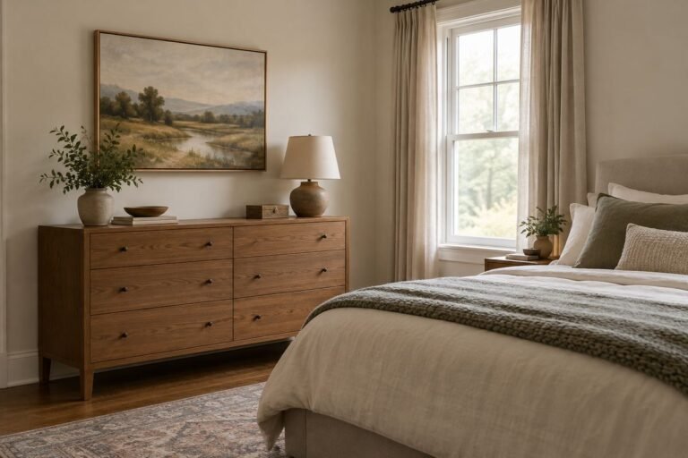
Bedroom paint colors become easier to choose when you start with the bed. A headboard, duvet and pair of nightstands occupy a large part of the view, so a wall color needs to relate to those pieces rather than simply look appealing on a screen.
These palettes offer different ways to connect the finishes you already own. Some make the headboard stand out; others let the wall and upholstery form a quieter background. None is a universal sleep-enhancing color or an exact match to a named paint formula.
Choose the relationship you want first, then test actual samples. Keep your usual bedding on the bed and use the lamps you normally switch on at night. That gives you a much more useful comparison than an empty room photographed in flattering daylight.
The images are original AI-generated decor concepts, not installation diagrams or photographs of completed client projects.
Browse These 25 Bedroom Paint Colors
Jump to an idea
- Try oatmeal bedroom paint colors with white bedding
- Choose a soft mushroom behind a cream headboard
- Balance a cherry-wood bed with pale blue-gray
- Use sage with a charcoal upholstered bed
- Pair a muted olive wall with warm linen
- Use deep green bedroom paint colors with pale wood
- Combine inky blue with a woven headboard
- Use slate blue with a cognac leather headboard
- Give dusty teal a simple cream companion
- Try dusty rose beside a black metal bed
- Connect peach bedroom paint colors to terracotta textiles
- Set muted terracotta against an ivory upholstered bed
- Use clay pink with dark walnut furniture
- Try pale lilac with cool gray linen
- Choose aubergine with oatmeal upholstery
- Try soft yellow bedroom paint colors with blue ticking
- Give muted ochre plenty of plain linen
- Use warm white around a colorful quilt
- Pair a cooler white with crisp navy bedding
- Use greige to connect gray upholstery and golden oak
- Balance brown bedroom paint colors with pale bedding
- Use burgundy with a restrained cream-and-wood palette
- Create a low painted band from the bedding palette
- Paint the trim and walls in related depths
- Carry pale bedroom paint colors over a sloped ceiling
Choose bedroom paint colors around the largest textile
Lay out the actual duvet, a pillowcase and any headboard fabric beside a wood sample or the furniture itself. Decide which item should lead the palette and which can be replaced easily. A patterned duvet you keep all year might lead; a small cushion probably should not. Compare two or three wall candidates against the same materials, with the bedroom arranged as usual. Describe the result in words: wall makes the ivory duvet look yellow; wall separates the gray headboard; wall blends with the oak.
| Bedroom detail | Useful question | What to bring to the sample |
|---|---|---|
| Upholstered headboard | Should its outline stand out or recede? | A fabric swatch or the headboard in place |
| White or ivory bedding | Does the wall change how the textile looks? | The actual duvet and pillowcase |
| Large wood furniture | Do the wall and wood feel connected? | A view of the largest wood surface |
| Patterned curtains | Which background color can the wall borrow? | A full repeat, not a tiny isolated motif |
| Bedside lamps | Does the color still work during the bedtime routine? | The normal bulbs and shades |
Make a keep-or-change decision before adding another color
For example, imagine a bedroom with a walnut bed, ivory duvet and blue patterned curtains. If all three stay, begin with the curtain background, a restrained blue-gray and a neutral that works beside the walnut. If the curtains are due for replacement, do not let their pattern dictate the next wall color. Write down the decision before shopping. This avoids buying new bedding merely to rescue a wall shade chosen for a temporary accessory.
Read paint samples as appearance tests
Benjamin Moore identifies its liquid color samples as tools for assessing color, rather than the final coating for a project. Use the selected paint product’s instructions for preparation, coverage and finish. A beautiful sample does not establish washability or application requirements. The generated images here show color-family relationships; they cannot reproduce an exact paint formula.
1. Try oatmeal bedroom paint colors with white bedding

An oatmeal wall gives crisp white bedding a soft surrounding tone without turning the whole room white. It can be particularly useful with a simple oak bed, where both the timber and the wall contribute quiet warmth.
Compare the wall beside a complete pillowcase rather than a tiny fabric corner. If the bedding suddenly looks blue or the wall looks strongly yellow, try a more balanced neutral before replacing any textiles.
Practical tip: Keep the white duvet in the room throughout the comparison.
2. Choose a soft mushroom behind a cream headboard

Mushroom offers a gentle change in depth behind pale upholstered furniture. The headboard remains readable, while the wall is less stark than a bright white backdrop. A warm metal lamp can provide a small additional detail.
However, mushroom shades may lean pink, gray or brown. Compare the actual sample against the cream upholstery and the room’s trim; the name on a color card does not tell you which undertone will be most noticeable.
Practical tip: Photograph the sample and headboard together only as a record, then judge them in person.
3. Balance a cherry-wood bed with pale blue-gray
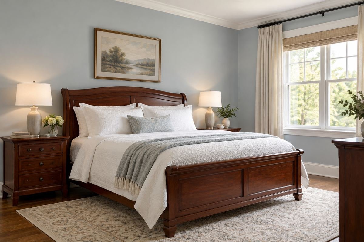
A restrained blue-gray can give red-toned wood a deliberate contrast. Keep the bedding light and relatively plain so the wall and bed remain the main relationship rather than adding another large competing pattern.
Place the sample beside both the headboard and a lower wood surface. Cherry furniture can vary in color across pieces, and a wall that works beside one polished panel may feel different beside a larger dresser.
Practical tip: Use the largest cherry piece as the deciding comparison.
4. Use sage with a charcoal upholstered bed
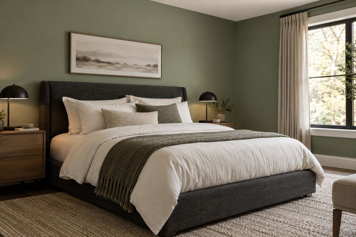
Muted sage separates a dark gray headboard from the wall while keeping the room’s colors restrained. Pale bedding and a few black details can connect the headboard to the rest of the arrangement.
Choose the green’s depth from a real sample. Some sages become nearly gray in dim light; others look noticeably yellow-green. Decide which version you prefer during an ordinary evening with the curtains closed.
Practical tip: Check whether the headboard outline stays clear after dark.
5. Pair a muted olive wall with warm linen
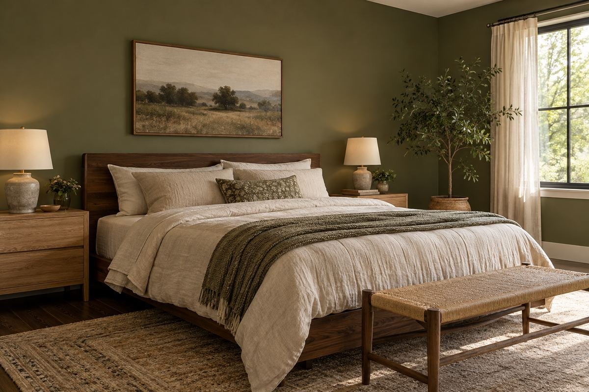
Olive works well as a substantial color when the bed has pale, textured textiles. The contrast can feel collected without needing many decorative objects, particularly with simple wood nightstands and a natural-fiber rug.
Avoid building the entire palette from nearly identical greens. Let the linen and wood provide different surfaces, then introduce another small green detail only if it helps the arrangement rather than merely matching the wall.
Practical tip: Compare olive beside the actual linen, including any yellow or gray undertone.
6. Use deep green bedroom paint colors with pale wood

Forest green can give a light wood bed a defined setting. A generous pale duvet and a simple curtain help separate the furniture from the dark wall without surrounding every edge with bright contrast.
Test the darkest area behind a nightstand as well as the area next to the window. If the furniture seems to disappear where you need to use it, adjust the lighting or compare a shallower green.
Practical tip: Evaluate the corner from your normal standing position beside the bed.
7. Combine inky blue with a woven headboard

An inky wall can make the texture of a woven headboard more visible. Keep the neighboring textiles comparatively quiet, allowing the weave to provide detail instead of adding several equally busy patterns.
Check the wall against any dark threads in the headboard and against the curtain fabric. A blue that looks almost black at night may be exactly what you want, but it should be a deliberate choice.
Practical tip: Look at the palette with the bedside lamp shades in place.
8. Use slate blue with a cognac leather headboard

Slate blue gives warm brown leather a measured contrast. The combination works best when the leather is allowed to remain a distinct material, supported by plain bedding and a few restrained dark-wood pieces.
Leather colors vary considerably, so compare the sample against the actual headboard rather than a photograph from a product page. Consider whether the wall makes the leather look richer, more orange or unexpectedly flat.
Practical tip: Check both the smooth and creased parts of the leather.
9. Give dusty teal a simple cream companion

Dusty teal can supply most of the room’s color while cream bedding keeps the bed easy to read. A plain timber frame and minimal artwork leave the wall’s blue-green character visible over a substantial surface.
Decide whether you prefer a teal that leans blue or green. Keep the same bed linen and lamps in place while comparing candidates, otherwise several changing variables can hide the reason one sample works better.
Practical tip: Compare two teals at the same depth before comparing lighter and darker options.
10. Try dusty rose beside a black metal bed
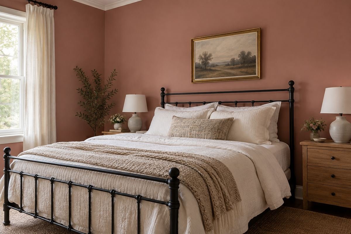
A muted rose wall gives a dark metal frame a softer surrounding field. White or ivory bedding keeps the outline of the bed clear, while a small wood surface prevents the room from relying only on pink and black.
Look for a rose with the amount of brown or gray you prefer. A shade that appears subtle on a screen may become much sweeter beside bright white bedding or under a warm bedside lamp.
Practical tip: Test the wall where the black frame crosses a pale pillow.
11. Connect peach bedroom paint colors to terracotta textiles
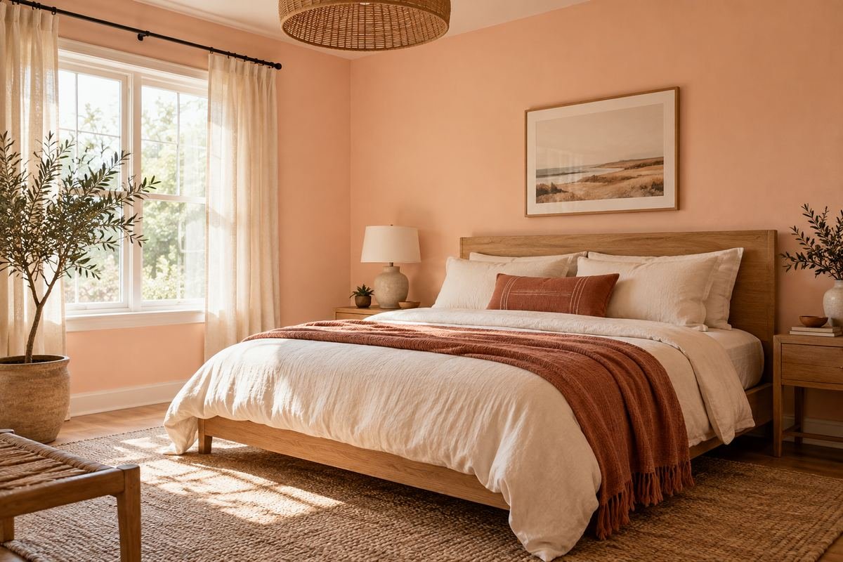
A pale peach wall can relate to a terracotta throw without copying its exact depth. Keep the large bedding neutral so the warmer accents remain intentional rather than turning every surface into a different orange.
Place the throw beside the sample in daylight and evening light. If they seem to pull in conflicting directions, try a more muted wall or keep peach to a smaller painted area.
Practical tip: Judge the wall against the throw’s dominant color, not one unusually dark thread.
12. Set muted terracotta against an ivory upholstered bed
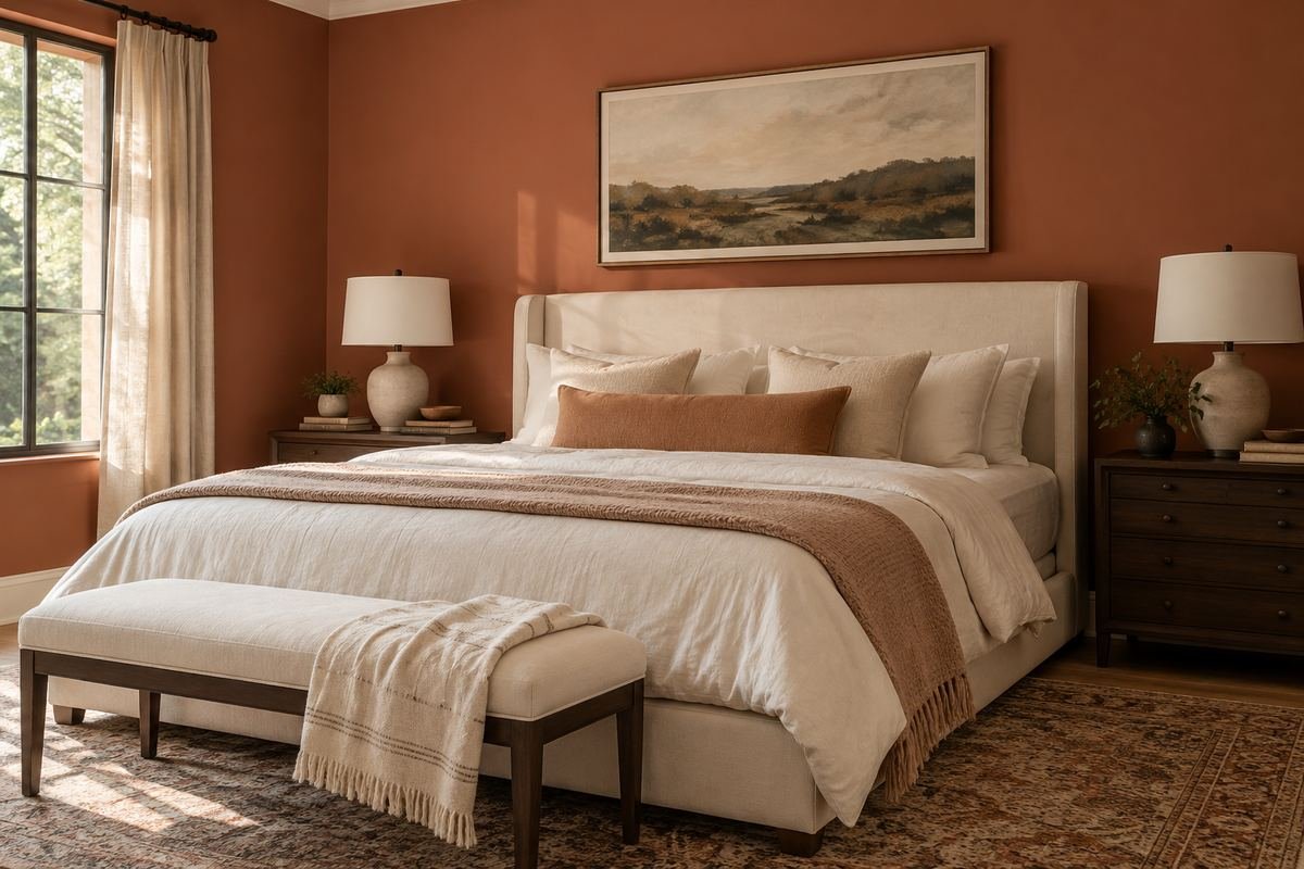
Terracotta can give a pale upholstered bed a strong but warm background. A broad ivory duvet extends that light area, while simple bedside furniture helps keep the wall from competing with many separate objects.
Compare the chosen shade beside any existing red or orange timber. You may want those surfaces to blend, or you may prefer enough difference for the furniture to remain distinct. Either relationship needs to be checked in the room.
Practical tip: Observe the full wall sample from the doorway as well as beside the bed.
13. Use clay pink with dark walnut furniture
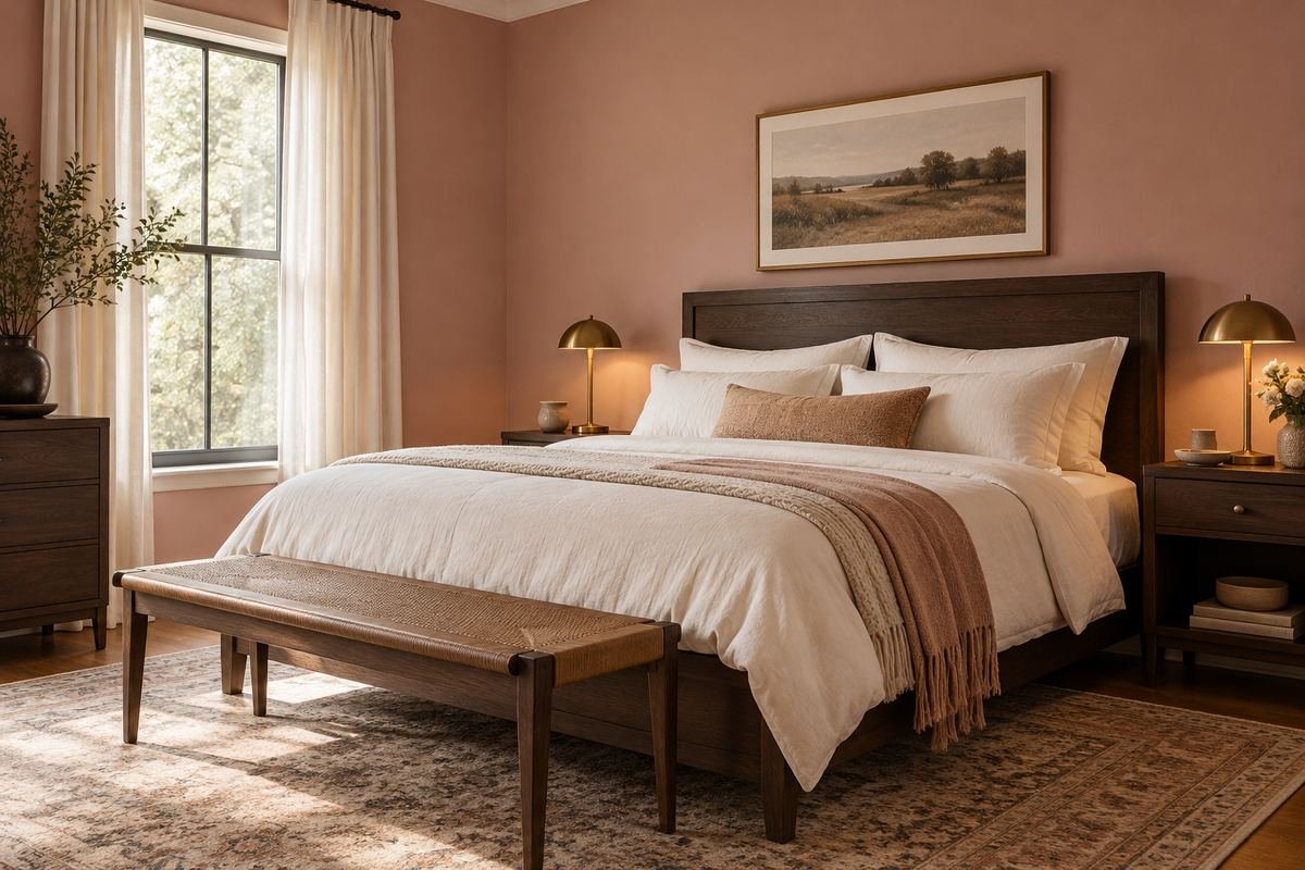
Clay pink sits between a conventional pink and an earthy neutral. It can connect to walnut furniture without losing its own color, especially when the bedding is kept pale and the accessories are restrained.
Look at the wall beside the most reflective wood surface. Polished walnut, matte veneer and unfinished timber can create different relationships even when their product descriptions all use the same wood name.
Practical tip: Compare the sample with the dresser as well as the bed.
14. Try pale lilac with cool gray linen

A restrained lilac wall can add a small amount of color to gray bedding without introducing a sharp contrast. A few pale wood details give the room material variety while leaving the textile palette relatively simple.
The useful question is whether the lilac looks gray enough or purple enough for your preference. Test it against the actual duvet and under the lamps, where subtle color relationships may become more obvious.
Practical tip: Avoid comparing lilac against several different gray blankets at once.
15. Choose aubergine with oatmeal upholstery

Aubergine can create a deep backdrop for an oatmeal headboard and pale bedding. Keeping the larger furniture simple lets the wall provide the room’s character without requiring elaborate trim or decorative layering.
Compare a browner version with a more purple version. Their effect beside oatmeal can be quite different, and the better choice depends on both the fabric undertone and the amount of light available.
Practical tip: Check the sample in the room’s darkest corner before selecting the full depth.
16. Try soft yellow bedroom paint colors with blue ticking

A pale butter-yellow wall can connect a traditional blue-striped textile to warm wood furniture. Keep the yellow gentle enough that the stripe remains a visible detail rather than becoming part of a strongly primary-color scheme.
Use the complete stripe repeat during testing. A narrow blue line on a white background behaves differently from a large blue block, even if both are described simply as blue bedding.
Practical tip: Lay the striped pillowcase beside both the wall sample and the wood.
17. Give muted ochre plenty of plain linen
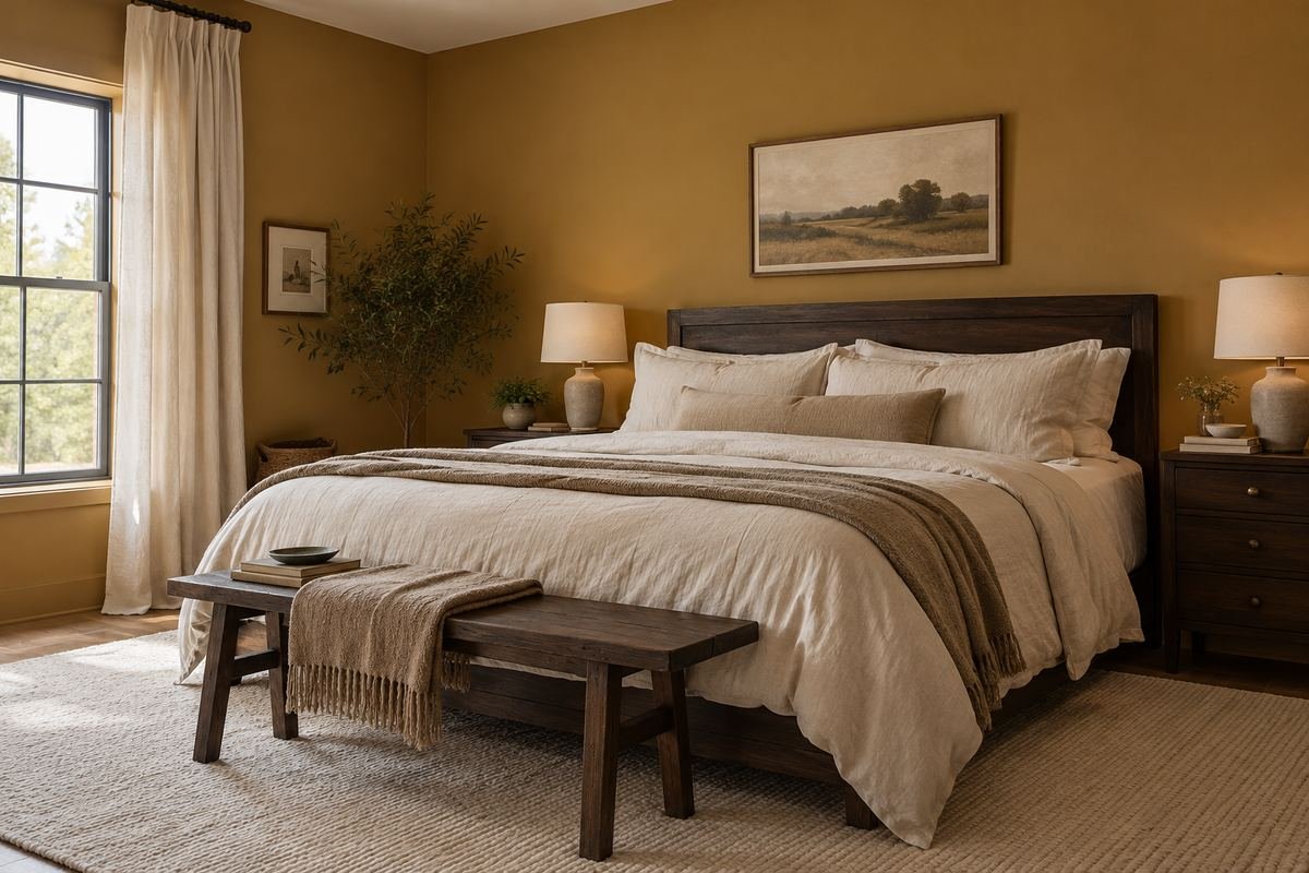
Ochre can be the main color in a bedroom with simple linen bedding. A neutral bed covering creates a large quiet surface, while a few dark accents help the room’s furniture shapes remain legible.
Compare the ochre against the floor. Two warm surfaces may feel connected, or they may become too similar for your taste. Try a more subdued wall sample before assuming the room needs new flooring or furniture.
Practical tip: Make the floor-to-wall junction part of the comparison.
18. Use warm white around a colorful quilt
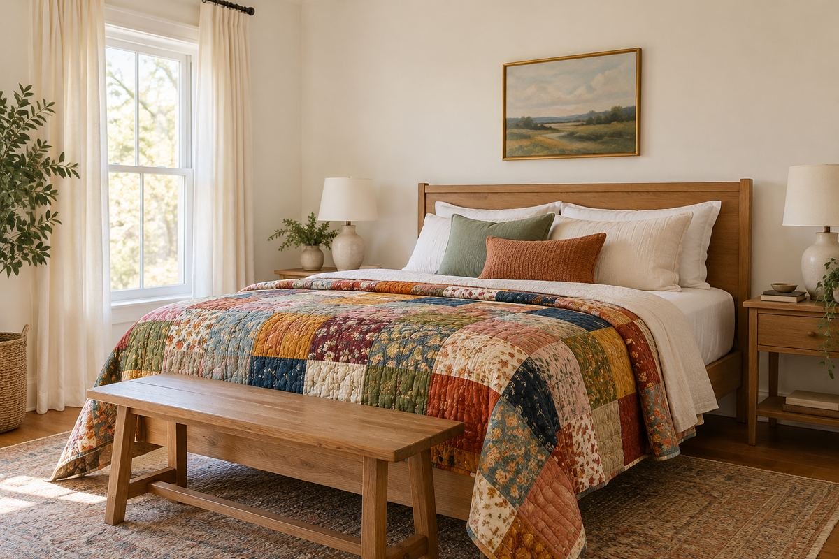
A restrained warm white can support a quilt with several colors without choosing a single motif to dominate the room. Let the quilt remain the main pattern, with simple curtains and a limited number of smaller accents.
Compare the white against the quilt’s lightest fabric. If that fabric becomes unexpectedly gray or yellow, choose another white rather than assuming every off-white will work in the same way.
Practical tip: Place the quilt on the bed in its normal orientation.
19. Pair a cooler white with crisp navy bedding
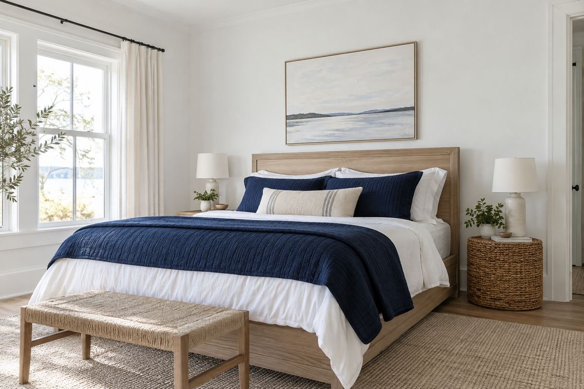
A cooler white wall can sit neatly beside navy and white bedding, particularly when the furniture has clean lines. A small wood or woven detail keeps the material palette from becoming entirely smooth and high contrast.
Check the wall against the existing ceiling and trim. If the new white makes those surfaces look markedly creamy, decide whether you like the difference before committing to additional painting.
Practical tip: Include the old trim in every sample comparison.
20. Use greige to connect gray upholstery and golden oak

A balanced greige is worth testing when the bed is gray but the floor is warm oak. It can offer a middle relationship without requiring either existing surface to be replaced.
Avoid choosing by the word greige alone. Some versions are visibly beige; others are mostly gray. Compare the sample at the point where the floor, headboard and wall can all be seen together.
Practical tip: Write down which existing surface looks better and which looks worse.
21. Balance brown bedroom paint colors with pale bedding

Cocoa walls can create a substantial setting for an ivory duvet and a pale headboard. Keep the light textile area generous, rather than scattering many small cream objects around a mostly dark room.
Consider how the brown relates to existing furniture. Similar dark woods may blend into the wall, while pale oak can stand out strongly. Decide which outline you want to see before testing the final shade.
Practical tip: Check the nightstand edges under the actual bedside lighting.
22. Use burgundy with a restrained cream-and-wood palette

A muted burgundy wall can supply a bedroom’s main decorative statement. Cream bedding and a plain wood frame keep the composition understandable, especially when the curtains avoid another large competing color.
Compare the burgundy beside the upholstery at night. A red-brown version and a purple-red version can look similar in one photograph but produce quite different relationships with cream and wood.
Practical tip: Select the undertone before deciding how dark to go.
23. Create a low painted band from the bedding palette
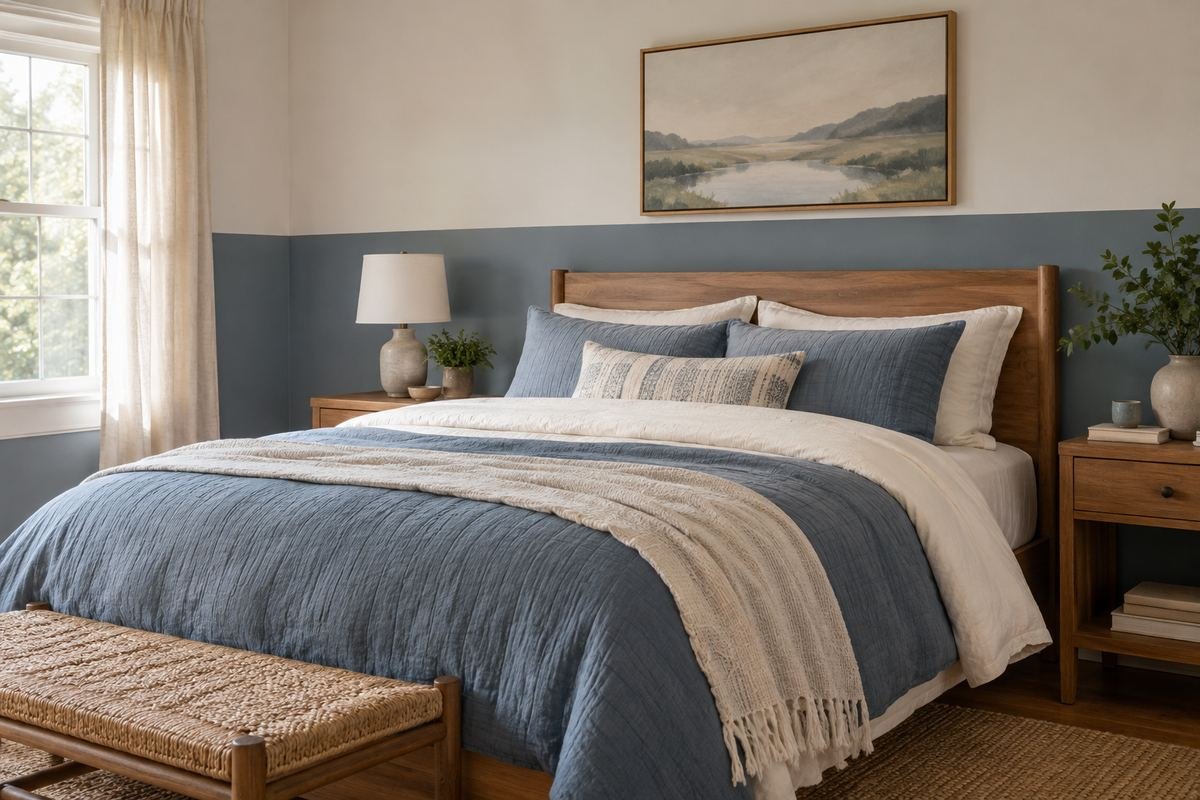
A two-tone wall can borrow a muted color from the duvet while leaving a lighter field above it. Use a deliberate horizontal division that relates to the headboard and furniture rather than copying an arbitrary height.
Mark the proposed line with removable low-tack tape appropriate for the surface, following its instructions. View it with the bedding in place and from the doorway before preparing the final paint layout.
Practical tip: Check where the line meets switches, door trim and the headboard.
24. Paint the trim and walls in related depths

Using related colors on walls and trim can make a room with many door edges feel more coherent. A slightly deeper trim gives definition without adding a bright outline around every opening.
Prepare separate samples for the finishes you intend to use. The same color can appear different in different sheens, and a small wall card does not fully predict the appearance of a glossy door frame.
Practical tip: Compare the junction of two actual sample finishes.
25. Carry pale bedroom paint colors over a sloped ceiling
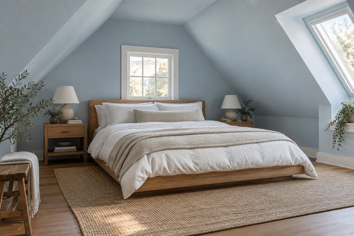
A pale color across an angled wall and ceiling can make an attic bedroom feel visually connected. Simple bedding and restrained trim allow the changing roofline to provide the architectural interest.
Observe an overhead sample from the pillow position as well as from the doorway. Light strikes a sloped surface differently from a vertical wall, so one small upright sample is not enough to judge the whole treatment.
Practical tip: Test the overhead relationship before ordering paint for every surface.
Frequently Asked Questions
What is the best paint color for a bedroom?
Start with the bedding, headboard and furniture you plan to keep. The useful choice is a color that supports those pieces and works in the room’s actual light, rather than a shade described as best for everyone.
Should bedroom walls match the duvet?
They can share a color family without matching exactly. A lighter or more muted wall can connect to a duvet while leaving the textile visible as a separate layer. Compare the real fabric beside the sample.
Can I paint a small bedroom a dark color?
Yes, if you enjoy the effect. Check how furniture, bedding and walking routes remain visible under the room’s ordinary lighting. Dark paint does not guarantee a room will feel either larger or smaller.
How can I choose between warm white and cool white?
Compare the candidates beside the same bedding, trim and wood. Look for changes in the neighboring materials as well as the samples. A white that looks neutral alone may show a clear undertone beside another white.
Do green or blue bedroom walls guarantee better sleep?
No. This article offers visual palette ideas, not a sleep treatment or health claim. Choose a color you like and assess the room’s practical lighting and comfort separately.
Choose the Details That Work in Your Home
Reduce the decision to one leading textile, the wood that stays and the light you actually use. Select a few suitable wall-color families, compare them beside those materials, and settle the paint before adding smaller accessories. A coherent bedroom can come from better relationships between existing pieces.
For related ideas, explore headboard ideas, bedroom curtain ideas, bedroom lighting ideas.
Planning References
Benjamin Moore: bedroom color inspiration and sampling; Benjamin Moore: using paint color samples; Benjamin Moore: warm and cool color relationships. Follow the instructions for the exact products you choose.
Optional digital guide for this topic
If you prefer a structured workbook, explore this related paid guide.