Color drenching ideas use a continuous color across a room’s architecture, often including the walls, ceiling, trim and interior doors. The result depends on the exact color, sheen, light and retained furnishings. It can be pale and quiet or deeply colored; it does not have to mean a dark room or furniture painted to match.
These 24 examples combine room palettes with the decisions that make the look coherent. Choose a direction from your existing floor and furniture, then use the surface worksheet below to define what will actually be painted. The images are original design concepts, not exact paint swatches or product demonstrations.
Contents
- 1. Try warm ivory across a small entry
- 2. Use mushroom to connect a hall’s many doors
- 3. Wrap a living room in muted sage
- 4. Give an olive study a lighter working surface
- 5. Choose inky blue for an enclosed dining room
- 6. Keep a powder-blue bedroom simple
- 7. Try dusty pink around dark wood
- 8. Pair muted clay with a breakfast table
- 9. Sample soft yellow in a reading nook
- 10. Use charcoal around a restrained media room
- 11. Frame a reading collection with aubergine
- 12. Try deep red with a limited furniture palette
- 13. Let crown molding read through shadow
- 14. Continue the color over a sloped ceiling
- 15. Bring a built-in cabinet into the envelope
- 16. Keep paneled interior doors within the color field
- 17. Use sheen as a separate design decision
- 18. Keep a wood floor as deliberate contrast
- 19. Let pale upholstery define the seating group
- 20. Use one patterned curtain as a separate layer
- 21. Choose the stop line at an adjoining room
- 22. Trial the idea in a genuinely bounded nook
- 23. Compare sample boards at wall and ceiling angles
- 24. Review the evening scene before making the final choice
Define the color envelope before choosing the paint
Mark walls, ceiling, trim, doors and any built-ins on a simple room sketch. Decide which suitable surfaces join the color envelope and which remain unchanged. Keep hardware, equipment, safety devices and working fittings out of an assumed decorative paint scope. Product suitability and preparation are separate from color matching; follow the actual manufacturer’s guidance and use appropriate professional advice where needed.
Choose the first comparison from the room you have
- A room with many door and trim outlines: Compare one shade across suitable walls, frames and doors to see whether the architecture feels quieter.
- A retained dark sofa or wood bed: Put its real finish or fabric beside the paint sample before selecting a deep palette.
- Several sloped ceiling planes: Mark the complete envelope and compare the color from the main seat or bed.
- Uncertain about painting the whole room: Try a deliberately bounded alcove or sample study before expanding the scope.
1. Try warm ivory across a small entry

Warm ivory offers a quiet starting point when you want the room’s outline to feel continuous without a deeply saturated palette. Compare it with the floor and the light coming through the entrance. A yellowish ivory can look quite different beside cool stone and golden timber, so retain both materials in the decision. Keep a bench or another useful object as a clear foreground rather than trying to match every furnishing to the paint.
View the doorway from the adjoining room before deciding where the ivory should stop.
2. Use mushroom to connect a hall’s many doors
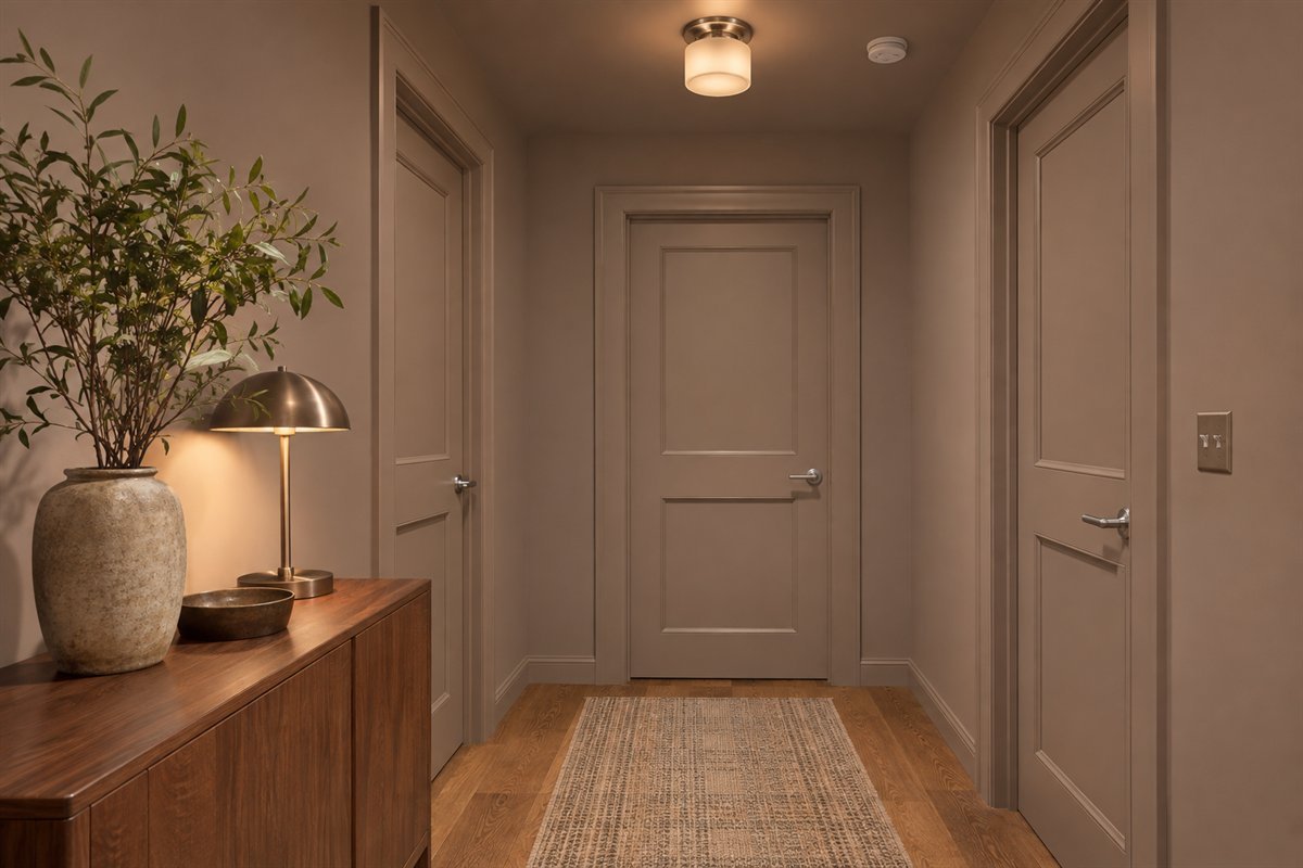
A hallway with several doors can feel visually fragmented when each frame creates another strong contrast. A mushroom shade repeated on suitable walls, doors and trim is one option for quieting those interruptions. Draw the surfaces included in the scheme before choosing the color. Keep hardware and fittings on their own appropriate specification rather than assuming that everything visible should receive wall paint.
Check the color against each room reached from the hall, not just the view from the front door.
3. Wrap a living room in muted sage

Muted sage can provide a continuous background around a cream sofa and retained wood furniture. The pale upholstery creates a distinct shape within the colored room, so the result does not depend on matching green accessories. Compare the green against the actual wood and the curtain fabric. If the green appears too cool in the room, try a different physical sample before changing the furniture to rescue the palette.
Leave the main upholstery sample beside the paint board while making the final comparison.
4. Give an olive study a lighter working surface

An olive envelope can sit behind a lighter desk so the work surface remains visually distinct. Keep color selection separate from the desk’s useful light, storage and equipment requirements. A richly colored room can still need appropriate task lighting. Compare the wall and ceiling from the actual chair rather than approving the scheme solely from a bright doorway photograph.
Try the usual writing or screen task under the evening light intended for the study.
5. Choose inky blue for an enclosed dining room

An enclosed dining room gives a deep blue scheme a clear boundary. A lighter table or chair fabric can remain the room’s focal group while the architecture recedes into one color. Include the room’s light fittings and any retained art in the sample comparison. The dark envelope should be a preference supported by the room’s actual use, rather than a promise that every dinner will feel more intimate.
Compare the blue with the table set for an ordinary meal, including the lighting used after dark.
6. Keep a powder-blue bedroom simple

Powder blue can carry from the walls over the ceiling while bedding remains a separate light layer. This is useful when the bed and floor already provide enough detail. Check the sample alongside the largest textile, since a blue that appears pale on a small card can become much more noticeable across the entire room. Keep the bedroom’s practical lighting and window requirements independent of the color choice.
Choose the bedding that will remain before comparing several similar blues.
7. Try dusty pink around dark wood

A dusty pink envelope can make a retained dark wood bed feel like an intentional part of the room. The useful comparison is between the actual timber, bedding and painted sample, rather than a pink label alone. Some pinks lean peach, others look cooler; choose the relationship you prefer in this room. Keep a limited textile palette so the wall color has a clear role.
Compare the sample at the headboard and near the window before committing to the whole ceiling.
8. Pair muted clay with a breakfast table
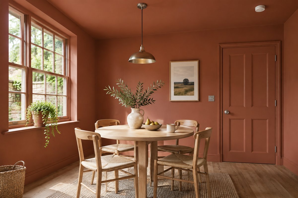
A muted clay shade can surround a small breakfast table without requiring patterned walls or elaborate trim. Relate it to any fixed floor and to the table’s actual finish. Keep the color envelope within a defined room or nook if the adjoining kitchen already has a busy material palette. A terracotta-colored coating and a textured mineral finish are different product choices even when the colors appear similar.
Decide whether the project is a color change or a new surface finish before comparing quotations.
9. Sample soft yellow in a reading nook

Soft yellow can provide a gentle colored background for a reading chair and a small table. Test a substantial sample because the effect across walls and ceiling can be stronger than expected from a tiny swatch. Compare it with the actual lamp light and the book or task used in the chair. Keep the scheme simple enough that you can tell whether the color itself is the part you enjoy.
Try one yellow sample beside a quieter alternative from the same chair position.
10. Use charcoal around a restrained media room

Charcoal can reduce the visual contrast between the room’s planes while lighter furniture keeps a readable outline. Compare the arrangement with the screen both on and off, and with the ordinary room lights. Decorative paint is not an acoustic treatment and does not verify a screen’s viewing conditions. Keep equipment ventilation, controls and service access available regardless of how continuous the color appears.
Judge the room during the way it is actually used, not only in a darkened photograph.
11. Frame a reading collection with aubergine

Aubergine can give a reading collection a distinctive background while the book spines provide varied small accents. A bookcase painted to relate to the room can look quieter than a contrasting surround. Check the case’s actual material, coating suitability and curing requirements before placing books back against a newly finished surface. The visual concept does not establish a cabinet-paint system.
Keep some clear shelf space so the background color remains visible among the books.
12. Try deep red with a limited furniture palette

A deep red room can work with a limited group of cream fabric, dark wood and a plain rug. This lets the color carry the visual emphasis without making every item compete. Compare the sample through the ordinary lighting changes; a red chosen from a bright screen may feel quite different in the actual room. Keep useful retained furniture in the comparison before assuming that the color requires a complete makeover.
Start with the one large furniture item that will stay and choose the red beside it.
13. Let crown molding read through shadow

Painting a suitable crown profile in the room color can let its shape read through shadow rather than through a white outline. Inspect the existing detail and sample the proposed finish before treating it as a background element. A strongly reflective coating may emphasize the profile differently from a quieter one. Keep the decision about color separate from repairing or replacing the molding itself.
View the profile from the main seat, where its shadow may differ from the doorway view.
14. Continue the color over a sloped ceiling

A sloped ceiling can create several changes of plane in one room. Continuing a single shade over suitable surfaces is one way to reduce the number of painted boundaries. Mark every slope and retained feature on the room sketch, then decide what belongs in the envelope. The approach changes the visible outline; it does not change headroom or make an awkward furniture position practical.
Compare the color from the bed and at the lowest visible slope before selecting the final sample.
15. Bring a built-in cabinet into the envelope

A built-in cabinet can join the room envelope when its finish relates closely to the walls. This can be useful if you want its contents and function to matter more than a contrasting cabinet outline. Specify the coating for the actual cabinet material and use rather than applying the wall product by default. Leave hinges, handles and other working parts on their own appropriate treatment.
Ask the supplier to identify the wall and cabinet products separately even when the color names match.
16. Keep paneled interior doors within the color field

A paneled door does not need a contrasting color for its shape to remain visible. Repeating the room shade can keep the door within the larger color field while the panels provide relief. Compare the door open as well as closed, including the transition toward the next room. Follow the actual door and coating requirements instead of assuming one paint suits every construction.
Record which face and edge belong to each room before the work begins.
17. Use sheen as a separate design decision

The same color can appear different when the finish changes. Benjamin Moore’s monochromatic guide distinguishes a single-shade scheme from using several shades of one hue, and discusses sheen as another layer. Compare the proposed wall and trim finishes together. Choose the actual products for their surfaces and use, rather than demanding identical reflection at the expense of suitability.
Ask for a sample of the intended finish on each surface type, not only a single color card.
18. Keep a wood floor as deliberate contrast

A color-drenched room does not require a painted floor. Retained wood can provide a useful contrast beneath a continuous wall-and-ceiling envelope. Compare the sample with the wood’s real tone and sheen, especially near the edge of the room where trim meets the floor. Keeping the floor outside the paint scope can also make the planned boundary easier to describe.
Write down retained surfaces explicitly so the project scope is clear.
19. Let pale upholstery define the seating group

Pale upholstery can create a recognizable seating group inside a deep colored room. Let the furniture’s shape and texture carry some of the contrast rather than adding several more accent colors. Check the actual fabric beside the wall sample under the room light. The photograph is a composition idea, not a claim that a particular fabric will look the same in every room.
Compare the sofa sample with both a wall and a ceiling-facing sample before approving the palette.
20. Use one patterned curtain as a separate layer

A single patterned curtain can sit within a color-drenched room when its colors relate clearly to the envelope. Keep the other large textiles quieter so the pattern has room to read. Compare a full repeat instead of only the smallest fabric cutting. Plan the curtain’s stack and operation with the actual window; color coordination does not establish a practical installation.
View the fabric hanging vertically beside the paint sample before ordering it.
21. Choose the stop line at an adjoining room

An open doorway can reveal two room palettes at once. Decide which surface provides the paint boundary and record that decision before work starts. You may prefer the room color to continue around a reveal or to stop at a specific architectural edge. Compare the actual view from both sides rather than applying a rule that every adjacent space must match.
Photograph the doorway from each room and mark the intended stop line on both views.
22. Trial the idea in a genuinely bounded nook

A bounded alcove can be a smaller place to compare an immersive color before considering a whole room. Include the alcove’s ceiling if that is part of the intended effect, and keep the edge deliberate. This remains a partial-room trial rather than a complete room drench. Judge it with the chair and light in place so the smaller project answers a real design question.
Choose a nook with a clear architectural boundary instead of inventing an arbitrary painted stripe.
23. Compare sample boards at wall and ceiling angles

Use physical samples to compare how the intended color appears on differently oriented surfaces. A wall sample alone cannot show the complete overhead effect. Bunnings recommends testing colors on different walls and in natural and artificial light; extend that comparison to the planes included in your own brief. Treat sample boards as a color study and follow the final product’s sampling and preparation guidance.
Record the sample, finish, position and lighting condition so the comparison can be repeated.
24. Review the evening scene before making the final choice

Make the final comparison during the time the room is used most often. Evening lamps can change the relationship between the room envelope and its furniture, so include them before approving the color. Try a normal activity and check whether the room still has the useful light and visual contrast you want. Choosing a color and choosing a lighting setup are connected decisions, but one does not substitute for the other.
Keep the final sample in place through an ordinary day and evening before placing the paint order.
A surface-by-surface color-drenching worksheet
Draw the room from above, then add a small elevation for each wall and a separate ceiling sketch. Record every opening and fixed feature that changes the visible outline. In the first column of a worksheet, list the surfaces included in the color envelope. In the second, list the retained floor, furniture, fittings and adjoining-room colors. This prevents a reference photograph from quietly expanding the project beyond what you intended.
For each painted surface, add a product and finish column. A shared color name does not mean that wall paint, a cabinet coating and a door finish are interchangeable. Ask the supplier to confirm the intended substrate, preparation, application and care for the actual products. Record the door face, edge and frame decisions so the change between rooms is understandable before the work begins. Do not add hardware or safety devices to the list simply to make a photograph look continuous.
Add a sample record with position, lighting and retained companion. For example, an original hypothetical study might compare a muted green beside an oak floor, a cream sofa cutting and the intended curtain fabric. Record a daylight view from the doorway, a seated view after dark and a ceiling-facing comparison. These observations describe a preference in one room; they are not a measured promise about room size, wellbeing or paint performance.
Finish with a decision column: approve, compare another sample, or exclude from the paint scope. Keep the physical samples and product information together. Once the color relationship is clear, obtain an itemized scope covering the actual preparation and application requirements. This worksheet is an original planning resource, not a substitute for product instructions or an assessment of existing coatings.
Compare a full drench with a related monochromatic palette
A single-shade room uses the same intended color across the chosen surfaces. A related monochromatic palette can instead use several depths within one hue. Describe which approach you mean in the brief: a lighter ceiling and deeper trim may be coordinated, but they are a different visual choice from a uniform-color envelope.
Try both approaches on a small drawing and with physical samples before deciding. If the ceiling is the part you are uncertain about, isolate that comparison while keeping the walls and retained furniture constant. Changing the ceiling color, wall shade, curtain and sofa all at once makes it harder to identify the effect you actually prefer.
Keep the result practical. A continuous color does not make uneven surfaces disappear, supply task lighting or verify coating suitability. If the palette works but the full scope is too large, retain the sample record and choose a smaller defined project. A considered stop line is more useful than painting unsuitable components to chase a perfectly continuous image.
What is color drenching?
It is a design approach that carries one intended color across a room’s selected architectural surfaces, often walls, ceiling, trim and doors. Define the scope and suitable coatings for the real room rather than assuming every object should be painted.
Does color drenching have to be dark?
No. Pale blue, warm ivory or muted yellow can also form a continuous color envelope. Compare the shade with retained furniture and the room’s actual light before choosing its depth.
Should walls, ceiling and trim use the same paint product?
Not automatically. The visual aim can be a shared color while the actual coating and finish are selected for each substrate and use. Follow the product guidance and compare the intended finishes together.
Will color drenching make a small room look bigger?
It can change the visible boundaries and contrast, but the impression varies with light, shade and furnishings. It does not add space or guarantee that the room will feel larger. Compare a physical sample study in your own room.
Can I keep a wood floor and white furniture?
Yes. Floors and furnishings can remain deliberate contrasting layers within a wall-and-ceiling envelope. Record them as retained surfaces in the planning worksheet.
A practical next step
Start with the retained materials, choose the extent of the color envelope and test the actual finishes together. A clear surface list and a daylight-and-evening comparison make the final palette easier to judge than a color chosen from a screen alone.
Compare living room colors with retained furniture. Coordinate bedroom paint with bedding and wood. Compare color with other ceiling design choices.
Images are original AI-generated room concepts. They are not exact paint formulas, photographs of completed projects or proof of coating suitability. The worksheet is an original design-planning tool. Follow the actual product and surface requirements; color does not verify an installation or guarantee a room-size, health or lighting outcome.
Sources and care references
- Benjamin Moore: single-shade and multiple-shade monochromatic schemes
- Bunnings: color-drenching scope, sample comparisons and product guidance
Optional digital guide for this topic
If you prefer a structured workbook, explore this related paid guide.