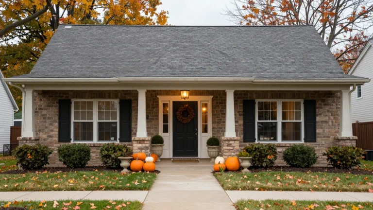
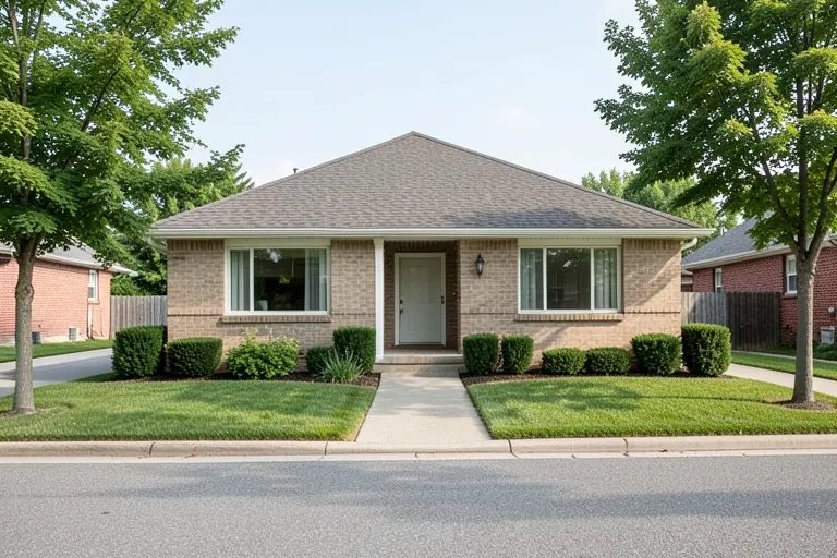
Front door colors are easier to choose when you treat the entrance as part of the whole house. The siding, brick, roof, trim and paving are all visible together, even when the door itself occupies only a small part of the facade.
Begin with the materials you will keep. A red-brick home may need a different blue or green from a house with cool gray siding. These 25 combinations show useful directions for several exterior palettes, with practical ways to compare the color from the sidewalk and at the doorstep.
The images are design concepts rather than exact paint formulas. Before changing the finish, check the door material, existing coating and current door-maker guidance. Product compatibility, exposure and any applicable property requirements should be settled before the final color is ordered.
The images are original AI-generated decor concepts, not installation diagrams or photographs of completed client projects.
Jump to an idea
- Use deep navy front door colors with red brick
- Pair slate blue with warm white siding
- Try powder blue against a quiet cream facade
- Use dusty teal beside pale gray siding
- Set a peacock-blue door within cream trim
- Choose sage for a warm neutral house
- Pair olive front door colors with warm stone
- Give forest green a white-sided setting
- Use eucalyptus green with gray-beige siding
- Try muted mint on a small porch
- Use burgundy with cream siding
- Pair oxblood with warm brick
- Give a tomato-red door a simple neutral facade
- Try muted coral with warm white
- Use terracotta against a pale plaster-look wall
- Try dusty rose with a warm gray exterior
- Choose soft yellow with deep gray siding
- Use ochre on a quiet white facade
- Set black front door colors against pale trim
- Use charcoal with mixed gray materials
- Try warm white on a dark house
- Use mushroom beside a colorful facade
- Connect cocoa brown to pale warm siding
- Try muted plum against light stone
- Coordinate the door and sidelight frames deliberately
Compare front door colors at two viewing distances
Place a real sample near the door in the same orientation as the finished surface. Look from the approach, where the door sits among the whole facade, and close up, where it meets the trim and hardware. Check both sun and shade when available. A color that looks balanced at the paint counter may become unexpectedly bright outside. Keep the roof and paving in your comparison rather than matching only a small piece of siding.
| Existing exterior | Compare these directions | Check before choosing |
|---|---|---|
| Red or orange brick | Navy, olive and deep charcoal | The mortar and the brick’s cooler markings |
| Cream siding | Forest green, burgundy and warm blue | Whether the trim is cream or bright white |
| Cool gray siding | Muted blue, teal and clear warm contrast | The roof and stone undertones |
| White siding | Black, green and a deliberate colorful accent | How much contrast you want at the entry |
| Warm stone | Olive, cocoa and muted clay | Several pieces of the varied stone |
Separate the color decision from the coating decision
A front door may be wood, metal, fiberglass or another construction, with a factory finish or previous coating. Those details affect the compatible preparation and painting system. Follow the exact door manufacturer’s and coating manufacturer’s current instructions, including any color or exposure limits that apply to your door. A photograph cannot establish that a particular dark finish is suitable for every door or storm-door arrangement.
Include the small permanent details
Keep the handle, lock, letter opening, house numbers and light fitting in one sample review. They do not all have to match, but they should feel deliberate beside the door and trim. If a storm or screen door sits in front, judge the color through that actual layer as well. Keep access, locking and the door’s normal operation clear when adding decorative items.
1. Use deep navy front door colors with red brick
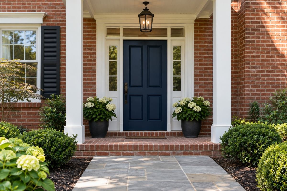
Deep navy gives warm brick a deliberate cool contrast. White or softly off-white trim can define the opening without competing with the door.
Compare the blue with the darkest and lightest parts of the brick, including the mortar. A navy that looks almost black in shade creates a different entrance from a brighter blue, so view the sample from the approach as well.
Practical tip: Keep the mortar visible beside the sample.
2. Pair slate blue with warm white siding

Slate blue can add a muted color focus to warm white siding. Its gray quality gives the door presence while keeping the exterior comparatively restrained.
Check the color beside the roof and any stone at the entry. If the blue appears too cold, compare a more muted or slightly greener sample before changing the trim. Keep accessories limited to let the pairing remain clear.
Practical tip: Compare the door sample with the roof color from a distance.
3. Try powder blue against a quiet cream facade

Powder blue offers a lighter entry color for a cream house. The contrast is gentle, making it useful when you want the doorway to feel distinct without becoming the strongest feature on the street.
A pale blue can look more vivid outdoors than on a small card. Compare the actual sample under the porch and in open daylight. A darker handle can provide a clear practical outline on the pale door.
Practical tip: Check the pale color in shade before deciding.
4. Use dusty teal beside pale gray siding

Dusty teal can bridge blue and green against pale gray siding. It adds color without needing a second bold feature on the porch.
The gray’s undertone matters. A violet-gray wall may need a different teal from a green-gray wall. Set the sample beside the siding and paving together, then use a quiet doormat and simple hardware.
Practical tip: Compare the teal against the paving as well as the siding.
5. Set a peacock-blue door within cream trim
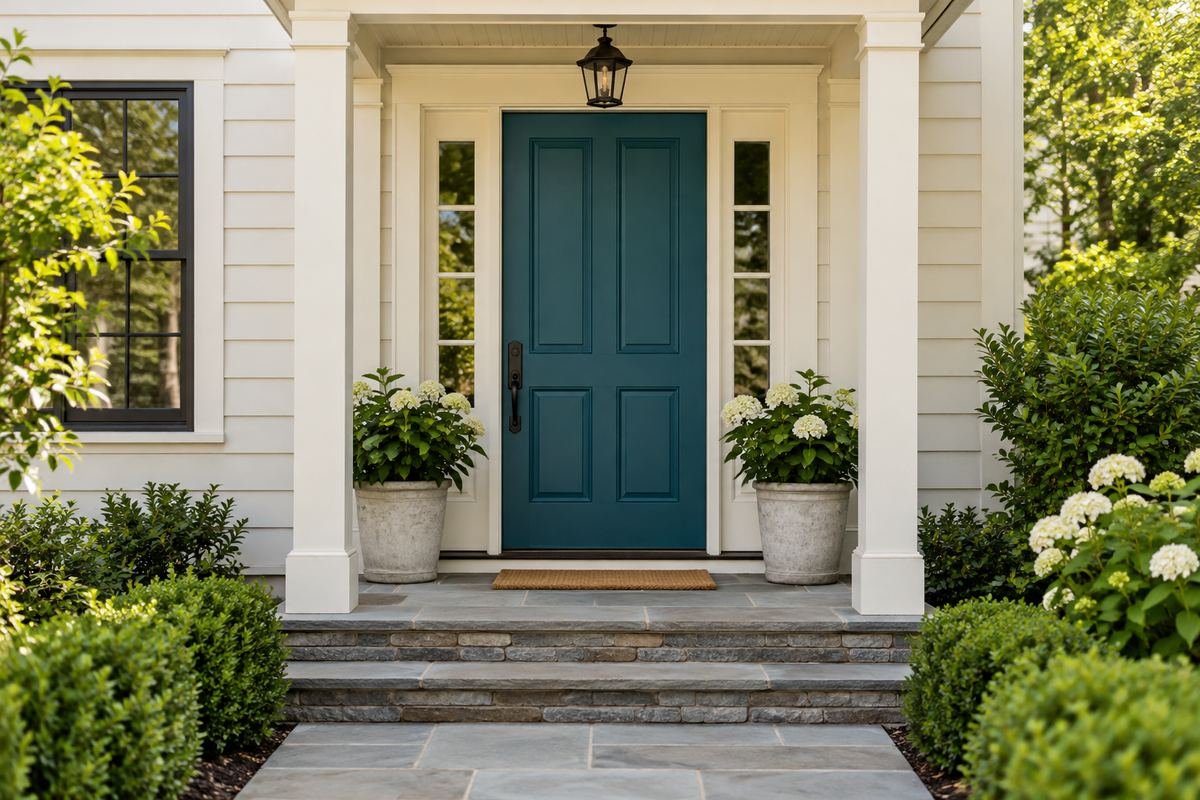
A richer peacock blue can make the entrance a focal point on an otherwise quiet facade. Cream trim softens the boundary around the stronger color.
Use the sample to decide how saturated the blue should be. Keep planters and accessories from introducing several competing accent colors. The door can carry the main statement while the rest of the entrance stays orderly.
Practical tip: View the sample from the far end of the approach.
6. Choose sage for a warm neutral house
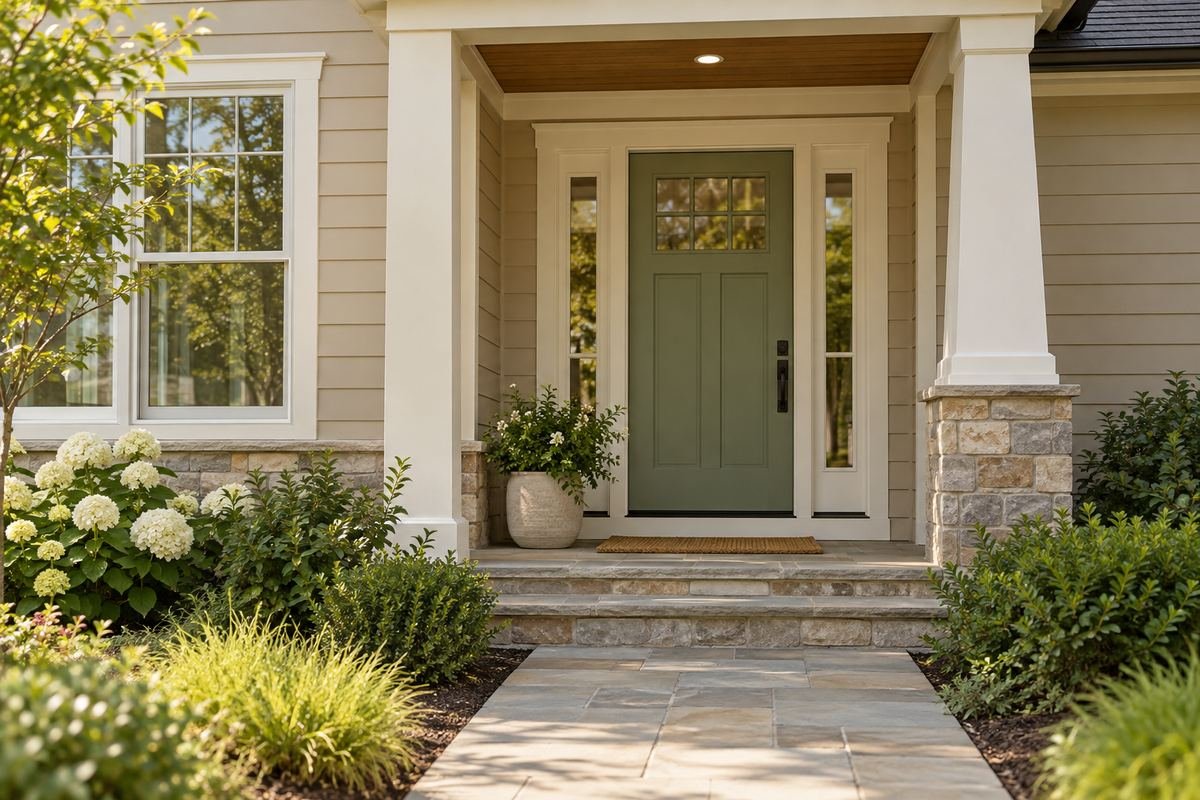
Sage can connect warm siding with garden foliage without copying the brightest green in the planting. The muted tone creates a soft change at the doorway.
Compare the green with the trim white, because one can make the other appear unexpectedly yellow. A natural wood or dark metal detail can give the pale palette a clear edge without adding another color family.
Practical tip: Keep the trim sample in the green comparison.
7. Pair olive front door colors with warm stone
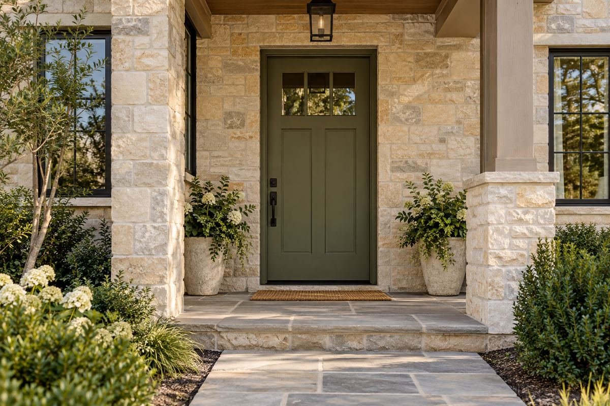
Olive can sit naturally beside stone containing beige, brown and muted gray notes. The door becomes a related color within the material palette rather than a separate bright accent.
Use several pieces of the stone in your comparison if the surface is varied. A green that works beside one piece may disagree with another. Let the mortar and trim help you settle the depth.
Practical tip: Compare more than one area of the stonework.
8. Give forest green a white-sided setting
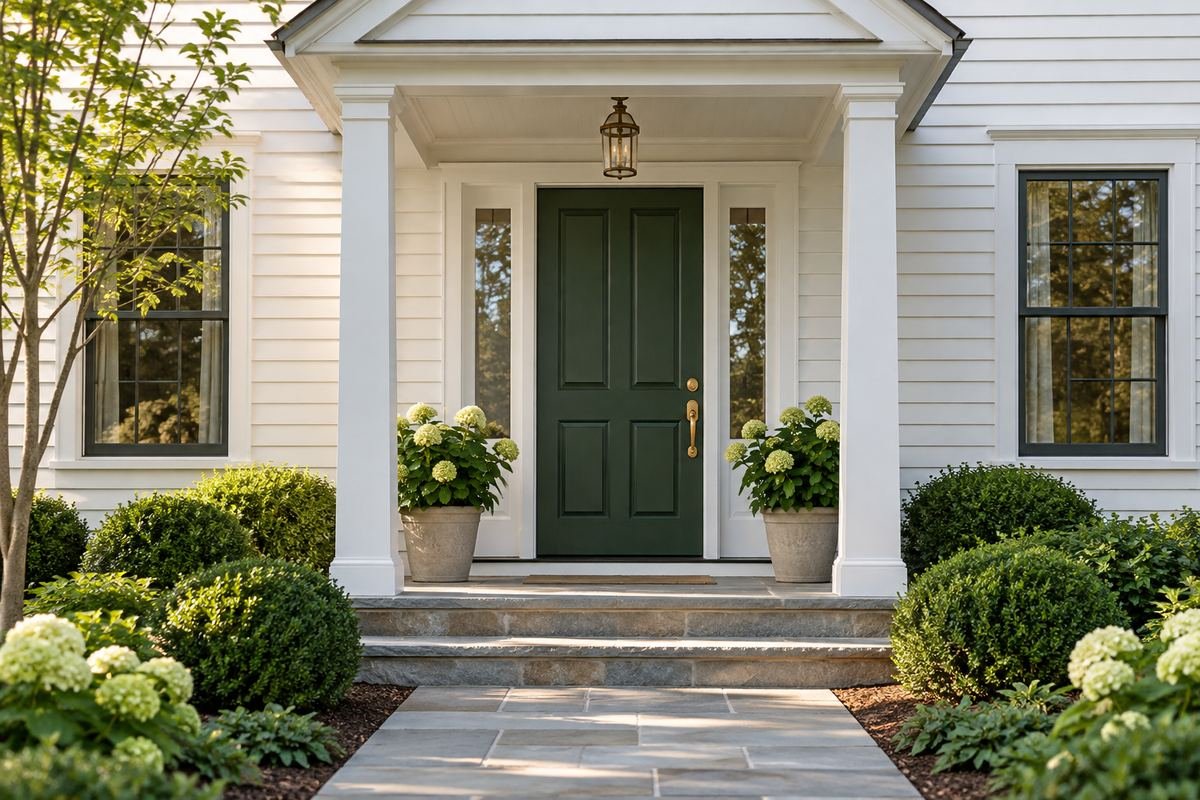
Forest green provides a deep focal point against white siding. A modest amount of warm metal can give the darker door detail without making the entry overly decorative.
Check how the green reads through any screen or storm door. The additional frame may change the visible proportions and contrast. Choose the color from the entrance as it will actually be used, with those permanent layers in place.
Practical tip: Judge the color through the actual screen-door layer.
9. Use eucalyptus green with gray-beige siding
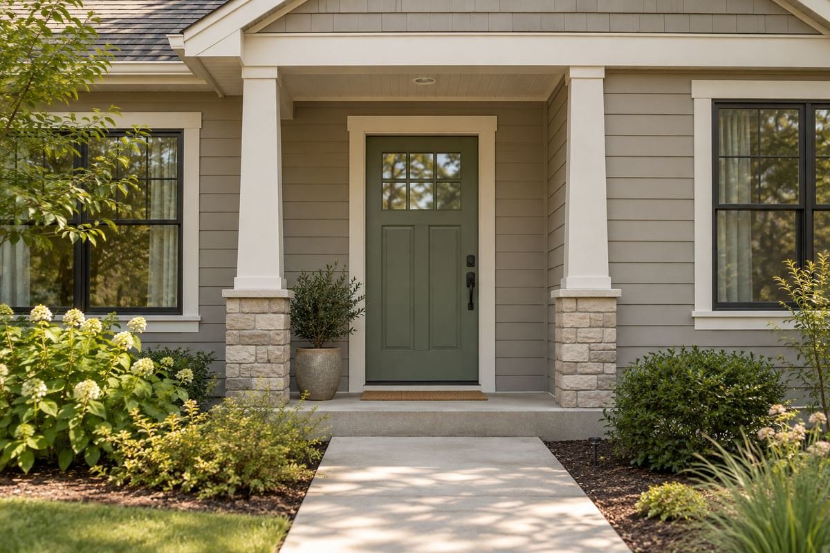
Eucalyptus green can connect a mixed gray-beige exterior to a slightly cooler doorway. Its muted character suits a house where the trim and paving already contain several subtle neutrals.
Avoid trying to match the siding exactly in green. A clear but quiet difference usually reads more intentionally than a near-match. Check the sample at the shaded edge of the opening where the undertone becomes easier to see.
Practical tip: Compare the shaded and sunlit parts of the sample.
10. Try muted mint on a small porch
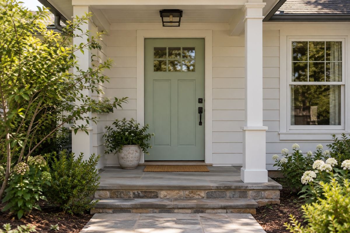
Muted mint can give a small porch a fresh color direction without a large decorating project. Keep the wall and trim quiet so the pale green remains visible.
Compare the mint with any warm brick or reddish floor at the entrance. If the pairing feels too pastel, choose a grayer green or a more defined hardware finish. One small planted pot is enough to connect the door to the setting.
Practical tip: Include the porch floor in the sample view.
11. Use burgundy with cream siding
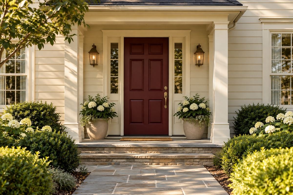
Burgundy creates a rich red-brown accent against cream siding. The restrained combination can work with traditional door panels and a simple pale surround.
Check the color with the roof and brick details. A purple-leaning burgundy differs from a brown-red one, especially outdoors. Use the actual samples to decide which connects to the existing house rather than choosing by the color name.
Practical tip: Compare the red’s purple and brown undertones.
12. Pair oxblood with warm brick

A deep oxblood can form a close, rich relationship with warm brick. The contrast comes from the door’s depth and finish rather than a completely different color family.
A pale surround can keep the opening readable if the brick and door are both dark. Compare the sample against the whole wall from the path; a close palette that looks subtle nearby can almost disappear at a distance.
Practical tip: Use trim to define a deliberately close color pairing.
13. Give a tomato-red door a simple neutral facade

A clearer red can become an energetic focal point on quiet gray or off-white siding. It works best as one deliberate accent rather than a color repeated on every porch item.
Test the saturation outside before committing. Strong red can dominate a small entrance, so decide whether that level of attention suits the facade. Keep the number display and lock area visually clear against the chosen finish.
Practical tip: Compare a muted red with a clearer red outdoors.
14. Try muted coral with warm white
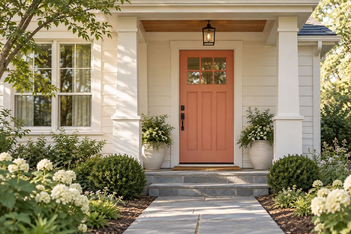
Muted coral gives a warm-white exterior a softer colorful accent than a vivid orange-red. A restrained gray or natural stone path can ground the combination.
Check the sample beside any red brick, terracotta tile or brown trim. Too many similar warm colors may look unresolved. If the facade already has strong warm notes, compare a quieter coral or a different depth.
Practical tip: Keep nearby brick and floor colors in the comparison.
15. Use terracotta against a pale plaster-look wall

Terracotta can give a pale neutral wall an earthy focal point. The color needs enough contrast with the surrounding surface to make the doorway feel clear.
Compare the door with the wall in the strongest daylight you normally see. A pale terracotta may become much brighter outdoors. Keep the hardware and planters quiet so the color relationship remains the main feature.
Practical tip: Judge the sample in the brightest available outdoor light.
16. Try dusty rose with a warm gray exterior
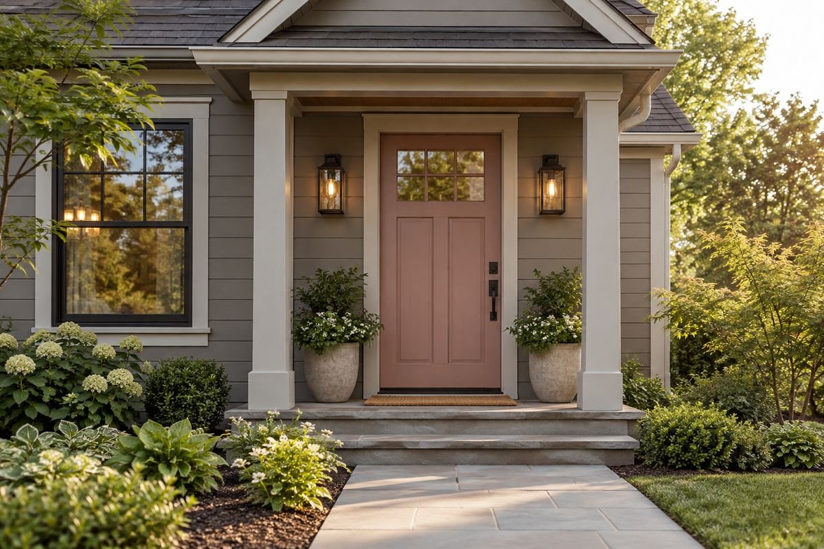
Dusty rose can introduce a gentle brown-pink note against warm gray siding. It gives the doorway individuality without relying on a very saturated accent.
The roof and paving can make the pink look warmer or cooler. Compare the sample with both before choosing. A deeper handle finish adds definition, while simple planting keeps the entrance from feeling overly themed.
Practical tip: Look at the sample with the roofline in view.
17. Choose soft yellow with deep gray siding
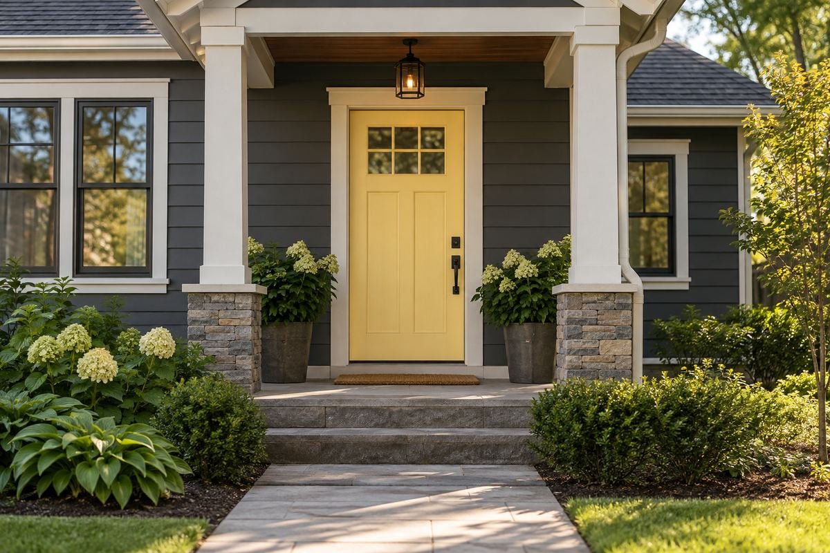
Soft yellow creates a clear warm contrast against deep gray. The combination can make the entrance easy to identify while the larger wall surface stays quiet.
Decide how bright the yellow should remain in open daylight. A buttery sample and a clear lemon sample create different effects. Compare both beside the actual trim, and avoid selecting from a screen alone.
Practical tip: Compare two yellow undertones against the same gray.
18. Use ochre on a quiet white facade

Ochre brings a deeper golden note to white siding. It offers warmth with more earthiness than a pastel yellow, particularly beside subdued stone or brick details.
Check the sample against any golden wood or brown roof. The aim is a connected palette rather than several competing yellows. Let the doorway remain the strongest warm element, with quieter accessories around it.
Practical tip: Keep secondary warm accents limited.
19. Set black front door colors against pale trim

Black and pale trim create a clear graphic doorway. The strong outline can suit both a simple slab door and a more detailed paneled entrance.
Confirm the proposed dark finish is suitable for your specific door and exposure. Then compare the black’s undertone with the roof and hardware. Some blacks feel warm, others blue-gray, and the difference can become visible beside another dark surface.
Practical tip: Check the door-maker’s finish guidance before finalizing a dark color.
20. Use charcoal with mixed gray materials

Charcoal can connect gray siding, stone and a dark roof without introducing another strong hue. A small difference in depth can distinguish the door from its surround.
Avoid an accidental near-match with black hardware or a dark storm-door frame. Compare those actual finishes together. A simple pale trim line can define the opening where the main exterior materials are already dark.
Practical tip: Compare every adjacent dark finish together.
21. Try warm white on a dark house
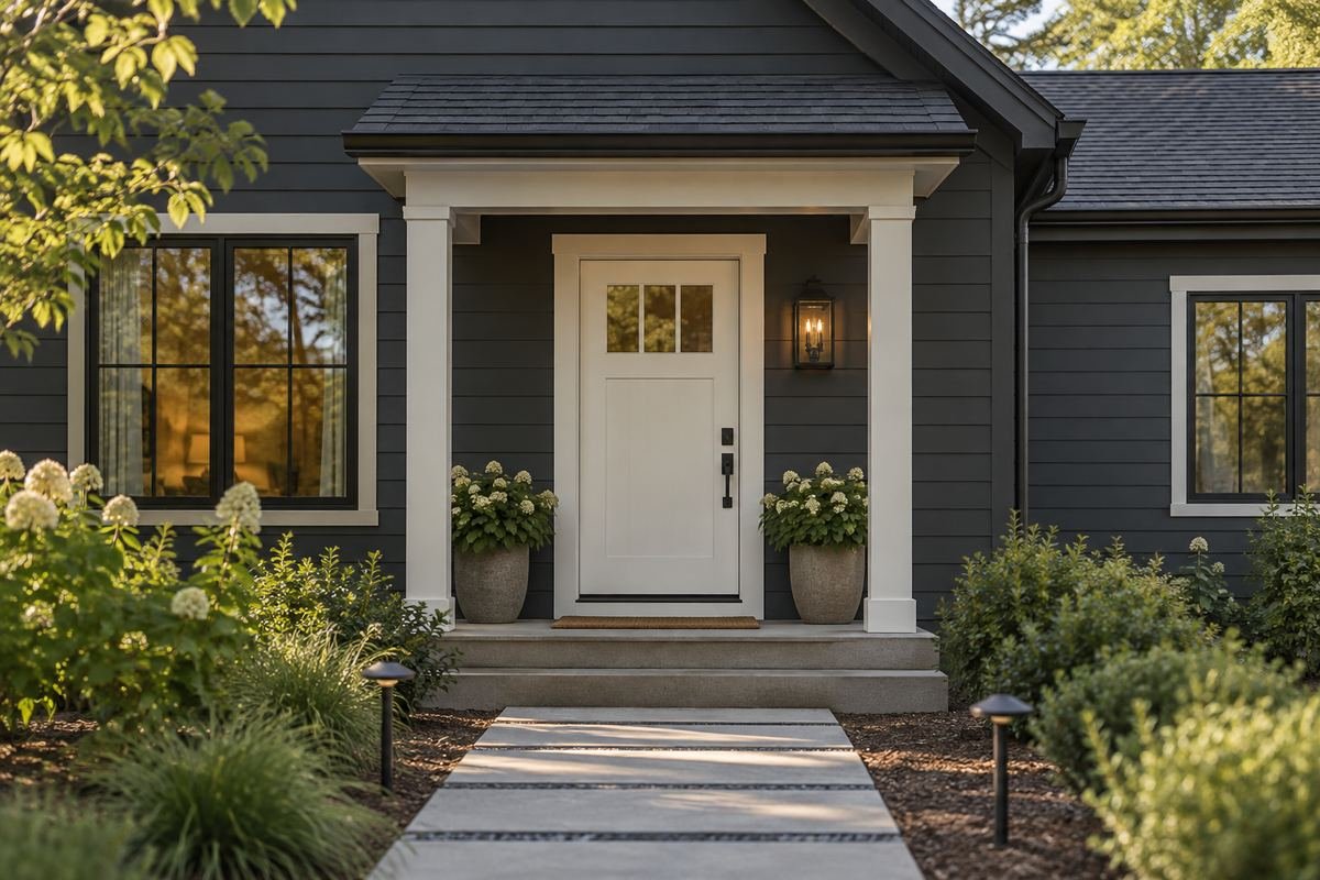
A warm-white door reverses the usual dark-door contrast. It can make an entrance clearly visible on a deep blue, brown or charcoal exterior.
Choose the white against the existing trim, which may be cooler or creamier. Two different whites can work if the relationship is deliberate. Test the finish close to the handle area as well as in a broad sample to judge the complete appearance.
Practical tip: Decide whether the door and trim whites will match or differ.
22. Use mushroom beside a colorful facade

A mushroom-colored door can give a colorful house a quieter entry. The muted brown-gray works as a pause when the siding already provides most of the personality.
Compare the door with both the siding and the paving. The neutral needs a clear relationship to the whole exterior. If the doorway disappears, use a more distinct depth or a defined trim color rather than adding more decorative objects.
Practical tip: Check that the entry remains readable from the path.
23. Connect cocoa brown to pale warm siding
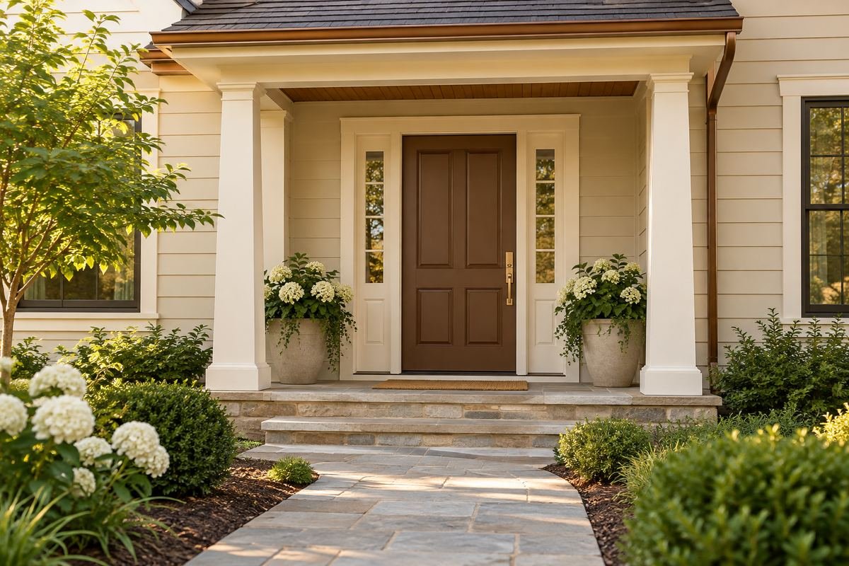
Cocoa brown gives pale warm siding a grounded doorway. It can relate to a brown roof or wood detail while remaining a clearly painted finish.
Do not expect a brown paint to reproduce the variation of natural stained wood. Choose it for its own color and sheen. A pale surround can keep the entry defined when the roof and other details are also dark.
Practical tip: Compare the brown paint as paint rather than a wood imitation.
24. Try muted plum against light stone

Muted plum can offer an unusual deep accent beside light stone. Its red-purple character needs careful sampling with the stone’s varied warm and cool markings.
Keep the entry’s other colors restrained while deciding. A quiet metal finish and simple mat allow the plum to remain the main accent. If the purple becomes too strong outdoors, compare a grayer version before abandoning the idea.
Practical tip: Compare the plum with several parts of the stone.
25. Coordinate the door and sidelight frames deliberately
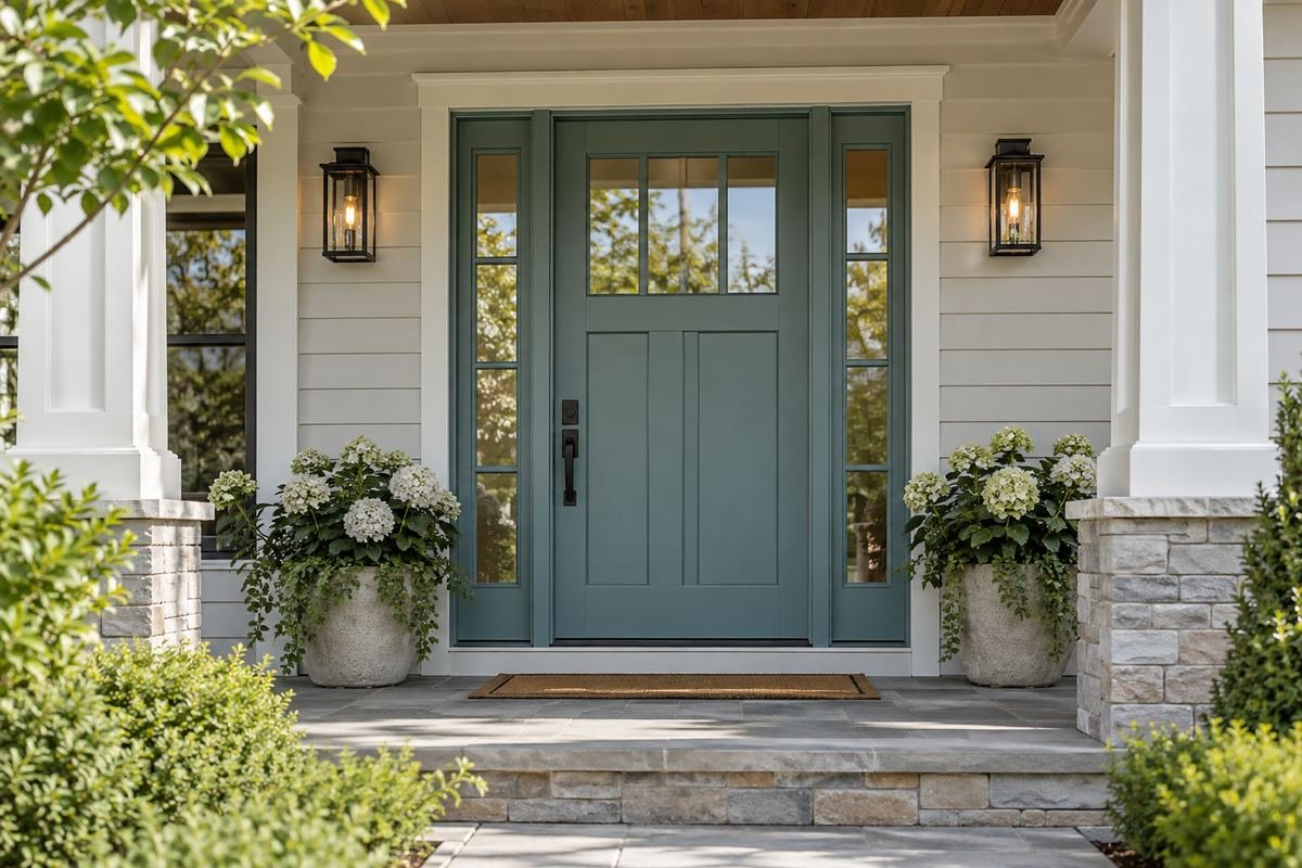
The same door color can look different depending on the sidelight frames around it. Matching frames create a broader color area, while pale frames keep the door itself more distinct.
Compare both arrangements on a simple elevation or physical samples. Include the transom and any storm-door frame in the decision so the color does not stop at an awkward visible edge. Keep glass, seals and operating hardware finished according to their actual specifications.
Practical tip: Plan every visible frame before ordering the finish.
Frequently Asked Questions
Should the front door match the shutters?
It can, but matching is one option rather than a requirement. Compare the door, shutters, trim and main wall together so the repeated color has a clear role.
Which front door color works with red brick?
Navy, olive, muted green and dark neutrals offer possible directions. The brick’s particular red, orange or brown notes and the mortar matter more than the general label red brick.
Can a front door be darker than the trim?
Yes, a darker door can provide a clear focal point. Confirm that the proposed finish and color are suitable for the actual door and its exposure before committing.
How do I test a front door color?
Use a physical sample near the door and compare it with the facade, trim and paving in the available outdoor lighting. Judge it both from the approach and close to the entrance.
Does a new door color guarantee more home value?
No. A coherent entrance may improve its appearance, but there is no reliable universal return from one paint color. Choose a suitable finish and a palette that works with the property.
Choose the Details That Work in Your Home
A well-chosen front door color connects the entrance to the rest of the house. Narrow the choices with your fixed materials, compare real outdoor samples and confirm the finish requirements for your specific door. Then keep the surrounding details simple enough for the chosen color to do its job.
For related ideas, explore exterior color ideas, curb appeal ideas, entryway rug ideas.
Planning References
Benjamin Moore: front door colors; Benjamin Moore: painting a front door and selecting a compatible coating; Benjamin Moore: choosing paint samples. Follow the instructions for the exact products you choose.
Optional digital guide for this topic
If you prefer a structured workbook, explore this related paid guide.