Curb Appeal
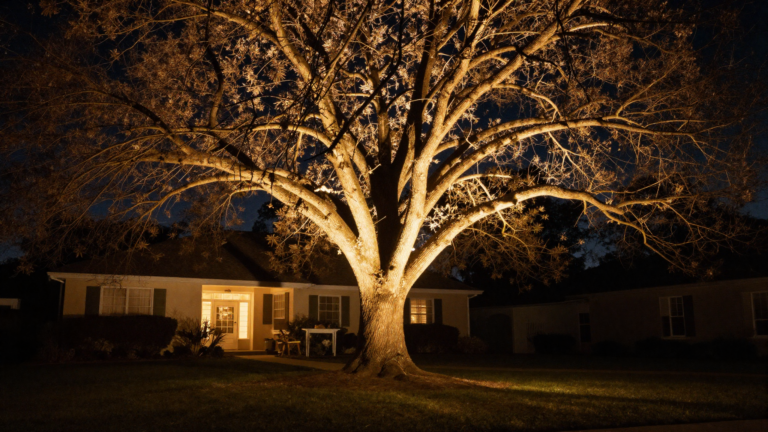
If your home’s exterior color has felt like an afterthought for years — the same beige it came with, or a repaint of whatever was already there — you’re not alone, and you’re not out of good options. Color is one of the few curb appeal upgrades that changes everything about how a house reads from the street, and it doesn’t require touching a single plant or structure to do it.
By the end of this article, you’ll have 12 real color directions to consider, from safe and timeless to genuinely bold, so you can choose a palette that actually fits your home instead of just following whatever’s trending this month.
Table of Contents
- 1. Go Warm White With Black Accents
- 2. Try a Muted Sage Green
- 3. Pair Warm Charcoal With Bronze Trim
- 4. Choose a Soft Desert-Inspired Taupe
- 5. Add One Bold Door Color as the Only Accent
- 6. Layer Gray Siding With Sage Shutters
- 7. Consider a Deep, Sophisticated Navy
- 8. Test Real Swatches Before Committing
- 9. Choose Texture Over Color When Going Neutral
- 10. Reference Historic Paint Archives
- 11. Don’t Forget the Roof in Your Color Plan
- 12. Try the Classic White, Black, and Brown Trio
- Effort & Cost Snapshot
1. Go Warm White With Black Accents
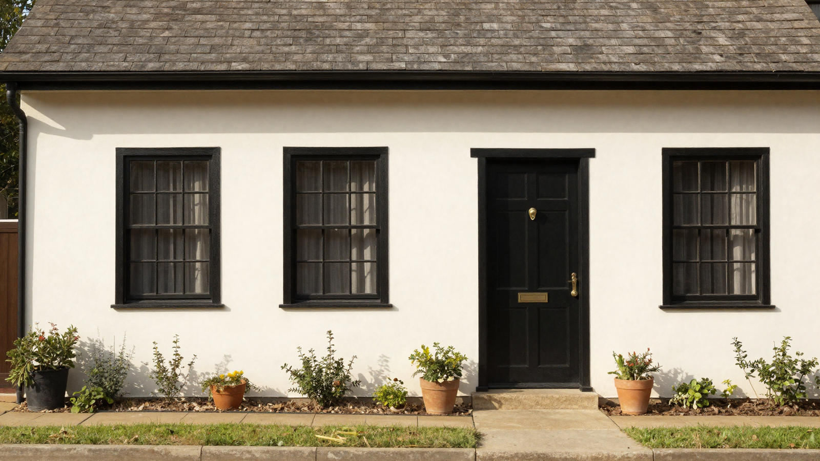
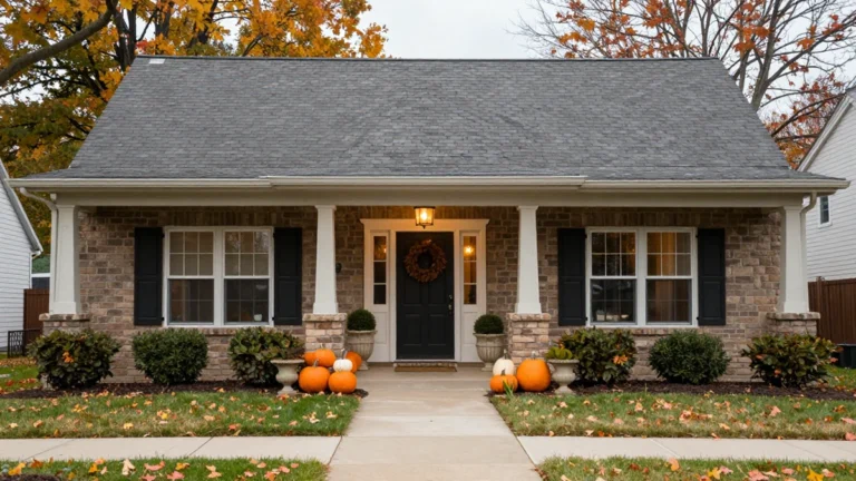
Creamy white siding with black window trim and a black front door remains one of the most reliable exterior combinations because it photographs beautifully and suits nearly any architectural style. The shift from stark, cool whites to warmer, creamier undertones is what keeps this classic pairing feeling current rather than dated.
💡 Smart tip: Look for whites with a slight cream or beige undertone rather than pure, cool white; it reads as far more welcoming in natural light.
⚠️ Mistake to avoid: Choosing a stark, blue-toned white; it can feel clinical and cold against most landscaping and natural light conditions.
2. Try a Muted Sage Green
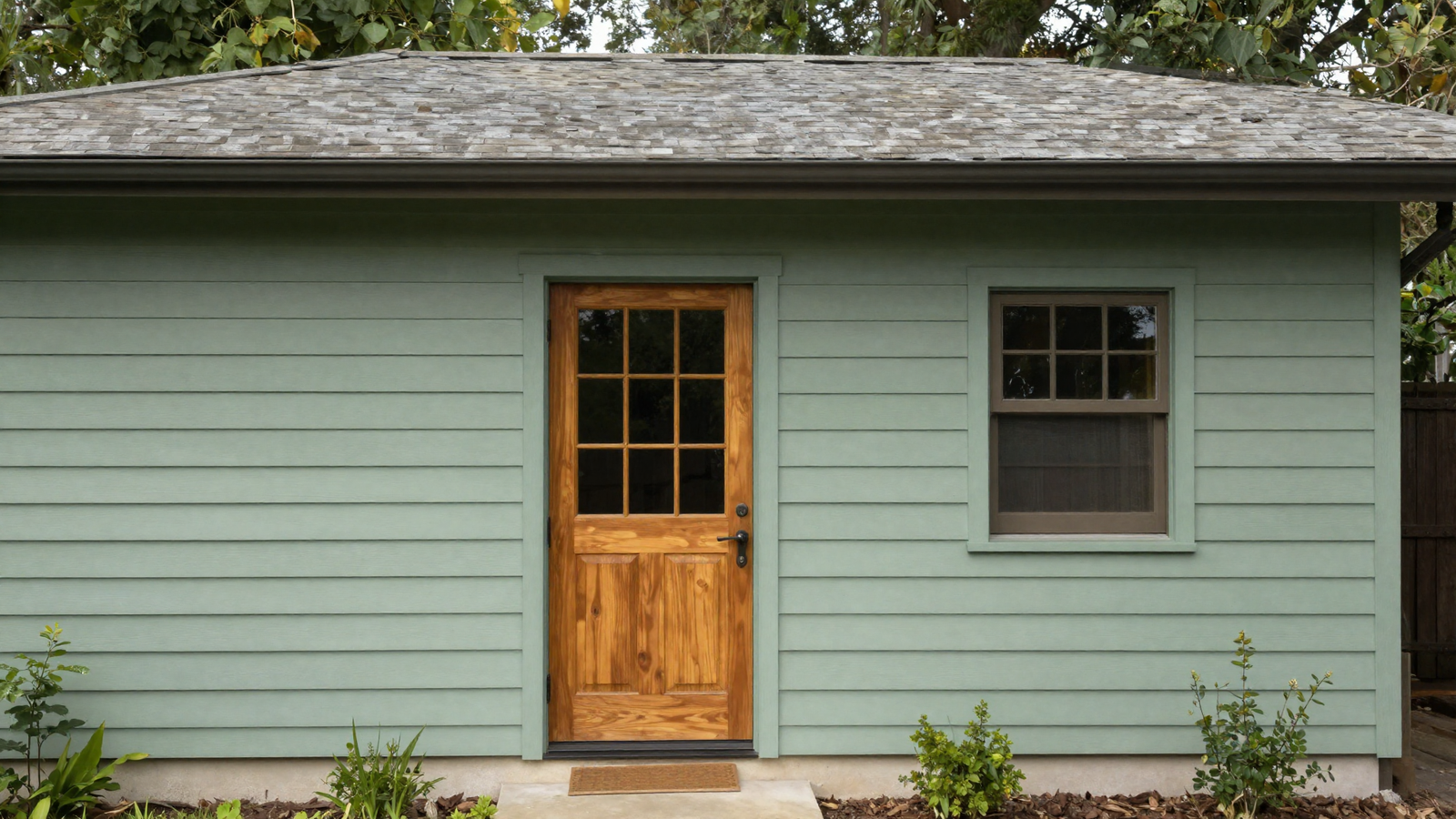
Sage and olive greens are having a genuine moment in exterior design, offering a natural, grounded look that blends beautifully into surrounding landscaping rather than fighting it. A warm wood door alongside the green keeps the palette from feeling cold or overly muted.
💡 Smart tip: Test the sage tone against your actual roofline and landscaping before committing; greens can shift dramatically depending on surrounding light and foliage.
⚠️ Mistake to avoid: Choosing a sage that’s too close to gray without enough green undertone; it can end up reading as simply dull rather than intentionally earthy.
3. Pair Warm Charcoal With Bronze Trim
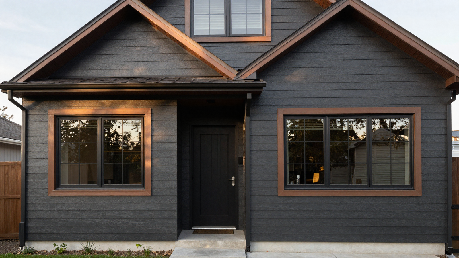
Warm charcoal is replacing the cooler blue-gray tones that dominated the last decade, and pairing it with bronze window and roofline trim adds a genuinely sophisticated contrast. It’s a bolder direction than white or beige, but it reads as elegant rather than severe when the undertones are warm.
💡 Smart tip: Confirm your charcoal has warm undertones, not cool blue-gray ones, so it pairs naturally with bronze or brass hardware instead of clashing.
⚠️ Mistake to avoid: Using charcoal on a home with little architectural detail; dark colors flatten a facade that doesn’t already have interesting shadow lines and texture.
Loving These Ideas? Get the Step-by-Step Guide
Grab the full 5-day eBook and turn these ideas into a finished room.




4. Choose a Soft Desert-Inspired Taupe
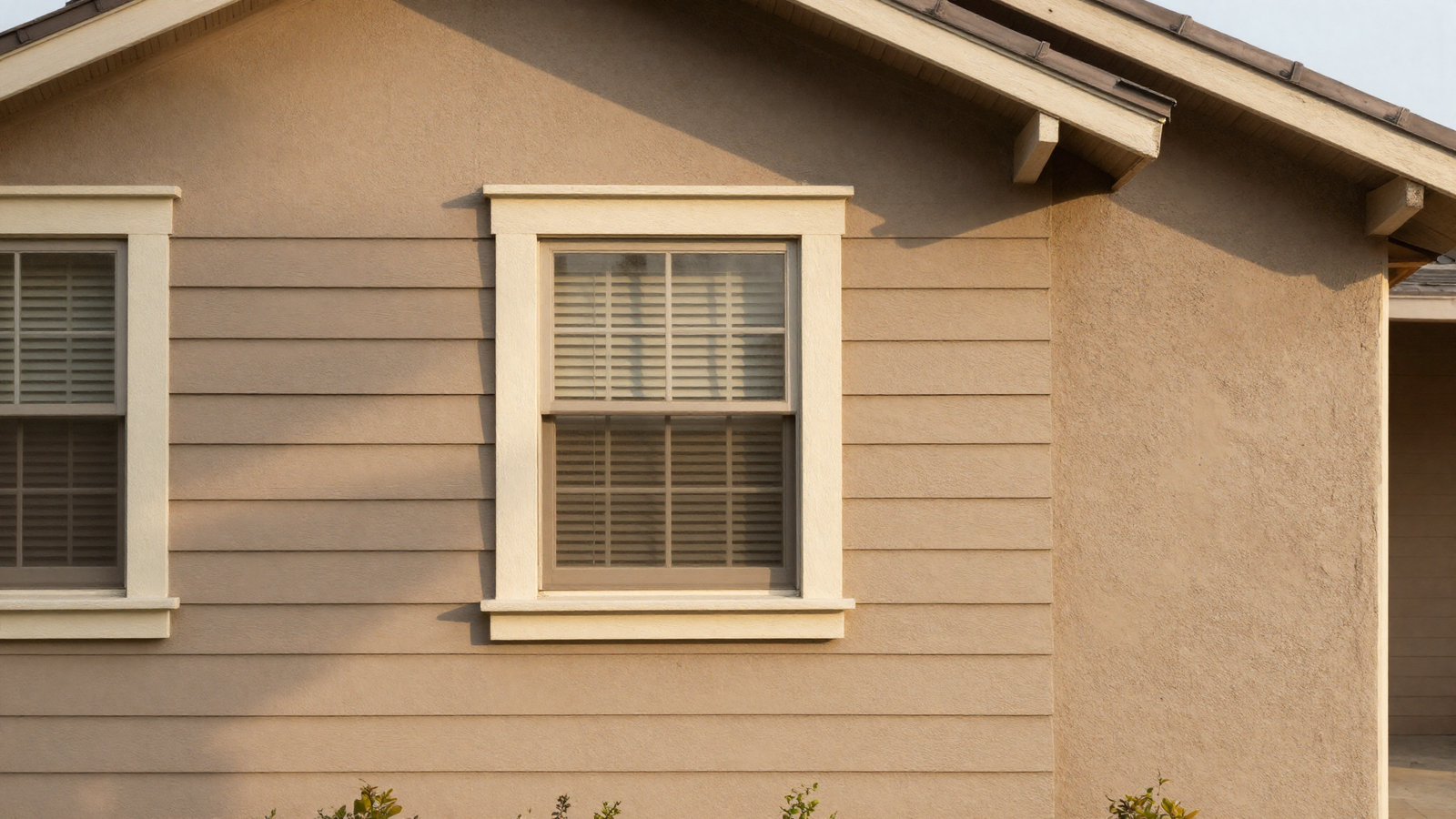
A warm taupe with a textured stucco or fiber cement finish creates a soft, sun-washed look that feels connected to the landscape rather than imposed on top of it. Paired with cream trim, it stays light and welcoming without slipping into the sterile territory that cooler grays sometimes fall into.
💡 Smart tip: Pair a textured finish with your taupe tone, since texture itself adds visual interest that flat, smooth paint on a neutral color sometimes lacks.
⚠️ Mistake to avoid: Selecting taupe without checking undertones in different lighting; some taupes shift noticeably pink or gray depending on the time of day.
5. Add One Bold Door Color as the Only Accent
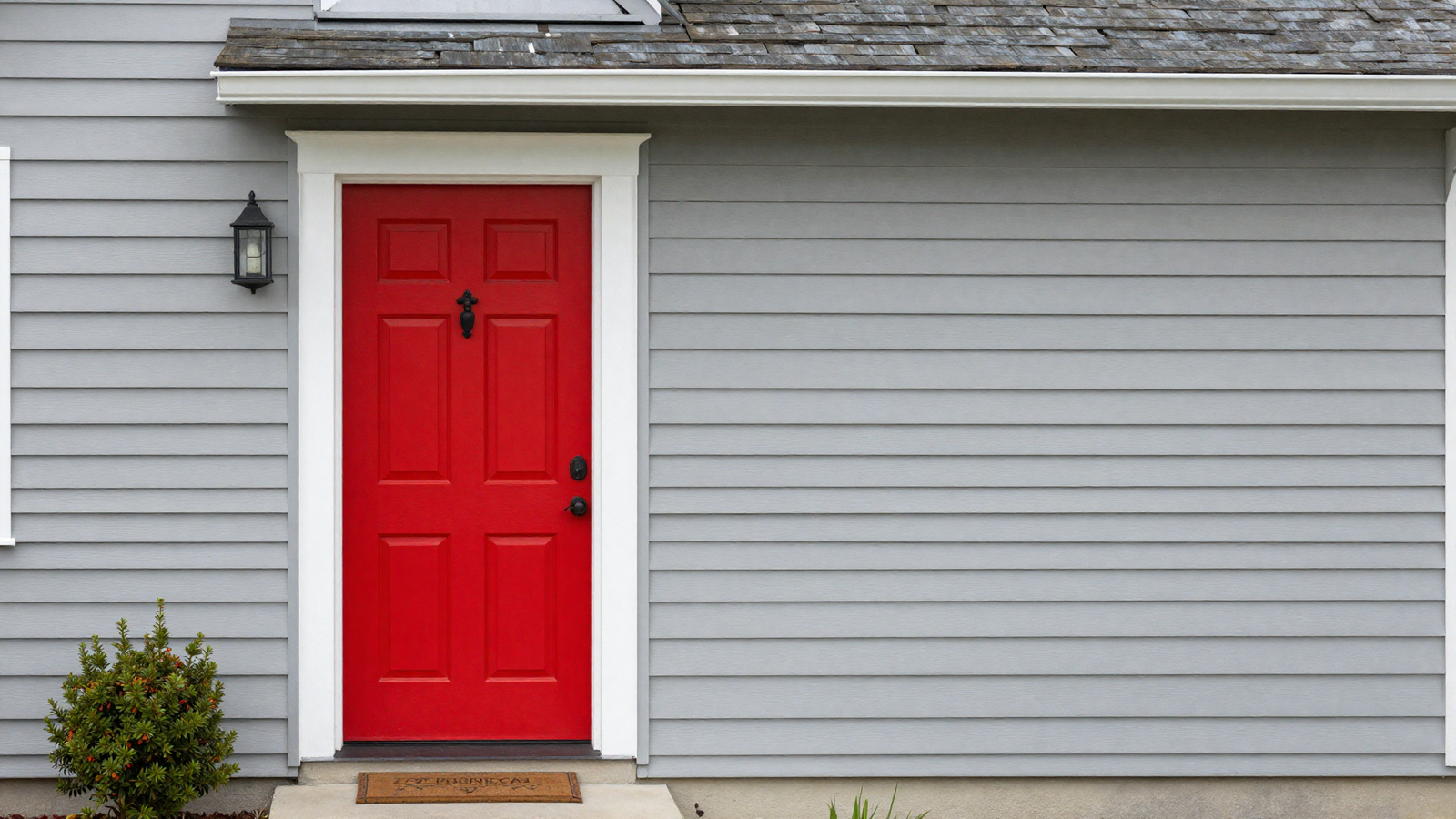
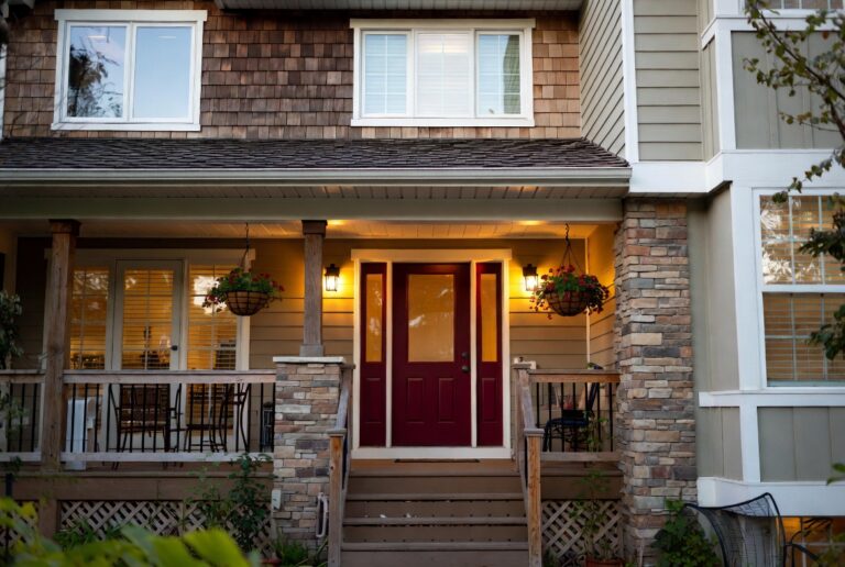
If a full repaint feels like too much commitment, a single bold color on just the front door delivers real personality with minimal risk. It’s a low-cost, low-effort way to add character to an otherwise neutral exterior, and it’s easy to change again later if your taste shifts.
💡 Smart tip: Keep the rest of the exterior firmly neutral if you’re going bold on the door; the contrast is what makes the accent color read as intentional rather than random.
⚠️ Mistake to avoid: Choosing a trendy, saturated color without checking how it holds up to UV fading over time; some pigments fade far faster than others in direct sun.
6. Layer Gray Siding With Sage Shutters
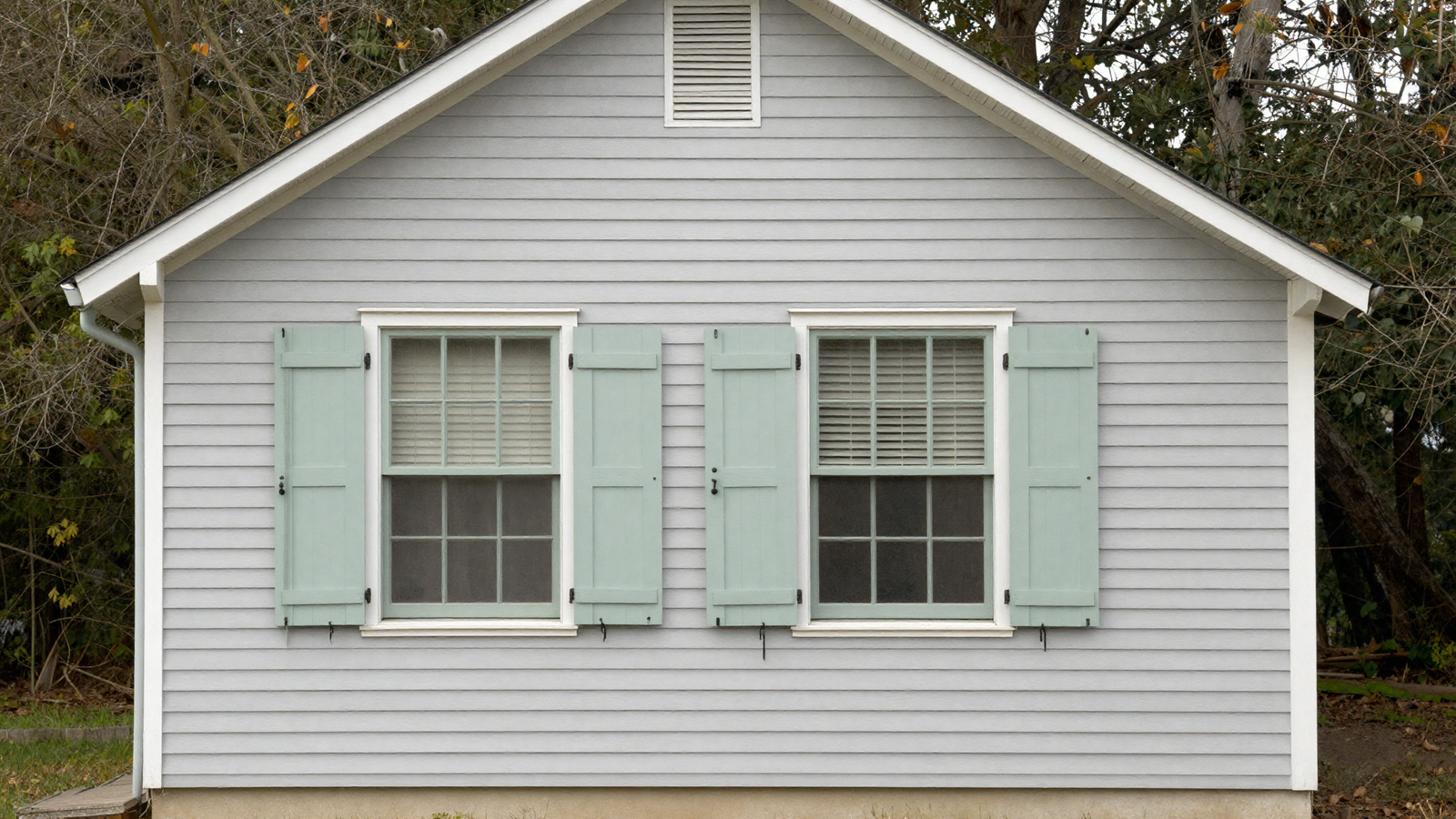
Light gray siding paired with soft sage shutters strikes a relaxed, earthy balance that works particularly well for homes surrounded by mature trees or heavy landscaping. It’s a quieter combination than a full green or full charcoal exterior, letting the color accents do the work instead.
💡 Smart tip: Choose a gray with warm undertones to complement the sage, rather than a cool, blue-based gray that can clash with green tones.
⚠️ Mistake to avoid: Painting shutters a color too close in value to the siding; you need enough contrast for the shutters to actually register as an accent.
7. Consider a Deep, Sophisticated Navy
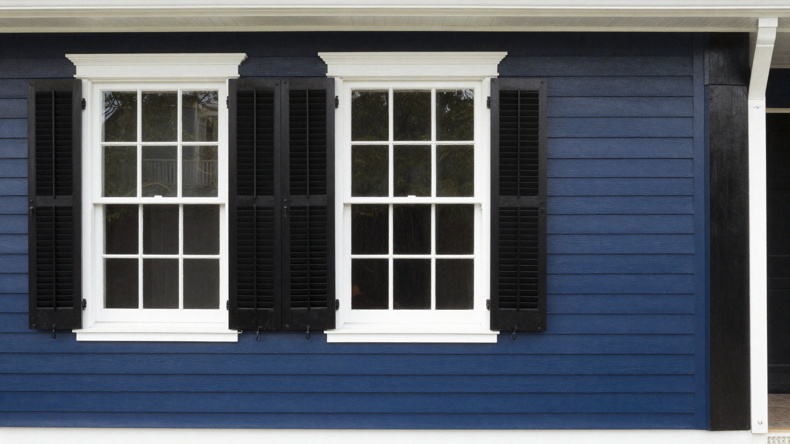
A deep navy exterior stands out on nearly any street while still reading as grounded and elegant rather than flashy. Crisp white trim keeps the overall look balanced, and a semi-gloss finish on shutters and doors adds a subtle richness that flat paint doesn’t capture.
💡 Smart tip: Use a semi-gloss finish specifically on doors and shutters rather than the full siding; it adds dimension without making the whole house feel overly glossy.
⚠️ Mistake to avoid: Choosing navy without checking your HOA guidelines first, since dark, saturated colors are sometimes restricted in planned communities.
8. Test Real Swatches Before Committing
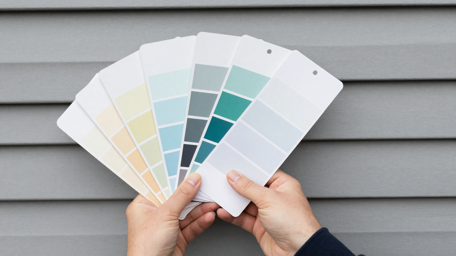
No color looks the same on a paint chip as it does across an entire facade in changing daylight. Holding large swatches against your actual siding at different times of day is the single best way to avoid an expensive repaint you regret within a year.
💡 Smart tip: View your top color choices at morning, midday, and evening light before making a final decision; exterior colors shift more than most people expect throughout the day.
⚠️ Mistake to avoid: Judging a color solely from a small paint chip; order the largest sample size available and test it directly on your home’s surface.
9. Choose Texture Over Color When Going Neutral
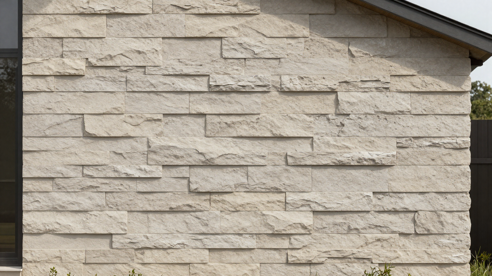
If you’re staying in safe neutral territory, textured materials that mimic natural stone or wood grain do more visual work than a flat, single-tone finish ever could. The subtle shadow and depth created by texture keeps a neutral exterior from reading as plain or forgettable.
💡 Smart tip: Look specifically at textured siding options like fiber cement panels designed to mimic natural stone; they add dimension without requiring a bold color choice.
⚠️ Mistake to avoid: Assuming “neutral” automatically means “boring”; texture and finish variation is what separates a forgettable neutral exterior from a genuinely elegant one.
10. Reference Historic Paint Archives
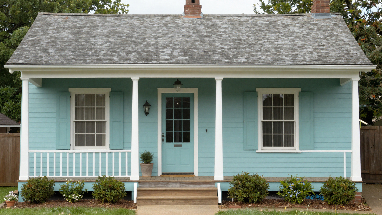
Rather than chasing whatever’s trending this season, many major paint brands maintain historic color archives with shades pulled from specific architectural periods. These tend to age more gracefully than trend-driven colors and are typically easier to source again for touch-ups years down the line.
💡 Smart tip: Ask your paint retailer specifically about their historic or heritage color line if your home has a period architectural style; the pairing usually looks more authentic.
⚠️ Mistake to avoid: Choosing a heritage color purely for its story without confirming it actually complements your home’s specific architectural details.
11. Don’t Forget the Roof in Your Color Plan
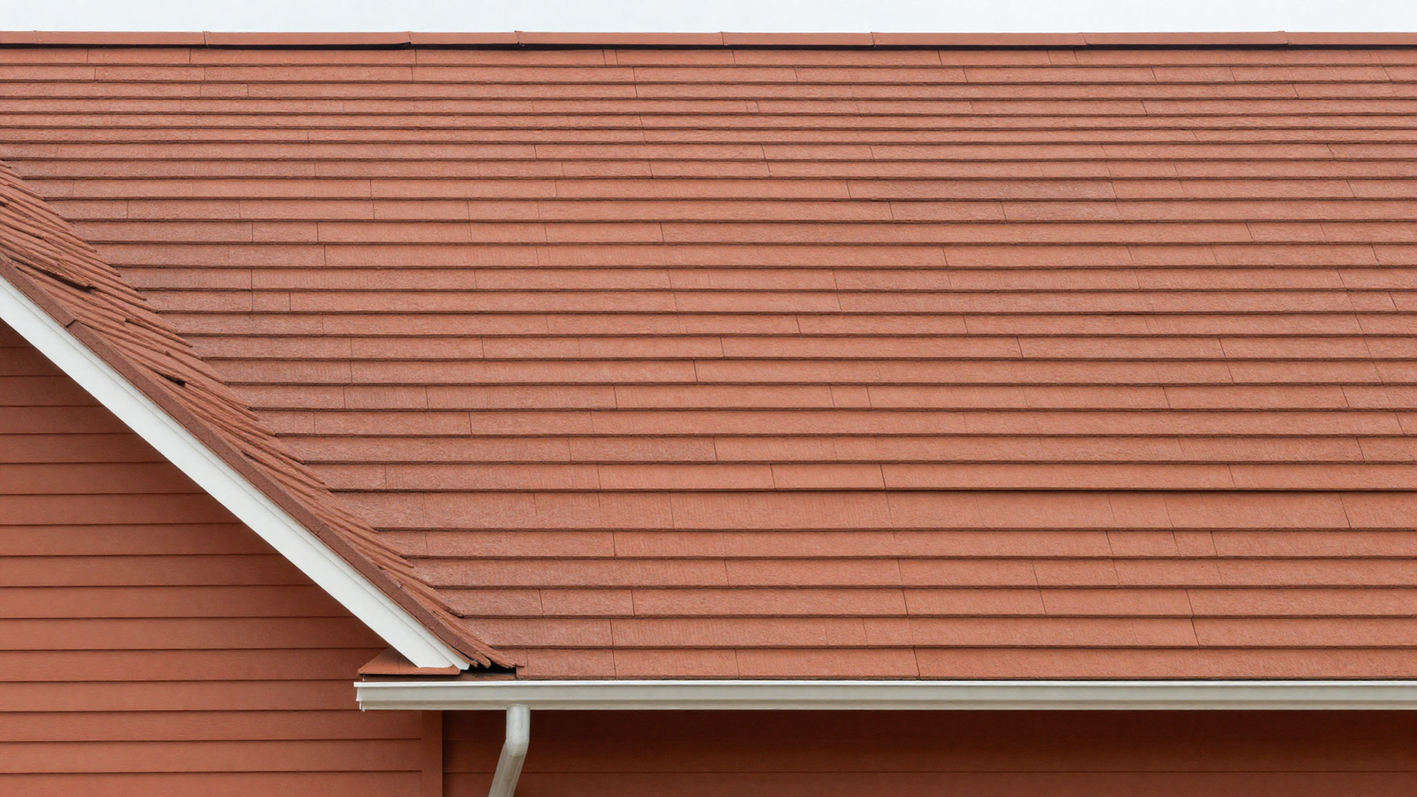
The roof can make up a substantial portion of a home’s visible exterior surface, yet it’s often the last thing people consider when planning a color scheme. Choosing a siding color that actually complements your existing roof tone, rather than clashing with it, makes the whole facade feel cohesive instead of mismatched.
💡 Smart tip: Photograph your roof and bring the image with you when selecting siding or trim colors, so you can compare undertones directly rather than relying on memory.
⚠️ Mistake to avoid: Planning a full repaint without accounting for the roof’s existing color; a beautiful new siding shade can still clash badly with an unconsidered roofline.
12. Try the Classic White, Black, and Brown Trio
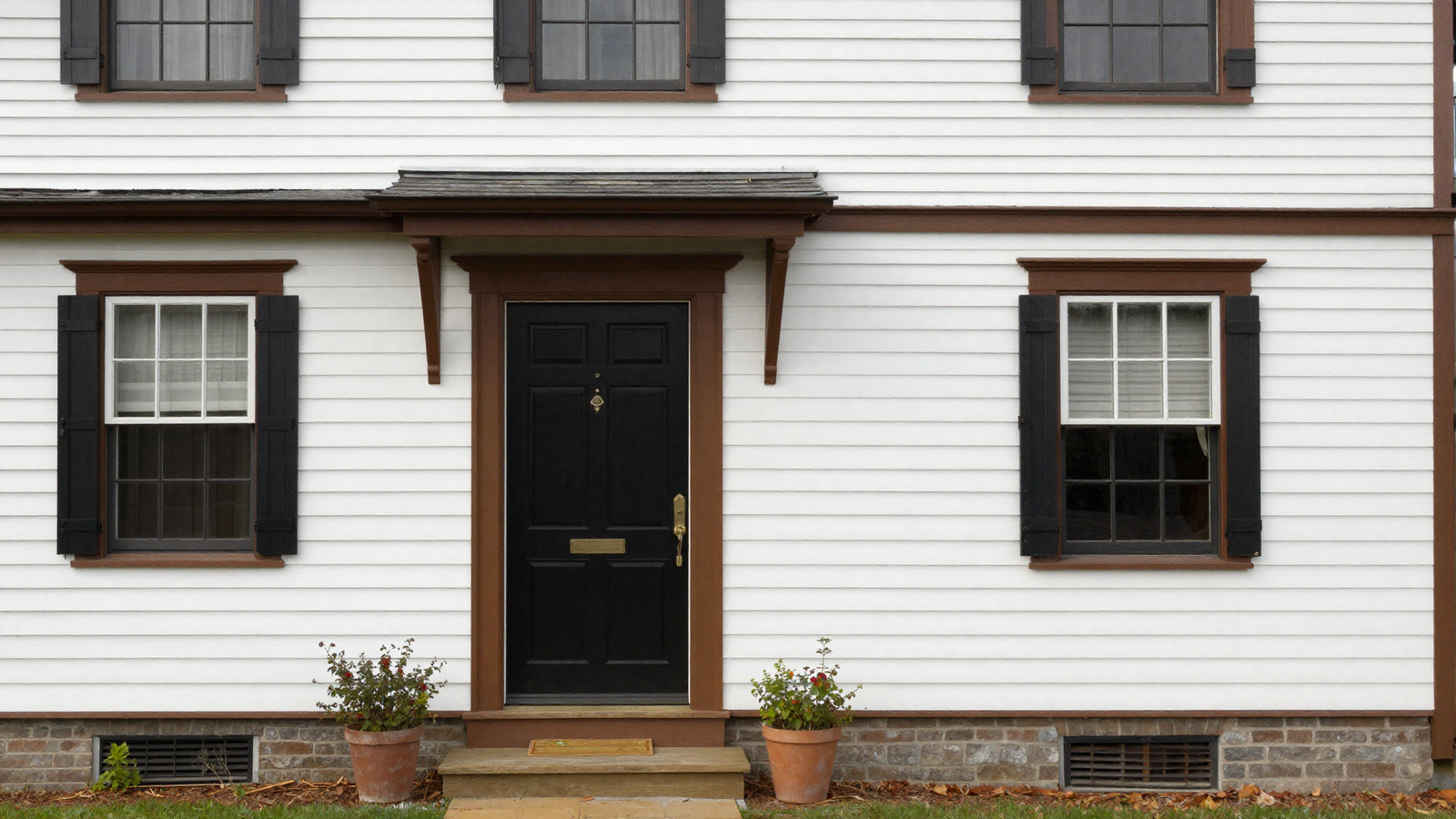
Warm white clapboard, a black front door, and brown accent trim is a combination that’s held up across decades because each color plays a distinct, clear role rather than competing for attention. It’s especially well-suited to traditional architectural styles like Cape Cod or farmhouse exteriors.
💡 Smart tip: Keep the ratio weighted toward white as the dominant color, with black and brown reserved for trim, doors, and smaller architectural details.
⚠️ Mistake to avoid: Using pure black trim on a home with a lot of small architectural detailing; it can read as harsh rather than classic on busier facades.
Effort & Cost Snapshot
| Idea | Effort | Approx. Cost |
|---|---|---|
| 1. Warm White With Black Accents | High (full repaint) | $3,000–$10,000 |
| 2. Muted Sage Green | High (full repaint) | $3,000–$10,000 |
| 3. Charcoal With Bronze Trim | High (full repaint + hardware) | $3,500–$11,000 |
| 4. Desert-Inspired Taupe | High (full repaint) | $3,000–$10,000 |
| 5. Bold Accent Door Color | Low (DIY, one weekend) | $40–$150 |
| 6. Gray Siding With Sage Shutters | Medium–High (siding + shutters) | $2,500–$8,000 |
| 7. Deep Navy With White Trim | High (full repaint) | $3,000–$10,000 |
| 8. Swatch Testing | Low (planning step) | $20–$80 |
| 9. Textured Neutral Siding | Very High (siding replacement) | $8,000–$25,000+ |
| 10. Historic Heritage Color | High (full repaint) | $3,000–$10,000 |
| 11. Coordinated Roof and Siding | Very High (roof + siding) | $8,000–$30,000+ |
| 12. White, Black, and Brown Trio | High (full repaint) | $3,000–$10,000 |
The right exterior color doesn’t have to be the trendiest one — it has to be the one that actually suits your home’s architecture and holds up years from now. Save this list to Pinterest so you can compare directions before committing to your own repaint.
Continue Your Home Transformation
Explore the full collection of step-by-step eBooks and get the guide that fits the room you're working on.