Useful hallway paint colors connect the rooms you see at the same time. A corridor can contain several door finishes, a continuous floor and light borrowed from another space. A sample that looks convincing near the entrance may appear noticeably different at a turn or beside the final doorway.
Start with those fixed details rather than an isolated color chart. Decide which doors and trim will stay, look toward the adjoining rooms and compare the lamps used during ordinary evening journeys. The hallway needs a coherent color relationship along its route, not only one attractive photograph.
These 26 concepts combine distinct colors with specific corridor conditions. They are visual starting points rather than exact commercial shade matches. Choose the actual coating for the surface and expected use, following its preparation, application and care instructions.
The images are original AI-generated decor concepts, not installation diagrams or photographs of completed client projects.
Browse These 26 Hallway Paint Colors
Jump to an idea
- Use warm white beside natural wood doors
- Compare a cooler white with cool stone flooring
- Set a soft cream against a darker hall floor
- Use oatmeal as a background for a hallway gallery
- Choose mushroom around repeated pale doorways
- Let greige connect two differently colored rooms
- Give pale gray a clear relationship with black metal
- Use muted sage near a naturally lit end opening
- Pair olive with a strong oak doorway
- Choose forest green where a deeper corridor is intended
- Try powder blue with borrowed light from another room
- Use denim blue with restrained pale trim
- Set navy against a warm timber floor
- Let dusty teal bridge blue and green room views
- Try a muted blush beside warm stone tile
- Compare pale peach in a windowless passage
- Relate muted clay to an existing brick floor
- Use restrained ochre with darker door trim
- Give an upper landing a soft butter-yellow identity
- Use quiet lilac beside cooler painted doors
- Try burgundy in a short connecting hall
- Use chocolate behind a restrained picture grouping
- Give charcoal a clear stairwell boundary
- Relate walls and trim to quiet repeated openings
- Put a deeper related color on the end wall
- Choose two tones around existing wall paneling
Compare hallway paint colors along the complete route
Place suitable real samples beside the floor, door trim and any finish that will remain. Compare them near the entrance, at a darker middle section and at a turn or landing. Review the view into adjoining rooms with the usual lights on. Define the painted boundaries and select the exact product only after the color relationships work in those positions.
| Existing condition | Useful comparison | Check in the real hall |
|---|---|---|
| Warm wood doors | Warm white, oatmeal or muted olive | The wood and wall undertones together |
| Cool stone flooring | A cooler white, pale gray or quiet lilac | The sample beside the actual stone |
| Many repeated doorways | Related wall and trim tones | Which outlines should remain prominent |
| Limited natural light | Several suitable samples under the normal lamps | Appearance at both ends and the middle |
| A visible stair landing | A palette viewed from both levels | The color transition at the architectural boundary |
| Colorful adjoining rooms | A restrained connecting tone | The simultaneous room-to-room view |
Use the doorway view as a color test
Benjamin Moore’s hallway guide emphasizes the relationship between connected rooms, entrances and stairs. Review the view through open doors before choosing a new hall color. A wall sample can agree with the corridor floor while feeling unrelated to the room visible just beyond it.
Separate color appearance from coating performance
Sherwin-Williams discusses lighting and trim relationships in its hallway guide. Use those considerations to compare appearance, then read the specification for the actual paint. A sheen name alone does not establish washability, scuff resistance or suitability for every wall condition.
Keep lighting comparisons consistent
Compare the same samples under the lamps normally used in the hall. If the lighting will change, resolve that plan before judging the final palette. A different lamp can change the appearance of the wall and nearby finishes; paint is not a replacement for useful route lighting.
Define the boundary at a real architectural edge
Mark where the hall becomes a stairwell, vestibule or adjoining room. An opening, corner or existing wall detail can provide a deliberate stopping point. Avoid changing color halfway across an uninterrupted plane simply because that was the easiest place to reach during painting.
1. Use warm white beside natural wood doors
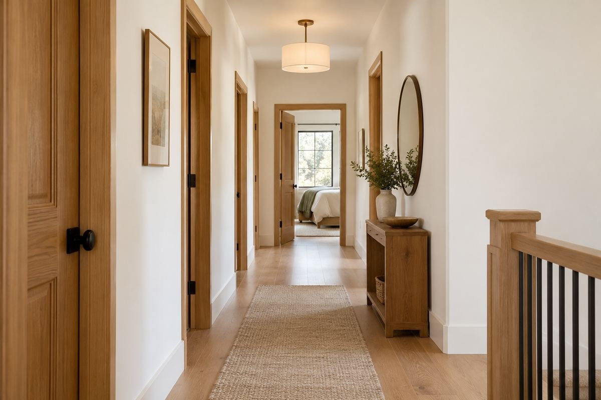
Warm white can provide a restrained background when several natural wood doors repeat along a corridor. The wood remains the main material feature while the walls connect the openings. Compare the chosen white with the actual door finish rather than assuming every warm white has the same undertone.
Review the sample beside both a door and the continuous floor. A white that works with one wood may appear unrelated to another nearby finish. Keep the first comparison simple, with the existing trim visible, before introducing a second painted accent.
Practical tip: Compare all permanent wood finishes in the same view.
2. Compare a cooler white with cool stone flooring

A cooler white can relate to a corridor floor with a distinctly cool stone character. Its restrained appearance lets the floor pattern remain visible without adding another strong color. Use actual samples to judge whether the combination feels connected in the available light.
Check the wall at a darker section as well as near the brightest opening. Stone veining and reflected light can complicate the comparison. Do not assume a white labeled cool will automatically suit every gray floor; the specific materials need to be seen together.
Practical tip: Place the sample directly beside the real floor finish.
3. Set a soft cream against a darker hall floor

Soft cream can give a dark floor a clear lighter companion without introducing a stark white contrast. This can suit a corridor where the floor already establishes a strong visual line. Keep the wall and ceiling relationship restrained while testing the sample.
Compare the cream under the normal evening lamps. Some combinations can read more yellow than expected beside dark wood or tile. Judge the actual finish rather than choosing from an image, and keep any existing white door trim in the comparison.
Practical tip: Check the cream beside the darkest permanent surface.
4. Use oatmeal as a background for a hallway gallery
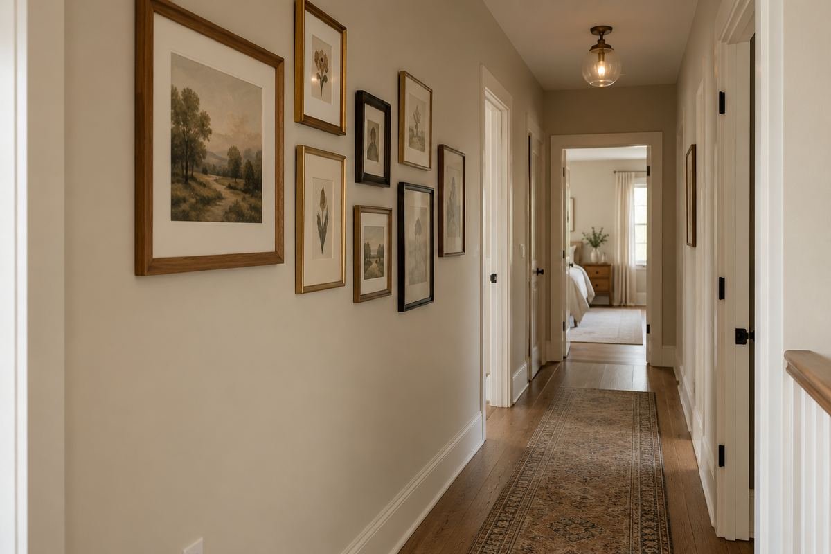
An oatmeal wall can support a modest gallery of framed pictures without making the corridor itself visually busy. Its quiet warmth can relate to varied frame materials. Keep the artwork grouping restrained enough that the walking route and repeated openings remain clear.
Compare the actual pictures and mounts against the wall sample. A photograph of a gallery cannot establish whether your artwork will retain the contrast you want. Review the wall from the end of the corridor as well as close up, since that distant view often defines the arrangement.
Practical tip: Test the wall color with an actual frame and mount.
5. Choose mushroom around repeated pale doorways
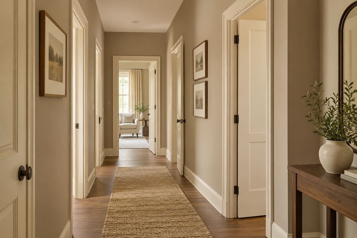
A mushroom tone can provide a gentle distinction around a series of pale doors. The repetition becomes an orderly part of the corridor rather than several sharply outlined rectangles. Keep the floor relationship clear so the wall tone does not feel detached from the rest of the home.
Check the whole run of doors before choosing the depth. A small contrast repeated many times can have a stronger effect than one sample suggests. Compare the sample beside the trim at several points, especially where the hall turns or receives less borrowed light.
Practical tip: Judge repeated contrast along the full run of openings.
6. Let greige connect two differently colored rooms
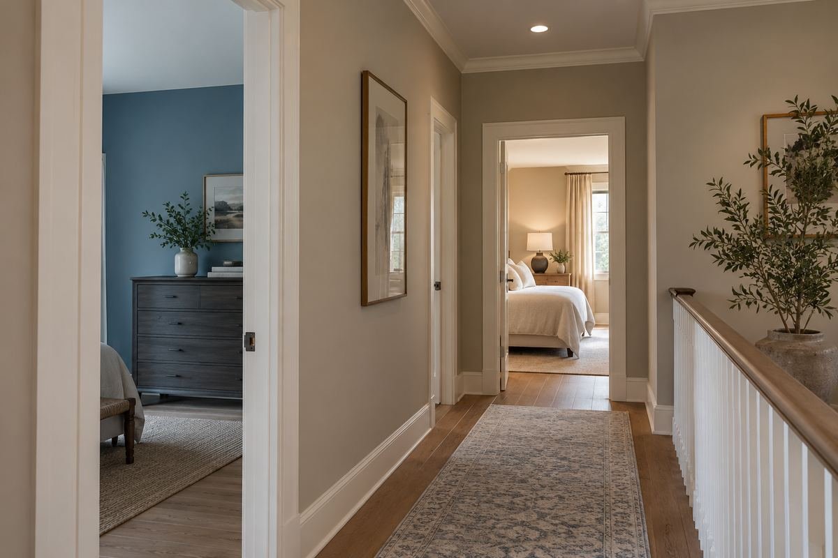
A restrained greige can serve as a connecting wall tone between adjoining rooms with different colors. The useful feature is its relationship with both views, not the idea that a neutral automatically matches everything. Keep the corridor itself simple while comparing those transitions.
Stand where both rooms are visible and review the sample there. One undertone may suit the first room but clash with the second. If the connection remains awkward, reconsider the exact sample rather than adding more colors to the hallway in an attempt to disguise it.
Practical tip: Use the viewpoint that includes both adjoining rooms.
7. Give pale gray a clear relationship with black metal
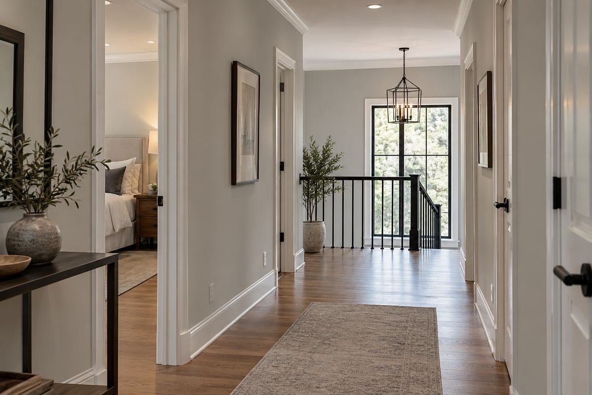
Pale gray can work with black metal door hardware or an existing stair detail when the contrast feels deliberate. Keep the gray connected to the floor rather than allowing the black accents to become the only reason for the palette. A restrained arrangement can make the details easy to read.
Compare the sample in the light nearest the metal element and farther along the route. Reflections and nearby wood can change how the gray appears. Review the actual finish and keep the black accents limited to details already useful in the room.
Practical tip: Check the gray beside both the metal and the floor.
8. Use muted sage near a naturally lit end opening
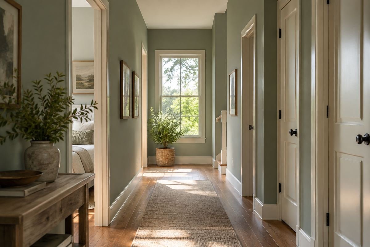
Muted sage can connect a corridor with a view toward daylight or greenery. Keep the finish quiet enough that the end opening remains the destination. The color can relate to the exterior view without becoming a literal attempt to match every leaf outside.
Compare the sage in the middle of the hall, where the same sample may look different from the bright end. Choose it for the complete route rather than only the sunlit photograph. Keep existing floor and door tones in the comparison.
Practical tip: Evaluate the color away from the brightest opening too.
9. Pair olive with a strong oak doorway
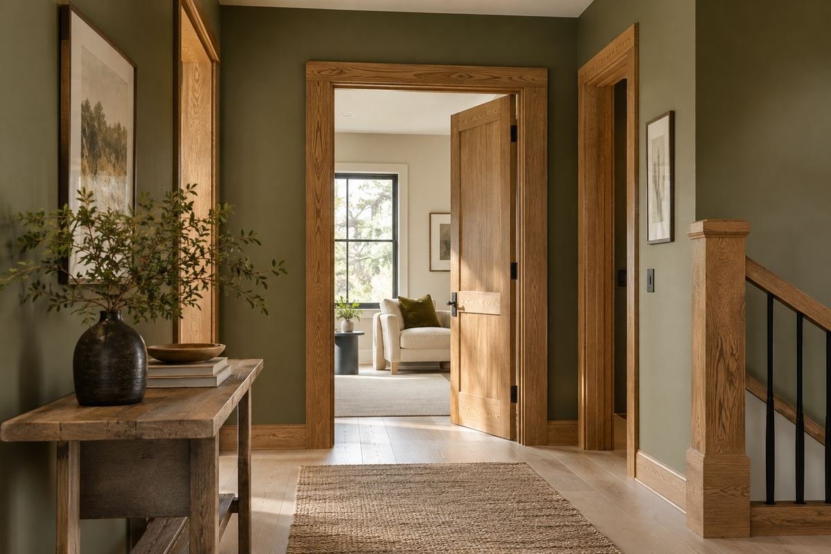
A muted olive can give a substantial oak doorway a considered painted companion. The wood grain stays visible as an architectural feature, while the wall introduces a separate color character. Keep other hallway elements restrained enough that this relationship remains clear.
Compare actual oak and paint samples under the normal lamps. Some olives can read very different beside golden or darker wood. Review the doorway from both sides so the hallway finish also relates to the room reached through it.
Practical tip: Check the doorway from both connected spaces.
10. Choose forest green where a deeper corridor is intended
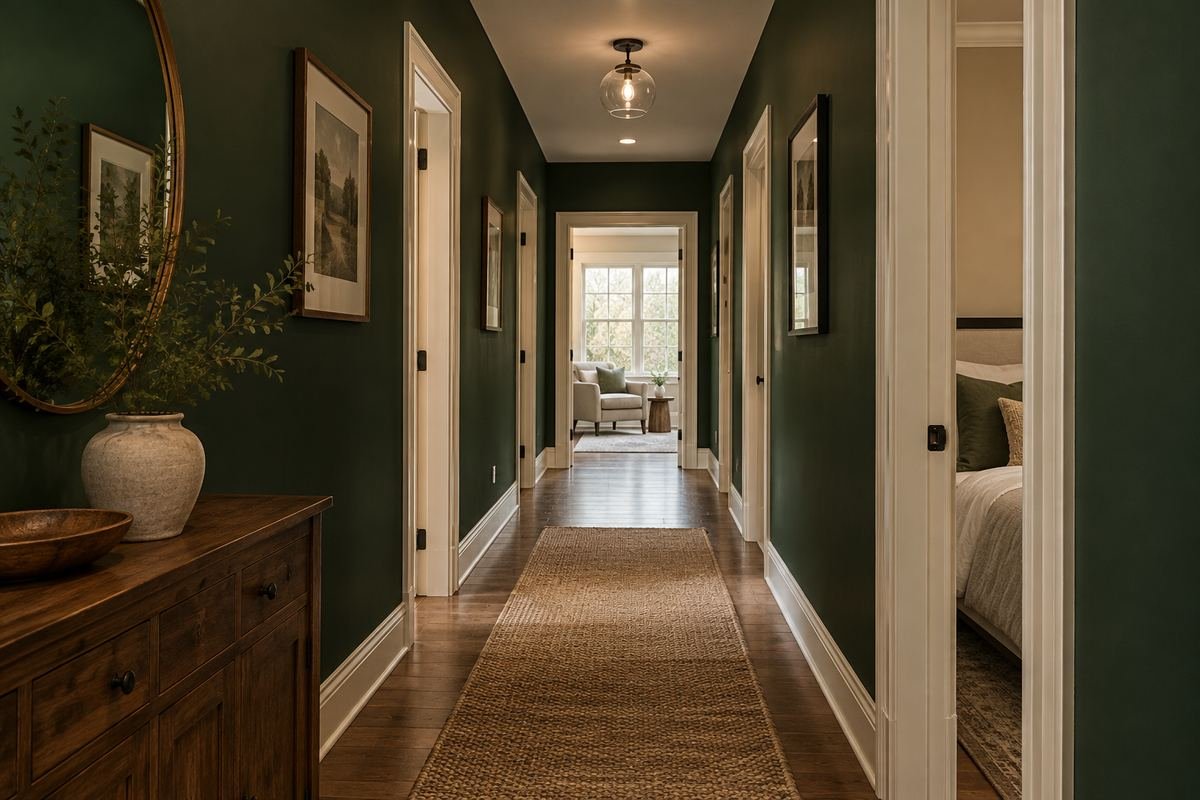
Forest green can give a hall a deliberate deeper character when that is the effect you want. Keep door outlines and the route visually readable through the overall lighting and finish arrangement. The color should be chosen as a preference, not as a guaranteed way to improve every dark hall.
Compare a full-size suitable sample under ordinary evening lighting. Review how the darker surface relates to the ceiling and adjoining rooms. If the route lacks useful light, resolve that separately instead of expecting a paint change to correct it.
Practical tip: Judge the deeper color with the route lighting in use.
11. Try powder blue with borrowed light from another room

Powder blue can give a corridor a quiet color identity when daylight arrives mainly through an adjoining room. Keep its relationship with that room visible in the comparison. The wall does not need to match the adjacent space exactly to feel connected.
Review the sample with the adjoining door open and closed. The difference in borrowed light can change the effect noticeably. Choose the final tone from those ordinary conditions, including evening use, rather than only the brightest daytime view.
Practical tip: Compare the hall with the adjoining door open and closed.
12. Use denim blue with restrained pale trim

Denim blue can give the walls a stronger presence while pale trim keeps the repeated openings distinct. This can suit a corridor with straightforward door geometry. Keep the trim contrast consistent rather than adding several different whites along the same short route.
Compare the wall depth with the actual door and trim finish. A pronounced contrast repeated around every opening may feel busier than one sample suggests. Review the complete corridor before deciding whether all of the outlines should stand out equally.
Practical tip: Judge the repeated trim contrast as one composition.
13. Set navy against a warm timber floor
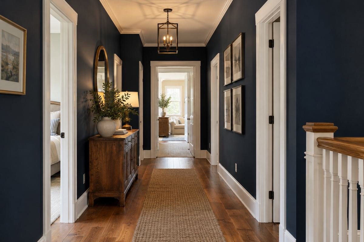
Navy can create a strong painted background beside a warm timber floor when the combination is intentional. Keep the ceiling and door relationships simple while you compare it. The floor can supply the warmer material note without requiring additional decorative wood pieces.
Review the navy at the far end and beneath the usual lamps. Very dark samples can lose some visible color character in certain conditions. Choose the effect you prefer in the actual hall rather than expecting the same blue appearance shown in a bright digital image.
Practical tip: Check the darkest sample under ordinary evening conditions.
14. Let dusty teal bridge blue and green room views

Dusty teal can provide a deliberate connection when the corridor opens toward rooms with related blue and green elements. Keep its depth restrained enough that the hall retains its own identity. The aim is a considered transition rather than an exact mixture of every neighboring color.
Review the sample from the point where the rooms appear together. If only one room is usually visible at a time, the relationship may need a different emphasis. Compare the fixed floor and trim as well so the connection does not rely only on decorative accessories.
Practical tip: Choose from the ordinary simultaneous room views.
15. Try a muted blush beside warm stone tile
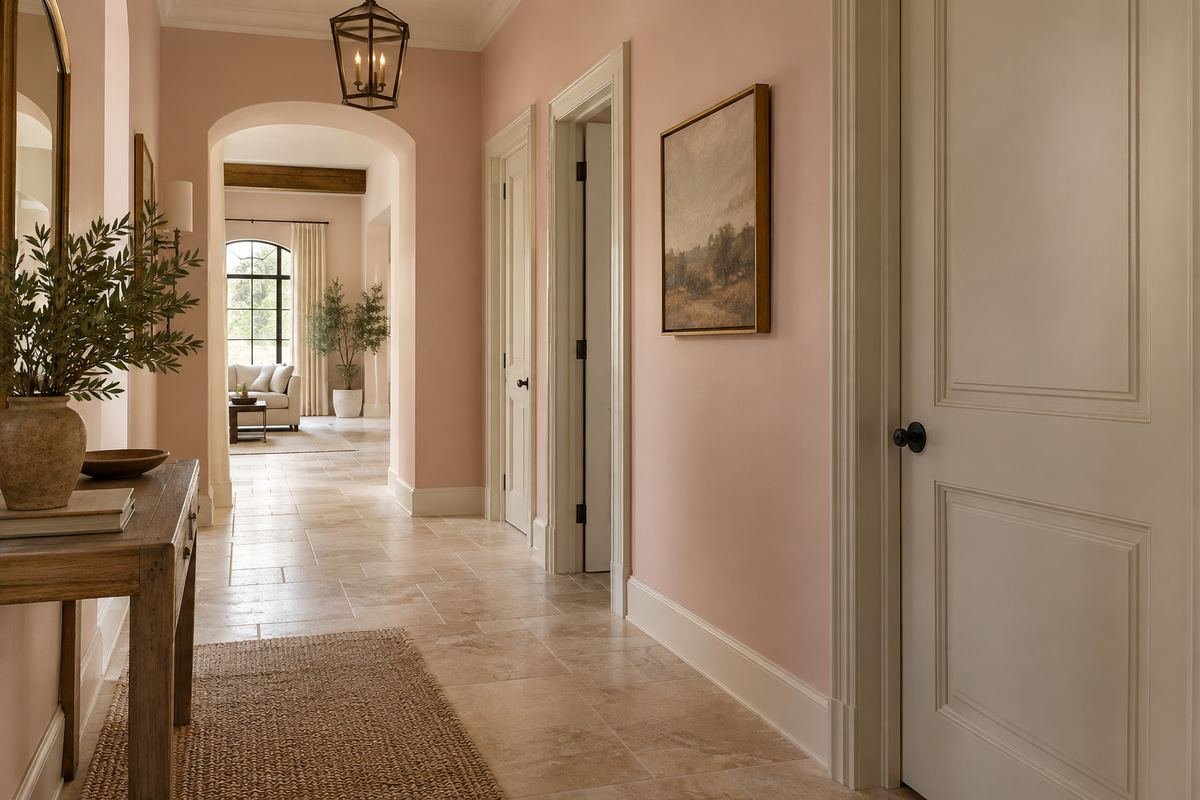
A muted blush can give warm stone tile a related painted companion without repeating the floor color exactly. Keep the wall tone quiet while comparing the stone’s variation. A simple trim scheme can leave the material relationship as the main feature.
Check the sample against several tiles rather than one unusually pale or dark piece. The floor may contain a wider range of tones than the first comparison suggests. Review the hallway under its usual lamps before deciding whether the blush has the right depth and undertone.
Practical tip: Compare the wall with the floor’s full range of variation.
16. Compare pale peach in a windowless passage
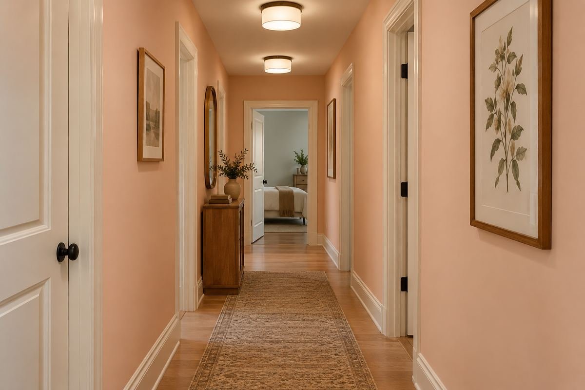
Pale peach can be a useful color to compare when a windowless passage needs a defined warm palette. Choose it under the actual artificial light, keeping the ceiling and door relationships clear. The color is an appearance choice rather than a substitute for daylight or adequate lighting.
Review a real sample at the darker middle section and both ends. A small sample beside an open bright room will not represent the whole passage. If the color changes in a way you dislike, compare another sample before altering other finishes that already work.
Practical tip: Test the color in the windowless section itself.
17. Relate muted clay to an existing brick floor

Muted clay can connect a hallway wall to the earthy character of an existing brick floor. Keep enough difference for the floor’s pattern and the wall plane to remain distinct. The relationship can feel cohesive without matching the brick exactly.
Compare the sample with mortar as well as the brick faces. Both contribute to the appearance of the floor. Review any nearby painted doors and avoid adding several further earthy colors until the main wall-floor combination works under ordinary light.
Practical tip: Include the mortar tone in the comparison.
18. Use restrained ochre with darker door trim
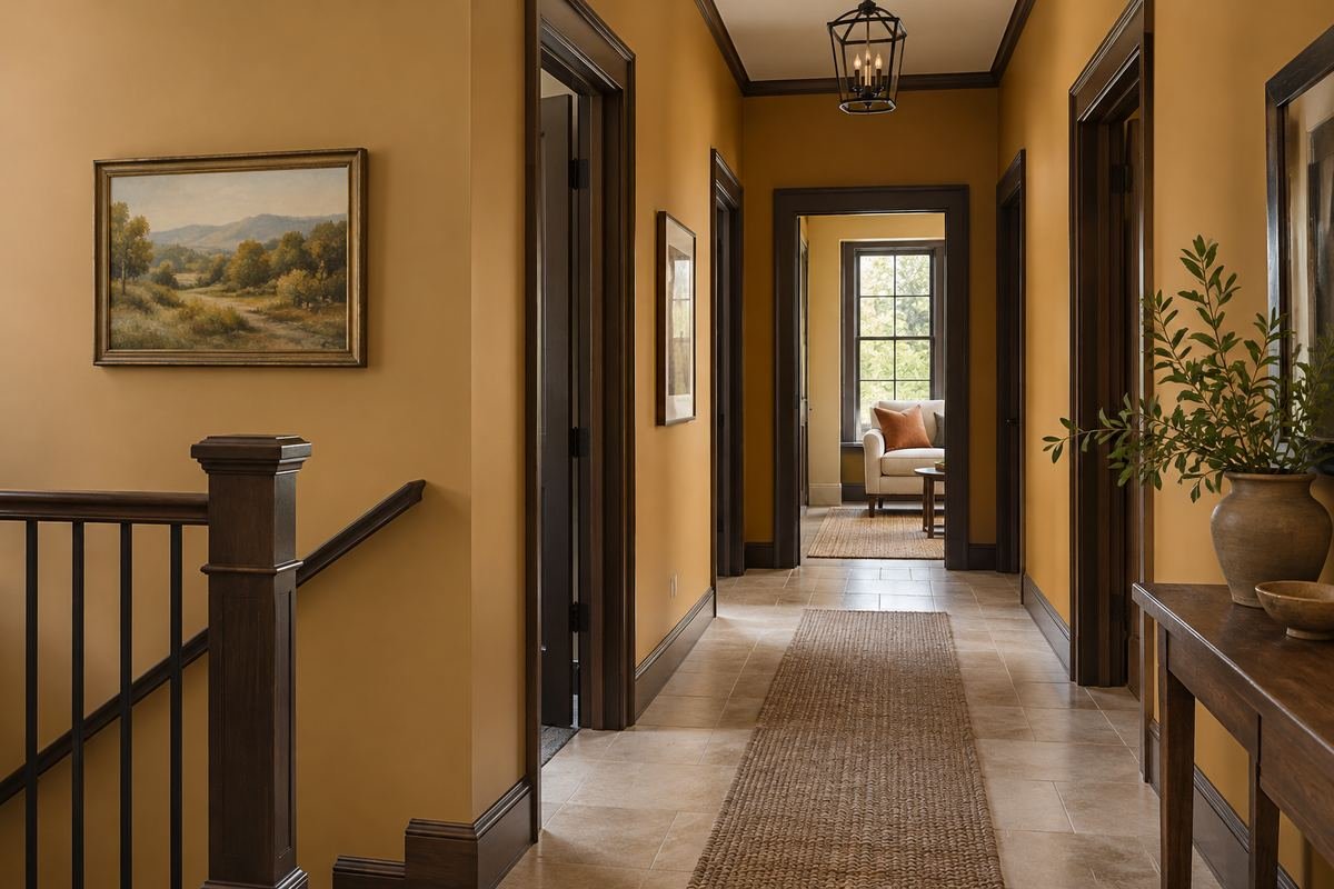
Restrained ochre can create a deliberate contrast with dark existing door trim. The wall color supplies a warmer field while the trim keeps its architectural outline. Keep the rest of the corridor simple so the repeated dark frames do not compete with several decorative elements.
Compare the ochre beside the actual trim and floor. A stronger yellow depth may look different at the far end or beneath the lamps. Choose the relationship from those conditions rather than expecting every ochre to produce the same effect.
Practical tip: Judge the repeated dark outlines along the complete corridor.
19. Give an upper landing a soft butter-yellow identity
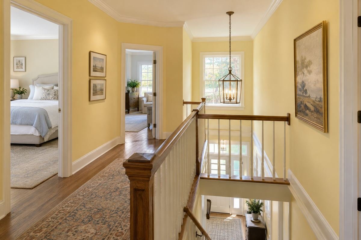
A soft butter yellow can give an upper landing a gentle color identity while relating to the stair below. Use the existing architectural boundary to contain it. The palette should work from the landing and from the lower approach, where the walls may appear together.
Compare the sample from both levels under the usual lighting. A color chosen only while standing on the landing may feel unrelated from downstairs. Keep stair visibility and lighting as separate practical considerations rather than treating the paint as the solution to the route.
Practical tip: Check the landing color from the stair approach too.
20. Use quiet lilac beside cooler painted doors
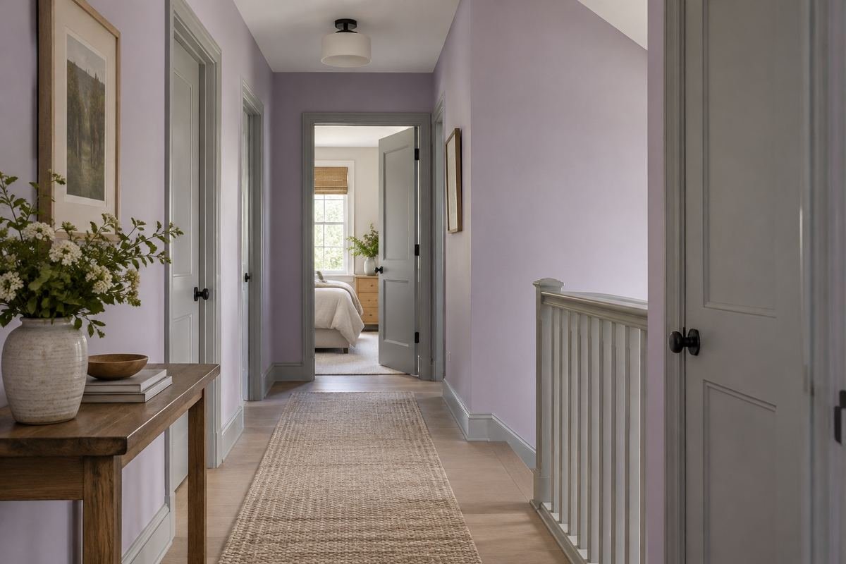
A quiet lilac can give cooler painted doors a related but distinct wall color. Keep the effect restrained so the corridor does not depend on several strong contrasts. Compare the wall, door and floor as a three-part relationship.
Review the actual samples under both borrowed daylight and the normal lamps. Lilac can read differently beside gray, white and blue door finishes. Avoid choosing it from a digital image that cannot reproduce the exact undertones of your existing paint.
Practical tip: Compare the lilac with the real door finish.
21. Try burgundy in a short connecting hall

A short connecting hall can carry a deeper burgundy when a distinct transition is the intended effect. Keep the boundaries at clear openings or corners so the color has a defined role. The adjoining rooms can remain quieter while the link receives its own character.
Look through the hall from both rooms before choosing the depth. A strong color visible in several directions has a wider effect than its small wall area suggests. Test the actual finish under the lighting used during everyday journeys between the spaces.
Practical tip: Review the short hall from both connected rooms.
22. Use chocolate behind a restrained picture grouping
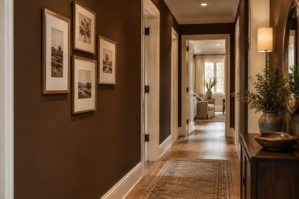
Chocolate brown can give a hallway picture grouping a substantial background when the deeper effect is deliberate. Keep the frames and mounts readable against it. A restrained number of pictures can make the relationship clearer than covering every available section of wall.
Compare an actual frame, mount and image against the wall sample. The deeper background may change the contrast more than expected. Review the arrangement from the far end of the corridor and ensure the useful route lighting remains part of the complete plan.
Practical tip: Test the artwork against the deeper sample.
23. Give charcoal a clear stairwell boundary
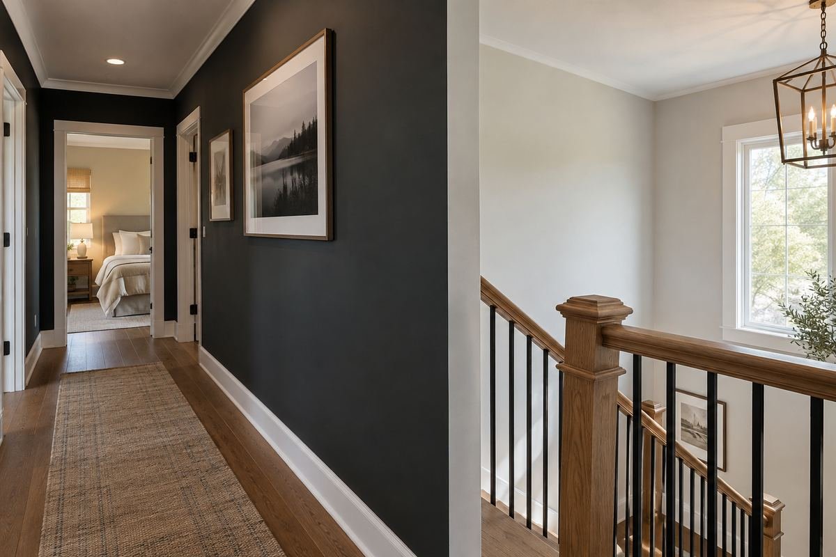
Charcoal can define a corridor wall near an existing stairwell when its endpoint is carefully chosen. Use a real corner or opening to establish the transition. Keep the stair, doors and route readable through the complete light and finish arrangement.
Review the charcoal from the stair and the hallway. A boundary that works from only one side may appear arbitrary from the other. Choose the actual coating for each surface; do not assume a wall-paint concept establishes what should be applied to railings or stair components.
Practical tip: Check the boundary from both sides of the stair junction.
24. Relate walls and trim to quiet repeated openings
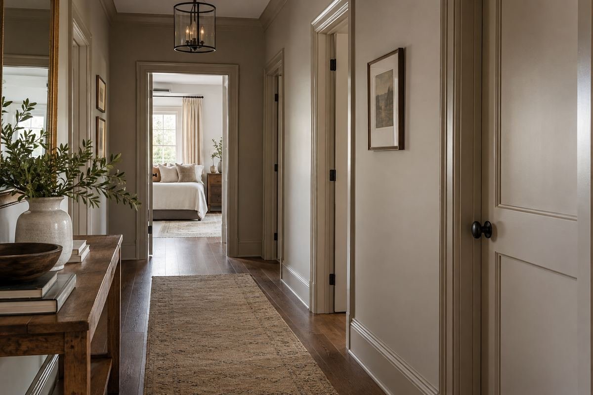
Using related wall and trim tones can soften the visual repetition of many doorways. The doors remain usable architectural elements without every frame becoming the strongest line in the hall. Choose a modest difference or close relationship according to the effect you prefer.
Compare the exact finishes and suitable products on the different surfaces. A shared color name does not guarantee identical appearance across materials or sheens. Keep enough visual information for the openings to remain easy to understand in the hallway’s ordinary light.
Practical tip: Compare the complete run of doorways after sampling.
25. Put a deeper related color on the end wall

A deeper related tone on an existing end wall can give a long corridor a deliberate destination. Keep the side walls restrained so the endpoint remains readable. The relationship can work without adding a separate decorative object at the end of the route.
Check whether the end surface contains a door, window or other important feature. Those elements become part of the composition. Review the color from the entrance and the middle of the hall rather than assuming a stronger end wall improves every corridor.
Practical tip: Include the end opening in the color composition.
26. Choose two tones around existing wall paneling

Existing wall paneling can provide a deliberate boundary between two related paint tones. Keep the division tied to that real detail rather than adding an arbitrary stripe. A restrained difference can give the corridor character while keeping repeated doorways coherent.
Compare the actual upper wall, paneling and trim together. Different materials may need different coatings and preparation. Review how the boundary meets door frames and turns before committing, so the palette remains deliberate along the complete route.
Practical tip: Use the existing paneling as the actual color boundary.
Frequently Asked Questions
What is the best paint color for a hallway?
Choose from the floor, doors, adjoining rooms and actual light. A useful palette needs to work along the route and through open doorways. There is no single shade that produces the same result in every hall.
What color works in a hallway without windows?
Compare real samples under the lamps normally used there. Pale and deeper colors can produce different effects, but neither replaces adequate lighting. Review the middle and both ends of the corridor rather than choosing from a sample held beside a brighter room.
Should hallway walls and doors be the same color?
They can be related or contrasting, depending on whether you want the repeated doors to stand out. Check the entire run of openings. Use suitable products for the different surfaces and compare actual samples before deciding how closely they should match.
Will light paint make a narrow hallway physically wider?
No. Paint changes visual relationships without increasing the usable width. Compare the appearance you prefer while keeping furniture projection, door movement and lighting as separate practical decisions. Avoid relying on a universal larger-room promise.
Should the hallway match every adjoining room?
It does not need to match each room, but the simultaneous views should feel deliberate. Compare the hall sample with the colors visible through open doorways. A repeated undertone, restrained neutral or related depth can provide a useful connection.
Which paint sheen is best for a busy hallway?
Choose the actual product for the surface, expected wear and care routine. Sheen affects appearance, but its name alone does not establish performance across different paints. Follow the manufacturer’s preparation, application and cleaning guidance.
Choose the Details That Work in Your Home
Choose hallway paint colors as part of a route through the home. Compare the doors, floor, light and adjoining rooms together, then define deliberate boundaries. A palette that works at the entrance, middle and landing will feel more considered than a shade selected from one bright corner.
For related ideas, explore hallway lighting ideas, entryway wallpaper ideas, living room paint colors.
Planning References
Benjamin Moore: hallway color relationships and connected spaces; Sherwin-Williams: hallway colors, lighting and trim. Follow the instructions for the exact products you choose.
Optional digital guide for this topic
If you prefer a structured workbook, explore this related paid guide.