Pink bedroom ideas work best when you decide which surface should carry the color. A blush wall, striped duvet and rose upholstered bed create different rooms even when their pinks look similar on a screen. Choose the part you want to notice before buying a matching collection.
The ideas below include pale and deeper pinks, larger paint changes and useful textiles. They are options to compare, not a shopping list to combine. A bedroom for adults can use pink through the same ordinary furniture and routines as any other palette, without a fixed theme.
All 23 images are original AI-generated decor concepts. They show color-family relationships rather than named paint shades, exact fabric colors, measured layouts or completed client projects.
Contents
- 1. Use blush walls with a pale oak bed
- 2. Give dusty rose a charcoal upholstered foreground
- 3. Pair a clay-leaning pink with walnut
- 4. Try a deeper rose with an ivory bed
- 5. Keep pink and white distinct through texture
- 6. Use pink bedding to refresh a gray bedroom
- 7. Balance a pink wall with sage curtains
- 8. Use navy as the main contrast to pink
- 9. Let cocoa brown ground a pale pink room
- 10. Give a pink room a simple black bed outline
- 11. Use red as one small edge beside pink
- 12. Add one ochre accent to a pink bed
- 13. Make tonal pink interesting through different surfaces
- 14. Let a broad pink stripe organize the bed
- 15. Choose a small pink check for quieter pattern
- 16. Use one pink floral wall with plain textiles
- 17. Make a pink headboard the lasting textile feature
- 18. Put pink at the window instead of on the wall
- 19. Try a pale pink ceiling over neutral walls
- 20. Give a useful wardrobe a pink front
- 21. Use a pink chair where you will actually sit
- 22. Connect the palette with one original artwork
- 23. Keep a compact pink bedroom easy to reset
Choose the job for pink before choosing its shade
Start with the finishes that will stay: the bed, flooring, main storage and any favorite textiles. Then decide whether pink belongs on a lasting surface or a piece you can change independently. Compare a limited shortlist in the actual room with the bedding and usual lights in place. Leave the remaining purchases open until that larger decision makes sense.
A pink bedroom shortlist you can complete with your own room
- Pink on the wall: Keep the existing bed and main bedding in the comparison; choose the wall around both.
- Pink on the bed: Leave the wall unchanged initially; try one useful covering or upholstered piece.
- Pink at the window: Compare the fabric stacked and drawn, after deciding the practical window treatment.
- Pink on storage: Choose the useful cabinet configuration first; judge the whole front as a color area.
- Pink as a smaller detail: Give one artwork or accent a role before adding another matching object.
- Decision to record: Write the surface that leads, the fixed material it must suit and the optional item you will defer.
1. Use blush walls with a pale oak bed
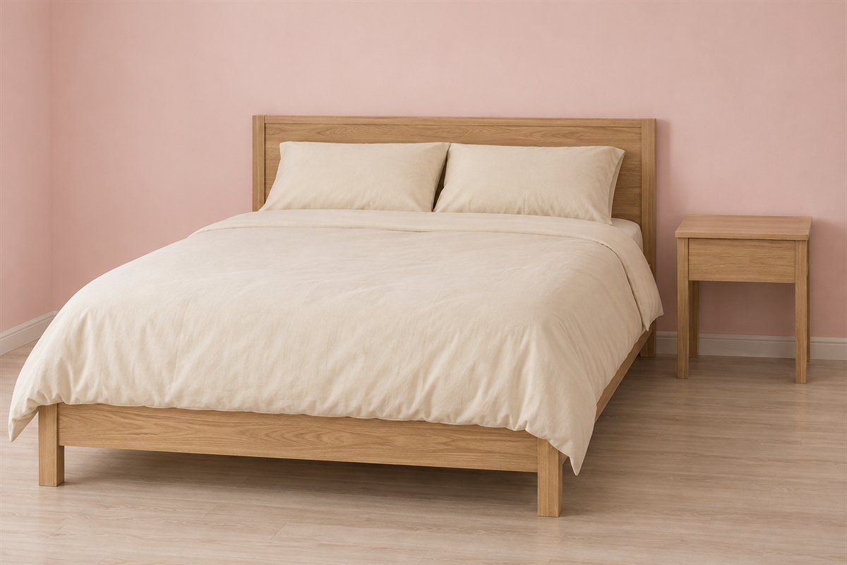
A pale blush wall can supply the pink while an oak bed and simple cream covering provide the larger material contrast. Keep the timber visible rather than covering every part of the frame with cushions. The combination can feel complete without pink furniture or a themed collection of accessories.
Compare the wall candidate with the broadest oak panel and the actual pillowcase. If the wall seems peachier than you intended, try a different pink before changing the useful wood furniture. View the group with the room arranged as it will normally be used.
2. Give dusty rose a charcoal upholstered foreground
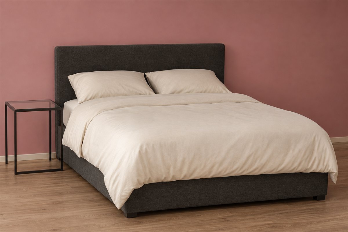
A charcoal headboard can remain a strong shape against a dusty rose wall. Keep the bedding mostly pale so the dark upholstery does not merge into a second large dark field. This is useful when the gray bed will stay but its former gray wall feels too similar.
Hold the pink sample beside the headboard fabric at its darkest and lightest areas. Upholstery texture can affect the appearance of the pair. Choose a deliberate difference between them rather than buying several almost-matching pink pieces to bridge an unresolved wall choice.
3. Pair a clay-leaning pink with walnut

A muted clay pink can relate to walnut without copying the wood’s brown depth. Use a pale bed covering to separate those warm surfaces. Keep the cabinet fronts and bed silhouette uncomplicated while deciding whether you prefer a more peach or more rose direction.
Compare the sample with the dresser as well as the bed if their timber tones differ. The goal is a relationship you enjoy across the room, not a promise that every walnut finish suits one named pink. Retain the larger existing pieces during that comparison.
4. Try a deeper rose with an ivory bed

A deeper rose wall can make an ivory upholstered bed the light center of the room. Leave a generous pale area on the bed so the wall has a clear companion. This direction relies on two substantial surfaces rather than many small decorative highlights.
Test the rose with both daylight and the bedside lighting you actually use. If the wall and upholstery become too similar in the evening, compare a different depth or undertone. A stronger pink is a visual choice; it is not evidence of a particular mood or better sleep.
5. Keep pink and white distinct through texture

Pink walls and white bedding can look considered when the white has a visible fabric texture and the pink remains a broad uninterrupted area. A simple frame allows that difference to be read. More matching pink objects are optional rather than the next necessary step.
Compare the bedding with the existing white trim. If those whites differ, decide which one stays before choosing paint. A screen image may make several whites look identical, while the actual room reveals cream, gray or blue undertones that change the pink’s appearance.
6. Use pink bedding to refresh a gray bedroom

Pink bedding can change the leading color while a gray wall and upholstered bed stay in place. Keep the covering plain at first so you can judge the pink against the two grays. A small pale sheet edge gives the textile a definite boundary.
Check whether the wall and headboard are warmer or cooler than each other. One pink may connect both; another may make their difference more obvious. Try the complete duvet on the bed before buying a matching curtain, rug and pillow set.
7. Balance a pink wall with sage curtains

A sage curtain can give pink a second color through a surface the bedroom already needs. Let the curtain and wall remain separate larger areas instead of repeating both in every textile. Plain bedding makes it easier to understand the pair from across the room.
View the curtain stacked and drawn before deciding how much green belongs in the scheme. Its visible area changes through the day. Keep the practical window treatment choice suited to the window, then compare the actual fabric with the pink rather than relying on two digital swatches.
8. Use navy as the main contrast to pink

A navy upholstered headboard can give a pale pink bed a defined outline. Keep the wall comparatively quiet if the bedding already supplies the pink. This makes the relationship easier to adjust later without requiring a navy wall, rug and wardrobe as well.
Compare the headboard with the largest pink textile in normal evening light. Some navy fabrics look almost black then. Decide whether you enjoy that deeper contrast before introducing another blue whose different undertone might become the room’s most noticeable feature.
9. Let cocoa brown ground a pale pink room
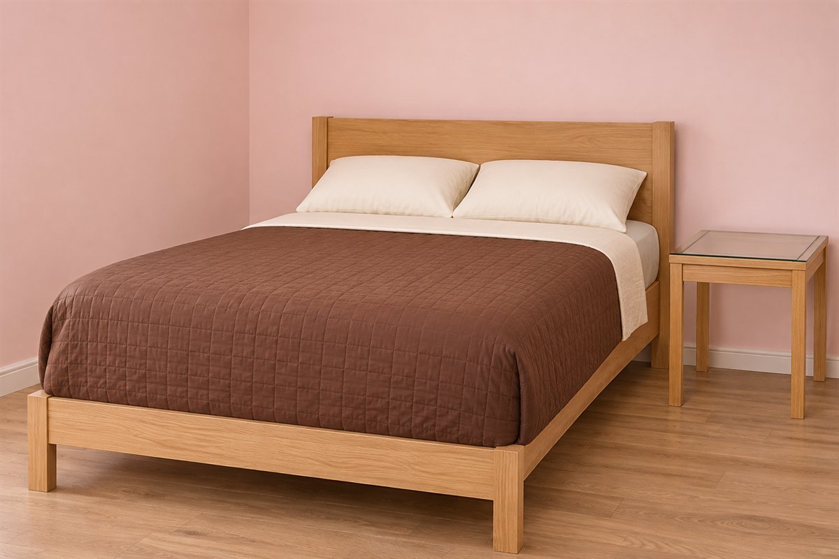
A cocoa-colored quilt can add a substantial darker area to pale pink walls. Keep its texture simple enough that the color relationship stays clear. Warm wood furniture can remain visible, with a lighter sheet edge preventing the bed from becoming one uninterrupted brown shape.
Try the quilt in its normal sleeping position before choosing additional accents. A folded narrow band and a full bed covering create different proportions. Choose the version you actually want to use, rather than adding a layer that must be removed and stored every night.
10. Give a pink room a simple black bed outline

A black metal frame can supply a clear silhouette while a pink duvet and pale walls provide softer fields. Keep the frame design uncomplicated and the textiles fairly plain. The outline then contributes enough detail without a collection of black accessories.
Check the complete frame against the proposed covering, including the footboard if there is one. Avoid a textile arrangement that hides the shape you wanted to emphasize. This is a contrast decision, so the pink does not need to match another small object elsewhere in the room.
11. Use red as one small edge beside pink
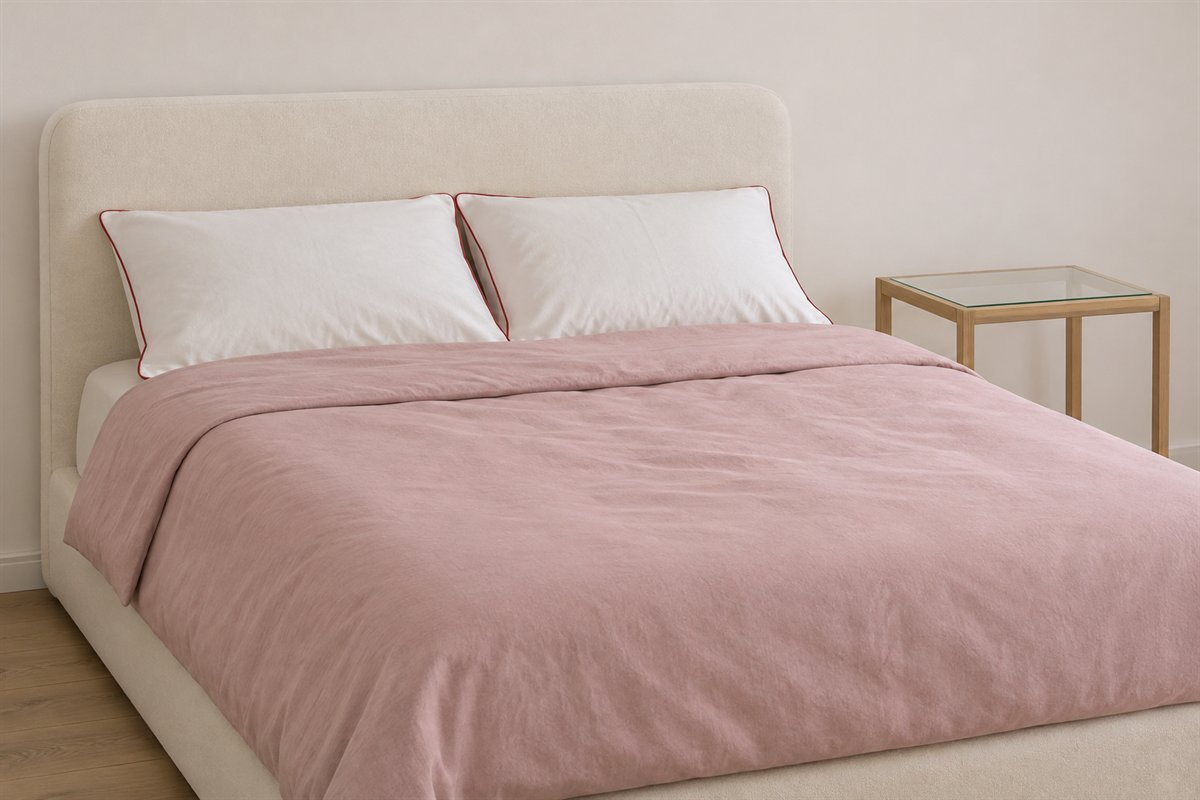
A restrained red detail can make a pink scheme more graphic. Try one red-trimmed pillowcase edge against a plain pink covering before adding a second red object. The small line creates a different effect from a broad red wall or a fully patterned duvet.
Compare the red and pink together under the room lights. A warm tomato red and a cooler berry red will not create the same relationship. Keep the detail on a useful textile, and choose its care requirements along with its appearance.
12. Add one ochre accent to a pink bed

One muted ochre cushion can introduce a small contrasting shape against pink bedding. Leave the other pillows simple so the accent remains a deliberate choice. Timber furniture can supply a separate material without another strong textile pattern.
Try the cushion you will actually keep rather than several possible accents at once. Give it an ordinary clean place when the bed is used. If clearing the bed becomes inconvenient, let a useful quilt or curtain carry that second color instead.
13. Make tonal pink interesting through different surfaces

Related pinks can form a complete scheme when their surfaces differ: a matte wall, a woven cover and a simpler upholstered headboard. Keep a visible change in depth between the largest areas. Exact matching is unnecessary and can hide the shape of useful furniture.
Compare the real fabrics with the wall sample at their normal angles. A textile lying flat on a bed may look different from the same swatch held upright. Start with the two largest surfaces, then decide whether a third pink contributes anything to the room.
14. Let a broad pink stripe organize the bed

A pink-and-white striped covering can provide the room’s one obvious pattern. Keep the headboard and walls plain so the stripe direction remains clear. This is an option for bringing pink into a neutral bedroom without repainting or replacing furniture.
Lay the full covering on the mattress to review where the repeat falls at both sides and the foot. A narrow product photograph cannot show that relationship. Let the stripe remain the main print before deciding whether a smaller patterned accent is needed.
15. Choose a small pink check for quieter pattern

A small pink-and-cream check can read as a softer repeat than a wide stripe. Keep it on one main covering and use plain pillowcases to give the pattern a boundary. A simple timber headboard contributes texture without a second competing fabric design.
Look at the check from the bedroom doorway as well as close up. Fine repeats can merge visually at a distance. Select the actual repeat you prefer at both scales, and keep the nearby curtain quiet until the full bedding is in place.
16. Use one pink floral wall with plain textiles

A pink floral wallpaper can lead the bed area when the bedding and curtains remain quiet. Choose the complete pattern for its background as well as its flowers. The background occupies a large part of the wall and may influence the room more than a small pink motif.
Review a full repeat with the headboard in place before deciding the extent of the wallpaper. Resolve the wall and paper suitability separately from its appearance. A print can be the one pink feature; the room does not also need floral cushions and a matching bedspread.
17. Make a pink headboard the lasting textile feature

A pink upholstered headboard can supply color independently of the duvet. Keep the wall and main covering simpler if you want that shape to remain visible. This can suit someone who changes bed linen often but wants a consistent pink element in the room.
Compare the upholstery with more than one bedding set you intend to keep. Check the actual bed construction, cleaning information and room fit before focusing on the fabric shade. The color should accompany a useful bed rather than dictate an awkwardly oversized furniture choice.
18. Put pink at the window instead of on the wall
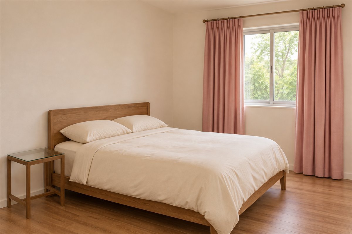
Pink curtains can provide a large soft color area while the paint and furniture remain neutral. Use a fabric you like both stacked and drawn. A quiet bed covering keeps the curtain from becoming part of an increasingly complicated group of nearly matching pinks.
Compare the full curtain sample with the wall and fixed flooring. Choose the actual heading, support, coverage and care to suit the window before settling the exact shade. Decorative color does not establish light control, privacy or a suitable installation on its own.
19. Try a pale pink ceiling over neutral walls

A pale pink ceiling changes the overhead field while leaving the walls available for existing furniture and art. Keep the larger bed covering neutral during the comparison. The ceiling is a complete color decision, not merely a reason to add more pink objects at eye level.
Judge a suitable sample overhead from the doorway and the pillow position. A color card held against a vertical wall cannot show the whole effect. Choose the actual coating for the surface and keep any lighting work separate from the decorative palette choice.
20. Give a useful wardrobe a pink front

A pink wardrobe can provide the main color area in a bedroom with plain walls and bedding. Let the cabinet remain a complete readable shape. A quiet top and simple fronts make the furniture look intentional without turning it into a display for unrelated objects.
Choose the storage configuration and door movement around the clothes you keep. If repainting existing furniture, assess its material and suitable preparation process rather than treating an illustration as an instruction. Keep the real opening route useful when evaluating the finished arrangement.
21. Use a pink chair where you will actually sit

A small pink chair can add the color in a dressing or reading corner while the bed stays neutral. Give the seat an actual role and keep it clear. Its shape and upholstery can provide the detail, so an unused decorative throw is not automatically needed.
Try the chair’s footprint and normal movement before choosing it for a spare-looking corner. If it becomes a permanent clothing pile or blocks a drawer, another use of pink may serve the room better. Select the furniture for use first and its color second.
22. Connect the palette with one original artwork
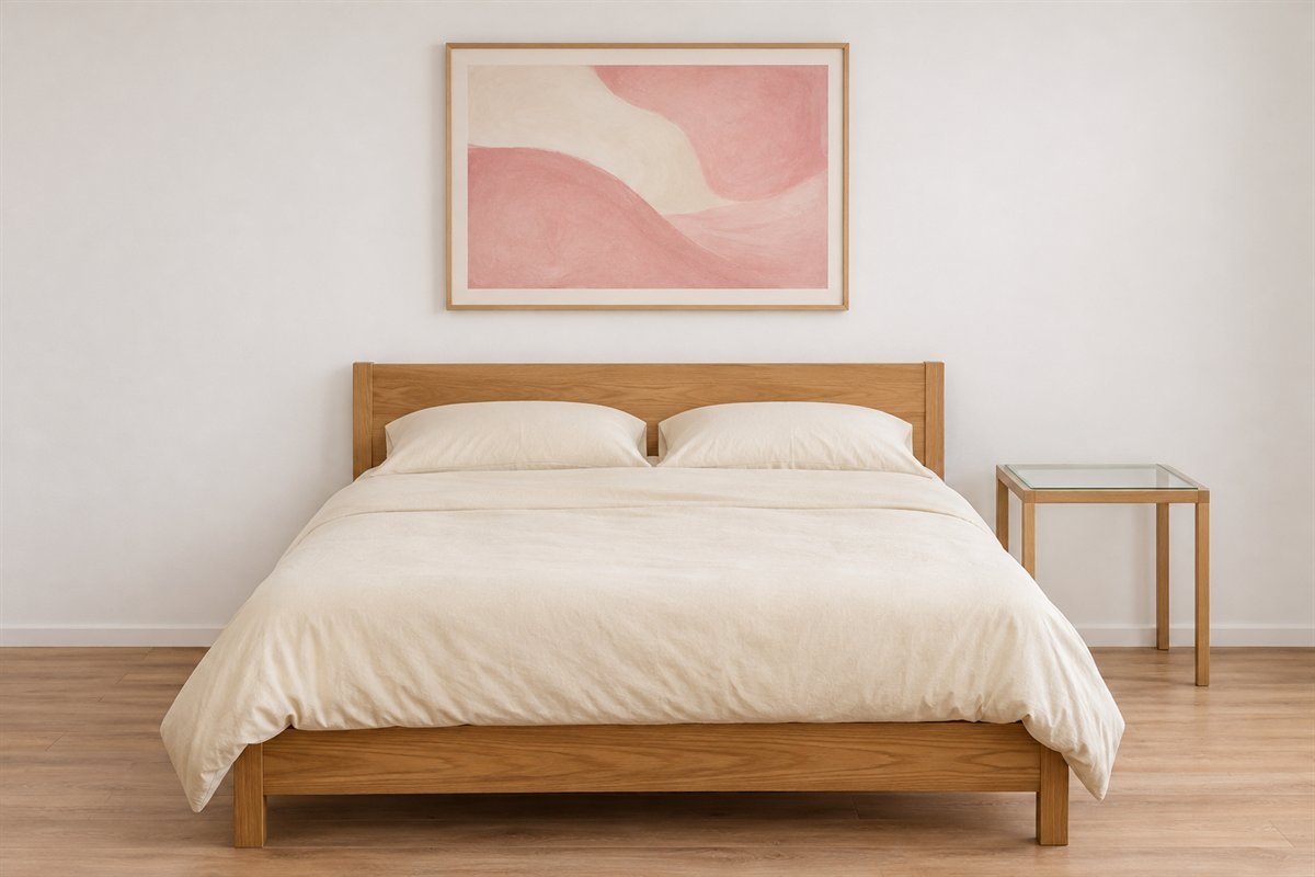
A single abstract containing pink and the room’s existing neutral can bring separate surfaces into one composition. Keep the print and frame simple enough to read as one object. It can supply the color in a bedroom where the walls and larger textiles will stay unchanged.
Compare the artwork with the whole furniture group, not just an empty gap. Choose its actual support and position for the wall, and avoid adding more pieces merely to fill space. The pink in the picture can relate to the room without an exact paint or fabric match.
23. Keep a compact pink bedroom easy to reset

In a small bedroom, one pink duvet can be enough to establish the color while the furniture serves the available floor area. A compact plain bedside surface and a clear route let the room feel considered in use. The scheme does not need an extra chair or bench to look complete.
Open the real door and storage with the bedding arranged normally. Adjust an oversized covering or projecting item before adding more matching accessories. A useful compact bedroom comes from those practical relationships alongside color; pink itself does not make the room physically larger.
Three complete starting recipes, with the swap left open
For a bedroom with an oak bed that will stay, one possible recipe is a blush wall, cream covering and the existing timber. Compare the wall with both the wood and cream before choosing smaller accents. The optional swap might be a curtain that no longer feels connected, but it does not have to be bought at the same time.
For a gray upholstered bed, try keeping the wall and changing only the main covering to pink. A plain pale sheet edge can give the colors a clear boundary. If the actual grays pull in different directions, compare another pink textile before deciding the useful bed needs replacing.
For a room whose walls cannot change, use a pink headboard, curtain or duvet as the larger color area. Choose one of those as the starting move. These are original hypothetical recipes, not measured projects, client results or instructions to buy every item shown.
When the pink looks too peach, purple or sweet
First identify the neighboring surface that makes the difference most obvious. A pink can look different beside cream bedding, a gray headboard and a warm timber floor. Keep those real materials in place while comparing a clearer rose, a more muted version or a different depth.
Change one candidate at a time. Replacing the lamps, duvet and wall sample together makes it harder to understand which relationship you preferred. Compare the room during ordinary daytime use and with the usual evening lights, keeping the same curtain positions for each comparison.
Write a plain observation: the ivory looks too yellow beside this pink, the gray bed remains clear, or the wood now looks more orange than I want. Those descriptions are more useful than assuming a color name such as blush or dusty rose predicts the result. There is no universally correct pink for every room.
Compare useful fabric area, not the number of accessories
The visible amount of a textile changes its effect. A pink covering across the whole mattress is a larger decision than a small folded strip at the foot. A curtain drawn across a window shows more fabric than the same curtain stacked to one side.
Try the pieces in the positions you intend to use. Keep the bed straightforward to uncover and provide a clean place for any optional cushion. Do not choose a complicated fold or a deep display that only works while the room is staged.
If the room feels busy, remove one competing pattern before assuming you need a different pink. A floral wall, broad stripe and strong check can each lead a scheme, but they do not all have to occupy the same view.
What the primary references can and cannot tell you
Benjamin Moore’s pink-color guide illustrates a range from pale pinks to stronger accents and discusses possible neutral and green companions. Its sampling guide explains that liquid color samples are for assessing appearance rather than serving as the final project coating. Use those references to narrow real candidates and understand the sampling task.
Our surface shortlist, room recipes and 23 illustrated combinations are original. None of the generated pinks identifies a manufacturer’s formula or reproduces a source photograph. Choose the actual coating, fabric care and furniture construction for their own uses. A bedroom color scheme is a visual preference, not a sleep treatment or a promise about wellbeing.
How can a pink bedroom work for adults?
Start with the furniture and routine rather than an age-based theme. A considered pink wall, useful covering or upholstered headboard can lead the room. Compare its depth and texture with the finishes you will keep, and leave unnecessary matching accessories out.
What colors go with pink in a bedroom?
White, cream, gray, green, navy, cocoa and restrained black are possible directions. Compare the actual pink with the real companion material. Different undertones and visible proportions can produce quite different rooms.
Should pink be on the walls or the bedding?
Choose the surface you can sensibly change and want to notice most. A wall frames the furniture; bedding creates a large textile area that can change separately. Try one leading pink surface first rather than changing everything together.
How do I make a pink and gray bedroom feel connected?
Compare one pink against both the gray bed and gray wall if those will stay. Keep the other textiles consistent during the trial. A pale sheet edge or quiet wood furniture can separate the larger fields without requiring more gray-and-pink prints.
Can I use pink in a small bedroom?
Yes. One useful color area may be sufficient. Keep the actual door movement, storage and route workable, and choose bed coverings that suit the bed. Color does not establish the room’s physical size or guarantee that it will look larger.
A practical next step
Choose one surface that deserves the pink, compare it with the fixed materials and live with the useful arrangement before adding another layer. A personal pink bedroom can emerge from a well-chosen wall or textile without replacing every piece in the room.
Compare other bedroom wall colors with your furniture. Choose the boundary of a bedroom accent wall. Plan bedding layers that remain easy to use.
Images are original AI-generated bedroom decor concepts, not exact paint matches, measured plans or completed client projects. The shortlist and starting recipes are original planning aids.
Sources and care references
- Benjamin Moore: pink color range and possible pairings
- Benjamin Moore: using samples to assess actual color
Optional digital guide for this topic
If you prefer a structured workbook, explore this related paid guide.