Black bedroom ideas do not require black on every surface. A dark wall can frame a pale bed, a black frame can define a light room, or black bedding can become the main color area without any painting. The useful choice is where you want the contrast to sit.
Start with the furniture, floor and bed linen that will stay. Decide which outline should be easy to see and which surface can become quieter. Wood, textured cloth and a practical light source can give the room variety without a collection of matching dark accessories.
These 23 original concepts focus on black as a color and material relationship, with different levels of contrast and several smaller changes to test first. They are not exact paint specifications or a prescribed theme. All images are original AI-generated decor concepts.
Contents
- 1. Frame a pale upholstered bed with one black wall
- 2. Keep a fine black bed frame against light walls
- 3. Use black painted wood for a more solid bed shape
- 4. Give a black upholstered bed a textured pale cover
- 5. Let a black-and-white grid be the main pattern
- 6. Make black bedding distinct with one pale edge
- 7. Use a blue-black wall with a warm cloth headboard
- 8. Let a brown-black wall connect with walnut
- 9. Make pale oak the strongest material contrast
- 10. Use shallow black paneling for shadow and rhythm
- 11. Keep black to a clearly defined lower wall area
- 12. Let black curtains define the window wall
- 13. Make a black wardrobe a useful single block
- 14. Keep a wood top visible on a black dresser
- 15. Use a black nightstand beside pale upholstery
- 16. Add a small warm-metal lamp against black
- 17. Choose a cooler metal for a sharper bedside detail
- 18. Pair black with one camel textile
- 19. Use a muted blue cushion for a cool color note
- 20. Try a clay layer with a black bed frame
- 21. Give a dark bed a pale patterned rug to sit on
- 22. Let one monochrome artwork supply the pattern
- 23. Keep a compact black bedroom’s route clear
Choose one main dark surface before changing the whole room
Name the part you want black to define: the wall behind the bed, the bed frame, the largest textile or one storage piece. Then name its useful companion, such as cream upholstery, white linen or retained oak. Begin with that pair before adding another dark element.
An original starting plan for using black in a bedroom
- Existing pale upholstered bed: Compare a black wall sample beside the actual fabric, leaving bedding plain.
- Existing light walls: Try a black frame or textile without committing to repainting.
- Existing dark furniture: Keep a broad pale textile area so the pieces you use stay distinct.
- Existing warm wood: Compare a neutral black with a warmer near-black before changing the timber.
- Compact room: Set the useful furniture and open route first, then decide which dark area should lead.
1. Frame a pale upholstered bed with one black wall

A complete black wall behind a cream bed gives the headboard a clear boundary. Let the upholstered shape remain simple, with enough visible wall at the sides to understand the contrast. A large pale duvet extends the light area through the room.
Compare the wall sample with the actual headboard fabric. Cream, ivory and white can look quite different against black, especially under bedside lamps. Choose the contrast you enjoy before adding patterned pillows or replacing useful furniture to match a screen image.
2. Keep a fine black bed frame against light walls

A slim black metal bed gives a pale bedroom a graphic outline without turning every surface dark. Keep the bedding plain while judging the rails. Their spacing and shape can provide enough interest on their own.
Try the frame with your usual duvet before adding a strong patterned rug. If both patterns compete, simplify one. Check the actual assembled footprint and access around the bed; a delicate-looking frame still needs to fit the room and suit daily use.
3. Use black painted wood for a more solid bed shape
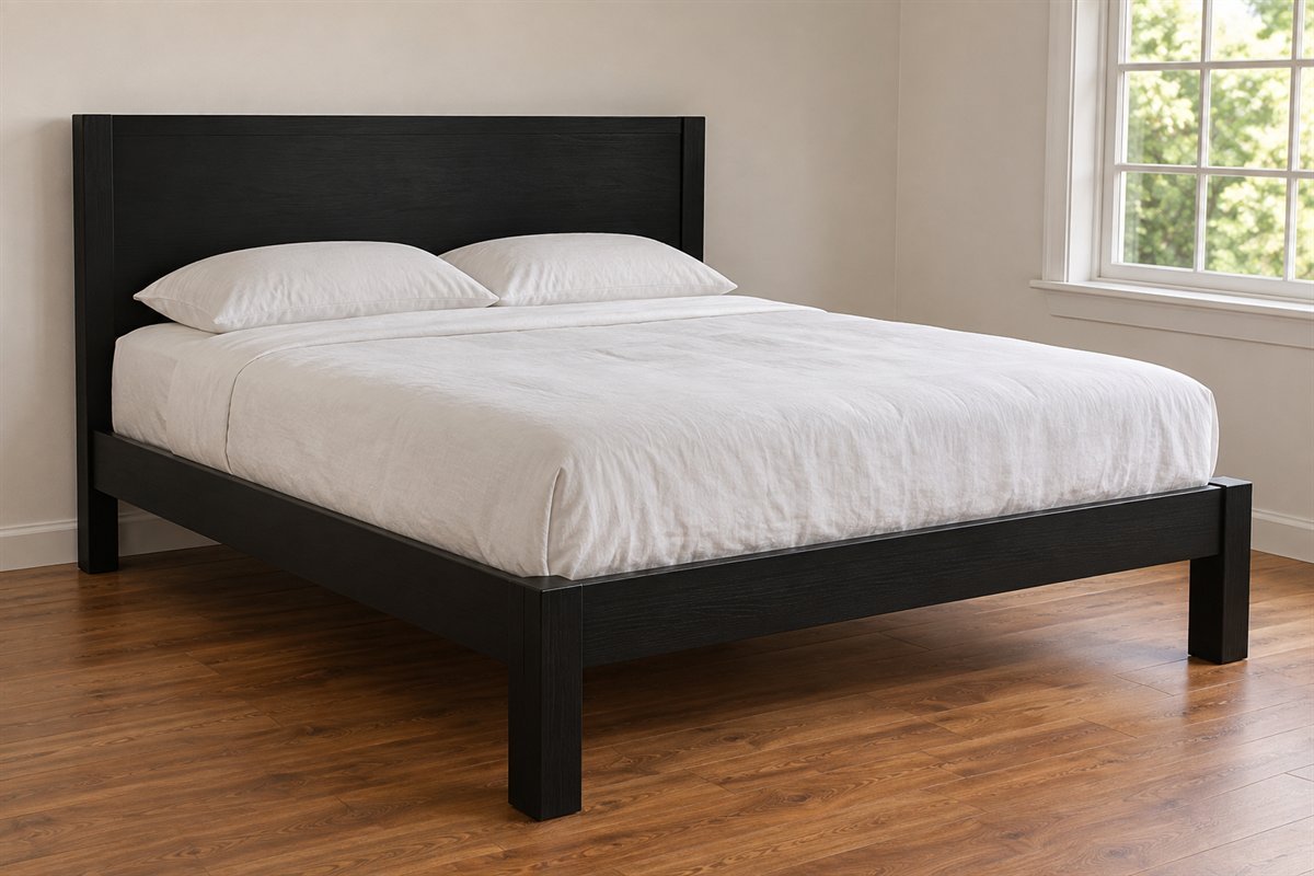
A simple black-painted timber bed can feel more substantial than narrow metal rails. White linen gives the dark headboard and side frame a clear setting, while a warm timber floor supplies a different material.
Look at how much of the bed frame remains visible when the bedding is in its normal position. A large cover can hide most of the design you chose. If refreshing an existing bed, follow its material and coating requirements rather than assuming any black paint is appropriate.
4. Give a black upholstered bed a textured pale cover

Black upholstery can remain the main dark material while a pale stitched bedcover introduces detail. Let the texture run over a generous area rather than hiding it beneath many cushions. The contrast comes from both lightness and surface.
Compare the fabrics in person. A smooth black cloth, a nubby weave and a velvet-like surface can look different even when the color names match. Choose comfort and care requirements for the actual products, then decide which neighboring texture makes the black outline easiest to read.
5. Let a black-and-white grid be the main pattern
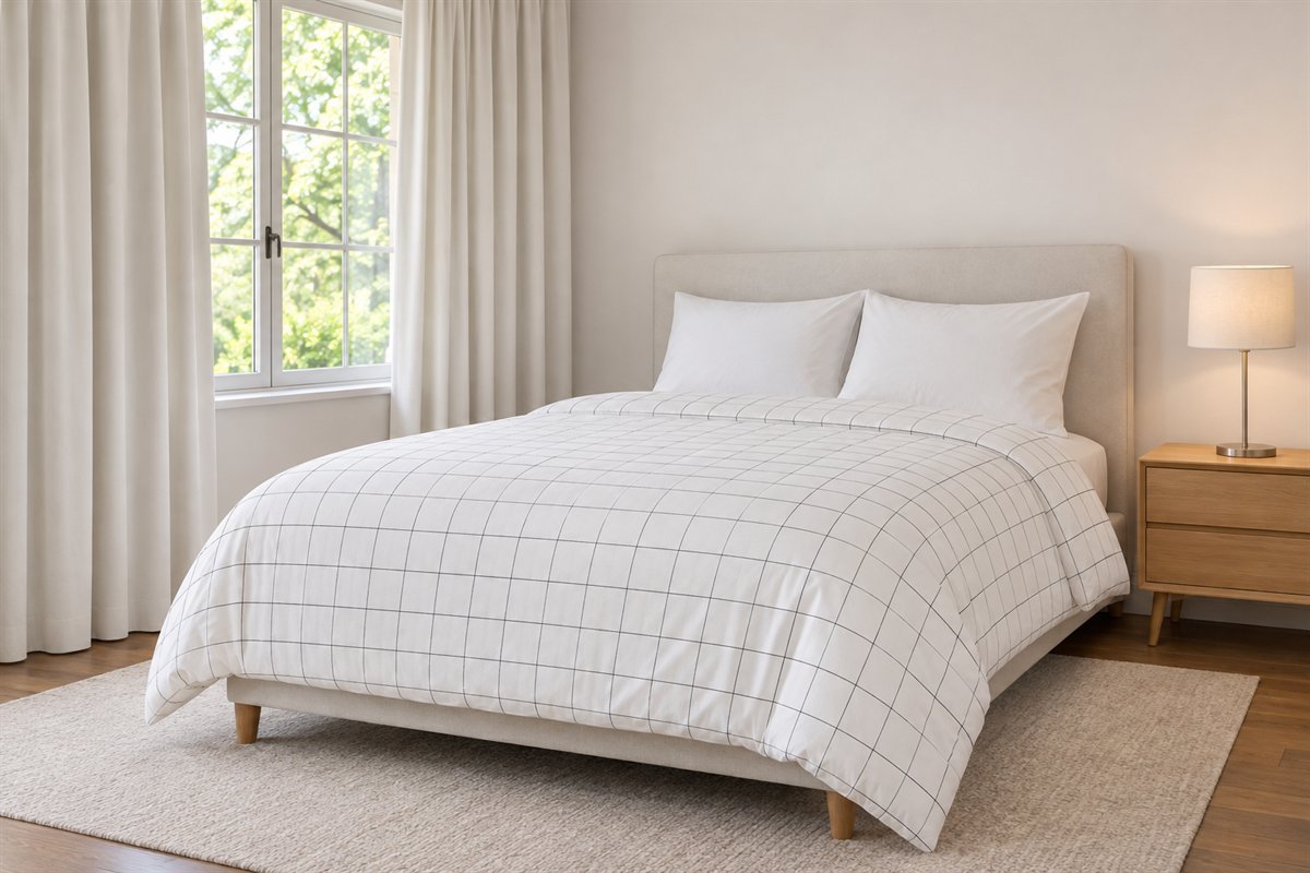
A clear grid on the duvet can make black part of a light bedroom without darkening the walls. Use plain pillows and a simple headboard so the repeat remains readable. Decide whether you prefer fine lines or a larger bolder check.
Lay out the full cover before choosing more patterned textiles. A grid partly hidden by a throw creates a different rhythm from one visible across the whole bed. Keep the curtains quiet while you judge the relationship, then add another pattern only if it has a useful role.
6. Make black bedding distinct with one pale edge

A black duvet can be the room’s main dark area while the walls and furniture remain lighter. A visible ivory sheet edge or pillowcase creates a boundary at the head of the bed, helping the layers remain understandable.
Check the actual duvet under the lighting you use. Deep folds may appear nearly flat in a photograph but remain tactile in person. Choose fabric for comfort and its specific care instructions; black bedding is a palette choice rather than a statement about temperature or sleep quality.
7. Use a blue-black wall with a warm cloth headboard

A near-black wall with a visible blue cast can set off a warm oatmeal upholstered headboard. Keep the bedding comparatively quiet so the wall’s undertone and the cloth remain the main relationship.
Compare several actual dark samples beside the same upholstery. A neutral black and an inky blue-black can look similar in isolation but quite different beside warm fabric. Observe the pair in the room’s ordinary light rather than assigning a manufacturer formula to a generated color.
8. Let a brown-black wall connect with walnut

A soft brown-black wall can relate to walnut furniture through warmth while remaining a distinct dark field. Keep a substantial light textile on the bed so the wood does not disappear into a large area of similar depth.
Compare the wall beside the most visible walnut panel and your usual linen. The useful choice may be a little lighter or more muted than the first sample. Retain differences in grain and sheen rather than trying to make paint and timber look identical.
9. Make pale oak the strongest material contrast

A pale oak headboard against black can bring a warm, visible grain into a restrained bedroom. Let the wood occupy a clear area above the pillows, with simple bedding below. A small amount of matching timber elsewhere may be enough.
View the headboard and wall together before buying a full furniture set. The existing bedside pieces might already work through shape or scale. If the oak seems unusually yellow beside the black, compare another dark sample before assuming the furniture needs changing.
10. Use shallow black paneling for shadow and rhythm
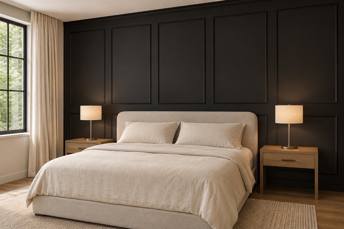
A finished black paneled wall can provide texture through its edges while the bed stays plain. Keep the panel pattern simple enough to understand around the headboard. Its shadow lines can supply detail without additional wall decoration.
Judge a real sample in the intended room lighting. A finish that shows gentle relief in side light may look flatter from another angle. This is a surface-appearance idea; wall condition, system choice and installation requirements need their own assessment before any work.
11. Keep black to a clearly defined lower wall area

A black lower section can give a room a dark base while a pale upper wall leaves a different distribution of contrast. Relate the dividing line to the actual headboard, doors and furniture rather than choosing a height from a photograph.
Mock up the proposed boundary using a method suitable for your wall and view it from the doorway and bed. If the line cuts awkwardly through the headboard shape, adjust the plan before painting. Keep nearby patterns quiet so the horizontal division remains intentional.
12. Let black curtains define the window wall

Black side curtains can create a strong vertical outline in a room with pale walls and bedding. Show them in their ordinary open position when judging the composition, with enough room for the folds to sit beside the window.
Color alone does not establish blackout performance, privacy or fabric weight. Choose the actual system for those functions and its fitting conditions. Keep the room’s usual daylight and window use available rather than leaving curtains partly closed only because the photograph looks dramatic.
13. Make a black wardrobe a useful single block

A plain black wardrobe can become the room’s large dark element while the bed remains pale. Clear door gaps and restrained handles give it definition. Keep the wall around it quieter so storage feels part of the furniture group.
Test the actual door or drawer movement with the bed in place. A strong color block is useful only when the contents remain accessible. Follow the specific unit’s assembly and securing instructions; the concept does not show an installation method or establish stability.
14. Keep a wood top visible on a black dresser

A black dresser with a warm timber top offers two materials in one useful piece. Leave enough top visible to see the relationship. A simple lamp can occupy one end without turning the surface into a display of matching black accessories.
Choose the storage layout for the belongings it must hold. If refreshing an existing dresser, assess its actual surfaces and hardware before deciding on a finish. A black-and-wood image does not identify a coating, wood species or suitable refinishing process.
15. Use a black nightstand beside pale upholstery

A black bedside table can create a small, useful outline beside a cream headboard. Choose a shape that provides the surface or storage you need, then leave space for ordinary items rather than filling the entire top with decoration.
Check the table from the pillow position as well as standing beside the bed. A pale lamp or contrasting top edge may make its surface clearer in the room’s evening light. The exact height and reach need to work with your actual mattress and routine.
16. Add a small warm-metal lamp against black

A warm brass-colored bedside lamp can be a precise highlight against a black wall. Keep the shade plain and the surrounding surfaces restrained. The finish becomes part of a useful object rather than an extra accessory to maintain.
Compare it with the nearby furniture hardware. The metals can differ, but a very reflective yellow finish and a quiet aged-looking finish create different effects. Choose the lamp’s actual light and practical controls separately from the visual appeal of its finish.
17. Choose a cooler metal for a sharper bedside detail

A restrained silver-colored lamp can provide a cooler accent beside a black upholstered bed. A light shade keeps the overall group from relying entirely on dark silhouettes. Let the metal show in one clearly chosen place.
Check the finish under your normal lighting and beside any existing black hardware. An illustrated silver surface does not establish a particular alloy or coating. Choose the actual fixture for its use and care, then judge whether that cooler detail suits the textiles you keep.
18. Pair black with one camel textile

A camel throw can introduce a warm cloth area to a black bed without adding another strong pattern. Fold it broadly enough for the color to read, leaving the black duvet visible around it.
Compare the throw beside both the black and the room’s largest wood surface. If the warm tones compete, choose a more muted cloth or remove another brown accent. Keep fabric comfort and care in the decision instead of assuming the color makes any throw practical.
19. Use a muted blue cushion for a cool color note
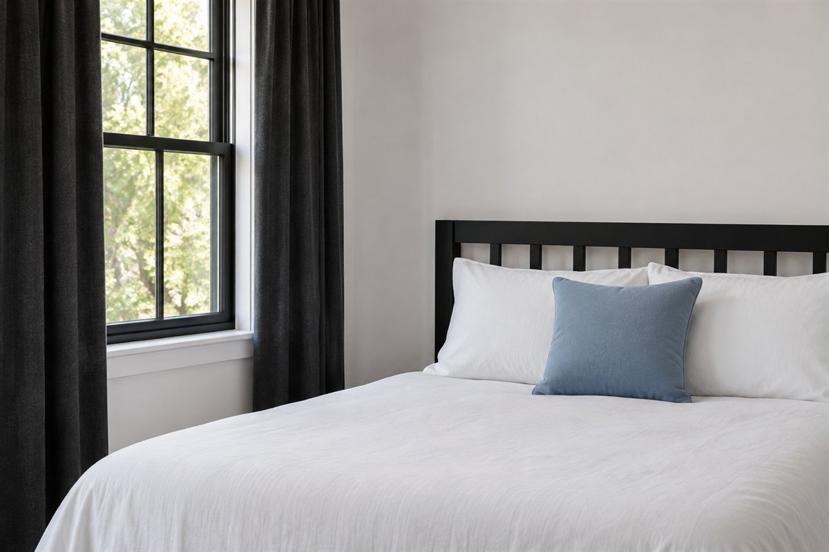
One dusty-blue cushion can add color to black-and-white bedding without changing the room’s large surfaces. Let it be visibly different in depth from the black, with the rest of the bed kept plain.
Test the actual blue next to the duvet before choosing another accent. A gray-blue, teal-blue and bright blue are different directions. If the cushion disappears at night, try a lighter cloth rather than multiplying small blue details throughout the room.
20. Try a clay layer with a black bed frame

A muted clay bedcover or throw can make a black timber frame feel warmer while keeping its outline clear. Use a generous plain area of cloth, supported by quieter pale pillows and walls.
Compare the clay with existing floor tones. A redder cloth and an orange-toned floor may form a stronger warm group than expected. Try the textile in the room before committing to paint or additional furniture, and keep the change easy to evaluate on its own.
21. Give a dark bed a pale patterned rug to sit on

A pale rug with a restrained charcoal herringbone-like pattern can separate a black bed from the floor. Keep enough of the rug visible around the furniture to understand its repeat. Plain bedding lets the floor pattern remain the one main textile motif.
Use the actual bed footprint and normal door movements when choosing the rug. A beautiful crop of a pattern does not establish size, grip or floor suitability. Check the selected rug’s care and placement guidance, and keep the usual route around the bed clear.
22. Let one monochrome artwork supply the pattern

A single black-and-white abstract can relate dark furniture to a pale wall. Give the image enough surrounding space to remain distinct from the headboard and lamps. The furniture and artwork can share a color family without every edge aligning exactly.
Choose an image you want to see independently of the room palette. Test its relationship to the full furniture group before deciding on size. Use suitable support for the actual wall and frame; the concept shows composition rather than hanging or fixing instructions.
23. Keep a compact black bedroom’s route clear

A small room can use a black wall or bed while keeping the furniture modest and the route obvious. One useful bedside cabinet may be preferable to a decorative bench and two oversized tables. Decide what the room needs before repeating dark surfaces.
Check the open door, wardrobe access and where you stand to make the bed. A dark palette does not remove those practical requirements or guarantee that the room seems larger. Keep the dark element you enjoy and remove the piece that makes ordinary movement harder.
A dark-surface priority card for your room
Use this original planning card before ordering paint or furniture. Write the dark surface you want to keep most, then list the next two largest surfaces around it. Describe each material and depth rather than simply writing black, white and brown. A matte black frame, glossy dark dresser and soft charcoal duvet are three different visual surfaces.
Next, choose one outline that needs to remain distinct: the headboard against the wall, the bedside surface against the bed or the storage doors against the surrounding room. Compare the relevant real samples together and under your ordinary lamps. If that outline disappears more than you want, change its companion or the light used for the activity before adding decorative objects.
Finally, write the next change you will postpone. Keeping the curtain or rug undecided while you settle the bed-and-wall relationship can prevent several simultaneous purchases that are difficult to evaluate. This is a planning aid, not a measured lighting assessment or fixed rule for every room.
Three hypothetical bedrooms and one first move
In a room with a cream upholstered bed and warm wood floor, first compare a neutral black and a brown-black wall sample beside both materials. Keep the existing duvet on the bed during the comparison. The better sample is the one whose relationship you prefer in that room, not the darkest name on a chart.
In a rented pale room with a useful wood bed, try black bedding with a visible pale edge before considering a wall change. Review the actual care requirements and live with the textile arrangement. Follow tenancy conditions for any later painting or fittings.
In a compact room with a black wardrobe, begin by making its access work and keeping the adjacent furniture simple. A pale bed may provide sufficient contrast already. These examples are hypothetical briefs, not product tests, client projects or measured layouts.
What the references support
Benjamin Moore’s black-color guidance distinguishes cooler and warmer undertones and recommends sampling. Its sampling resource explains that color samples represent appearance rather than the final coating. Use those resources to choose an actual color and suitable product independently of the illustrations.
IKEA’s small rented-studio example uses black and white through furniture, graphic lines and storage. It offers one practical interpretation of the palette. Our combinations and priority card are original, and the generated images do not identify its products or reproduce its layout.
Do black bedroom ideas require black walls?
No. A black bed frame, duvet, curtain or storage piece can supply the main dark area while walls stay light. Choose the surface you can sensibly change and the contrast you want to see.
How can I make a black bedroom feel warmer?
Try a retained wood surface, a cream textile or one muted camel or clay layer. Compare actual materials together and keep the additions useful rather than repeating many small warm-colored objects.
Can a small bedroom use black?
Yes, if you like the appearance. Fit the furniture and preserve the route to doors, storage and the bed. Neither dark nor pale color guarantees that the room will feel larger.
Which black paint is best?
Compare actual samples beside the floor, bed and textiles you keep. Blacks can show different undertones, so no single formula is best for every room. Choose the final coating for its actual surface and product requirements.
Do these images show exact paint or fabric colors?
No. They show generated material and contrast relationships. Screen display, light, finish and actual textiles affect appearance, so use real samples before a major change.
A practical next step
Give black one clear role, then let the surrounding materials make that role readable. A useful bedside surface, comfortable textile and retained wood piece can contribute more than another dark accessory. Settle the large relationship first and finish the room around daily use.
Compare a predominantly white bedroom with smaller dark outlines. Explore a broader romantic dark-feminine bedroom direction. Consider bedroom lighting around everyday activities.
Images are original AI-generated decor concepts, not photographs of named products, completed client projects or measured installations. The priority card and three hypothetical briefs are original planning aids.
Sources and care references
- Benjamin Moore: black undertones, contrast and sampling
- Benjamin Moore: how color samples should be used
- IKEA: one black-and-white rented-studio interpretation
Optional digital guide for this topic
If you prefer a structured workbook, explore this related paid guide.