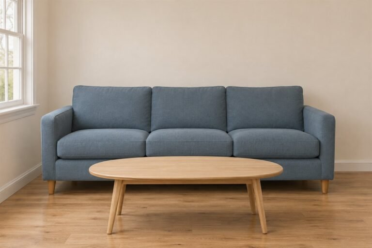
Gray living room ideas are easier to apply when you identify what feels unresolved: the sofa may look unexpectedly blue beside a wall, two large surfaces may blend together, or the room may simply contain too many similar finishes. Each problem calls for a different comparison.
Begin with the useful furniture and fixed flooring. This guide offers gray sofas, painted areas, textiles and supporting materials as alternatives. You can keep a comfortable gray piece and change one relationship around it rather than replacing the whole room.
The 22 images are original AI-generated decor concepts. They illustrate color and furniture relationships rather than exact paint formulas, named products, tested materials or measured layouts.
Contents
- 1. Keep the gray sofa and try a warm-white background
- 2. Use a warm gray wall with quiet ivory seating
- 3. Give cool gray a deliberate blue companion
- 4. Set a retained gray sofa against muted green
- 5. Use red in one small textile area
- 6. Let cream provide a larger companion to gray
- 7. Frame pale seating with a charcoal wall
- 8. Give a charcoal sofa a pale surrounding field
- 9. Separate gray-on-gray through depth and texture
- 10. Pair gray cloth with one camel chair
- 11. Keep a red-brown wood floor in the comparison
- 12. Use wood to distinguish gray from pale stone
- 13. Let the coffee table supply the stronger wood tone
- 14. Choose a pale round table for a different shape
- 15. Use a light rug to reveal the seating group
- 16. Let one gray-and-cream rug carry the pattern
- 17. Use gray curtains beside warmer neutral walls
- 18. Introduce pattern through a single curtain
- 19. Concentrate gray in useful closed storage
- 20. Use gray trim as a smaller architectural outline
- 21. Make a silver-colored lamp a useful detail
- 22. Finish a compact gray room around the useful seats
Identify the gray problem before choosing the next purchase
Describe the issue in ordinary room terms. Is the sofa too close to the wall in depth, does a neighboring white make it seem bluer, or does the room lack a surface you enjoy using? Keep those questions separate while comparing actual samples. Start with one candidate, the same retained furniture and the normal lamp settings.
An original gray-room troubleshooting sheet
- Unexpected color cast: Compare the gray beside the actual wall, floor and largest textile; do not judge it alone.
- Furniture outline disappears: Try a useful change in depth, neighboring textile or position before another matching gray.
- Too many similar smooth surfaces: Compare a substantial wood or textured fabric area rather than more small ornaments.
- Two strong patterns compete: Retain one leading repeat and test a quieter companion.
- Room works only in daylight: Repeat the comparison under the lights and curtain positions actually used after dark.
- Next action: Write one item to keep, one relationship to compare and one purchase to defer.
1. Keep the gray sofa and try a warm-white background

A useful gray sofa can stay while a quieter wall and visible oak give the room another direction. Begin with the actual upholstery rather than replacing it because the old arrangement feels flat. A clear wood surface and a plain pale rug can provide enough contrast without a new set of patterned cushions.
Compare the warm white with the sofa and fixed trim together. If the fabric seems bluer or more violet than you enjoy, try a less creamy candidate before changing every textile. Keep the furniture and lamp settings consistent while judging that first wall decision.
2. Use a warm gray wall with quiet ivory seating
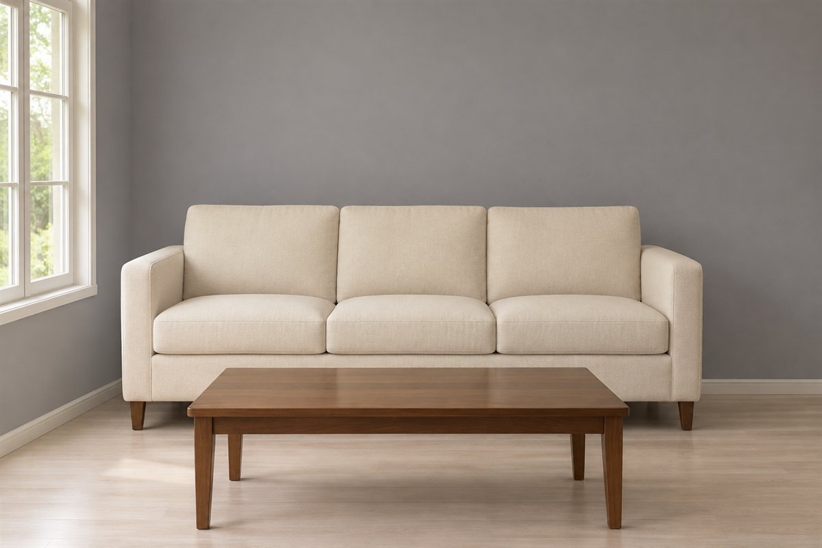
A warmer gray wall can give ivory upholstery a visible setting without making the room strongly colorful. Leave the sofa’s fabric plain enough to read as a substantial light area. The useful contrast is between the wall and seat, with wood supplying another surface rather than another gray.
Compare a browner gray and a more neutral gray beside the same ivory fabric. Do not assume a name such as stone or pewter specifies the undertone. Check the retained floor in the same view before choosing the whole-wall color.
3. Give cool gray a deliberate blue companion

A dusty-blue chair can make a cooler gray palette feel intentional instead of trying to disguise every cool note. Keep the wall and main sofa quieter so the chair reads as a useful second seat. A plain timber table supplies material variety.
Compare the actual blue upholstery beside the gray sofa under ordinary evening light. Choose enough difference in depth for the two seats to remain distinct. If the blue is already the accent you want, a patterned blue curtain may be an unnecessary second statement.
4. Set a retained gray sofa against muted green
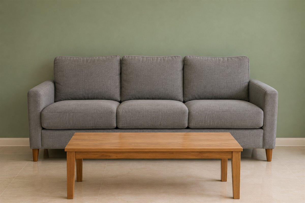
A gray sofa can remain neutral while the wall carries a subdued green. Give the two surfaces a clear difference rather than choosing a green so gray that they almost merge. Keep the surrounding textiles plain while deciding which color should lead.
Compare the green with the broad sofa back and the fixed floor, not just a small fabric swatch. A yellow-green and a blue-green will create different relationships. Use the existing sofa position during the trial so the wall is judged in its real context.
5. Use red in one small textile area
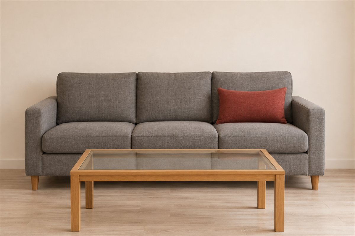
One muted red cushion can give gray seating a distinct accent without changing the larger room. Keep enough exposed gray fabric around it for the contrast to remain understandable. The cushion is a small optional feature, not a reason to repeat red on every wall and table.
Try the actual cloth on the sofa before choosing more pieces. A warm red and a cooler berry tone may behave differently beside the same upholstery. Keep the cushion useful and easy to move, and leave another strong print out of the first comparison.
6. Let cream provide a larger companion to gray

A cream chair or larger cream textile can contribute more clearly than many tiny pale accessories. Place the chair where it serves the seating group, allowing the gray sofa to remain the main neutral. A restrained table keeps the relationship simple.
Compare the cream with existing white trim and the actual gray fabric. The difference between white and cream may become more obvious beside a cool sofa. Select the chair for comfort and its complete footprint as well as its color contribution.
7. Frame pale seating with a charcoal wall
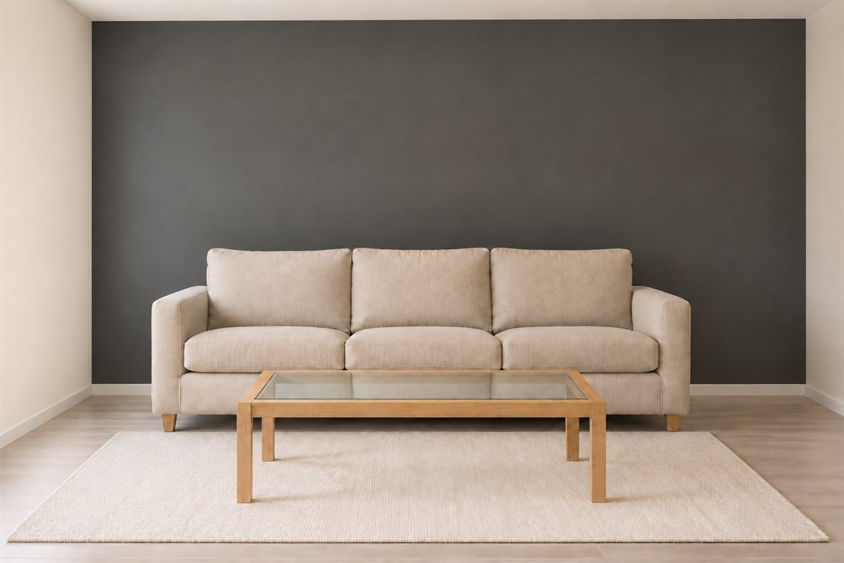
A charcoal wall can give a pale sofa a definite outline without requiring dark furniture everywhere. Let the lighter upholstery remain a generous field. Keep the neighboring floor and table different enough that the room is more than a series of dark shapes.
View a real wall sample from the sofa as well as the entrance. Check the room with the lights normally used for conversation or reading. The dark color is a preference about contrast; it cannot establish useful illumination or guarantee an apparent change in room size.
8. Give a charcoal sofa a pale surrounding field

A charcoal sofa can be the larger dark object while the walls stay light. Keep the arms and seat visible instead of covering most of the upholstery with decorative pillows. A pale rug can separate the sofa from the floor where their depths are otherwise similar.
Compare the sofa’s real weave and any sheen in daylight and lamplight. Dark gray fabric does not behave like an identical paint swatch. Choose the supporting wall and rug from those actual surfaces rather than ordering several products simply because they share a gray label.
9. Separate gray-on-gray through depth and texture
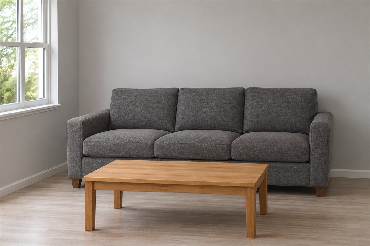
A gray wall and gray sofa can work together when each remains a deliberate surface. Compare a paler wall with a more substantial textured seat rather than relying on an accidental near match. Let a wood table introduce another material without making the scheme busy.
View the sofa arm, back and wall in the same ordinary light. If their edges disappear more than you want, change one surface’s depth or the useful neighboring textile. Buying another nearly matching gray item will rarely explain which relationship was missing.
10. Pair gray cloth with one camel chair

A camel chair can bring a different upholstery color and surface beside gray cloth. Keep the chair within the conversation group rather than isolating it as a decorative sample. A simple wall and table leave the contrast between the seats visible.
Compare the actual camel with the wood floor before ordering. Some versions lean yellow, others red or brown. Choose the real chair’s comfort, care and usable size separately from the palette; a warm-looking image cannot identify a leather finish or prove its performance.
11. Keep a red-brown wood floor in the comparison

A retained red-brown floor is a substantial color area, so include it while choosing gray upholstery or paint. Leave part of the timber visible instead of assuming a new rug must conceal it. Pale walls can give the gray and wood a quieter shared background.
Compare the gray with several floorboards because wood color and reflections vary across a room. If the pairing makes the floor seem too orange for your taste, test another gray candidate before changing useful furniture. Keep the same floor area in each comparison.
12. Use wood to distinguish gray from pale stone

A broad wood tabletop can give a room with gray seating and pale stone-like flooring another material. Keep the grain visible and the top useful. This is a more substantial change than scattering small wood ornaments around the sofa.
Compare the table with both the floor and upholstery from the entrance and seats. Decide whether you want a clear difference in depth or a closer tonal relationship. Choose the actual floor and tabletop for their stated care rather than inferring material or durability from an illustration.
13. Let the coffee table supply the stronger wood tone

If the gray sofa and pale walls already work, an existing darker wood table may provide the missing definition. Let the table remain visibly different from the flooring. Matching every leg and cabinet to one exact timber tone is optional rather than a condition for a finished room.
Check the table where hands and everyday belongings reach it. Its useful position matters more than a perfectly centered photograph. Compare the broadest wood surface with the gray upholstery before buying a matching side table or replacing other pieces that already serve the room.
14. Choose a pale round table for a different shape

A pale round tabletop on a restrained dark base can introduce a softer outline among a rectangular gray sofa and rug. Keep its surface mostly clear while comparing the shape. It can supply enough contrast without adding another colored upholstered piece.
Try the complete diameter and base with the actual route around the sofa. A round form still occupies floor space and does not automatically fit a narrow room. Select the real top for its weight, edges and care, then judge the pale surface as part of the palette.
15. Use a light rug to reveal the seating group

When the sofa and wood floor are both deep, a larger quiet light rug can make their edges easier to distinguish. Keep its relationship with the whole seating group clear. A tiny pale piece beneath only the table may emphasize the wrong part of the arrangement.
Establish the useful outline with the real furniture before selecting a shade. Check the exact rug’s floor compatibility and care separately. If the retained floor already provides enough contrast, another pale rug may be unnecessary; choose the change that answers the actual room.
16. Let one gray-and-cream rug carry the pattern

A simple geometric rug can connect gray seating with pale surroundings. Keep the sofa fabric and curtains plain while judging its full repeat. The pattern should remain understandable after the table occupies its normal position.
Compare the entire product layout with the seating footprint, not only a close-up of one attractive corner. A quieter border and a strong central motif create different effects once furniture covers them. Keep the main pattern on one useful larger surface before adding printed cushions.
17. Use gray curtains beside warmer neutral walls

Gray curtains can supply the neutral through a taller textile area while a warmer wall remains unchanged. Let the sofa be a related but separate surface. The curtain does not have to match the upholstery exactly to belong in the room.
Compare the cloth beside the wall with the curtains both stacked and drawn. Choose the practical coverage, support and care before the final shade. Color alone does not establish privacy, light control or the way a fabric will hang in the actual window.
18. Introduce pattern through a single curtain

A restrained gray-and-white curtain can bring a repeat into a room with plain gray seating. Use the curtain background in the comparison, not only its darkest stripe. Keep the rug or floor quieter so the window remains the main patterned surface.
Review a useful portion of the actual fabric both gathered and extended. A stripe that reads clearly when flat changes when folded. Select the window treatment for its ordinary operation first, then decide whether its pattern contributes enough to keep other decorative textiles simpler.
19. Concentrate gray in useful closed storage
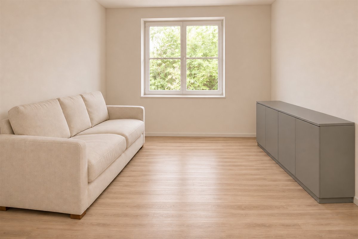
A gray closed cabinet can be the room’s larger neutral piece while the sofa stays cream or another quiet color. Plain fronts keep the unit readable. A clear top can serve the room without becoming a permanent display of objects bought to repeat the palette.
Choose the interior around the belongings it serves and try the doors with the seating in place. Follow the actual cabinet’s securing and care information. Its gray finish is a visual choice, not evidence that the unit suits every equipment or storage application.
20. Use gray trim as a smaller architectural outline

A gray door frame or existing wall trim can introduce a limited neutral outline while the larger walls remain pale. Keep the sofa and nearby table uncomplicated so the architecture is readable. This is an alternative to a full gray wall, not a requirement to outline every edge.
Compare the proposed gray with the actual wall white and fixed floor. Identify the material and a suitable coating system before refinishing. View the opening with its door in the usual position; a color boundary should make sense during everyday use as well as in a staged closed view.
21. Make a silver-colored lamp a useful detail

A silver-colored lamp can supply a precise highlight beside gray fabric. Keep the metal in a place where its light is useful rather than repeating it as a collection of ornaments. A plain shade lets the larger sofa and wall remain the main surfaces.
Assess the actual fixture, controls and light from the seat. Then compare its finish with existing hardware under the room lighting. A brushed surface and a more reflective one may create different appearances even when their descriptions use the same metal color.
22. Finish a compact gray room around the useful seats
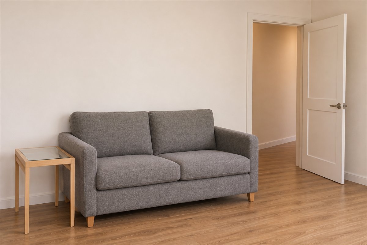
A small room can have a substantial gray sofa while keeping other pieces limited. Begin with the seats used in ordinary life and the reachable surfaces they need. The color scheme can be complete without an extra chair, console and decorative stool.
Walk the approach to the sofa and open the real door or nearby storage with the furniture in place. Remove the least useful obstruction before changing the wall color. A gray palette should accompany a workable arrangement; it does not make the floor area larger or prove the furniture fits.
Separate an undertone issue from a contrast issue
A gray sofa can look blue beside one wall and less blue beside another. That is different from a sofa whose edge simply disappears against a wall of similar depth. Begin by describing what you see before deciding the entire gray scheme is wrong.
For the first situation, compare a limited range of wall samples beside the real upholstery and flooring. Keep their positions and the lighting consistent. For the second, try a clearly lighter or deeper companion, or a useful textile between the large surfaces. Change only one comparison at a time.
A gray does not have to be perfectly neutral to work. A blue-leaning, green-leaning or warmer gray may be exactly what you want. The useful question is whether that undertone belongs with the finishes and preferences in this room.
A worked example with a sofa and floor that stay
Imagine a hypothetical household keeping a cool-gray sofa, a red-brown timber floor and cream curtains. The first shopping list adds a gray rug, gray cabinet and metallic accessories. Before buying them, record the actual complaint: the sofa seems bluer beside the cream curtain, while the useful table already works.
Begin with a comparison at the curtain-and-sofa junction. Try a different pale textile candidate or another wall sample while leaving the floor and furniture unchanged. Observe the result with the curtain gathered and drawn. This identifies whether the larger pale area, rather than a missing gray accessory, is the relevant decision.
If the retained curtain is still preferred, explore a gray-and-blue direction deliberately instead of trying to eliminate every cool note. Keep the existing table and defer the cabinet until it has a storage role. This is an original planning example, not a measured room, product test or completed client result.
Make the gray scheme work after the room has been used
Return the remote, cups, reading material and ordinary textiles to their usual places. Notice where a reachable surface is missing, which cabinet is inconvenient to open and which optional cushion must move before anyone can sit. Those observations should influence the next piece more than a perfectly empty photograph.
Select the largest pattern from the items you genuinely want to keep. A rug or curtain can provide the repeat while the sofa stays plain. If both already have strong patterns, simplify a smaller layer before ordering another print simply because it contains gray.
Follow the exact upholstery, rug and furniture care information. Gray does not establish stain resistance, washability or fade behavior. The image’s surface appearance cannot identify the fiber, coating or cleaning requirements of a real product.
Use the primary references as comparison tools
Benjamin Moore’s gray-living-room collection shows warmer and cooler gray directions and encourages checking samples with the room’s other finishes. Its warm-and-cool guide explains how undertones and lighting affect color comparisons. These references support looking at real neighboring materials rather than selecting by a gray color name alone.
Our troubleshooting sheet, hypothetical example and 22 concepts are original. The illustrations do not identify the brand’s formulas or reproduce its room photographs. Choose the actual finish and product for its surface and care, then use physical samples to settle appearance. The scheme offers no health, mood or room-size guarantee.
What colors go with a gray sofa?
White, cream, muted blue, green, camel and restrained red are possible directions. Start with the actual sofa fabric and fixed floor. The gray’s undertone and the visible amount of the companion matter more than a generic color name.
How can a gray living room feel less flat?
Identify whether the issue is similar depth, too many matching surfaces or a missing useful piece. Compare a larger wood area, a distinct light textile or one restrained accent. More gray accessories may add little if the larger relationship is unresolved.
Should the walls match the gray sofa?
They can relate without matching exactly. A lighter or deeper wall can reveal the sofa outline, while a deliberately tonal pair can emphasize texture. Compare actual samples beside the upholstery in the room’s normal light.
Why does my gray look blue or purple?
The apparent undertone can become more noticeable beside other finishes and under different lighting. Compare the same gray with the fixed wall, floor and textiles before assuming the product is defective or buying a matching item.
Can I use gray in a small living room?
Yes. Check the furniture footprint, openings and normal seating first. A compact useful arrangement can include gray walls or upholstery, but the color cannot establish fit or guarantee that the room will seem larger.
A practical next step
Keep the useful gray piece and name the relationship that needs attention. Compare one wall, textile or material change with the real room, then postpone additions that do not answer it. A coherent gray living room can come from a clearer mix of existing surfaces.
Compare a broader range of living room paint palettes. Explore a stronger blue sofa and its room palette. Compare darker furniture and wall relationships with black.
Images are original AI-generated living-room decor concepts, not exact paint matches, measured plans or tested products. The troubleshooting sheet and hypothetical example are original planning aids.
Sources and care references
- Benjamin Moore: gray living room color families and sampling
- Benjamin Moore: undertones and warm-versus-cool comparisons
Optional digital guide for this topic
If you prefer a structured workbook, explore this related paid guide.