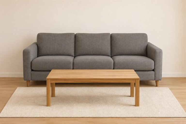
White living room ideas work best when pale surfaces have distinct materials and practical roles. A white wall, cream sofa and warm wood cabinet can belong together without an exact match. The room can also keep a colored seat, a television and familiar furniture rather than replacing everything to follow a palette.
These 22 ideas focus on the whole pale room: upholstery, storage, textiles, contrast and ordinary use. Our separate living-room paint guide covers a wider range of wall colors, while the minimalist guide explores editing belongings. Here the useful addition is a surface-care map for choosing where white belongs and what a household can realistically maintain.
All images are original AI-generated decor concepts. They illustrate color and material relationships, not exact products, paint formulas, measured arrangements or tested cleaning performance.
Contents
- 1. Let white walls support a sofa you already like
- 2. Pair a white sofa with the floor that will stay
- 3. Compare cream upholstery against a cleaner white wall
- 4. Keep a dark wood cabinet as a substantial anchor
- 5. Use one black table for a clear outline
- 6. Let a brown leather chair bring another material
- 7. Try a woven chair beside plain upholstery
- 8. Use one substantial textured rug beneath the group
- 9. Choose a restrained patterned rug as the main repeat
- 10. Keep plain curtains useful for the actual window
- 11. Let one muted-green chair provide the accent
- 12. Try one warm textile instead of a full accessory group
- 13. Give one colored artwork a clear white background
- 14. Use a black-and-white work when color is already settled
- 15. Let white closed storage carry the everyday collection
- 16. Bound an open book display to one useful place
- 17. Compare white wall and trim as one pair
- 18. Keep a white fireplace surround visually simple
- 19. Let retained ceiling wood remain a separate material
- 20. Keep the television as an ordinary dark feature
- 21. Give the reading seat useful evening light
- 22. Leave the white room ready for ordinary use
Make a white-surface care map before choosing the next finish
List the broad white or pale surfaces you want: wall, sofa, rug, curtains and storage fronts. Give each a daily contact pattern, actual care requirement and nearby retained material. Compare the whole set before buying so a pale palette does not become an unsupported promise that everything cleans the same way.
An original surface-care map for a white living room
- Surface: Name the actual wall coating, upholstery, textile or cabinet finish being compared.
- Contact: Record who touches it and what ordinary activity happens there.
- Care: Keep the exact cleaning, laundering or maintenance instructions with the sample.
- Neighbor: Compare the retained floor, sofa, trim or wood directly beside it.
- Light: Observe the pair in daylight and under the normal evening lamps.
- Decision: Keep, sample another option or defer the purchase for a specific reason.
1. Let white walls support a sofa you already like
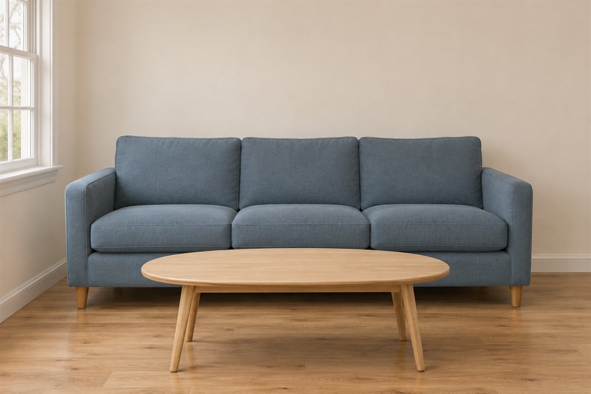
A white living room can begin with the walls while a useful colored sofa stays. Give that larger upholstery a clear background and compare the remaining furniture before buying pale replacements. The room can have a white direction without requiring every substantial object to be white.
Keep the actual sofa fabric beside the wall samples under ordinary light. A blue or green seat may become the main color, which can be enough without matching it through every accessory. Choose the relationship you enjoy rather than treating the retained sofa as a problem to conceal.
2. Pair a white sofa with the floor that will stay
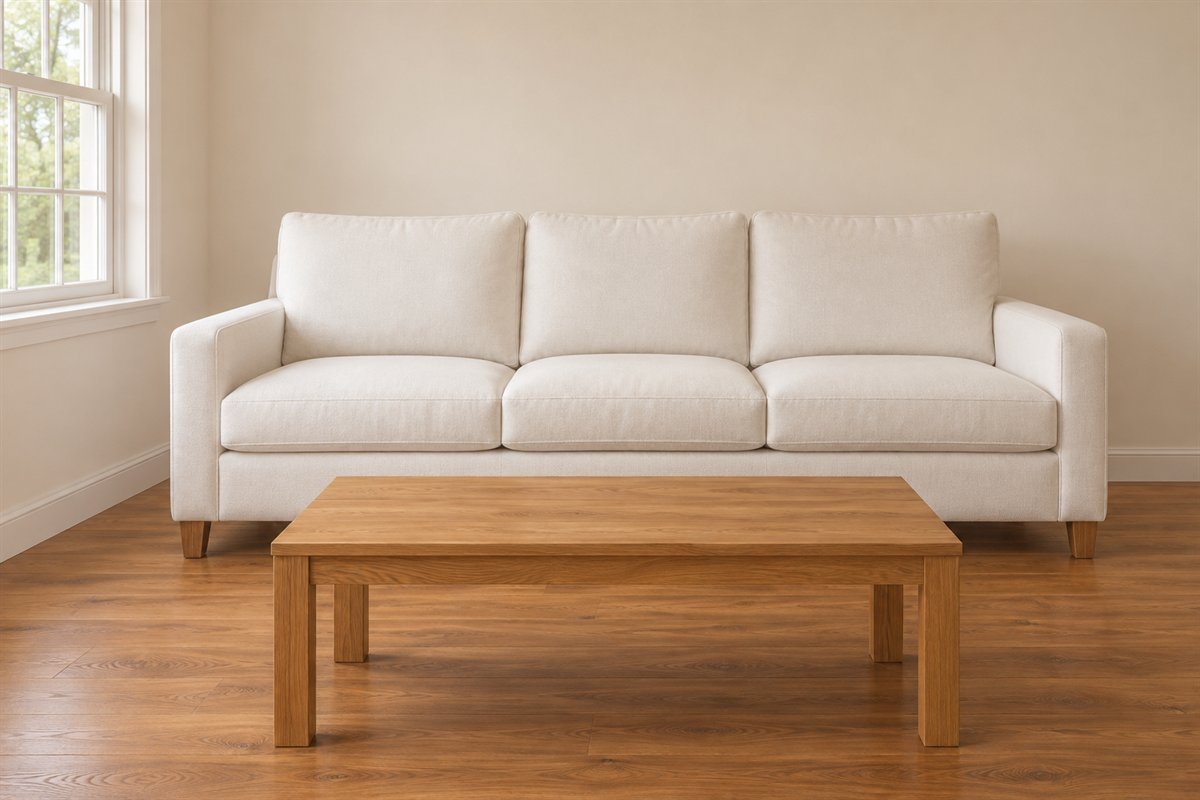
A white upholstered sofa can give a retained wood floor a different setting. Compare the sofa’s actual fabric with the floor finish before changing either surface. The wood can provide much of the room’s warmth and visible texture without a new layer of decorative objects.
Check the real fabric’s care, feel and suitability for the household separately from its color. A white cover is not automatically removable or machine washable. If laundering matters, confirm those properties for the exact cover and include drying and refitting in the decision.
3. Compare cream upholstery against a cleaner white wall
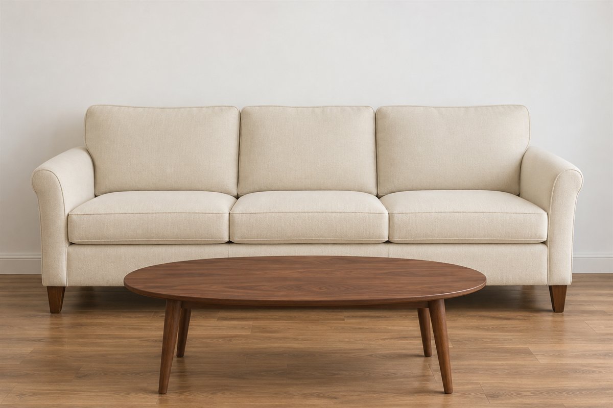
A cream sofa and a cleaner white wall can form a deliberate pale contrast. Keep their difference visible instead of assuming the two materials must be identical. Compare the whole sofa with the wall, because a tiny fabric chip can understate how warm the upholstery looks.
View the pair under the lamps normally used as well as daylight. If one surface seems unexpectedly yellow or gray, compare another wall sample before replacing a useful sofa. Pale variation can be part of the room when it is chosen through actual neighboring materials.
4. Keep a dark wood cabinet as a substantial anchor
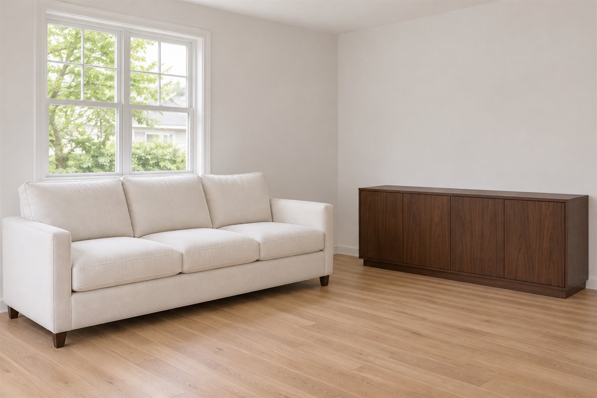
An existing dark cabinet can belong in a white room without another matching dark item in every corner. Let the larger pale surfaces give its outline a clear setting. Choose which part of the cabinet remains useful before deciding how much display should surround it.
Compare the wood grain and undertone with the retained floor. Follow the real furniture’s support and restraint guidance and keep its doors usable. If the cabinet already supplies substantial visual weight, a quieter table or wall can balance the view without another decorative layer.
5. Use one black table for a clear outline
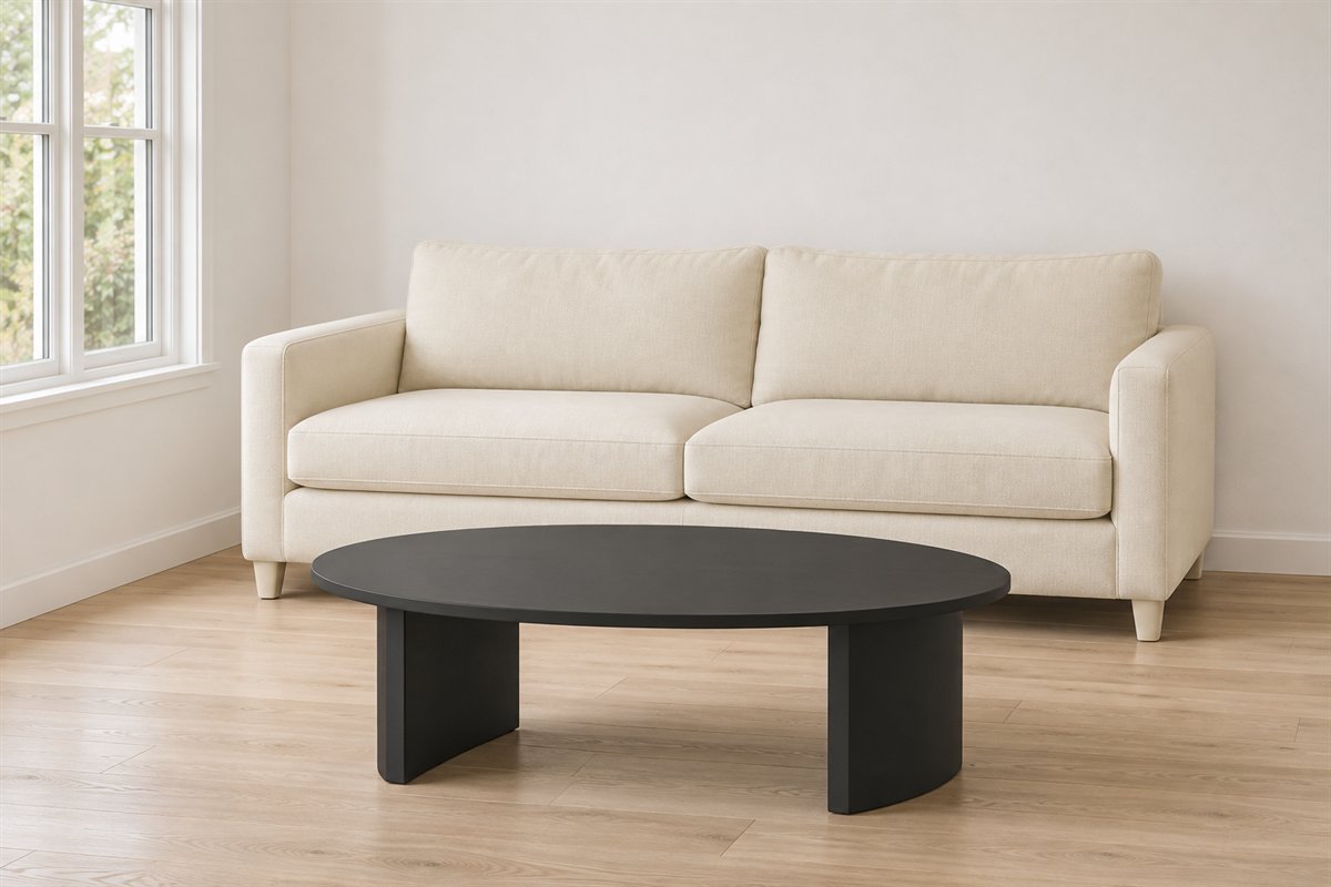
A simple black coffee table can define the center of a pale sitting group. Keep the shape and finish quiet so its contrast has a useful role. Count the black details already in the room before adding another set of dark accessories to explain the table.
Compare the actual reach and full base with the sofa. A strong outline is a visual choice, not a reason to make the tabletop too large. If the screen and window frames already provide enough contrast, try a wood table before treating black as a compulsory part of a white room.
6. Let a brown leather chair bring another material

One retained brown leather chair can give a white room a different surface and color without becoming a rustic theme. Compare it with a quieter pale sofa and a useful table. The contrast comes from the larger furniture rather than many small brown accessories.
Choose the chair through comfort, condition and actual care information. Do not infer a leather grade or durability from a generated image. Keep the complete occupied chair footprint in the seating arrangement so the material addition also supports a useful place to sit.
7. Try a woven chair beside plain upholstery
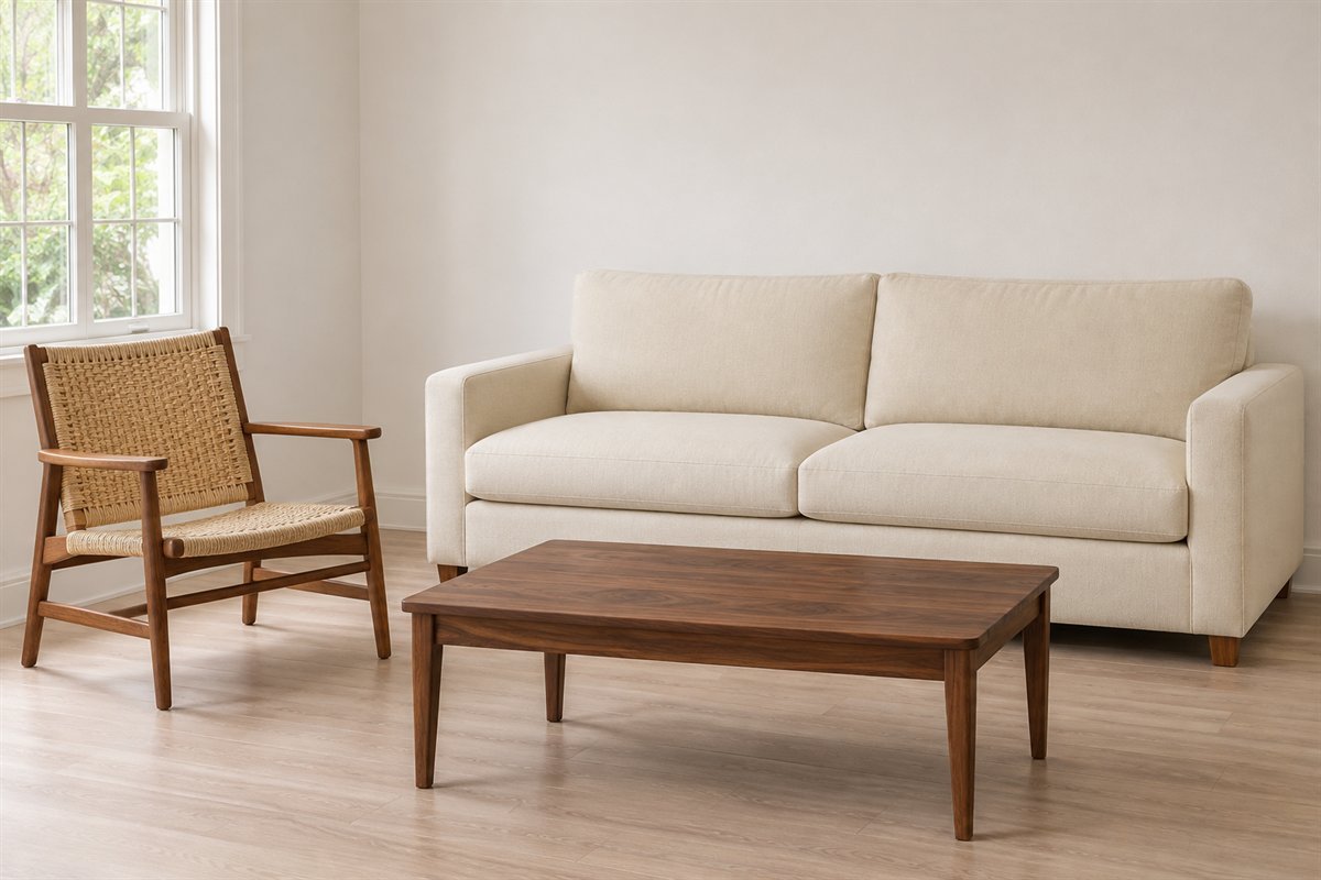
A suitably constructed woven chair can introduce visible texture against a plain white sofa. Keep its frame and surrounding furniture restrained while comparing the material. One textured seat can be enough to change the room without a woven item on every surface.
Check the exact chair’s intended use, comfort and care before choosing it. A light-looking weave does not establish strength or suitability for another environment. Compare sitting and standing with the actual piece and retain a clear route around the complete group.
8. Use one substantial textured rug beneath the group

A suitable pale textured rug can give a white room another broad material instead of another color. Compare the weave with the sofa fabric so the surfaces remain distinct. The rug should relate to the actual seating group rather than sit as a small isolated patch in the middle.
Choose real dimensions, backing and care for the floor and household. A generated weave cannot identify fiber or cleaning performance. Keep the rug edge and ordinary movement in the comparison; softness of appearance does not remove the need for an appropriate real product.
9. Choose a restrained patterned rug as the main repeat
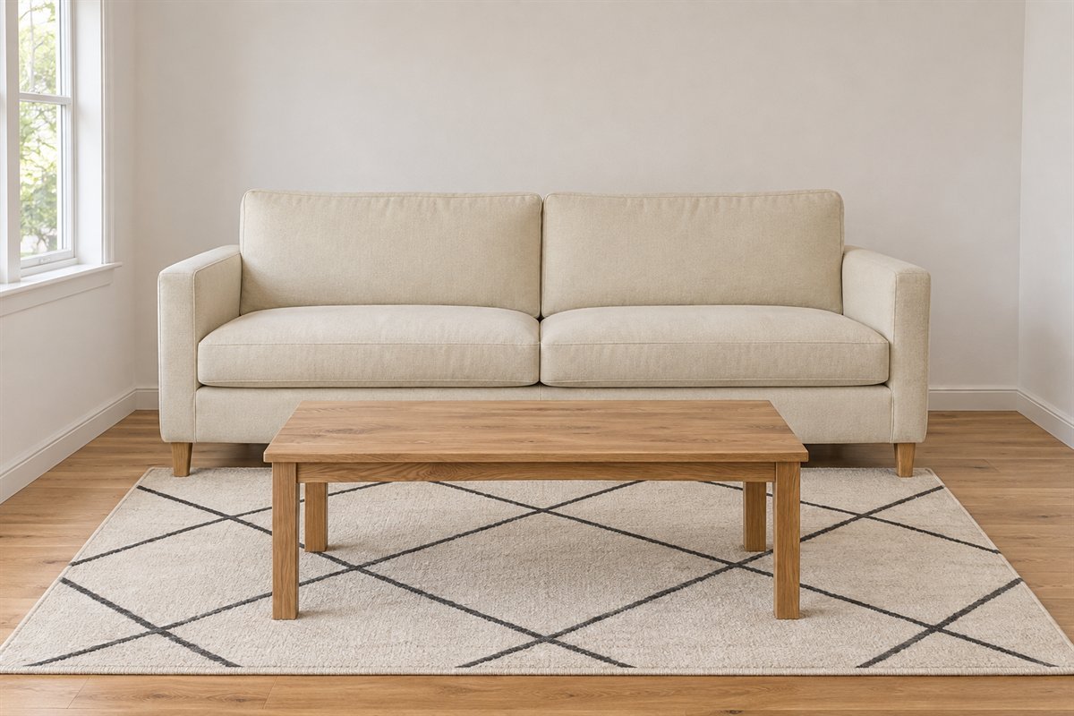
A pale rug with a simple darker pattern can give a white room a clear textile focus. Keep the sofa and largest surrounding surfaces quieter for the first comparison. This lets the pattern contribute enough interest without requiring printed cushions and curtains at the same time.
Review the complete repeat at the intended rug size and compare it with the furniture in use. A small product swatch may hide how busy the pattern becomes across the floor. Choose the real material and care separately rather than reading performance from the graphic.
10. Keep plain curtains useful for the actual window
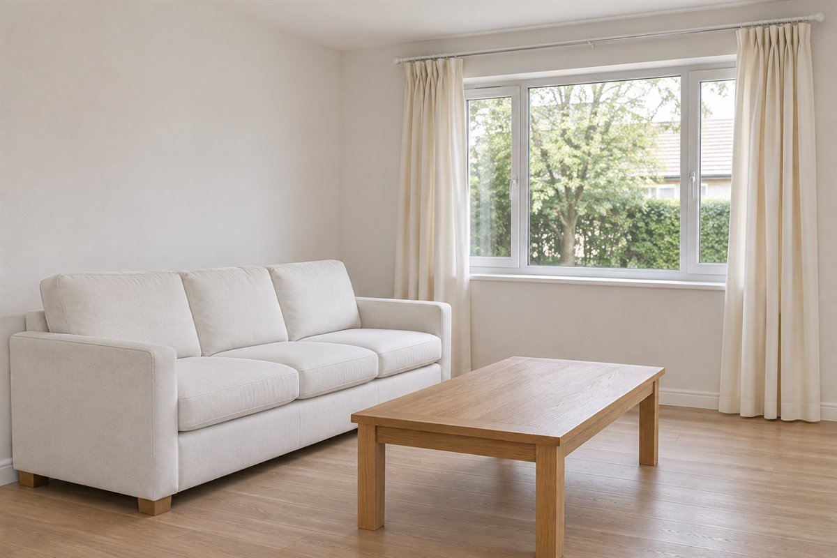
A plain pale curtain can support the white palette while giving the window a quieter frame. Choose its task before the fabric’s appearance: privacy, light control or a decorative layer may need different suitable products. Keep the full opening and stack position in the plan.
Check the real textile under daylight and evening conditions. A sheer-looking illustration does not establish after-dark privacy or blackout performance. Compare the curtain white beside the sofa and wall so its broader area belongs to the room when drawn.
11. Let one muted-green chair provide the accent

A green chair can give a white room a substantial color area without changing the main sofa. Compare a muted tone with the retained floor and the white surfaces. The accent can remain one useful seat rather than a color repeated on every small object.
Sit in the actual chair and compare its fabric in the room before choosing it by a palette alone. Keep the full footprint related to conversation and reach. If the room already contains a strong artwork or patterned rug, decide which feature should lead before adding another colored piece.
12. Try one warm textile instead of a full accessory group
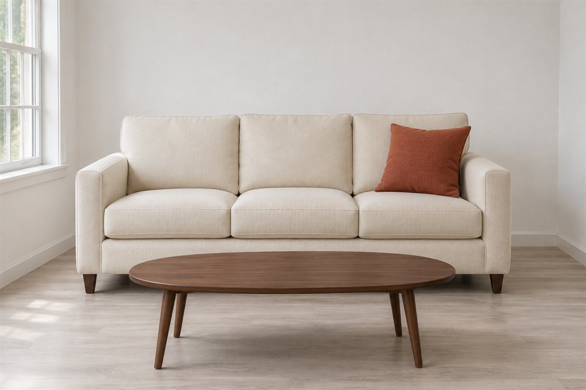
A single rust or clay cushion can be enough to change a pale sofa’s color relationship. Compare its scale and actual fabric with the upholstery before adding several matching pieces. The textile should be something the household enjoys using rather than another item moved to the floor each evening.
Choose comfort and care as well as color. If the cover is removable, follow its exact laundering instructions and retain a suitable insert. A warm-colored cushion supplies visual contrast; it does not prove a fabric composition or a measurable change in room temperature.
13. Give one colored artwork a clear white background

A white wall can give a personal artwork a distinct place without another color repeated throughout the room. Compare the piece with the furniture below and from the actual seat. Keep enough surrounding wall for its shape and frame to read clearly.
Test the full outline and reflections before fixing. Use appropriate secure support for the real frame and wall. The best piece need not match the sofa exactly; a meaningful work can be the feature around which the quieter larger surfaces settle.
14. Use a black-and-white work when color is already settled
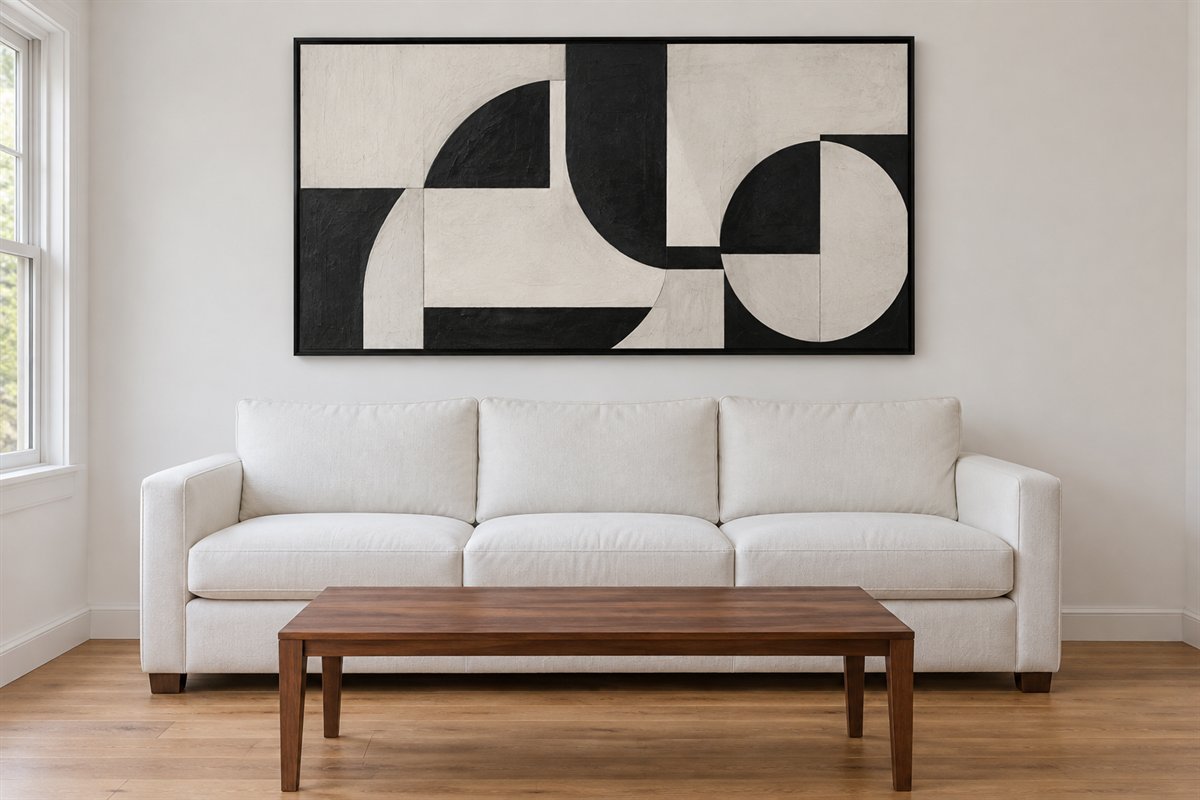
A restrained monochrome artwork can introduce graphic detail within a pale room. Compare its complete shape with the sofa and any dark furniture already present. Keep it as a considered composition rather than the first of many small high-contrast purchases.
Check glare, mounting and the actual viewing position. If the room already has a bold rug, compare a quieter image or the bare wall before adding both. The useful relationship is the whole room, not the requirement that every white wall receive a black frame.
15. Let white closed storage carry the everyday collection
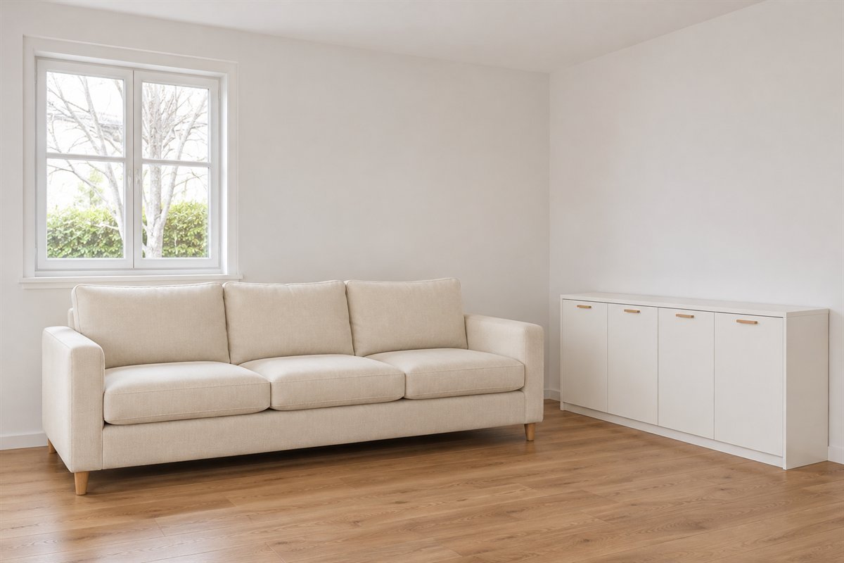
A plain white cabinet can give recurring belongings a quieter home while the sofa and materials remain visible. Choose the interior through the real collection before deciding how much wall to fill. A small useful cabinet can be better than a longer run with inconvenient compartments.
Check the doors and drawers with nearby seating occupied and follow support and restraint instructions. White fronts do not make storage disappear physically. Keep handles, full depth and the person retrieving items in the room plan rather than judging the closed elevation alone.
16. Bound an open book display to one useful place
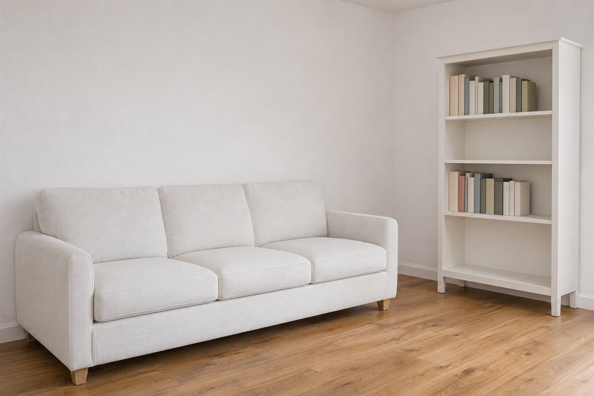
A white bookcase can keep a real reading collection visible without making every wall a display. Give the shelves a defined role and choose their actual capacity. The books can supply enough color variation when the surrounding furniture is quieter.
Keep frequently used titles reachable and follow the exact furniture’s load and stability guidance. Avoid filling gaps with decorative books chosen only for spine color. A pale shelving outline is useful when the collection remains accessible, not when it requires a difficult reset after ordinary use.
17. Compare white wall and trim as one pair

A white wall and nearby trim can differ deliberately. Compare the samples together with the largest textile and floor. The relationship may be quieter or sharper, but similar color names do not guarantee that the actual finishes belong together.
Use the intended surface and viewing angle while comparing, then choose the final product and sheen for its real use. A sample helps judge appearance rather than long-term coating performance. Keep a bright existing door in the comparison before selecting another almost-matching white for the walls.
18. Keep a white fireplace surround visually simple
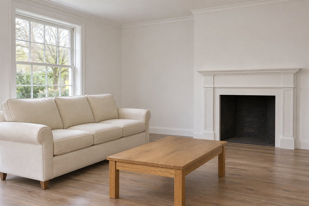
An existing white surround can belong to a pale room without a dense mantel arrangement. Compare its shape with the sofa and floor and leave its architectural outline readable. A quieter treatment can allow an older fireplace detail to remain part of the room.
Assess actual fireplace condition, materials and required clearances through the real installation. Decorative paint or a generated image cannot establish suitability near heat. Keep the illustration as a composition example and resolve any proposed finish change appropriately before work.
19. Let retained ceiling wood remain a separate material
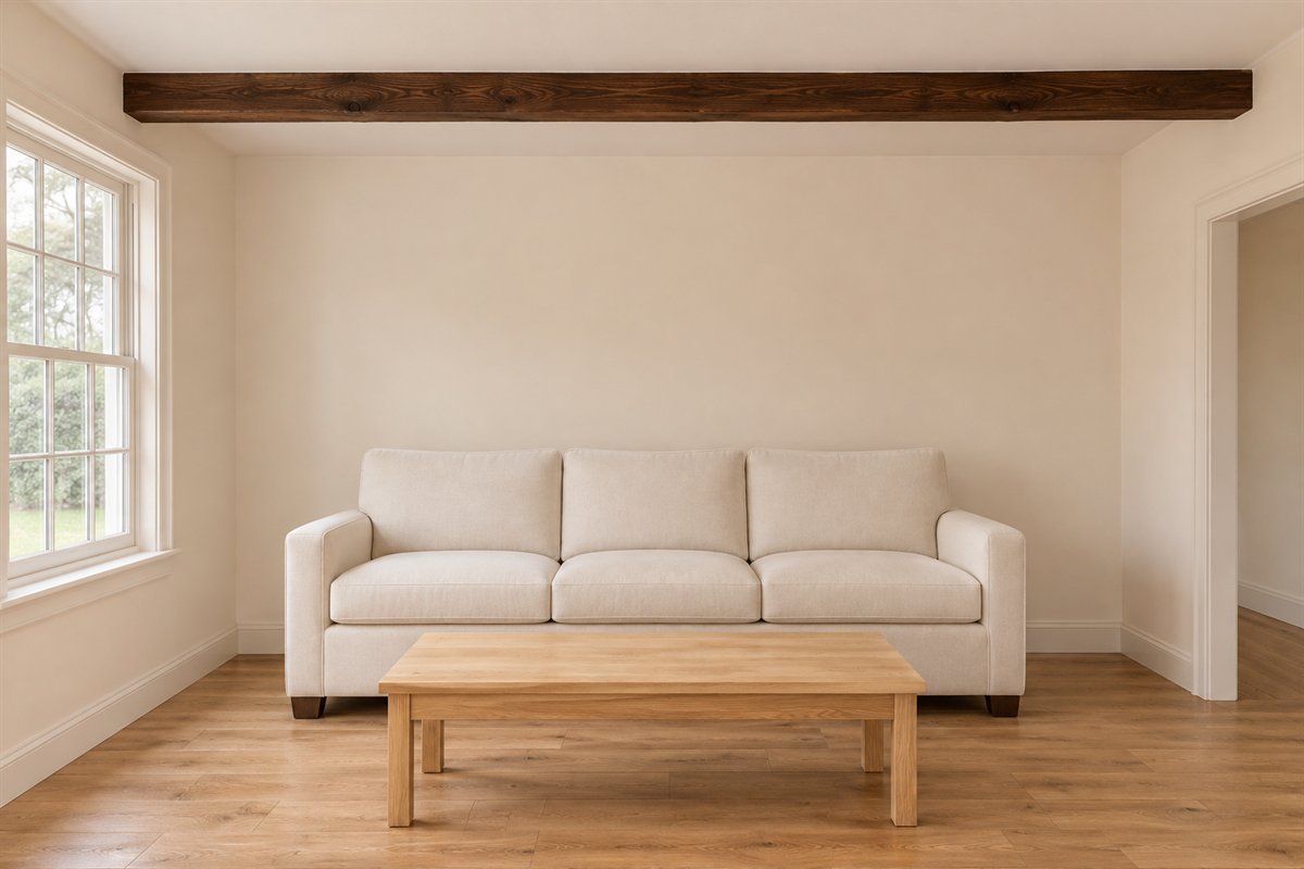
White walls can frame existing ceiling wood without requiring it to be painted to match. Compare the actual timber with the floor and largest furniture. The architecture may already provide enough texture, allowing the rest of the room to stay comparatively plain.
Keep the real beam’s role and condition separate from the palette decision. Do not alter or cover structural material to copy a concept. If the timber is visually strong, compare a quieter coffee table and textile before adding another pronounced wood pattern below.
20. Keep the television as an ordinary dark feature
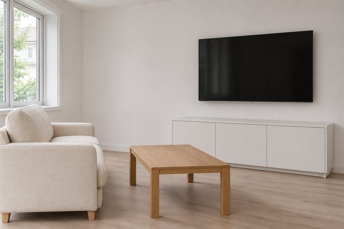
A television can remain visible within a white room. Compare the actual screen and useful supporting cabinet before adding a large surrounding display to disguise it. The dark rectangle may already supply the contrast that the furniture group needs.
Keep proper support, equipment ventilation and cable arrangements in the real project. Do not hide devices behind unsuitable closed panels for the sake of an all-white picture. Choose the seating view and necessary connections, then assess whether any decorative dark repeat is still useful.
21. Give the reading seat useful evening light

A pale room still needs light for the activities happening after daylight fades. Compare a simple lamp beside the actual reading seat and keep its control reachable. A broad white surface cannot substitute for a useful beam at the page or for a sensible room-light arrangement.
Check glare from the occupied position and use suitable equipment and installation. Keep the fitting’s complete base and cable route in the plan. Choose its visible material after the task works; a quiet shade can belong to the white palette without needing another ornamental light elsewhere.
22. Leave the white room ready for ordinary use

A white palette can include the useful furniture and everyday objects the household needs. Keep clear surfaces where activities happen and appropriate return places nearby. The finished room does not have to resemble an empty showroom to remain visually coherent.
Review the room during an ordinary evening before adding the next accessory. Note which surface needs better care, storage or reach. Keep the adjustment tied to that observation; another matching white object is optional when it has no useful task or personal meaning.
A worked example with an existing sofa and golden floor
Imagine a hypothetical room keeping a comfortable blue sofa and a golden-oak floor. The first shopping list replaces the sofa, rug and curtains with white versions. Before ordering, identify the actual intention: a quieter pale background and fewer competing material relationships.
Map the proposed surfaces. Compare two wall samples beside the actual floor and sofa under the same lamps. Keep the existing sofa in place and try one suitable pale textile before committing to an entirely new upholstered piece. The sofa can become the deliberate accent while the wall carries the white direction.
If a white sofa is still preferred, compare its actual cover care and the household’s ordinary use. Include a realistic laundering or cleaning routine for the exact product. This original hypothetical example does not promise stain resistance, a universally suitable fabric or a measured improvement in the room.
Separate a white appearance from cleaning performance
White describes a color direction, not a material specification. A painted wall, coated cabinet, woven rug and upholstered sofa ask different things of their surfaces. Keep the exact finish and product guidance with each proposed purchase instead of assigning one cleaning method to all pale items.
A removable cover is not automatically machine washable, and a washable fabric still has specified temperatures, drying and refitting requirements. Confirm the complete care label and compatibility for the exact cover. Likewise, choose the actual wall coating for its intended substrate and use rather than treating a color sample as the final performance specification.
The original map makes these differences visible before a purchase. If the preferred care routine is unrealistic, compare another suitable material or place white on a lower-contact surface. A pale wall with a retained darker seat can be a complete white-room direction, not a compromise that needs to be corrected later.
Keep pale surfaces distinct without adding many accents
Compare the largest neighboring surfaces first. A cream sofa may look warm against a cleaner white wall, while a subtly different curtain can introduce another broad tone. Keep the difference deliberate and observe it from the seat as well as from close beside the sample.
Choose a small number of visible material relationships. A grained cabinet, textured rug or personal artwork can contribute enough variety without several small decorative groups. The room does not need to repeat every wood, metal or accent color on each surface.
If the pale room feels indistinct, identify the actual issue before adding black everywhere. The missing element may be a clearer furniture outline, more useful light or a meaningful focal point. Test one change while keeping the larger retained materials in the comparison.
Compare the evening room and its ordinary return routine
Use the room after daylight fades. Read from the usual seat, open storage and place ordinary items on the surfaces that serve them. A pale palette should not require removing useful equipment or keeping every tabletop permanently reset for a photograph.
Keep suitable light where activities happen, assess the actual window treatment and note what repeatedly lands on the nearest clear chair. The next adjustment might be a more convenient return place rather than another pale storage unit. Preserve the furniture that already supports the household.
The references contribute limited context: IKEA shows that a white room can include material variation and useful light; Benjamin Moore explains comparing white undertones through real samples and changing room light. Our care map, hypothetical example and 22 concepts are original. Neither reference establishes a tested product choice or a guaranteed visual result in another home.
Does every piece in a white living room need to be white?
No. White walls or another broad pale surface can establish the direction while useful wood, a colored sofa and ordinary equipment remain. Compare the larger materials together before replacing furniture.
How do I keep a white living room from looking flat?
Compare texture, furniture outlines and a deliberate material contrast. A substantial wood piece or personal artwork may be enough. Review useful light before adding several small accent objects.
Can I mix white and cream?
Yes, when the actual neighboring surfaces work together. Compare the wall, upholstery, trim and curtains under daylight and evening lamps rather than assuming similar names guarantee a match.
Is a white sofa practical?
That depends on the exact fabric, cover construction, care instructions and household. Confirm removable or washable properties rather than inferring them from color or a generated picture.
Do white walls make a dark room bright?
They change the color and contrast of its surfaces, but useful actual light is still needed. Compare samples and the normal lamps in the real room; a pale illustration does not establish illumination.
A practical next step
Choose where white has a useful role, keep the substantial furniture you enjoy and compare actual materials together. Use the care map before buying, then refine texture, contrast and light through an ordinary day in the room.
Compare a broader range of living-room paint palettes. Trial a simpler display without removing useful furniture. Choose actual living-room curtains for light and privacy.
Images are original AI-generated white-room decor concepts, not exact paint formulas, named products or tested cleaning examples. The surface-care map and hypothetical room are original planning aids.
Sources and care references
- IKEA: material variation and useful light in a white room
- Benjamin Moore: comparing white undertones and real samples
Optional digital guide for this topic
If you prefer a structured workbook, explore this related paid guide.