Black and white bathroom ideas work best when the contrast has a clear place. A dark vanity against white walls, a patterned floor beneath plain fixtures and a slim black mirror frame are three different approaches. Combining every one at full strength can make a room feel crowded even when the counter is empty.
Begin with the fixtures and finishes that will remain, then choose the main dark area and the quieter supporting surfaces. These 25 original concepts compare whole-room color relationships, small updates and more involved finish choices. They do not assume that a bathroom needs replacement simply to adopt a two-color palette.
Contents
- 1. Start with a white room and a single black vanity
- 2. Keep the vanity white and give the mirror a black outline
- 3. Put the strongest pattern on the floor
- 4. Use a white floor to set off dark lower cabinetry
- 5. Limit a black wall finish to the vanity backdrop
- 6. Balance black lower walls with a light upper field
- 7. Let one narrow dark tile line finish a white field
- 8. Use quiet grout when the room already has contrast
- 9. Choose a dark grout grid deliberately
- 10. Give checkerboard enough visible floor to read
- 11. Try a fine mosaic instead of large contrasting squares
- 12. Keep a marble-look pattern subordinate to the palette
- 13. Use a slim black shower-frame outline as one connected detail
- 14. Let a white alcove bath sit within a quiet dark surround
- 15. Use a plain white shower curtain beside darker fittings
- 16. Try a striped textile when the tiled surfaces are plain
- 17. Warm the palette with one existing wood element
- 18. Keep chrome when it already belongs to the room
- 19. Add a restrained warm metal detail
- 20. Keep a small bathroom light through larger surfaces
- 21. Make one powder-room wall the graphic feature
- 22. Use a black door as the room’s main dark plane
- 23. Give the white ceiling a clear relationship to the walls
- 24. Keep countertop accessories to one useful dark group
- 25. Connect the doorway to the neighboring room
Make a contrast map before choosing another finish
Sketch the four walls, floor, vanity and doorway. Mark retained items first, including the actual whites of the basin, bath and tile. Assign one large area as the main contrast feature, then identify the surfaces that should remain quieter. Compare samples in the bathroom rather than judging whites and blacks separately on a screen.
A contrast map for keeping the whole bathroom coordinated
- Retained surfaces: List the basin, bath, toilet, floor and cabinetry that will remain, including their actual colors.
- Main dark area: Choose a vanity, wall, door or floor pattern as the most prominent black element.
- Supporting lines: Record the smaller mirror, handle or textile details that connect to that area.
- Pattern scale: Choose which surface carries the clearest repeat; simplify nearby competing grids.
- Everyday test: Review the map with the door and storage open, towels in use and ordinary mirror lighting on.
- Product decisions: Record exact materials, approved locations, care and installation questions separately from their colors.
1. Start with a white room and a single black vanity
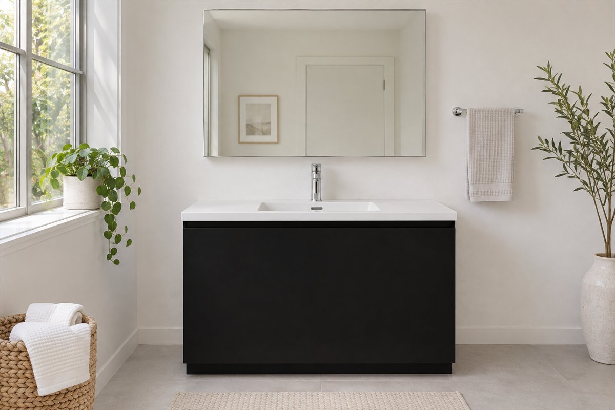
A black vanity creates one substantial dark shape beneath a white basin and light walls. This is a useful direction when you want a clear focal point without dividing every surface into contrasting areas. Compare the cabinet front with the retained floor before selecting smaller black accessories.
Inspect the full cabinet, including its side panels, plinth and handles. A dark front with a bright unfinished-looking end can change the composition at the doorway. Keep the countertop useful and let the cabinet provide most of the contrast instead of filling the basin area with matching objects.
2. Keep the vanity white and give the mirror a black outline

A slim dark mirror frame can introduce the palette while leaving a functioning white vanity in place. Compare the frame thickness from the doorway and from the basin. A fine line and a broad frame have very different visual weight even when both are described as black.
Check the actual mirror size, support and relationship to nearby lighting. Keep its usable reflective area suited to the people using the basin. There is no need to replace sound plumbing just to repeat the frame color; a second small detail can establish the connection.
3. Put the strongest pattern on the floor
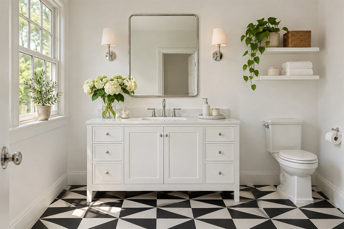
A black-and-white patterned floor can supply the main graphic element while the vanity and walls stay quieter. Look at a full repeat at standing height rather than enlarging one tile on a screen. The doorway, cabinet and usual bath mat determine how much pattern remains visible.
Draw the pattern around those real footprints before ordering. Keep product approval separate from appearance: the exact tile must suit the intended location. When the floor is already expressive, a low-contrast wall grid can help the room read as one composition.
4. Use a white floor to set off dark lower cabinetry

A light floor can give a dark vanity a clear edge without introducing another strong motif. Compare a real floor sample with the cabinet and the white sanitary fixtures. A white that looks neutral in a catalog may read noticeably cream or blue beside the basin.
Plan the floor finish, joints and care through the actual product. Do not choose a polished-looking surface on the assumption that every white tile behaves alike. A simple field still needs a considered threshold and cuts around the room perimeter.
5. Limit a black wall finish to the vanity backdrop

A dark vanity wall can frame a white basin without making the whole bathroom dark. End the finish at a meaningful boundary, such as the full wall plane, rather than an arbitrary strip behind the mirror. Compare the adjacent return wall in the same view.
Choose the actual finish for the surface and exposure. Keep mirror lighting useful when judging the dark background; a dramatic photograph does not show whether grooming tasks are comfortable. If the room already has a dark floor, test the two together before committing.
6. Balance black lower walls with a light upper field
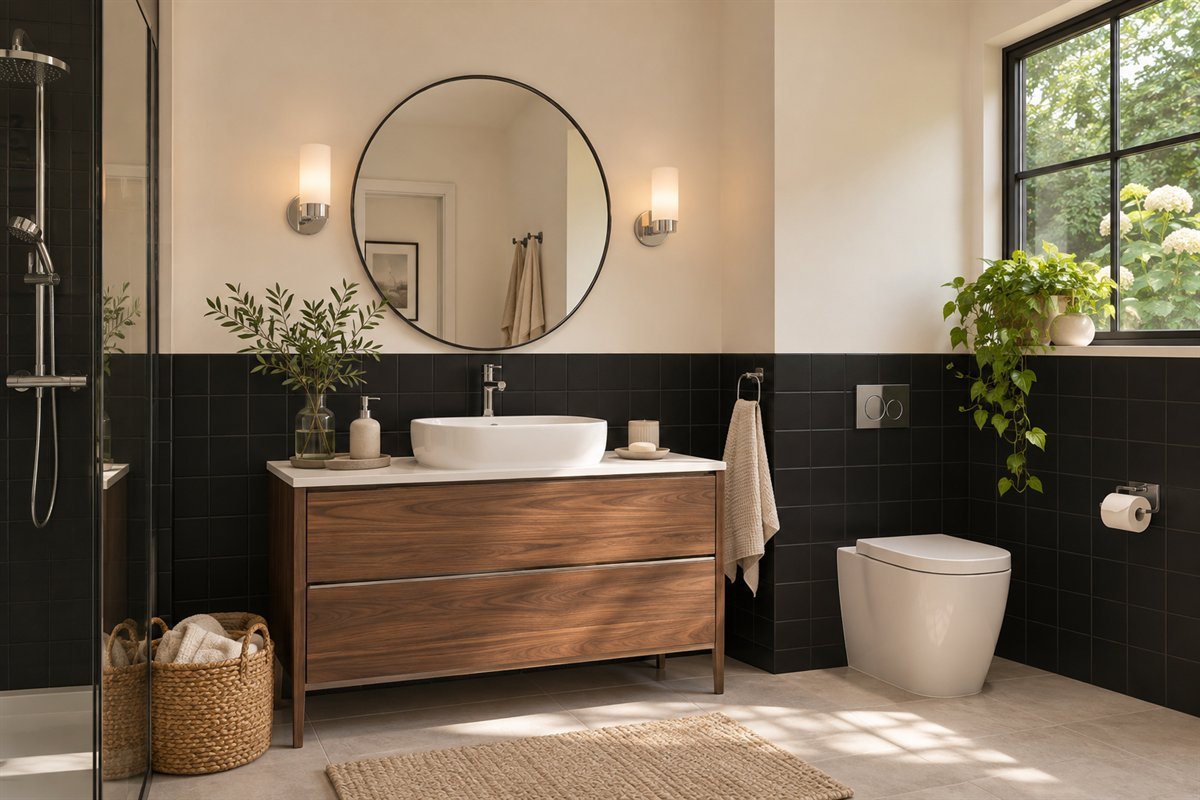
A two-part wall can place dark color at the lower level while keeping the upper room light. Establish the height through actual fixtures, trim and wall openings. A line that cuts awkwardly through the basin or a window can matter more than an attractive proportion in an unrelated photo.
Record how the finish continues around corners and ends at doors. In a bathroom with a bath or shower, the decorative split does not define waterproofing requirements. Resolve the complete assembly first, then use the color boundary consistently where appropriate.
7. Let one narrow dark tile line finish a white field

A narrow dark tile detail can connect white wall tile to black cabinetry or a mirror. Compare the line with the tile grid and the room width. A single boundary is often easier to read than several parallel lines competing with fixtures and shelves.
Ask the installer to show corners, ends and the relationship to any wall tile trim. Similar colors do not establish compatible thicknesses or edge profiles. If a clean termination cannot be detailed for the chosen products, simplify the feature before buying.
8. Use quiet grout when the room already has contrast

White wall tile with a close grout color can act as a light background for a dark vanity. This approach leaves the shape of the cabinet and mirror more prominent than every tile joint. View an assembled grouted sample before judging the field.
Keep the actual grout product and joint requirements tied to the tile and installation. A photograph cannot prove stain resistance or maintenance needs. The visual choice is whether the wall reads as a broad light area or a repeated grid.
9. Choose a dark grout grid deliberately
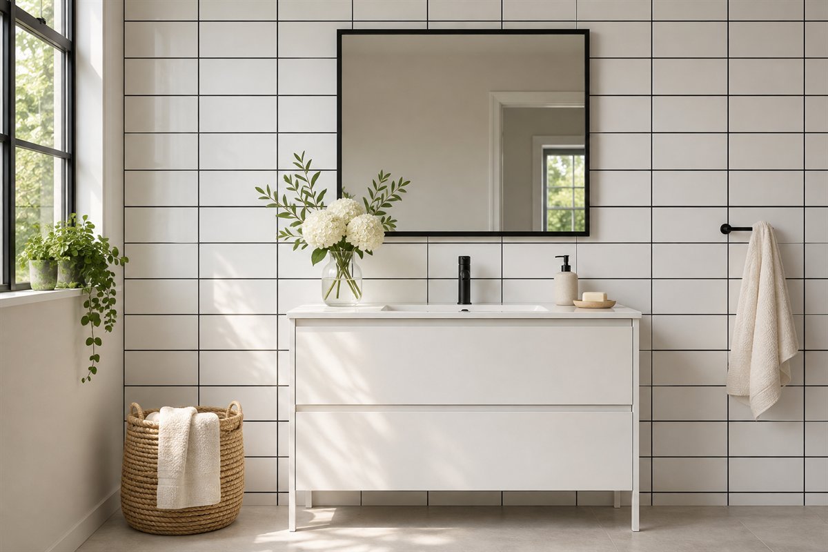
Dark joints around white wall tiles turn the tile layout into a conspicuous pattern. Compare the grid with mirror edges, cabinet divisions and the floor. If all of those lines have similar strength, the room may need fewer decorative objects rather than another finish.
Test the cured grout with the actual tile and follow the product guidance. Choose its color for the intended visual effect, not a promise that it eliminates cleaning. Keep the layout and visible cuts considered around corners and fittings.
10. Give checkerboard enough visible floor to read

A checkerboard needs enough exposed area for its alternating squares to be understood. Compare tile scale with the space left after the vanity, toilet and mat are included. Two oversized partial squares can feel quite different from the repeated field imagined from a product photo.
Coordinate the exact two tile products, dimensions, thicknesses and application requirements with the supplier and installer. This is a layout choice within a complete floor design. Keep the wall treatment restrained so the checkerboard does not compete with another equally strong grid.
11. Try a fine mosaic instead of large contrasting squares

A small black-and-white mosaic can read as a finer texture beneath plain fixtures. Choose a pattern that remains legible from the bathroom doorway rather than only in a close-up. A small dot or basketweave detail offers a different rhythm from a large checkerboard.
Look at joined sheets and their edges when reviewing the proposed layout. Sheet alignment, joints, cuts and upkeep belong in the installation conversation. Specify the exact use; a mosaic appearance does not establish suitability for a shower floor.
12. Keep a marble-look pattern subordinate to the palette
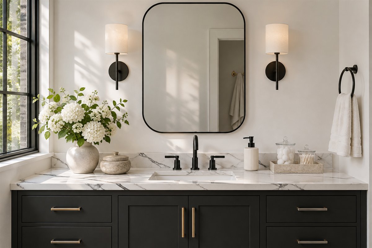
A white surface with dark veining can link the two colors without a geometric grid. Compare several pieces or the full slab layout, since a small sample may miss the strongest marks. Decide whether the veining should be the room’s main pattern.
Confirm what the product actually is before choosing its care. Natural stone and porcelain with a marble print are different materials. Keep the surrounding cabinetry and textiles plain when the vein movement already supplies a strong visual feature.
13. Use a slim black shower-frame outline as one connected detail

A dark enclosure frame can repeat a mirror or cabinet outline while leaving the wall finish light. Compare the frame thickness and the actual opening with the vanity and towel positions. A grid of decorative bars creates much more visual activity than a simple perimeter.
Choose the complete enclosure for its dimensions, door movement, installation and care. The illustrated outline does not specify glass, fixing or water containment. Keep the shower plan functional before matching its metal color to other accessories.
14. Let a white alcove bath sit within a quiet dark surround

A white bath can remain the light focal shape when the nearby wall finish is darker. Compare the whole alcove, including its end walls and access, rather than choosing a dark strip only for the long wall. A simpler floor can support the stronger bath backdrop.
Resolve the actual bath, surround and water-management assembly with appropriate installation advice. Keep decor off the entry edge. The color relationship can be considered separately from decisions about waterproofing, services or replacing a functioning bath.
15. Use a plain white shower curtain beside darker fittings

A plain curtain creates a broad light area that can calm a room with dark cabinetry or a patterned floor. Compare its width and hanging position when both open and closed. Gathered fabric can hide part of a wall feature that looks prominent in an empty-room drawing.
Choose the real curtain, liner and support for the bath or shower arrangement, including drying and care. Keep fabric from bunching on the floor or crowding the route. The curtain can establish the palette without adding another printed motif.
16. Try a striped textile when the tiled surfaces are plain

A black-and-white stripe can introduce pattern through an item that is easier to change than installed tile. Keep the stripe scale distinct from any wall grid. One towel can test the relationship before a full set or a large curtain is purchased.
Choose the item for its normal job and care, then check where it hangs or dries. A striped towel should not require constant arranging to make the room look intentional. Keep a plain background around it so the pattern has a clear role.
17. Warm the palette with one existing wood element

A wood cabinet, mirror frame or shelf can keep a two-color room from feeling entirely graphic. Choose one useful piece and compare its undertone with the retained whites. It need not match black fittings or be repeated on every surface.
Use a material and finish appropriate to the actual position and its care requirements. Keep vulnerable surfaces out of standing water as directed. A wood-looking photograph does not establish that an object is suitable for a wet area.
18. Keep chrome when it already belongs to the room

Black and white do not require every metal fitting to become black. Existing chrome can sit within the scheme while the cabinet, frame or textiles provide the dark areas. Compare the working fittings with proposed samples before replacing something useful purely for color matching.
Keep the repeated dark details simple enough to make the palette clear. Check compatibility and installation if a fitting genuinely needs replacement. Decorative coordination is not a reason to assume a new tap will fit existing holes or services.
19. Add a restrained warm metal detail
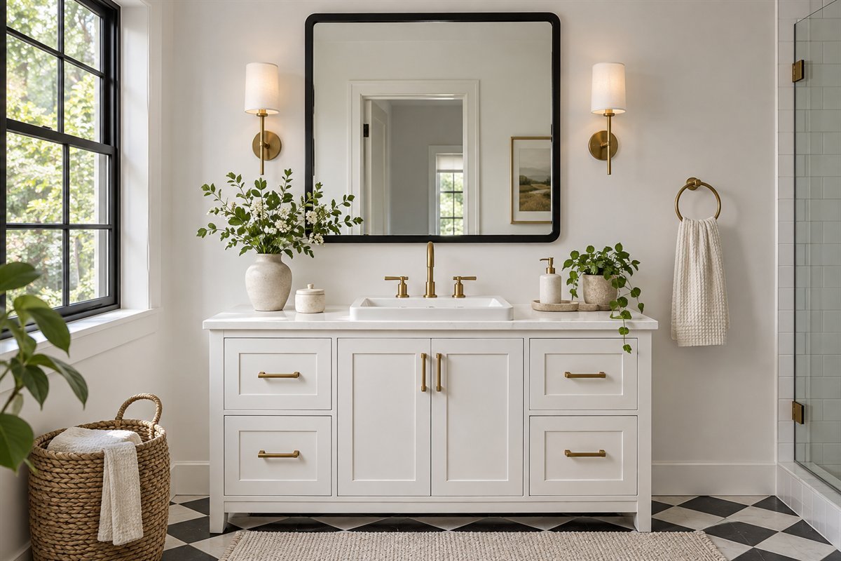
A warm metallic finish can provide a small third element against black and white. Start with one defined group, such as cabinet handles or a mirror frame, and compare the real finish with the faucet that will remain. Several different gold-colored products may not look alike.
Keep scale and use part of the decision. Comfortable handles and a suitable mirror matter more than repeating a metallic accent everywhere. If the finish feels disconnected, reduce the group instead of adding more items to justify it.
20. Keep a small bathroom light through larger surfaces

In a compact room, the broad wall and cabinet areas determine the palette more than tiny accessories. A predominantly white field with a few precise black edges can keep the view understandable without assuming color changes the actual usable dimensions.
Draw the vanity, door and storage in use before deciding that a dark cabinet will fit. Preserve a clear route and practical surface space. A small bathroom benefits from a coherent plan as well as a restrained number of contrasting pieces.
21. Make one powder-room wall the graphic feature
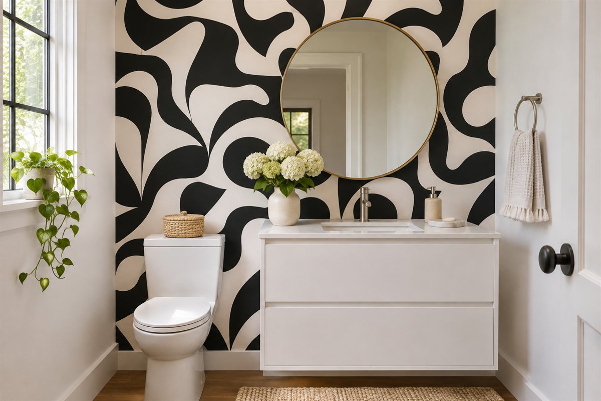
A powder room can hold a stronger black-and-white wall pattern when the remaining surfaces are quiet. Compare a full repeat around the actual mirror and basin. A large motif needs enough visible wall to read, while a very fine one may blend into texture.
Confirm the wallcovering and surface preparation for the room’s conditions. Keep decorative paper away from exposure it is not designed to handle. Choose original artwork and pattern samples rather than assuming a photographed design is available or suitable.
22. Use a black door as the room’s main dark plane

A dark interior door can carry much of the contrast while the bathroom finishes remain white. Review both the open and closed views, including the adjoining hallway. The door is a moving surface, so its visual position changes during normal use.
Keep the frame, handle and nearby cabinet fronts in the same comparison. Any refinishing needs suitable preparation and a product for the actual substrate. Do not block ventilation details or conceal an unresolved surface problem for a cleaner photograph.
23. Give the white ceiling a clear relationship to the walls

A light ceiling can finish a room with dark lower surfaces without introducing another decorative treatment. Compare its white with the upper wall and retained trim. A near-match that looks accidental at the junction can be more noticeable than a deliberate tonal difference.
Check the room under the light normally used at night as well as daylight. Keep existing ventilation and access unobstructed. The ceiling color is one part of a complete room; it does not resolve persistent condensation or inadequate illumination.
24. Keep countertop accessories to one useful dark group

A small black tray or container can connect a white counter to a mirror frame without using more permanent dark finishes. Begin with what is actually used at the basin. One refillable dispenser may serve better than several decorative jars with no everyday role.
Lift the group during an ordinary clean and check that it is easy to return. Keep the faucet, outlet and working area accessible. The arrangement should still make sense with a towel in use and the cabinet open, not only immediately after styling.
25. Connect the doorway to the neighboring room

Review the palette from outside the bathroom before calling it finished. A black cabinet, a light floor and a white door frame can each relate to something in the hallway without repeating the entire bathroom pattern there. The threshold is a useful place to compare those larger surfaces.
Keep any floor transition appropriate to the actual assemblies and finished heights. A dark decorative strip is not a solution for an unresolved level change. Record the chosen edge and open-door view on the same contrast map as the vanity and walls.
Separate color coordination from material suitability
A black tile, a black cabinet coating and a black metal finish are different products with different requirements. Daltile distinguishes ordinary floor use from shower-floor use in its usage guide. Choose the exact product for the planned location instead of treating a color, small tile size or matte appearance as approval.
Keep the complete wet-area assembly, drainage, services and installation outside a purely decorative comparison. For alterations, obtain the appropriate project assessment. These images show finished concepts; they do not demonstrate concealed waterproofing or establish the performance of a particular surface.
Use texture without introducing another color scheme
A white towel, a plain painted wall and a glazed tile can remain within the same palette while looking different. KOHLER’s neutral-bathroom guidance discusses varying materials and coordinating finishes rather than relying on color alone. Use that as a comparison principle, then choose the actual textures for care and use in your room.
Keep one larger sample of each main finish together. View the group from the doorway, at the basin and under the lighting used during an ordinary evening routine. Screen brightness and product photography are useful for collecting options, but they are not the final color reference.
A worked contrast-map example for a bathroom you keep
Imagine a hypothetical bathroom with a sound white basin, white bath, pale floor and existing chrome fittings. The proposed change is a black vanity front. Mark the vanity as the main dark area and try a slim black mirror frame as the supporting line. Leave the floor and curtain quiet during the first comparison.
If a black-and-white floor is later preferred, make a second map using the same retained fixtures. Decide whether the floor should replace the vanity as the strongest feature. Comparing two complete maps makes the tradeoff clearer than continually adding dark pieces to one scheme. This exercise is an original planning aid, not a measured renovation or tested product combination.
How much black should a white bathroom have?
There is no required percentage. Choose one main dark area and compare it with the actual room, lighting and retained fixtures. A thin frame and a full black wall have very different visual weight.
Can I keep chrome fittings in a black and white bathroom?
Yes. Black and white describe the larger palette; they do not require every metal fitting to be black. Compare the existing chrome with a dark cabinet, frame or textile before replacing functioning fittings.
Will black and white make a small bathroom look larger?
The palette does not change usable dimensions. A restrained number of contrasting areas can make the view easier to understand, but the fixture layout, door movement, storage and useful light still need their own review.
Should the floor or wall carry the pattern?
Start with whichever surface you want to be the main feature. Compare its full repeat with the real fixtures and visible area, then keep nearby surfaces quieter if the patterns compete.
Does a matte black tile suit every bathroom floor?
No. Color and apparent sheen do not establish approval. Check the exact tile’s intended use and the requirements of the complete floor or shower assembly with the supplier and installer.
A practical next step
Choose the dark feature, keep the supporting surfaces deliberate and judge the palette with everyday items in place. A contrast map helps retain useful fixtures and resolve the room as a whole before another patterned surface or matching accessory is added.
Compare bathroom floor patterns and material checks. Plan useful bathroom decor around daily tasks. Compare vanity shapes and storage arrangements.
Images are original AI-generated bathroom concepts, not inspected installations, tested products or waterproofing diagrams. The contrast map and hypothetical example are original planning aids.
Sources and care references
Optional digital guide for this topic
If you prefer a structured workbook, explore this related paid guide.