Green kitchen cabinets can relate to warm wood, pale or dark countertops and a considered hardware finish. Start with the actual surfaces that will remain, then choose where the green belongs and how it should read across the room. A cabinet door sample is more useful here than trying to name an exact paint from a screen image.
These 23 ideas examine different material pairings and cabinet groups, including sage with dark walnut and green islands within a two-tone room. They are alternatives to shortlist, not features to combine in one kitchen. The comparison exercise below helps you resolve a specific color conflict before committing to the finished fronts.
Contents
- 1. Pair soft sage with a distinct dark walnut run
- 2. Give a golden wood floor a restrained gray-green neighbor
- 3. Use olive with a warm pale countertop
- 4. Try deep green with a dark countertop
- 5. Use a bottle-green slab front for a clear color field
- 6. Let gray-green relate to a gray-veined pale surface
- 7. Give pale mint a crisp, simple setting
- 8. Compare blue-green with a retained terracotta floor
- 9. Set a rich green beside one simple tile rhythm
- 10. Combine green base cabinets with warm-white uppers
- 11. Use green lowers beneath a wood upper group
- 12. Make a green island distinct from walnut perimeter storage
- 13. Reverse the relationship with a wood island
- 14. Give a tall green bank a complete boundary
- 15. Use one green across several cabinet heights
- 16. Frame a small tableware display with green fronts
- 17. Let brass-tone hardware form a modest contrast
- 18. Try silver-tone hardware for a cooler relationship
- 19. Plan the finished edge where green meets the wall
- 20. Keep a patterned floor as the main competing surface
- 21. Keep the green coherent through a compact galley
- 22. Give the adjoining room a small connection to the green
- 23. Read the green under the evening lights you actually use
Name the fixed finish before choosing the green
List the floor, countertop, backsplash and appliances that will remain. Identify the complete cabinet group being changed and the rooms from which it is seen. Compare real finish samples in those positions and under the ordinary lighting. Cabinet color, compatible coating, construction and installation are separate decisions; an attractive combination does not establish the other requirements.
Choose the relationship you want to test
- Dark walnut is staying: Compare a distinct sage group and a deeper green beside the actual wood finish.
- The floor is golden or terracotta: Include its full color variation before selecting the cabinet sample.
- The counter will remain: Compare both its larger background and its visible pattern beside the green.
- Only one cabinet group is changing: Resolve its complete visible boundary, including returns and end panels.
- Daylight and evening give different results: Keep a record of the sample and actual light setting rather than choosing from one photograph.
1. Pair soft sage with a distinct dark walnut run

Sage and dark walnut can make two cabinet groups visibly different while keeping the room’s color range considered. Compare the actual wood finish beside the green rather than assigning a shade from a photograph. Keep the counter and floor in the same comparison.
Decide which group carries the wood before drawing the smaller details. A tall walnut bank can have a different effect from a wood island or just a shelf. The color relationship does not establish a cabinet’s construction, species or coating; specify those separately with the chosen supplier.
2. Give a golden wood floor a restrained gray-green neighbor

A muted gray-green can offer a quieter comparison beside an existing golden floor. View the sample against the actual boards, including the strongest grain and color variation. The aim is a deliberate relationship, not making the floor disappear.
Keep other large samples close while choosing. A cabinet green may relate to the floor and still conflict with a cream counter or cool tile. Test the complete group before adding a new decorative layer, and retain a suitable floor when a different green solves the visual question.
3. Use olive with a warm pale countertop

Olive and a warm pale counter can form a related combination when the real samples retain enough distinction. Compare the counter’s larger background as well as its small marks. Do not choose the cabinet from one attractive vein or fleck alone.
A quiet wall can leave the olive and counter relationship clear. Check the green at the shaded end of the run as well as near the window. The finished color should be one you enjoy across the kitchen, not only in the location where the sample looks most flattering.
4. Try deep green with a dark countertop
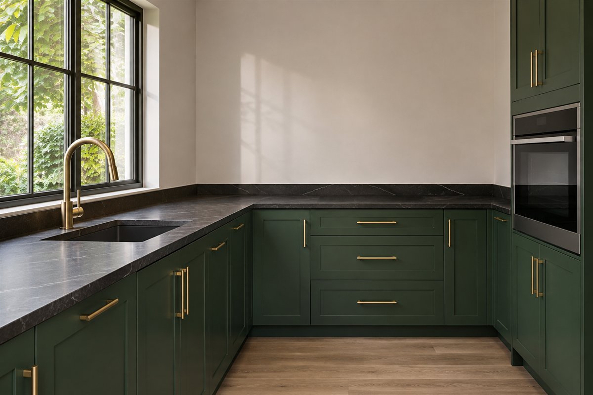
A dark counter can give deep green cabinets a more tonal appearance than a pale top. Compare the two dark samples directly, including their sheen. A black that leans brown or blue can change the relationship more than its name suggests.
Keep enough distinction to read the counter edge and cabinet fronts. Useful task lighting and the actual finish care matter separately from the mood of the image. A dark scheme is an option to assess in the real room, not a rule for a particular kitchen size.
5. Use a bottle-green slab front for a clear color field

A flat cabinet front lets a bottle-green finish read across a simpler outline. Compare a full front where possible because the finish, edge and reflected light all contribute to the result. The color does not need a detailed door profile to feel considered.
Resolve the actual opening system and comfortable use before removing visible handles from the brief. A sleek image cannot establish how a real front opens or how it is maintained. Keep the surrounding material group limited enough to see the green itself.
6. Let gray-green relate to a gray-veined pale surface
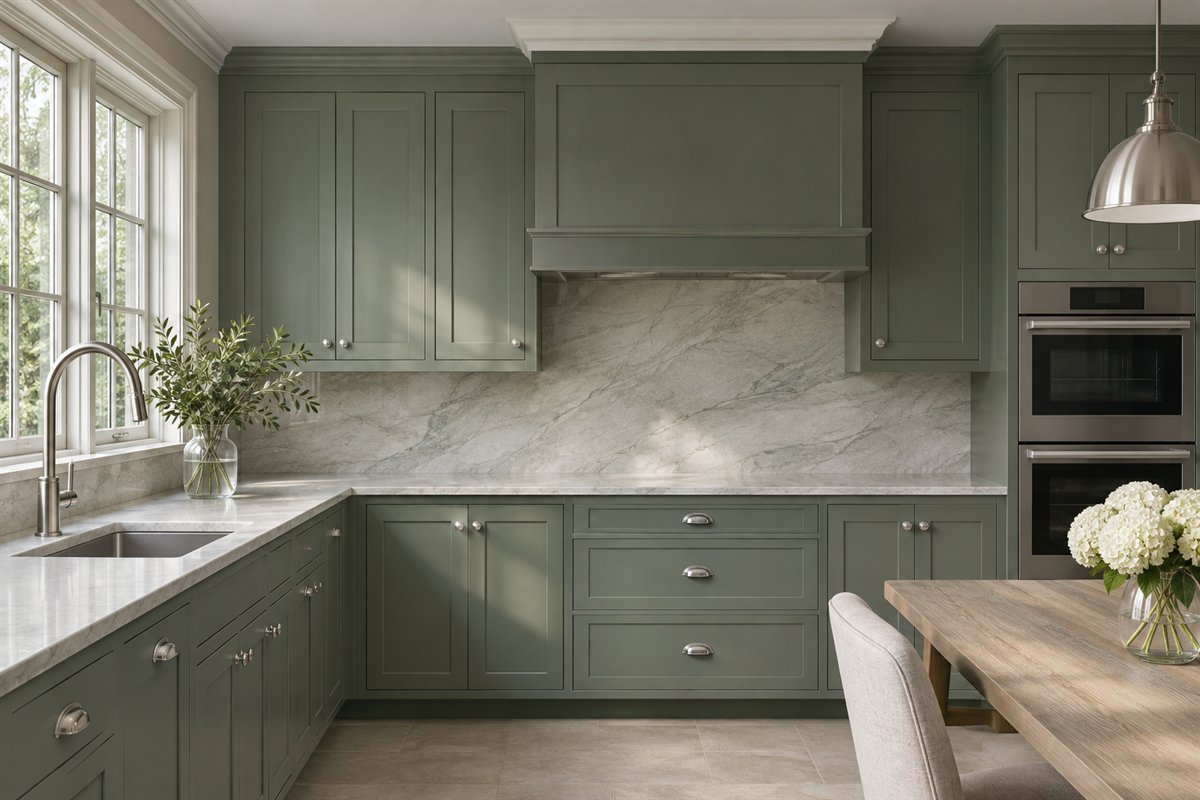
A gray-green front can connect with a pale surface that has visible gray movement. Compare the whole counter or backsplash sample, not just the vein nearest the cabinet. The background may be warmer than it first appears.
Keep the pattern amount deliberate. One main veined field can be enough beside a run of detailed cabinet fronts. Confirm the actual surface material and care through its supplier; an image of pale veining cannot establish that it is a particular stone or engineered product.
7. Give pale mint a crisp, simple setting

Pale mint can provide a lighter green direction beside simple white surfaces and silver-toned hardware. Compare its blue and yellow balance with the actual white. A sample that seems mint in one setting can look almost gray in another.
Keep the remaining color group manageable while deciding how much mint you want. A small base run may be enough, or the full cabinetry may suit your preference. Choose the actual coating and cabinet product independently from the light, smooth appearance in the illustration.
8. Compare blue-green with a retained terracotta floor

Blue-green cabinets can create a deliberate contrast with a warm terracotta-colored floor. Put the actual cabinet sample beside the tile and grout. A saturated green, a grayer version and a darker one can give quite different readings against the same orange-red surface.
Let the retained floor be a real part of the brief. Choose a quieter counter while comparing the two strong colors rather than introducing another equally strong pattern. Check the result from the adjoining room, where the entire floor and cabinet group may be visible together.
9. Set a rich green beside one simple tile rhythm

A rich green can sit beside a deliberately limited backsplash pattern. Compare the size of the tile rhythm with the cabinet fronts and the distance from which it is seen. A small sample board is useful only when you also consider the size of the finished field.
Keep the pattern to a clear boundary and resolve the actual tile, grout, surface preparation and installation appropriately. The green does not need additional patterned accessories to repeat the effect. A quiet counter can separate the two main visual elements.
10. Combine green base cabinets with warm-white uppers
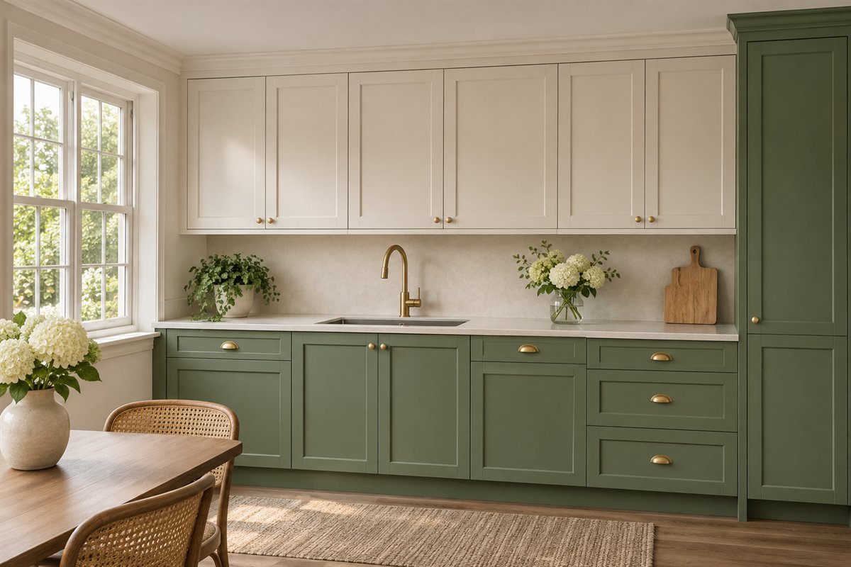
Green below and warm white above can divide the room into understandable cabinet groups. Compare the upper white with the actual counter and wall so it looks intentional. A very different white can become a third strong color instead of a quiet supporting surface.
Draw the full run, including exposed ends and the point where it meets any tall storage. Keep the color assignment clear at that junction. The two-tone choice should explain the room’s elevation rather than alternate colors from one door to the next.
11. Use green lowers beneath a wood upper group
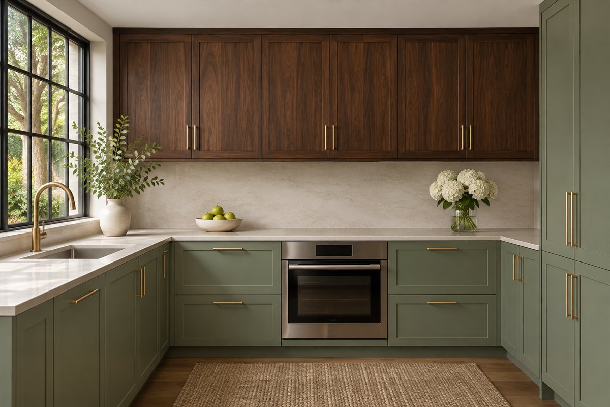
Green lower cabinets can sit below a defined wood upper run when the actual wood and green work together. Compare them with the floor as a three-part group. The two woods can differ deliberately without becoming an accidental near-match.
Keep the wood group sized for the contents and appearance you want. Glass, open and closed fronts have different everyday implications, so choose the real cabinet arrangement through its use. A wood-colored picture cannot verify species, veneer, support or shelf loading.
12. Make a green island distinct from walnut perimeter storage

A green island can provide a different cabinet surface within a wood perimeter. Compare the island from each approach, including the side facing the next room. Include the exposed end panels and toe-kick relationship in the appearance plan.
Choose the actual island through its layout and use before assigning the accent color. A handsome green front does not answer seating, appliance or circulation questions. Keep the wood perimeter as a coherent group so the island reads as a deliberate separate piece.
13. Reverse the relationship with a wood island

Green perimeter cabinets and a wood island can give the room a different balance from a colored island alone. Compare how much green is actually visible on the walls. A long run can carry much more of the scheme than the small sample suggests.
Keep the island wood related to the floor and other retained pieces without requiring an exact match. Resolve the real counters, support and services separately. This is a material-distribution choice rather than a reason to add an island where the layout does not need one.
14. Give a tall green bank a complete boundary

A tall cabinet bank can carry the main green color while neighboring working runs are lighter. Mark the full outline before ordering finishes. Include fillers, side panels and any visible returns so the color does not stop unexpectedly at an exposed edge.
Compare its scale from the doorway and the normal working position. The green bank should still serve the actual storage brief. Keep the adjacent surfaces quieter when that makes the cabinet group easier to understand rather than adding another feature simply to balance its size.
15. Use one green across several cabinet heights

An all-green arrangement can have a clear relationship when the same finish continues across the real base, upper and tall groups. Compare the sample at different heights and lighting positions. Matching the color name alone does not establish an identical appearance across different products.
Keep the counter, wall and floor in the same decision. One continuous cabinet color can simplify the elevation while other surfaces provide contrast. Choose the full actual system and its visible parts rather than assuming separately ordered fronts will match.
16. Frame a small tableware display with green fronts

A limited glazed upper can let green cabinetry frame the dishes inside. Compare the interior color, visible tableware and surrounding solid fronts. The display does not have to contain enough objects to fill every visible shelf.
Keep the actual shelf, door movement and installation suitable for the contents. Decide whether that group needs to be visible or would work better behind a solid front. The green frame is a visual choice; glazing is not proof of useful access or cabinet strength.
17. Let brass-tone hardware form a modest contrast
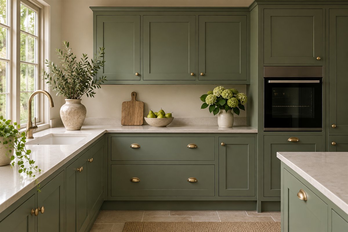
Brass-toned pulls can stand out clearly on a muted green front. Compare an actual handle with the finish sample and consider its size before ordering a full set. Several similar warm metal finishes may differ noticeably beside one another.
Check the fixing centers and comfortable use of the actual handle. Existing holes can influence a replacement choice, so keep that information with the sample. Let the hardware provide a considered contrast without assigning it a universal traditional or modern style.
18. Try silver-tone hardware for a cooler relationship

A silver-toned knob or pull can give green cabinetry a different relationship from warm metal. Compare it with the sink fitting and visible appliance fronts. The goal may be a deliberate match or a controlled difference, depending on the real room.
Look at the finish under ordinary lighting and touch the actual sample before choosing by photograph. Keep the handle’s shape and mounting suitability part of the decision. A reflective silver detail can behave differently from a brushed one even when both are described casually as silver.
19. Plan the finished edge where green meets the wall

At an open end, the exposed cabinet side can either continue the green or relate to the surrounding wall through an appropriate finished detail. Choose that boundary in the supplier’s drawing rather than leaving it to an assumption. View it from the room you approach through.
Keep the actual construction and finishing options with the decision. A wall panel is not automatically interchangeable with a cabinet side. The useful question is how the completed edge reads and works, including any base, trim or adjacent opening.
20. Keep a patterned floor as the main competing surface

When the floor has a strong pattern, compare a quieter green front before adding patterned tile above the counter. View enough of the floor to include its repetition. The cabinetry may need to relate to the pattern’s larger background as well as its accent color.
A plain backsplash and restrained hardware can make that comparison easier. Do not assume a small piece cut from the floor contains every important color. Choose the actual products for their intended use and care; the illustration only demonstrates the distribution of pattern.
21. Keep the green coherent through a compact galley

A compact galley can use green on a defined cabinet group when the actual layout and light work. Compare the same sample on both sides if both are being changed. Reflected light and shaded positions can give the fronts different appearances.
Keep the layout assessment separate from color selection. Show openings and the working passage in the real plan rather than estimating them from the image. A quieter counter and wall can make the cabinet relationship legible without introducing another decorative focal point.
22. Give the adjoining room a small connection to the green

If the cabinet run is visible from dining or living space, compare the actual view through the opening. A small related textile or painted detail can connect the areas while their larger furniture remains different. It need not match every cabinet front exactly.
Keep the neighboring room’s own fixed surfaces in the sample discussion. The green is part of a larger view here, not an isolated kitchen photograph. Choose a connection you want to live with rather than purchasing several matching accessories solely to repeat the color.
23. Read the green under the evening lights you actually use

The final comparison should include an ordinary evening with the relevant room lights on. Look at the cabinet, counter edge and backsplash as one group. A daylight-only decision can leave an important everyday view unconsidered.
Keep a note of the actual sample and light setting. If a relationship changes, revisit that specific sample rather than replacing every light or finish at once. The evening illustration suggests an appearance; it cannot identify a real light spectrum, paint formula or tested coating.
An original way to resolve competing green samples
Choose two or three actual candidates rather than a large collection of tiny chips. Give each a simple identifier on your own record and retain the maker’s exact finish information separately. Keep the fixed counter, floor and backsplash in the comparison. The purpose is to identify a specific relationship you prefer, not to award an abstract score to a color.
If the green seems too gray, record where that happens and what is beside it. Compare it at the actual cabinet position and with the light normally used there. Keep another candidate in the same location so the comparison is fair. A sample may be attractive while still missing the clearer green appearance you wanted. That is a preference to resolve before ordering, not a defect proven by a photograph.
If a cream counter becomes the part you dislike, compare the green with the counter’s larger background instead of one small fleck. Keep the green candidates together at the same edge and note which relationship feels intentional to you. Consider the wall and grout as well. Changing an appropriate retained surface is a separate project decision, not the automatic next step when the first green sample disappoints.
If the wood and green seem too similar in depth, compare a more distinct candidate before adding another material. Include the actual wood finish and enough of its variation to understand the whole group. This matters particularly when sage and dark walnut are assigned to different cabinet banks. The two groups should have a deliberate relationship from the normal approach, not just when their samples are held close together.
If hardware dominates the front, compare its actual outline and finish on the same green sample. Record mounting dimensions and any existing holes before proposing a different handle. A quieter shape may answer the question without changing the cabinet color. Keep the comparison tied to the real door profile and comfortable operation.
For a hypothetical kitchen retaining a warm cream counter and golden floor, proposal A might use a blue-leaning light green with a highly reflective handle. Proposal B might use a more muted green and a quieter handle on the same retained surfaces. Compare them in the actual positions, including evening, and record which specific relationship you prefer. This is an original decision example, not a tested room, a manufacturer color match or a prediction that one combination will suit every home.
Finish with a short decision note: selected sample, fixed surfaces, cabinet group, observed light settings and any unresolved edge or product requirement. Share those exact details with the cabinet or coating supplier. Keep a physical approved sample where possible so a later decision is not based on a compressed photograph alone.
Keep a green color choice separate from the coating system
Sherwin-Williams’ cabinet-refinishing overview advises considering the cabinets’ condition, the desired result and the wear expected before choosing a product. That is a useful distinction for a green scheme too: selecting a shade does not establish a compatible preparation or coating system.
Have the actual material and existing finish identified, then follow the chosen system’s current instructions with appropriate project support. This article does not provide sanding, stripping, spraying or curing instructions. The images cannot establish coating chemistry, durability, cleaning performance or the condition of existing doors.
Use paint-maker inspiration without treating the image as an exact match
Clare’s green-cabinet guide distinguishes warmer, cooler and gray-muted greens and recommends checking samples in more than one position and time of day. Those are useful comparison categories. They do not mean a green shown here is a named Clare paint or that a color’s popularity proves it belongs in a particular room.
Keep the actual material care and project requirements beside the approved samples. A pale stone-looking counter or wood-looking cabinet in an illustration is a visual example; it does not identify the exact material or establish its suitability, support, installation or long-term performance.
What works with green kitchen cabinets?
Possible partners include actual wood finishes, pale or dark counters and considered metal hardware. Start with the surfaces you are retaining and compare complete real samples rather than treating one combination as universal.
Can sage green work with dark walnut cabinets?
It can form a deliberate two-tone relationship when the actual finishes and room suit your preference. Decide which complete cabinet groups carry each finish, and include the counter and floor in the sample comparison.
Do green lower cabinets need white uppers?
No. White, wood, another green or a continuous finish are possible options. Compare complete groups and visible boundaries instead of alternating colors randomly between individual fronts.
Will green hide fingerprints or make cleaning easier?
Do not assume that from the color alone. The actual coating, sheen, texture, use and care information determine the practical finish decision; these images provide no performance test.
Can these images identify an exact paint or cabinet product?
No. They are AI-generated concepts. Choose the actual finish through approved physical samples and resolve the real product, fit, coating and installation requirements separately.
A practical next step
Select the fixed surface that matters most, shortlist a few real greens and compare one specific relationship at a time. Resolve the complete cabinet groups and record the approved finish before allowing hardware and small details to multiply the decisions.
Compare other kitchen cabinet color families before committing to green. Check kitchen hardware through shape, fixing and the actual finish. Compare countertop choices through their real material and care requirements.
Images are original AI-generated green-kitchen concepts, not measured plans, exact paint matches, tested finishes or verified installations. The sample-comparison exercise and hypothetical example are original planning aids.
Sources and care references
- Clare: green undertone categories and sample comparison
- Sherwin-Williams: cabinet condition, expected wear and product selection
Optional digital guide for this topic
If you prefer a structured workbook, explore this related paid guide.