Kitchen pendant lighting sits directly in the view of a room you use throughout the day. Its shade shape and finish matter, but so do the people sitting across the island, the surface beneath it and the other lights that serve the kitchen.
Start by deciding what the pendant needs to contribute. It may mark an island, introduce a curved shape among straight cabinets or provide part of the working light. Compare complete fixtures instead of choosing a shade in isolation from its suspension and light source.
These ideas offer distinct visual directions for real kitchens. The pictures are original concepts rather than lighting calculations or installation drawings. Check the chosen fixture’s specifications, compatible controls and installation requirements with the supplier and installer.
The images are original AI-generated decor concepts, not installation diagrams or photographs of completed client projects.
Browse These 22 Kitchen Pendant Lighting
Jump to an idea
- Start with opal-glass kitchen pendant lighting
- Use clear glass where the background should stay visible
- Try ribbed glass for a more textured outline
- Give cream cabinets a muted ceramic shade
- Use woven texture as a considered decorative accent
- Frame pale cabinetry with black kitchen pendant lighting
- Add warm brass above muted green
- Keep nickel restrained in a cool-toned kitchen
- Use dark bronze with warm timber
- Try shallow cone shades over a compact island
- Choose cylinder-shaped kitchen pendant lighting for a narrow outline
- Use a bell-shaped shade with framed doors
- Give a lantern form a quiet background
- Use one purpose-made linear fixture over a long island
- Compare three small shades with one repeated shape
- Use two broader shades as kitchen pendant lighting focal points
- Let one pendant mark a compact peninsula
- Relate a globe to rounded stools
- Use a quiet pendant beside a strongly patterned counter
- Coordinate the island lights with a nearby dining fixture
- Check kitchen pendant lighting on a sloped ceiling
- Finish with a clear view across the island
Plan kitchen pendant lighting from the counter and room view
Record the counter size, ceiling height, fixture dimensions and the views you want to preserve. Visual Comfort’s placement guide treats light on the island and clear views across it as linked considerations, with the actual fixture and users affecting the result. Pendants also sit within a wider lighting plan. Use a full-size visual mock-up to assess appearance, then have the final layout and required installation details checked for the actual space.
| Record | Why it changes the decision | Compare in the actual room |
|---|---|---|
| Shade width and height | Determines the visual mass | A full-size silhouette from the main doorway |
| Complete suspension range | Affects achievable overall position | Ceiling-to-fixture dimensions and permitted adjustment |
| Light source and shade | Affects the appearance and distribution of light | A lit sample or suitable manufacturer information |
| Counter and seating arrangement | Changes what the fixture may obscure | Views while seated and standing |
| Finish and cleaning access | Connects appearance with upkeep | Actual finish sample and reachable surfaces |
| Control compatibility | Determines available dimming behavior | The specified lamp, driver and control combination |
Compare two layouts without mistaking a sketch for a lighting design
For example, draw a 96-inch island to scale and compare two 16-inch-wide shade silhouettes with three 10-inch ones. The first option has 32 inches of combined shade width; the second has 30, but the repeated shapes and gaps look different. These numbers only describe the example’s silhouettes. They do not establish spacing, light coverage, clearances or the correct fixture count for your kitchen.
Make a short list that a lighting supplier can answer
For each candidate, record the complete fixture dimensions, permitted suspension range, light-source details, cleaning instructions and any dimming compatibility information. Add photographs of the kitchen from both ends of the island and the adjoining room. A supplier can then respond to a specific arrangement rather than a vague request for a pendant that looks like an inspiration picture.
1. Start with opal-glass kitchen pendant lighting
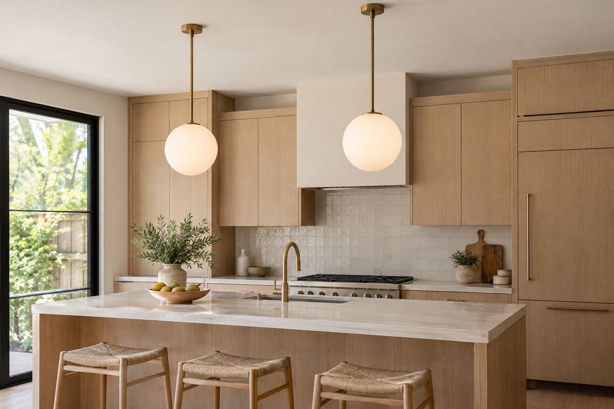
An opal-glass globe introduces a soft round shape above straight cabinet lines. Its pale surface can remain a visible feature without adding a strong new color to the kitchen palette.
Look at the complete fixture when lit as well as unlit. The globe, fitting and suspension should still feel proportionate when viewed from the adjoining room.
Practical tip: Ask to see the actual fixture illuminated.
2. Use clear glass where the background should stay visible
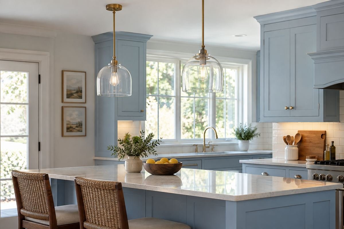
A clear-glass shade leaves more of the background visible through its outline. It can suit a kitchen where a window, tiled wall or cabinet arrangement is an important part of the view.
The lamp and internal fittings may also remain visible. Judge those details as part of the design rather than selecting only the outer glass shape.
Practical tip: Review the light source from the normal seated viewpoint.
3. Try ribbed glass for a more textured outline
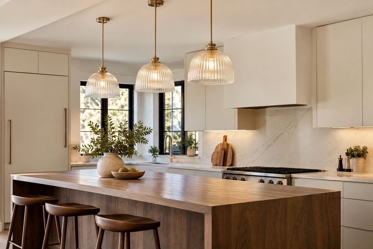
Ribbed glass adds surface detail to a pendant without requiring a large color change. The repeated lines can relate to fluted cabinetry or provide contrast against plain slab doors.
Inspect the real glass and its cleaning requirements. Texture, seams and reflections are difficult to assess from a small online image alone.
Practical tip: Compare the shade with the other repeated lines in the room.
4. Give cream cabinets a muted ceramic shade
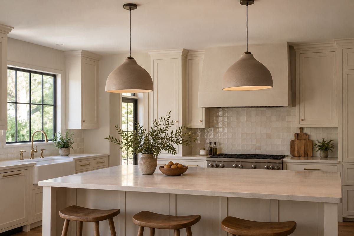
A ceramic-look shade in a muted tone introduces a more solid object above the counter. Its surface can connect with handmade-looking tiles or simple pottery elsewhere in the kitchen.
Check the actual material and finish named by the supplier. A photograph that resembles ceramic does not establish the product’s construction or cleaning method.
Practical tip: Use one material description consistently in the final order.
5. Use woven texture as a considered decorative accent
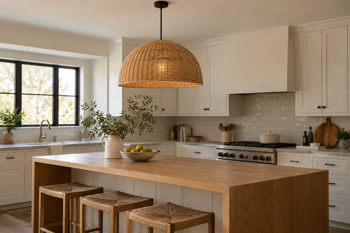
A woven pendant can bring a visibly textured element to a room dominated by smooth counters and cabinets. It works best as an intentional feature rather than one more pattern among many.
Confirm that the complete fixture is suitable for its proposed kitchen location and follow its lamp and care requirements. A decorative woven shade is not automatically appropriate everywhere.
Practical tip: Choose a complete specified fixture rather than improvising a shade.
6. Frame pale cabinetry with black kitchen pendant lighting
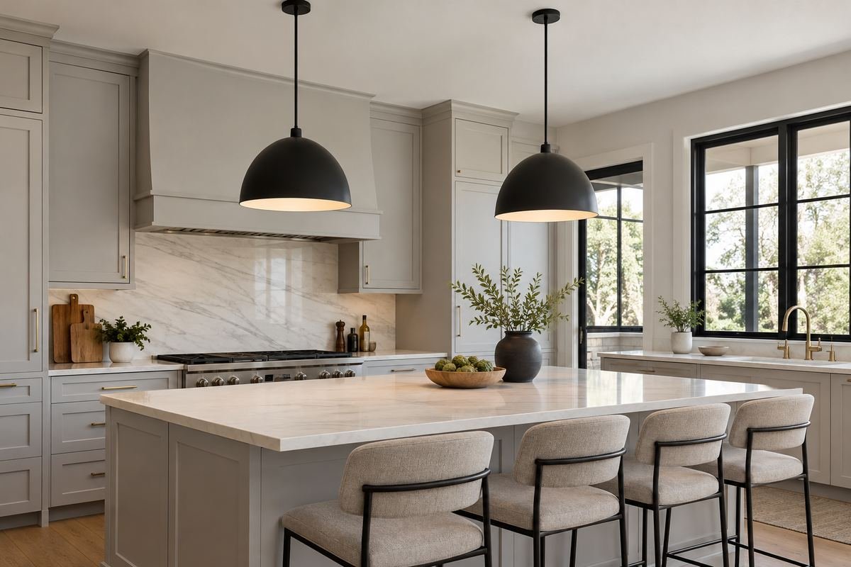
Black pendant shades create a clear repeated outline above a pale kitchen. They can connect dark windows or a restrained hardware finish without changing the larger cabinet surfaces.
Look at the underside from a seated position. Its appearance may be more prominent across an island than the outer finish shown in a product’s front photograph.
Practical tip: Include the underside view in the comparison.
7. Add warm brass above muted green
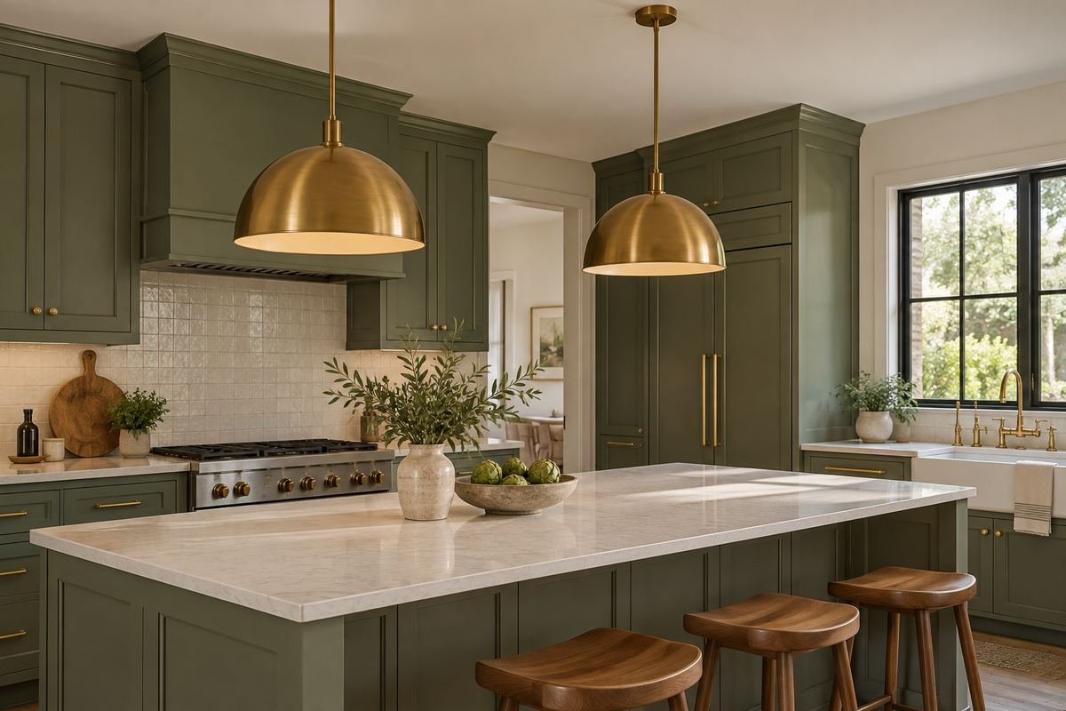
A warm-metal pendant provides a deliberate highlight above green cabinetry. Repeating a related metal in one other detail can connect the finish without requiring a complete matching set.
Compare the actual brass sample with the handles or faucet. Similar finish names can describe noticeably different tones and levels of sheen.
Practical tip: Bring the metal samples together before ordering.
8. Keep nickel restrained in a cool-toned kitchen
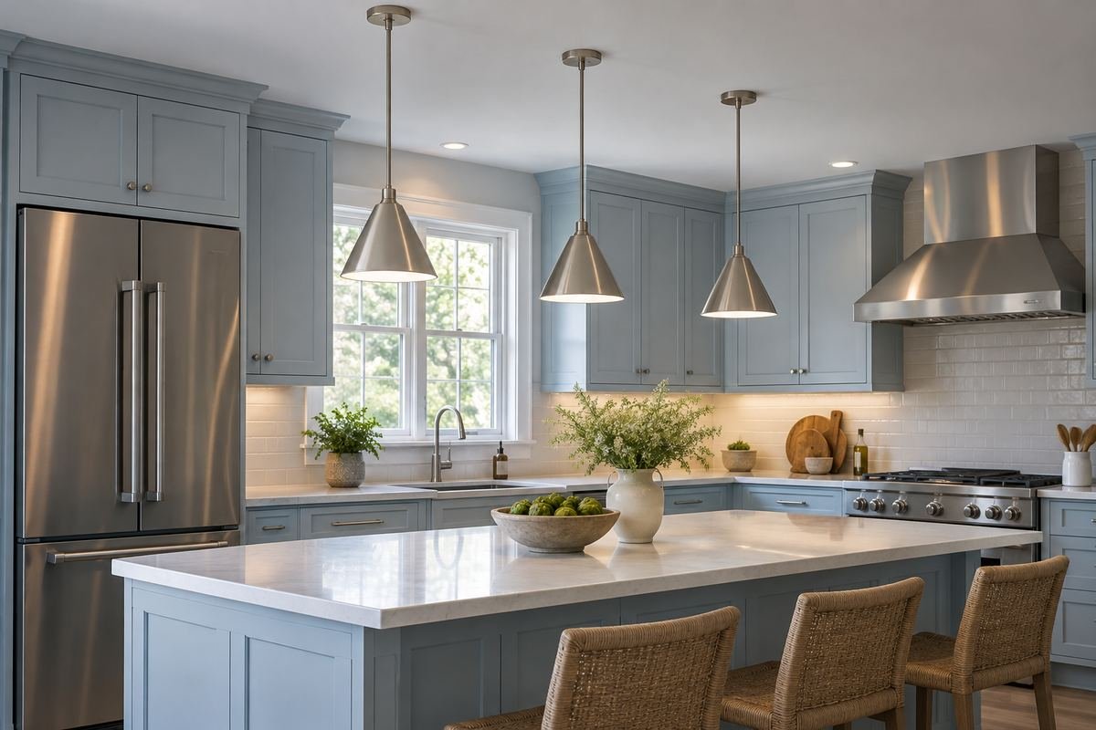
A nickel-colored pendant can connect stainless appliances and other cool-toned details. A simple silhouette allows the metal relationship to remain the main decision rather than adding decorative complexity.
Check the finish against the actual appliances instead of expecting an exact match. Differences can work when they appear deliberate within the overall room.
Practical tip: Compare the metals from normal room distance.
9. Use dark bronze with warm timber
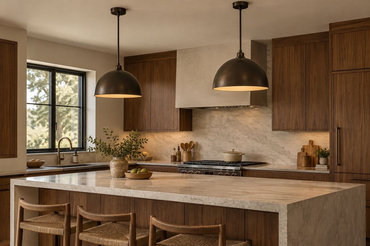
Dark bronze offers a quieter alternative to a bright warm metal beside wood cabinetry. The deeper finish can relate to darker grain while leaving the timber as the larger visual feature.
Inspect the sample in the room’s evening light. A bronze that reads warm in daylight may look almost black under the fixtures you normally use.
Practical tip: Approve the evening appearance as well as the daylight one.
10. Try shallow cone shades over a compact island
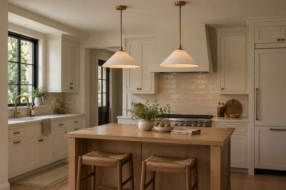
A shallow cone gives a pendant a defined edge without a tall shade body. It can introduce a simple geometric shape where a deeper pendant would feel visually heavy.
Compare the complete fixture dimensions, including the fittings above the cone. The shade height alone does not describe everything that hangs in the room.
Practical tip: Use the full product drawing for the silhouette.
11. Choose cylinder-shaped kitchen pendant lighting for a narrow outline
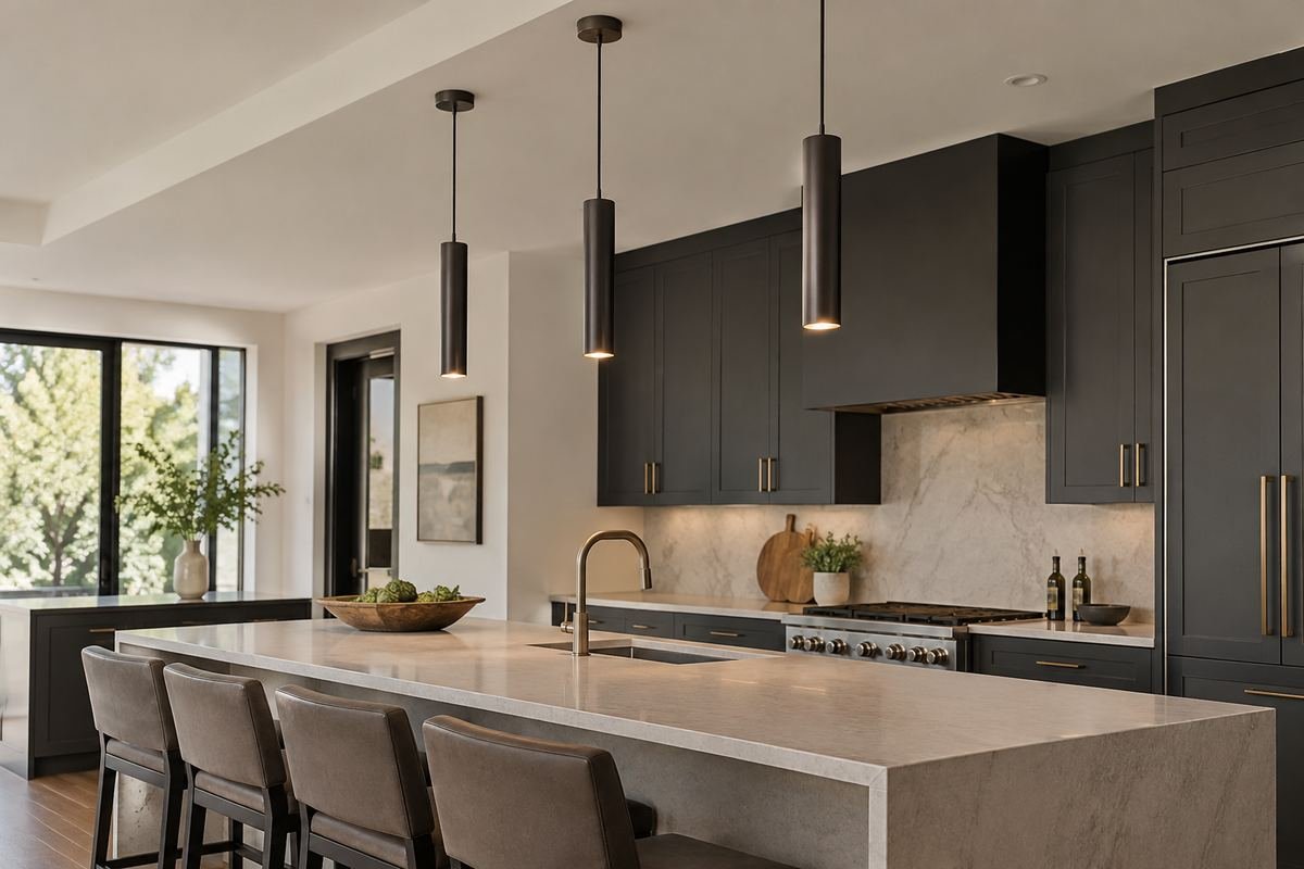
A narrow cylinder creates a different rhythm from a broad dome or globe. It can provide a restrained vertical accent when the kitchen already contains wide horizontal cabinet runs.
Do not infer light coverage from the slim outline alone. Review the actual fixture’s light information and the wider room plan with the supplier.
Practical tip: Compare the lit effect as well as the cylinder’s width.
12. Use a bell-shaped shade with framed doors
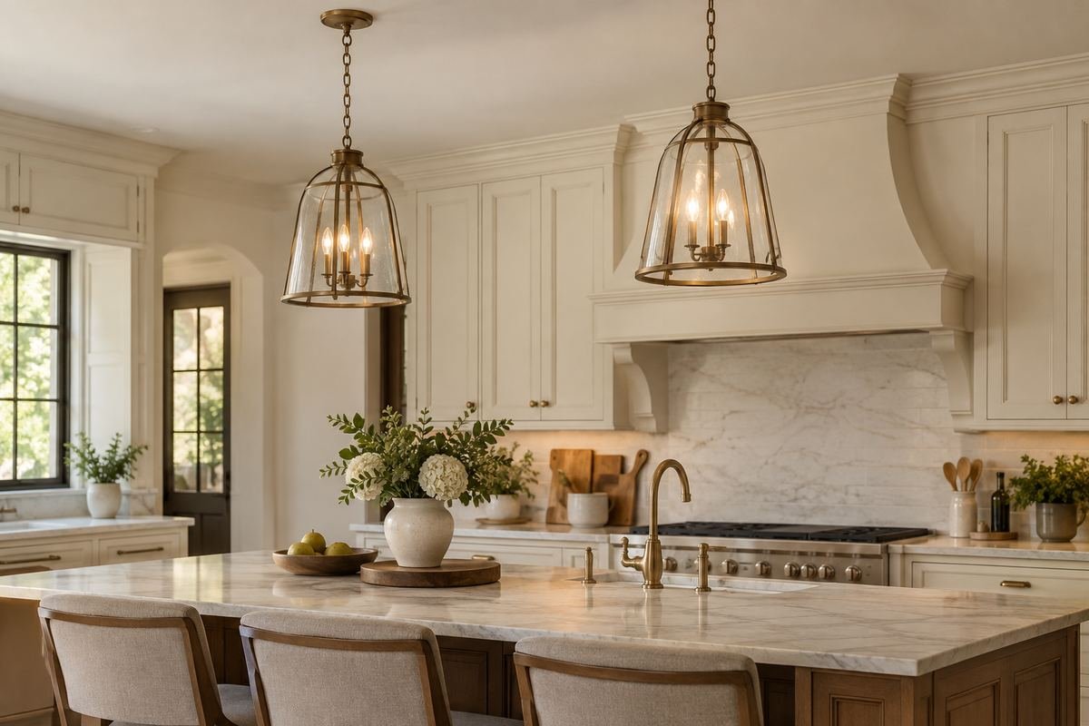
A bell-shaped pendant can echo the softer profiles of traditional framed cabinetry. Its curved outline gives the room detail without introducing an ornate fixture in every ceiling position.
Keep the surrounding fittings restrained if the bell form is the intended feature. The cap, chain and canopy can add more visual detail than expected.
Practical tip: Judge the suspension and shade as one composition.
13. Give a lantern form a quiet background
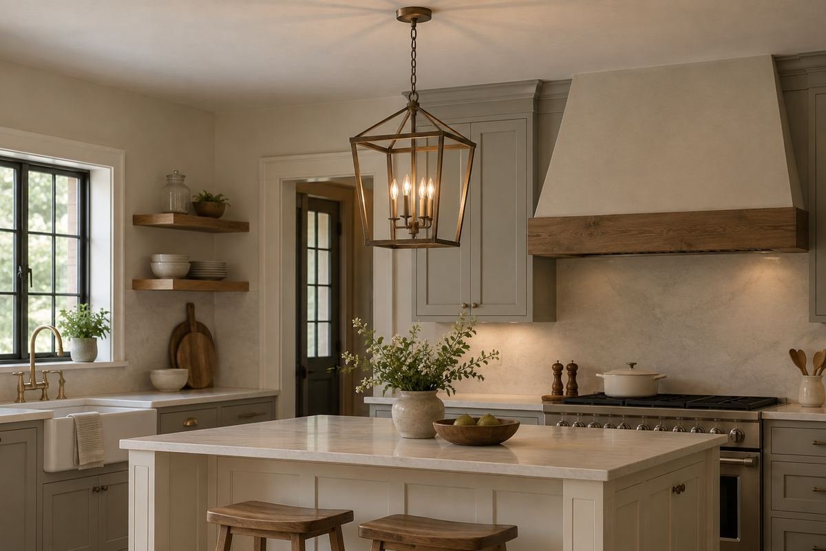
A lantern-shaped pendant introduces a more open frame above the island. A plain backsplash and simple cabinet arrangement help the frame remain legible without too many competing lines behind it.
Check which parts of the lamp and frame are visible from across the counter. The fixture should work from that side view as well as directly from the room entrance.
Practical tip: View the lantern against the actual background.
14. Use one purpose-made linear fixture over a long island
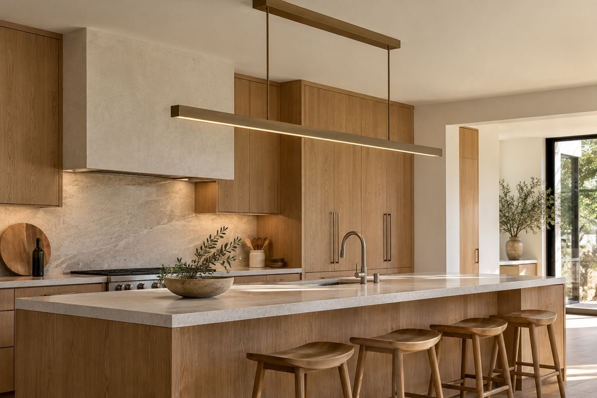
A linear fixture offers a different composition from several separate pendants. One elongated form can relate to a long island while reducing the number of individual ceiling canopies.
Review the complete fixture’s size, mounting requirements and light distribution. Its length alone does not establish that it will serve every part of the counter.
Practical tip: Compare the fixture with the actual island plan.
15. Compare three small shades with one repeated shape
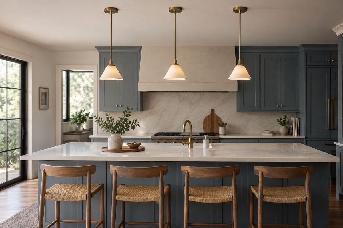
Three smaller pendants can create a deliberate sequence across an island. Keeping the shade shape and finish consistent makes the repetition easier to read among the kitchen’s other details.
Make full-size silhouettes before deciding on the count. A row that looks restrained in a wide photograph may feel more crowded when seen from a nearby seat.
Practical tip: Check the row from the end of the island.
16. Use two broader shades as kitchen pendant lighting focal points
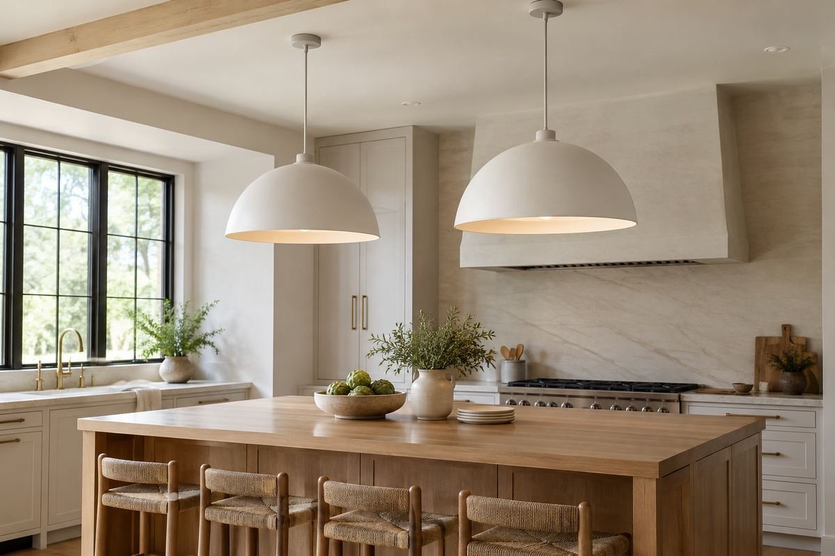
A pair of broader shades creates a different pace from a row of small fixtures. The larger forms can become the main decorative feature above a quiet island.
Compare how much of the background each shade blocks. Keep the final choice connected to the room’s actual views and the lighting information for those fixtures.
Practical tip: Judge the pair from both standing and seated positions.
17. Let one pendant mark a compact peninsula
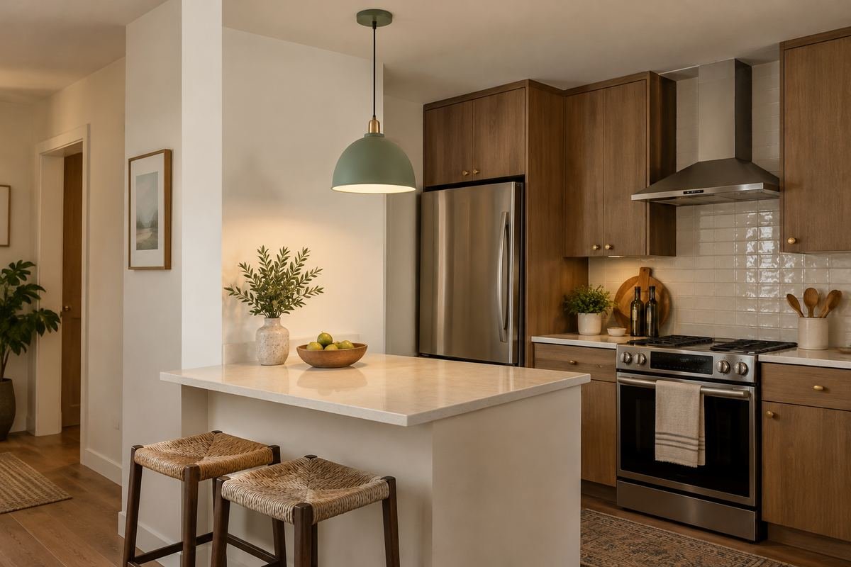
One considered pendant can identify a compact peninsula without filling its view with repeated objects. The fixture can relate to a single seating area or a clearly defined section of counter.
Confirm its role in the complete lighting arrangement. Choosing one decorative object does not establish that one light source will provide all the illumination the space needs.
Practical tip: Keep the peninsula’s other lighting needs on the plan.
18. Relate a globe to rounded stools

A round pendant can connect with curved stool backs or a rounded island corner. Repeating a broad shape family is often enough; the objects do not need identical sizes or materials.
Use the connection sparingly. If every accessory repeats the same circle, the larger relationship between the pendant and seating may become harder to notice.
Practical tip: Repeat the shape in one clear companion detail.
19. Use a quiet pendant beside a strongly patterned counter
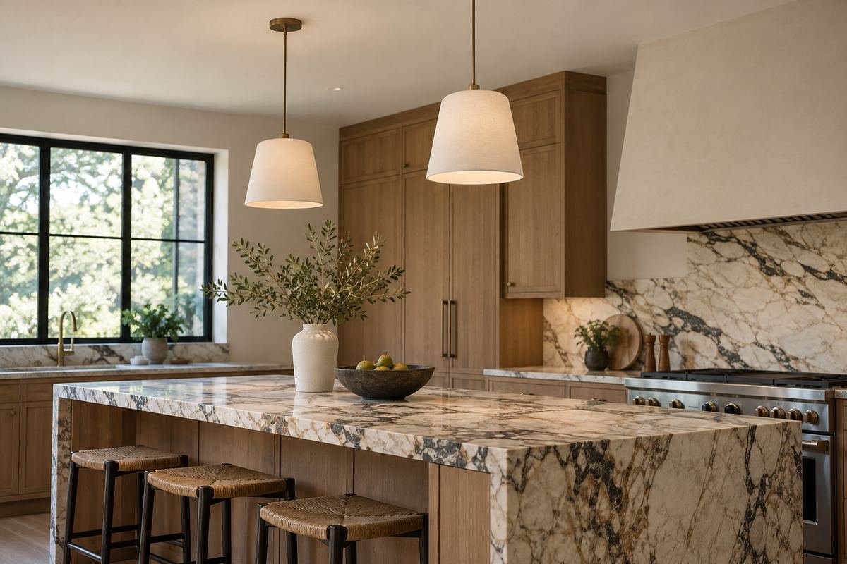
A patterned counter already creates a prominent surface. A simple pendant outline and restrained finish can give that pattern space while still defining the area above it.
Review the countertop and pendant in the same room view. Selecting them independently may introduce two competing focal points along the same sightline.
Practical tip: Choose which feature should attract attention first.
20. Coordinate the island lights with a nearby dining fixture
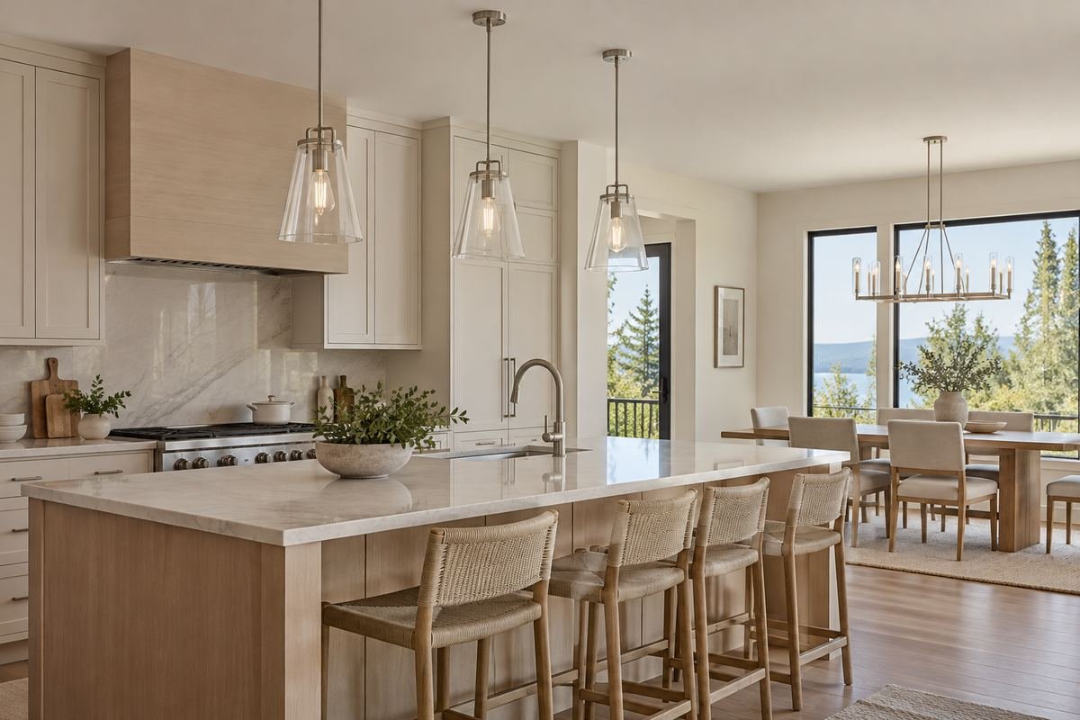
An open kitchen and dining area can use related fixtures without repeating the same object. Shared metal tones or a similar curve can connect pendants and a dining light while preserving different roles.
Compare both areas from the position where they are seen together. A close photograph of each fixture alone cannot show their combined effect.
Practical tip: Use the shared open-room view for the final choice.
21. Check kitchen pendant lighting on a sloped ceiling

A sloped ceiling changes the relationship between the canopy, suspension and room. A compatible fixture can preserve the chosen look while responding to the actual ceiling geometry.
Confirm that the specific model and mounting system support the proposed slope and position. Do not assume that any cord, rod or canopy will adjust in the same way.
Practical tip: Obtain the model-specific ceiling compatibility information.
22. Finish with a clear view across the island
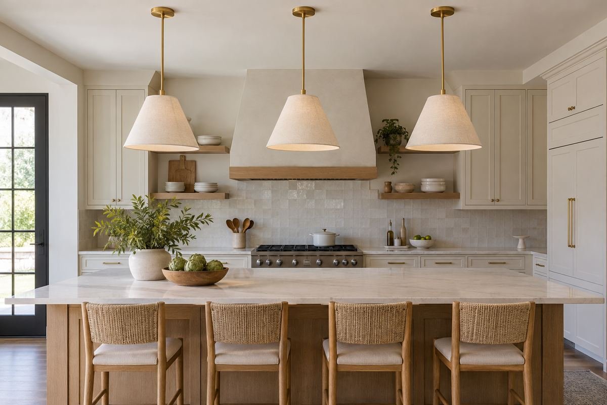
The most useful final check is the view you will live with. A fixture should belong to the room when you approach it, prepare food beneath it and sit on the opposite side.
Compare the approved full-size silhouettes with the complete product specifications before purchase. Then review the final positions, supporting installation and controls with the installer.
Practical tip: Keep a photograph of the approved room view with the order.
Frequently Asked Questions
How high should kitchen pendants hang?
Plan the final position around the actual counter, fixture, users and required clearances. Manufacturer design ranges can start a discussion, but do not establish one correct height or replace the product’s installation requirements.
Should I choose two pendants or three?
Compare the complete fixture sizes, island dimensions, light coverage and appearance together. Two large shades and three smaller ones create different rhythms; neither count is automatically correct for every island.
Does pendant lighting replace the other kitchen lights?
Usually a kitchen needs light beyond the pendant area, including its other work surfaces and circulation space. Review how the pendants fit within the whole room’s lighting plan.
Must pendants match the cabinet handles?
An exact match is optional. A related finish can connect the details, while a deliberate contrast can make the pendant a focal point. Compare actual finish samples under the kitchen’s light.
Can every pendant be dimmed?
No. Check the specified fixture, lamp or integrated light source, driver and control compatibility. A dimmable description for one component does not establish that any combination will work.
Choose the Details That Work in Your Home
Choose a pendant that relates to the kitchen when both lit and unlit. Compare the complete dimensions, room views, shade appearance and everyday care before ordering, then confirm the final arrangement and controls with the appropriate supplier and installer.
For related ideas, explore kitchen island decor ideas, kitchen cabinet colors, breakfast nook ideas for small kitchens.
Planning References
Visual Comfort: kitchen island pendant height and placement guide; LEDVANCE: fixture and bulb dimmer compatibility. Follow the instructions for the exact products you choose.
Optional digital guide for this topic
If you prefer a structured workbook, explore this related paid guide.