Limewash wall ideas combine color with variation across the surface. Begin by choosing the wall you want to change, then compare a real sample with the floor, furniture and normal light. A pale quiet finish and a deeper expressive one can create different relationships even when both are described as limewash.
The product choice matters as much as the image. Traditional lime-based finishes, mineral washes and plaster-like decorative effects can have different preparation, application and care requirements. These 23 original room concepts focus on design decisions, followed by a sample-and-surface plan for discussing the actual project.
Contents
- 1. Let a warm ivory wall carry quiet movement
- 2. Compare mushroom with pale stone and fabric
- 3. Use a deeper tone where contrast is intentional
- 4. Keep a clay wall beside quieter companions
- 5. Let a muted green relate to the retained wood
- 6. Give the bed one complete wall field
- 7. Choose a whole-room scheme with deliberate stop lines
- 8. Use a bounded reading alcove as a smaller study
- 9. Give a dining wall a simpler furniture setting
- 10. Let an existing arch frame one textured-looking plane
- 11. Treat an open-plan wall as one complete view
- 12. Resolve a corner return before the main wall is finished
- 13. Keep brick and the wall finish on separate specifications
- 14. Put the wall treatment above retained paneling
- 15. Relate the trim color without matching the wall product
- 16. Make the ceiling a separate approval
- 17. Keep one artwork clear against the moving background
- 18. Use the wall to support a retained older cabinet
- 19. Let simple upholstery reveal the finish
- 20. Choose an entry wall through its care demands
- 21. Study a stair wall from the ordinary approach
- 22. Compare a prepared sample with the actual companions
- 23. Keep the care and repair record after the room is complete
Choose the actual wall system before the finished look
Portola describes its Lime Wash as a brush-applied lime-based finish with natural color variation and identifies the unsealed surface as non-wipeable. Romabio’s interior guide separately presents Velatura Mineralwash and Venetian Glaze as routes to different decorative effects. Treat each exact product as its own system. Confirm the existing surface, preparation, sample, care and any proposed topcoat rather than transferring one recipe between brands or product families.
Choose the next comparison before choosing more colors
- You like the movement but not a strongly patterned wall: Compare a quieter sample beside the largest retained textile.
- The wall receives frequent contact or cleaning: Resolve the actual product and care suitability before approving the finish.
- The room includes several surface materials: Record each substrate and its proposed system separately.
- The effect changes across the room: View the same sample from ordinary seats, corners and doorway positions.
1. Let a warm ivory wall carry quiet movement
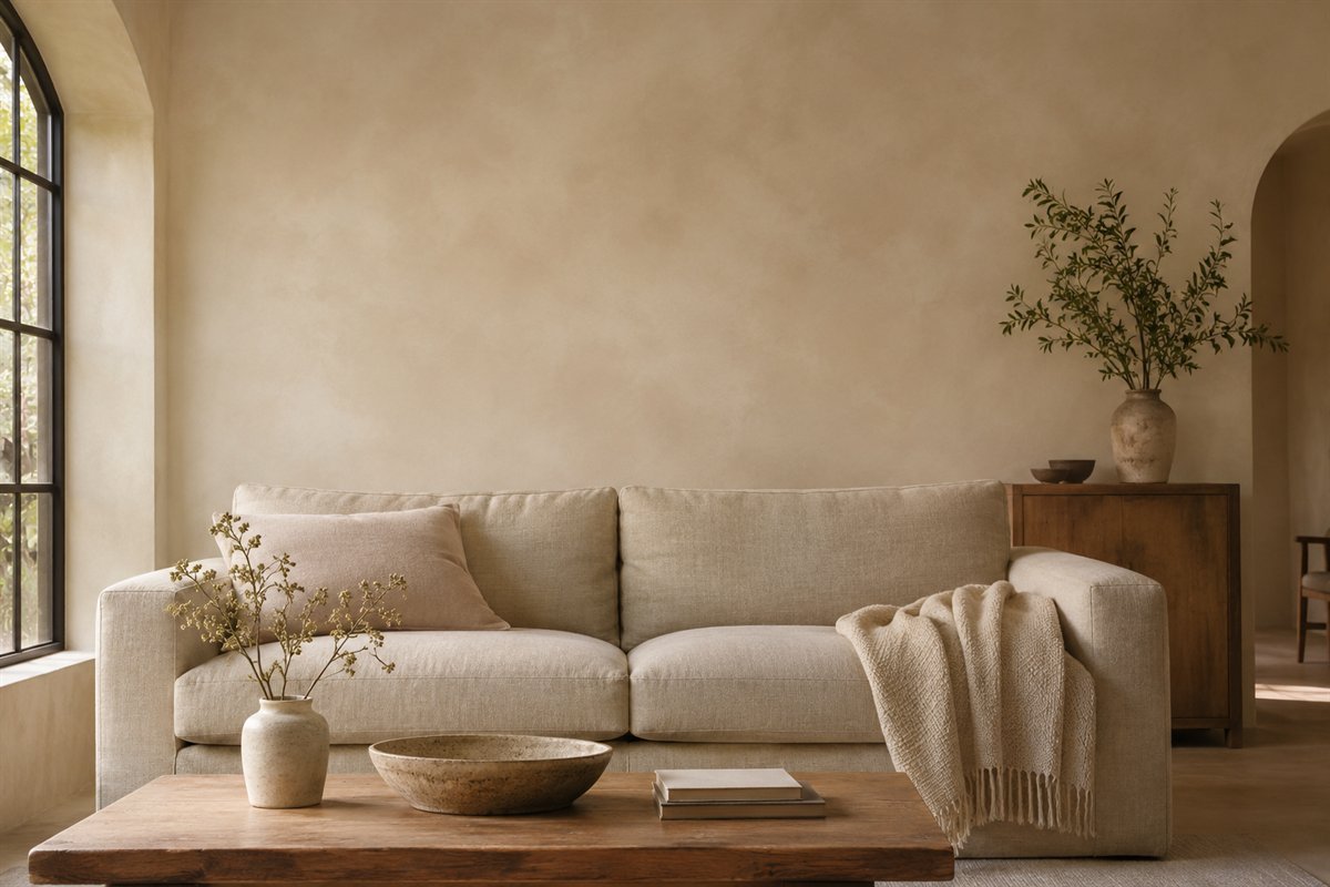
A warm ivory can let the finish provide variation while the furniture stays visually clear. Compare the sample beside the real floor and largest textile so the wall does not become unexpectedly yellow. Keep the movement quiet enough for the room you want rather than demanding a dramatic cloud effect from every pale color. The finished appearance should be judged on an actual prepared sample.
Choose the wall through its complete view from the main seat.
2. Compare mushroom with pale stone and fabric

A mushroom-toned wall can provide a muted background beside pale stone and plain fabric. Compare the actual undertones as a group, including the darker and lighter parts of the sample. A finish with variation is different from one flat color chip. Keep the room’s larger patterned materials in the comparison so the wall contributes another considered layer rather than another competing motif.
View the sample where it meets the retained stone or stone-look surface.
3. Use a deeper tone where contrast is intentional

A deeper wall can give pale furniture a distinct outline, with movement visible within the color. Check the deepest corner as well as the bright area beside a window. Decide whether the room still has the useful light and contrast wanted during ordinary use. A dramatic rendering is a reference for composition, not a promise that a selected product or technique will reproduce that exact effect.
Compare the actual sample under the evening lights before choosing the depth.
4. Keep a clay wall beside quieter companions
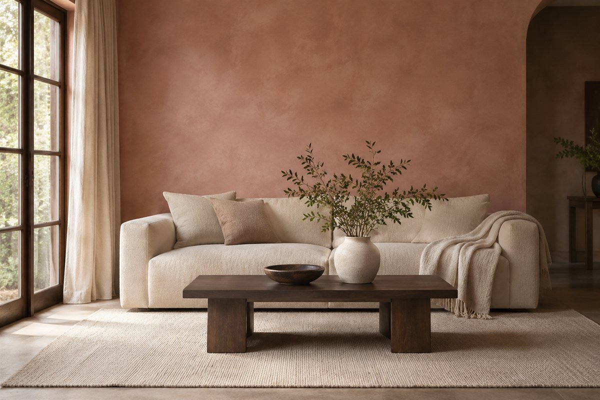
Muted clay can supply the room’s main color while upholstery and rugs remain quieter. Judge the pink, brown and orange balance beside the actual furniture. Strong movement and strong color can compete with a busy textile, so choose which surface should lead. Keep the proposed finish distinct from a conventional clay-colored paint or a troweled decorative plaster when discussing the project.
Describe both the color family and the intended degree of movement in the brief.
5. Let a muted green relate to the retained wood
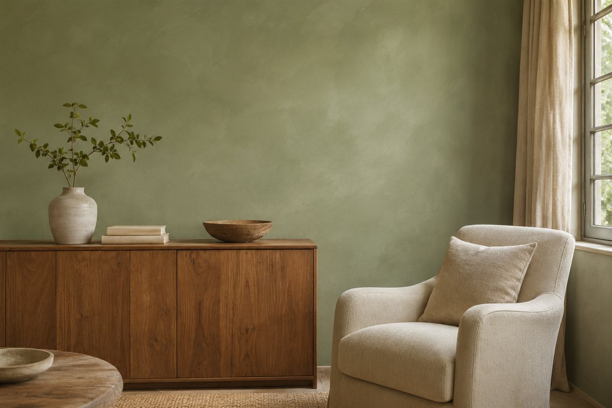
A restrained green can connect with warm wood without becoming a botanical theme. Compare the real sample against the largest retained timber surface and under the lamps used after dark. The green may appear grayer or warmer than expected. Let the wood grain and the wall movement remain separately readable instead of adding another large textured finish beside them.
Keep one substantial wood sample with the wall sample during the final comparison.
6. Give the bed one complete wall field
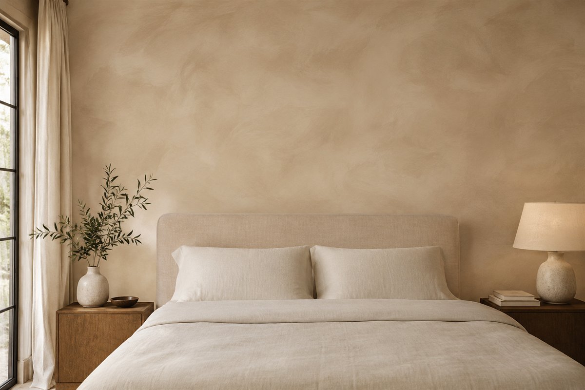
A headboard wall offers a clear furniture relationship for a varied finish. Compare the whole field, including the bedside positions and where the wall meets the ceiling and adjoining planes. Keep the bedding plain during the sample study so its pattern does not obscure the effect being considered. Choose the wall system through the actual surface and care needs before using the decorative concept.
Judge the proposed field from both the doorway and the bed.
7. Choose a whole-room scheme with deliberate stop lines

A whole-room treatment can provide a continuous background without requiring every surface to receive the same material. Draw the corners, ceiling boundary, trim and door faces before comparing a sample. Decide whether the finish should continue onto an adjoining plane or stop at a clear architectural edge. The distinction is especially useful when one room opens onto another with a different coating.
Write the included surfaces down before the project grows beyond one wall.
8. Use a bounded reading alcove as a smaller study

An existing alcove can contain a smaller decorative field while still serving an activity. Compare the back plane with the chair and its useful light before deciding how much of the alcove to include. A small project should answer the same surface and sampling questions as a larger one. Keep the edge deliberate rather than inventing an arbitrary stripe across an otherwise continuous wall.
Use the alcove’s real architectural boundary to define the comparison.
9. Give a dining wall a simpler furniture setting

A dining wall can supply variation behind a comparatively simple table and chair group. Compare the finish with the table set for an ordinary meal, including the lighting used after dark. A highly figured tabletop or patterned upholstery may need a quieter wall sample. Choose the relationship among the substantial surfaces before adding decorative objects to reinforce the palette.
Include the chairs and table finish when reviewing the wall sample.
10. Let an existing arch frame one textured-looking plane
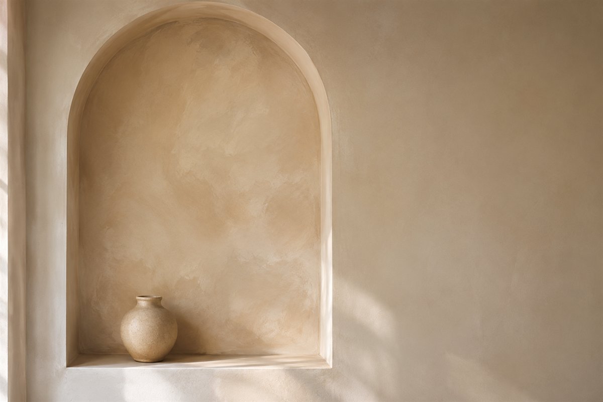
An existing arch can frame a varied back plane without requiring the finish to cover the entire room. Compare the reveal and surrounding wall as separate surfaces, deciding where the treatment ends. Keep the shape useful and the display restrained. This is a composition idea for an existing detail; changing an opening or constructing an arch is a separate project with its own requirements.
Mark the back plane and reveal separately in the surface list.
11. Treat an open-plan wall as one complete view

A long wall seen from two activity areas needs to be assessed as one composition. Compare the finish beside the living-room textiles and dining furniture before approving the whole field. Decide how the wall meets each opening and retained surface. A color that relates well to one sofa may need another comparison beside the kitchen or dining finishes visible from the same position.
Review the wall from both ends of the open room.
12. Resolve a corner return before the main wall is finished
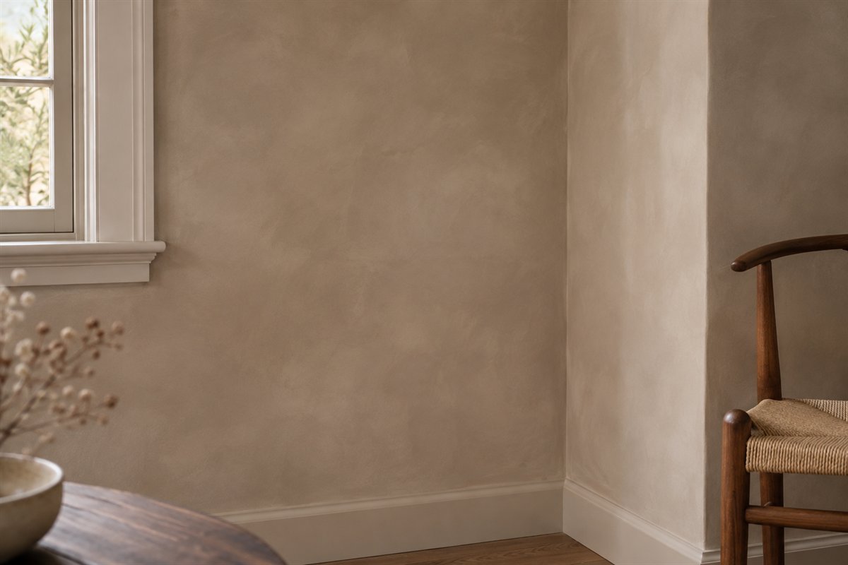
A corner return can either join the main field or mark a change toward another room. Make that decision before the application scope is agreed. Compare the shadow at the corner and the view from the adjoining doorway. A continuous appearance depends on the actual product, preparation and application plan, so leave those details to the chosen system rather than treating the corner as an isolated touch-up.
Include a corner in the sample discussion when it is central to the room view.
13. Keep brick and the wall finish on separate specifications
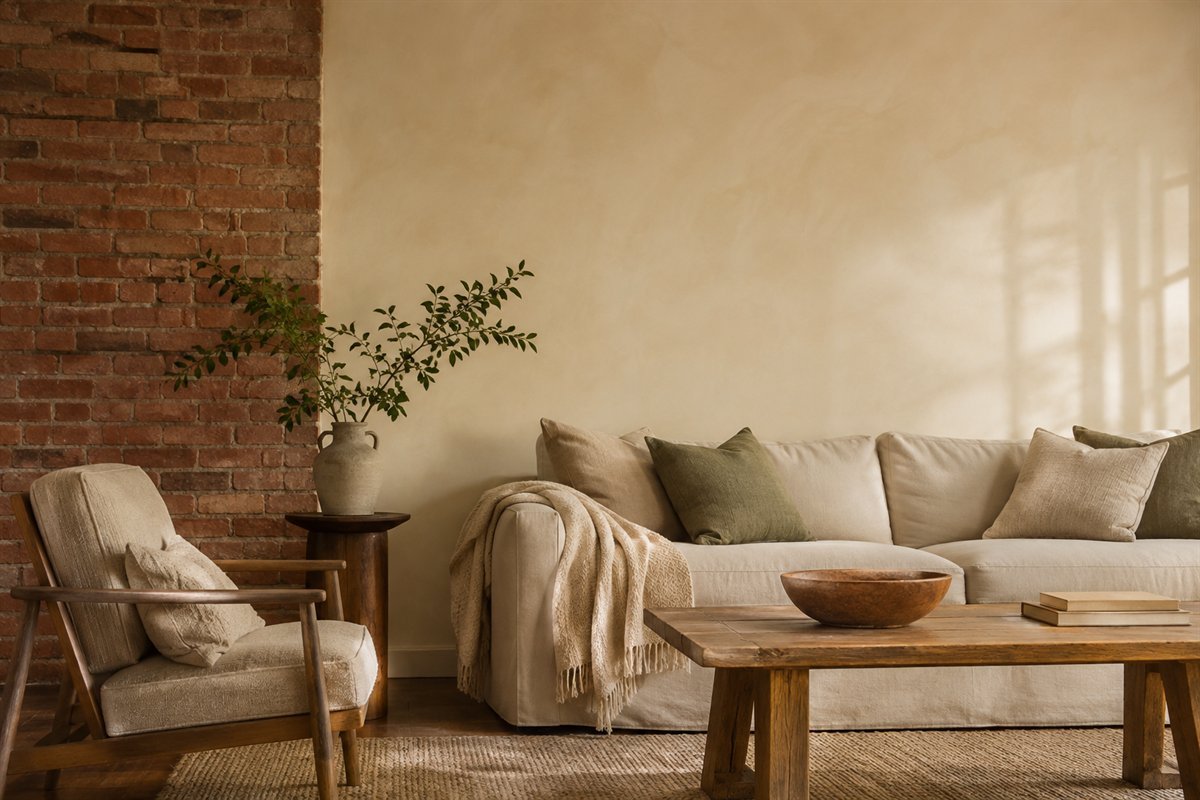
Brick, painted drywall and other surfaces can require different systems even when the intended colors are related. Compare the materials together visually, then confirm each substrate and product separately. A single supplier’s range may include several decorative products with different preparation. Do not transfer a masonry recipe to a different wall merely because both projects use the word limewash.
Record each surface independently before accepting a single undifferentiated coating description.
14. Put the wall treatment above retained paneling
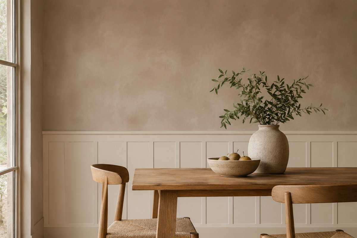
Existing paneling can remain a separate lower layer while a varied wall field sits above it. Compare the horizontal boundary and the level where the two meet. Choose the panel coating through the actual panel material and its use; the wall finish does not automatically belong on wood or other trim. A related color can connect two appropriate products without making their formulations identical.
Keep the wall and panel products as two entries in the project record.
15. Relate the trim color without matching the wall product
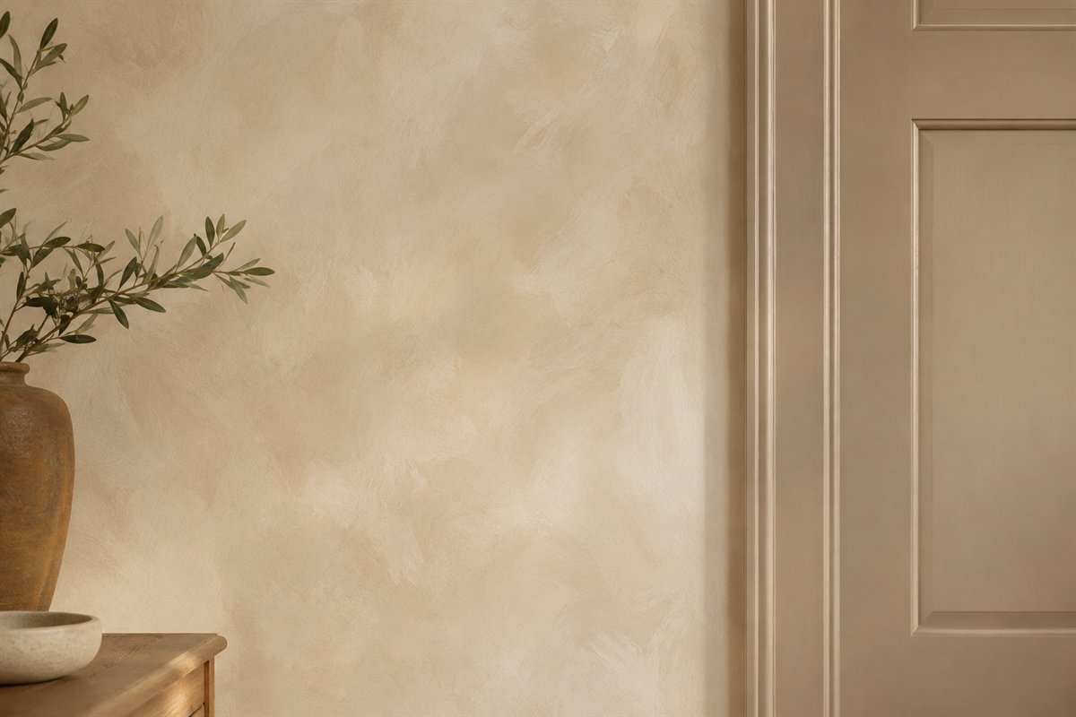
A related trim color can keep an opening quiet while the wall provides tonal movement. Compare the finishes together because their reflection and texture may remain different even with a similar intended hue. Choose the actual trim coating for that material and task. A close color relationship is a decorative decision, not a requirement to apply a delicate wall finish to every component.
Ask for separate surface and product information even when the color descriptions are similar.
16. Make the ceiling a separate approval
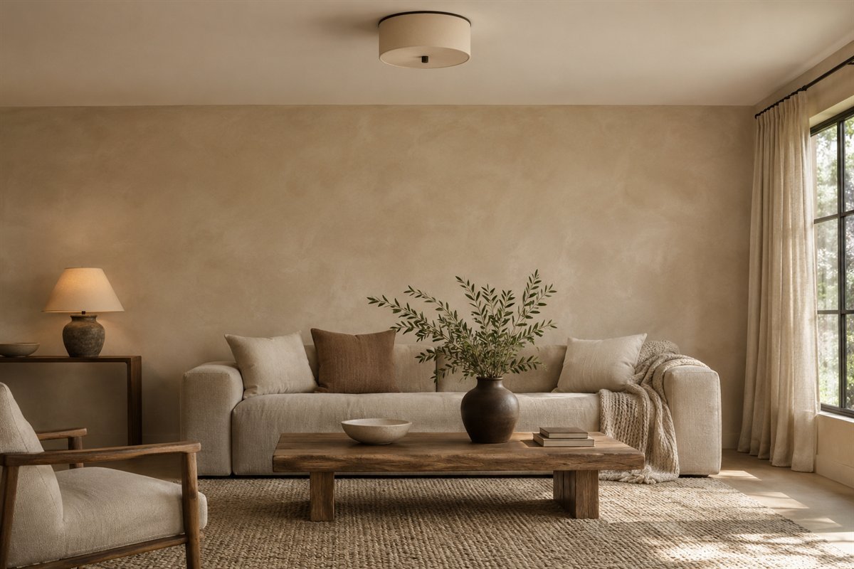
A plain ceiling can give varied walls a useful limit. If an overhead decorative finish is being considered, treat its substrate, product suitability, access and application as a separate approval. Compare the intended appearance from the seats before expanding the scope. The wall image cannot verify how another product will behave overhead or establish the work needed at height.
Decide whether the ceiling should be included or retained before obtaining the final scope.
17. Keep one artwork clear against the moving background
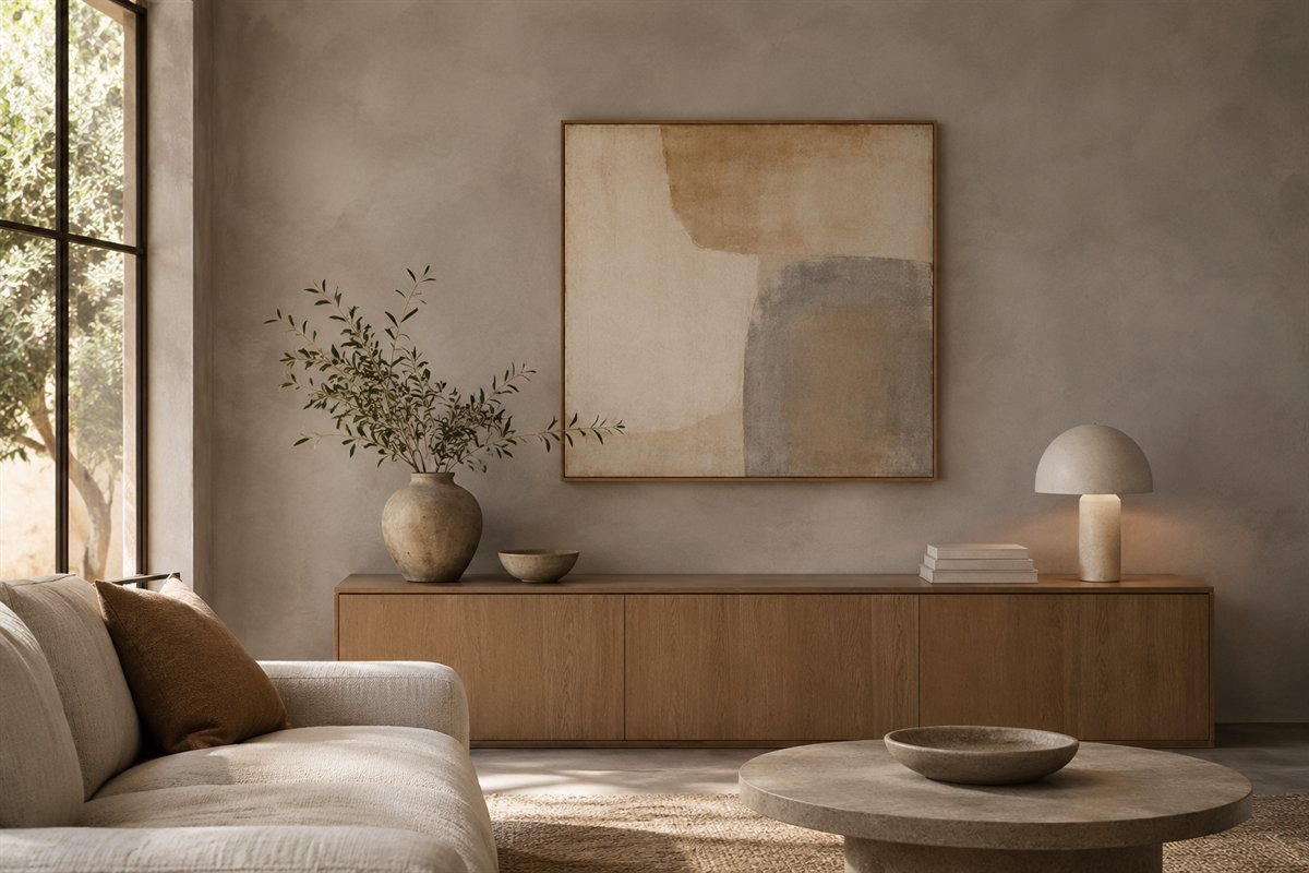
A single clear artwork can sit against a varied wall without making the finish disappear beneath many small frames. Compare the full frame and the space around it with a sample of the proposed movement. Choose suitable mounting for the actual object and wall. Let the artwork and background have different roles instead of asking both to carry the room’s strongest pattern.
Test the complete frame outline before deciding how much surrounding wall should remain visible.
18. Use the wall to support a retained older cabinet
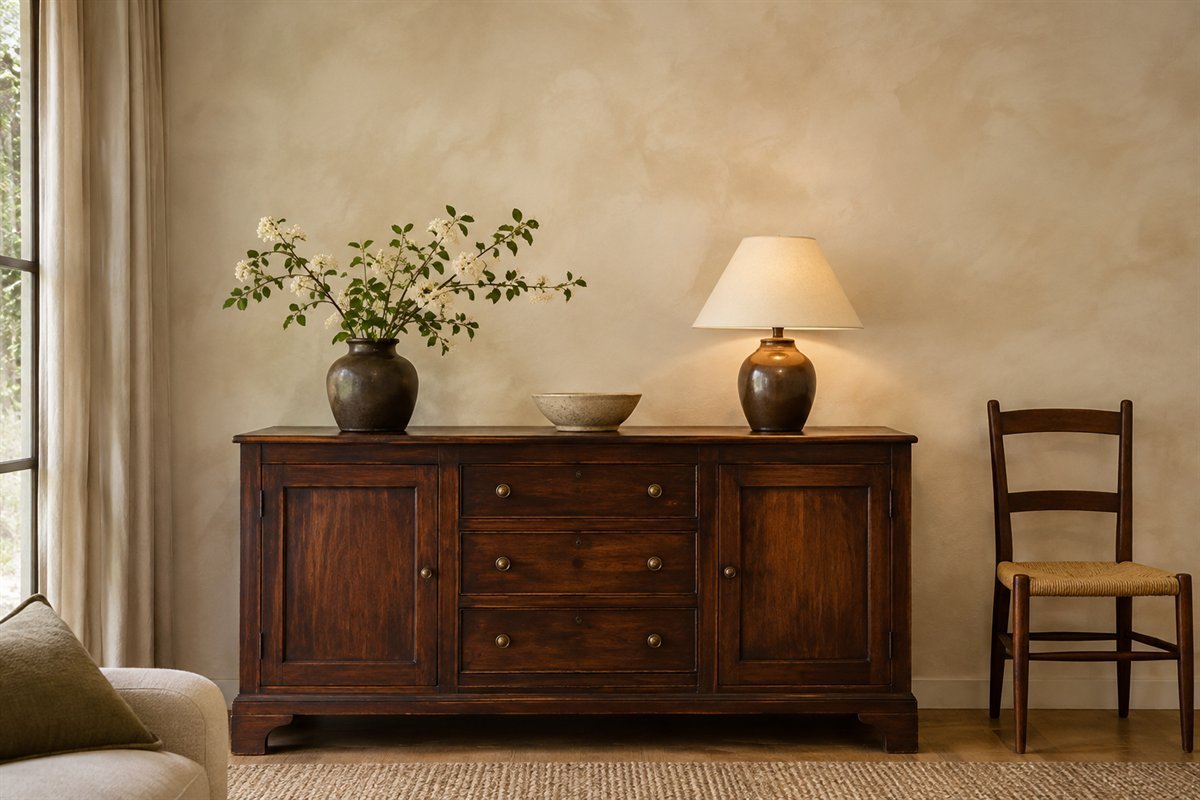
An older cabinet with useful proportions can remain the main furnishing while a quieter varied wall becomes its background. Compare the actual grain, finish and condition beside the sample. The wall need not imitate age or make a newly decorated room appear historic. Keep the object’s known history separate from the decorative effect of its surroundings.
Use the cabinet as a retained reference rather than changing it to match the new wall.
19. Let simple upholstery reveal the finish
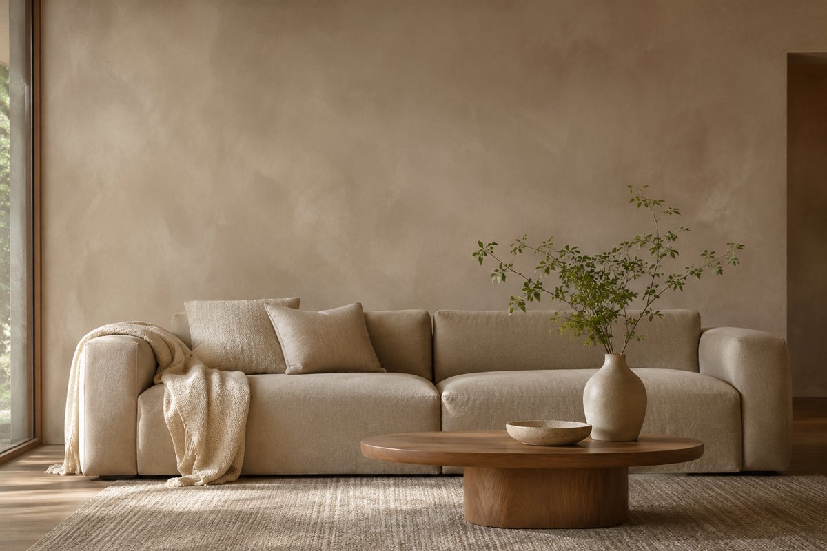
Plain upholstery can make subtle wall movement easier to see. Keep the floor, sofa and largest textile in the comparison before selecting the final depth. If the furnishings already create strong contrasts, choose a quieter sample rather than adding a more pronounced effect to make the finish noticeable. The wall can contribute character without becoming the only feature in the room.
Review the sample with the main textiles in place instead of against an empty room.
20. Choose an entry wall through its care demands
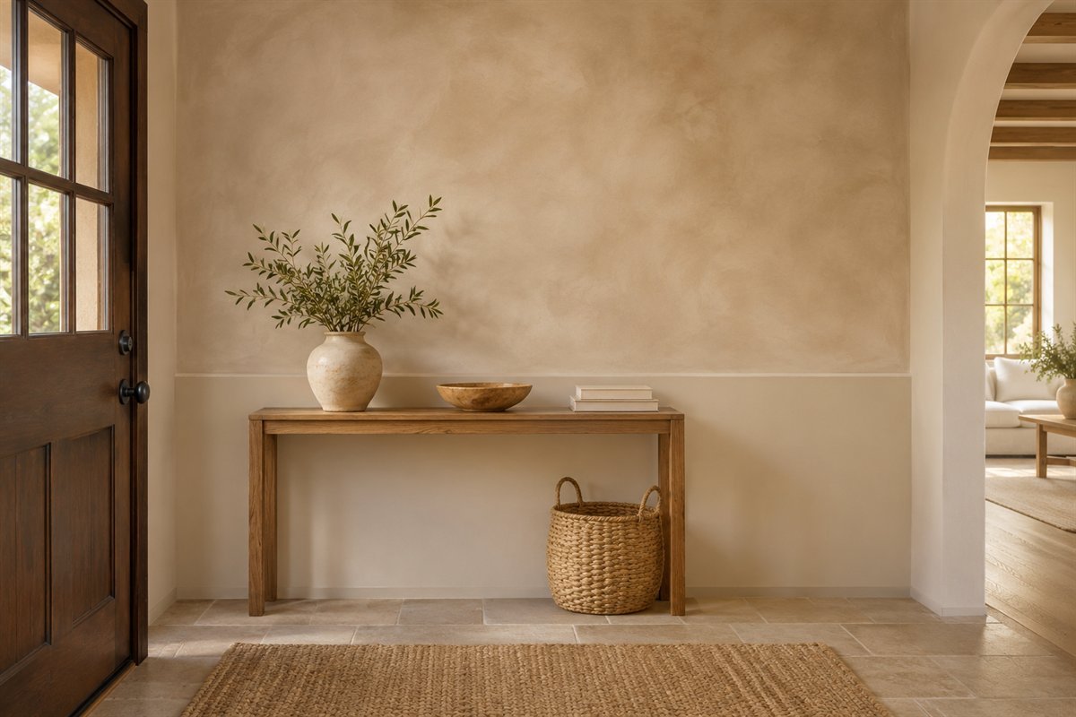
An entrance can receive repeated contact from hands, bags and coats. Decide whether the proposed wall system suits that actual routine before choosing its appearance. A separate lower treatment or a different product may be a more useful comparison where cleaning is frequent. Keep the exact care information with the decision rather than assuming every mineral-looking finish can be wiped in the same way.
Identify the contact areas on a normal arrival before choosing the decorative field.
21. Study a stair wall from the ordinary approach

A stair wall can show a varied finish from several heights and angles. Compare the appearance along the ordinary approach, then resolve the work and appropriate access through the actual project team. Retain handrails, fittings and other working features according to their own requirements. The attractive uninterrupted wall in a concept image does not justify changing or painting every component to match it.
Keep the decorative surface list separate from the access and installation plan.
22. Compare a prepared sample with the actual companions
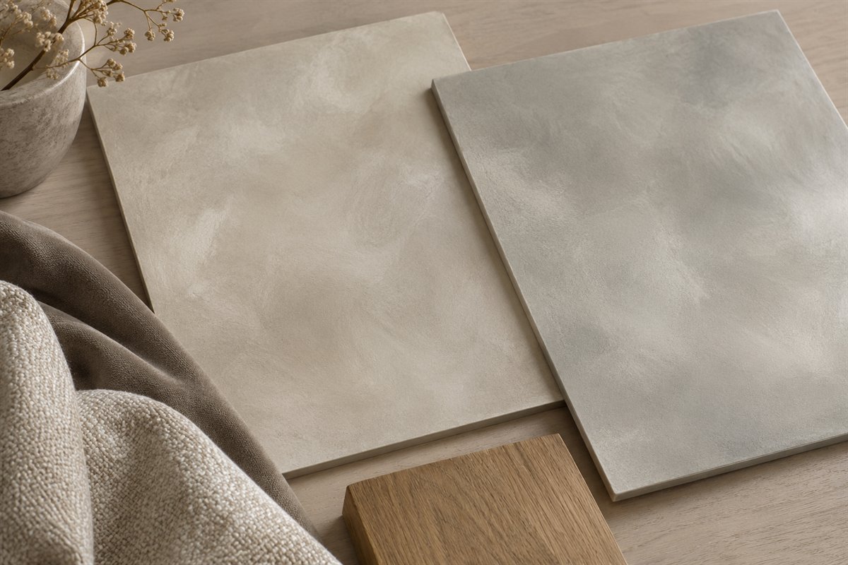
Compare a sample that represents the intended system, not merely a digital color. Keep the relevant preparation and any proposed topcoat in the discussion, following the manufacturer’s sampling guidance. View it with the real floor, fabric and trim. Record its appearance after the maker’s specified development period rather than treating a wet patch as the final color and movement.
Keep the product, surface and sample-stage information together.
23. Keep the care and repair record after the room is complete
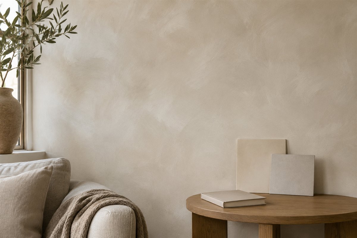
Keep the exact product, color, batch information if supplied, preparation, application record and care guidance after the work is complete. A future scuff may need product-specific advice rather than an improvised scrub or spot repair. The record also helps distinguish an original coating from a later decorative effect. Store the useful information where the household can find it without relying on a photograph of the room.
Use the sample-and-surface plan below to preserve those details from the start.
An original sample-and-surface plan
Begin with an appearance brief and a surface record. The appearance brief describes the chosen wall, color relationship, desired degree of movement and the retained furniture. The surface record identifies what is actually there and the proposed product system. Keep them linked without treating an attractive image as a specification for a material you have not identified.
For each surface, record its known substrate, existing coating if documented, condition and the question that still needs answering. Leave unknowns visible. Painted drywall, masonry, trim and a ceiling are separate entries even when they meet within one photograph. Ask the appropriate supplier or project professional to confirm the compatible preparation, product and application requirements for those actual surfaces. Use current product information rather than a technique borrowed from another finish.
Define a sample before approving the room. Agree what it should represent: the chosen surface or an appropriate sample support, required preparation, the intended finish and any proposed protective layer. Record the products and the stage at which the sample is being judged. A screen image can help explain the visual direction, but it cannot establish the real color, substrate behavior or completed coating’s care requirements.
Review the sample against the substantial retained materials and from the room’s normal viewing positions. Include a daylight view, an ordinary evening view and a location where the wall turns or falls into shadow. Keep the furniture and lighting consistent so the comparison answers one question at a time. Record the observation in plain language: movement too pronounced beside the curtain, color too warm near the floor, or contrast clear behind the cabinet.
Next, decide the boundaries. Mark where the treatment stops at a corner, reveal, panel, ceiling or adjoining room. Identify surfaces that remain outside the scope and specify their own appropriate products if they are changing. Confirm the actual project sequence with the chosen system rather than treating a varied wall as conventional paint that can always be taped, cleaned or touched up in the same way.
Finish with a care decision before the purchase. Ask what ordinary contact, cleaning, repair and recoating will involve for this exact finish. If a topcoat is proposed, review a representative sample of the complete system because the appearance and performance may change. Keep the final instructions with the record. This is an original design-planning aid, not a universal application recipe, product test or assessment of an existing coating.
Three ways to narrow the design choice
For a room with a strong rug or figured wood cabinet, compare a quieter pale field and keep the furniture as the main detail. For a restrained room with plain upholstery, compare a more visible degree of movement while keeping the other surfaces simpler. For a heavily used entrance or contact area, resolve product care first and compare another appropriate finish if the preferred system does not suit the routine.
These are hypothetical composition briefs, not exact color matches or manufacturer endorsements. The illustrations show limewash-like visual movement; their appearance cannot establish binder chemistry, breathability, washability, mold resistance or suitability for a wet area. A different decorative product may produce a related look while requiring a different complete specification.
Can limewash go directly onto any painted wall?
Do not assume so. Confirm the exact product, existing coating, substrate and required preparation with current manufacturer guidance. One brand’s or product family’s instructions do not apply automatically to another.
Can I wipe a limewash wall clean?
Check the exact system. Portola identifies its unsealed Lime Wash as non-wipeable. Other products or complete systems have their own care requirements, so resolve this before choosing a high-contact location.
Are limewash, mineral wash and decorative plaster the same?
They can create related visual effects, but product formulations and application methods differ. Identify the actual product and surface instead of selecting a system solely from a style name or an illustration.
Should the trim and ceiling receive the same wall product?
Treat them as separate surfaces. A related color can connect appropriate products without making their formulations identical. Confirm suitability and the project scope independently.
Will the generated images match my final paint color?
No. They are original illustrative room concepts. Use a real prepared sample of the intended system and review it with the actual materials and light in your room.
A practical next step
Choose the wall and desired movement, identify the actual surface and compare a prepared sample with the room you will keep. A clear boundary and care record can make a decorative finish easier to judge than a color selected from an image alone.
Compare living-room palettes with retained furniture. Relate bedroom wall colors to bedding and wood. Review hallway color transitions between rooms.
Images are original AI-generated design concepts showing limewash-like visual effects, not exact product demonstrations, color samples or verified installations. The sample-and-surface plan is an original planning aid. Follow the actual product, surface, care and project requirements.
Sources and care references
- Portola Paints: Lime Wash surface, sampling, preparation and care information
- Romabio: distinct interior mineral-wash and glaze options
Optional digital guide for this topic
If you prefer a structured workbook, explore this related paid guide.