Dining room paint colors make the most sense beside the furniture you already own. A wall color that looks attractive on its own may compete with a red-toned table, disappear beside pale upholstery or feel very different when the evening lights are on.
Begin with the largest fixed surfaces: the floor, table, chairs and any built-in cabinetry. Decide which one should lead the palette, then use the wall color to connect the others. You do not need to replace every accessory to make a room feel considered.
These 25 palettes show different ways to handle warmth, contrast and adjoining rooms. The images are original AI-generated concepts rather than exact paint formulas. Use physical samples of the actual products before choosing a color.
The images are original AI-generated decor concepts, not installation diagrams or photographs of completed client projects.
Browse These 25 Dining Room Paint Colors
Jump to an idea
- Start with warm-white dining room paint colors
- Choose soft cream with a dark traditional table
- Use a pale beige with woven textures
- Try mushroom with pale oak furniture
- Give greige a clear warm companion
- Explore sage dining room paint colors with simple chairs
- Choose olive with warm timber and linen
- Pair deep forest green with pale upholstery
- Use eucalyptus gray-green beside black details
- Try dusty blue with natural oak
- Choose blue-gray dining room paint colors for a quieter backdrop
- Use navy with warm-white trim
- Pair a muted teal with walnut
- Try pale clay with cream and oak
- Use terracotta as a deliberate full-room color
- Choose dusty-rose dining room paint colors with dark wood
- Use a soft peach with restrained natural materials
- Try muted ochre with a simple dark table
- Give plum a quiet neutral setting
- Use charcoal with clearly visible furniture edges
- Put a deep color above pale paneling
- Carry one color across walls and suitable trim
- Connect open-plan dining room paint colors to the kitchen
- Paint a dining alcove as one defined area
- Let a colorful rug guide a restrained wall choice
Test dining room paint colors with the table and evening light
Benjamin Moore’s sampling guidance emphasizes evaluating actual color samples in the room. Use your shortlist beside the table, floor and upholstery rather than relying on a screen image. Look at each option during the day and under the lights used for dinner. Record what changes instead of choosing from a single photograph.
| Existing feature | What to compare | Useful first direction |
|---|---|---|
| Orange or red-toned timber | Whether the sample emphasizes or balances the wood | Quiet cream, muted green or a considered blue |
| Pale oak and cream upholstery | Enough separation to see each surface | Mushroom, soft clay or a medium neutral |
| Dark table and dark chairs | How the furniture silhouette reads | Pale warm wall or deliberately layered deep tones |
| Colorful rug | One repeatable hue rather than every color | A muted wall version of one rug detail |
| Open connection to the kitchen | The doorway view and shared floor | A related undertone with a deliberate change in depth |
| Decorative wall paneling | Where the color breaks and how trim reads | One coherent color or a clearly planned two-tone scheme |
Build a three-sample comparison around one fixed object
Suppose the room has a medium oak table and cream chairs. Compare a warm off-white, a mushroom neutral and a muted olive. Keep the tablecloth, lighting and nearby accessories the same while reviewing them. This makes the wall color the main variable. If every sample seems wrong beside the floor, adjust the shortlist before changing the furniture.
Define the color boundary before estimating the job
Write down whether the project includes walls only, paneling, trim, ceiling, door or built-in cabinetry. A darker wall above pale paneling covers a different visible area from the same color carried to the floor. Take that boundary plan to the paint supplier and confirm the appropriate coating and coverage for each actual surface.
1. Start with warm-white dining room paint colors

Warm white gives timber furniture a quiet backdrop while leaving the table grain easy to see. It is useful when a rug, artwork or upholstered chair already provides the room’s stronger color.
Compare the white against the chair fabric rather than assuming all pale surfaces match. A cream seat beside a much cooler wall can make the upholstery appear more yellow.
Practical tip: Bring an upholstery sample into the paint comparison.
2. Choose soft cream with a dark traditional table

Soft cream can provide a light field around a dark traditional table. The contrast lets the table shape remain visible without adding a second deep surface behind it.
Keep the ceiling and casing in the comparison. Different pale colors can work together, but the relationship should look intentional across the whole doorway.
Practical tip: View the wall sample beside existing trim.
3. Use a pale beige with woven textures

Pale beige can connect woven chair seats, a natural rug and a light wood table. The effect depends on the texture differences as much as the wall color itself.
Avoid making every surface the same value. A slightly darker table base or a few defined chair frames can keep the furniture from disappearing into the room.
Practical tip: Keep one visible edge darker than the wall.
4. Try mushroom with pale oak furniture
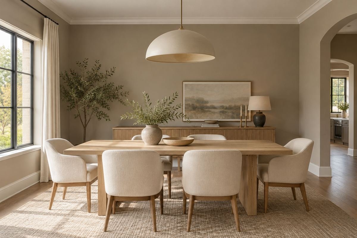
Mushroom offers a deeper neutral behind pale oak without creating a strong color statement. It can give cream upholstery and white ceramics a little more definition.
Check whether the sample reads pink, green or gray beside the floor. Those relative shifts are more useful than the neutral name on the sample card.
Practical tip: Compare the color directly against the floor.
5. Give greige a clear warm companion
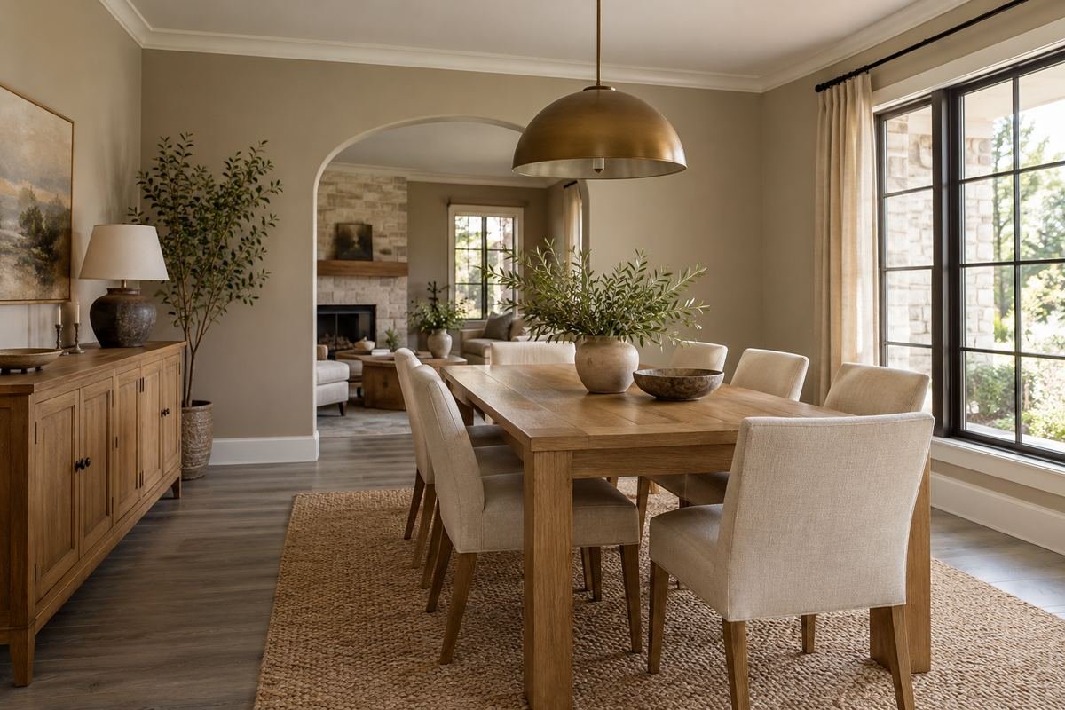
A greige wall can connect a gray floor with warmer wood furniture. The palette becomes easier to read when one warm material, such as the tabletop, remains the main feature.
Keep the rug quiet while testing the color. A large patterned rug can introduce several additional undertones and make a close neutral decision harder.
Practical tip: Evaluate the fixed floor before adding new accessories.
6. Explore sage dining room paint colors with simple chairs
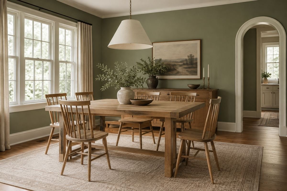
Muted sage creates a gentle color field behind plain timber chairs. It can relate to an adjoining garden view while still looking like a deliberate interior palette.
Compare the green with the wood’s undertone. A yellow-green sage and a gray-green sage may give the same table quite different emphasis.
Practical tip: Test two green undertones rather than only two depths.
7. Choose olive with warm timber and linen

Olive provides more depth than a pale sage and can sit comfortably with warm timber. Linen upholstery introduces a softer surface against the deeper wall.
Use the wall sample behind an actual chair. The gap between wall and chair determines whether the furniture outline remains clear in evening light.
Practical tip: Check the chair silhouette after dark.
8. Pair deep forest green with pale upholstery

Forest green can create a strong backdrop for pale dining chairs. Keeping the tabletop and accessories restrained allows that light-dark relationship to lead the room.
Choose the ceiling treatment deliberately. A pale ceiling keeps a visible upper boundary, while a related deeper ceiling creates a different sense of enclosure.
Practical tip: Decide the ceiling color alongside the wall.
9. Use eucalyptus gray-green beside black details

A gray-green wall can connect pale timber with a few black metal details. Its quieter color gives a black chair frame or pendant a defined outline.
Limit the number of unrelated metal finishes in the main view. Repeating one finish can make a mixed-material dining set look more coherent.
Practical tip: Repeat the strongest dark detail at least once intentionally.
10. Try dusty blue with natural oak
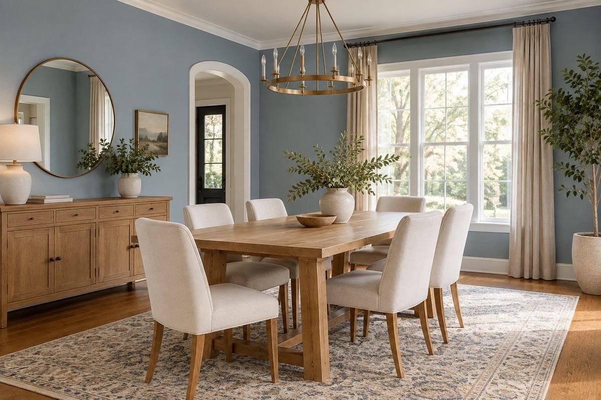
Dusty blue introduces color without the stronger contrast of navy. Natural oak gives the palette a warm surface so the room does not depend entirely on pale blue and white.
Review the sample from the adjoining room. The wall may appear cooler when seen beside a cream kitchen than when viewed alone.
Practical tip: Include the connecting doorway in the test.
11. Choose blue-gray dining room paint colors for a quieter backdrop

Blue-gray can provide a restrained background for a patterned rug or large painting. It gives the wall a visible hue while allowing another object to remain the focal point.
Keep a sample near that focal object during selection. A paint that matches one small detail too closely may flatten the contrast you wanted.
Practical tip: Choose a relationship, not an exact artwork match.
12. Use navy with warm-white trim

Navy creates a clear perimeter around a dining room when framed by warm-white trim. A timber table can keep the palette from becoming entirely dark blue and pale white.
Check how much trim is visible. Wide casing and paneling contribute more light area than a thin baseboard, changing the balance of the same wall color.
Practical tip: Judge the actual wall-to-trim proportions.
13. Pair a muted teal with walnut
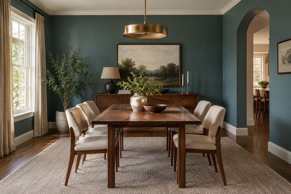
Muted teal can bring blue and green into a room with walnut furniture. The combination works best when the wall remains a broad quiet field rather than competing with several other patterns.
Choose one lighter surface to interrupt the depth. Pale upholstery or a simple rug can make the table grouping easier to read.
Practical tip: Keep the largest fabric surface relatively quiet.
14. Try pale clay with cream and oak
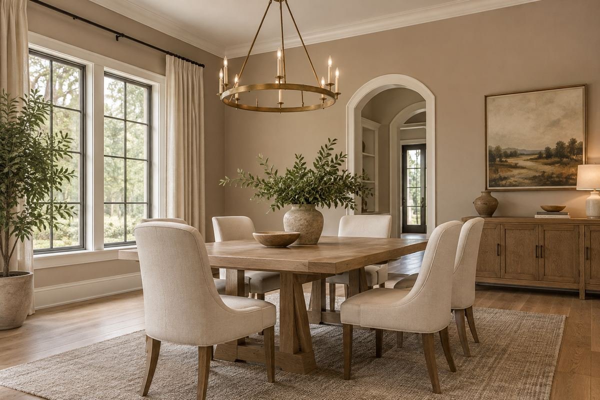
Pale clay gives a dining room a warm color without using a deep terracotta. Cream chairs and oak furniture let the wall remain the most noticeable hue.
Compare the sample beside any pink or orange floor tones. Similar warmth can be harmonious, but it may also become stronger than expected across a large area.
Practical tip: Test the wall and floor together at their junction.
15. Use terracotta as a deliberate full-room color

Terracotta can turn the walls into a strong warm frame for the dining set. Keep the table setting simple so small decorative objects do not compete with the room’s main color.
Test a muted version before choosing a very saturated orange. Larger wall areas can feel more assertive than a small sample held in the hand.
Practical tip: Compare a softened candidate at the same time.
16. Choose dusty-rose dining room paint colors with dark wood

A brown-based dusty rose can create a softer contrast with dark wood than a brighter pink. Pale linen and simple ceramic pieces give the palette quieter supporting surfaces.
Review the color under the evening lamps. A warm lamp and a warm wall may combine differently from the daylight view.
Practical tip: Approve the sample with the actual dinner lighting.
17. Use a soft peach with restrained natural materials

Soft peach can give a light dining room a visible warm hue. Natural timber and quiet cream fabrics help the color look deliberate without requiring many matching accessories.
Keep the neighboring wall colors in view. A peach room beside a strongly yellow hallway can create a different relationship from the same color beside white.
Practical tip: Review the sequence of adjoining spaces.
18. Try muted ochre with a simple dark table

Muted ochre offers a golden wall color with more depth than cream. A simple dark table gives the composition a clear central shape against the warmer background.
Choose the rug after checking the wall and floor together. Another large yellow-brown surface may reduce the distinction between the main materials.
Practical tip: Leave some pale area around the furniture.
19. Give plum a quiet neutral setting
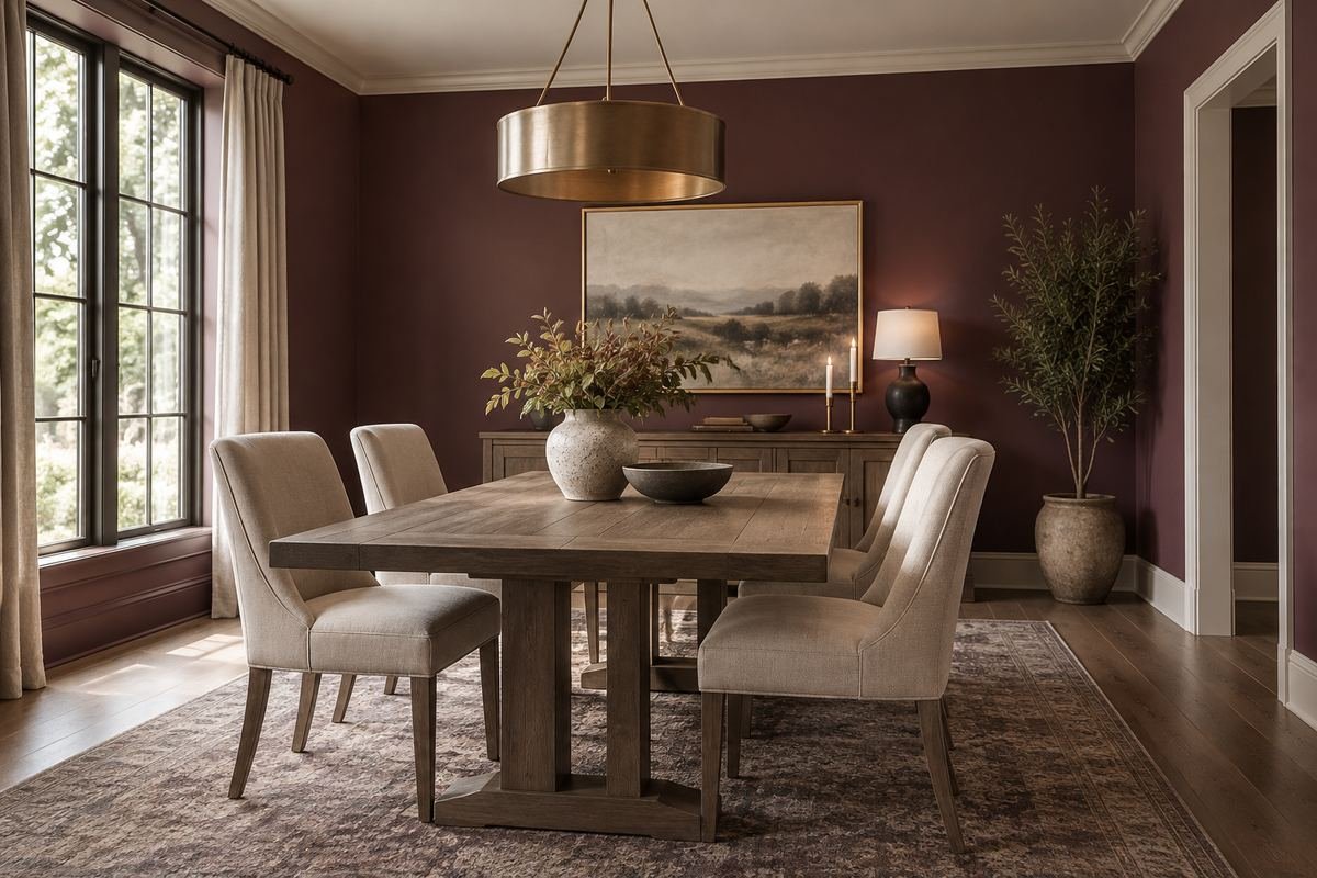
A softened plum wall can create a distinctive dining room when the furniture and textiles remain restrained. Gray-brown timber and oatmeal upholstery provide quieter companions.
Look for the balance between the red and blue in the paint sample. A more purple candidate changes the room more noticeably than a brown-based version.
Practical tip: Compare different undertones at similar depth.
20. Use charcoal with clearly visible furniture edges

Charcoal can make pale upholstery and lighter timber stand out. The result is easier to read when the furniture has visible contrast rather than sharing the wall’s darkness everywhere.
Check the dining room at the light level you actually enjoy. Additive lighting choices are a separate design decision from choosing a paint color.
Practical tip: Evaluate the complete evening view before committing.
21. Put a deep color above pale paneling

A deep upper wall and pale lower paneling divide the color into a clear architectural arrangement. Navy, forest green or a muted plum can all create different versions of that relationship.
Keep the top of the paneling consistent around the visible walls. The color boundary becomes an important horizontal line in the room.
Practical tip: Sketch the boundary before choosing its color contrast.
22. Carry one color across walls and suitable trim
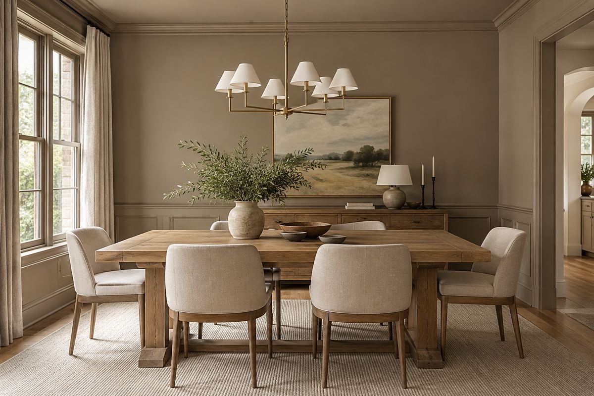
A related wall and trim color reduces the number of contrasting edges around the room. Panel relief, sheen and shadow can provide detail without a separate bright outline.
Confirm the appropriate product for each surface. A shared color does not mean that one coating is suitable for walls, timber trim and cabinetry alike.
Practical tip: Approve the finish as well as the color.
23. Connect open-plan dining room paint colors to the kitchen
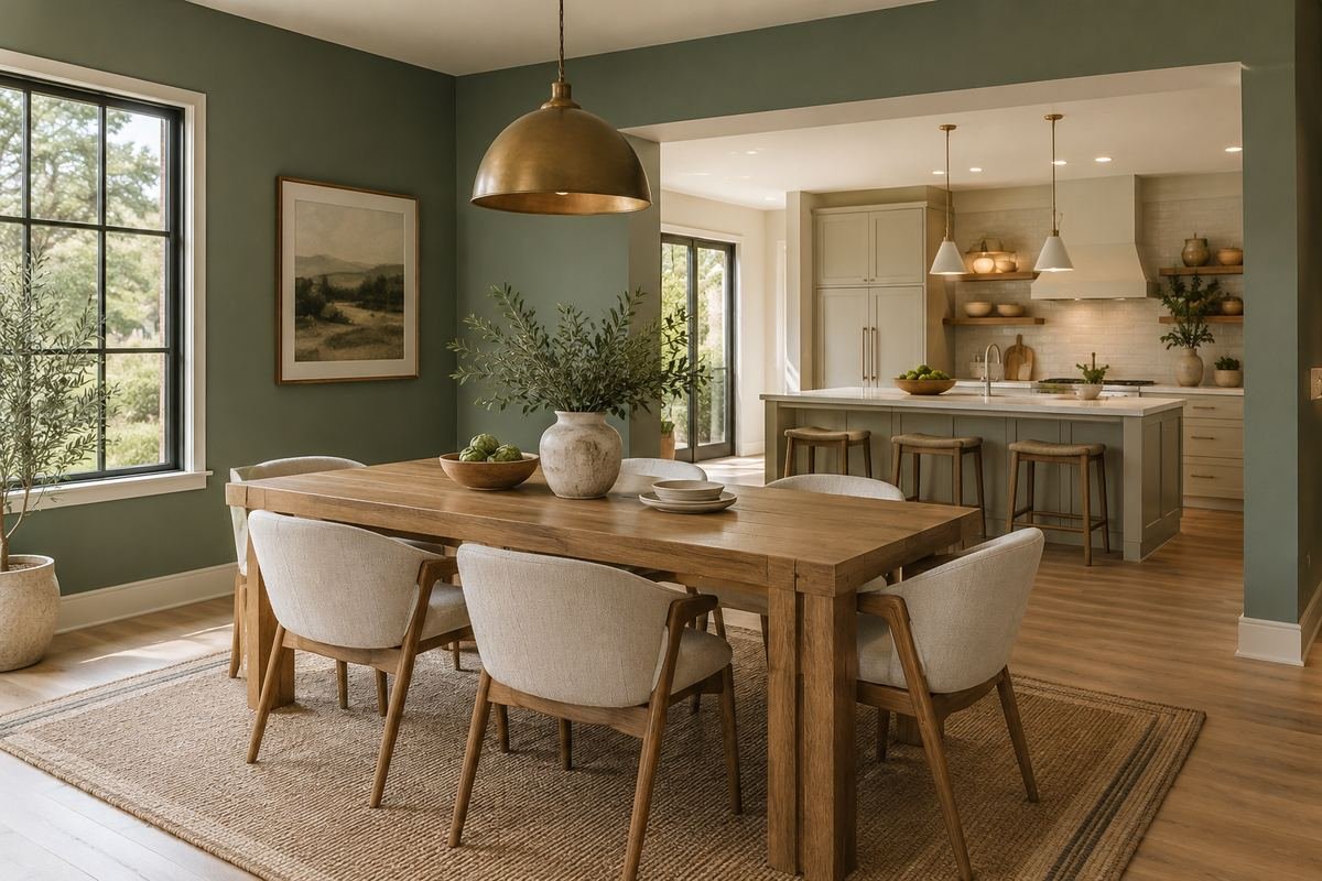
An open-plan dining area can use a wall color that relates to the kitchen without matching every cabinet. Repeating a compatible undertone gives the spaces a visible connection.
Check the long view across both areas. A color that works near the dining table may look different beside the kitchen worktop or backsplash.
Practical tip: Test the sample where both rooms can be seen.
24. Paint a dining alcove as one defined area

A dining alcove can hold a distinct color when its architectural edges provide a clear stopping point. A deeper neutral or muted hue can mark the table area without adding another furnishing.
Choose the return walls and ceiling edge before painting. A color ending halfway across an unbroken surface needs a deliberate visual reason.
Practical tip: Use existing architectural boundaries when possible.
25. Let a colorful rug guide a restrained wall choice

A rug with several colors can supply the starting point for a quieter wall. Choose one muted relationship rather than trying to repeat every accent across the room.
Keep the rug in place while testing samples. Its large area changes how a neutral or softened color appears beside the table.
Practical tip: Select the wall after the largest patterned textile.
Frequently Asked Questions
What is a good paint color for a small dining room?
Choose according to the desired contrast and the actual light. A pale neutral can connect quiet surfaces, while a deeper color can deliberately frame the table. Compare full-room relationships rather than treating room size as a rule that requires white.
Should the dining room match the adjoining kitchen?
It can, but it does not have to. Compare both rooms from the connecting doorway. Repeating an undertone or one material can connect different wall colors without making every surface identical.
Which colors work with a dark wood dining table?
Pale cream can emphasize the table shape; muted green, blue or mushroom can create a more layered palette. The wood’s particular undertone and the chairs matter more than the label dark wood alone.
Can I use a strong color above white paneling?
Yes, as a visual arrangement. Check the combined proportions, trim and ceiling. Confirm the correct coating for each substrate rather than assuming the wall product is also suitable for the paneling.
How do I choose between two similar neutrals?
Place physical samples beside the fixed materials and compare them under the same lighting. Look for whether each seems too pink, yellow, green or gray relative to the furniture. Record the result in the room.
Choose the Details That Work in Your Home
A coherent dining palette starts with the table, chairs and light you actually use. Choose a clear relationship between the walls and those surfaces, test the real color and define the finish boundaries before committing to the whole room.
For related ideas, explore dining room wall decor ideas, dining room lighting ideas, dining room rug ideas.
Planning References
Benjamin Moore: evaluating paint color samples; Benjamin Moore: warm and cool color relationships. Follow the instructions for the exact products you choose.
Optional digital guide for this topic
If you prefer a structured workbook, explore this related paid guide.