Scandinavian living room ideas can include a blue sofa, a red lamp or a patterned rug alongside light wood and useful everyday furniture. Begin with the seat and storage that already work, then choose a small number of color and shape relationships that make the room feel personal.
These 24 original contemporary concepts focus on the decorative choices that distinguish this direction: a light material backdrop, clear graphic detail and selective color. Use the color-and-pattern trial below to compare a change in your own room before turning inspiration into a shopping list.
Contents
- 1. Use pale wood as a backdrop for color
- 2. Let a saturated sofa carry the main color
- 3. Keep a gray sofa and change its companions
- 4. Introduce red through one useful small piece
- 5. Compare muted pink with blue and pale timber
- 6. Use dark blue as a stronger graphic anchor
- 7. Give a striped rug enough space to read
- 8. Put a check pattern on a removable textile
- 9. Choose a graphic artwork with a personal reason to stay
- 10. Keep the window treatment light in appearance and useful in practice
- 11. Retain a sound timber floor as part of the scheme
- 12. Compare a compact rounded coffee table with the seats
- 13. Relate two wood finishes through their visible roles
- 14. Use two small tables for separate seats
- 15. Add a curved wood-frame chair without building a period set
- 16. Let a colored cabinet earn its place through storage
- 17. Allow real book colors to become part of the room
- 18. Use one woven cabinet front for a different texture
- 19. Choose a simple pendant through the room beneath it
- 20. Try a colored lamp shade before repainting a wall
- 21. Give the reading chair a complete small setup
- 22. Plan a family cabinet around the belongings used there
- 23. Fit a small work surface into the edge of the room deliberately
- 24. Connect an adjoining dining area through one selected detail
Compare one color relationship at the scale of the room
Choose the largest retained upholstery, a wood reference and one proposed accent. Put physical samples together in the room, then compare the view from the entrance and the main seat. Include any existing graphic rug or artwork. Change one relationship at a time so the comparison can explain a decision.
A color-and-pattern trial for a Scandinavian-inspired room
- Retained reference: Record the actual sofa, floor and largest cabinet that will stay.
- Main color: Choose which substantial surface should lead the colored part of the view.
- Graphic detail: Compare one stripe, check or artwork at its intended visible size.
- Wood relationship: View the real finishes together rather than matching names or photographs.
- Light review: Compare daylight and the lighting used during an ordinary evening.
- Decision: Keep, reduce or change one relationship before ordering another item.
1. Use pale wood as a backdrop for color

A pale wood table or cabinet can give a colorful room a quieter material reference. Start with the largest timber surface already present, including the floor. Compare a new piece beside it before deciding that all woods must be the same species or shade.
Keep enough of the wood surface visible to understand its grain. Let the colored upholstery or artwork provide a separate role rather than covering every horizontal surface with matching accessories. A restrained backdrop can make a small amount of color easier to judge.
2. Let a saturated sofa carry the main color

A blue, green or red sofa can be the main colored area in a Scandinavian-inspired room. Compare its actual fabric with the wall, floor and rug before adding smaller accents. The sofa occupies a substantial part of the view, so a tiny swatch on its own is an incomplete comparison.
Keep the surrounding pieces useful and comparatively simple. Choose the sofa for comfort, dimensions and care as well as color. If the existing sofa is already the right saturated tone, build around it instead of buying a new suite to complete a style label.
3. Keep a gray sofa and change its companions

A gray sofa can remain the useful neutral within a more colorful scheme. Try one clear accent beside its actual fabric and review the retained floor at the same time. A cool blue-gray sofa may need different companions from one with a warmer brown-gray direction.
Use a substantial textile or artwork for the first comparison rather than scattering several tiny colored objects. Keep the sofa visible while testing. This lets you judge whether the new relationship works with the furniture you own, rather than with an imagined replacement.
4. Introduce red through one useful small piece
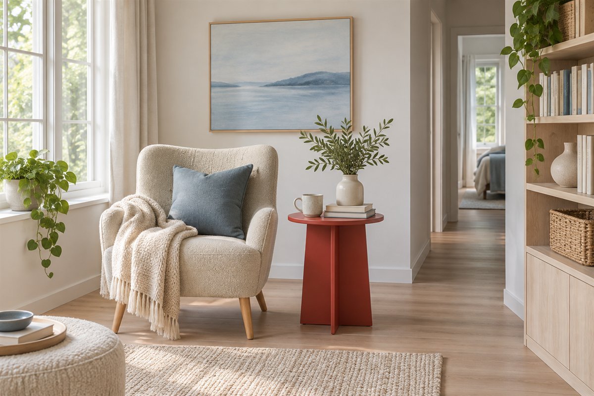
A red side table or lamp can provide a concentrated accent without changing the large upholstery. Choose a piece that already has a task, such as holding a cup beside a chair. Compare its outline from the entrance and from the occupied seat.
One small colored piece may be enough when a room already contains strong book spines or artwork. Avoid purchasing a second item solely to make the color appear at regular intervals. Keep the useful footprint and normal reach more important than the decorative repeat.
5. Compare muted pink with blue and pale timber

A muted pink textile can sit beside a blue accent without making the whole room pastel. Compare the shades with the actual wood and larger upholstery. Let one color occupy a broader surface and the other appear more selectively so the relationship remains legible.
Try the combination with pieces you can move before changing a fixed finish. A cushion and a borrowed artwork can answer the first color question. Keep both together in the room through daylight and an ordinary evening before expanding the palette.
6. Use dark blue as a stronger graphic anchor

Deep blue can provide a darker edge in a light room without requiring black outlines everywhere. Compare one larger area, such as a chair or cabinet, with the wall and floor. The strongest contrast may already exist in a television or window frame.
Keep the dark element related to a real furniture need. A blue cabinet can supply useful storage as well as color, while an extra chair that is never used may only narrow the route. Review the full piece before selecting small accessories to match it.
7. Give a striped rug enough space to read

A striped rug can establish the main graphic pattern beneath comparatively plain furniture. Mark its proposed outline with the seats in their normal positions. Compare the stripe direction with the room entrance, sofa and visible floor instead of assuming one direction always enlarges a space.
Choose the actual rug through its construction, care and floor compatibility. Keep nearby textiles simpler while evaluating the pattern. The rug should support the occupied seating group, not become an isolated rectangle that looks balanced only when the furniture is pushed away.
8. Put a check pattern on a removable textile

A checked cushion or throw offers a smaller way to introduce geometry. Compare its scale with the size of the seat and any existing pattern. A large check and a tiny check have different visual weight even when their colors are similar.
Start with one textile you will actually use and inspect its care information. Keep enough plain upholstery visible for the pattern to remain distinct. If the room already has a strong striped rug, test the check beside it before buying several coordinating covers.
9. Choose a graphic artwork with a personal reason to stay

A clear abstract shape or a personally selected print can provide the main wall color. Compare the entire frame outline with the furniture below it. Include the visible margin around the work instead of choosing a size from a cropped online image.
Use original or properly licensed artwork and an appropriate mounting method for the actual wall. A Scandinavian direction does not require copied commercial posters, generic slogans or a famous designer motif. Let the work establish a color relationship that the rest of the room can support.
10. Keep the window treatment light in appearance and useful in practice

Plain curtains can relate to a simpler palette while still serving the room’s light-control and privacy needs. Check where the fabric gathers when open and whether the window remains usable. A bulky stack may occupy the part of the opening you wanted to keep clear.
Choose real fabric and treatment performance before judging a daytime rendering. A sheer appearance cannot establish privacy after dark. Review the occupied seats for glare and keep suitable control of the window instead of removing a necessary layer merely to imitate a photograph.
11. Retain a sound timber floor as part of the scheme

A useful existing wood floor can guide the next material decision. Compare its tone with the sofa, cabinet and intended rug before planning a replacement. A slightly darker or warmer floor can still belong in a Scandinavian-inspired room.
Keep refinishing, surface treatments and product care separate from the style decision. An image cannot identify a floor’s construction or establish that it can be sanded. Begin with a visual comparison and a clear account of the actual floor before proposing work.
12. Compare a compact rounded coffee table with the seats

A round or softly rounded tabletop can change the relationship between a rectangular sofa and nearby chairs. Test its complete outline, base and useful height in the real arrangement. Rounded edges still occupy floor space and do not guarantee an easier route.
Keep enough tabletop for the ordinary shared task. A very small sculptural table may be inconvenient when two people need somewhere to put a drink. Compare reach from the occupied seats before accepting a pleasing shape as the solution.
13. Relate two wood finishes through their visible roles

Two different timber finishes can remain distinct rather than becoming an imperfect matched set. Let the larger floor or cabinet establish the main relationship, then compare the second finish at its actual scale. Grain, sheen and undertone all affect the view.
Avoid adding a third large wood piece merely to connect the first two. Try a simpler rug or textile beside the retained furniture before buying. Keep finish care and construction information with the actual products; the visual exercise does not identify species or provenance.
14. Use two small tables for separate seats
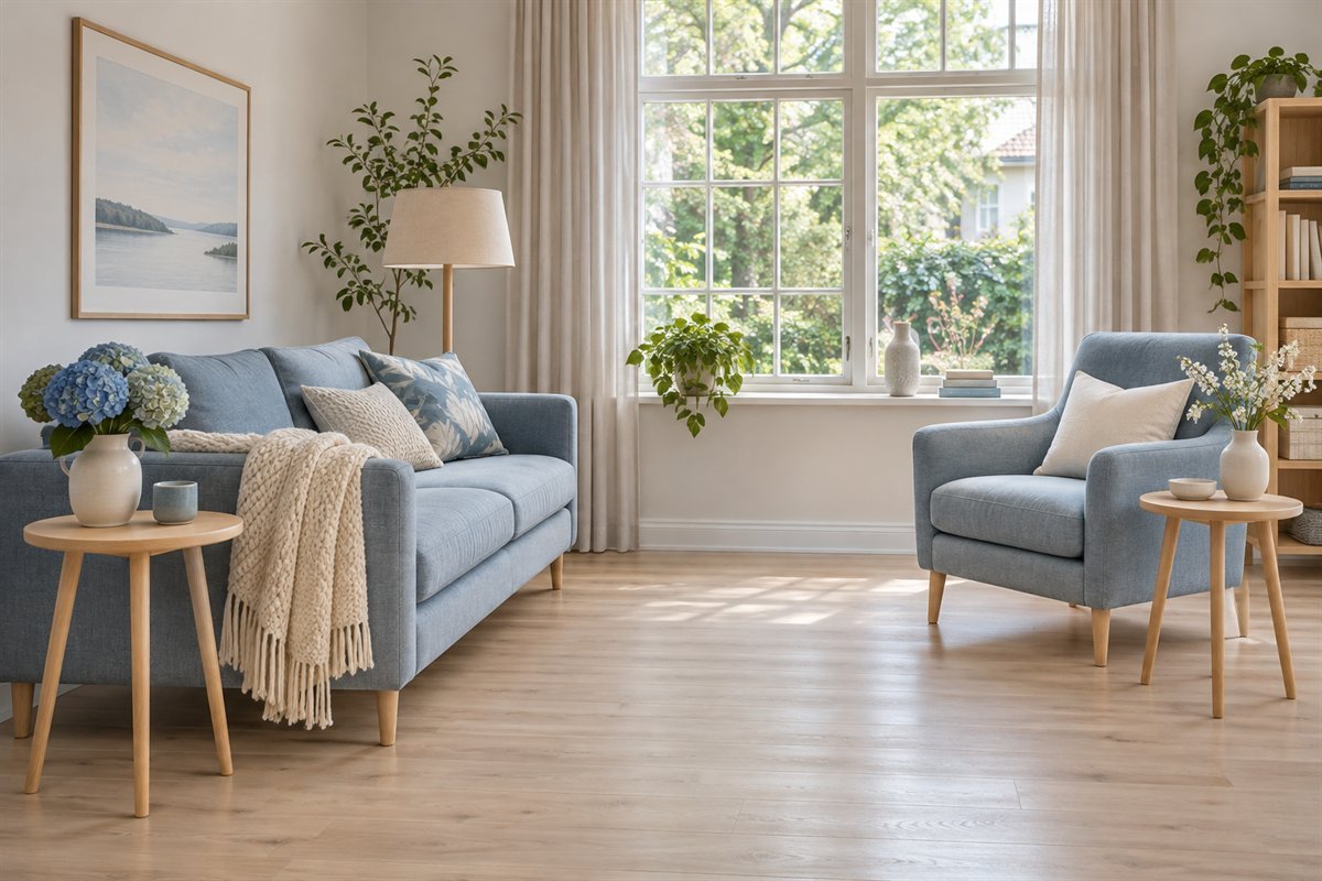
Two small tables can serve different seating positions when one central surface is awkward to reach. Compare each table while someone occupies the nearby seat, including the room left for standing and passing. Keep the tables out of the route when their use is finished.
Choose pieces that can be moved as intended by their actual design. A narrow base, a heavy top or an unstable floor can change the practical decision. The benefit is separate useful surfaces, not a requirement to buy a coordinated nesting set.
15. Add a curved wood-frame chair without building a period set

A curved or visibly open timber frame can provide a different outline beside upholstered seating. Compare its arm position, support and occupied footprint in person where possible. Its appearance alone cannot tell you whether the chair suits a long reading session.
Treat an older piece through its actual condition and documented origin. New furniture can provide the outline without pretending to be an authenticated design icon. A single useful chair can contribute character while the rest of the room remains contemporary.
16. Let a colored cabinet earn its place through storage

A green, blue or muted yellow cabinet can provide a substantial color block below a quieter wall. Choose its usable interior around the belongings that return there. Include the open door or drawer in the layout rather than judging only the closed elevation.
Keep the top available for one clear purpose, such as a lamp or a short personal display. Follow the actual furniture’s stability and installation information. A colored finish can unify useful storage without making every neighboring accessory part of a matching collection.
17. Allow real book colors to become part of the room

An ordinary book collection can supply color without decorative editions bought for their spines. Group it for the way you browse and return the books. Keep the shelf arrangement suited to the real sizes, including larger volumes that do not fit a narrow compartment.
Compare the complete shelf from the seats before adding another patterned surface nearby. Books do not have to be turned backward to suit the scheme. Follow the actual furniture’s load and stability guidance and keep a useful collection easier to find rather than harder to recognize.
18. Use one woven cabinet front for a different texture

A woven-looking cabinet front can vary the surface beside plain upholstery and smooth wood. Compare how much texture is visible from the normal seat. One useful storage piece may supply enough variation without adding woven chairs, baskets and shades everywhere.
Check the actual material, interior access and care requirements. The open appearance of a weave does not establish a cabinet’s suitability for electronics or guarantee ventilation. Choose it for the belongings and task it can properly serve, then assess the decorative relationship.
19. Choose a simple pendant through the room beneath it

A broad rounded shade can relate to plain furniture without becoming an oversized object in the room. Compare its position with the actual ceiling height and the circulation below. Keep the complete approved fitting and installation requirements part of the decision.
Review the light from the occupied sofa and chair after dark. A soft-looking shade does not establish adequate brightness or comfortable glare control. Let other appropriate lighting support tasks that a central fitting does not serve well.
20. Try a colored lamp shade before repainting a wall

A useful table lamp can bring a smaller colored area into a room that already works. Compare the shade beside the sofa fabric and the wall behind it. The apparent color may change when the lamp is lit, so review both states before expanding the scheme.
Choose a compatible complete lamp and suitable light source through their instructions. Keep controls convenient and the base stable. A lamp introduced for color should still be useful during an ordinary evening, with its cable appropriately managed.
21. Give the reading chair a complete small setup

A reading place needs a comfortable seat, suitable light and a reachable place for the book or cup. Compare those three pieces together before selecting their style. A light wood frame or a colorful shade can connect the corner to the larger room without adding more furniture.
Use the corner at the normal reading time and note the specific inconvenience. Keep a working chair if the real problem is glare or a missing surface. The Scandinavian influence can come through the resolved group rather than through a complete replacement.
22. Plan a family cabinet around the belongings used there

Games, drawing supplies and blankets can have a convenient return point within the main seating area. Compare the actual collection with the cabinet compartments and opening. Avoid planning storage around almost-empty display baskets that cannot hold the household’s ordinary items.
Choose furniture and small-item arrangements appropriate for the household, following stability guidance. Color can identify a useful compartment without requiring labels on every surface. Keep the occupied floor and the return routine in the room plan from the start.
23. Fit a small work surface into the edge of the room deliberately

A living room that also supports occasional paperwork needs the whole working position considered. Include the chair in use, the light and the place where papers return. A narrow tabletop alone is not evidence that the corner works as a full-time workstation.
Choose equipment and dimensions for the actual task. Relate the desk to the main room through one wood finish or color, while keeping suitable task lighting and access. When the work is finished, the return point should not transfer the pile to the sofa.
24. Connect an adjoining dining area through one selected detail

An open living and dining room can share a timber tone or a modest color without using identical furniture. Compare both groups with their chairs occupied. The shared view matters, but it should not make the route between seating and dining less convenient.
Choose the connection from a piece you intend to keep, then test one repeat. A blue textile in the living area and a quieter blue artwork near the table may be enough. Let each activity retain the furniture and light that serve it.
A contemporary direction with room for color
IKEA’s Scandinavian living-room guidance brings together simple useful furniture, light timber, color and graphic textiles. Its separate colorful room example also shows that related hues need not match exactly. These are contemporary retail interpretations, not a complete history or a requirement to buy a particular collection.
Designmuseum Danmark’s Danish Modern exhibition follows a varied design history, including work beyond the familiar pale-wood image. Danish Modern is one reference within a wider field. This guide offers contemporary room ideas rather than authenticating furniture or treating every Nordic tradition as one identical style.
Run the color-and-pattern trial before expanding the scheme
Start with a short written brief rather than a list of products. Name the room, the pieces that will stay and the one relationship you want to investigate. For example: the blue sofa works, but the rug and wall art compete; or the gray sofa and wood floor work, but the room needs one clearer colored feature. A specific question makes the comparison useful.
Gather the actual samples available to you: upholstery, proposed rug or curtain, paint sample if relevant and a representative wood finish. Keep unknown materials marked unknown. Use the real room as the background instead of a white screen, because the retained floor and furniture affect the comparison. A photograph is a reminder of the arrangement, not a reliable color measurement.
Give the proposed graphic detail enough visible area to judge its scale. A tiny piece of striped fabric cannot show how a full rug repeats across the seating group. Lay out the intended outline with suitable removable paper or another recoverable method that will not damage the floor. Compare the pattern with the room from the entrance and from the normal seat. Do not walk on loose sample materials or leave them in the route.
Review the same group in ordinary daylight and with the lamps normally used after dark. Note what changes: a blue becomes grayer, a cream looks yellow beside the wood, or the graphic detail overwhelms the smaller textile. These observations are specific to the actual room and products. They are more useful than an assertion that one neutral or accent is correct for every Scandinavian-inspired interior.
Make a decision about one relationship. Keep the sofa and reduce a competing rug pattern, retain the plain rug and try a stronger artwork, or keep both and investigate a different curtain. Record what stayed and why. There is no compulsory color ratio or fixed number of patterned objects; the exercise is intended to prevent several untested purchases from becoming one expensive uncertainty.
A hypothetical room might contain a sound gray sofa, a honey-colored floor and a small patterned rug that the household likes. The first trial could place a blue fabric sample beside the sofa while the existing rug remains visible. If the combination competes, compare a plain textile before assuming the floor needs changing. This is an original planning example, not a tested client room or a promise that blue will suit every gray sofa.
Choose useful details before calling the room finished
Review the room during a normal evening. Check the reach to the side surface, the book light, the cabinet opening and the route to the window. Color and pattern should support a room that already works. Resolve the actual product’s care, dimensions, stability, equipment and installation requirements independently of its appearance.
Keep the scheme open to personal belongings. A familiar book collection, a repaired cabinet or an inherited chair can remain a meaningful part of the room. Choose the next decorative relationship around those pieces instead of replacing them to make the room resemble a uniform online image.
Does a Scandinavian living room have to be white and beige?
No. Contemporary interpretations can include saturated upholstery, primary-colored details and graphic textiles. Compare those choices with the substantial furniture and finishes you actually keep.
How can I add color without replacing the sofa?
Try one useful small piece, a textile or a personally chosen artwork beside the actual sofa fabric. Review the relationship in the room before repeating the accent.
Can I keep a darker floor or older furniture?
Yes. Use its actual tone, condition and function as part of the brief. Light timber can be one companion rather than a reason to replace all existing wood.
How is this different from the Japandi guide?
This article focuses on a contemporary Scandinavian color and graphic-pattern direction. The Japandi guide separately considers Japanese and Scandinavian influences through materials and everyday routines.
Do I need designer originals to use these ideas?
No. Choose sound furniture that fits the household. Verify provenance independently when purchasing an item described as an authenticated historical design; the illustrations make no such claim.
A practical next step
Choose one clear color relationship, a wood reference that belongs to the real room and a graphic detail you enjoy. Test them together, then keep the furniture, storage and light useful during an ordinary day. The result can feel personal without requiring a matched suite or a completely new interior.
Explore the separate Japandi material-and-routine approach. Try editing an existing room before replacing useful furniture. Compare living room paint colors with the pieces you keep.
Images are original AI-generated contemporary Scandinavian-inspired concepts, not exact manufacturer products, authenticated historic rooms or measured furniture plans. The trial and example are original planning aids.
Sources and care references
- IKEA: contemporary Scandinavian color, pattern and material guidance
- IKEA: a contemporary colorful Scandinavian room interpretation
- Designmuseum Danmark: Danish Modern in its wider design history
Optional digital guide for this topic
If you prefer a structured workbook, explore this related paid guide.