Japandi living room ideas can connect simple furniture, considered materials and personal belongings without requiring an empty room. Begin with comfortable seating and the pieces you want to keep. Then choose a few deliberate relationships in wood, textile, shape and light that support the room’s daily use.
IKEA presents Japandi as a contemporary meeting of Japanese and Scandinavian design influences. Use that broad reference as a starting point rather than a complete account of either tradition. These 29 original room concepts offer choices for different homes, followed by a practical record for comparing materials and reviewing an ordinary day in the room.
Contents
- 1. Keep the seat height that suits your household
- 2. Balance solid upholstery with one open-frame chair
- 3. Let an existing gray sofa set the neutral direction
- 4. Give dark wood a deliberate role
- 5. Compare wood samples as a group
- 6. Let one useful wood surface show its grain
- 7. Use a dark outline as a quiet connection
- 8. Introduce clay color through one modest textile
- 9. Create interest through a visible weave
- 10. Choose upholstery care before choosing the palest fabric
- 11. Make the rug a quiet field around the seats
- 12. Try an oval table when its outline helps
- 13. Let a side table serve a room without a central table
- 14. Combine a small open display with concealed storage
- 15. Use a plain cabinet front to quiet a busy collection
- 16. Leave breathing room around one personal object
- 17. Give a simple stem arrangement a stable place
- 18. Compare one ceramic shape with the furniture
- 19. Choose original artwork rather than a set of cultural props
- 20. Use a soft-looking shade through its real light
- 21. Keep the reading seat useful after dark
- 22. Let curtains answer the privacy question
- 23. Treat the screen as one dark shape in the room
- 24. Plan where everyday connections remain accessible
- 25. Choose one woven companion for material contrast
- 26. Connect the living and dining areas with one quiet repeat
- 27. Give family belongings a convenient return point
- 28. Let the room show an evening in progress
- 29. Keep one feature that makes the room yours
Choose useful simplicity before a complete new look
List the activities and substantial furniture that already work. Choose the next change because it resolves a named conflict: an unrelated finish, a difficult surface, missing storage or light at an occupied seat. Compare actual samples and product information, then let decorative decisions build around those observations. The illustrations show contemporary concepts rather than measured layouts or authentic historic rooms.
Choose the relationship to resolve first
- The seating works but the room feels disconnected: Compare the next large textile with the retained sofa and floor.
- Belongings repeatedly cover the tables: Give the recurring items a convenient storage point.
- Several materials compete equally: Choose the retained material that should lead and simplify its companions.
- The reset view looks good but use is awkward: Review an ordinary evening before buying more decor.
1. Keep the seat height that suits your household

Begin with a sofa people enjoy using, including its seat height, depth and support. A low-looking silhouette is an option, not an obligation. Compare the whole piece with the people and routines it serves before judging how minimal it looks. If your existing sofa works, keep its comfortable proportions and develop the material relationships around it.
Write down what the current seating does well before making a replacement list.
2. Balance solid upholstery with one open-frame chair

A visibly open chair frame can provide a different rhythm beside a substantial sofa. Compare the side view and the space occupied by the back, arms and cushions. An open frame does not automatically mean a small footprint or comfortable seat. Choose one chair for the way it will be used, then let the structural contrast supply the decorative interest.
View the chair beside the sofa rather than choosing it from an isolated product photograph.
3. Let an existing gray sofa set the neutral direction

A gray sofa can belong in the palette without being disguised under layers of beige fabric. Compare its actual undertone with the wall, floor and next substantial textile. A warmer gray may relate differently to oak or cream than a cooler one. Keep the sofa visible while testing the companions so the final room is built around the material that is really there.
Bring the proposed rug or curtain sample beside the sofa in daylight and evening light.
4. Give dark wood a deliberate role
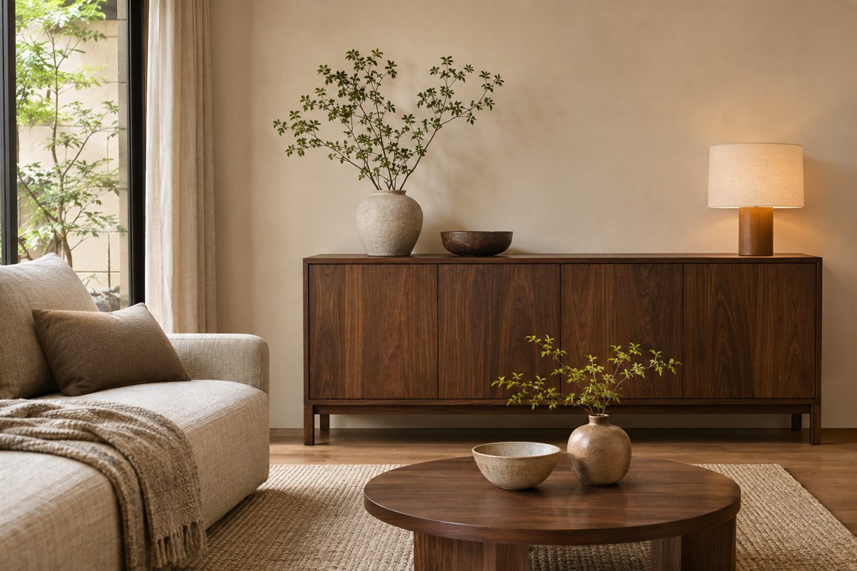
A dark cabinet can provide a settled contrast in a light room. Decide whether it is the main dark area, then compare the other large surfaces before repeating the finish. The room can remain restrained even when its wood is deep brown rather than pale. Use the existing useful cabinet as a reference instead of purchasing several nearly matching pieces.
Choose the main wood relationship from the largest piece you intend to keep.
5. Compare wood samples as a group

Different woods do not need to match exactly, but the relationship should be considered together. Put samples beside the actual floor and retained furniture. Notice whether a new finish introduces a strong pink, yellow or gray direction that was absent from the room. A photograph cannot settle species, construction or finish care, so separate the visual comparison from the product specification.
Photograph the samples together as a reminder, then make the final judgment in the room.
6. Let one useful wood surface show its grain

One clear grain pattern can supply interest without another printed layer. Keep enough of the surface visible to appreciate its variation while leaving room for everyday use. Choose the actual finish for the household and follow its care instructions. A wood-look image does not establish whether a table is solid timber, veneer or another construction.
Resolve the tabletop’s practical use and care before choosing decorative objects for it.
7. Use a dark outline as a quiet connection

A dark line in a lamp, frame or furniture base can connect otherwise soft surfaces. Choose a small relationship instead of outlining every object in black. Look across the room to see whether the line helps the furniture read clearly or starts competing with it. The useful amount depends on the existing windows, screen and other dark features.
Count the dark elements already present before adding another matching accessory.
8. Introduce clay color through one modest textile

A restrained clay, olive or muted blue accent can make the room personal without changing every large surface. Choose one color you enjoy and compare it with the retained upholstery. It does not need to be repeated at equal intervals. A single substantial textile or artwork may provide a clearer relationship than several small objects selected only to match.
Try an existing textile first and assess the whole room before expanding the accent.
9. Create interest through a visible weave

Texture can differentiate similar colors at the place where people sit. Compare a smoother upholstery with one more visible weave rather than layering several bulky textiles. Check the fabric’s actual composition and care information; a rough-looking surface in a rendering does not tell you how it feels or cleans. Keep only the layers that remain comfortable during normal use.
Handle a real sample and test the combination against the sofa before ordering.
10. Choose upholstery care before choosing the palest fabric

The most useful neutral is one you are prepared to maintain. Compare the maker’s cleaning instructions, cover construction and any limitations before committing to a pale seat. A washable appearance or removable-looking cushion does not establish that a cover is machine washable. Let the real care requirements influence the color and texture decision instead of treating maintenance as a later problem.
Keep the exact fabric and care details in the room record before buying a large upholstered item.
11. Make the rug a quiet field around the seats
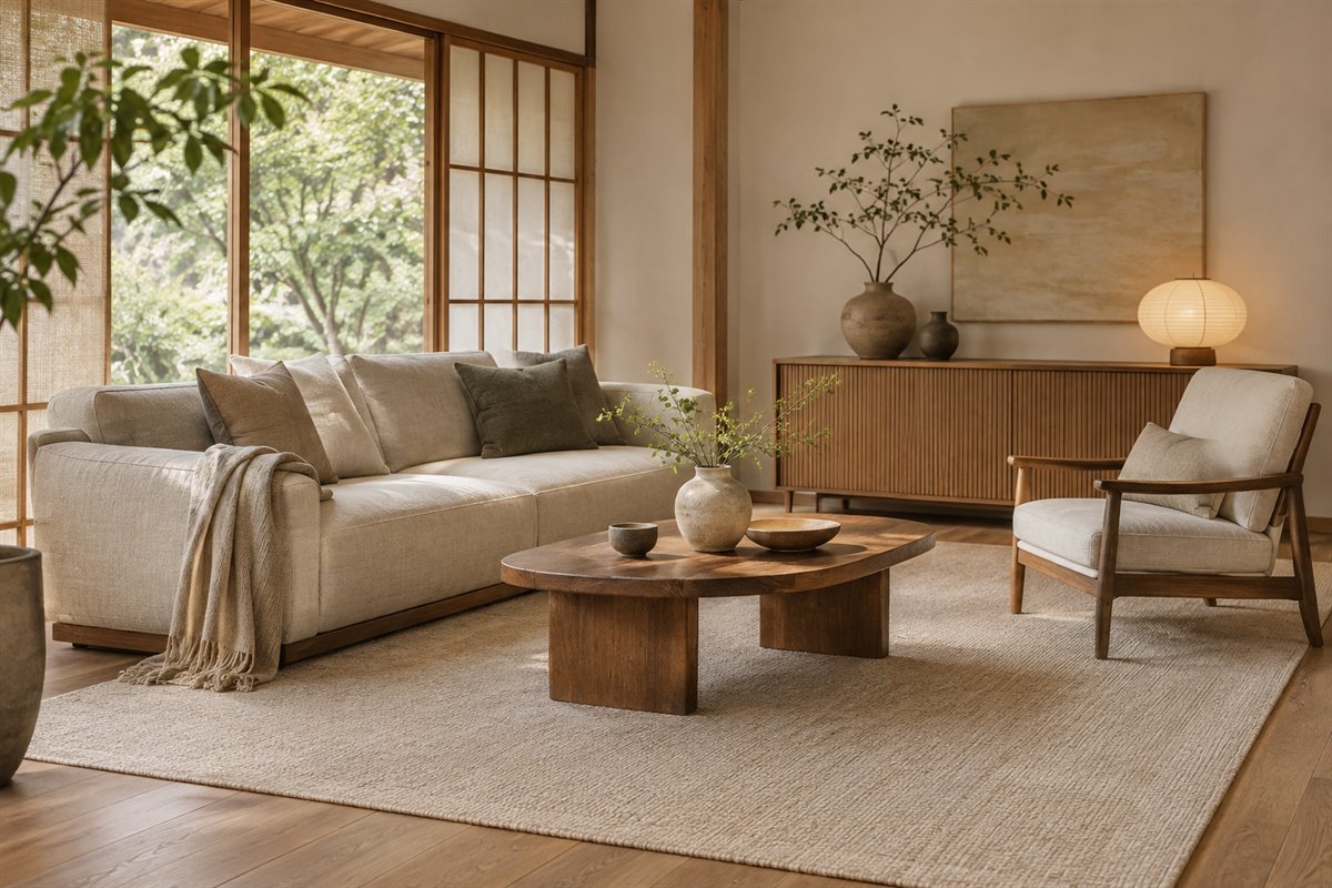
A comparatively quiet rug can relate the seating without becoming a second collection of motifs. Compare its proposed footprint with occupied chairs, tables and the visible floor. Then examine the actual fiber, edge and suitable floor or underlay guidance. A neutral color is a compositional choice; it does not determine comfort, durability or how a rug behaves in use.
Mark the outline first, then compare the real surface with the upholstery.
12. Try an oval table when its outline helps
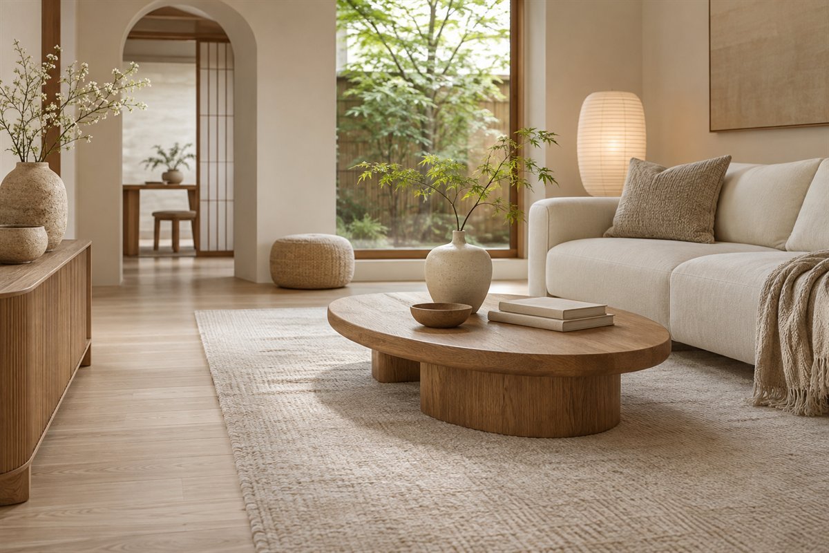
An oval outline can soften the relationship between rectangular seating and storage. Compare the complete top and base with the way people reach a drink or move past the sofa. Rounded ends still occupy space and do not guarantee an easy route. Choose the table through its actual dimensions, support and daily task rather than through a style label alone.
Compare a paper oval with the existing table footprint while the seats are occupied.
13. Let a side table serve a room without a central table

A room does not need a central table merely to complete a familiar photograph. If its main use is conversation, reading or flexible floor space, compare a useful side surface instead. Check the reach from the seat and where shared belongings will go. Keep the center open because it supports the room’s actual activity, not because emptiness is a goal by itself.
Use the room for an evening before deciding which surface is missing.
14. Combine a small open display with concealed storage

Divide storage according to what should remain visible. A few books or objects can occupy an open area while less attractive supplies have a convenient home behind doors. Avoid choosing the open-to-closed balance from a staged product image with almost no contents. List the belongings first and follow the actual furniture’s load, stability and installation guidance.
Check the usable compartments against the real collection before choosing the cabinet face.
15. Use a plain cabinet front to quiet a busy collection

A plain front can let a room contain an ordinary collection without displaying every item. Compare handles, drawer travel and internal access as carefully as the attractive elevation. Storage that is awkward to reach often sends belongings back onto nearby surfaces. Keep the cabinet’s top available for one useful role rather than treating it as another shelf to fill.
Name the items that return there each day and choose the interior around them.
16. Leave breathing room around one personal object

An object you value becomes easier to notice when it has a considered place. Try a limited group, then compare the view from the normal seat. Keep some surrounding surface unoccupied without removing everything personal. This is an editing exercise rather than a rule about owning a fixed number of objects, and the collection can change as the room is used.
Choose the object for its meaning or form before buying a display accessory to surround it.
17. Give a simple stem arrangement a stable place

A modest arrangement can introduce an irregular line beside simpler furniture. Choose the actual plant material for the household and an appropriate container, then keep it away from the ordinary route. A generated image cannot establish species suitability or a vessel’s watertightness. The composition can remain small; a dramatic branch is unnecessary if it overwhelms the surface.
Check the real container and position before adding plant material.
18. Compare one ceramic shape with the furniture

A rounded or irregular vessel can offer a different outline beside a straight cabinet. Judge the complete object and the empty surface around it instead of collecting many similar ceramics at once. Matte-looking finishes and handmade-looking shapes vary in actual care and construction. Choose the object for the intended use and keep decorative appearance separate from claims about food suitability or origin.
View the object from across the room before adding a second one.
19. Choose original artwork rather than a set of cultural props

A restrained room can hold artwork with personal meaning or a clear shape relationship. It does not need generic calligraphy, a copied print or a collection of symbols to establish a style. Compare the full frame and suitable mounting with the furniture below it. Let the work provide a deliberate focus rather than filling every wall gap with another coordinated image.
Choose the artwork first and test its complete footprint before hanging.
20. Use a soft-looking shade through its real light

A rounded translucent-looking shade can relate to plain textiles and soften the appearance of a fitting. Judge the actual light from the seats and the room’s normal activities. Appearance alone cannot establish brightness, glare control or material suitability. Choose a complete approved fitting and appropriate installation rather than treating a decorative shade as interchangeable with any light source.
Review the fixture, lamp specification and occupied view together.
21. Keep the reading seat useful after dark

A room can look quiet in daylight while still needing a useful reading light. Start with the occupied chair and the book or activity, then compare the light and controls. A sculptural lamp should serve that role without placing its base in the route. Use appropriate cable management and the exact equipment instructions so visual simplicity remains connected to actual use.
Try the existing lighting during a normal evening and identify the specific shortfall.
22. Let curtains answer the privacy question
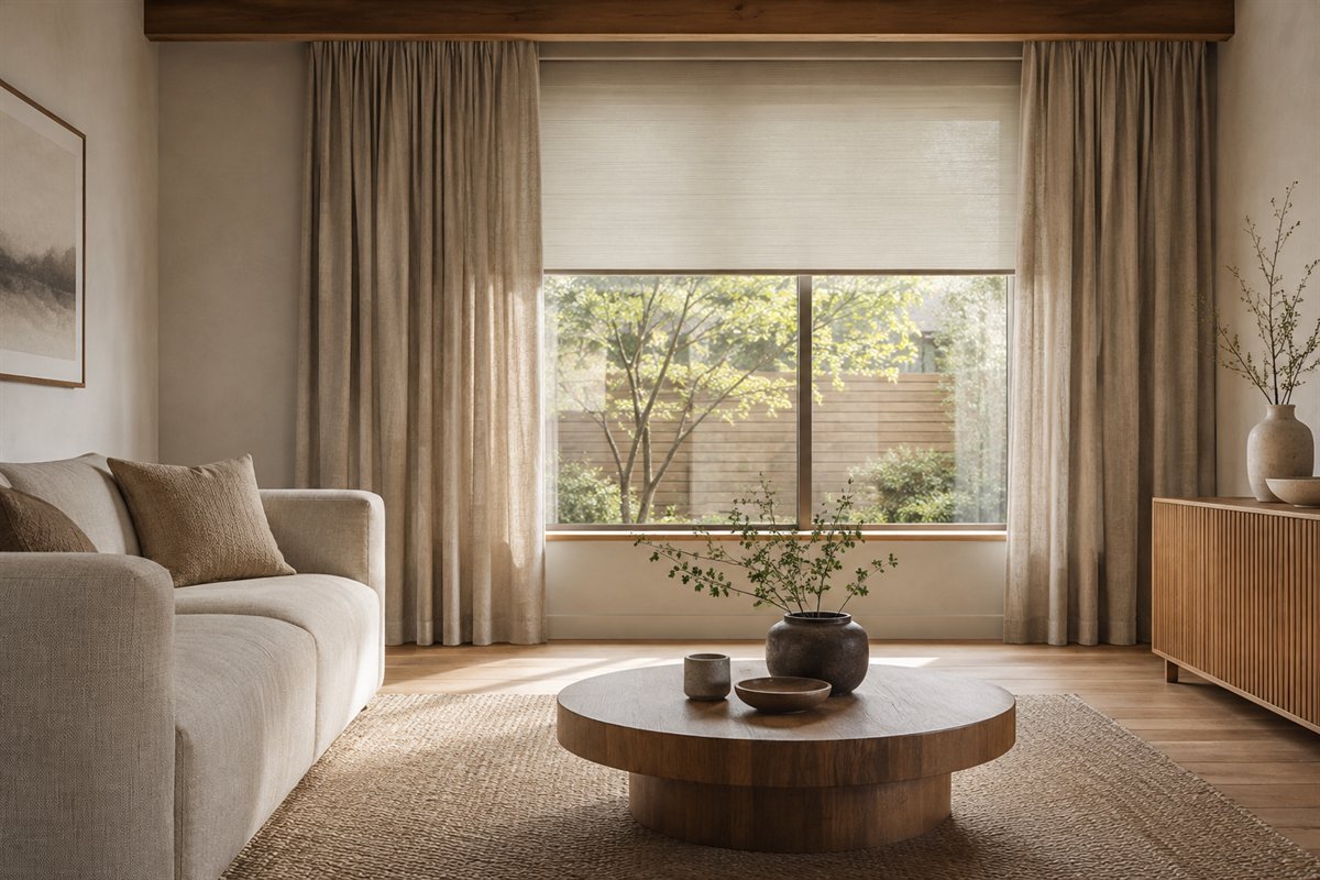
Choose the privacy and daylight control needed before deciding how minimal the window should look. A simple curtain can relate to the upholstery while another suitable treatment serves a different light-control task. Check the actual fabric and product information. A sheer-looking material does not establish privacy, and a beautiful daylight illustration cannot answer what happens when the interior lights are on.
Review the window at the time privacy matters, including after dark.
23. Treat the screen as one dark shape in the room

A television can remain visible within a considered composition. Relate its cabinet to the other furniture and avoid surrounding the screen with objects that make equipment access difficult. Choose the viewing arrangement, support and ventilation from the actual devices. Decorative restraint does not require hiding equipment behind a face that interferes with its normal operation.
Start with a working media arrangement and simplify the surrounding display.
24. Plan where everyday connections remain accessible

An orderly route for device cables can support a simple-looking room without making maintenance awkward. Identify the connections and the openings actually provided in the furniture. Keep the appropriate plugs and controls accessible and follow equipment guidance. A smooth cabinet front is not a reason to enclose unsuitable equipment or improvise concealed electrical work.
Record which connection belongs to each device before grouping the cables.
25. Choose one woven companion for material contrast
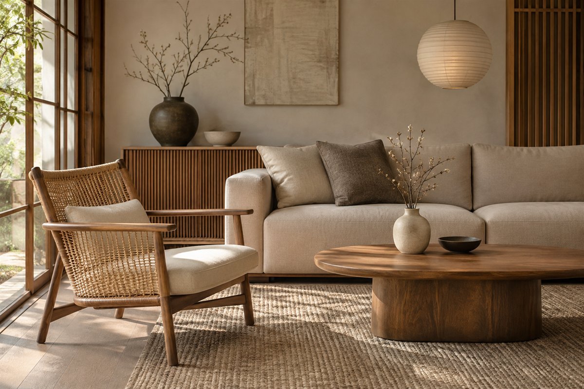
A woven-back chair can introduce a different surface beside upholstery and smooth wood. Compare the actual support, comfort, finish and care needs before selecting it as a daily seat. One such companion may provide enough variation without buying a matching woven suite. Keep the material relationship specific to the piece rather than assuming every natural-looking product has the same qualities.
Try the real chair where possible and inspect the product details independently of the style description.
26. Connect the living and dining areas with one quiet repeat

A repeated finish or textile tone can connect two activity areas while each retains useful furniture. Choose the relationship from the pieces that will stay. Then compare the room with dining chairs and living-room seats occupied. The shared view should not be improved at the expense of a route that becomes difficult whenever someone sits down.
Choose one connecting material before considering another decorative divider.
27. Give family belongings a convenient return point

A living room used by a family needs places for the actual belongings that arrive there. Choose convenient storage for the blanket, game or other recurring item rather than expecting the room to remain empty. Keep products appropriate for the household and follow their stability and installation guidance. A quiet palette can coexist with visible evidence of daily life.
Observe what remains out after a normal evening and give that item a realistic home.
28. Let the room show an evening in progress
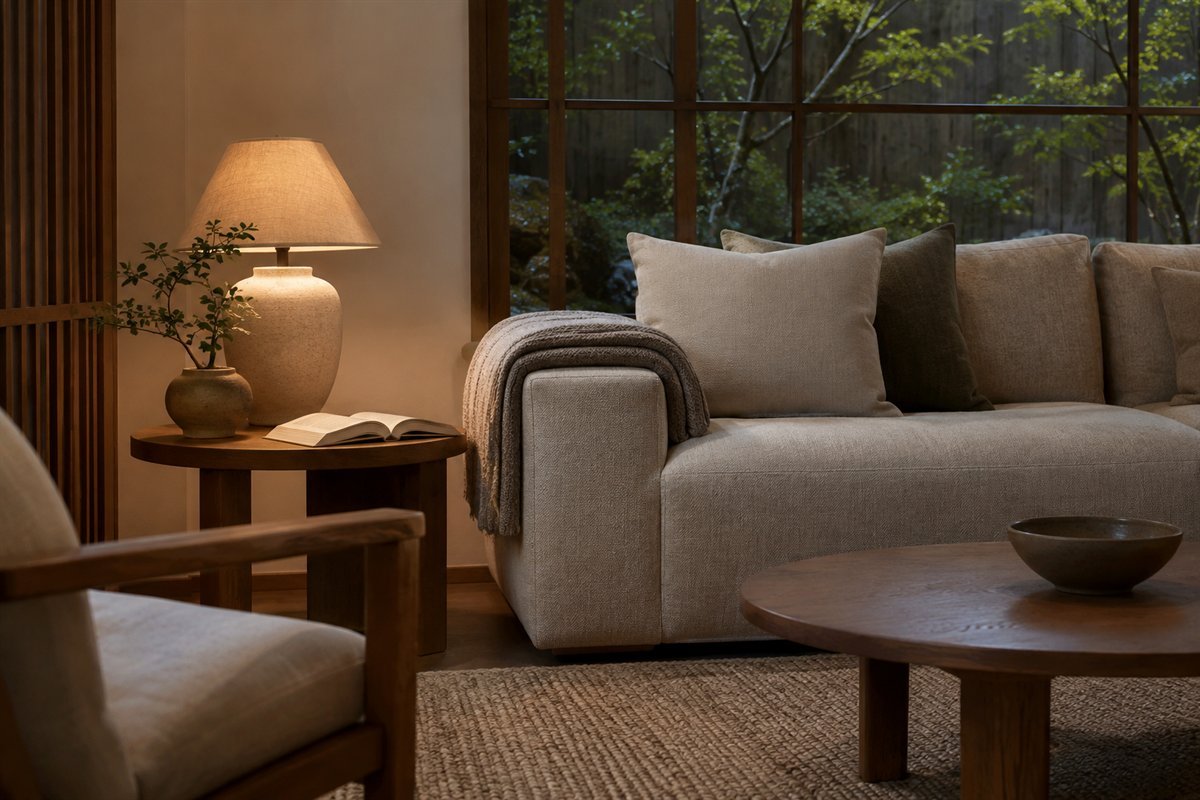
Test the finished composition during a real session instead of judging only the reset view. A book, a cup and an unfolded throw belong to the room when they are in use. Notice which surface is missing, which lamp is awkward and which storage point is inconvenient. Make the next change answer one of those observations rather than adding another decorative layer.
Record one specific adjustment after using the room normally.
29. Keep one feature that makes the room yours
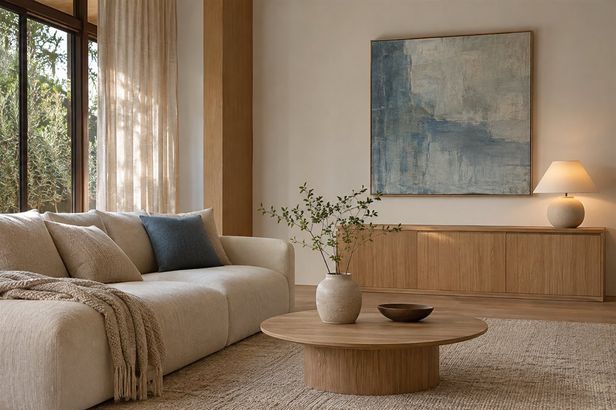
A favorite color, inherited table or personal artwork can remain even when it does not match a narrow online formula. Decide which feature you most want to preserve, then simplify the competing relationships around it. The result can express a contemporary Japandi influence without pretending to represent the full design traditions of two cultures. Keep the room connected to its actual household.
Use the material-and-routine record below to protect that personal feature while resolving practical conflicts.
An original material-and-routine record
Use two short pages for one living room. On the first, record the material relationships. On the second, record what happens during an ordinary day. This separates a visually attractive combination from an arrangement that is genuinely convenient for the household. The exercise is an original planning aid, not a measured design service or a tested product comparison.
For the material page, make one row for each substantial retained surface: floor, sofa, storage, tables, largest textile and wall. Record the actual finish or fabric if known, its visible color direction, the care requirement you can verify and the role it should play. Leave an unknown material marked unknown until the manufacturer or other reliable documentation identifies it. A wood-like photograph and a neutral color name are not specifications.
Beside each row, write lead, support or reconsider. The floor might lead because it is the largest fixed wood surface. The sofa might support through a quieter textile. A new cabinet with a strongly different undertone might need reconsideration before another object is bought to connect it. These are comparison notes, not universal rules about color ratios. A room with inherited furniture may deliberately retain a contrast that another household would simplify.
For the routine page, make three observations: the room ready for use, the room during an ordinary evening and the room after the belongings have been put away. Record what moves, what needs a surface, which light is used and where objects return. Do not stage the middle observation. Its purpose is to discover whether the attractive composition actually supports the book, game, device or conversation that takes place there.
Link the two pages through one decision. If the table fills with essential objects, another vase does not answer the problem. Compare a suitable storage point or a more useful surface. If the room works but the finishes compete, compare one substantial sample beside the retained materials. If the light is poor at a particular chair, choose the fitting through that activity before deciding which shade best expresses the decorative direction.
Finish with a small review rather than a complete shopping list. Keep the real product dimensions, finish, instructions and return conditions with the decision. Compare the change during use and note what improved. Resolve any appropriate mounting, electrical, stability or installation requirements independently. A quiet-looking room still consists of actual objects with their own limitations.
Three starting rooms to adapt
In a room with a gray sofa and dark floor, begin by comparing a quieter rug and one warm wood companion with the retained materials. Let the screen or cabinet provide the dark contrast that is already present. In a room with pale upholstery and several similar woods, choose the main grain relationship before adding more small accessories. In a family room, begin with the recurring belongings and their return points, then decide how open and closed storage should share the wall.
These are original hypothetical briefs rather than prescribed Japandi formulas. None requires replacing comfortable furniture, sitting on the floor or using only beige. Keep an individual feature that matters to you and use the record to determine which surrounding decision deserves attention next.
Does a Japandi living room have to be entirely beige?
No. A contemporary interpretation can include gray, darker wood, a muted accent or personal artwork. Compare the actual retained materials and choose a deliberate relationship rather than a compulsory palette.
Do I need very low furniture?
No. Choose seat height, support and dimensions for the people using the room. A lower-looking silhouette is a decorative option and should not override practical comfort.
Can I keep an existing sofa or inherited table?
Yes. Record what works and compare the next material or shape around it. The room can become more considered through a few resolved relationships instead of a complete replacement.
How do I keep the room personal?
Keep meaningful belongings and choose one feature you want to preserve. Give it a considered place and simplify the competing display rather than removing every sign of daily life.
Are the illustrations measured rooms or exact products?
No. They are original AI-generated contemporary concepts. Check actual furniture, materials, care, equipment and installation information independently.
A practical next step
Keep the furniture that serves the household, compare real materials together and review the room while it is being used. A deliberate relationship between useful objects can express a Japandi influence while leaving room for personal belongings and ordinary life.
Compare coffee tables through the seats they serve. Keep useful surfaces in end-table arrangements. Compare living-room curtains with actual privacy and daylight needs.
Images are original AI-generated contemporary design concepts, not exact manufacturer products, measured layouts or authenticated traditional interiors. The material-and-routine record and example briefs are original planning aids. Check real product and installation information for your home.
Sources and care references
- IKEA: contemporary Japandi influences and everyday room use
- IKEA: simple forms, material contrasts and Japandi room examples
Optional digital guide for this topic
If you prefer a structured workbook, explore this related paid guide.