Most bookshelves fall into one of two traps. Either every inch is crammed with books spine-out, or the whole thing sits half-empty because nobody knew where to start.
Getting the living room bookshelf right makes the biggest difference in how the space actually feels day to day. A well-planned living room bookshelf balances function and style, and even small tweaks to your living room bookshelf can transform the whole area.
Neither one photographs well, and neither one feels good to look at every day. The gap between a “meh” bookshelf and one that actually anchors a room usually isn’t about buying more decor.
It’s about a handful of specific styling habits that designers use over and over, whether the shelf is a full built-in unit, a freestanding bookcase, or two simple floating boards.
This guide walks through 14 of those habits in detail, with a practical tip and a common mistake to avoid under each one, so you can actually apply them today.
1. Follow the “Rule of Three” When Grouping Objects for Your Living Room Bookshelf
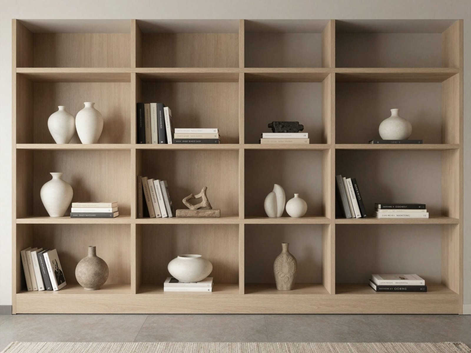
Odd-numbered groupings read as more natural to the eye than even ones. Two objects side by side can look like a matched pair waiting to be separated.
Three objects, on the other hand, almost always look intentional. It’s the single most repeated rule among professional stylists for exactly this reason.
Try it on any cluttered or empty section of your shelf before adding anything else — it will immediately tell you what’s missing or what needs to go.
💡 Smart tip: Vary the heights within each group of three — one tall, one medium, one low — so the eye has somewhere to travel.
⚠️ Mistake to avoid: Don’t group three objects that are all the same shape and material. Without contrast, the grouping reads as one blob instead of three distinct pieces.
2. Mix Vertical Stacks with Horizontal Stacks for Your Living Room Bookshelf
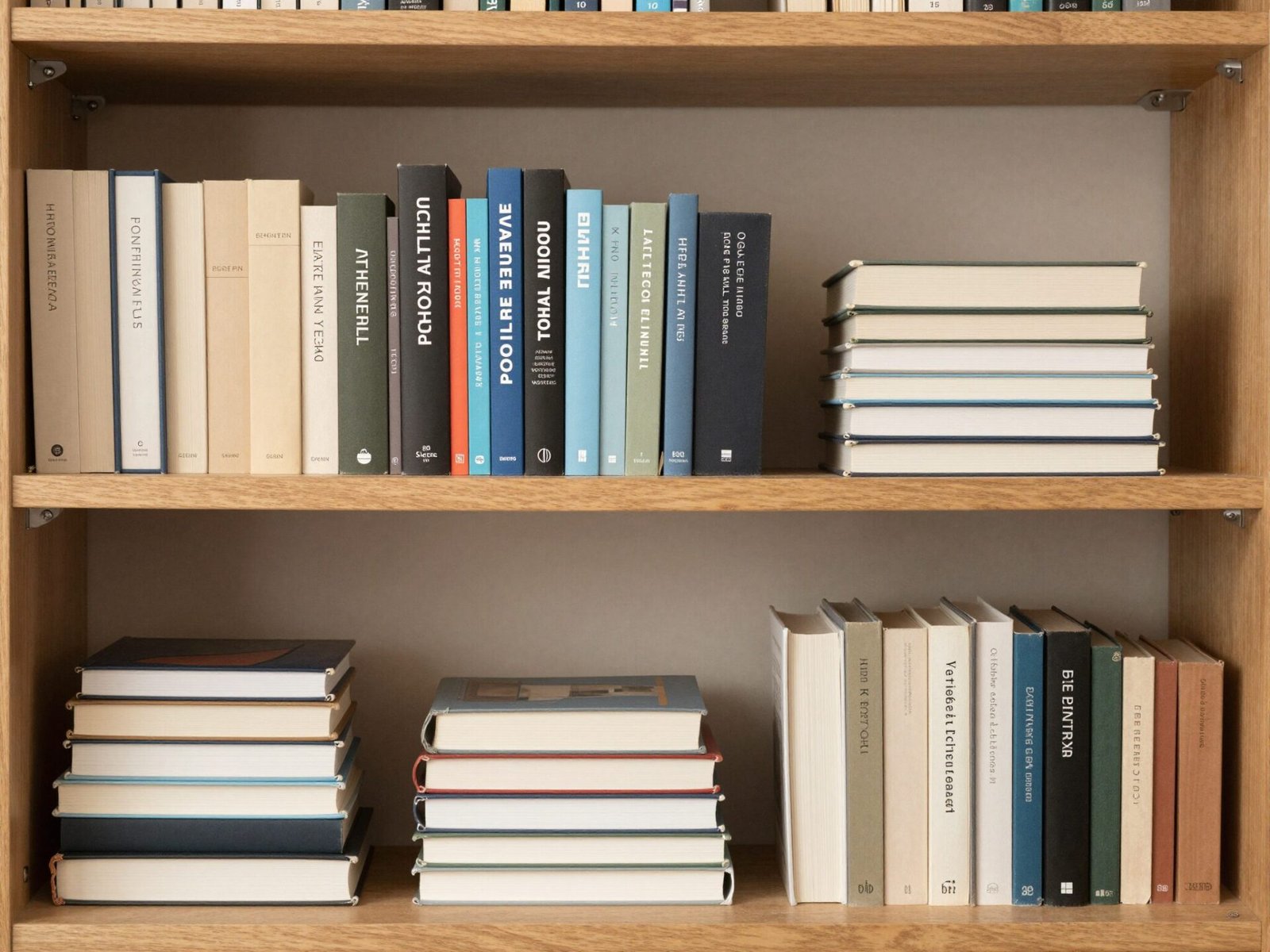
A shelf lined entirely with upright, spine-out books reads as a library, not a living room. It’s functional, but visually flat.
Turning a small stack of books on their side breaks that rhythm immediately. It also creates a flat surface where you can rest a small object on top.
This single swap is often the fastest fix for a shelf that feels stiff or overly formal.
💡 Smart tip: Stack no more than 4-6 books horizontally at once — taller stacks start to look precarious and lose their intentional feel.
⚠️ Mistake to avoid: Don’t alternate vertical and horizontal on every single shelf. Repeating the pattern too evenly makes it look like a formula instead of a natural rhythm.
3. Add a Painted or Wallpapered Shelf Backing for Your Living Room Bookshelf
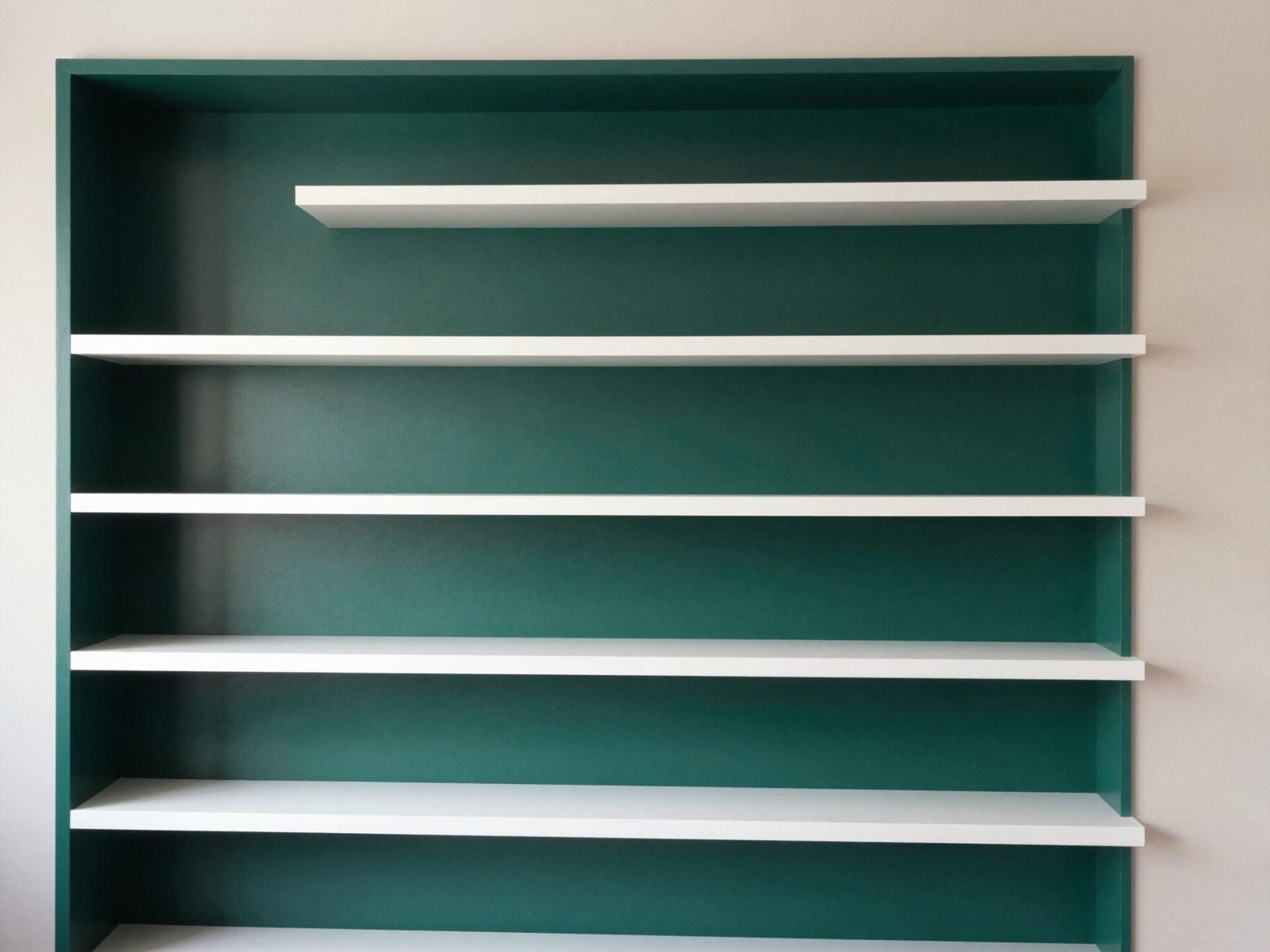
The flat wall behind a shelving unit is often the single biggest missed opportunity in the whole room. Most people never touch it.
A contrasting paint color or a small run of wallpaper on that back panel instantly gives every object in front of it more visual weight.
It also makes an otherwise plain, builder-grade bookcase look like a custom architectural feature rather than a piece of furniture.
💡 Smart tip: Go two or three shades darker than your wall color for a subtle version of this effect, or go bold with a jewel tone for real drama.
⚠️ Mistake to avoid: Don’t choose a busy wallpaper pattern for the backing if your shelf is already densely styled — the two will compete instead of working together.
Loving These Ideas? Get the Step-by-Step Guide
Grab the full 5-day eBook and turn these ideas into a finished room.



4. Layer Objects Front-to-Back for Depth for Your Living Room Bookshelf
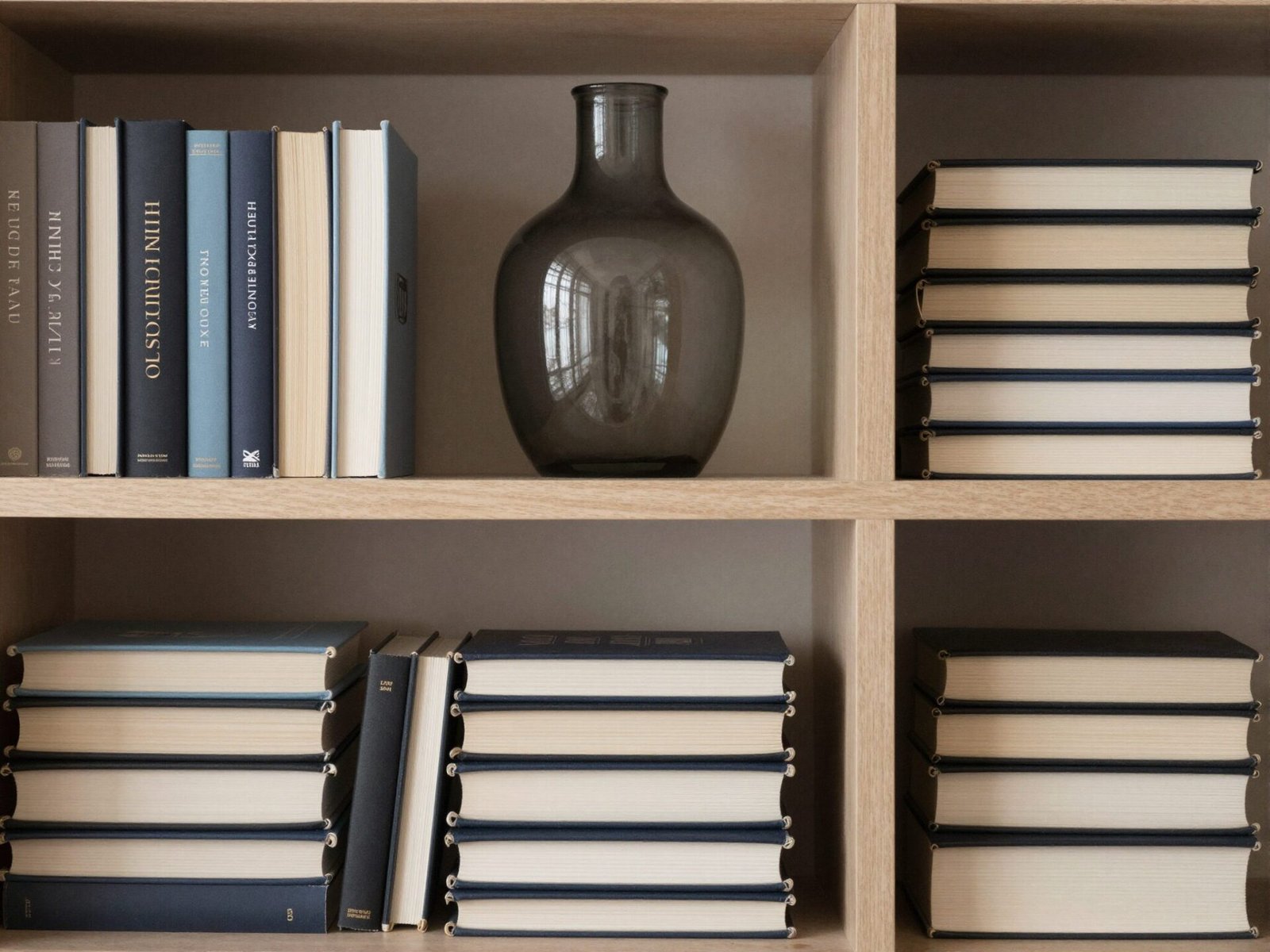
Most people style a shelf in a single row, front edge only. It’s the most common reason a “fully styled” shelf still feels flat in photos.
Pulling one taller object slightly back, so a shorter one sits partly in front of it, creates real depth instead of a flat silhouette.
This is especially effective on deep built-in shelves, where the extra depth otherwise goes completely unused.
💡 Smart tip: Reserve your tallest, most architectural piece for the back layer — it acts as an anchor for everything styled in front of it.
⚠️ Mistake to avoid: Don’t push every object all the way to the back. Shallow depth still needs a few pieces right at the front edge, or the whole shelf reads as empty from a normal viewing angle.
5. Use Bookends as a Styling Tool, Not Just a Function for Your Living Room Bookshelf
Bookends get treated as purely practical, but a sculptural pair can do real styling work — especially on a shelf where books alone feel monotonous.
Marble, brass, or carved wood bookends add a material contrast that plain spines can’t provide on their own.
They also give you a built-in excuse to break up a long run of books into smaller, more intentional sections.
💡 Smart tip: Use bookends to divide a long shelf into two or three distinct zones rather than pinning down one single row from end to end.
⚠️ Mistake to avoid: Don’t buy bookends heavier than the number of books they’re actually holding — an oversized pair with just a few thin books looks unbalanced.
6. Leave Real Negative Space Between Groupings for Your Living Room Bookshelf
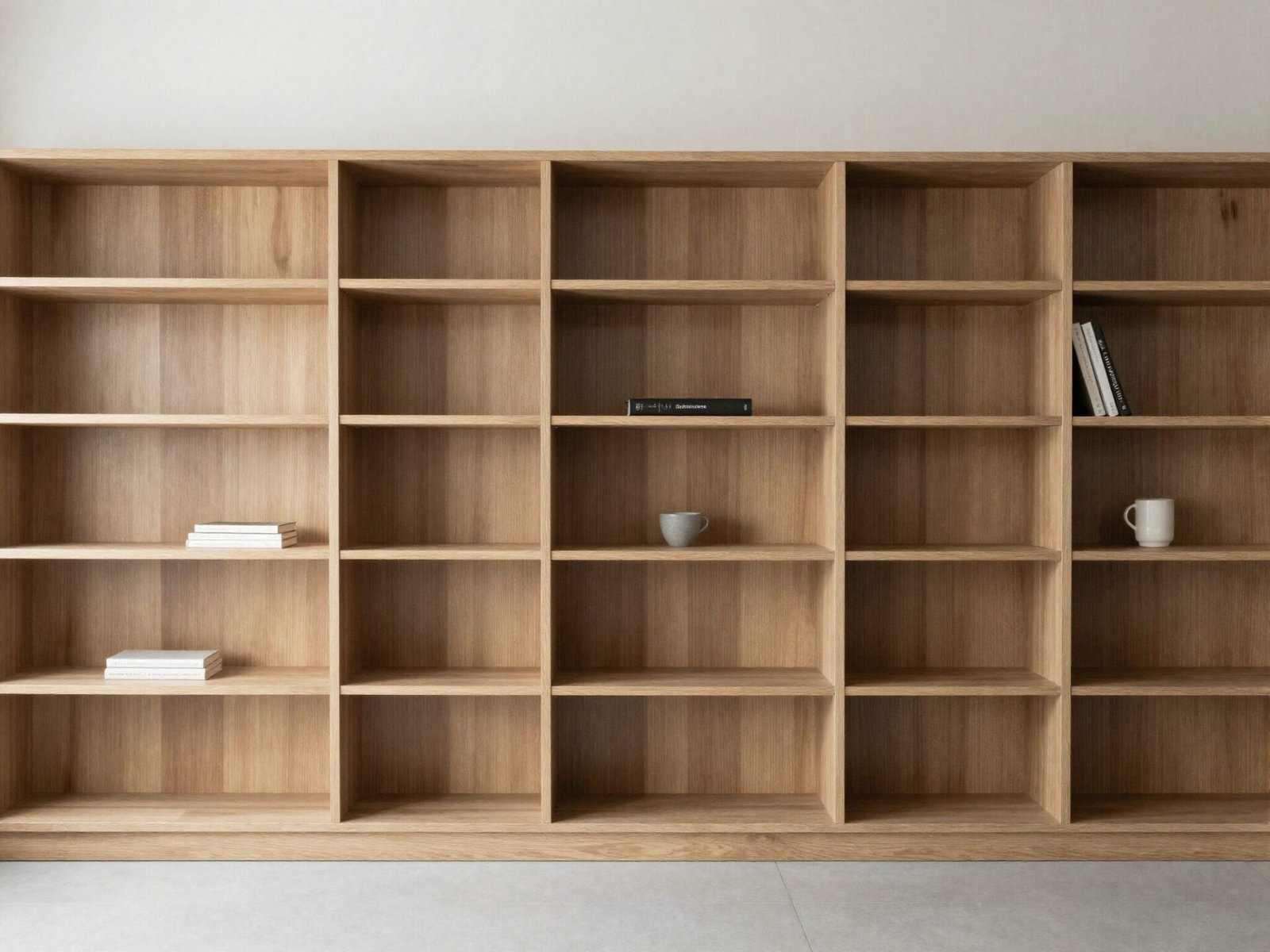
The instinct with a bookshelf is almost always to fill it. But empty space is doing real visual work — it’s what lets your eye rest between groupings.
Professional stylists often leave 20-30% of a shelf’s surface completely empty on purpose, even on a fully “finished” shelf.
Without that breathing room, even beautifully chosen objects start to blur together into visual noise.
💡 Smart tip: Step back ten feet and squint at the shelf. If you can’t identify separate groupings at a glance, you likely need more negative space, not more objects.
⚠️ Mistake to avoid: Don’t leave the exact same amount of space on every single shelf — uniform gaps look mechanical rather than curated.
7. Add a Trailing Plant to Soften the Lines for Your Living Room Bookshelf
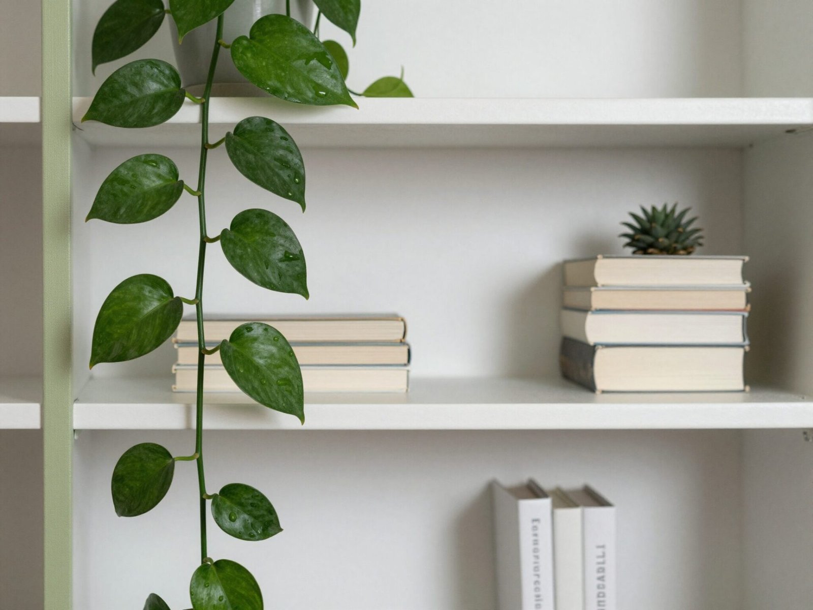
Shelving units are full of hard, straight lines — the frame, the books, the boxy objects. A trailing plant is one of the only elements that breaks that pattern naturally.
A pothos, philodendron, or string of pearls draping down the side of a shelf softens the entire composition, even if nothing else on the shelf changes.
It also introduces real, living texture and color that decor objects alone can’t replicate.
💡 Smart tip: Place trailing plants on an upper shelf so the vines have room to grow downward across multiple levels over time.
⚠️ Mistake to avoid: Don’t choose a plant that needs bright direct light for a shelf tucked into a dim corner — it will decline no matter how well it’s styled.
8. Lean a Small Piece of Art Against the Back Panel for Your Living Room Bookshelf
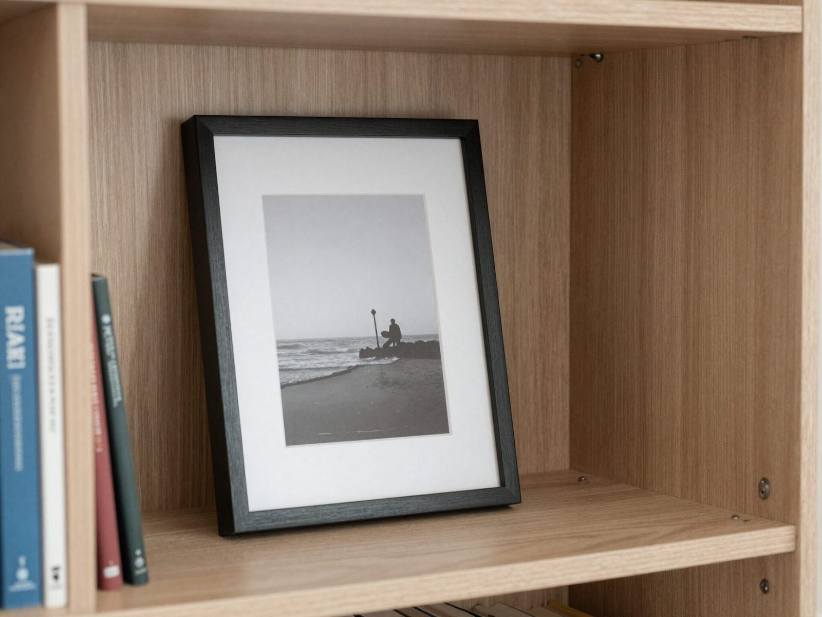
Hanging every piece of art on the wall is one option, but a small framed print simply leaning against the back of a shelf feels far more relaxed.
It also gives you the freedom to swap it out on a whim, without patching a nail hole every time your taste changes.
Leaned art tends to look most natural when it’s partially obscured by an object placed in front of it.
💡 Smart tip: Lean art slightly off-center rather than dead center behind a grouping — it reads as more candid and less staged.
⚠️ Mistake to avoid: Don’t lean a large, heavy frame on a shelf without a lip or ledge to catch it — it’s a real tipping hazard, especially with kids or pets nearby.
9. Mix Materials: Wood, Ceramic, Brass, and Glass
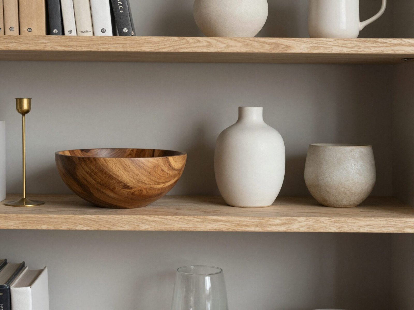
A shelf styled with all-matching materials, like an entire set of matching ceramic vases, tends to look like a display at a store rather than a home.
Mixing in wood, brass, glass, and ceramic within the same grouping gives each material something to contrast against.
This is one of the fastest ways to make a shelf look collected over time instead of purchased all at once.
💡 Smart tip: Aim for three to four different materials per shelf section — enough for contrast, without turning into visual chaos.
⚠️ Mistake to avoid: Don’t mix more than two metal finishes, like brass and chrome, in the same tight grouping — it reads as mismatched rather than intentional.
10. Use a Single Family of Colors Instead of Rainbow Chaos
A shelf with objects in every color of the rainbow rarely looks cohesive, no matter how nice each individual piece is.
Sticking to a limited palette, like warm neutrals with one accent color, ties everything together even when the objects themselves are wildly different in style.
This doesn’t mean everything has to match exactly. It just means every piece should feel like it belongs to the same general color story.
💡 Smart tip: Choose your color family based on what’s already dominant in the room, like your sofa or rug, so the shelf feels connected to the space around it.
⚠️ Mistake to avoid: Don’t force every single object into the palette. One or two intentional outliers actually make the overall scheme feel more real and less staged.
11. Add a Woven Basket for Hidden Storage
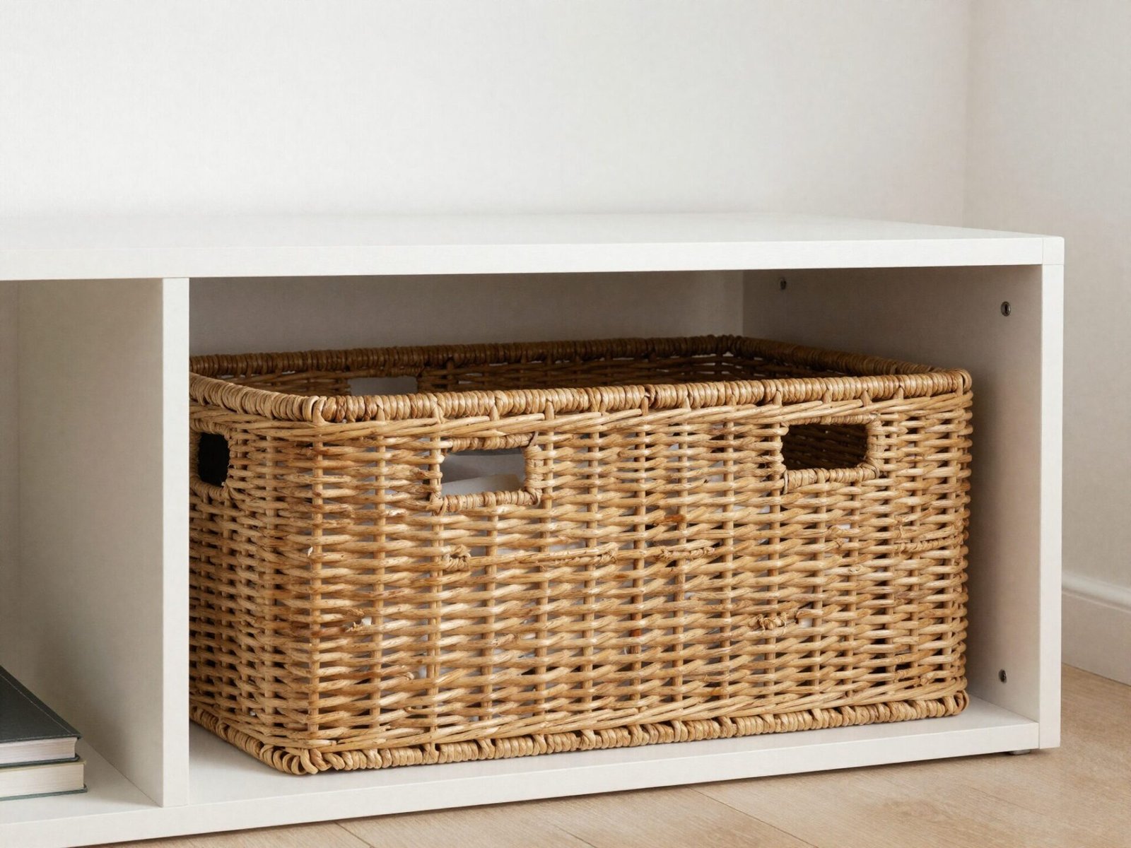
Not everything on a shelf needs to be on display. Remotes, chargers, and loose papers all need somewhere to go that isn’t the coffee table.
A woven basket tucked into one lower cube gives you exactly that, while still contributing texture and warmth to the overall composition.
It’s a rare case where the most practical choice and the most stylish choice happen to be the same thing.
💡 Smart tip: Reserve baskets for the lowest shelves — they’re heavier looking, and grounding them at the bottom keeps the whole unit visually balanced.
⚠️ Mistake to avoid: Don’t use more than one or two baskets per unit. Beyond that, the shelf starts to look like pure storage rather than styled display.
12. Incorporate Personal, Sentimental Objects
The most common thing missing from an otherwise well-styled shelf is anything that actually belongs to the people who live there.
A travel souvenir, a family photo, or a childhood object adds a layer of meaning that no amount of purchased decor can replicate.
These pieces are also usually what a guest actually asks about, which says something about what makes a shelf feel genuinely interesting.
💡 Smart tip: Give sentimental objects their own small grouping rather than scattering them across the whole unit — it makes them easier to notice and talk about.
⚠️ Mistake to avoid: Don’t display fragile keepsakes at a height young kids or pets can easily reach — sentimental value makes breakage sting even more.
13. Light the Shelves with Picture Lights or Puck Lights
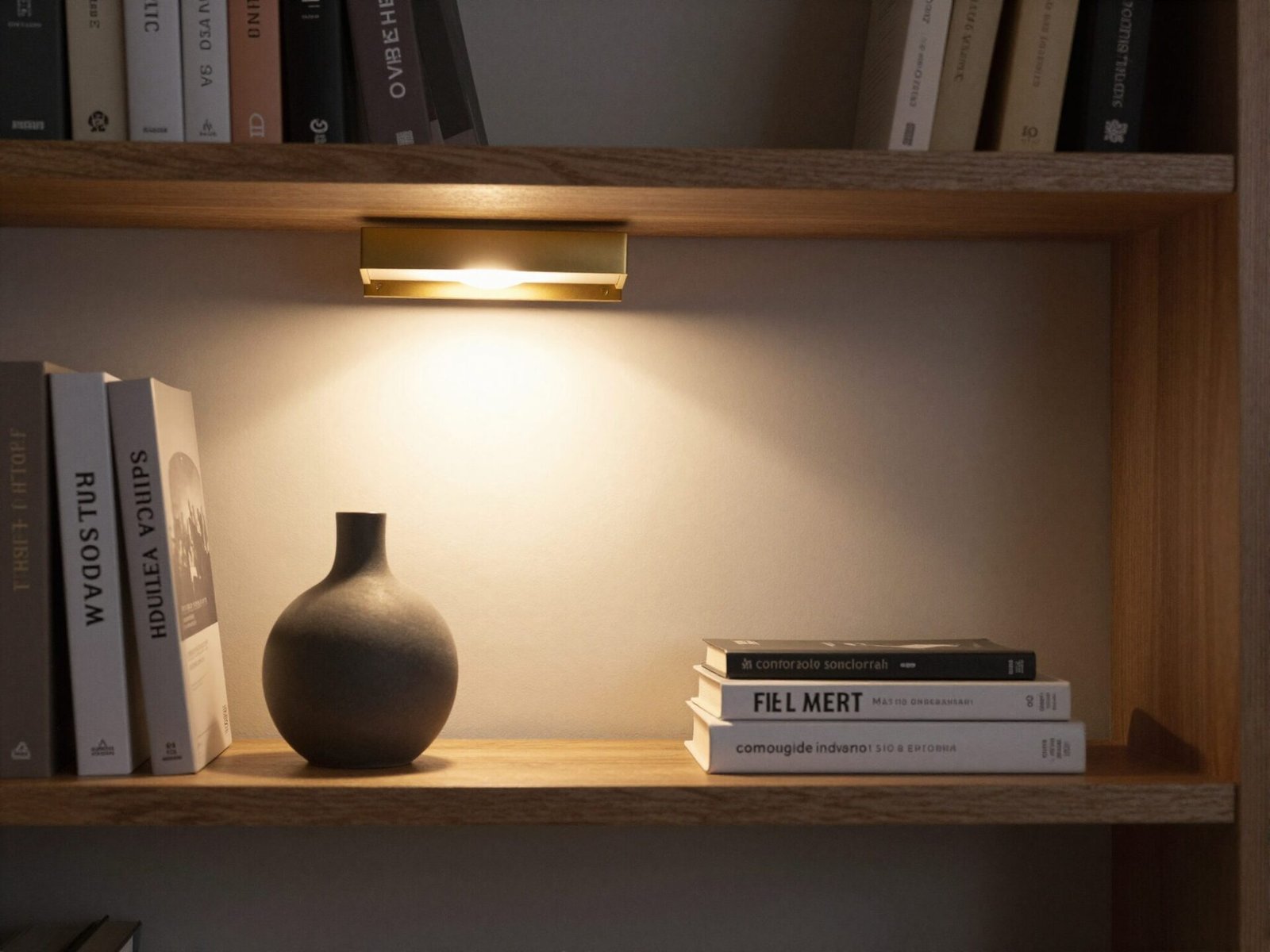
Most living room lighting points down or across a room, but rarely at the bookshelf itself, so it fades into shadow once the sun goes down.
A small picture light mounted above the unit, or discreet puck lights tucked under each shelf, changes that completely.
At night, the shelf goes from an afterthought to one of the room’s actual focal points.
💡 Smart tip: Choose warm-toned bulbs, around 2700K, so the lighting flatters wood tones and skin tones rather than casting a clinical white glow.
⚠️ Mistake to avoid: Don’t mount lighting so close to the shelf surface that it creates harsh, direct glare on glossy objects like glass or lacquered ceramics.
14. Rotate the Styling Seasonally
A shelf styled once and never touched again eventually stops registering at all — your eye simply learns to skip over it.
Swapping a handful of objects every season, even just three or four pieces, keeps the whole unit feeling current and intentional.
It also gives you a low-pressure reason to actually use decor you already own but rarely display.
💡 Smart tip: Keep a small labeled bin of “off-season” decor nearby so swapping takes minutes instead of becoming a full afternoon project.
⚠️ Mistake to avoid: Don’t rotate every single object at once. Changing everything at the same time erases the layered, collected look you worked to build in the first place.
Effort & Cost Snapshot
| Idea | Effort | Approx. Cost |
|---|---|---|
| 1. Rule of Three Grouping | Low | $0 (uses what you own) |
| 2. Vertical and Horizontal Stacks | Low | $0 |
| 3. Painted or Wallpapered Backing | Medium | $40–$150 |
| 4. Front-to-Back Layering | Low | $0 |
| 5. Sculptural Bookends | Low | $25–$90 |
| 6. Negative Space | Low | $0 |
| 7. Trailing Plant | Low | $15–$45 |
| 8. Leaned Art | Low | $20–$100 |
| 9. Mixed Materials | Low | $30–$120 |
| 10. Single Color Family | Low | $0–$60 |
| 11. Woven Storage Basket | Low | $25–$60 |
| 12. Sentimental Objects | Low | $0 |
| 13. Picture or Puck Lighting | Medium | $40–$150 |
| 14. Seasonal Rotation | Low | $0 |
You don’t need to apply all fourteen ideas in one weekend. Pick two or three that address whatever’s currently bothering you about your shelf, whether that’s flatness, clutter, or empty stretches, and build from there.
The shelves that feel most “designed” are almost never finished in a single sitting. They’re layered in gradually, which is exactly what makes them feel real.
Continue Your Home Transformation
Explore the full collection of step-by-step eBooks and get the guide that fits the room you're working on.