A wall clock is both an object in the composition and something you need to read from across the room. Its face, hands and position matter as much as its finish. Start with the view from the chair, counter or doorway where you normally check the time, then compare styles that work from that spot.
The ideas below cover different materials, shapes and room layouts. They are design directions rather than product recommendations or universal mounting heights. Use the actual clock's dimensions, weight, mechanism and instructions when deciding what belongs on your wall.
Contents
- 1. Start with a light face and contrasting hands
- 2. Let one large round clock fill an open wall
- 3. Keep a compact desk clock visually modest
- 4. Repeat the room's warm wood tones
- 5. Use a black frame to echo window details
- 6. Bring a small warm-metal accent to the wall
- 7. Use a blue dial as the room's color accent
- 8. Put a pale clock against a darker wall
- 9. Try a square frame beside linear furniture
- 10. Use a pendulum form for a taller wall section
- 11. Keep sculptural hands on a readable background
- 12. Give a retro kitchen a simple rounded clock
- 13. Find the kitchen's real viewing position
- 14. Place a dining-room clock outside the centerpiece view
- 15. Make the entryway clock part of the leaving routine
- 16. Keep a home-office clock in an easy side glance
- 17. Choose the mechanism for a quiet reading corner
- 18. Keep a laundry clock away from moisture sources
- 19. Mount the clock above a shelf instead of leaning it
- 20. Give a gallery wall one clear timekeeping point
- 21. Use the wall between windows carefully
- 22. Balance the clock with furniture below it
- 23. Consider a projecting clock only where the route allows
- 24. Use texture when the palette is already complete
Check the face, the view and the fixing
Make a paper outline of the candidate clock and hold it in the proposed position without making a permanent fixing. Check its scale from the main viewing points, then examine a real face or a life-size print to judge readability. Read the exact model's mounting and battery instructions. For example, IKEA lists one fixing for KOPPARDUVA and two for SVARTGOK; those product-specific details are a reminder that a clock's appearance does not tell you how to hang it. Use supports suited to both the wall and the product.
Choose an arrangement that fits your situation
- Reading from across the room: Prioritize the actual hand and marker contrast, then compare a life-size face at the viewing distance.
- Quiet workspace or reading corner: Check the exact movement description; appearance cannot establish whether it ticks.
- Kitchen or laundry: Keep the clock in a suitable dry position away from heat and splashes, following its environmental limits.
- Unusual shape or bracket: Measure the full projection and movement space as well as the visible dial.
1. Start with a light face and contrasting hands
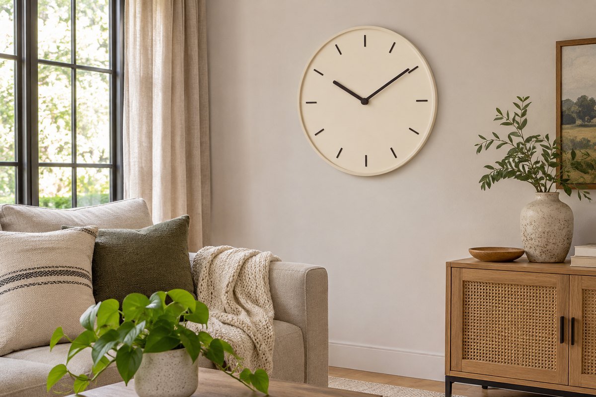
A pale dial with clearly darker hands can be an uncomplicated starting point when the clock needs to be read from several places. Compare the hand thickness and hour markers rather than judging contrast from the frame alone. View the candidate at the distance you actually use. A clock can look beautifully simple up close yet become difficult to read from the sofa.
2. Let one large round clock fill an open wall
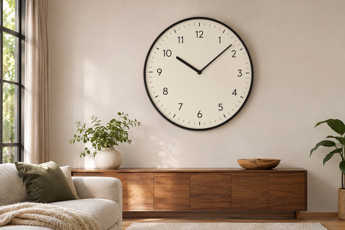
A broad empty wall can carry a larger clock as its main feature. Test a full-size paper outline before buying so the frame does not crowd nearby corners or furniture. Keep other wall objects restrained while judging the result. The best size is the one that feels proportionate and reads comfortably in your room, not a fixed percentage of the wall.
3. Keep a compact desk clock visually modest
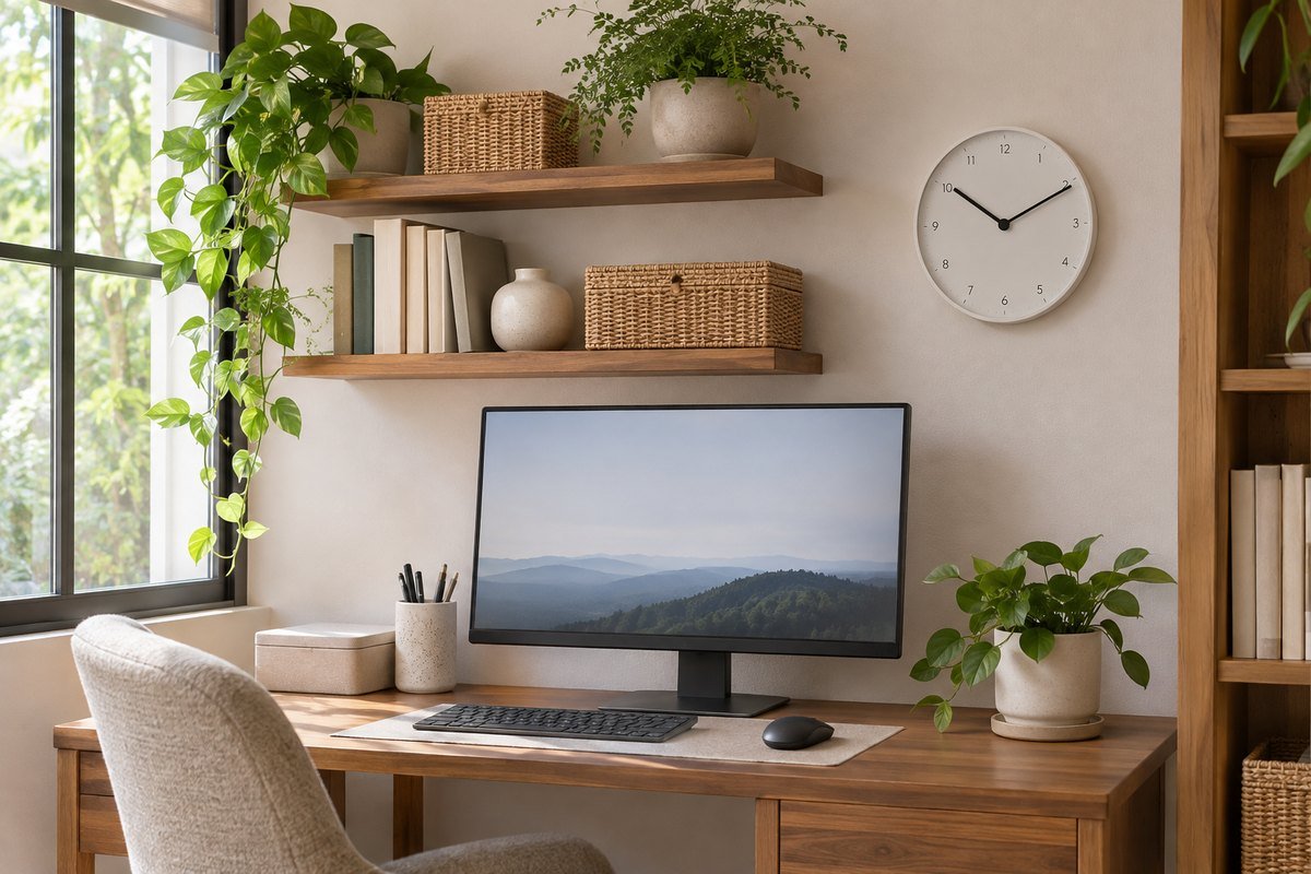
A small wall clock can suit a desk corner when it is close enough to read without dominating the workspace. Place it where shelves and a monitor do not hide part of the face. Check the view while seated in the normal working position. If the clock becomes another distraction in an already busy wall arrangement, simplify the surrounding display first.
4. Repeat the room's warm wood tones
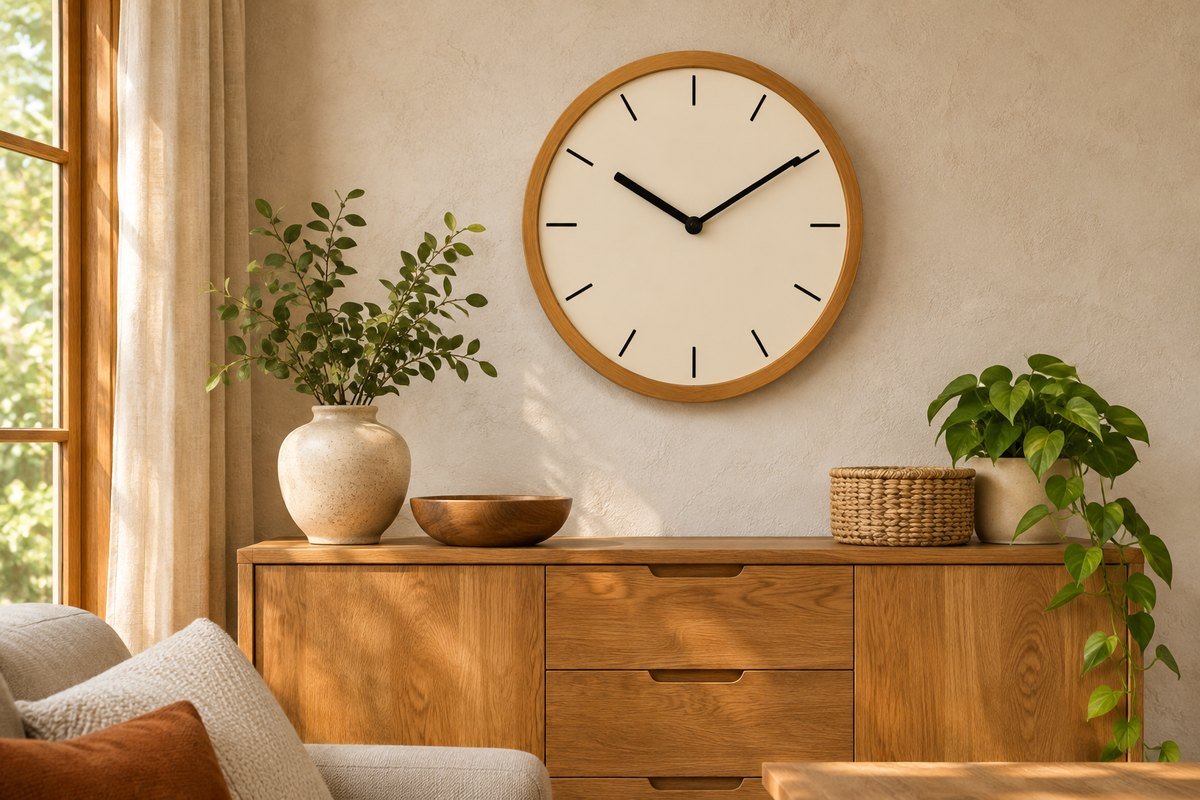
A wood-framed clock can connect to a sideboard, chair or shelving unit. Compare the undertone in daylight; similar-looking woods may differ enough to feel unrelated when placed together. The face can remain plain so the frame supplies the texture. Leave some space between the clock and nearby wood-framed art if the collection starts to look like one heavy block.
5. Use a black frame to echo window details
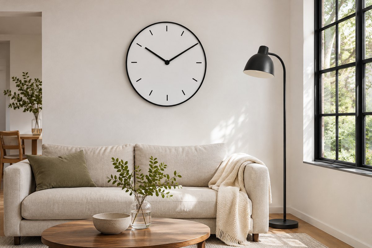
A dark clock rim can repeat black window frames, chair legs or lamp details without introducing another color. Keep the dial readable against the wall rather than choosing a dark face solely to match the frame. One clear repeat is usually enough. If every nearby object has a heavy black border, choose a finer rim so the wall does not feel crowded.
6. Bring a small warm-metal accent to the wall
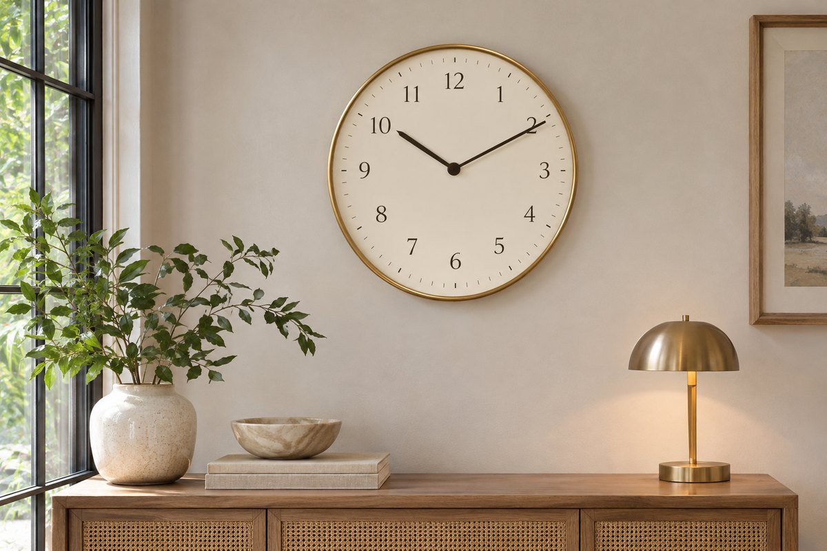
A brass-toned rim can relate to existing handles or lamp bases. Compare the finish under the room's lighting because warm metals can vary in color and reflectivity. Keep the face and hands clear enough for daily use. The clock does not need to match every metal exactly; a restrained repeated tone can connect the pieces without making them look like a purchased set.
7. Use a blue dial as the room's color accent
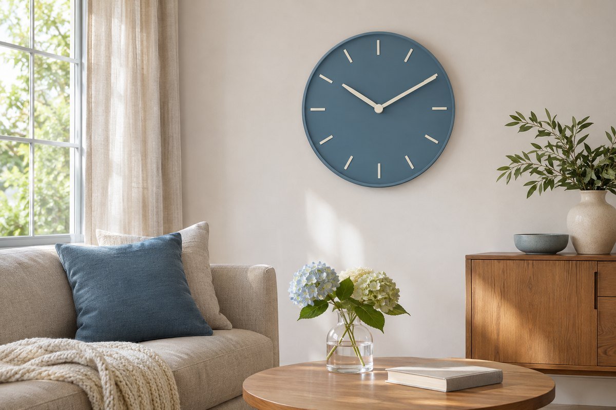
A blue face can supply a controlled patch of color in an otherwise pale room. Check whether the hands and markers remain distinct in both daylight and evening light. Repeat the blue in one textile or small picture rather than adding several competing objects. If the face is dark, compare a real sample instead of assuming pale hands will read clearly at your viewing distance.
8. Put a pale clock against a darker wall
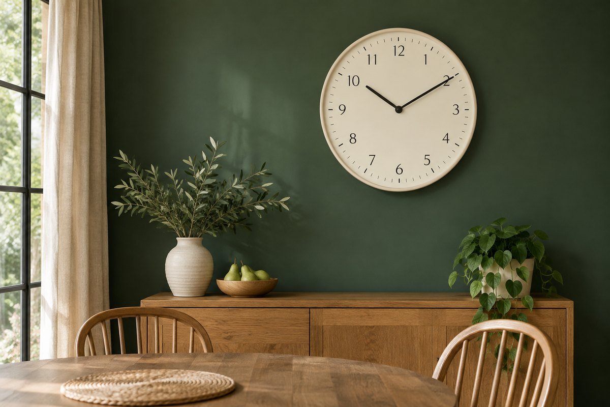
A light rim and face can stand out on deep green, navy or charcoal paint. Keep the surrounding wall simple enough that the clock remains easy to find at a glance. Test the finish for glare from nearby lamps. A contrasting outline may look strong in a photograph while reflections still make the actual dial difficult to read in the room.
9. Try a square frame beside linear furniture
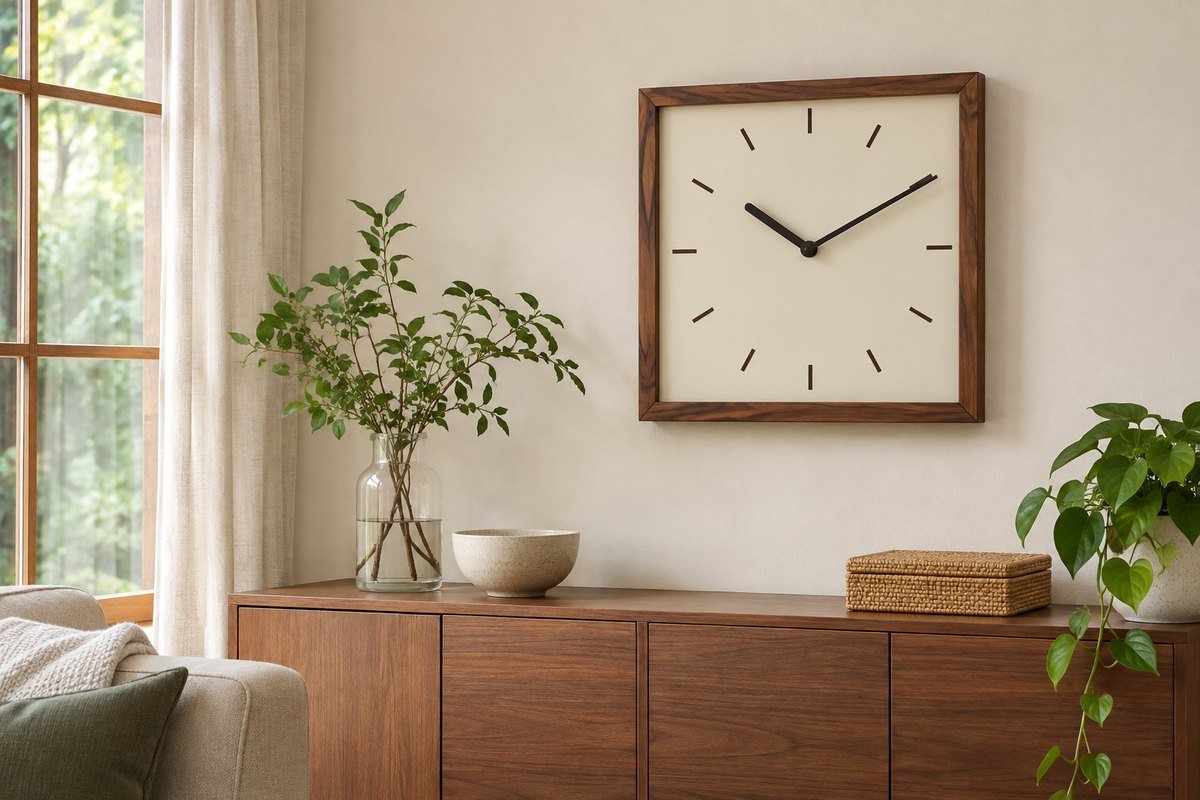
A square clock can relate to rectilinear cabinets or a grid of wall panels. Leave enough space around it so the corners do not appear squeezed between other edges. Compare its outer dimensions with a round candidate rather than treating the stated width as the whole visual footprint. A plain face keeps the shape from becoming another busy pattern.
10. Use a pendulum form for a taller wall section
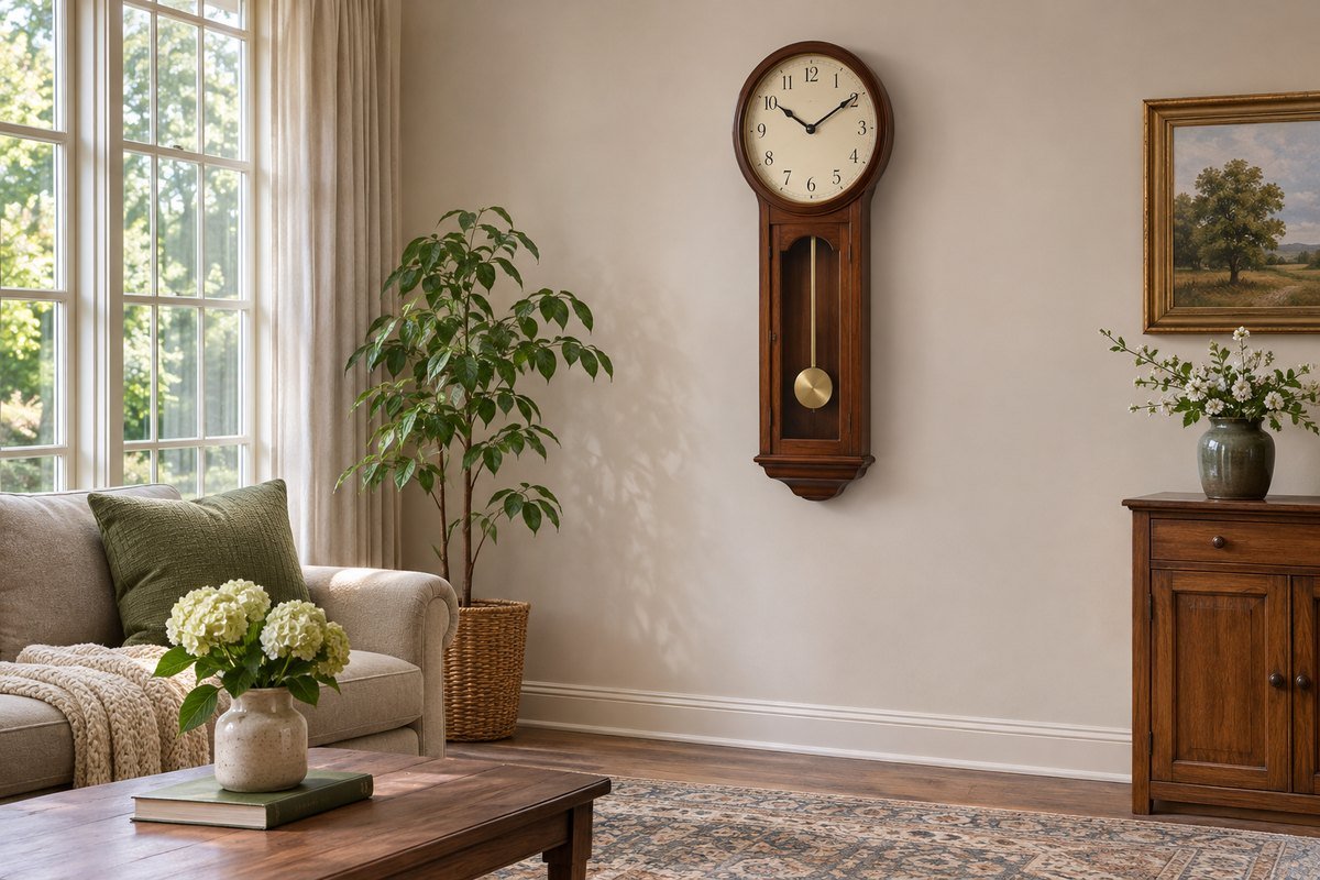
A clock with a long lower section can suit a vertical area that feels too narrow for a large circular face. Check the full body dimensions and any movement clearance in the instructions. Keep it separate from doors or objects that could interfere with moving parts. Choose it for the whole silhouette while still checking that the dial can be read from the intended position.
11. Keep sculptural hands on a readable background
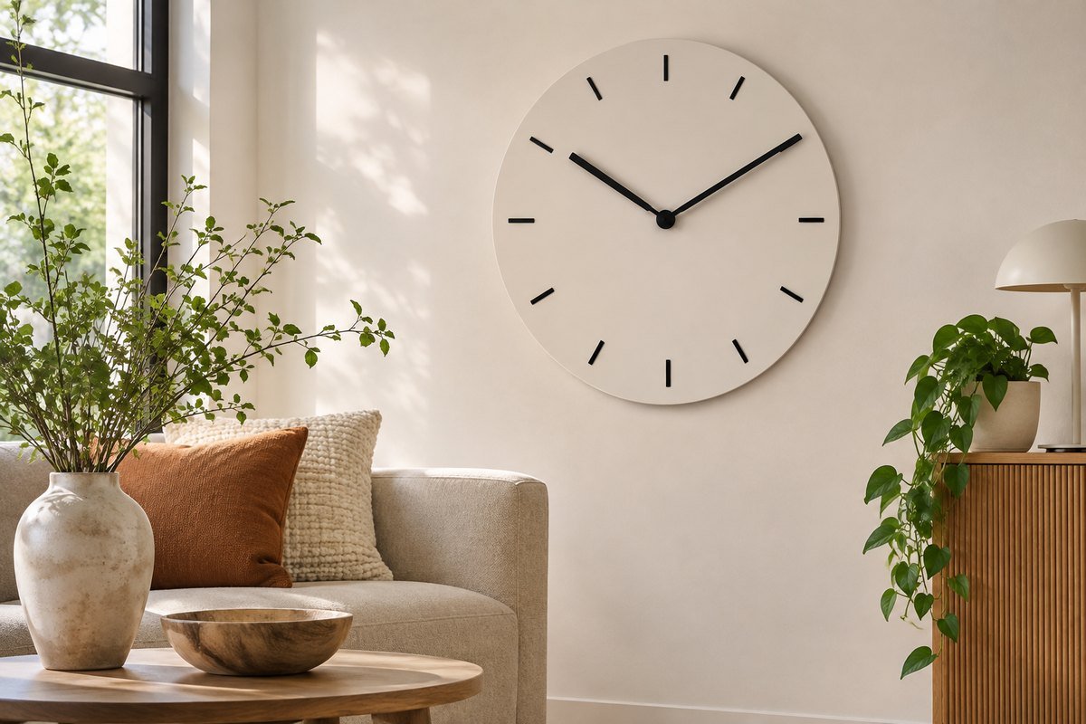
A minimal clock can use long hands and simple markers as a graphic feature. It still needs enough contrast and a clear reference for reading the time. Compare it from the main seat before treating it as the room's only clock. If the design is mostly decorative at that distance, choose a clearer face for the practical timekeeping role.
12. Give a retro kitchen a simple rounded clock
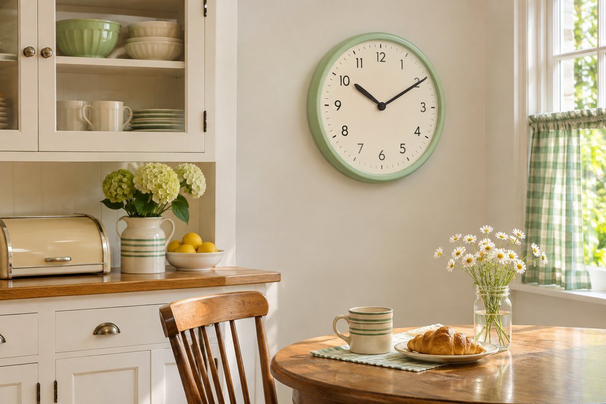
A rounded rim and a soft color can relate to vintage-inspired cabinetry or an older kitchen table. Keep the shape restrained if the room already contains patterned tile or wallpaper. Check the dial from the working area and the breakfast seat. A nostalgic appearance does not establish the mechanism, so read the product information rather than assuming the sound or operation from the style.
13. Find the kitchen's real viewing position
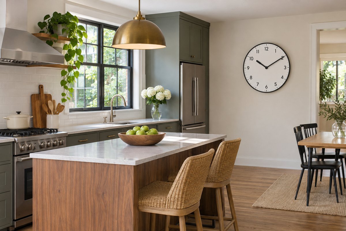
Stand where you usually prepare food and check which wall is visible without turning around. Then test the clock from the breakfast seat if that view also matters. Keep the proposed position away from heat, steam and splashes unless the product is specifically suited to them. A nearby dry wall may be more useful than the decorative space directly above the range.
14. Place a dining-room clock outside the centerpiece view
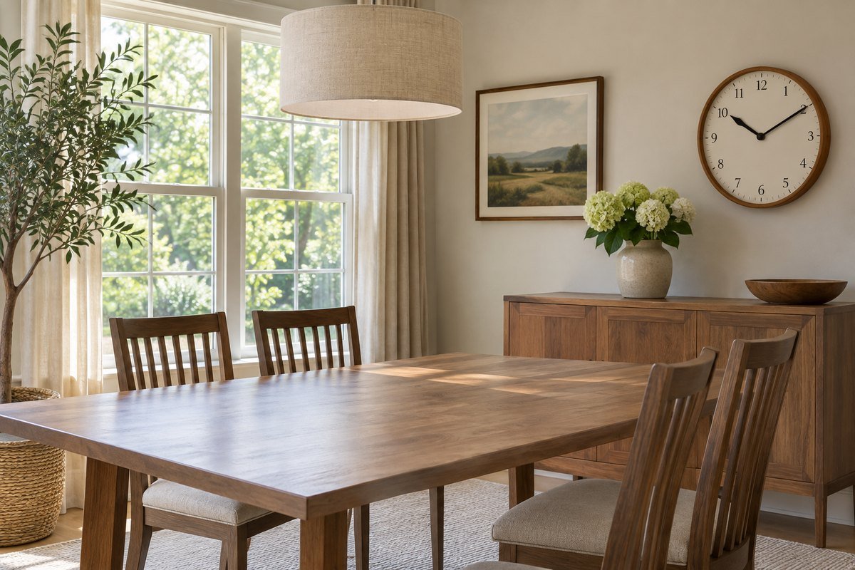
A clock can be useful in a dining room without competing with the table's main decorative view. Try a side wall or a position above a low cabinet, then check it while seated. Keep it separate from a dense group of pictures if glancing at the time becomes difficult. The clock can relate to the furniture finish while the table remains the main focus.
15. Make the entryway clock part of the leaving routine
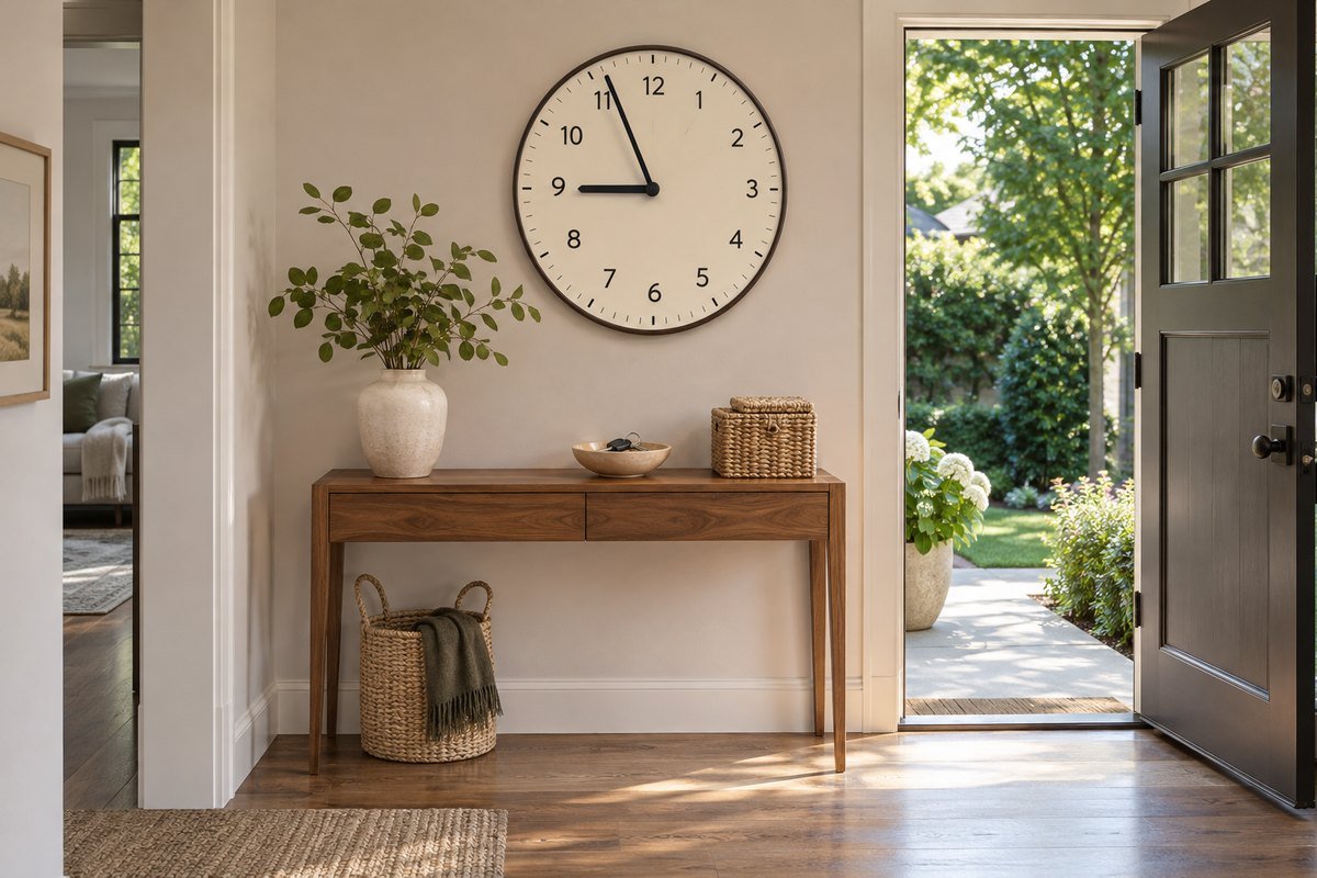
A clock near the usual key or bag area can be useful on the way out. Check that it is visible from the approach rather than hidden behind an open door. Keep the wall arrangement shallow enough for the route and follow the mounting instructions. A small coordinated group can work, but do not sacrifice the clarity of the face to fill a gallery-style composition.
16. Keep a home-office clock in an easy side glance
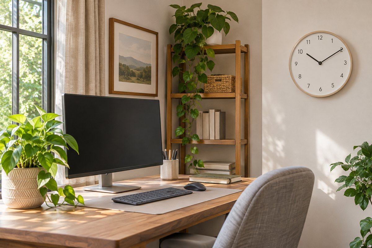
Place the clock where it can be read from the chair without competing with the monitor. Consider the camera view as well if you regularly join video calls; a clock does not need to dominate the background. Check the sound specification if ticking would distract you. The visible style and the movement's noise are separate buying decisions.
17. Choose the mechanism for a quiet reading corner
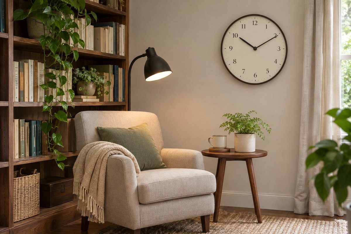
A reading room may suit a restrained clock that blends with the shelving and chair. Before buying, check the exact model's movement description and return conditions if sound matters to you. A photograph cannot tell you whether it ticks. Keep the face visible from the reading seat and leave the lamp's task light directed at the book rather than reflecting across the dial.
18. Keep a laundry clock away from moisture sources
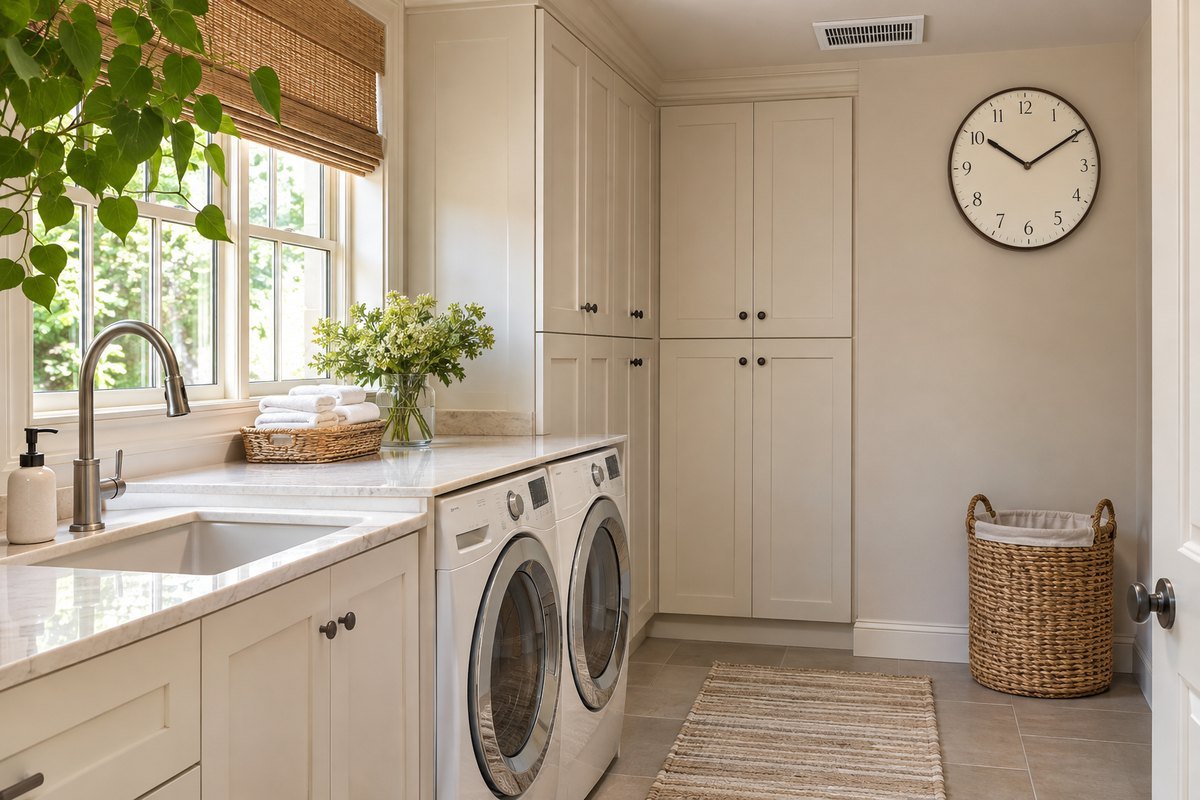
A clock can help with a household routine, but its location and suitability still need checking. Use a dry wall position and read the product's environmental limits rather than assuming every indoor clock can tolerate humidity or splashes. Keep appliance doors, storage access and ventilation clear. If the room has no suitable position, use another timing method outside the damp area.
19. Mount the clock above a shelf instead of leaning it
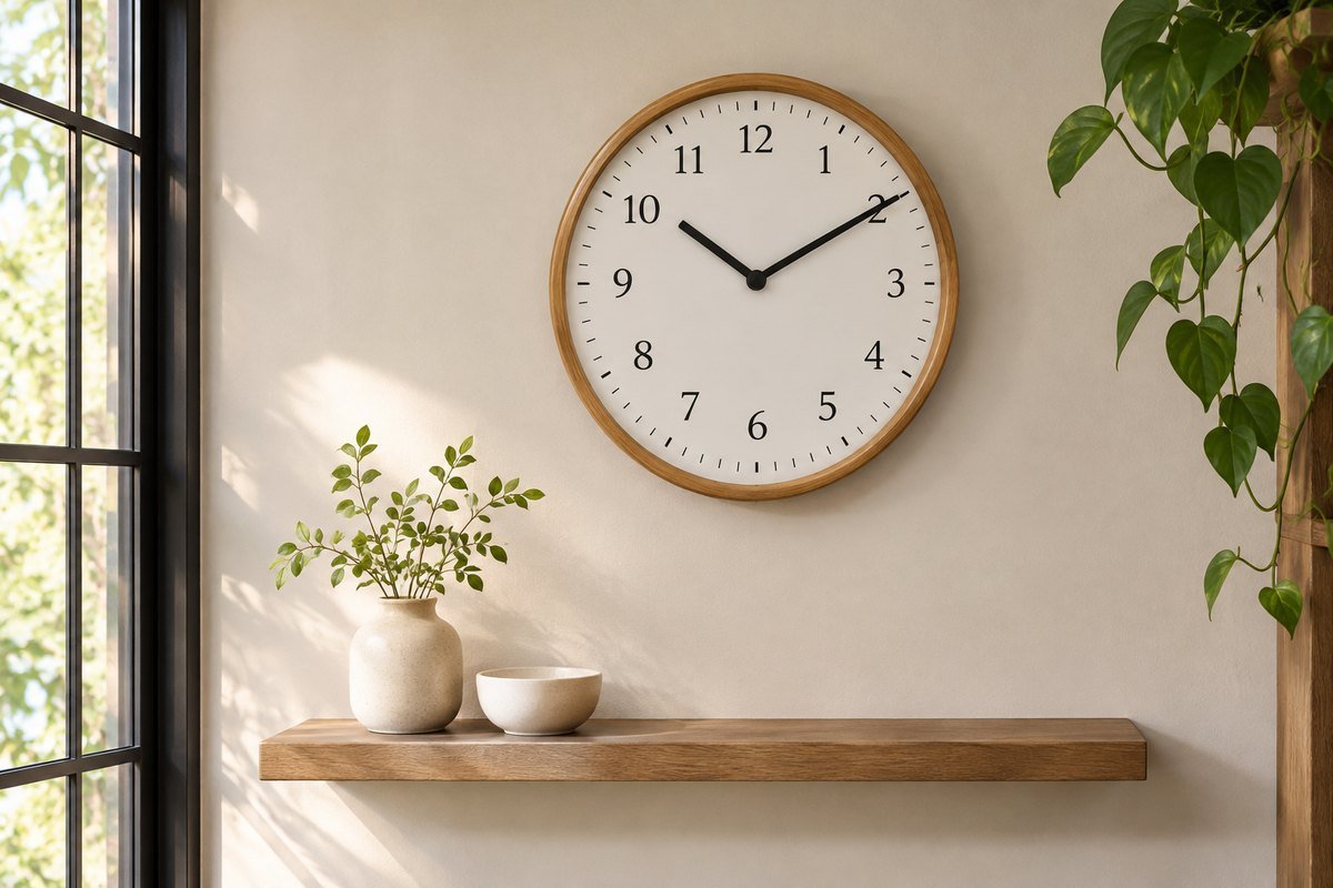
A wall-mounted clock and a useful shelf can share a composition while keeping their functions separate. Leave room to remove the clock as its instructions require and avoid filling the shelf with objects that hide the lower dial. Do not lean a wall-only product against the wall unless its maker permits that use. Choose a tabletop model when a freestanding clock is the actual need.
20. Give a gallery wall one clear timekeeping point
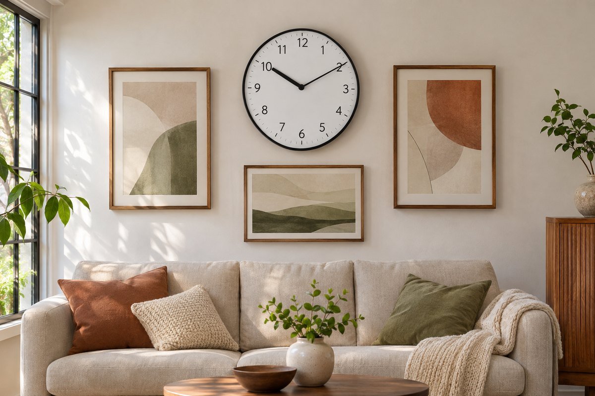
A clock can join framed art if its face remains distinct from the neighboring patterns. Try a few well-spaced pieces around it rather than fitting it into the smallest leftover gap. Compare the frame finishes and overall visual weight. If the clock disappears into the gallery, simplify its immediate surroundings or give it a separate wall position.
21. Use the wall between windows carefully
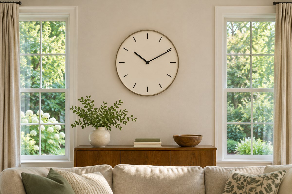
A short wall section between windows can provide a useful position, provided curtains and shades do not hide the clock when they move. Test the full range of the coverings before choosing the size. Check reflections from both windows at different times of day. Keep the clock within the available wall rather than allowing its frame to overlap trim or moving fabric.
22. Balance the clock with furniture below it
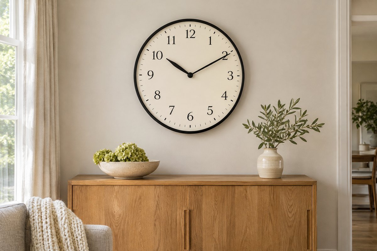
A low console or sideboard can give a wall clock a visual base. Compare the relationship from the room entrance rather than automatically centering everything on the wall itself. Keep enough space above tall objects on the furniture so they do not obscure the dial. The clock can align with the furniture while still sitting in the most useful viewing position.
23. Consider a projecting clock only where the route allows
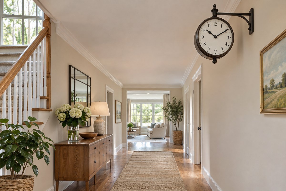
A double-sided or bracket-mounted clock can be seen from two directions, but the projection is part of its footprint. Read the complete mounting instructions and check the actual corridor or room before choosing it. Keep it outside head and shoulder space and avoid narrow routes. If the position is uncertain, a conventional flat wall clock is easier to accommodate.
24. Use texture when the palette is already complete
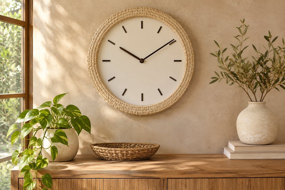
A neutral textured frame can add interest without introducing another color to the room. Compare the texture with nearby woven pieces, plaster or wood, then keep the face straightforward. Check cleaning instructions before choosing an intricate surface for a dusty location. The frame should complement the room while the dial remains the feature you can find and read quickly.
A three-view wall clock comparison sheet
For each candidate, note the outer width, depth, weight, mounting method, battery requirement and stated movement type. Check a life-size outline from three places: the main seat, the usual working position and the entrance. Then test the actual dial for hand contrast, marker clarity and glare in daytime and evening light. Record the position that works for use and appearance together. These observations are specific to your room, not a universal size or height rule.
A practical next step
Choose the clock from the position where you will use it, then refine the color, shape and relationship to the furniture. Check the full product instructions before mounting and keep the face clear of clutter and glare. A considered clock should make the time easy to find while looking like it belongs in the room.
For the surrounding room, plan a balanced gallery wall around the clock. Coordinate useful home-office wall storage.
The images are original AI-generated design concepts, not photographs of tested products or verified installations.
Sources and care references
- IKEA: KOPPARDUVA model details and mounting guidance
- IKEA: SVARTGOK model details and mounting guidance
Optional digital guide for this topic
If you prefer a structured workbook, explore this related paid guide.