A boho living room can feel personal through a mix of textiles, woven materials, color and objects you enjoy using. Start with the furniture that works in your home, then choose the layer that will lead the room. A patterned rug, a rattan chair or one textile wall piece can provide character without requiring a complete matching collection.
These 26 ideas show quieter and more colorful versions of the contemporary look. IKEA’s own bohemian-room guide describes natural materials, texture and personal details as styling ingredients; they are options to interpret, not a mandatory shopping list. Use the palette and pattern worksheet below to connect the choices to your retained furniture.
Contents
- 1. Build the boho scheme around the sofa you already keep
- 2. Let cream and sand carry a quieter boho room
- 3. Use rust and ochre as deliberate warm accents
- 4. Try sage and muted blue for a cooler variation
- 5. Give boho minimalism one expressive layer
- 6. Let one patterned rug lead the color choices
- 7. Layer rugs only when the floor arrangement still works
- 8. Mix a broad motif with a quieter small pattern
- 9. Use woven texture where another print would be too much
- 10. Make one rattan chair a considered furniture choice
- 11. Use a woven shade as one clear silhouette
- 12. Let curtain layers handle two different jobs
- 13. Give an older wood cabinet a present-day role
- 14. Balance woven pieces with a firm useful table
- 15. Choose a basket for one real category
- 16. Let one textile wall piece replace a cluster of small accents
- 17. Connect mixed artwork through one visible relationship
- 18. Display personal objects with room to see them
- 19. Use colored glass as a small light-catching accent
- 20. Repeat a metal detail sparingly
- 21. Use greenery as an optional shape, not a style requirement
- 22. Make the reading corner useful beneath the styling
- 23. Keep a dark sofa and lighten its neighboring layers
- 24. Start a rental-room change with movable layers
- 25. Keep a family-room reset within the boho scheme
- 26. Scale the boho mix down in a small living room
Choose the boho living room’s main layer before the accents
Identify the sofa, floor, cabinet or rug you will keep. Compare the largest samples beside it and under the room’s ordinary lamps. Decide which single layer carries the strongest pattern or texture, then keep the neighboring layers quieter. Furniture comfort, textile care and the usable layout remain part of the decision.
Choose the direction from the room you have
- A strong patterned rug already belongs in the room: Keep it as the palette reference and compare quieter upholstery layers.
- The room has several detailed objects: Try a broad plain surface or textile instead of another small motif.
- You want a pale boho scheme: Vary the weave and furniture outlines before adding extra color.
- A dark sofa will stay: Compare pale neighboring textiles and one controlled warm accent.
- The room is compact: Keep the variety in fewer objects and preserve the occupied-seat route.
1. Build the boho scheme around the sofa you already keep

A useful boho living room can begin with an ordinary sofa. Keep the upholstery that works, then compare a patterned cushion, a textured throw and one wood or woven companion against it. The contrast gives the room character without making every large piece compete. Check the sofa’s real color in daylight before choosing the smaller layers; cream, gray and brown each change the palette around them.
Choose the retained anchor first, then add one small layer at a time.
2. Let cream and sand carry a quieter boho room

A pale scheme can still have variety when the materials differ. Compare a plain sofa with a visibly woven rug, a wood table and a small textile detail rather than putting the same cream texture on every surface. Leave enough contrast to distinguish the shapes. The result depends on the room’s light and fixed finishes, so test the actual samples instead of assuming every off-white will sit quietly together.
Look for differences in weave and outline before adding another color.
3. Use rust and ochre as deliberate warm accents

Rust and ochre can give a neutral room a warmer direction without requiring a new sofa. Try them on a cushion group or a small artwork and keep an area of quieter upholstery around them. Decide which accent should be most visible from the main seat. If both compete with a strong existing rug, reduce one rather than adding another pattern to connect everything.
Choose one warm accent as the lead and let the other appear more sparingly.
4. Try sage and muted blue for a cooler variation
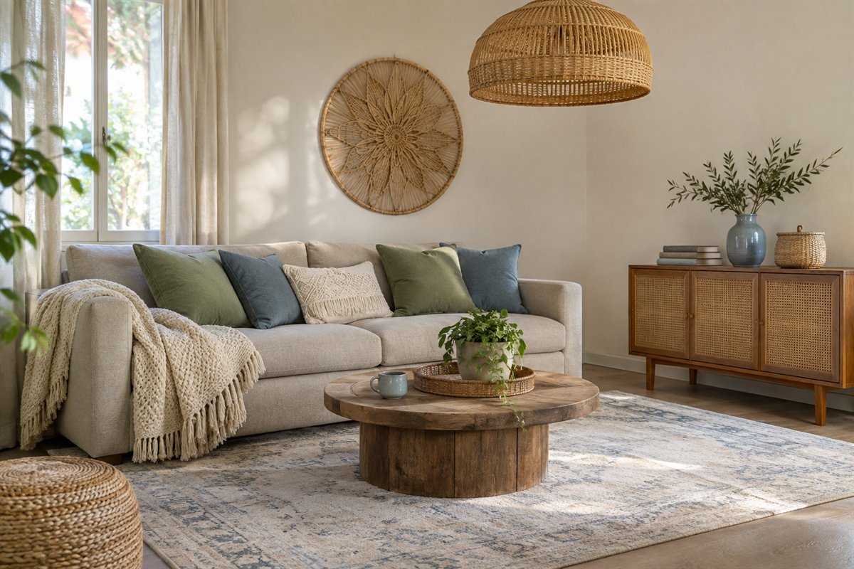
A boho room does not have to use only orange and brown. Sage and muted blue can work with warm wood and woven details when the actual colors relate. Use one repeated undertone to connect the textiles, then compare the room after dark. A cooler accent may feel different under the existing lamps, and a small fabric sample can answer that question before a larger commitment.
Keep the wood or weave consistent while testing the cooler textile palette.
5. Give boho minimalism one expressive layer

For a restrained version, choose one expressive layer and make the rest quieter. A patterned rug can carry the look while the sofa, curtains and table stay simple. A woven wall piece can do the same job in a room with a plain rug. The useful choice is the layer you enjoy seeing most, not a checklist that requires every familiar boho accessory.
Remove one competing detail before deciding the room needs more character.
6. Let one patterned rug lead the color choices

A rug can establish the palette when its size and placement suit the furniture. Pick one or two colors from the actual rug for smaller textiles rather than trying to match every shade. Leave part of its pattern visible around the table. Use the separate rug-sizing guide to compare the furniture relationship; a beautiful pattern does not compensate for a size that interrupts the room.
Begin with the rug you intend to keep and place fabric samples directly beside it.
7. Layer rugs only when the floor arrangement still works

A smaller patterned rug over a plain base is one option, not a requirement. Ruggable’s own layering guide discusses differences in pattern scale and shared color as styling tools. For your actual rugs, check the intended support, edges, door movement and care instructions. If layers shift or make the route awkward, one suitable rug can carry the same palette with less complication.
Try the complete walking route and chair movement before keeping both layers.
8. Mix a broad motif with a quieter small pattern

Two patterns can relate without repeating the same motif. Compare a broad geometric design with a narrower stripe, using a shared color so the difference feels deliberate. Keep some plain upholstery visible between the detailed pieces. Judge the group from the doorway as well as close up; a small pattern that looks subtle in your hand may read busily across a whole sofa.
Choose the main motif first and make the second one visibly quieter.
9. Use woven texture where another print would be too much

When the rug or artwork already supplies enough pattern, use weave for the next layer. A ribbed, slubbed or visibly woven cushion can add depth beside a plain fabric without introducing another color story. Handle the real textile and read its care label before buying. Texture has to suit the way the sofa is used, including what catches, sheds or needs frequent cleaning.
Ask whether the room needs a new motif or only a different surface texture.
10. Make one rattan chair a considered furniture choice

A woven chair can give the room an open outline and a different material from the sofa. Choose it for sitting as well as appearance, and read the exact care instructions. IKEA’s cited rattan seat-shell guide, for example, warns that nearby radiators or other heat sources can dry and damage that material. Use the guidance for the piece you own rather than assuming all woven-looking furniture is the same.
Check the chair’s comfort, condition and intended indoor or outdoor use before placing it.
11. Use a woven shade as one clear silhouette

A woven shade can introduce a distinct outline above a quiet furniture group. Compare its full shape with the ceiling, nearby artwork and the room’s existing light. Open weave changes the appearance of the lit shade, so inspect the actual product and its fitting requirements rather than judging only an unlit photograph. Keep useful reading light available where the decorative fitting does not provide it.
Choose the installed lighting arrangement before adding more decorative lamps.
12. Let curtain layers handle two different jobs
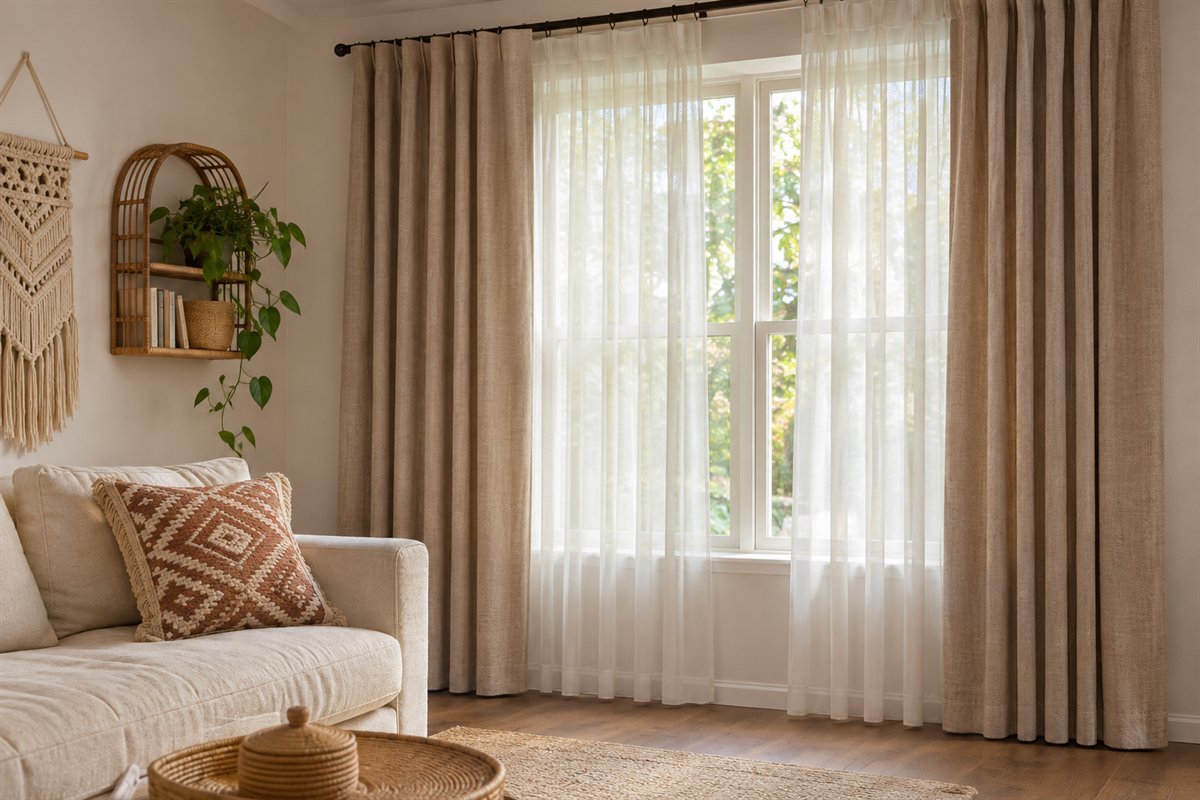
A sheer layer and a more opaque covering can handle changing daylight and privacy separately. Relate their colors to the larger textiles while keeping both easy to operate. The stack at the sides also uses wall space, so compare it with the furniture and window access. You can keep the curtain design quiet when the rug or sofa cushions already contain a strong motif.
Check the room from outside after dark before deciding the privacy layer is sufficient.
13. Give an older wood cabinet a present-day role

An older cabinet can give the room a collected quality when its size and everyday role suit the layout. Use it for storage you actually need, then connect its wood tone with a table or frame rather than matching every finish. Examine condition and operation before bringing it into use. An older appearance alone does not establish age, value or sound construction.
Measure the cabinet with doors open and compare it with the retained furniture.
14. Balance woven pieces with a firm useful table
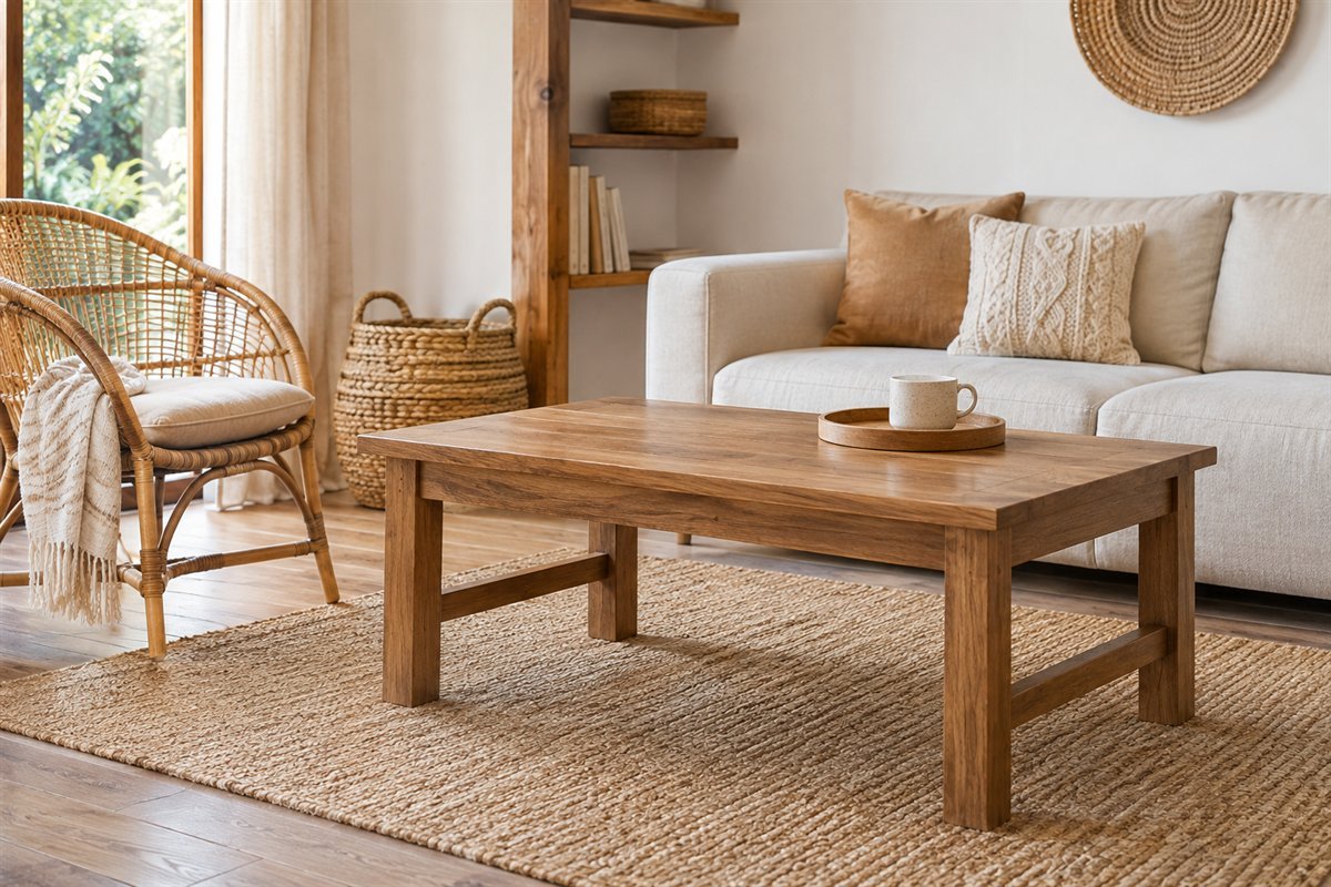
A room full of open weave can benefit from a simpler solid surface at its center. Choose the coffee table for reach, stability and the objects placed on it, then let nearby woven furniture provide the texture. A decorative basket or upholstered pouf is not automatically a substitute for a table designed to hold drinks. Keep a useful area free rather than covering the whole surface with props.
Try the actual cup, book or tray from the main seat before completing the arrangement.
15. Choose a basket for one real category
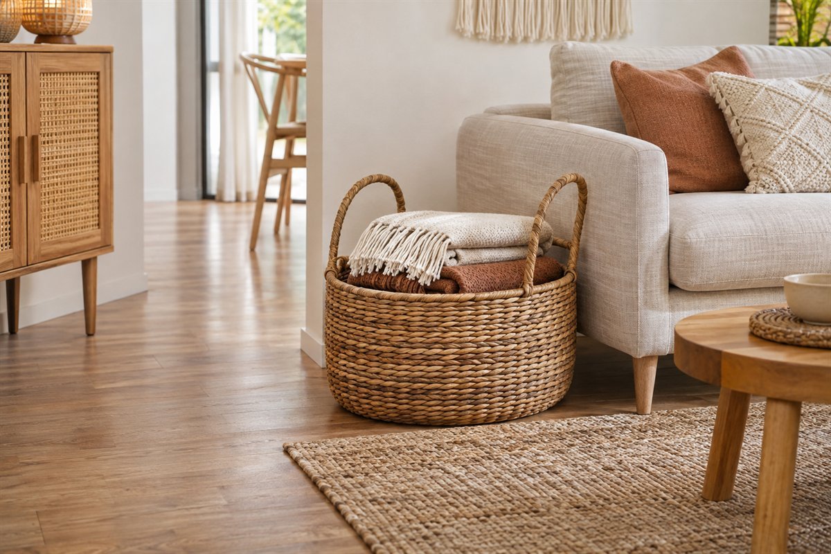
A basket works best when its shape suits the things it holds. Use one for throws, a small game selection or another clear category rather than combining unrelated objects under a decorative lid. Compare the opening, handle and filled weight with the way it will be used. A basket that looks right beside the sofa still needs to leave the ordinary route open.
Choose the contents first and keep the basket’s return position obvious.
16. Let one textile wall piece replace a cluster of small accents

A textile wall piece can add a broad soft shape without filling the floor or table. Give it clear wall around the edges so the weave is visible from the seats. Choose a suitable mounting for the actual textile and wall, keeping it away from heat and active equipment. You do not need several small hangings to make the room read as boho.
Compare the whole silhouette on the wall before adding neighboring frames.
17. Connect mixed artwork through one visible relationship

A few different artworks can belong together through color, frame finish or spacing. Pick one relationship instead of making every piece identical. Include work and objects with an identity you can describe accurately; an attractive print does not need an invented cultural origin or handmade story. Keep the collection small enough that the room’s main furniture still has a clear outline.
Place the actual pieces together on a table before choosing their wall positions.
18. Display personal objects with room to see them

A personal collection is more convincing when each object has space to be seen. Choose a few belongings you enjoy rather than buying a generic group solely to fill a shelf. If an object has a known maker or history, preserve that information; if not, describe its material or appearance without assigning a story. Keep the display separate from the surface you need for everyday tasks.
Choose the object that matters most and remove anything that hides it.
19. Use colored glass as a small light-catching accent

A small glass group can repeat the textile colors without adding another fabric pattern. Place it where the changing light is useful and the objects are stable. Check the view from the main seat so the group reads as one modest accent rather than scattered packaging. Fragile decorative pieces need a position suited to the household, away from busy edges or active play.
Keep the group limited and leave the neighboring surface useful.
20. Repeat a metal detail sparingly

A lamp base, frame or small handle detail can connect different furniture without creating a matching set. Choose a metal tone that relates to the wood and fabrics, then repeat it in a limited way. Read the exact finish-care instructions, especially on older or plated pieces. A warm-colored surface is a visual choice; it does not establish that an object is solid brass.
Start with the metal piece already in the room before buying another accent.
21. Use greenery as an optional shape, not a style requirement

One suitable leafy plant can provide an irregular shape beside repeated furniture lines. Choose it from the actual light, household needs and care routine rather than adding foliage just to complete the photograph. Keep watering practical and away from upholstery and electronics. A boho room can also work without plants; use artwork or woven texture if those choices suit the home better.
Use the linked nature-inspired guide for the wider room-and-plant comparison.
22. Make the reading corner useful beneath the styling

A reading corner can add a different scale of seating, but the chair, light and table must work together. Try reading from the actual position before surrounding it with accessories. A patterned cushion can connect the corner to the sofa while the table stays available for a book. Leave the approach clear so the smaller group belongs to the room rather than becoming a decorative obstacle.
Test the useful arrangement before adding the final textile layer.
23. Keep a dark sofa and lighten its neighboring layers

A charcoal or deep brown sofa does not have to be replaced to create a lighter boho direction. Compare a pale rug or curtain sample with it and add a controlled warm accent. Keep enough of the original upholstery visible for the contrast to look deliberate. Choose the surrounding layers from the real sofa’s undertone rather than assuming every dark fabric behaves as a neutral.
Test the largest neighboring textile before repainting the room.
24. Start a rental-room change with movable layers

In a rental, a rug, cushions, freestanding furniture and other movable pieces can change the room without starting with fixed alterations. Choose only the layers that fit the layout and your care routine. Wall fixing, paint, ceiling lights and adhesive products have their own permission and surface requirements. A product described as removable is not proof that it will leave every wall undamaged.
Separate movable purchases from changes that need an actual permission or surface check.
25. Keep a family-room reset within the boho scheme

The look will last more usefully when everyday belongings have a return position. Let closed storage hold the visually busy reserve and use a small visible basket only for a category that is easy to retrieve. Keep the textiles and fragile display appropriate to the household. The objective is a room people can use, not a photograph that depends on removing ordinary life.
Try the evening reset before adding another decorative container.
26. Scale the boho mix down in a small living room

In a compact room, keep the material variety but reduce the number of separate pieces. One woven chair, one main rug and a focused cushion group can express the style without several extra stools or poufs. Compare the actual occupied seats and the route through the room. Use the small-room guide for layout options and let the boho layer remain proportional to the furniture that fits.
Remove the least useful piece if the room only works when everything is pushed tightly together.
A keep-first palette worksheet
Write the items that remain: sofa ____, floor ____, main storage ____, rug ____. Add a short description of each item’s actual color rather than relying on a label such as neutral or natural. Photograph samples privately if useful, but make the final comparison in the room because screens and changing light can alter what you see.
Choose one lead layer next: patterned rug, textile wall piece, upholstered chair or another object you already own. Note two colors you would be happy to repeat from it. Compare a plain fabric in one of those colors with a smaller contrasting texture. Leave a place for quiet material around the detailed layer instead of spreading the same motif across curtains, cushions and artwork.
For every proposed addition, record its job, actual size, care requirements and return or storage position. A cushion should still leave useful seating; a basket should fit its contents; a side table should serve the chair. Review the room from the doorway and from the main seat. If the collection feels busy, remove a minor layer temporarily before assuming a larger purchase will bring it together.
Finally, compare the room during an ordinary week. Notice what is repeatedly moved aside and which textile is inconvenient to maintain. Keep the personal pieces you still enjoy with the room in use. This method is an original planning exercise, not a tested guarantee of a particular visual or behavioral result.
Three example palettes to compare with real samples
Quiet cream and wood: retain a pale sofa, choose a sand-toned rug and use one visibly woven accent against simpler fabric. The variation comes from surfaces and outlines rather than many competing colors. Compare the off-whites beside the actual floor so a sample that looked creamy in a shop does not become unexpectedly gray or yellow at home.
Rust with muted blue: take a patterned rug as the lead and repeat rust on one cushion or artwork detail. Use a quieter blue companion where it relates to the rug. Keep the other textiles plain enough that the main pattern remains easy to see. The aim is a visible relationship, not an exact match between every object.
Sage with charcoal: keep the dark sofa, add a pale neighboring rug and test a muted green accent with the existing wood. A woven chair or a simple textured throw can add a different surface without another large print. These are hypothetical design combinations. They do not prescribe paint codes, product colors or a universal color ratio.
Does a boho living room need lots of plants?
No. Use plants only when their care and household suitability work in the real room. Texture, artwork and a limited personal collection can provide variety without a large plant display.
Can a boho living room be minimalist?
Yes. Choose one expressive pattern or woven element and keep neighboring surfaces quieter. A limited number of useful pieces can still communicate the mix of materials and personal detail.
Do boho living rooms need layered rugs?
No. One appropriate rug can lead the palette. Keep multiple layers only when their intended support, movement and care work with the actual floor and furniture.
Can I use the sofa I already own?
Start there when it remains useful. Compare small fabric and color changes around the real upholstery before deciding a replacement is necessary.
A practical next step
Keep the useful furniture and choose one lead layer. Connect the remaining colors and textures selectively, leave room for everyday use and let the personal collection develop without filling every surface.
Compare a broader approach to layered living-room arrangements. Check the rug size against your actual seating layout. Plan the furniture before adding style to a small living room. Compare plant placement with light and practical room use.
Images are original AI-generated design concepts, not photographs of tested rooms or verified products. Example palettes are hypothetical. Follow the actual furniture, textile, rug and lighting instructions, and describe object origins only when known.
Sources and care references
- IKEA: its contemporary bohemian living-room styling guide
- IKEA rattan seat-shell care guide: material and nearby heat
- Ruggable: its rug-layering styling guidance
Optional digital guide for this topic
If you prefer a structured workbook, explore this related paid guide.